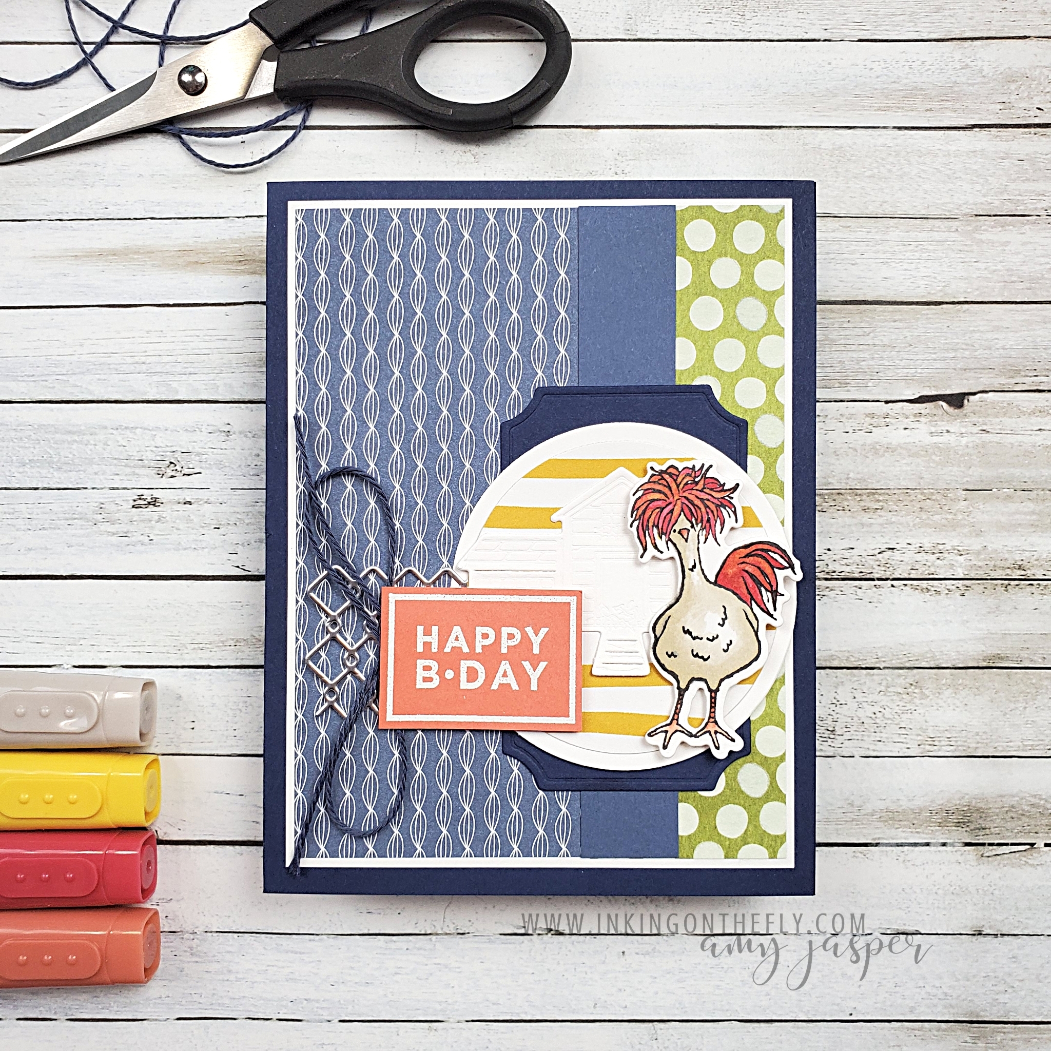
As You See It

Spring Chicken

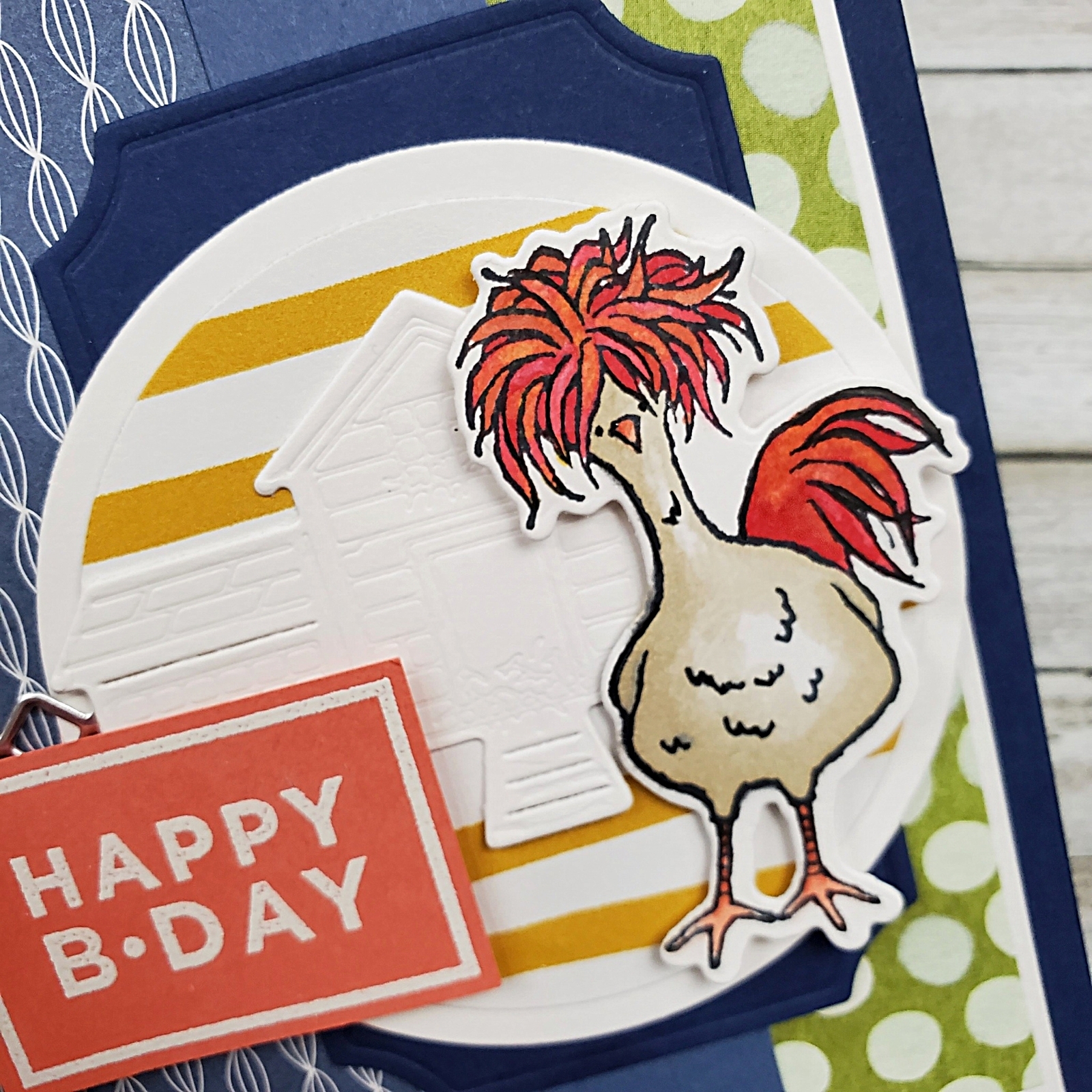
The Hey Chick Stamp set is so much fun! This chicken with the wild feathers on its head is definitely my favourite of the images in the set!

A few years ago, I made a special pop-up card with the Hey Chick stamp set. You can see that card by clicking HERE.

The sentiment from the Happiest of Birthdays stamp set is the perfect size and style for this card design. The Chick Dies add so much more to this card with the die-cut chicken, the Basic White chicken coop, and the Silver Foil chicken wire.

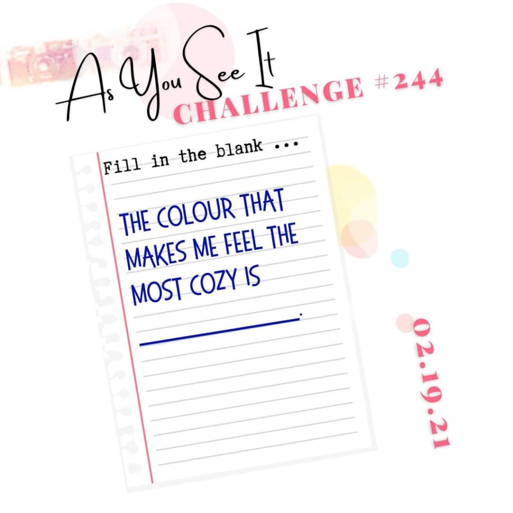
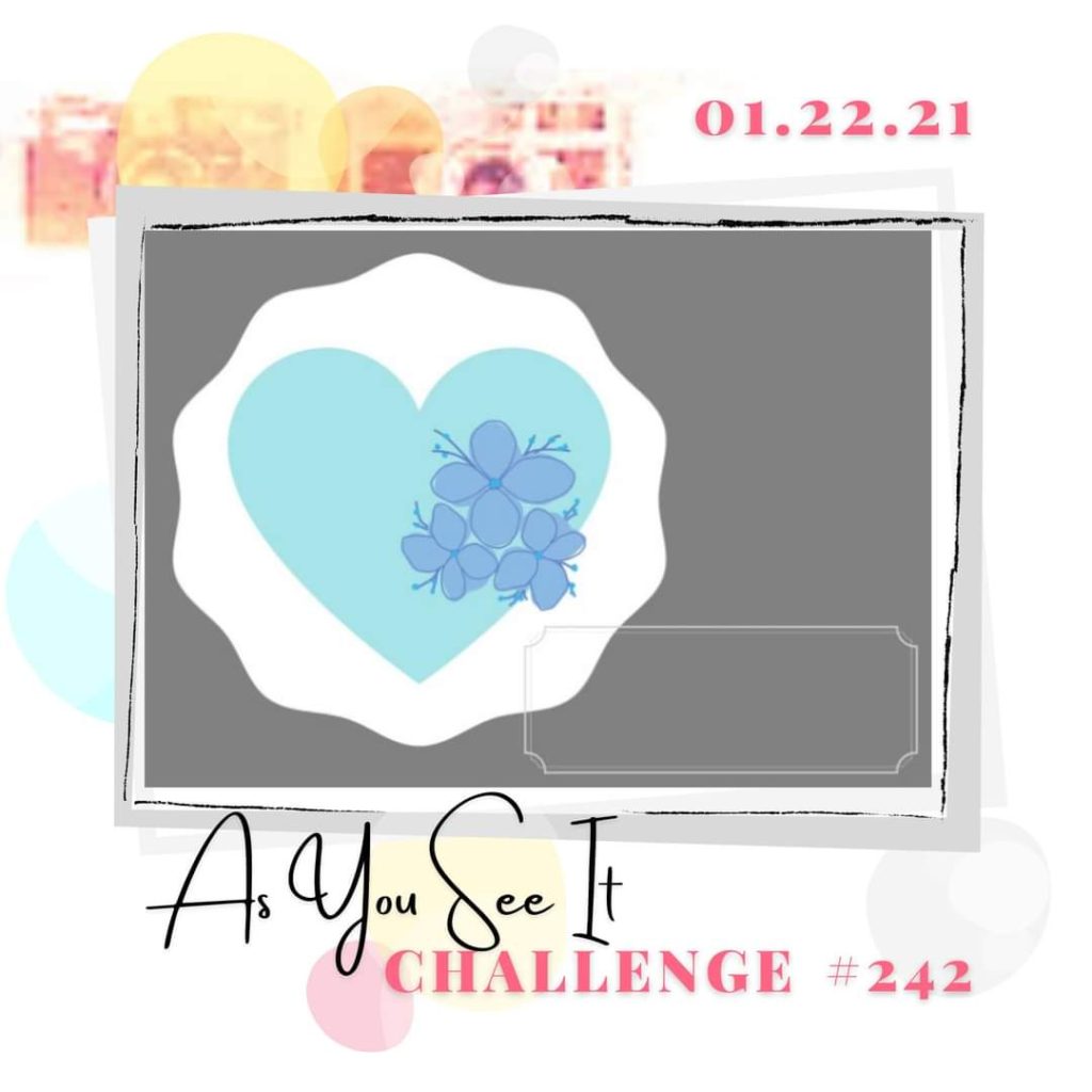
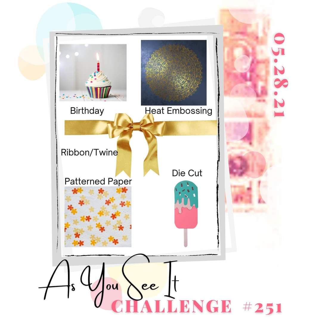
This layered card has all the elements necessary to show you how you can make a card and play along with the As You See It Challenge blog. Can you identify all five of the elements on my card?

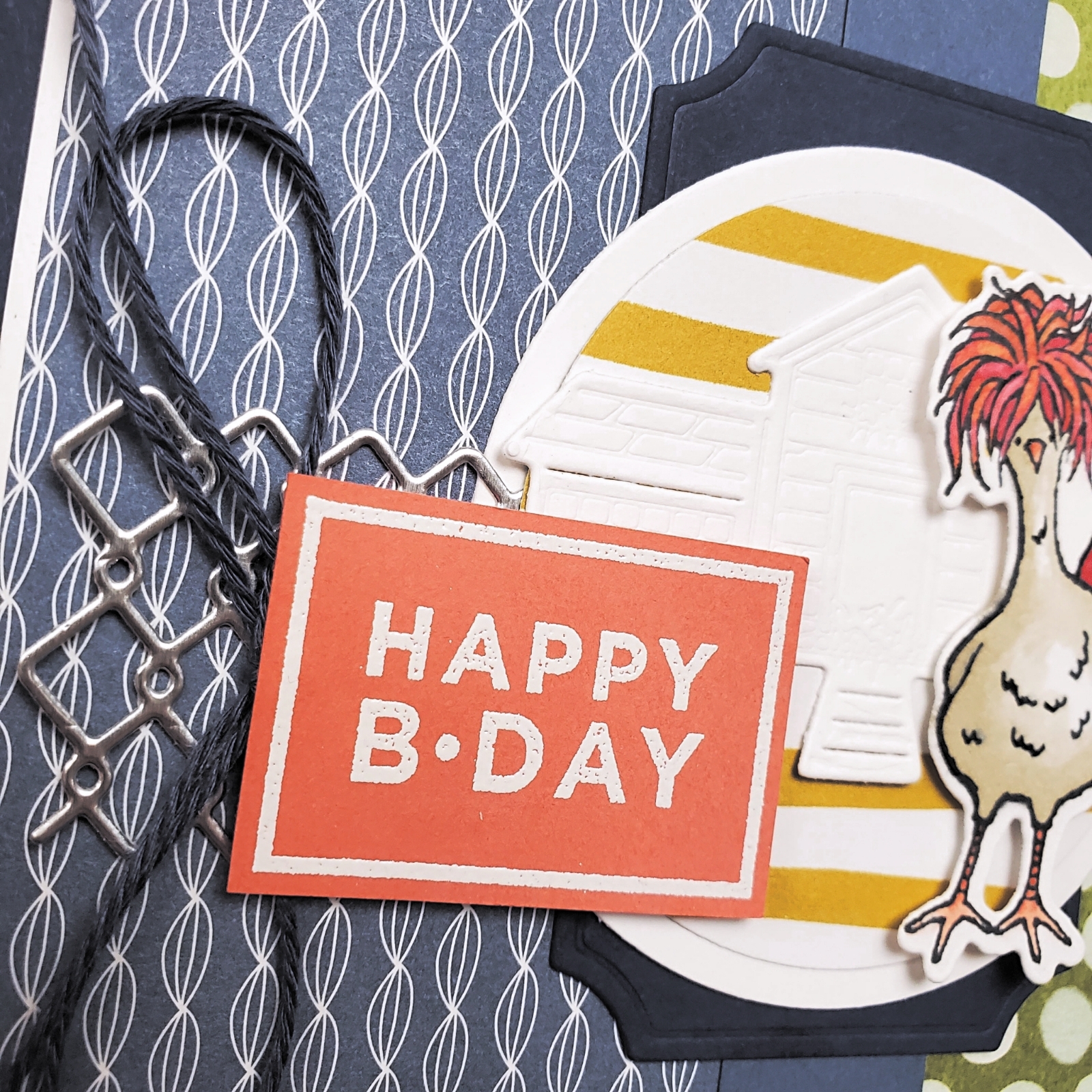
  1. Birthday – The sentiment is from the Happiest of Birthdays stamp set and stamped on Calypso Coral cardstock with Versamark ink.
  2. Heat Embossing – White Embossing Powder is added to the sentiment and heat set with the Heat Tool.
  3. Ribbon/Twine – A bow of Navy Baker’s Twine from the Well Suited Twine Combo Pack is attached with a Glue Dot.
  4. Patterned Paper – The Misty Moonlight patterned paper and the Bumblebee striped paper are both from the Dandy Garden Designer Series Paper. The Old Olive polka-dot patterned paper is from the Ice Cream Corner Designer Series Paper.
  5. Die-cut – The chicken, the chicken coop, and the chicken wire are all die-cut with the Chick Dies. Both circles are cut using the Layering Circle Dies. The Night of Navy label that you see behind the circles is cut using the Painted Labels Dies. This element is more than covered, don’t you think!? LOL!

The chicken is stamped on Basic White cardstock using Tuxedo Black Momento ink, then coloured with Stampin’ Blends Markers. Real Red, Calypso Coral, Crumb Cake, and some Daffodil Delight, all play their part in making that chicken so fun! After colouring, I did some careful touch-ups with the pen end of my Basic Black Stampin’ Write Marker. I often do this to sharpen an image after it’s been coloured as the colouring process can soften the lines. Doing that is kind of the same as using the sharpening feature when editing photos.

The card base is Night of Navy cardstock, layered with Basic White. Then the patterned paper pieces are added with a 3/4″ wide strip of Misty Moonlight cardstock to separate the two patterns. Next, the Night of Navy die-cut label, the Basic White circle, the Silver Foil die-cut chicken wire, the Bumblebee striped die-cut circle, and the Basic White die-cut chicken coop are layered on the cardfront.

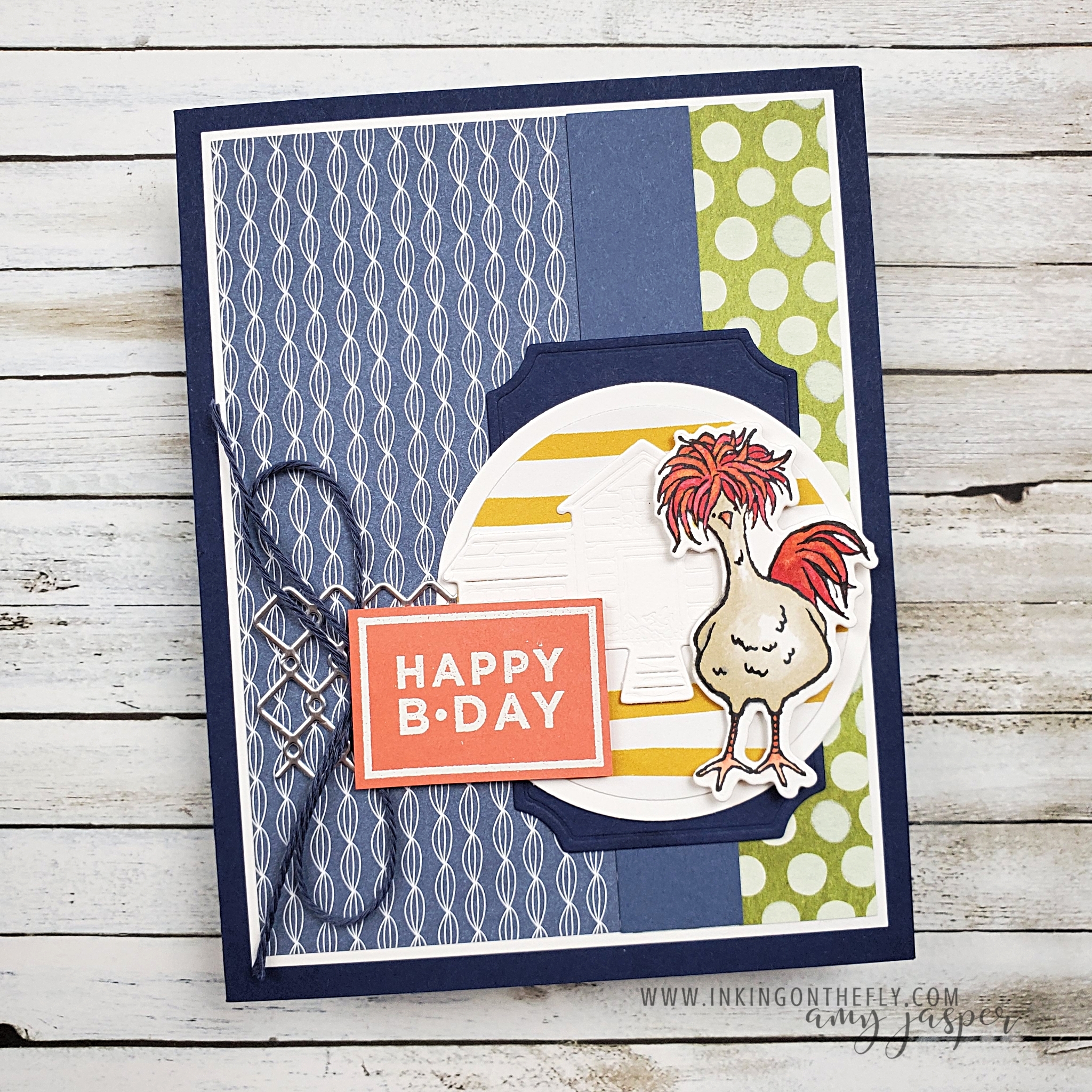
The only items that are attached with Stampin’ Dimensionals are the sentiment and that crazy, funky chicken.

Go to the As You See It Challenge blog to see all the designs shared by our design team. Why not give this challenge a try and share it with us on the challenge blog? It’s fun to play along and we love seeing where your creativity takes you!

Cosy is a Feeling

Let’s begin with a discussion on the English language, shall we? LOL!

I’m Canadian. Canadian culture, language, and numerical systems are a bit … wonky. We’ve been strongly influenced by both our British connection and our American neighbours. Thus, the title of this post uses the British influenced spelling of “cozy”, even though my spellcheck underlines it in an irritated, red squiggly line! However, I will continue to measure my cardstock in inches, my height in feet, and my weight in pounds. Celsius stands firm, though, because I will never understand what any number in Fahrenheit means! I will spell “favourite”, not “favorite”, “catalogue”, not “catalog” and “counsellor”, not “counselor”. We’re weird like that.

Let’s just call it a cute little quirk and move on.

So, how ’bout we talk stamping!

The card for today’s post is inspired by the As You See It Challenge, which happens to be, what we like to call, a “fill in the blank” challenge.

I had to really think about what it means to me to be cosy. Often it’s about being warm, comfortable, and becoming one with the couch (or do you prefer “sofa”, “settee”, or “chesterfield”, LOL!). But, as I considered what colours make me feel the most cosy, I realised it’s less about the colour and more about the environment. So, I thought, “which environments make me feel the most cosy and what colours are associated with those environments?”.

I’m pretty sure I’m overthinking this, LOL!

I feel cosy curled up under a blanket watching the flames dance in the fireplace while sipping a hot beverage from my favourite mug. I couldn’t really associate a colour with that image, though.

My final thought was the cosy comfort and security of a glowing light source in the deep colours of the evening sky.

I found my colour. The deep colours of the evening sky!

Pretty Peacock is the closest I have of this colour. When paired with the contrasting warmth of Bumblebee, it’s as cosy as cosy can be!

I enjoyed all the sponging on this card! I started with a piece of Pretty Peacock and sponged around the edges with Pretty Peacock ink, Night of Navy ink and Tuxedo Black ink. I stamped the trees from the Campology Stamp Set with Tuxedo Black ink on the Pretty Peacock, then die-cut the paper with one of the rectangles from the Stitched Rectangle Dies and the Stampin’ Cut and Emboss Machine. That was layered on Bumblebee cardstock, wrapped with Linen Thread, and attached with Stampin’ Dimensionals to the Pretty Peacock cardbase which I had lightly sponged around the edges with Pretty Peacock ink to add a bit more of a rich and full colour.

I fully admit to going a little crazy with the details around the lantern image from the Campology Stamp Set. I first stamped it with Tuxedo Black ink on Basic White cardstock. Then I used a Sponge Dauber to apply Mango Melody ink to the centre of the light and used circular motions to blend the colour out as I increased the circumference of the circle. I then went in with the Pretty Peacock and Night of Navy to darken the surrounding areas on the Basic White. I coloured the lantern a bit here and there with some Stampin’ Blends. I used a bit of Bronze, Soft Suede, and Crumb Cake. I even went in with my Basic Black Stampin’ Write Marker to sharpen up some of the black lines in the image. I finished the lantern by applying a bit of sparkle to the glass on the image with my Wink of Stella Brush.

Now this is where it gets a little crazy …

I cut around the bottom of my lantern and straight out from the sides so that I could attach that piece to some woodgrain patterned paper in the In Good Taste Designer Series Paper, giving the lantern a picnic table to stand on. This piece needed to match the colouring of the lantern piece, so I grabbed my sponges again and applied the Mango Melody, Pretty Peacock, and Tuxedo Black.

When the lantern felt cosy enough, I used another of the rectangles from the Stitched Rectangles Dies and cut it out so I could adhere it to my card with Stampin’ Dimensionals.

The final touch was to grab the sentiment from my stash. This sentiment is from the awesome background stamp called Many Messages. What makes it so awesome, is that it is one stamp with … well… exactly that – many messages. I had already stamped all these sentiments on Basic Black cardstock with Versamark ink and heat embossed all of them at once using White Embossing Powder and my Heat Tool. Then (now this is the coolest part) I used ONE die, to cut out ALL of the sentiments at once! Now I have a little stash of sentiments on labels ready for me to use at my greatest of convenience! If you haven’t considered the Many Messages Bundle, check it out on my online store or have a look in the January – June Mini Catalogue on page 35. I love it!

I’m so glad you visited me today. Be sure to take a moment to leave a hello in the comments so I know you stopped by!

Scattered Gold

Do you do anything to occupy your mind when you’re doing a task that you don’t enjoy?

I dread doing any kind of maintenance chores, like folding and putting away my laundry, making dinner (ugh), planning meals, cleaning my craft room, (cleaning pretty much anything, actually), and grocery shopping. To avoid boredom and reduce the torture of performing some of these tasks, I will often binge a show on Netflix or Prime. I find that 20 to 30 minute episodes work best and they can’t be a show that I have to pay to close attention to, since I need to actually accomplish the unpleasant task at the same time. I’ve tried watching some of those home improvement or organization reality shows, but those aren’t working at all. They’re nice to look at, but really boring to listen to, LOL!

The shows that keep me company and make my tasks a bit more bearable are my tried and true favourites. I just come back to them over and over. They’re fun and light and always help to lift my mood.

  1. The Office (my son bought me the complete box set for Christmas!)
  2. Brooklyn 99 (absolute gold!)
  3. New Girl
  4. The Good Place

I’ve watched some other shows that I’ve enjoyed as well, of course, but these ones are a few of the ones that I can listen to while I work and I know exactly what’s happening without looking at the screen most of the time because I’ve seen it before. They’re my friends and they always make me smile.

The one circumstance on my list above where I have to give my full attention, is grocery shopping. Maybe listening to music with ear buds would help? Kind of like my own personal movie soundtrack!

How do you endure the unpleasant and boring tasks in your day? Do you have any special tricks that dust a little bit of gold over the dull and dreary parts?

Of course, some of the shiniest gold that’s scattered throughout my week is when I get to play in my craft room! AND PLAY, I DID! As usual, the card I have to show you today begins with some creative inspiration from the As You See It Challenge Blog! It’s a sketch!

My Gilded Leafing from Stampin’ Up! has been quietly waiting for me to play with it since I bought it over a month ago. I have to admit, I was a little nervous to even open the container after being warned that it will expand or make a horrible mess. I wasn’t sure if I was ready for ACTUAL scattered gold to be all over my craft room! But for my card today, I’m happy to report that my Gilded Leafing has been a wonderful and fun art experience that definitely needs further exploration.

I used the Art Gallery Bundle, which, if purchased between now and February 28th during Sale-a-bration, will allow you to choose a free Sale-a-bration item. Coincidentally, I also used the Oh So Ombre Designer Series Paper on this card, which is a free pack of 6×6″ patterned paper with a $60 CAD purchase. I used one of my new Blending Brushes with Bermuda Bay ink to sponge a little extra colour behind where my flower was going to be. The stem and leaves were stamped with Shaded Spruce and I stamped the two steps of the flower on a separate piece of the same paper using Pretty Peacock and Night of Navy ink. After adding some Wink of Stella to the accents on the flower, it was die-cut with the coordinating die.

Before attaching the die-cut flower, I played with my Gilded Leafing and some Multipurpose Liquid Glue. I had NO idea what I was doing. That’s what made it fun (and a little bit scary, too!). I wondered if I could create a splatter kind of effect by mixing a small amount of water with the liquid glue on a paint brush, then tapping the brush on my finger over the paper to splatter the thinned glue on the surface. Then I would apply the leafing to the glue. This didn’t go as planned at all because I applied the gilding while the glue was too wet. It smeared the glue, resulting in a less defined placement of the gold leaf. If you make sure the glue is completely dry (remember, this glue stays sticky when it’s dry!) before you apply the leafing, you will not get the smudged gold like I did. The splatter the the left of the flower was dry, while the splatter to the right was too wet when I applied the leafing. See the difference?

I decided I liked the smeared imperfection! I carried on with the piece by rounding the two corners of the ombre paper with my Detailed Trio Punch and attached the flower with Stampin’ Dimensionals. This was glued to the Basic White layer and the Gray Granite card base. I added a bit of texture and interest to the Basic White layer by running it through my Stampin’ Cut & Emboss Machine with the Painted Texture 3D Embossing Folder. I also added some splatter by flicking some ink from my Black Stampin’ Blends Marker onto the white cardstock.

The final elements on my card are the Fine Art Ribbon and the white heat-embossed sentiment on the black die-cut label. The sentiment and label are from the Many Messages Bundle. This bundle is really cool because it has a bunch of different sentiments on one large background stamp AND they line up perfectly with the ONE die that cuts them ALL OUT AT ONCE! Oh my gosh! Talk about a time saver for making multiple cards for multiple occasions! I think that will be my next project – make a set of cards using all the sentiments from this bundle. Ooooh! I can feel the creative wheels gaining momentum! Yup. That’s my next project, for sure!

Make sure you give this sketch challenge a try and share it with us over at the As You See It Challenge Blog.

But before you go, don’t forget to share with me any tips and tricks you have to scatter gold

(or smear it, LOL!)

over the dreaded tasks you have in the day. What is your dreaded task and how do you get through it without dying? Or is it just me? Am I the only one who feels like it’s torture to do these things? I tell you, if I was a wealthy person, I would pay good money to have all of those things done for me!