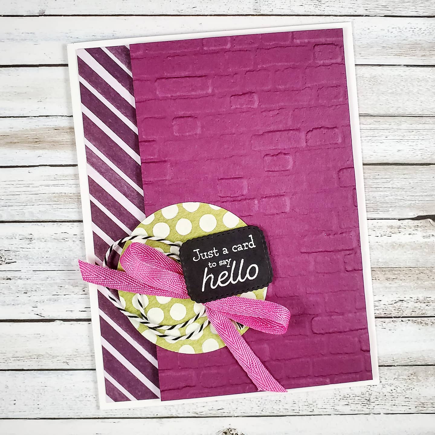
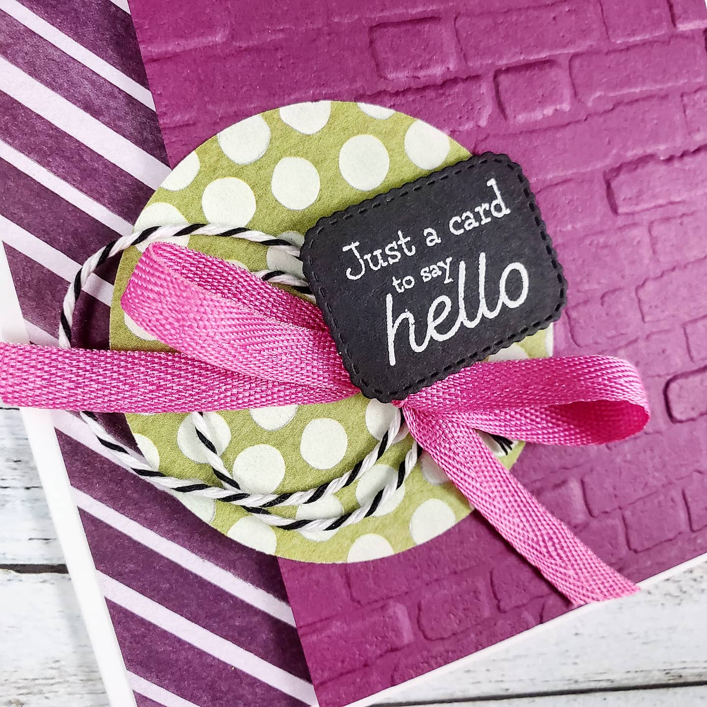
I used a Thick Basic White card base and added a 1″ strip of designer series paper to the left of the card. The Rich Razzleberry cardstock on the right side was embossed in the Cut & Emboss Machine using the Brick & Mortar 3D Embossing Folder and attached with Stampin’ Dimensionals. Fabulous texture! The polka dot piece of patterned paper from the Ice Cream Corner Designer Series Paper was cut with the 2 1/4″ Circle Punch from Stampin’ Up! and adhered directly to the Razzleberry layer.
The true delight is in the loops of black and white baker’s twine from the Playful Pets Trim Combo Pack, combined with the bright Magenta Madness 1/4″ Twill Ribbon tied in a bow and the black label with the White Embossed sentiment. The label and sentiment come from the Many Messages Bundle. The big background stamp has a wonderful collection of sentiments and the die cuts them all out at once! It’s brilliant!
You can find all these products on my online store with Stampin’ Up!
The next Stamp Camp event will be May 15th! If you’re in Canada, then be sure to save the date and watch for registration info!
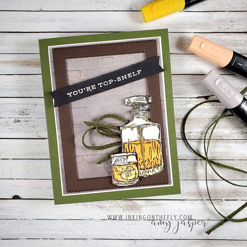
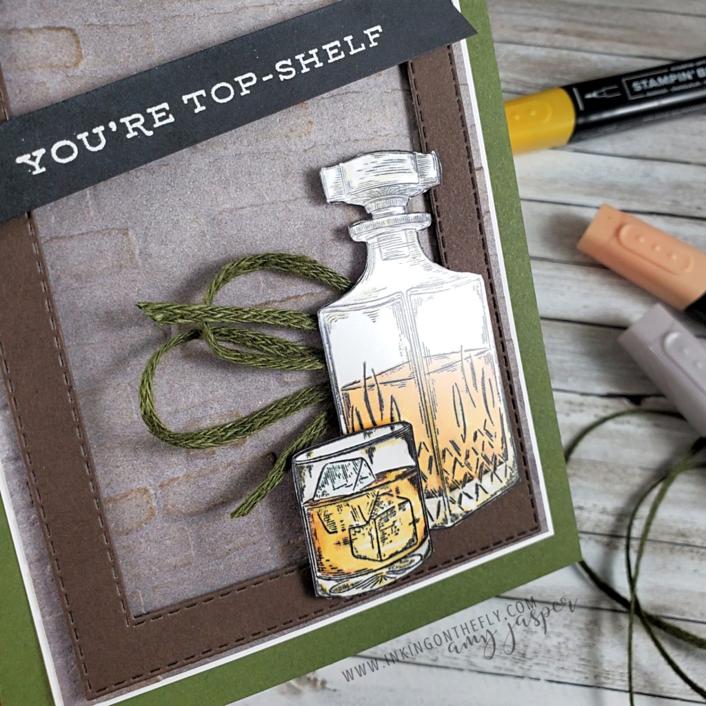
Check out this Stampin’ Up!® card with earth tones and a whiskey theme featuring the Whiskey Business stamp set.
Lots of women drink whiskey (I know I do!) and love the colours in the earth’s palette, so to say my card today is designed for a man would be inaccurate. I don’t think that certain colours or styles are for men and others are for women and I would LOVE to see us move away from that. I have also struggled with saying that something is masculine or feminine – who decides that anyway? That said, it is super challenging to re-train our thinking and our descriptive language out of using these terms. When someone tells me that something looks masculine, I know exactly what they mean – brown, navy, gray, black, green, rust and maybe shades of darker reds and oranges. It often also implies textures like wood, stone, and leather. Themes like cars, sports, hunting, fishing, whisky, beer, and barbecues. Thus being caught between wanting to avoid using “masculine” or “feminine” as descriptive terms and recognizing these as commonly understood descriptives.
My card today is made with rich earth tones and textures, modern lines, and a whiskey theme. You might choose to give it to your dad for Father’s Day, or to your friend along with a bottle of her favourite scotch whiskey for her birthday (yes, please! LOL!).
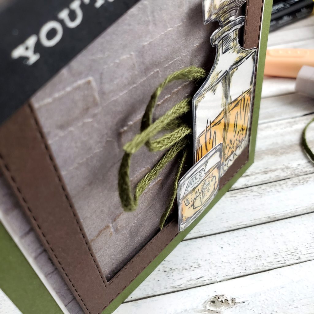
One of the patterns from the In Good Taste Designer Series Paper looks like granite or cement, which I embossed using the Brick & Mortar 3D Embossing Folder. I lightly sponged it with Crumb Cake ink to highlight the bricks and warm up the gray of the patterned paper. This was adhered to a piece of Basic White and then to the Mossy Meadow card base.
To create a frame, I used two of the Stitched Rectangle Dies with Early Espresso cardstock and adhered it to the card with Stampin’ Dimensionals. The images were stamped on Basic White cardstock with Tuxedo Black Momento ink and coloured with my Stampin’ Blends Markers. I used Light Mango Melody and Light Pumpkin Pie to create the amber liquid. Sparse use of the Light Gray Granite with the Light Mango Melody help to achieve some shading on the decanter and the whiskey tumbler. I stamped the same images on some Window Sheets with Black StazOn ink. I fussy cut tight around all the images and adhered the Window Sheet image to the Basic White image using sparing dots of Multipurpose Liquid Glue. The decanter is adhered directly to the Early Espresso Stitched Rectangle frame and the tumbler is on Stampin’ Dimensionals over the bottle.
I tied a piece of Mossy Meadow Linen Trim in a loose bow, folded it in half and tucked it under the decanter with a glue dot. The sentiment is stamped on the Basic Black cardstock with Versamark Ink, then powdered with White Embossing powder and heat set to the smooth glossy finish with the Heat Tool. I flagged the ends by hand with my Paper Snips and adhered the sentiment to the card front with Stampin’ Dimensionals over the frame.
This was my first time to finally use the Whiskey Business stamp set from Stampin’ Up! and I’m so happy with how it turned out!
Let’s begin with a discussion on the English language, shall we? LOL!
I’m Canadian. Canadian culture, language, and numerical systems are a bit … wonky. We’ve been strongly influenced by both our British connection and our American neighbours. Thus, the title of this post uses the British influenced spelling of “cozy”, even though my spellcheck underlines it in an irritated, red squiggly line! However, I will continue to measure my cardstock in inches, my height in feet, and my weight in pounds. Celsius stands firm, though, because I will never understand what any number in Fahrenheit means! I will spell “favourite”, not “favorite”, “catalogue”, not “catalog” and “counsellor”, not “counselor”. We’re weird like that.
Let’s just call it a cute little quirk and move on.
So, how ’bout we talk stamping!
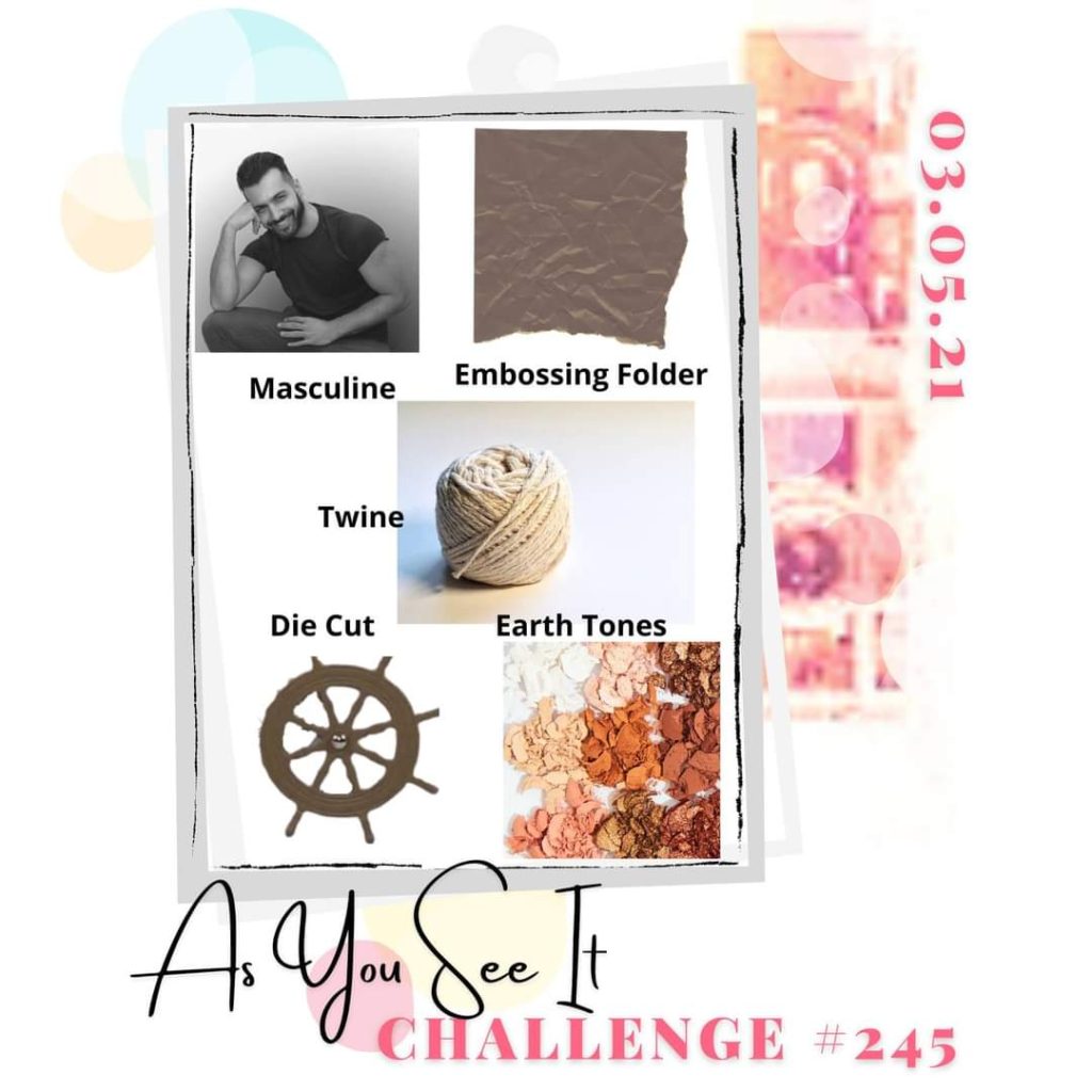
The card for today’s post is inspired by the As You See It Challenge, which happens to be, what we like to call, a “fill in the blank” challenge.
I had to really think about what it means to me to be cosy. Often it’s about being warm, comfortable, and becoming one with the couch (or do you prefer “sofa”, “settee”, or “chesterfield”, LOL!). But, as I considered what colours make me feel the most cosy, I realised it’s less about the colour and more about the environment. So, I thought, “which environments make me feel the most cosy and what colours are associated with those environments?”.
I’m pretty sure I’m overthinking this, LOL!
I feel cosy curled up under a blanket watching the flames dance in the fireplace while sipping a hot beverage from my favourite mug. I couldn’t really associate a colour with that image, though.
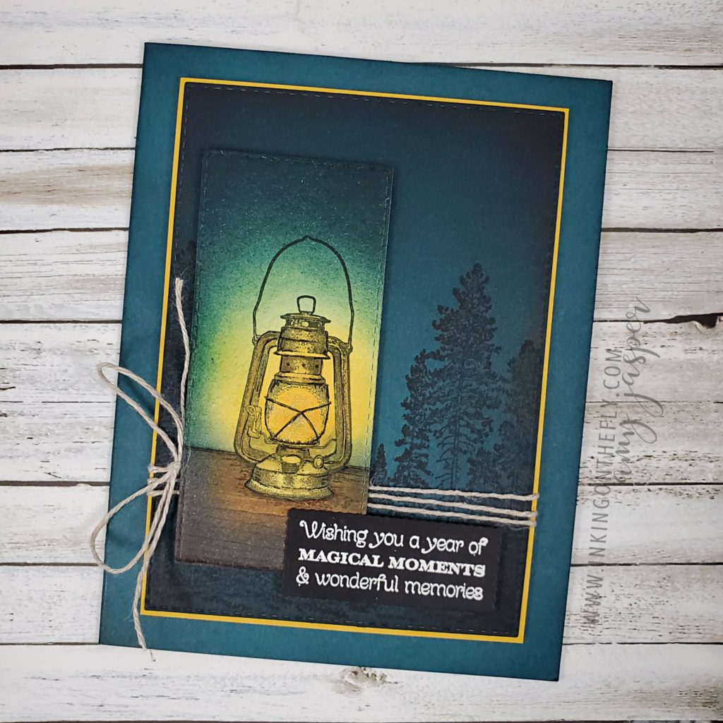
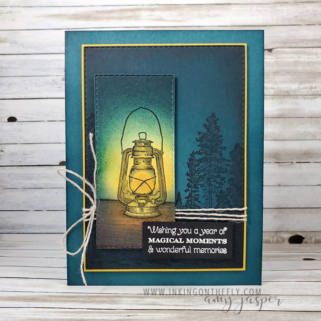
My final thought was the cosy comfort and security of a glowing light source in the deep colours of the evening sky.
I found my colour. The deep colours of the evening sky!
Pretty Peacock is the closest I have of this colour. When paired with the contrasting warmth of Bumblebee, it’s as cosy as cosy can be!
I enjoyed all the sponging on this card! I started with a piece of Pretty Peacock and sponged around the edges with Pretty Peacock ink, Night of Navy ink and Tuxedo Black ink. I stamped the trees from the Campology Stamp Set with Tuxedo Black ink on the Pretty Peacock, then die-cut the paper with one of the rectangles from the Stitched Rectangle Dies and the Stampin’ Cut and Emboss Machine. That was layered on Bumblebee cardstock, wrapped with Linen Thread, and attached with Stampin’ Dimensionals to the Pretty Peacock cardbase which I had lightly sponged around the edges with Pretty Peacock ink to add a bit more of a rich and full colour.
I fully admit to going a little crazy with the details around the lantern image from the Campology Stamp Set. I first stamped it with Tuxedo Black ink on Basic White cardstock. Then I used a Sponge Dauber to apply Mango Melody ink to the centre of the light and used circular motions to blend the colour out as I increased the circumference of the circle. I then went in with the Pretty Peacock and Night of Navy to darken the surrounding areas on the Basic White. I coloured the lantern a bit here and there with some Stampin’ Blends. I used a bit of Bronze, Soft Suede, and Crumb Cake. I even went in with my Basic Black Stampin’ Write Marker to sharpen up some of the black lines in the image. I finished the lantern by applying a bit of sparkle to the glass on the image with my Wink of Stella Brush.
Now this is where it gets a little crazy …
I cut around the bottom of my lantern and straight out from the sides so that I could attach that piece to some woodgrain patterned paper in the In Good Taste Designer Series Paper, giving the lantern a picnic table to stand on. This piece needed to match the colouring of the lantern piece, so I grabbed my sponges again and applied the Mango Melody, Pretty Peacock, and Tuxedo Black.
When the lantern felt cosy enough, I used another of the rectangles from the Stitched Rectangles Dies and cut it out so I could adhere it to my card with Stampin’ Dimensionals.
The final touch was to grab the sentiment from my stash. This sentiment is from the awesome background stamp called Many Messages. What makes it so awesome, is that it is one stamp with … well… exactly that – many messages. I had already stamped all these sentiments on Basic Black cardstock with Versamark ink and heat embossed all of them at once using White Embossing Powder and my Heat Tool. Then (now this is the coolest part) I used ONE die, to cut out ALL of the sentiments at once! Now I have a little stash of sentiments on labels ready for me to use at my greatest of convenience! If you haven’t considered the Many Messages Bundle, check it out on my online store or have a look in the January – June Mini Catalogue on page 35. I love it!
I’m so glad you visited me today. Be sure to take a moment to leave a hello in the comments so I know you stopped by!