Happily Pretty Simple
The As You See It Challenge Sketch #079 is bold and simple at the same time. This week I worked with heat embossing, Blender Pens, a note card project, and Envelope Liner Framelits.
Here’s the sketch challenge I started with for this project:
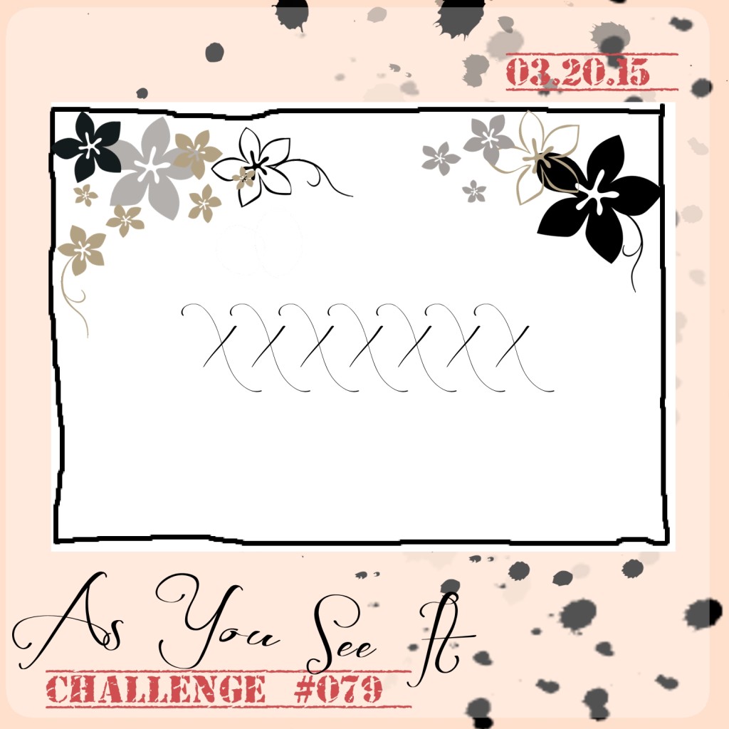
At first glance, I had NO idea what to do with this sketch. So, I started by looking at the largest sentiments that I had available, then carried on from there. I hadn’t even mounted my Big News stamp set yet and it was perfect for this layout!
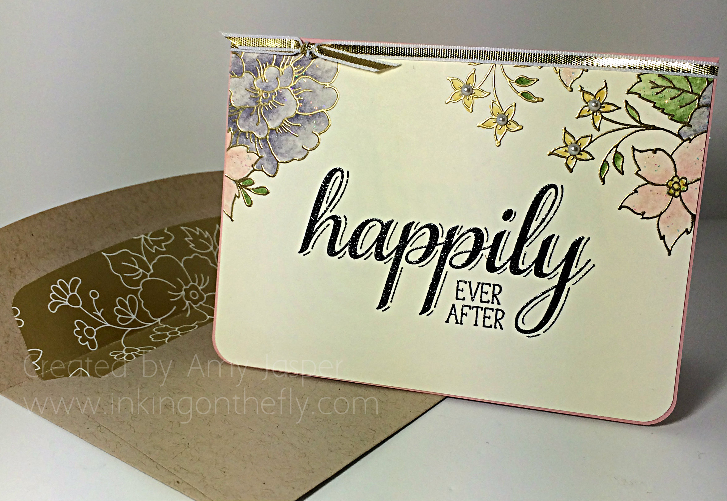
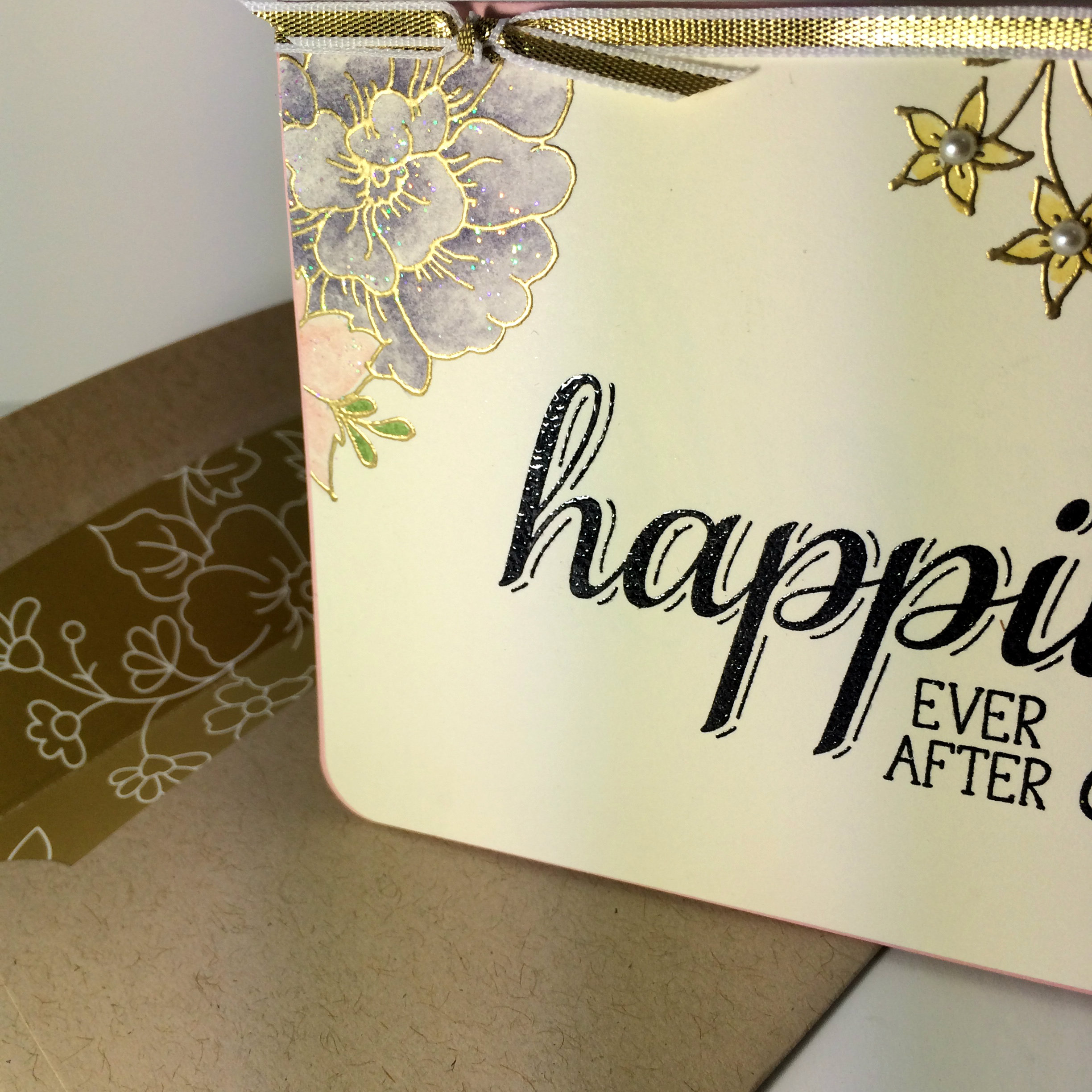
In the end, my card became a note card size (3.5″ x 4.75″), but only because I changed my mind a few times as to what I wanted it to look like and eventually it had to be cut down to the size you see here.
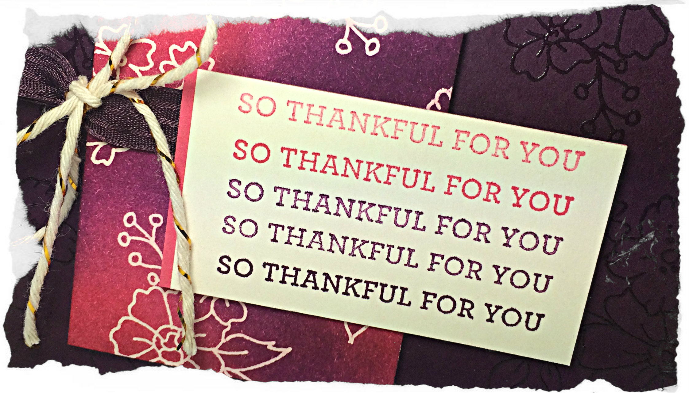
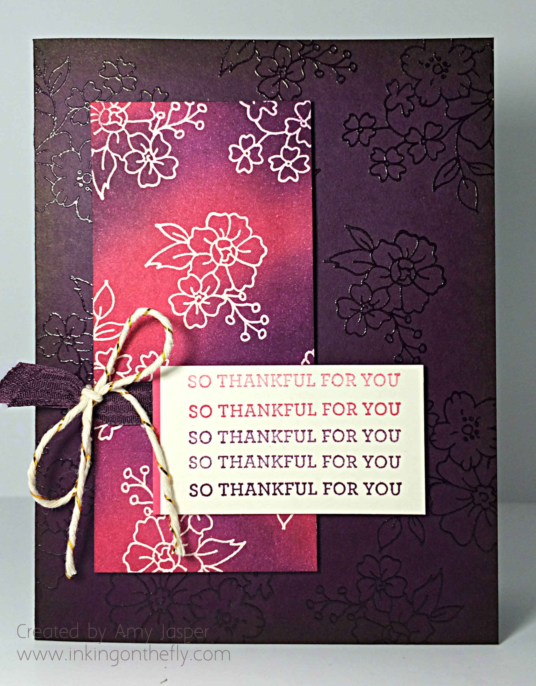
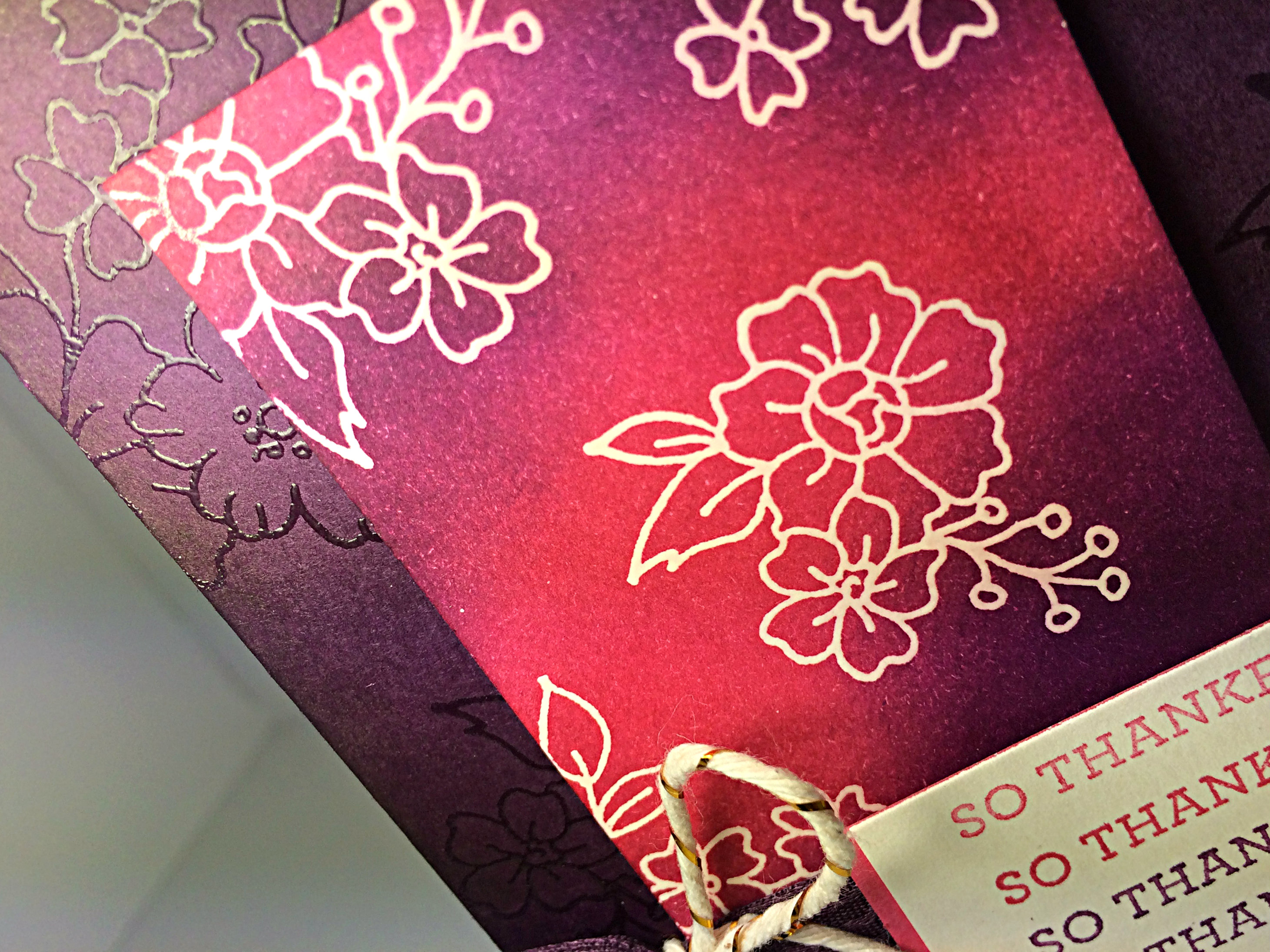
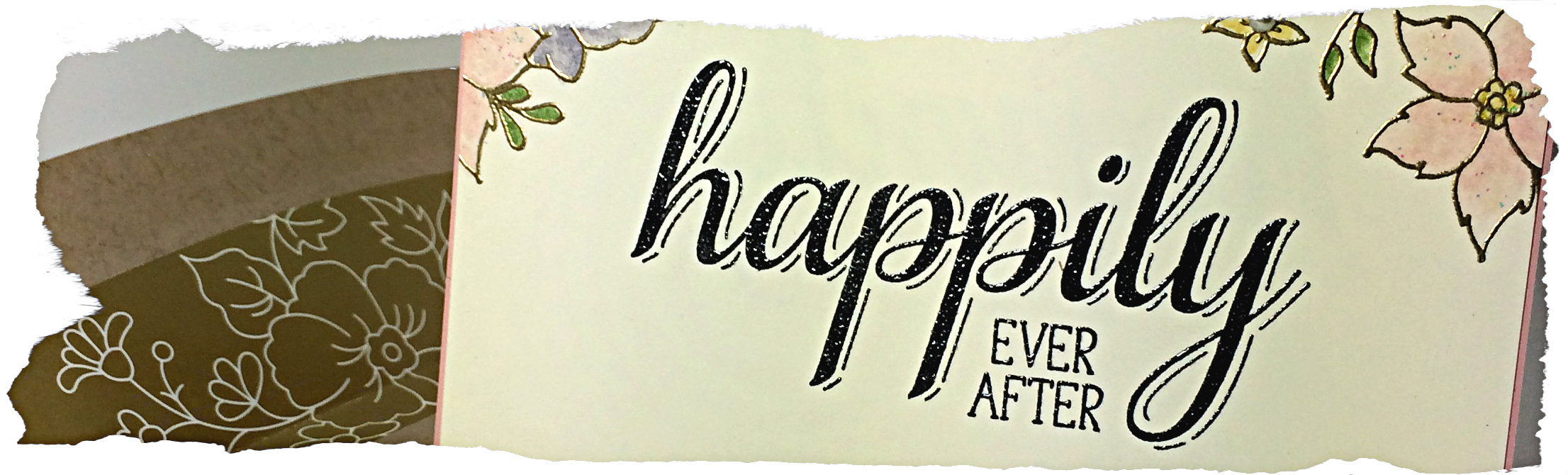
I used Very Vanilla cardstock and stamped the sentiment in Jet Black Stazon ink. It looked too flat, so I applied Clear Embossing powder over the ink and heat set it to give a glossy finish (did you know you could do that with Stazon?!). I then stamped the flowers from the I Like You hostess stamp set with Versamark ink and heat set the Gold Embossing powder over that. Next, the flowers were coloured with Classic ink using a Blender Pen (pulling those out again now that the Blendabilities are discontinued…sniff…) I used Blushing Bride, Wild Wasabi, Hello Honey, and Wisteria Wonder ink for the flowers, then finished them off with a few blobs of Dazzling Details glitter glue which I spread all over the flowers and leaves with the tip of my finger. The wee flowers were topped off with small Basic Pearls.
You can see the glitter from the Dazzling Details glue a bit better in the above photo. Did you notice the envelope liner in this photo? I used the Gold Soiree Specialty Designer Series paper and my Envelope Liner framelits to create the elegant look to this Crumb Cake Note Card Envelope. It’s very handy to have paper that coordinates with the I Like You stamp set!
I used Blushing Bride cardstock for the base with a very thin border around the Very Vanilla layer. The bottom corners were all rounded with my Project Life corner rounder punch. I topped the front of the card with a piece of Gold 1/8″ ribbon.
Simple.
Pretty.
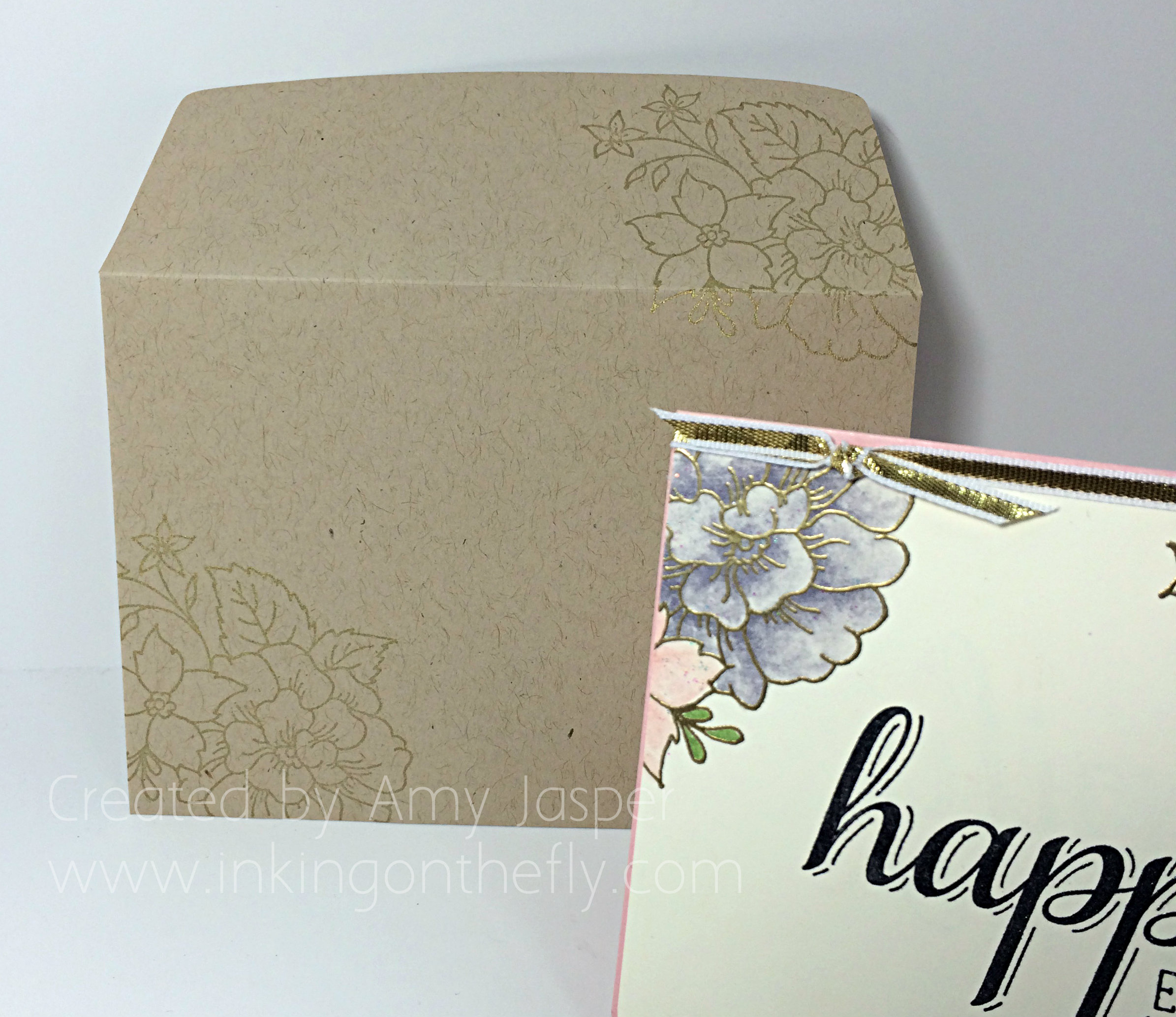
The outside of the envelope was stamped using the I Like You flower image as well, but with Gold ink.
And it all comes together! Whah whah!!
Now I’m ready for the next wedding (come on my single friends!! Bring it on!) when I will use this gift card to top off the amazingly expensive and perfect and fabulous wedding present that will go along with it.
Why don’t you give this sketch a go? Don’t forget to show it off at the As You See It Challenge blog. I know you will inspire me with whatever your take on the sketch may be. I can’t wait to see what you come up with!!
Amy
![]()