Starburst Spring Card
 It’s time for another challenge card with my Stampin’ Up papercrafting supplies. I was getting tired of the usual 4 1/4″ x 5 1/2″ rectangles, so I went with circular card today using the Starbust Framelits and some faux water colouring. Gotta shake it up a bit now and then, lol!
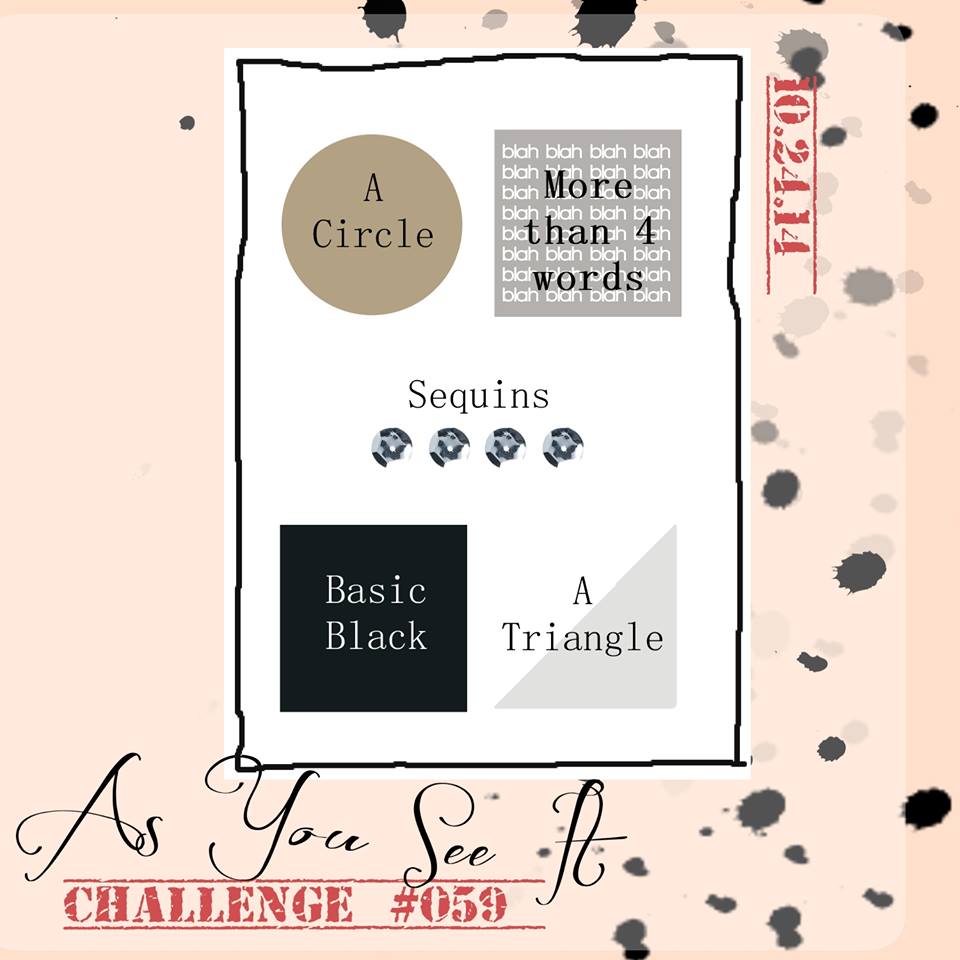
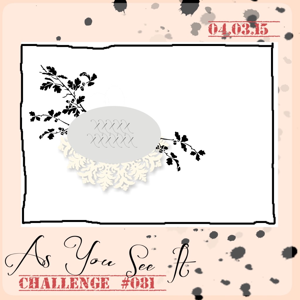
Here’s the challenge sketch that I started with from the As You See It Challenge blog:
 I decided to work with my Water Colour Paper, Handpicked Framelits, the From the Garden stamp set, the Mother’s Love Stamp set and some spritzing with water!
I shared this card with my technique class just the other night. My monthly group have become some of my closest friends. They really are the main reason that I have remained a Stampin’ Up Demonstrator for so long! Don’t get me wrong, I love creating with stamps and ink; I love the coordinating colours in paper, inks, and embellishments; I adore the tools and how easy they make it to create something beautiful; but what really carries me through and holds the most meaning and significance for me as a Demonstrator, are the relationships. It’s all about the people, the smiles, the laughter, the playful banter, the excitement and joy, and, especially the silliness.
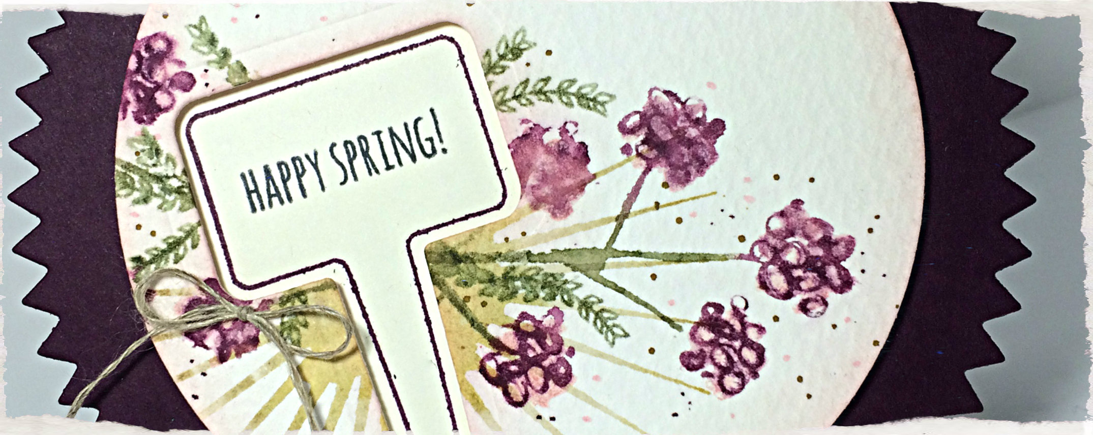
Here’s the card:
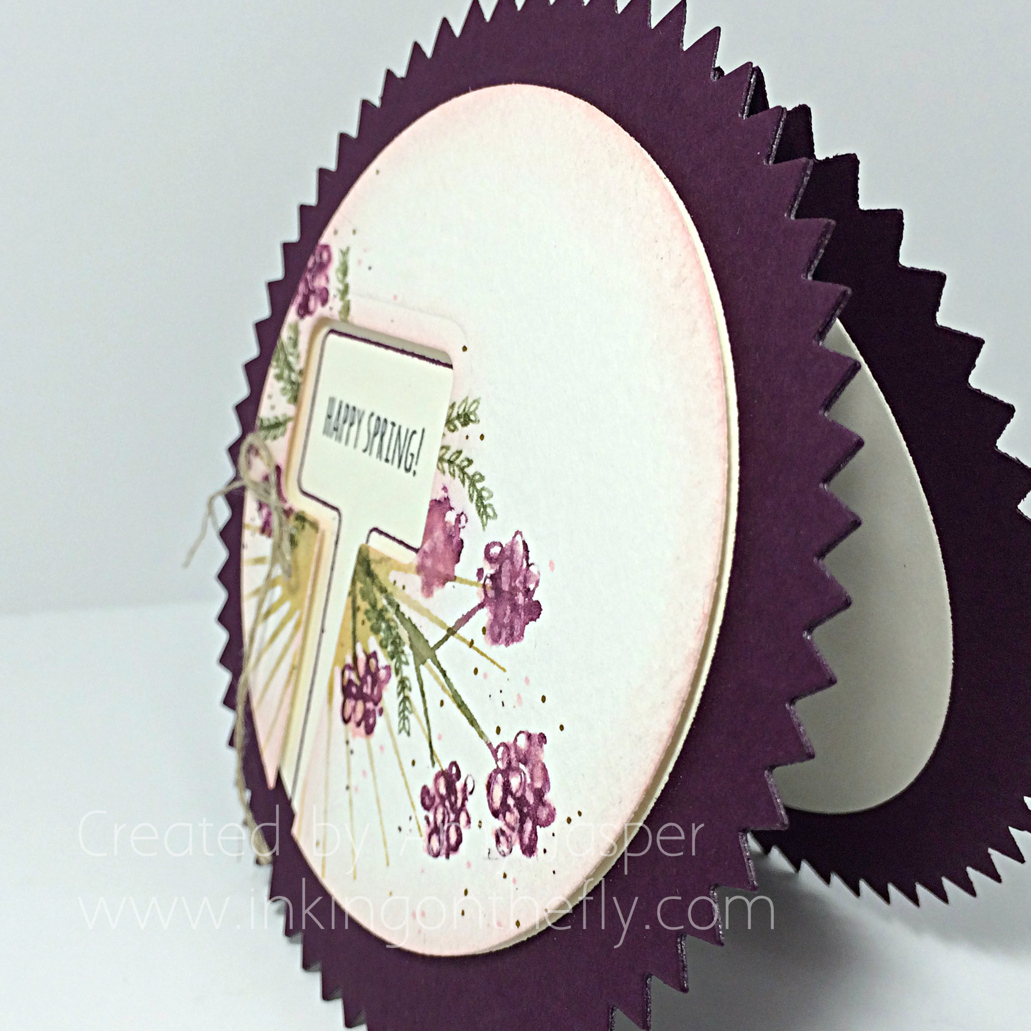
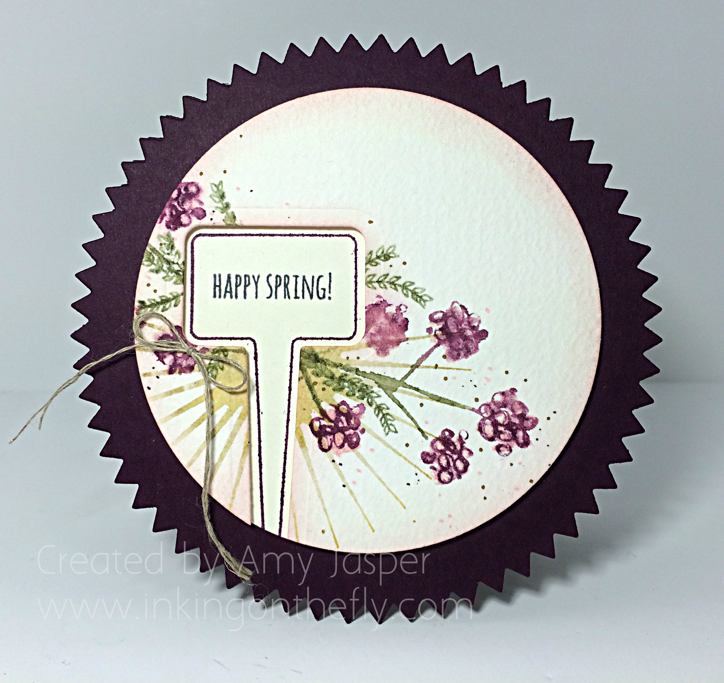 Ah, Blackberry Bliss. I wish you would photograph a bit better.
I think the most challenging element of this card was to stamp the outline image inside the cut out! We tried a few different ways, but the two that seemed to work the best were to lay the Water Colour paper with the cut out (from the Handpicked Framelits) over top of the Very Vanilla circle (cut with the Big Shot and the Circle Framelits), then either outlining the inside of the cutout with pencil, then using the pencil outline as a guide for where to lay your image; or simply stamping through the cutout itself.
In hindsight, drawing the pencil line, then using the Stamp-a-majig would have probably been the best solution to the challenge (sorry, Mom, I should have thought about that!)
 The images were first inked either with the ink pads as you normally would, or with markers, then the photopolymer or rubber was spritzed with water before stamping the image on the Water Colour paper. The Mother’s Love set has a very pretty two-step stamping method so that we could do the outline image of the flowers with Blackberry Bliss and Mossy Meadow ink (using the Stampin’ Write Markers), then we could fill in the flowers with the coordinating flower stamp, using Pink Pirouette ink. One important trick with layers of images like in this card, is to allow each layer to dry before stamping the next layer, otherwise you could end up with a bit of a muddy mess as the colours run into each other and lose the definition of the images. When you are impatient, you can dry it a little faster by dabbing the really wet spots with a paper towel and drying the rest with a Heat Tool before moving onto the next layer.
The starburst image is from the Kinda Eclectic Stamp set. I used a piece of paper to mask off the upper portion of the image as I wanted only the lower portion of the stamp to show on my card (to work best with the challenge sketch). I originally used Sahara Sand ink for that image, but you can see that it looks very yellow here – I think the stamp had not been cleaned after it was last used – oops. When my stampers recreated this card, they used Hello Honey, which worked quite nicely to mimic this unknown colour, lol!
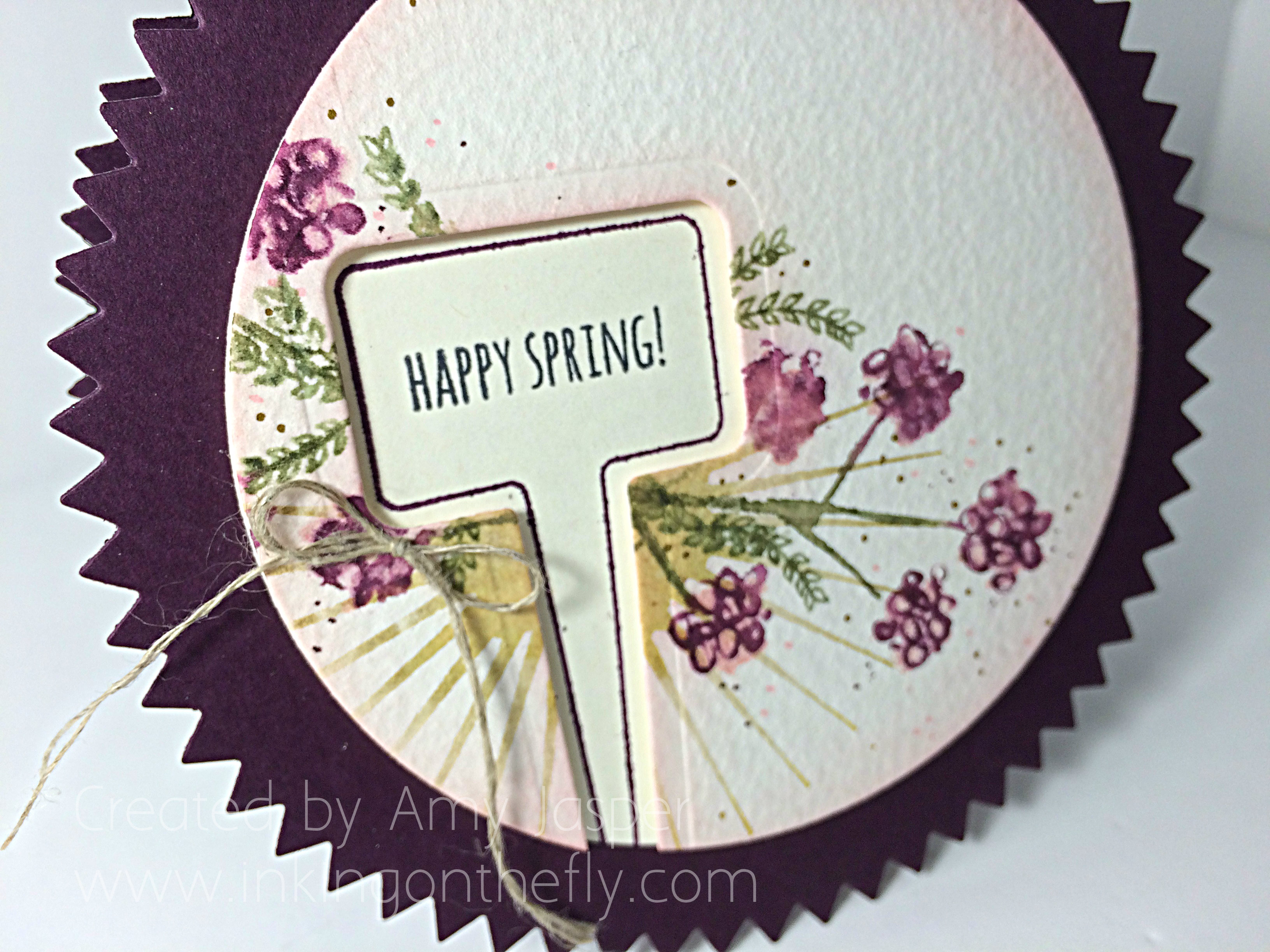 Once all the images were in place, I sponged Pink Pirouette ink all around the edges of the Water Colour paper to give it a soft finish. It still didn’t look done, so I got a hold of my Gold Glimmer pen, Blackberry Bliss marker, and my Pink Pirouette marker and added randomly placed dots around the flower clusters. Up on Dimensionals, it went over top of the Very Vanilla circle and the Linen Thread bow was added with a dab of Multipurpose Tombow Liquid Glue.
Now, who to give this card to for spring? – I think it looks like a great Mother’s Day card. What do you think?
Be sure to try out the sketch at the As You See It Challenge Blog and share it with us there. Inspiration comes from every card I see, so bring it on!
Amy
![]()