A Trip Around the Sun
 I’m excited to share with you my love of designing using Stampin’ Up stamps, paper, ink, and tools! I love playing with the Blendabilities and wish they were available in EVERY colour! Alas, I had to use my Classic Ink and a blender pen for some of this project. Colouring is therapeutic, though, no matter what tools you use!
I decided to combine the As You See It 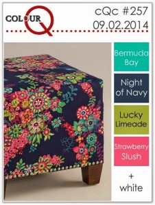 Challenge with another challenge this week. I loved the colours for Colour Q #257, so I thought I’d play along.
I sure do miss Lucky Limeade. It was my favourite green while it was available. Sadly, it has retired, so I used Old Olive instead.
As You See It Challenge #52 is a theme challenge!! You can use any colour you want, you can choose any layout you want, and you can make anything you want! Maybe use paper though, lol!
Can you believe that the challenge blog has survived an entire trip around the sun?!! 52 weeks of challenges. One whole year of fun! YOWZAUZ!!
(that’s how you say “yowzers” with a poor British accent, in case you’re wondering, lol!)
I have to admit, I was not feeling the creative mojo for this challenge. I just couldn’t get started! I wanted to try to keep it simple, as everything seemed like too much effort. But one stamp on a single layer of paper was not going to get me by, lol! So I started with my colours and a stamp.
It’s funny how you can’t get going until you get started. After a couple of false starts, I was able to get into a groove and ended up with a decent card (actually, I quite like it!). Can I just say, as a reminder to myself, that this process isn’t unlike exercise. How often do you just not feel motivated to get going for a walk, or jog, or whatever. But if you get your running shoes on and get out the door, you find it’s not so bad after all and you actually feel pretty good about yourself once you’re done.
sigh.
guess I’ll strap on my shoes and get out the door tomorrow morning. Time to “just do it”.
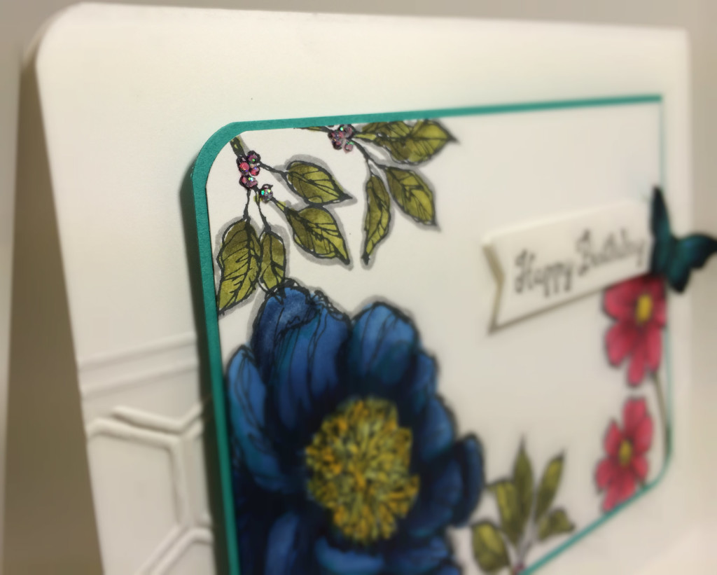
The one thing that I don’t like all that much with this card is the outlining that I did around the images with a Smoky Slate marker. In hindsight, I should have had a much lighter hand, or I should have used Sahara Sand for the shading. Not terrible, but something to remember for next time.
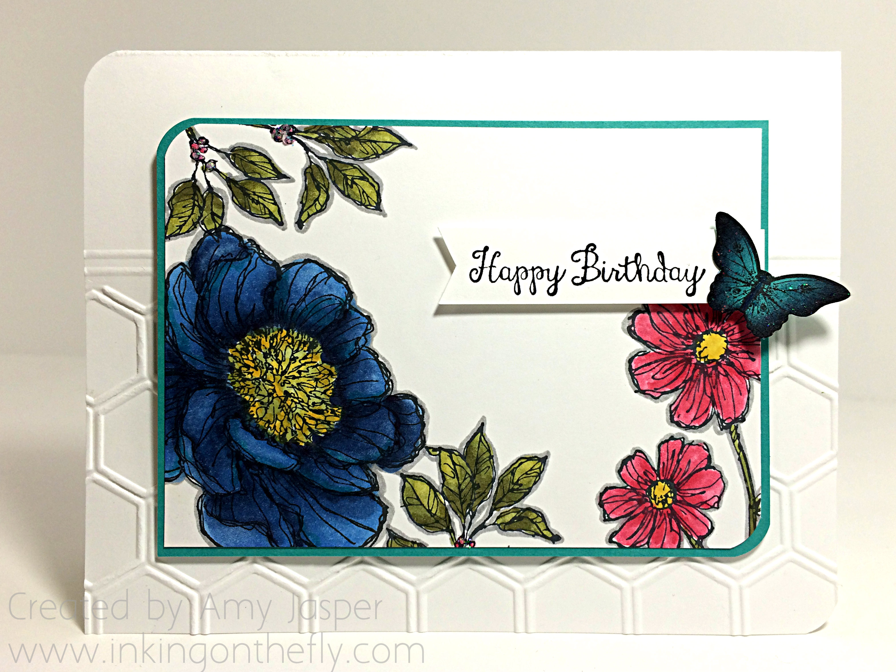
I used the Night of Navy Blendabilities for the large flower of the Bloom with Hope stamp set. I added some subtle touches of Bermuda Bay Stampin’ Write marker over top in some areas as well. The centre of the flower is mostly Old Olive, but it needed some highlights of Daffodil Delight in there as well. I used the Old Olive Blendabilities for the leaves, and painted the daisies with a Blender Pen and Strawberry Slush ink as there are no Strawberry Slush coloured Blendabilities.
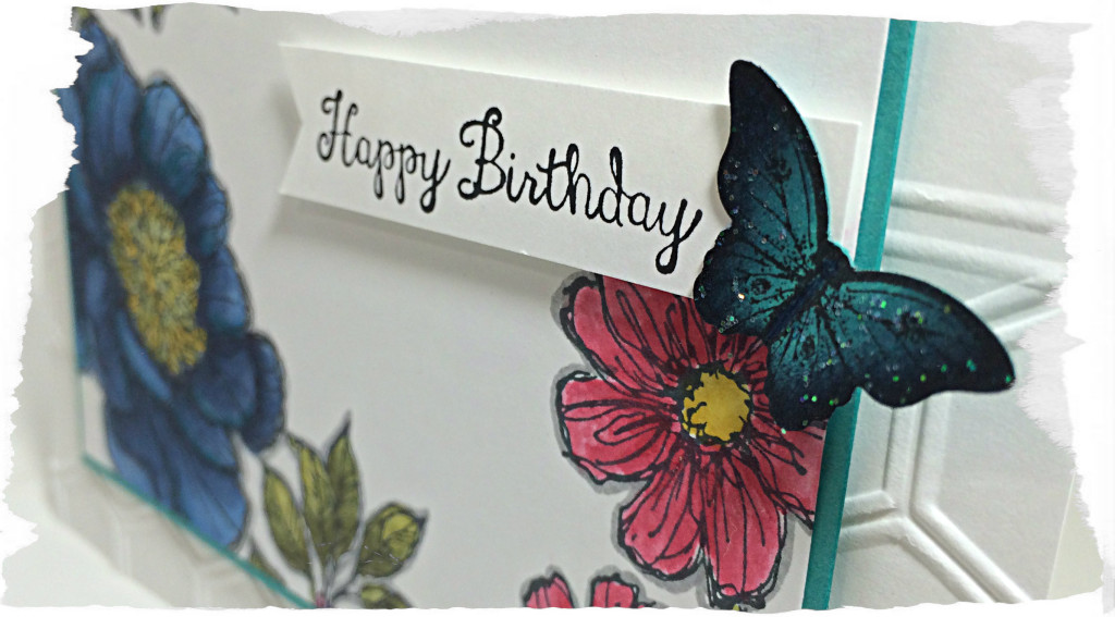
The butterfly is stamped with Stazon Black ink on Bermuda Bay cardstock, punched out with the small butterfly punch, then sponged along the edges with Night of Navy ink. I added a bit of sparkle to that little guy as well. Just globbed on a small bit of Dazzling Details and smudged it around with my fingertip. There’s some glitter on the berries that you may be able to see in the photo below. No smudging for them, just a little dollop for each berry.
The sentiment from the Bloom with Hope stamp set is stamped on the strip of Whisper White cardstock with Jet Black Stazon ink and I flagged the end of the strip of paper by using my Banner punch.
My center piece of Whisper White cardstock has the opposing corners rounded by using the corner punch on my Envelope Punch Board, as does the matting Bermuda Bay piece of cardstock. These are attached to the card base with Dimensionals for added interest. The card base was embossed only 2/3 of the way up the card front using the Honeycomb embossing folder. I then used my Simply Scored tool to score two lines above the embossed area just to give it a defined edge.
I also used the Envelope Punch Board to round the corners on the card base so it would coordinate with the centre pieces.
I’m so glad you stopped by today to see what I’ve been up to. Why don’t you give the challenges a try? Click on the images above and they will take you to the websites. Make your project and link it up to inspire others with your take on those challenges. I can’t wait to see what you come up with!
Amy.


September 10, 2014 @ 8:54 am
Beautifully done, such pretty flowers! Thanks for joining us at the ColourQ!
September 6, 2014 @ 4:21 am
I think this is gorgeous. Great colouring – the big blue bloom is fab!
September 5, 2014 @ 6:51 pm
I think the grey shading looks great around the flowers – it makes them really pop against the white background. I love how you’ve done the butterfly…so pretty. Thanks for playing along at Colour Q!
September 5, 2014 @ 3:25 pm
I think this card is beautiful! I love the opposing rounded corners. It is the perfect amount of white and colour. I don’t mind the outline in smoky slate (maybe it looks different in person but I like it). Your creativity is inspiring 🙂
September 5, 2014 @ 9:32 am
Pretty card. Rounding the diagonally opposing corners on the layers and card base just gives the card that little extra something. I wish I could borrow your creative brain!
September 5, 2014 @ 11:13 am
Funny thing is that I inherited yours, lol! Thanks, Mom!