Birdie Soiree

069header

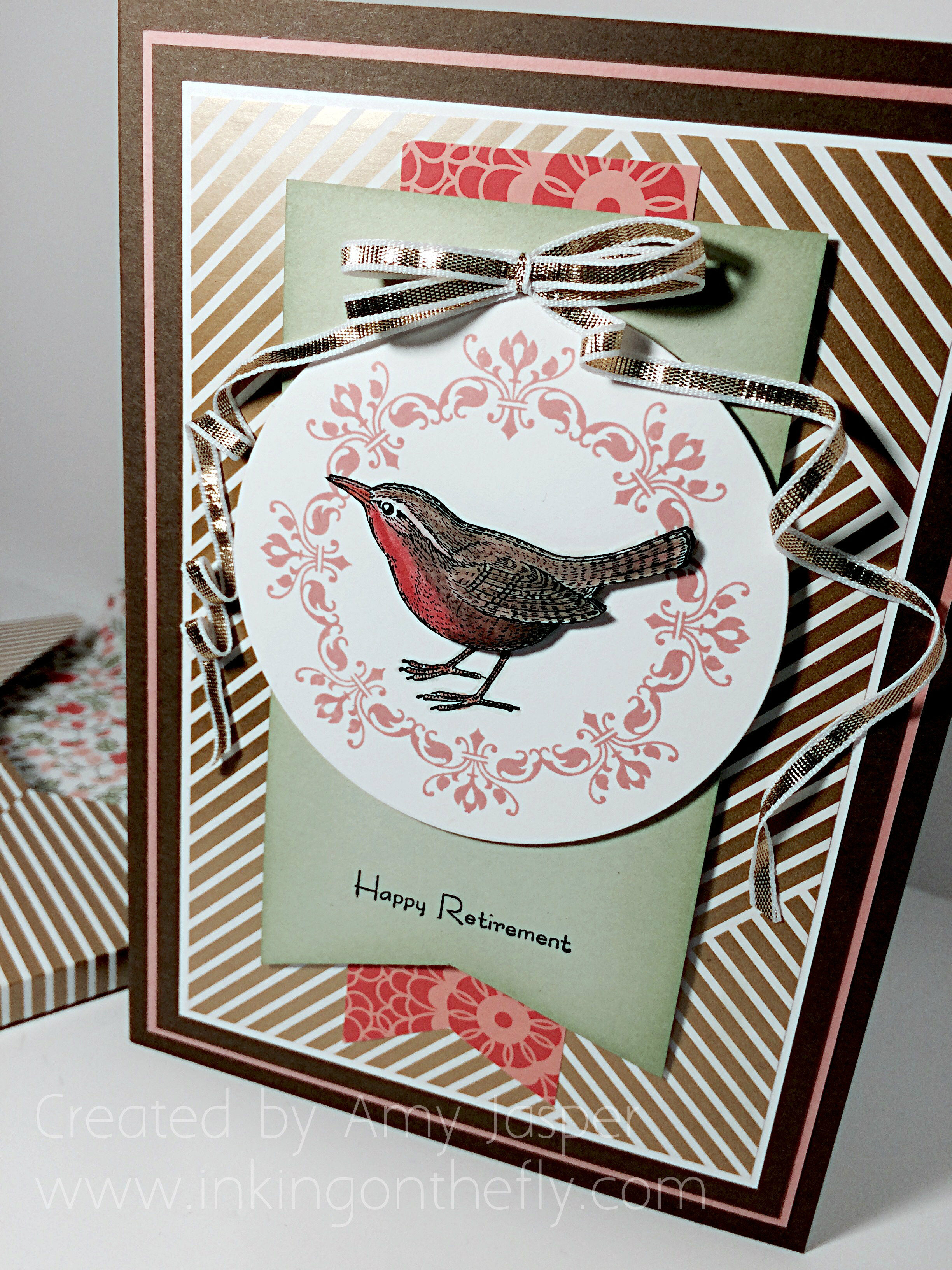
I’ve got what I call an uber-card for you today. Every now and then I get to make something fancy. This one is a 5×7″ retirement card designed for many people to say their well-wishes and farewells to someone who has brought meaning and inspiration to their lives and has earned the title “Retired”. A time where you get to live off of your savings and live out your golden years. I used Gold Soiree Specialty Designer Series Paper and my beloved An Open Heart stamp set from Stampin’ Up!

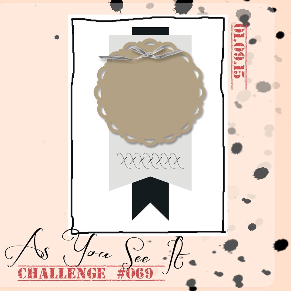
I decided to use a challenge sketch to find some inspiration and creative mojo to get this card going. This is the sketch I used:

#069

When I make cards with multiple writing pages inside, I like to create the card with a 1/8″ to 1/4″ spine to allow for the extra bulk of the pages. This one started with a 7″x10.25″ piece of Soft Suede cardstock which I scored at 5″ and 5.25″ to make two folds for the book-like shape of the card base.

069Amy

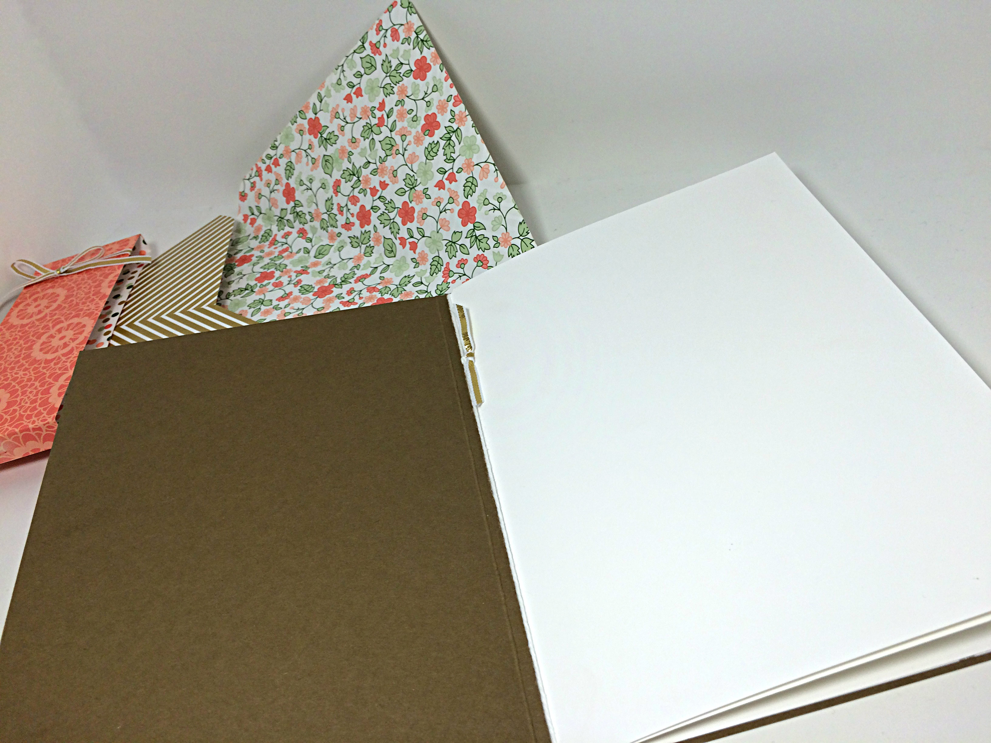
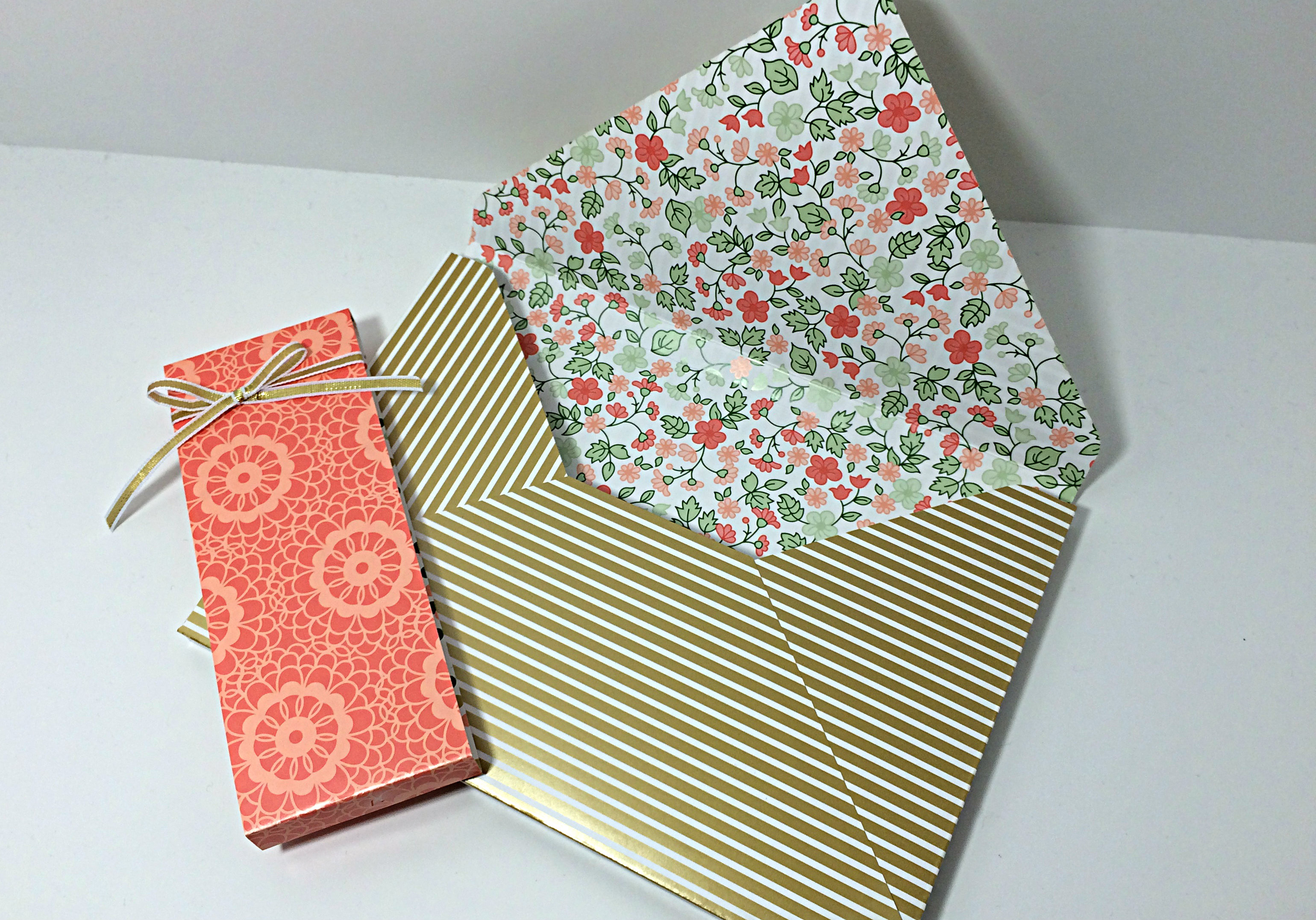
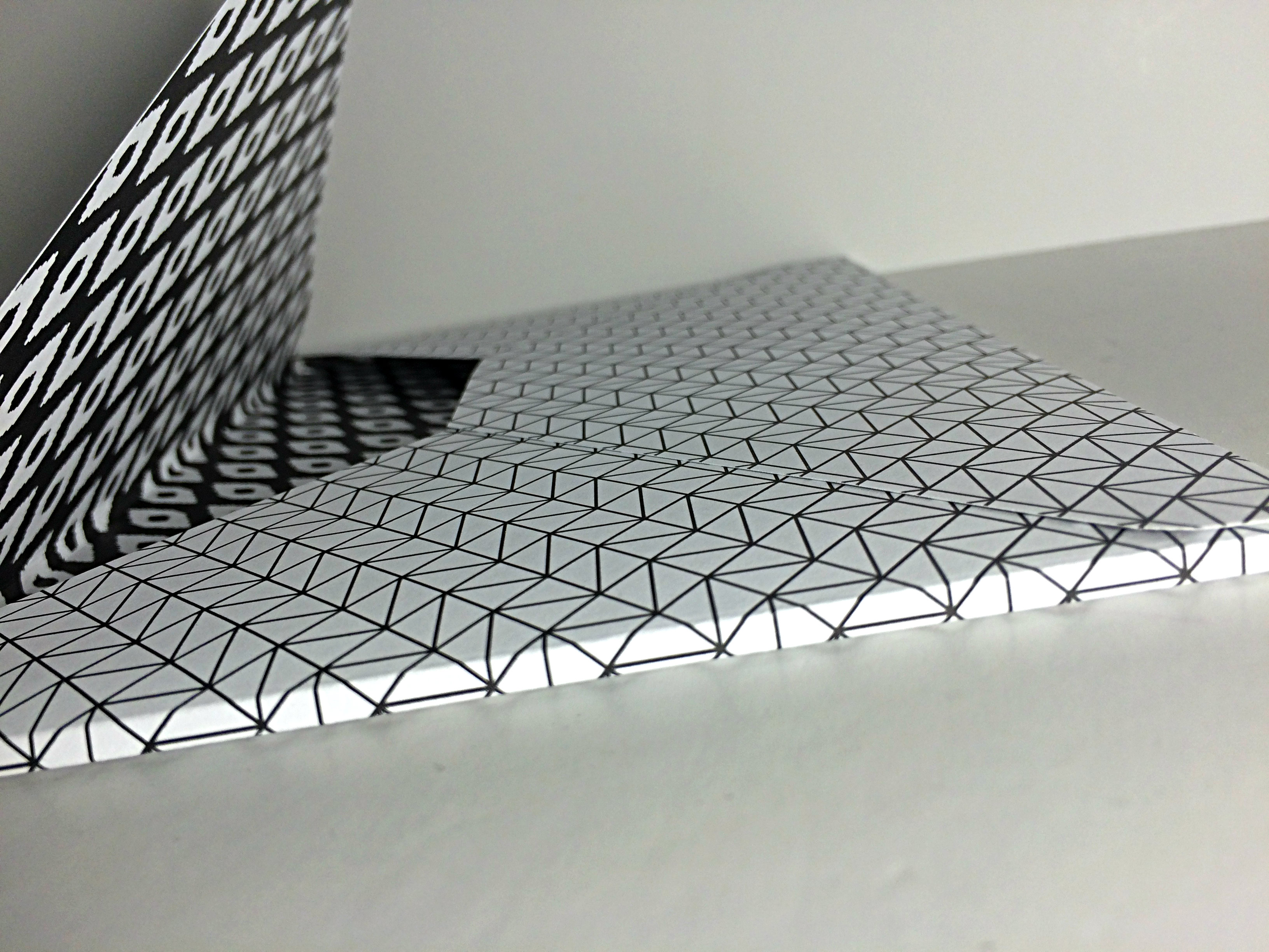
Unfortunately, I realize that none of the pictures taken of this card allow you to see the spine, but you can see the same extra depth added to the envelope beside the card in the photo above. The spine of the card is narrower, but this gives you an idea of what the spine would look like.

I chose to add some layers on the card base to frame the Gold Soiree Specialty Designer Series paper (DSP). You have the base layer of Soft Suede, the second layer of Crisp Cantaloupe, another layer of Soft Suede, until the final matte of Whisper White cardstock to frame the geometric gold base of the artwork. This Gold Soiree Specialty DSP is very unique as it has a sheen and texture that is cool and smooth, a bit like plastic. It makes for a nice professional finish on your projects.

069birdclose

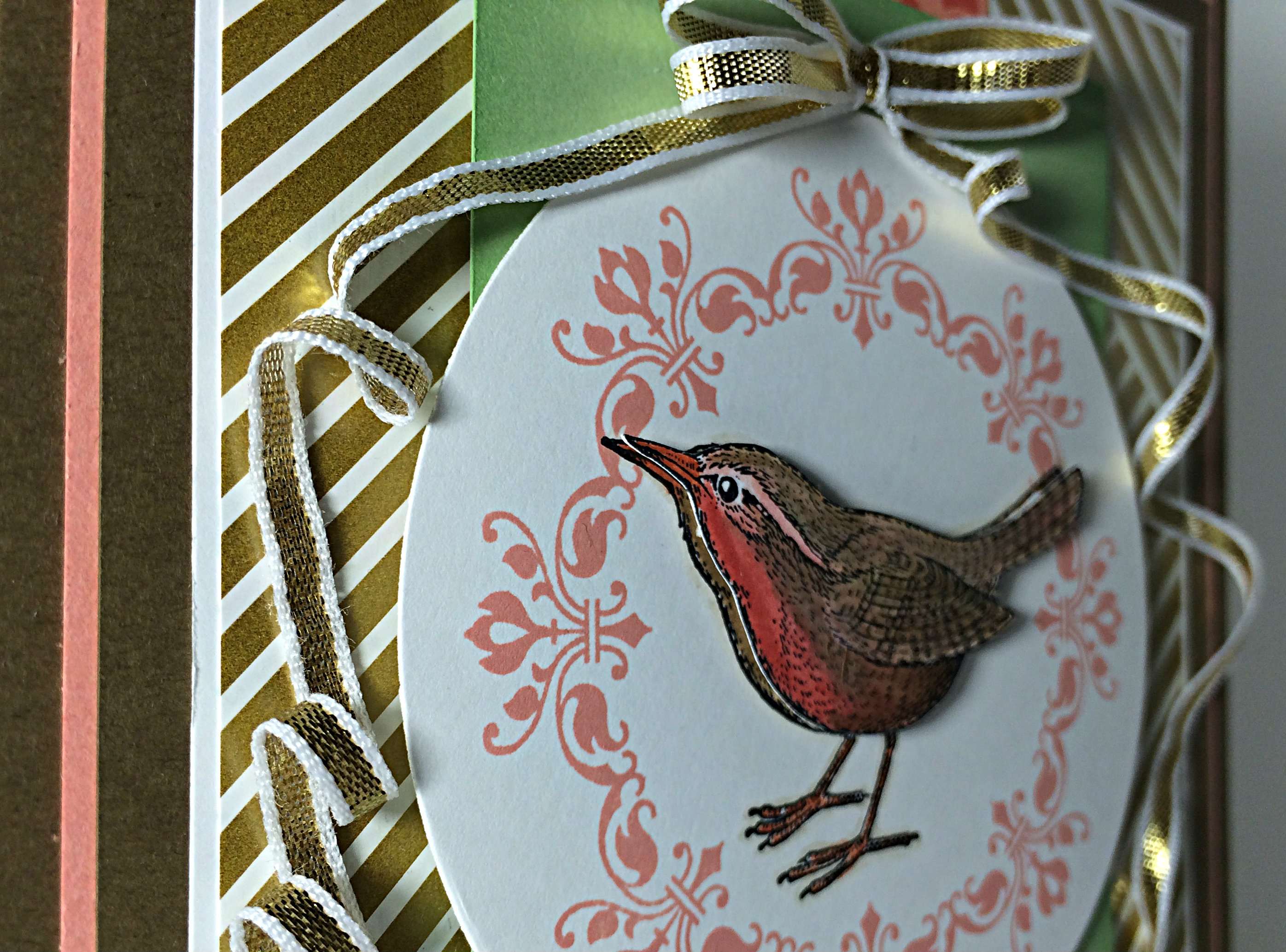
The bow was created using a fingertip double loop bow technique and the long tails were twisted into submission a bit at a time and strategically adhered with glue dots along the way.

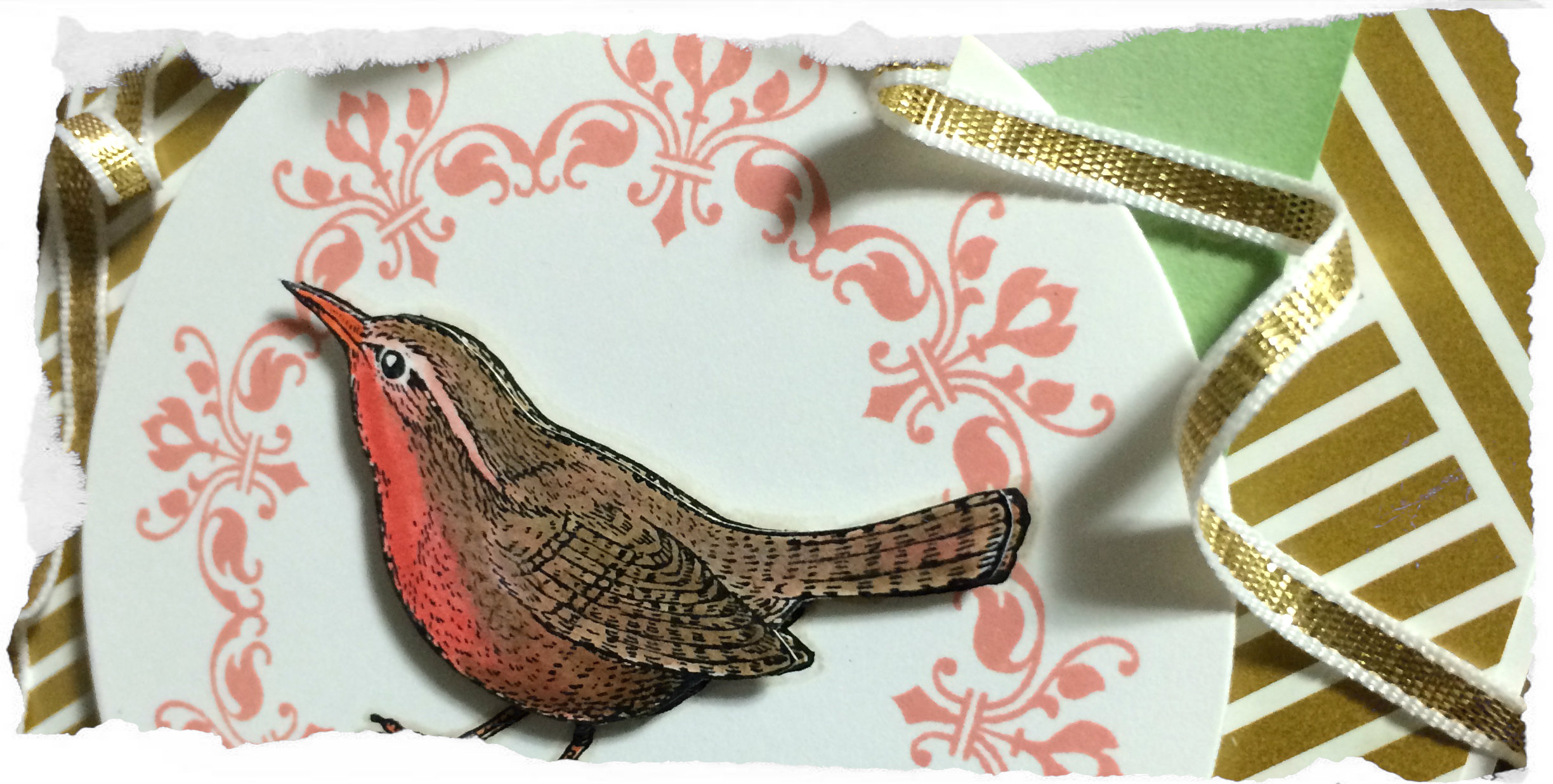
Isn’t that bird from the An Open Heart stamp set cute? You can see that he was stamped twice, once in the center of the circle and again on a seperate piece of Whisper White cardstock from which he was carefully cut out with my Paper Snips (I didn’t cut out the legs, but relied on the legs from the first image). I coloured both birds, with more detail on the top layer, using my inks and blender pens. I chose Calypso Coral for the breast, Tangerine Tango for the beak and feet, and I carefully added a shadow outline with Sahara Sand and a blender pen. That little guy is raised up on Stampin’ Dimensionals.

069insidepages

To create the pages of this card, I cut two 6.75″x9.5″ pieces of Whisper White cardstock and scored and folded them to create two 6.75″x4.75″ inserts which were placed one inside the other and tied together at the “binding” with Whisper White bakers twine. I added a little bit of the 1/8″ gold ribbon for a simple embellishment. The back of the last page of this insert was adhered directly to the inside back of the card base, allowing it to be secure inside the card.

069envelope

Due to the size of the card, a custom envelope was required. I used the matching Gold Soiree Specialty DSP and my Envelope Punch Board (which just so happens to be on sale this week!) to create a 3D envelope that is deep enough to fit the dimensions of my card. When I do custom envelope that are hand delivered rather than delivered by the postal service, I prefer to close the envelope with a belly band of paper rather than seal it with adhesive. It’s a bit of a prettier presentation, I think.

I hope you give the sketch this week a try and link your creations to As You See It Challenge #69. I love how your designs offer new inspirations each week!

Happy stamping!!

Amy
Designer-Badge

Enjoying Life

068header

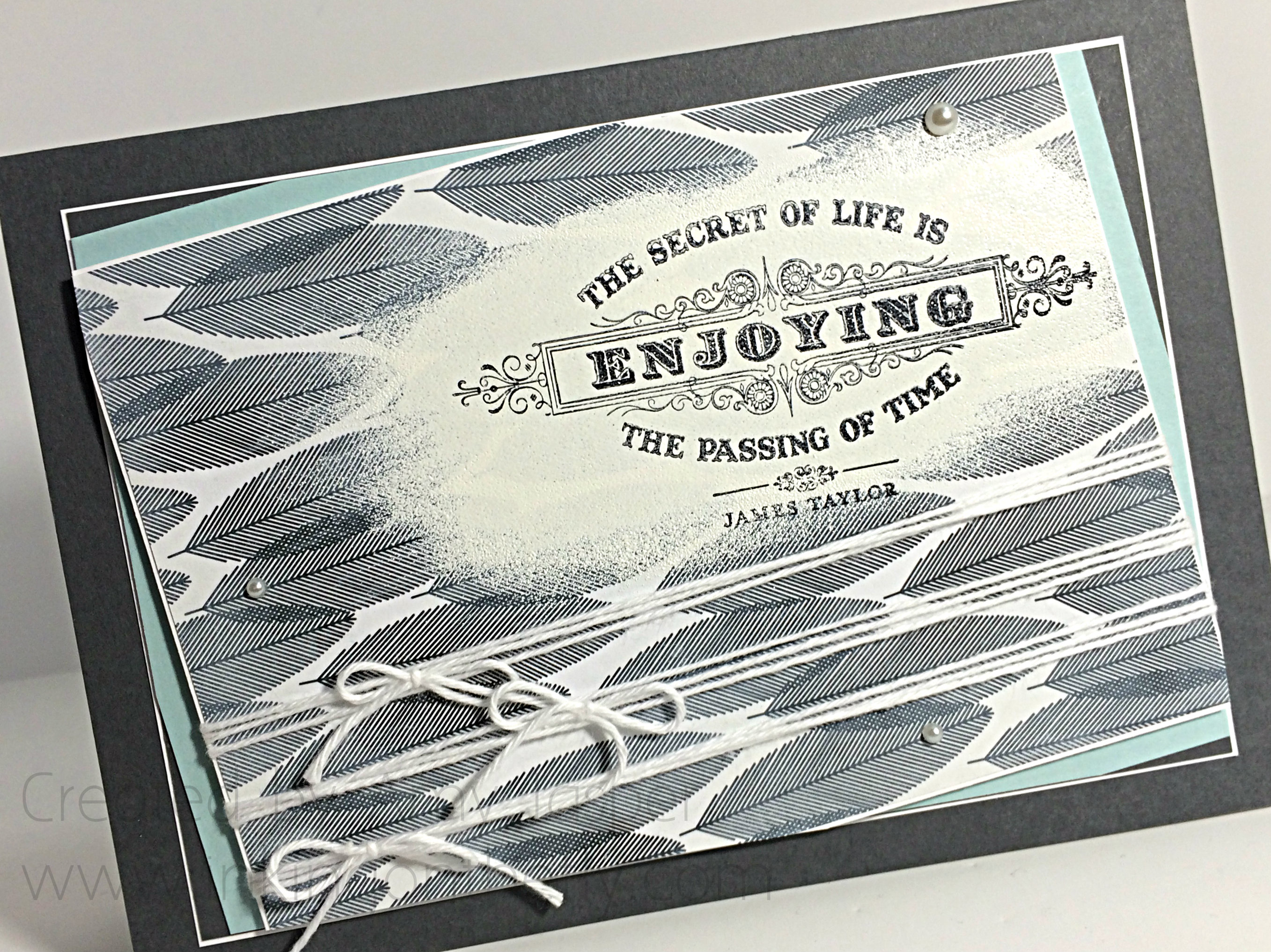
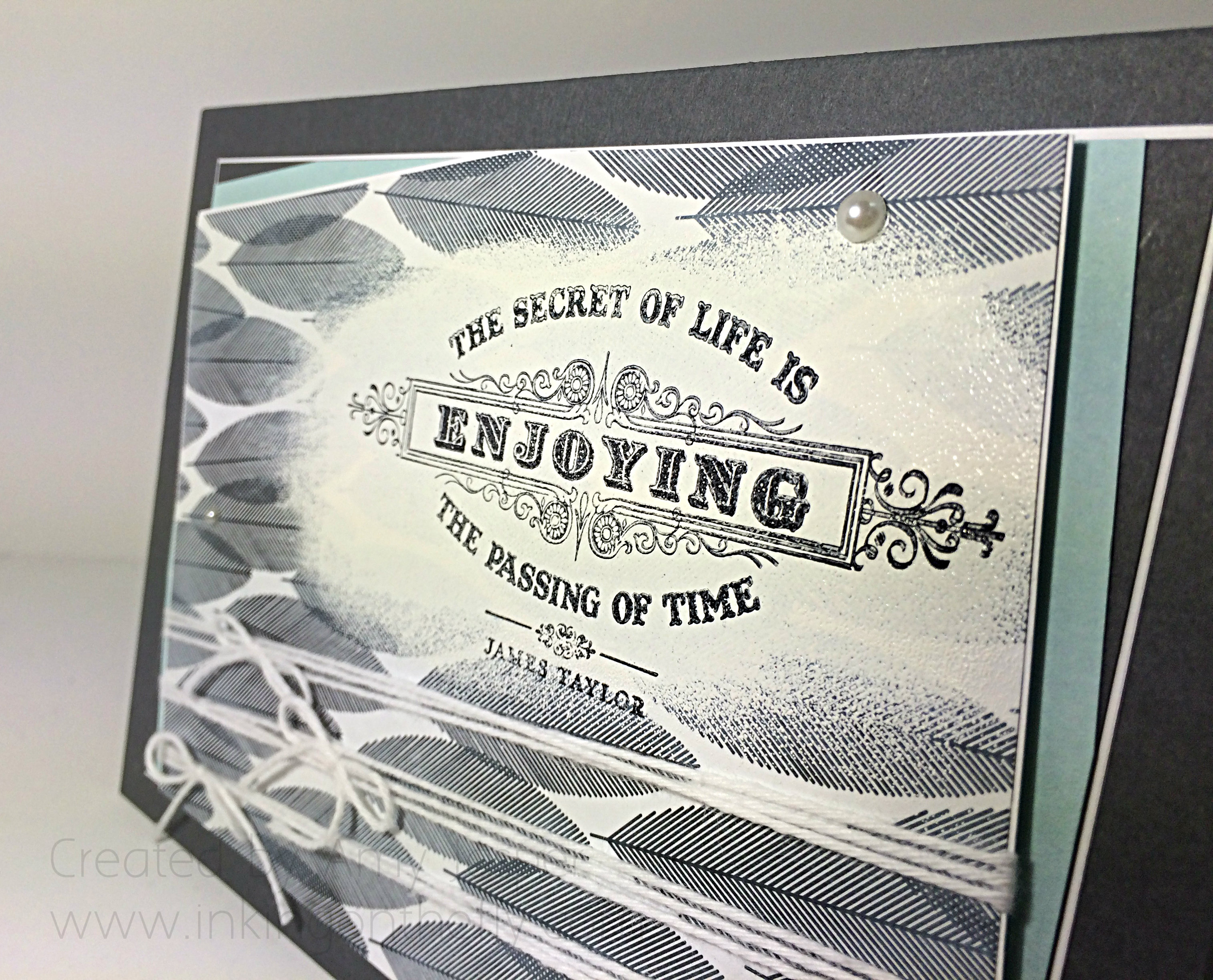
Welcome to my blog! My design today is a 5×7″ card for As You See It Challenge #068 featuring the From My Heart stamp set and the Back to Black designer series paper.

I’ve been taking a break from crafty expectations and obligations for the past couple of weeks. It’s time to jump back into all the “doing”, but the sentiment on this card represents the need to not forget the “being”. I have enjoyed playing Rock Band on the Play Station 3 with my family, playing charades, playing boardgames, going skiing, eating too much food and making spirits bright.

“I will not allow my busy life to interfere with my creative living”, has been my motto for this past year. It still applies, but I also need to add that I won’t allow my busy life to interfere with quality time with my family. I thought that was a given, but I think it’s important to remind myself that I need to take the opportunities to play games and enjoy my kids and my husband. Sometimes, I find myself denying them because I’m too busy with things that need to get done. Obligations and expectations that are put upon me mostly … by me.

Do you enjoy the passing of time? Or do you get caught up in the tasks and all the things that you want to accomplish in a day? Could it be that you let too much time pass and nothing gets done? Maybe you got it all figured out and have found balance between family, work, home, and all the things. I’d love to hear your secrets.

#068

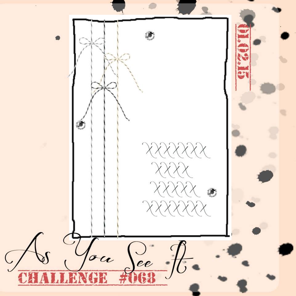
It’s a fun sketch with lots of possibilities. You can check out the diversity of our designers over at the As You See It Challenge to see what they’ve done with this one. I wanted my card to be simple, and it is … sort of. I ended up complicating it with twisted layers. LOL!

068Amy

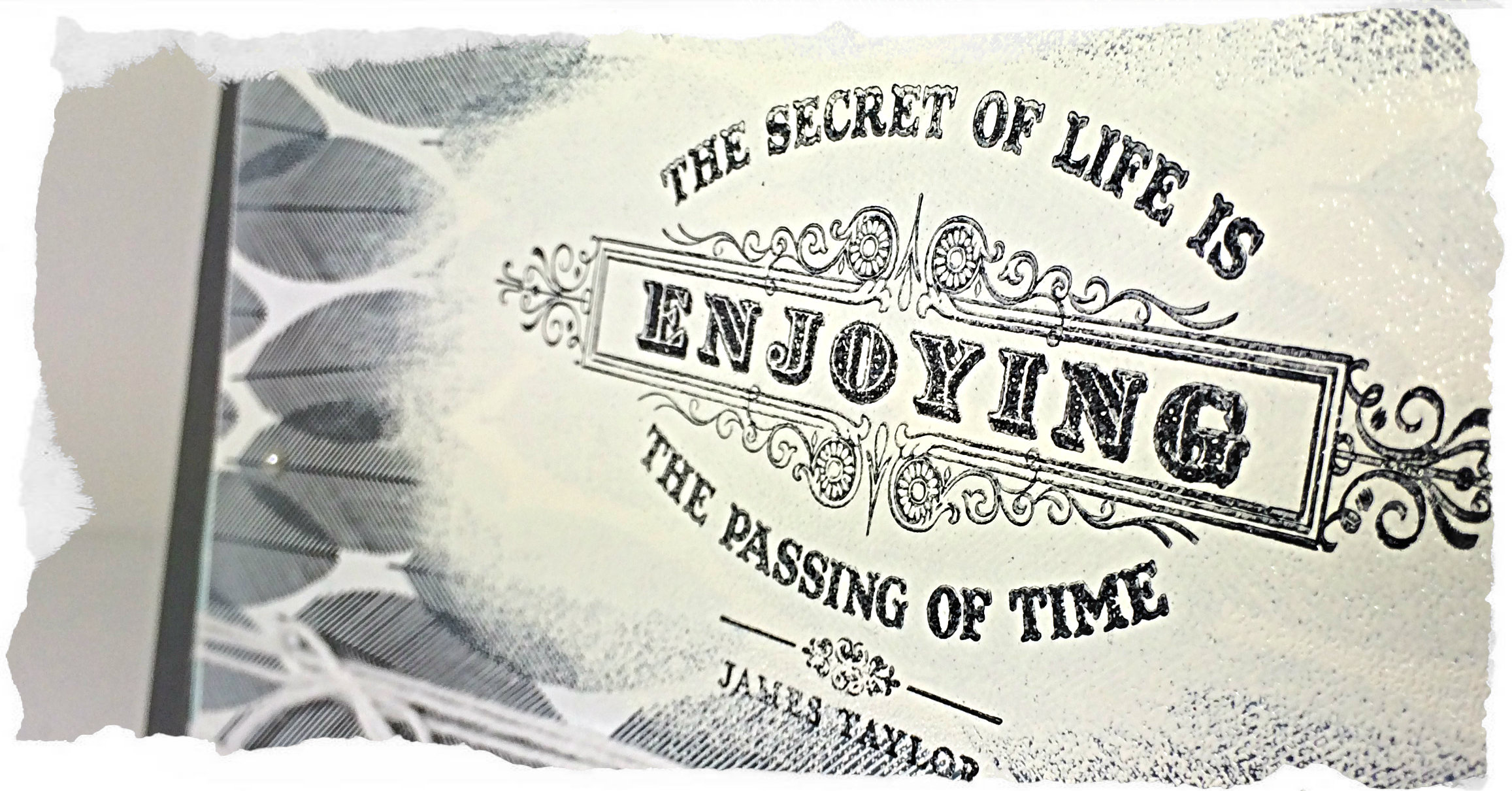
I started with the idea of using Whisper White craft ink over a section of the Back to Black Designer Series Paper, so that my sentiment could be seen. I found that the thin layer of ink wasn’t quite enough to fade out the black and white design, so I used Versamark ink directly to the paper, then used White Embossing powder over the area and melted it with my Heat Tool.

After giving the powder a minute to cool, I stamped the sentiment from the “From My Heart” stamp set over the white embossing with Stazon Jet Black ink. Still, the black and white pattern in the background seemed to harsh. I decided to fade it out with a bit of Whisper White craft ink. I added the ink directly from the ink pad to the paper, focusing on the edges, then I used a sponge to soften the ink, giving a softer look to the paper.

068collage

After all that, I ended up cutting off a lot of the sponged areas as I worked on my card. I’ll definitely use that technique again, though. I quite like the softer look and I suspect it will work beautifully on other patterned paper as well.

068angle

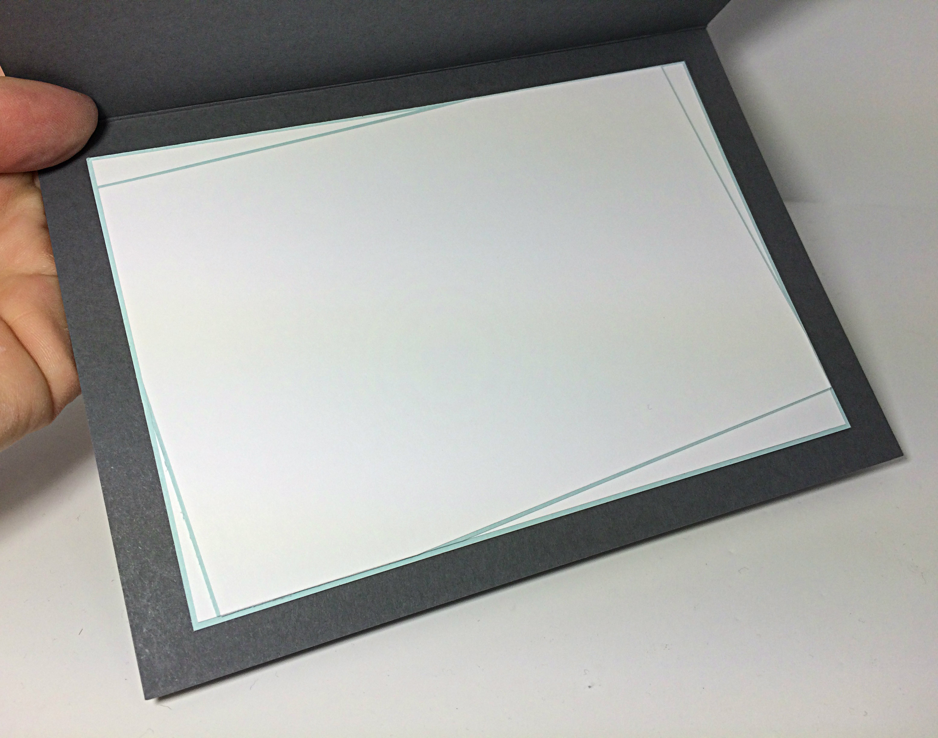
I used Whisper White bakers twine and Basic Pearls for the embellishments. Basic Gray, Soft Sky and Whisper White cardstock were used along side the Back to Black Designer Series Paper. I chose to mostly use thin white borders to show the layered edges. I even pulled those angles and thin edges to the inside of this 5×7 card.

068insideI’m trying to make sure that I complete the inside of my cards as soon as I’m done the design as it can be very frustrating to grab a nice card to quickly write in as you run out the door (this happens more often than not, for me), only to find that you forgot to add a writing space inside the dark coloured card base. sheesh!

Because my card is 5×7″, I also needed to use a handmade envelope, which I did using my Envelope Punchboard. I decided to avoid squishing the card by making my envelope slightly fatter. To do this, I added 1/8″ of an inch to the paper size required to make a 5×7″ card, then when punching and scoring, I started with the usual score guide number first, then added a second punch and score on mark that is 1/8″ more. So, the envelope punch board guide says that I needed to punch and score at the 4 inch mark. I did that, then punched and scored again at the 4.1/8″ mark and carried on around my paper following the directions on the punchboard, but adding that second 1/8″ bigger mark. Folding those little score lines can be fussy because they are so close together.

068envelopeGlad you came by for a visit today.

Be sure to show off your card using the As You See It sketch this week by linking it to the challenge site.

Hope you do!

Amy.

Designer-Badge


Groovy White

067header

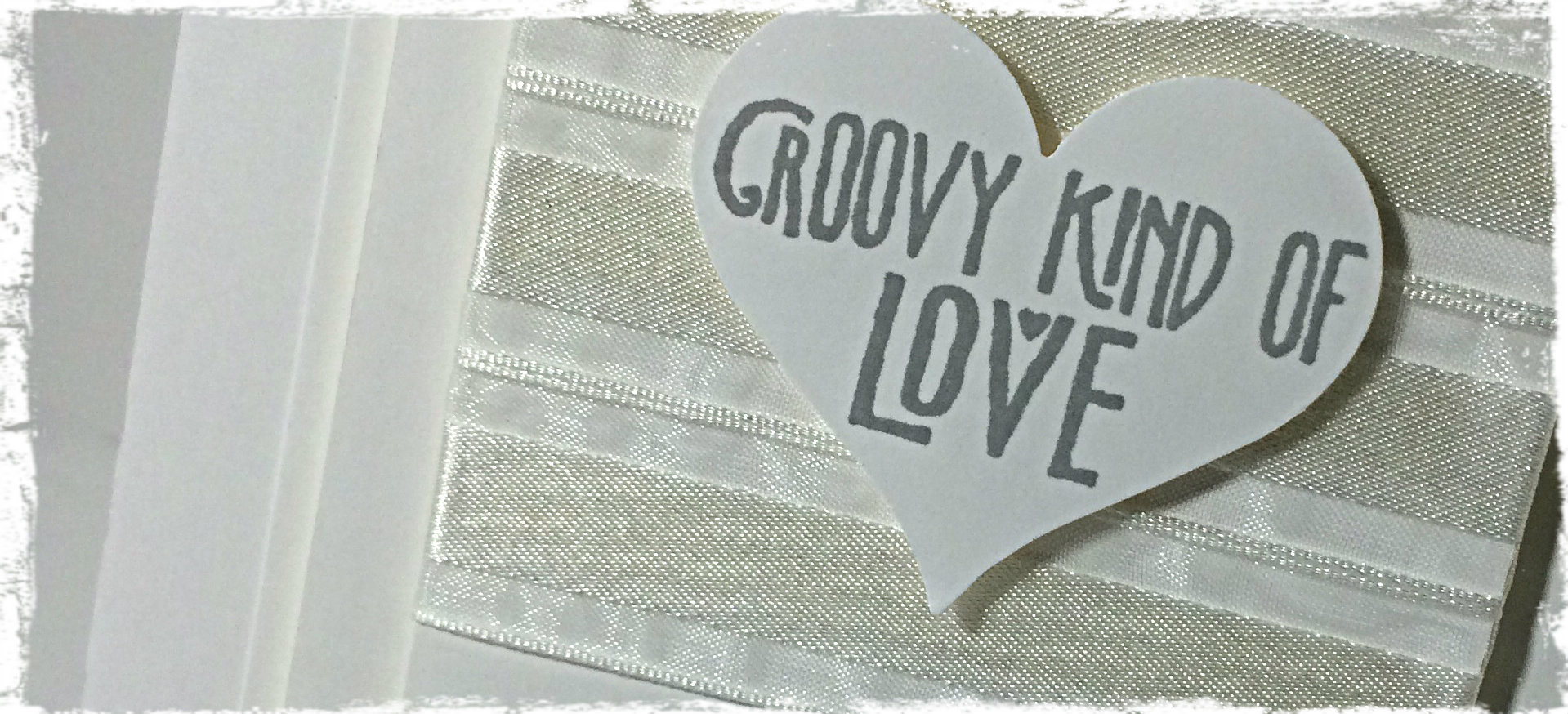
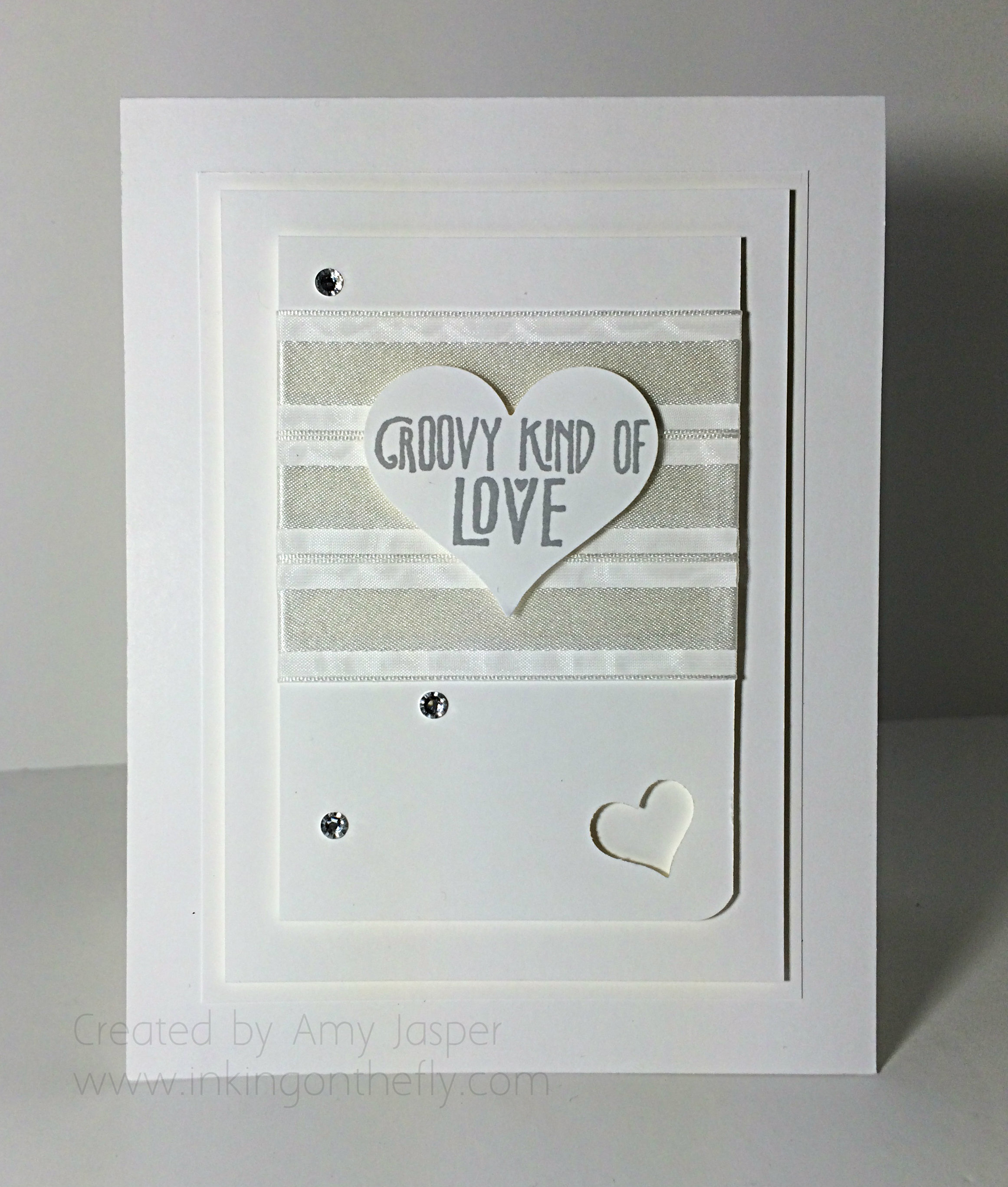
An all white card designed for the As You See It Challenge blog. I used the Groovy Love stamp set with the coordinating Sweetheart Punch from Stampin’ Up!

#67

Gotta love the strain of a speed challenge. It’s a good exercise to stretch your creativity and push yourself. These 10 minute challenges are probably the toughest for me. Having to use all white definitely added another creative stretch. Technically, you could add vanilla or grey for this challenge, since they would be considered “shades” of white, but I opted for primarily white.

067Amy

I managed to finish this card in 9 minutes and 53 seconds.  Not too bad, considering the state of my craft room and that I made the mistake of cutting my nails nice and short. (Peeling off the backing of sticky strip with no fingernails and with a time limit can be very frustrating)

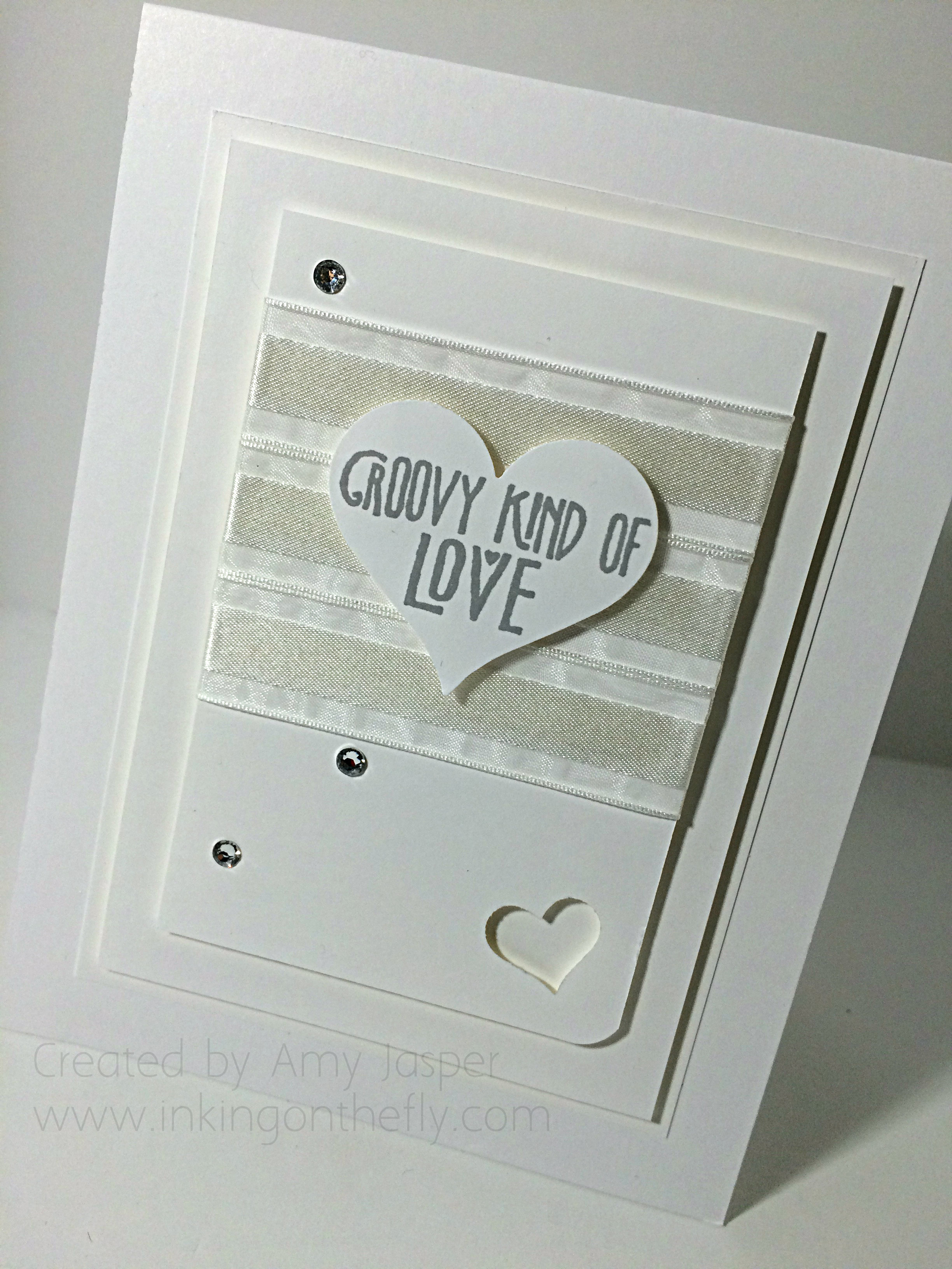
The card is nice, but needed a bit of a refining, so I did a second one. See if you can spot the subtle differences and tell me which one you like better.

067Amy2

You can see that I have fewer of the Basic Rhinestones on the second card. I also only rounded one corner with my Corner Rounder punch and lowered the placement of my ribbon. I added the small heart punch from the Itty Bitty Accents Punch Pack. The biggest improvement for me was how I attached the strips of White Organza Ribbon. On the first card, I only put Sticky Strip on the back of the Whisper White Cardstock. This caused the ribbon to float a bit on the front of the card. I tried to anchor it after the fact by slipping a couple pieces of Sticky Strip underneath, but it just got more untidy. The second card used full strips of Sticky Strip across the front of the cardstock to anchor the entire length of the Organza ribbon, then a couple pieces on the back of the cardstock to secure the ends of the ribbon on the back. A much smoother and tidier finish on the second card.

Both cards have the sentiment from the Groovy Love stamp set stamped in Smoky Slate ink. Both cards have Stampin’ Up! Dimensionals under the heart, the first rectangle layer and the second rectangle layer. After all, an all-white card demands layers and texture!!

067again

By the way, did you miss me last week? With the Christmas season upon us, I just couldn’t find the time to share a project with you. Each of my 3 kids had Christmas concerts that week (separate nights), and I was shopping all week to find something to wear to my husband’s staff Christmas party.

(Me + shopping for clothes = forever!!)

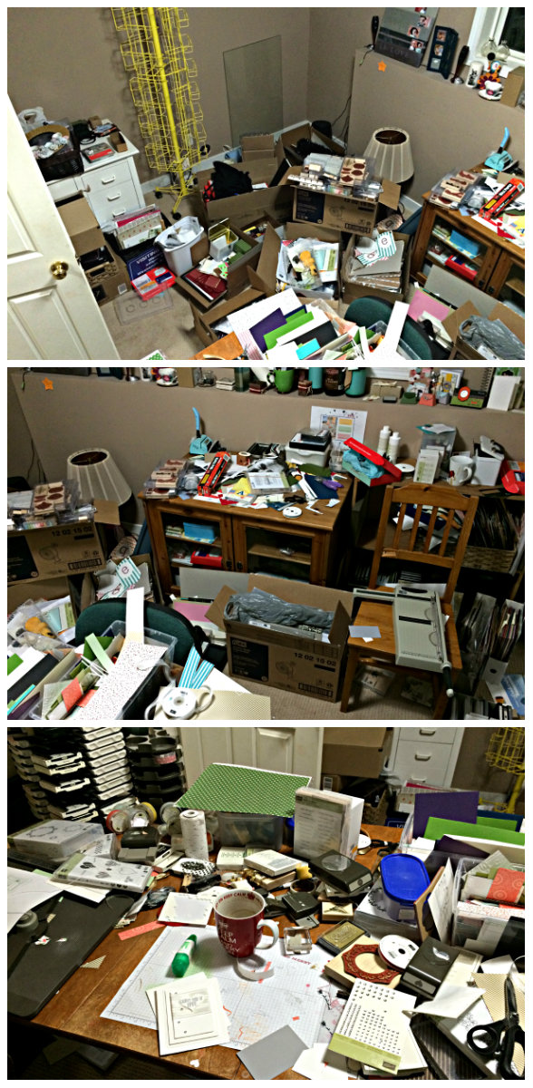
Life has been very busy. Take a look at the current state of my craft room. Consider it a representation of my head these days.

craft room chaos

I suppose you can guess what I’ll be working on the next week or two. Gotta get this room functional again before the new year!

I know how busy the season can be, but why not take a 10 minute time out from it all and make a card? Load it up to the As You See It Challenge #67 and tell us how long it took. Even if your a little bit over, that’s okay. Stretch your creative brain!

Designer-Badge