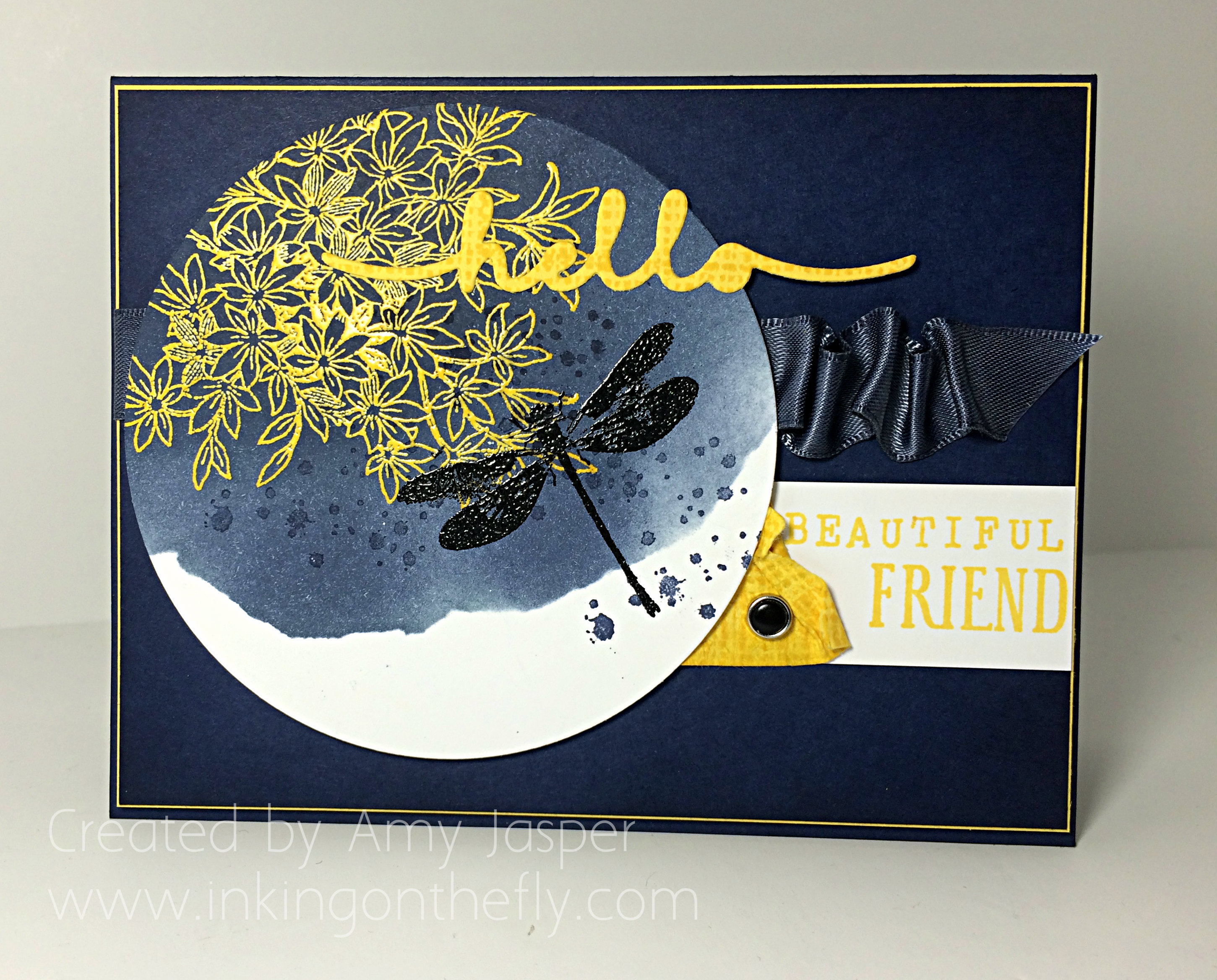
Beautiful Friend
 Welcome to my blog where I have the joy of sharing my love of designing with paper and ink using my beloved supplies from Stampin’ Up! Today’s design shows off the new Awesomely Artistic stamp set and begins with an As You See It colour challenge.
 I love the whimsical beauty that a dragonfly image automatically adds to artwork, whether it’s a photograph, a painting, a scrapbook layout, or a card design.
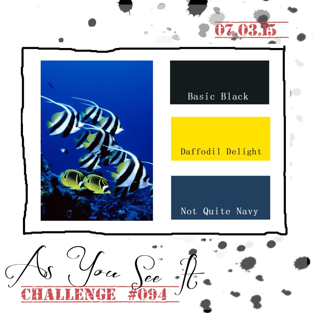
This colour combination calls for Not Quite Navy, which is a colour that has retired from Stampin’ Up’s colour collections. It was a favourite of mine. However, since it isn’t available, I chose the next best thing: Night of Navy. It’s a lovely rich navy blue, that when a bit of the same colour of ink is sponged around the edges, it makes it even more rich and gorgeously deep!
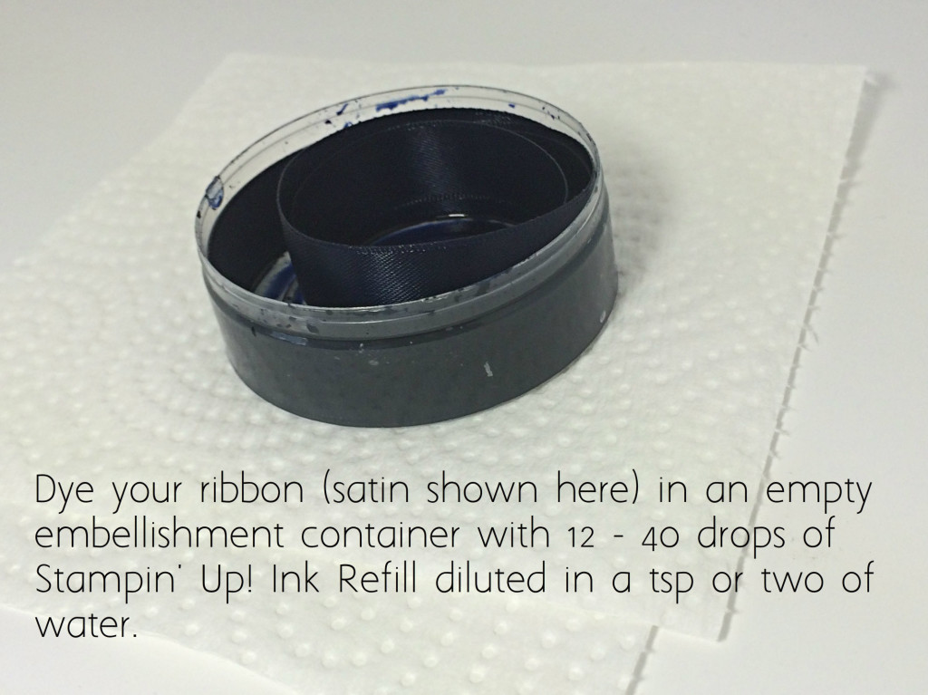
 I wanted to add some ribbon to my card, but didn’t have anything that worked. Since necessity is the mother of invention, I chose to dye some satin ribbon to match my project!
 Tips:
Tips:
- Use gloves. I am pretty good at keeping my hands and my workspace clean, but dying ribbon is a messy process. Gloves will be a member of my craft studio from now on.
- Use a small container. A small container allows you to be frugal with your ink refill. A small ziplock baggie works great and gives you freedom to squish your ink and ribbon around, ensuring total coverage. I chose to use an empty embellishment container and coiled my ribbon inside. It was very cool to watch the colour wick up the ribbon until it was saturated.
- More ink gives a darker colour. I started with 12 drops of ink refill and a couple teaspoons of water and my ribbon came out a lovely steel blue, but it wasn’t quite as dark as I wanted. I added 20 more drops of ink to the same container and placed my coiled ribbon in it again. This gave me the desired colour.
- Dry the ribbon. If your ribbon is wet, it will colour anything it touches. You can lay your ribbon on a paper towel and let it dry overnight. If you’re impatient (like me), you can dab it on a paper towel until most of the wet comes off, then hold in in your (un-gloved) hand and use your heat tool over it like a blow dryer (not too close). Holding it in your hand will prevent you from melting your ribbon (because you will feel the heat on your hand). If your ribbon isn’t dry, you will see marks of ink on your project as you add your ribbon. Also, it will not adhere well if you use glue dots or other adhesive to attach a bow.
- Different ribbon give varied results. Satin ribbon takes colour beautifully. Others will take colour differently, so test it out and see how it goes. Some ribbons are treated with sizing, which make them repel water, so they require extra work to get them to absorb the colour. You can wash them ahead of time in the sink or just take the time to massage in the colour (plastic bag technique would be the best container choice in this case).
- Not always true to colour. Some inks won’t give true colour on your ribbon. Sometimes it’s the ribbon, but sometimes it’s as though the ink separates. For example, I have seen Chocolate Chip ink end up a dusty rose pink colour when used on ribbon!
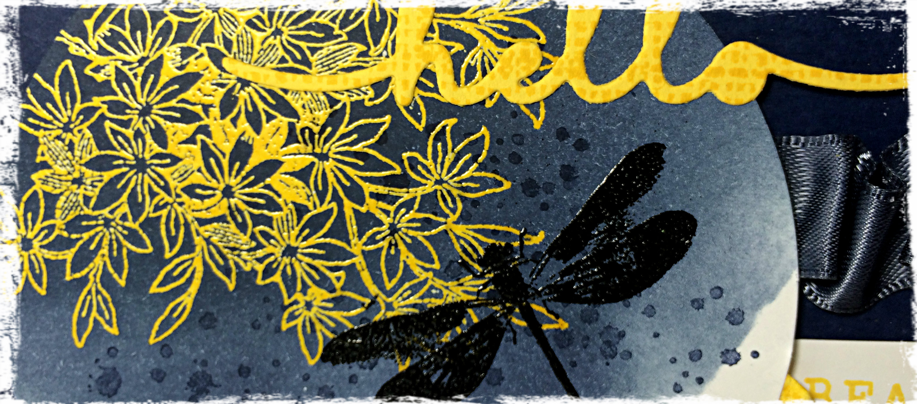
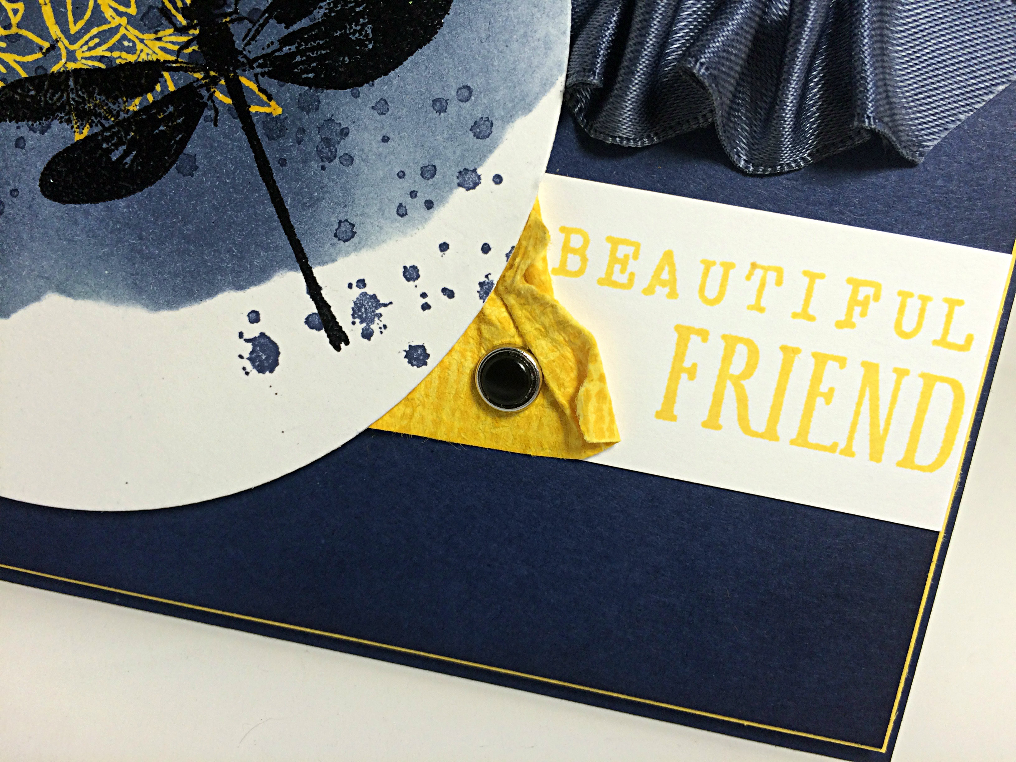 I ruched the ribbon using a length of Tear Tape to adhere it as I ruffled and attached, ruffled and attached. The photo above also shows the piece of Daffodil Delight cardstock, which I textured by running it between my bone folder and my thumb multiple times until the fibres in the paper began softening. I actually softened it enough that I could separate it into two layers which makes a sort of suede-like finish (can’t really see it in the photo). This process makes the paper really pliable for a nice distressed look. I stamped it with the textured image from the Awesomely Artistic stamp set for an added amount of colour and texture.
And I’m quite pleased with the use of the black Candy Dot in the Candy Dot brad! I can’t remember the last time I used one of these brads with the Candy Dots! It looks great!
The sentiment is a combination of the Greeting Thinlits “hello”, which I created using Daffodil Delight cardstock with that same texture stamp image over it; the “beautiful” is created using the Rotary Alphabet stamp; and the “friend” image from the Awesomely Artistic stamp set.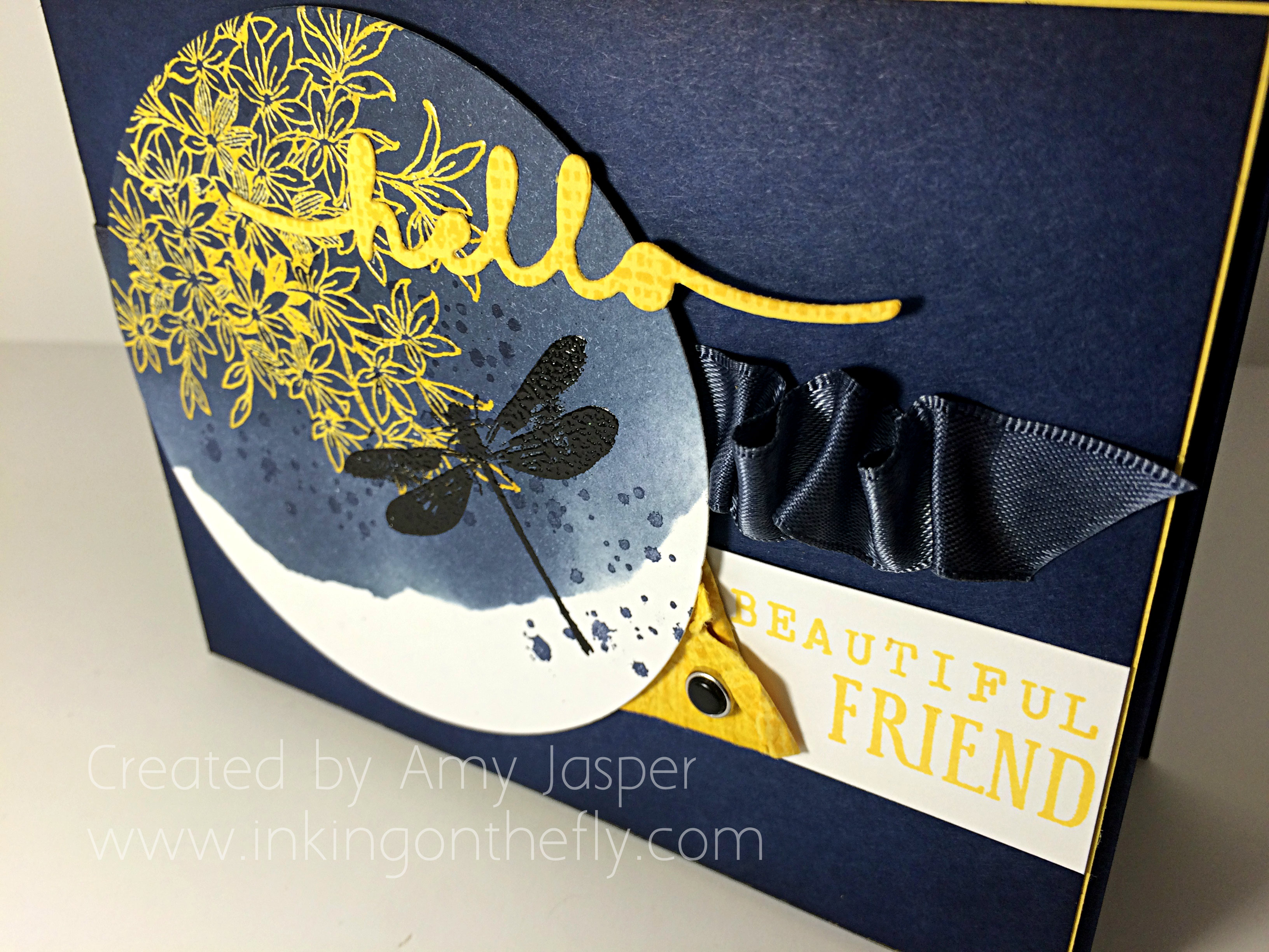
I was very pleased with my circle section of this card. I started by rubbing my Embossing Buddy over the paper and stamping the floral image from the Awesomely Artistic stamp set by first inking the stamp with Versamark ink, then inking over that with Daffodil Delight ink. This allows the ink to stay “wet” longer so I could cover it with Clear Embossing powder and heat-set it with my Heat Tool. Once set, I added Night of Navy ink over it with a sponge and circular motions. Torn pieces of sticky note paper were applied as a mask to create the vacant area on the circle.
After sponging to my heart’s content, I used my Embossing Buddy again and stamped my dragonfly with Jet Black Stazon. Then I applied Black Embossing Powder and used my Heat Tool. I applied the Night of Navy splatter with the splatter image stamp from the same stamp set.
The thin mat of Daffodil Delight cardstock was a great finish to the overall card. It looked so plain before adding that splash of light. That Daffodil Delight mat is on Stampin’ Dimensionals, as is the circle of Whisper White cardstock with the dragonfly image.
I had the pleasure of stamping with a friend while creating this card. I think that’s why the sentiment says “hello beautiful friend” – because I was thinking of her. She was my muse for the day. Thanks Gwen!
What would you do with this colour combination? Try it and share it with the As You See It Challenge blog! We love to see what you create!
Amy
![]()