blendabilities

Winter Bird

063header

Check out my design this week for the As You See It Challenge blog using An Open Heart stamp set from Stampin’ Up! I love the blended ombre effect in the winter background.

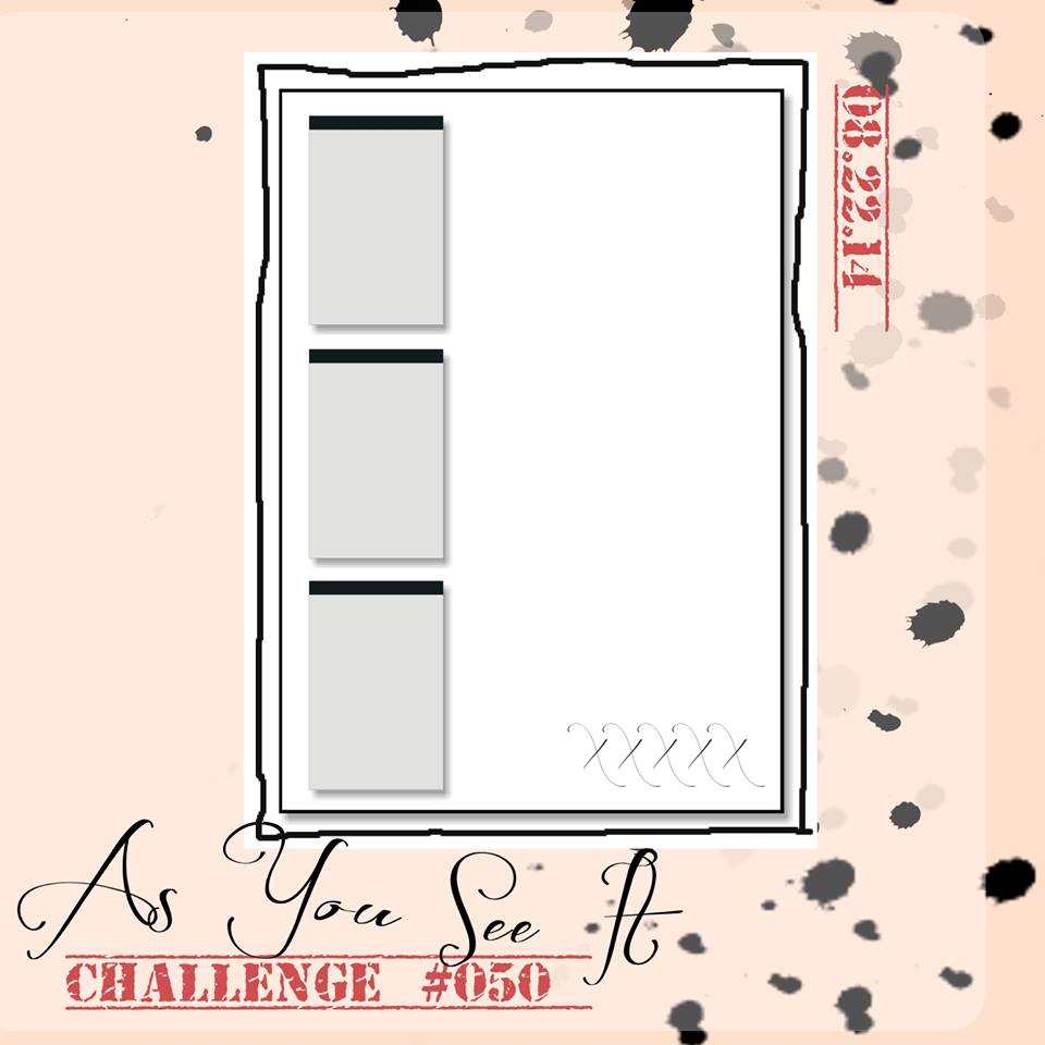
I was leery of the sketch this week. The small center square bugged me. But the funniest thing happens when I am lacking inspiration with a particular layout or colour scheme: I end up really liking the final product!

#63

I can’t wait to see what everyone comes up with for this one. I found it so challenging! I decided to use the little bird from the An Open Heart stamp set in place of that square. The snowflake sequins (which were too stark white, so I coloured them with my Light Coastal Cabana Blendability marker), are in place of the flowers on the As you See It layout above. The rest is eye candy for me! Techniques and fun! The stuff I thrive on!

063Amy

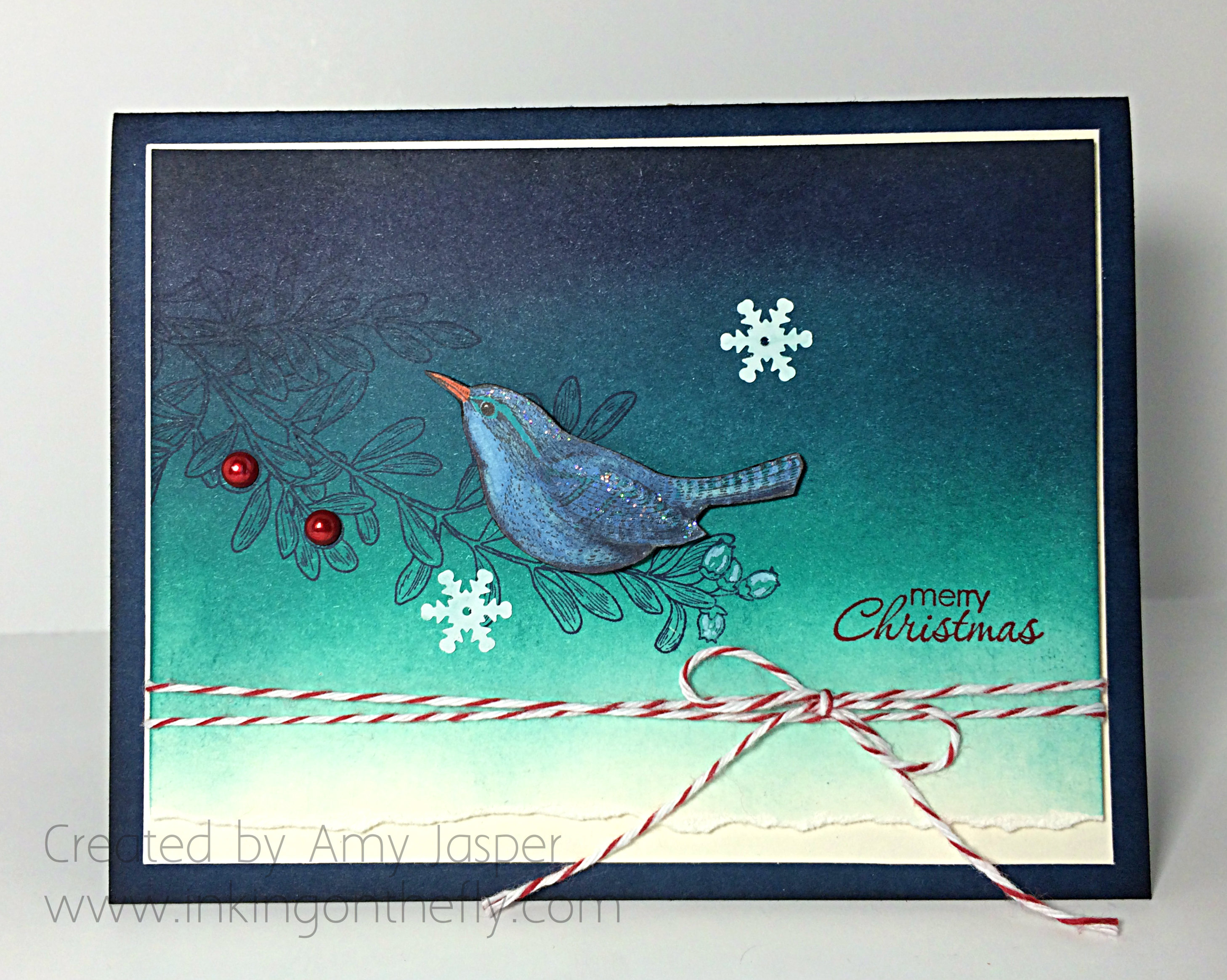
I started with a piece of Very Vanilla cardstock and began using sponge and ink to shade the evening sky background. I was inspired by an image I found on Pinterest for this colour scheme and I love it! With a sponge, from top to bottom, I applied Night of Navy, Island Indigo, and Bermuda Bay ink. Once I was satisfied with the saturation of colour, I added a touch of Momento Black to the very top edge to complete the look. The most bottom edge of the Very Vanilla cardstock was left un-inked and I tore the edge for a bit of texture detail.

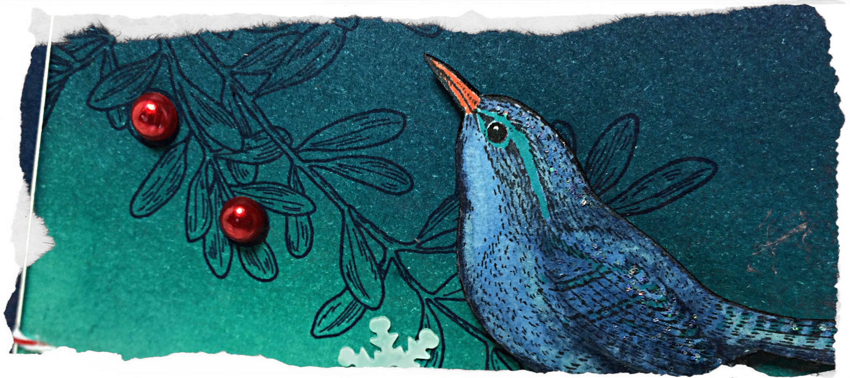
Then I stamped the branch image from An Open Heart in Night of Navy ink. The pearls were coloured with the Medium Cherry Cobbler Blendability marker and added for the berries on the branch. I then decided to use my Chalk Marker to accent the buds on the end of the branch. The snowflakes were also coloured (as mentioned above) and adhered to the card with a small dab of Crystal Effects. The Merry Christmas sentiment is from the Petite Pairs stamp set and was stamped with Real Red ink.

063close

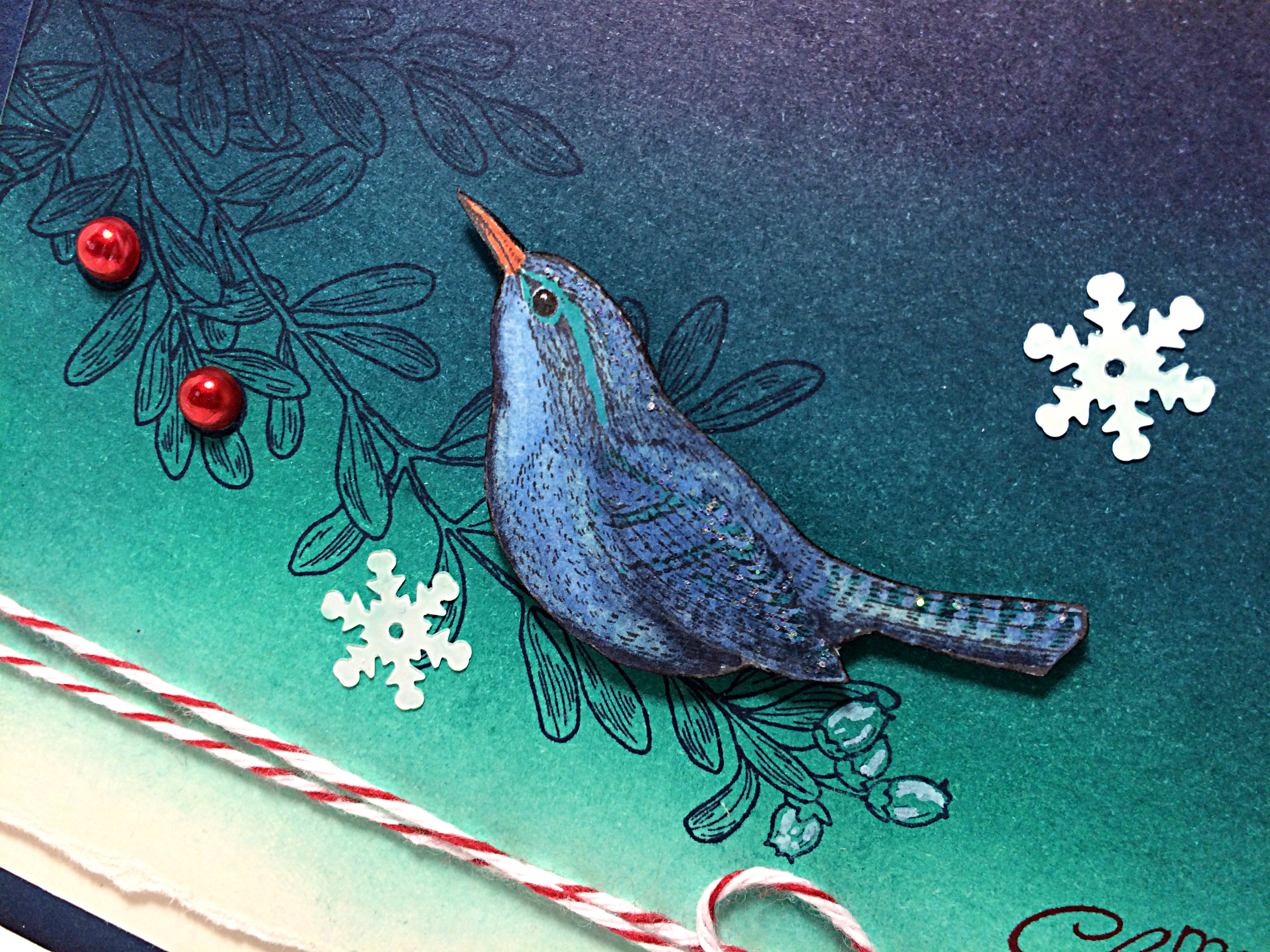
The blue bird was stamped with Momento Black ink and coloured with Night of Navy and Coastal Cabana Blendability markers and a touch of Dazzling Details glitter was applied to the bird as though a wee bit of snow was glinting in the moonlight. His beak was coloured using a Tangerine Tango Stampin’ Write Marker. I cut out the bird with my Paper Snips and cut his little legs right off so he could be sitting all comfy-like on the branch. I also used my Project Life journaling pen to darken his beady little eye so it would have a little more life in it (a trick I learned in the watercolouring class I took last spring). That sweet little winter bird was then adhered to the cardstock with Stampin’ Dimensionals.

After wrapping the Cherry Cobbler Baker’s Twine around that layer of cardstock, I used Stampin’ Dimensionals to layer it over the thin mat of Very Vanilla Cardstock. This all was adhered to the Night of Navy card base which looked a little flat next to all that deep blue ink, so I added a bit of Night of Navy ink to the edges of the card base with a sponge.

What will you do with this sketch? I hope you’ll share it with us over at the As You See It Challenge blog!!

Amy.

Designer-Badge

A Trip Around the Sun

052headerI’m excited to share with you my love of designing using Stampin’ Up stamps, paper, ink, and tools! I love playing with the Blendabilities and wish they were available in EVERY colour! Alas, I had to use my Classic Ink and a blender pen for some of this project. Colouring is therapeutic, though, no matter what tools you use!

I decided to combine the As You See It cqc257Challenge with another challenge this week. I loved the colours for Colour Q #257, so I thought I’d play along.

I sure do miss Lucky Limeade. It was my favourite green while it was available. Sadly, it has retired, so I used Old Olive instead.

As You See It Challenge #52 is a theme challenge!! You can use any colour you want, you can choose any layout you want, and you can make anything you want! Maybe use paper though, lol!


#52

Can you believe that the challenge blog has survived an entire trip around the sun?!! 52 weeks of challenges. One whole year of fun! YOWZAUZ!!

(that’s how you say “yowzers” with a poor British accent, in case you’re wondering, lol!)

I have to admit, I was not feeling the creative mojo for this challenge. I just couldn’t get started! I wanted to try to keep it simple, as everything seemed like too much effort. But one stamp on a single layer of paper was not going to get me by, lol! So I started with my colours and a stamp.

It’s funny how you can’t get going until you get started. After a couple of false starts, I was able to get into a groove and ended up with a decent card (actually, I quite like it!). Can I just say, as a reminder to myself, that this process isn’t unlike exercise. How often do you just not feel motivated to get going for a walk, or jog, or whatever. But if you get your running shoes on and get out the door, you find it’s not so bad after all and you actually feel pretty good about yourself once you’re done.

sigh.

guess I’ll strap on my shoes and get out the door tomorrow morning. Time to “just do it”.

052Amy

The one thing that I don’t like all that much with this card is the outlining that I did around the images with a Smoky Slate marker. In hindsight, I should have had a much lighter hand, or I should have used Sahara Sand for the shading. Not terrible, but something to remember for next time.

I used the Night of Navy Blendabilities for the large flower of the Bloom with Hope stamp set. I added some subtle touches of Bermuda Bay Stampin’ Write marker over top in some areas as well. The centre of the flower is mostly Old Olive, but it needed some highlights of Daffodil Delight in there as well. I used the Old Olive Blendabilities for the leaves, and painted the daisies with a Blender Pen and Strawberry Slush ink as there are no Strawberry Slush coloured Blendabilities.

The butterfly is stamped with Stazon Black ink on Bermuda Bay cardstock, punched out with the small butterfly punch, then sponged along the edges with Night of Navy ink. I added a bit of sparkle to that little guy as well. Just globbed on a small bit of Dazzling Details and smudged it around with my fingertip. There’s some glitter on the berries that you may be able to see in the photo below. No smudging for them, just a little dollop for each berry.

052dazzlingdetails

The sentiment from the Bloom with Hope stamp set is stamped on the strip of Whisper White cardstock with Jet Black Stazon ink and I flagged the end of the strip of paper by using my Banner punch.

My center piece of Whisper White cardstock has the opposing corners rounded by using the corner punch on my Envelope Punch Board, as does the matting Bermuda Bay piece of cardstock. These are attached to the card base with Dimensionals for added interest. The card base was embossed only 2/3 of the way up the card front using the Honeycomb embossing folder. I then used my Simply Scored tool to score two lines above the embossed area just to give it a defined edge.

I also used the Envelope Punch Board to round the corners on the card base so it would coordinate with the centre pieces.

I’m so glad you stopped by today to see what I’ve been up to. Why don’t you give the challenges a try? Click on the images above and they will take you to the websites. Make your project and link it up to inspire others with your take on those challenges. I can’t wait to see what you come up with!

Amy.

Designer-Badge


Bloom with Hope

050header

Welcome to my blog where I share my love of designing with Stampin’ Up! ink, paper, stamps and tools!

Are you up for something a little different from my usual style? My design today is clean, simple and pretty (at least I think so). The As You See It Challenge blog has a sketch challenge for you this week. I knew right away how I wanted to play with those little rectangles to the left of the design and it would involve flowers!

#50

I wanted my card to be simple and elegant. I had intended on keeping it neutral in colour, but ended up giving it a splash of Crisp Cantaloupe – still soft, still elegant, but adds a touch of feminine grace, too.

050Amy

I love the Rhinestones!! I coloured them with the medium Calypso Coral Blendability marker. Before I added them, the card was too heavy on the left side. They add balance.

The stamp set I used is the Bloom with Hope hostess set. It is a beautiful set, but you can only purchase it with your hostess dollars when you host a workshop. I’d love to do this card with you and your guests so you can get this gorgeous collection of stamps for free!

050close

I used Very Vanilla for my base card. I honestly am not drawn to vanilla (well, unless it’s ice cream!), but it is much softer than Whisper White and definitely works for a sympathy card. I stamped the large flower on the card base with Crisp Cantaloupe, stamping it off once on a scrap piece of paper so it would be a softer image. Then I used my Stampin’ Write Markers to colour my rubber stamps directly before stamping the images that are on the rectangles. I used Crisp Cantaloupe and Wild Wasabi first, then randomly added daubs of Rich Razzleberry to the blooms and Mellow Moss to the stems.  Don’t forget, that whenever you colour your rubber with the markers, you should ‘huff’ on the rubber before stamping your image on your cardstock. This will ensure that the ink is re-moistened and will give you the image quality that you intend.

If you have no idea what I’m talking about, ‘huffing’ involves a heavy exhale of your breath onto the rubber while it’s close to your open mouth. While we take the time to colour directly on the rubber stamp, the areas that you coloured first start to dry.  The slight moisture from your breath that would normally fog a mirror is enough to re-activate the ink’s moisture on the rubber. It sounds weird, but is a necessary step with this technique.

050inside

I layered my rectangles with the thinnest mat of Crisp Cantaloupe cardstock as possible, then matted it again with a wider Very Vanilla. You can see I used Stampin’ Dimensionals to pop up each of the Crisp Cantaloupe layers.

Finally, I used the corner rounder punch on my Envelope Punch Board to round the corners of my card and I stamped my sentiments with Jet Black Stazon ink.

Don’t forget to try this layout for yourself, whether it’s for a card, a scrapbook page, or artwork for your wall. You can take a photo of it, load it to a public site (Pinterest works well), then link it to Challenge #50 on the As You See It Challenge blog!

I’m not exaggerating when I tell you that we are inspired by every card that you share with us. Everyone has their own tricks and style to share, whether they know it or not: the way your tear your cardstock, a colour combination that I’ve never thought of before, little added touches, how you tie your ribbon – I am always learning from other people’s creativity. I hope you will share yours with us on the challenge blog!

As a side note: for the first time, I’m having trouble with taking photos with my iphone. I hope it’s just the light-coloured card design, but I had to fuss with my lighting and angles more than usual to avoid weird lines and halos. You can see one of those halos in the center of my last photo. Taking a good photo of your card is about good lighting, the right shadows, a crisp image, and quality product (avoiding ink smudges or halos, cutting ribbon and cardstock with sharp blades, and making sure that things intended to be straight on your product are actually straight!) – things to keep in mind when you upload to Pinterest.

Sign up this week to be a Stampin’ Up! demonstrator, like me, and join my team!! Stampin’ Up! is offering the kit for the usual $125, tax and shipping free, but you can choose $190 in product for your kit instead of the usual $155 of product. The kit is already a great deal, but now it’s even better!! Check out the SHORT AND SWEET sign up offer by clicking on the link and learn more about it and other promotions currently available.

Happy Stamping!

Amy.

Designer-Badge