Celebrate it!
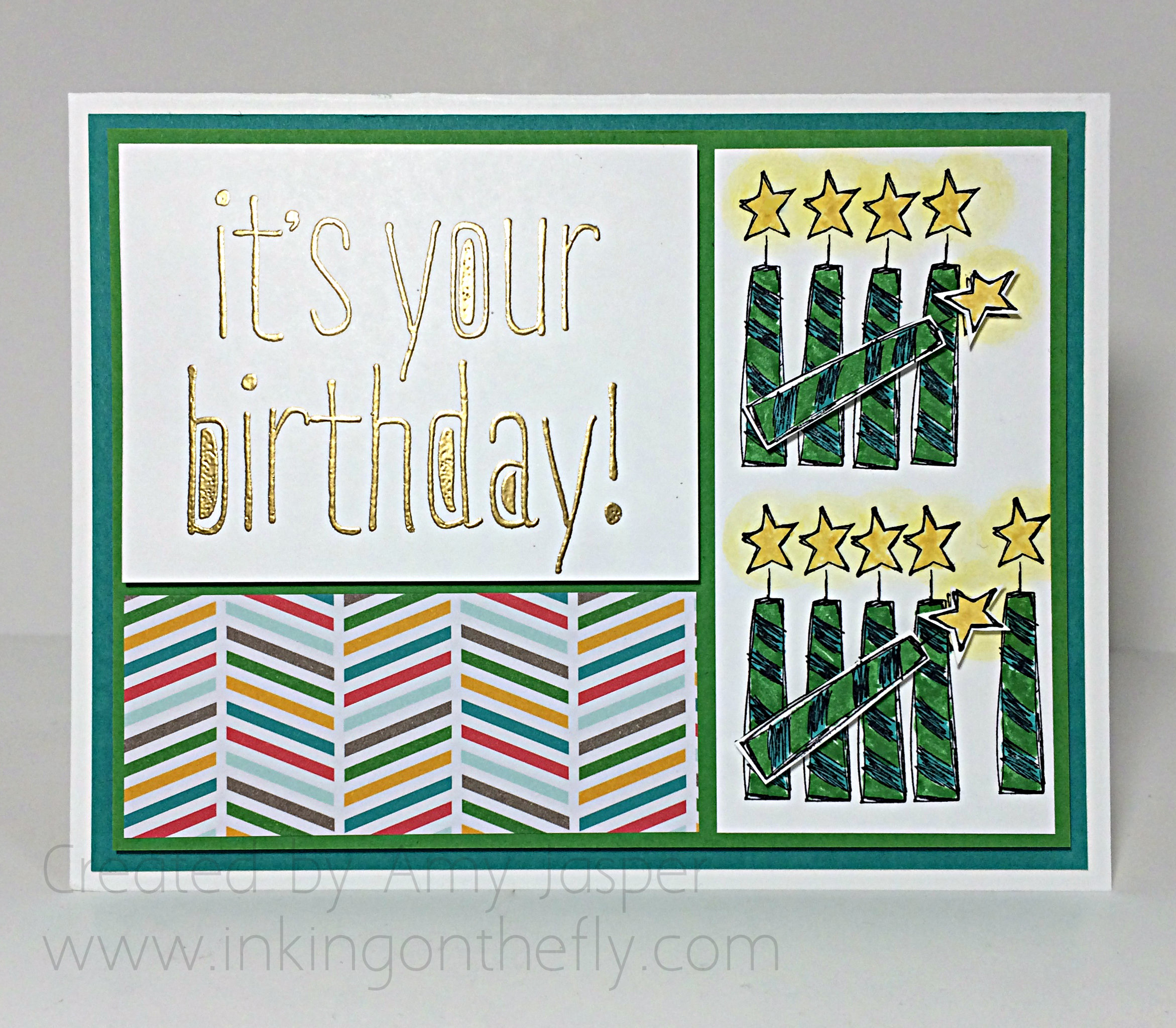
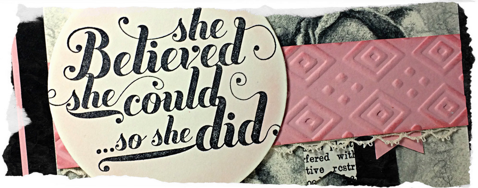 Welcome to my blog where I have the privilege to share my love of designing with Stampin’ Up products. Check out the beautiful Timeless Elegance designer series paper on this inspiring card for today’s project.
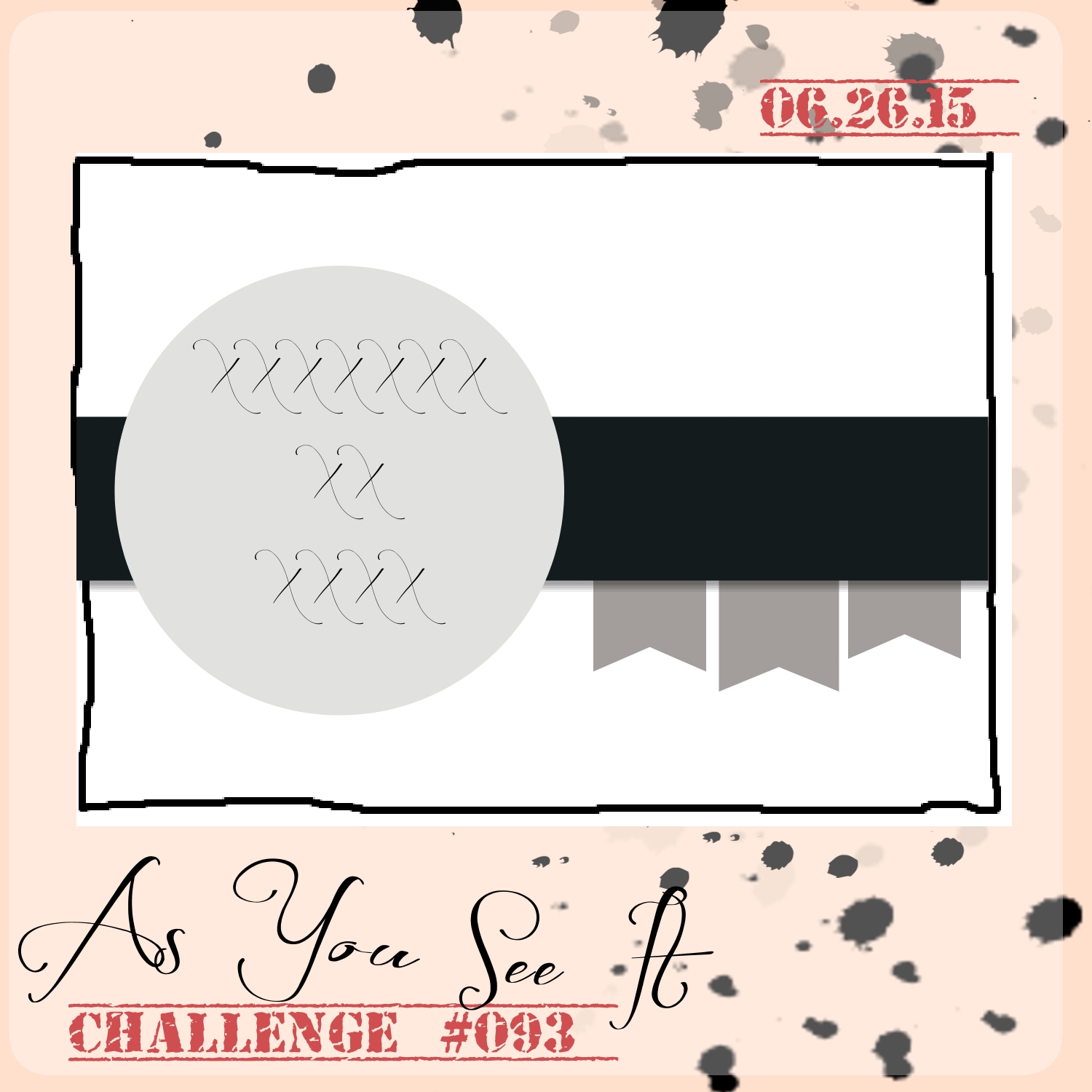
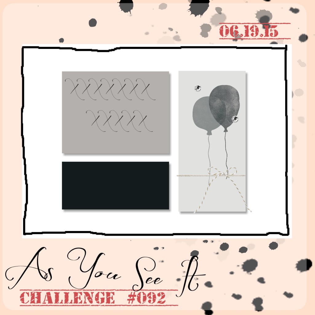
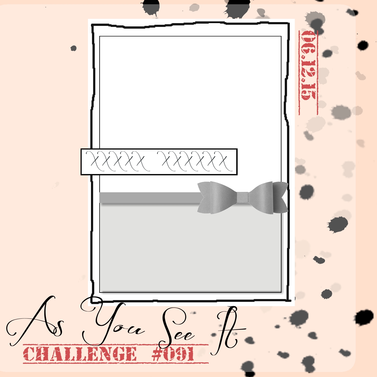
This card began with As You See It Challenge #093:
This card is to celebrate achievement that comes from hard work and perseverance, but also from turning your dreams into plans. 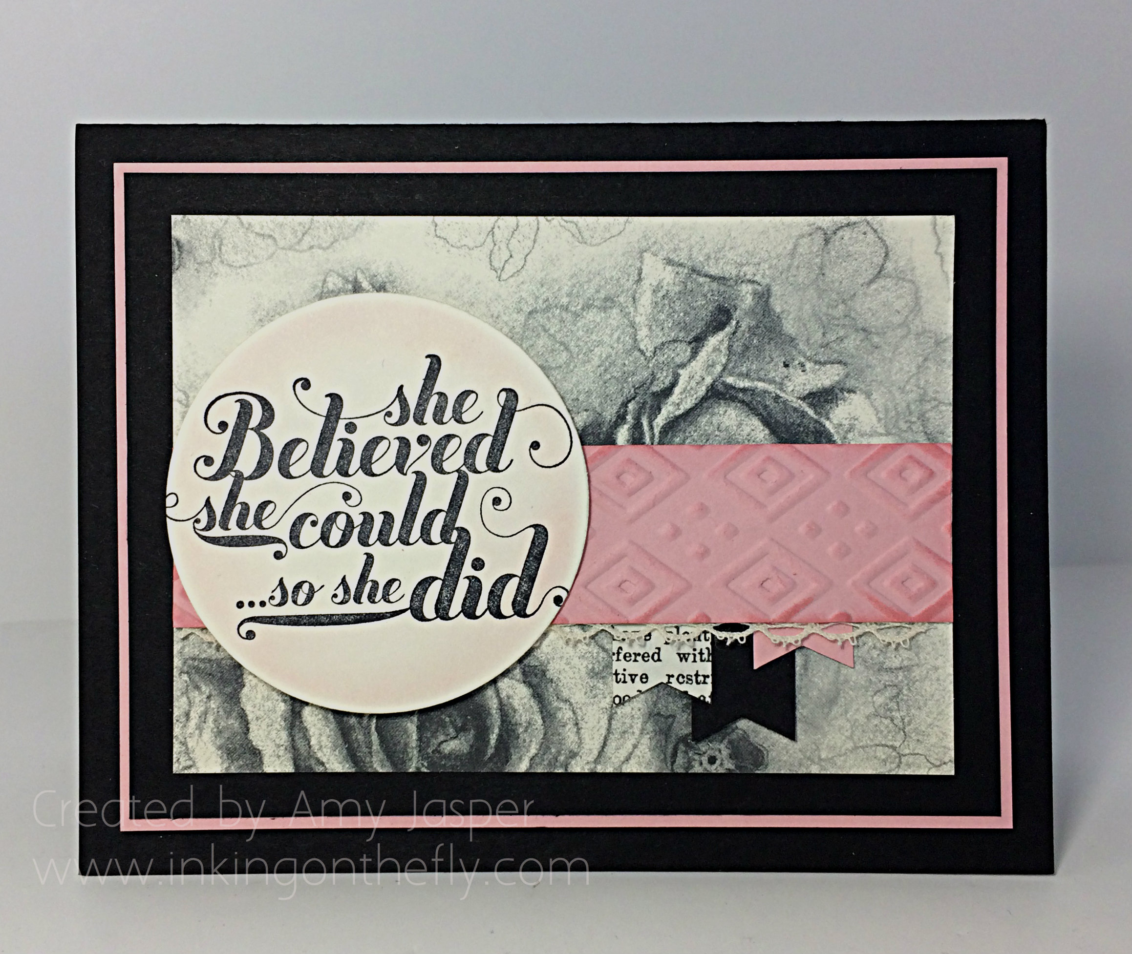
While designing it, I was thinking of goal-setting and the chaos of a summer schedule now that the kids are out of school. I’m not great with goals, but I REALLY want to be. Goals have the potential to give me the focus I need to accomplish things that are important to me, my family, my business, and my day job. The crazy summer months with scheduling child care, juggling my work schedule so that either my husband or I are home with the kids as much as possible, getting as much camping in as possible, and keeping my stamping friends creating even through their own busy summers, all makes goal-setting even more of a priority.
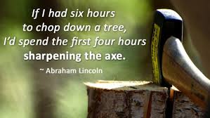
My husband refers to this sort of planning as “sharpening your axe”. Apparently it was Abraham Lincoln who used this phrase:
We need to take the time to reflect on habits in our past and determine where improvement needs to take place. This can be prioritizing, goal-setting, planning, scheduling, reflecting, learning, gathering supplies, and even just taking a break to refresh ourselves. It can be hard to take the time for these things when our lives are busy, but this is when it is even more essential. Without “sharpening your axe”, you are likely to be less efficient, less effective, less productive, and more likely to burn out or become overwhelmed.
So one of my goals this summer is to start each week with some quiet time where I can sit down and sharpen my axe. It will start with a basic to do list, then prioritizing, planning and scheduling. With a flexible plan (you always need to allow wiggle room to foster relationships), I can have a great summer and start some new habits. And, feel successful in my accomplishments.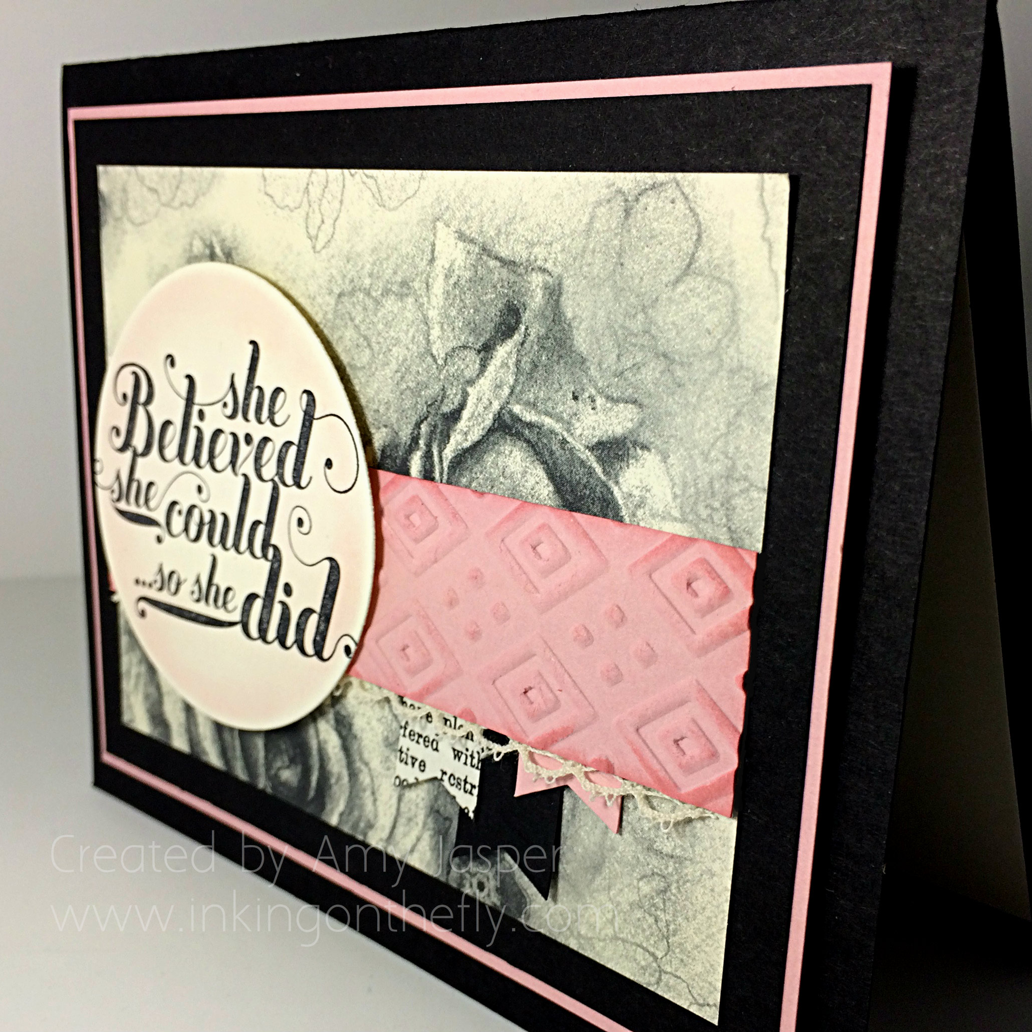 I hope to be able to read this statement at the end of the summer and glow a little bit, knowing that it applies to me!
As for the details on this one:
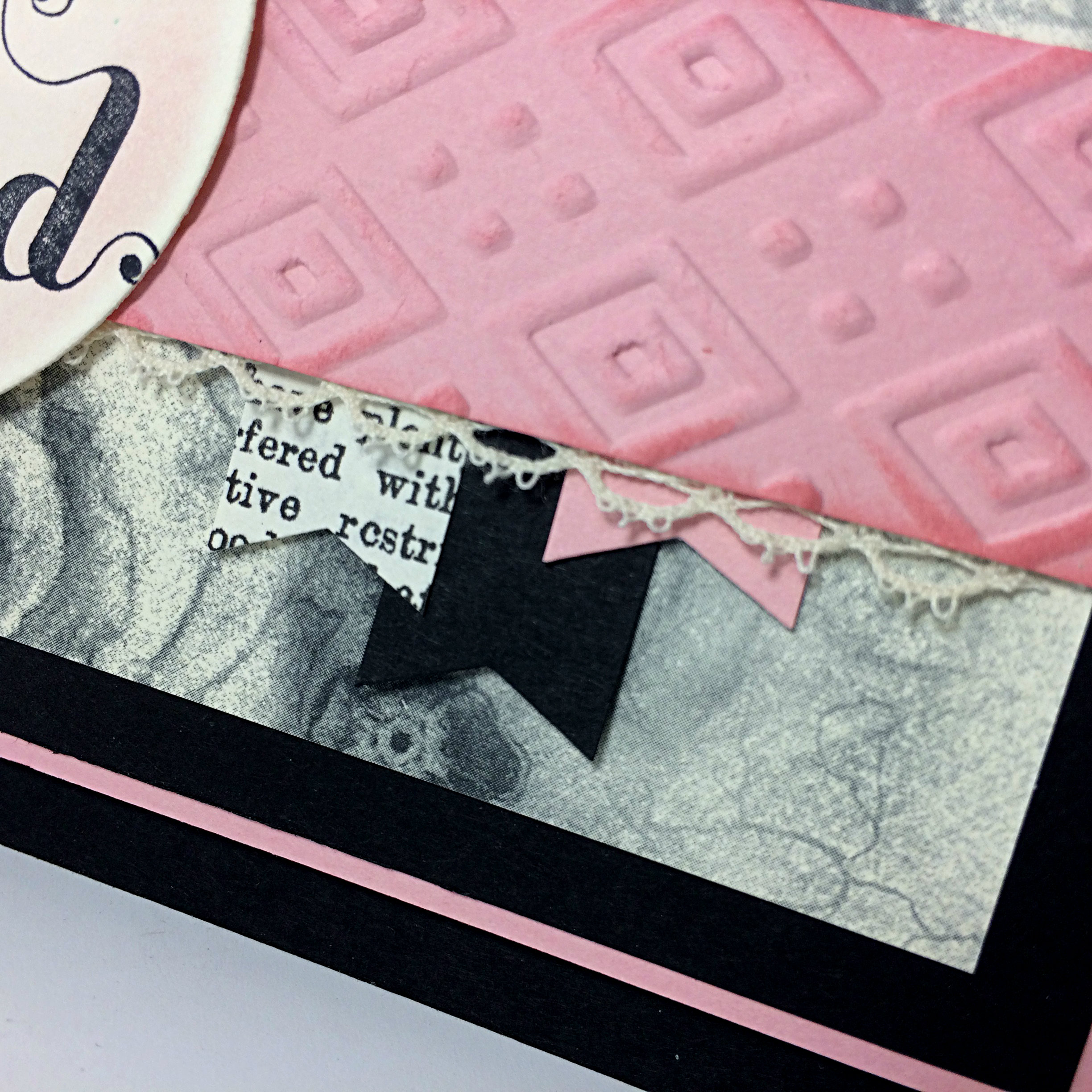
Basic Black, Very Vanilla and Blushing Bride cardstock were used for the colour combination. I love the Timeless Elegance Designer paper – soo pretty. The strip of Blushing Bride Cardstock across the front of the card is embossed using the Boho Embossing folder and the Big Shot machine. I sponged Blushing Bride ink around the edges of the piece so that the embossing would “pop” that much more. The Venetian Crochet Trim is just peeking out under that strip of embossed cardstock for an added touch. I chose Basic Black, Blushing Bride, and a small piece from the Typeset Specialty Designer paper to create the little 5/8″ wide little banners. The Banner Punch comes in handy to snip perfect little banner ends.
The sentiment is one of my favourites from the Feel Good stamp set. I stamped it using Jet Black Stazon ink on the Very Vanilla cardstock. It was cut into a circle using the Big Shot and Circle Framelits. To add a light sponging of Blushing Bride ink, I left the framelit in place and used a Sponge Dauber in gentle circular motions. This leaves a subtle, but effective, thin outline on your die cut shape.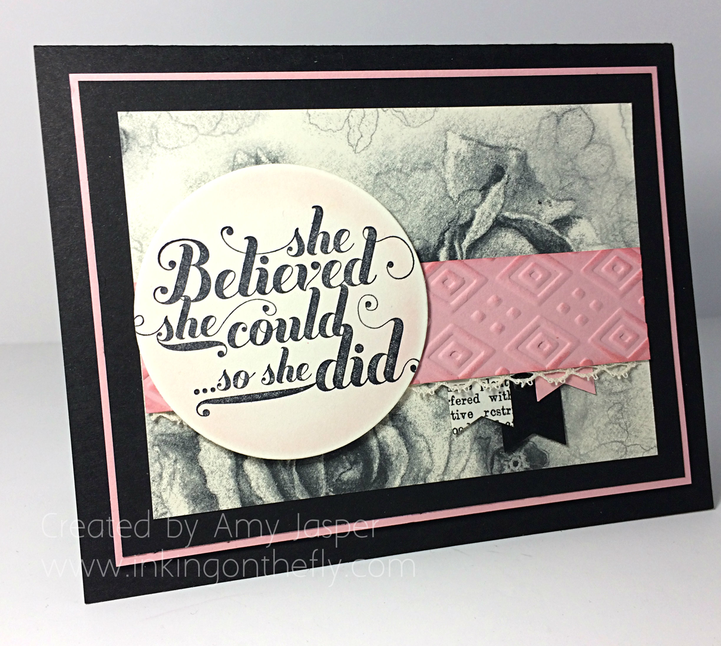
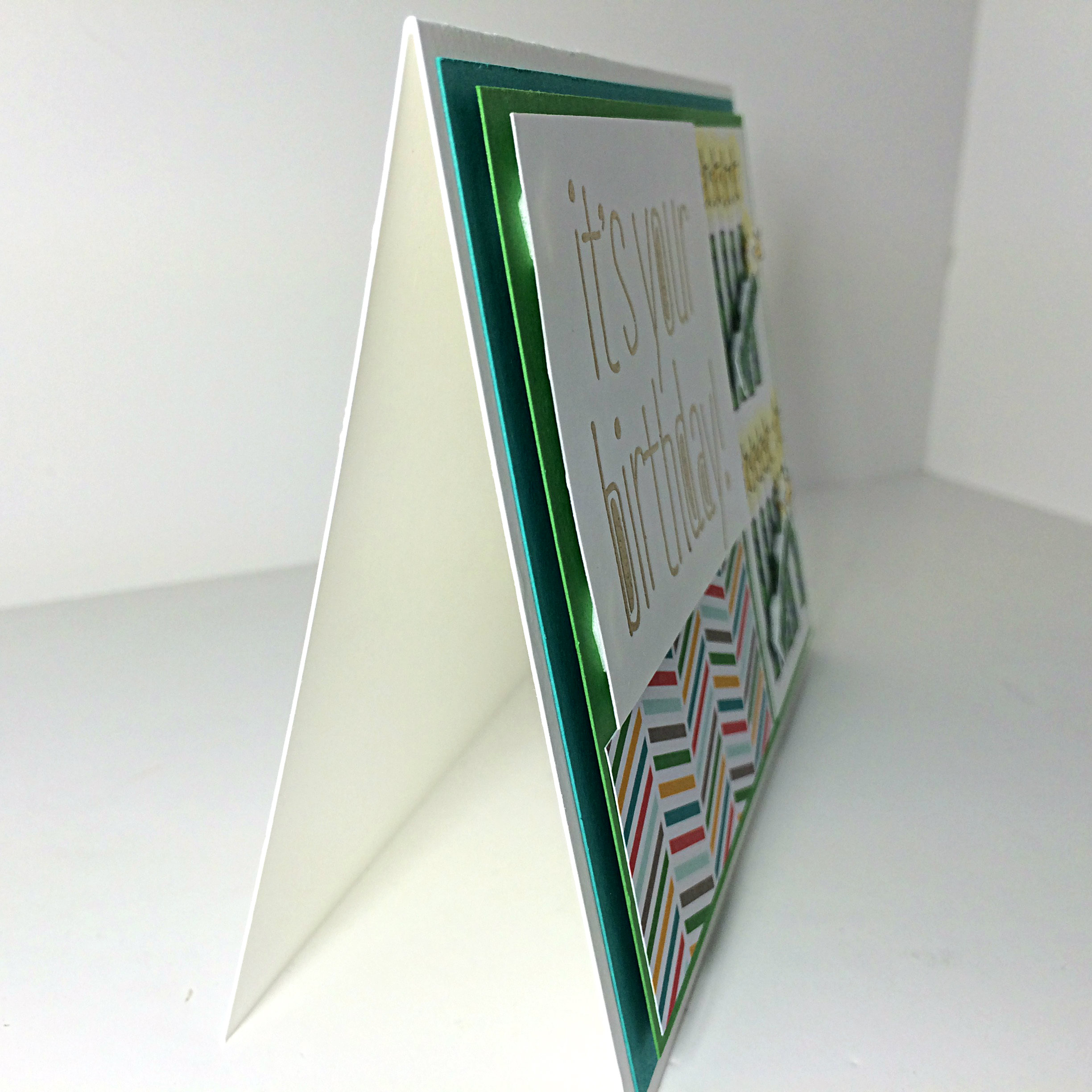
Of course, most of my cards are not complete without using Stampin’ Dimensionals somewhere! I used them to raise up the Blushing Bride mat on the Basic Black card base. I also used them under the circle shape with the sentiment.
What do you think? Is this a card that I can give you at the end of the summer? How will you sharpen your axe so you can reach your goals?
Amy
