Stampin’ Up

Words of Encouragement

087headerSometimes, a monochromatic card gives me comfort and Stampin’ Up always makes it easy. My design is a simple and clean Sahara Sand card with many words, but one intent: to encourage.

It all began with this sketch from the As You See It Challenge blog. Be sure to visit it and see what the other designers created using this same sketch!
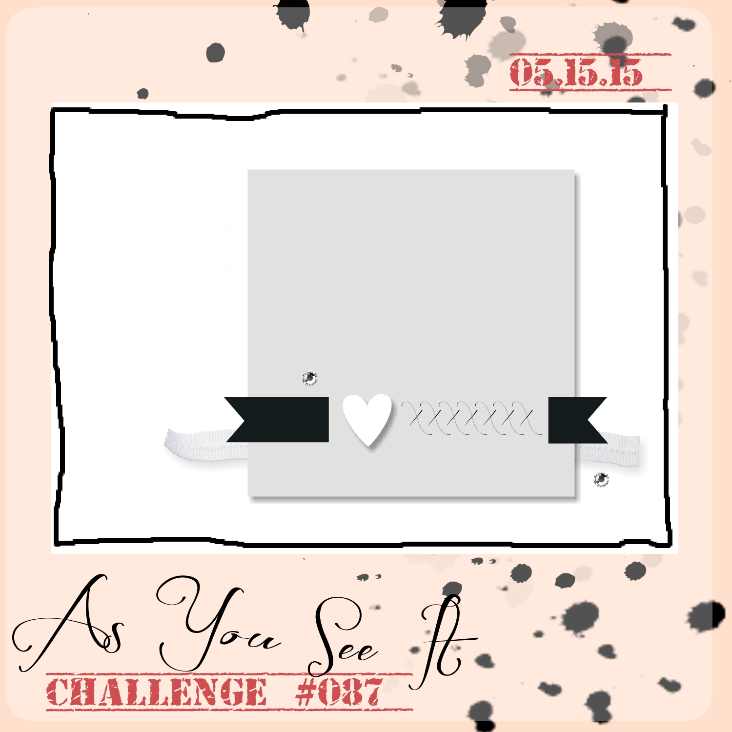
AYSIChallenge087I used Saharah Sand cardstock for my base and was determined to use Stampin’ Up product that is currently on the retiring list. I am very sad to see most of these items retiring, but will likely hang onto a few of my favourites, while others will go into my “For Sale” bin.
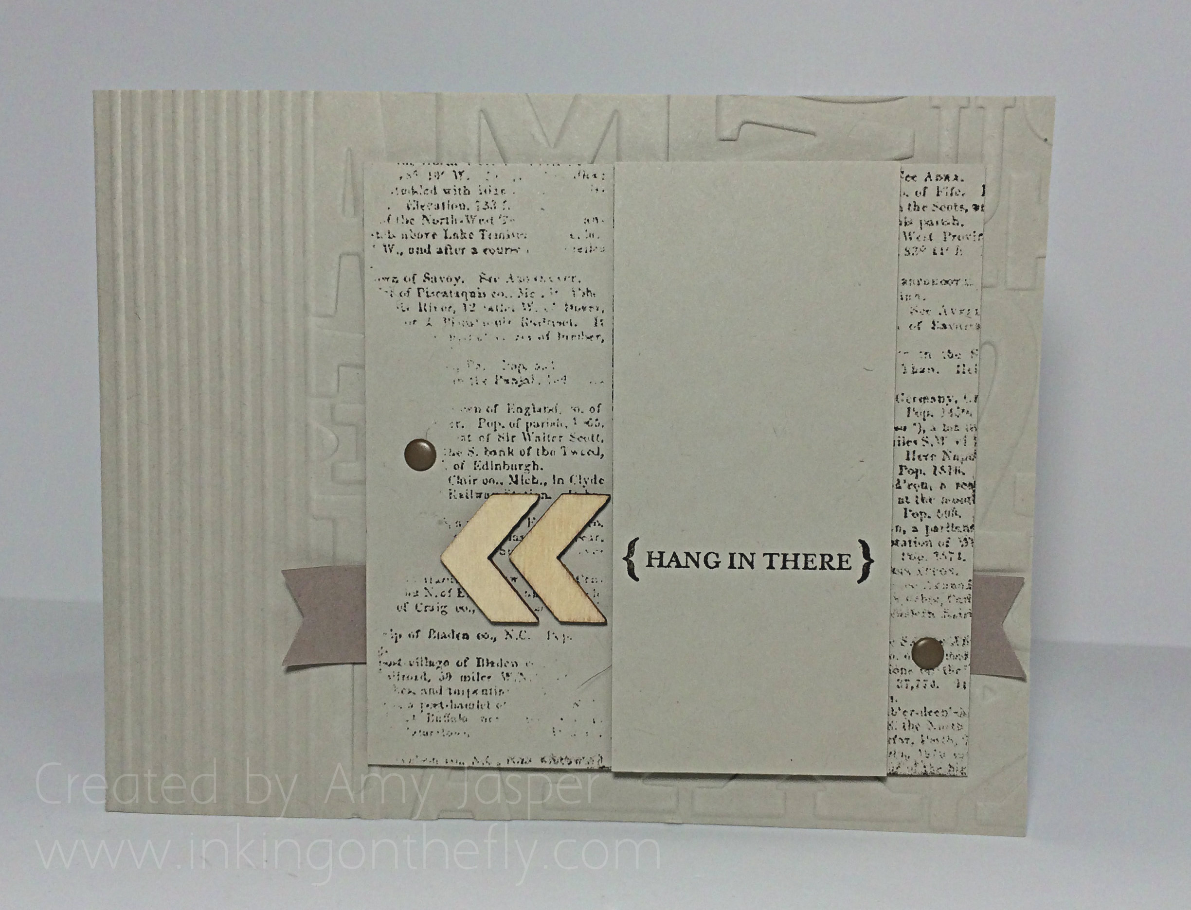
087AmyI chose a simple sentiment that is in the “From My Heart” stamp set and stamped it with Early Espresso ink. That layer of Sahara Sand cardstock is over a square layer of the same colour that is stamped with the Dictionary background stamp, also in Early Espresso. I only tapped lightly in a few spots on the paper while it laid over the rubber stamp so that I could get an uneven image.
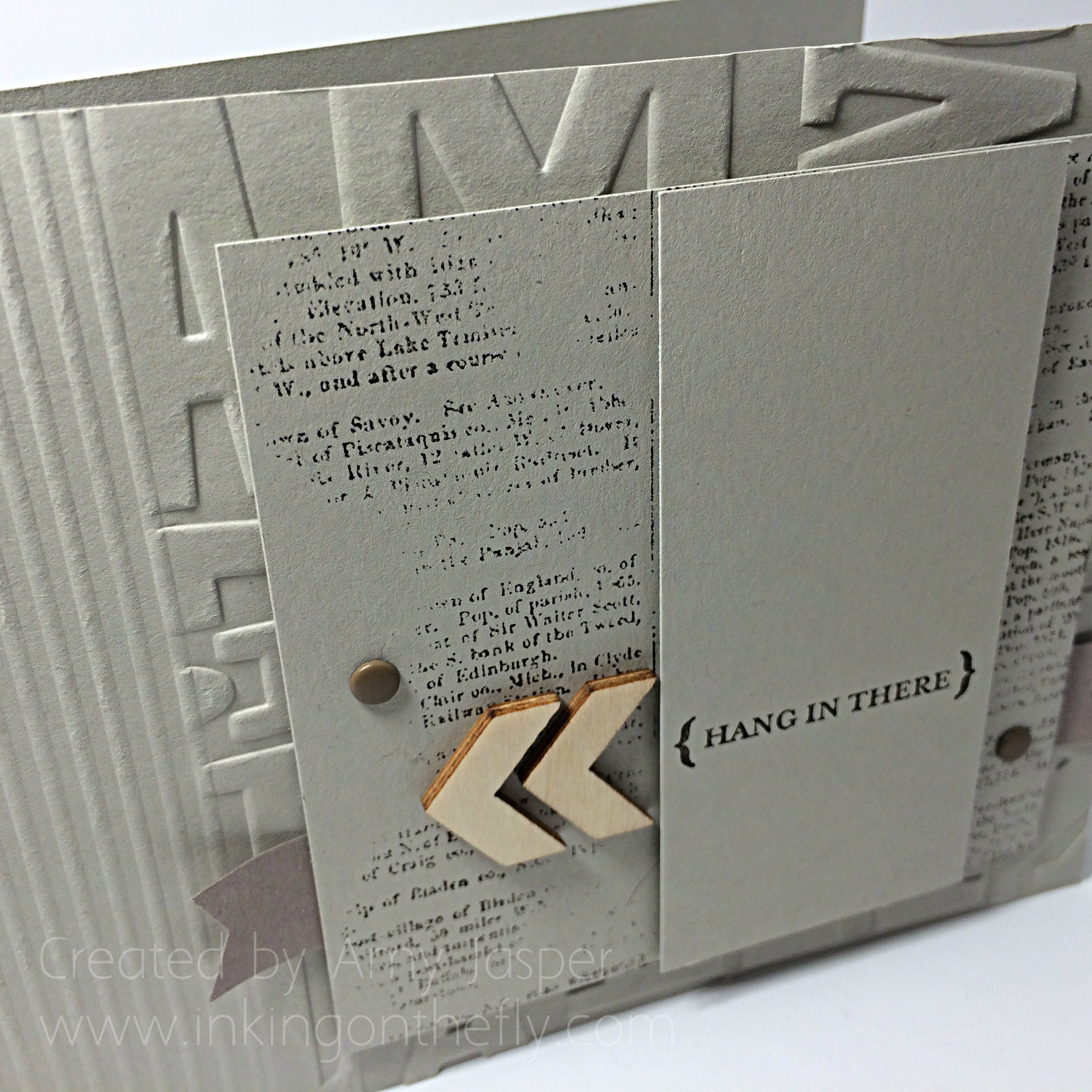
087closeThe base of the card was embossed using the Alphabet Press embossing folder and the Big Shot so that only about 3/4 of the card front was actually in the folder. The remaining 1/4 of the card front was scored multiple times to create the striped embossed area near the folded side of the card.

I used Neutral Candy Dots and the Essentials Wooden Elements as the only embellishments on the card along with a strip of the (not yet available) Tip Top Taupe cardstock. I love using my Banner Punch to cut perfect v-shaped ends for banners and flags. It’s so easy!
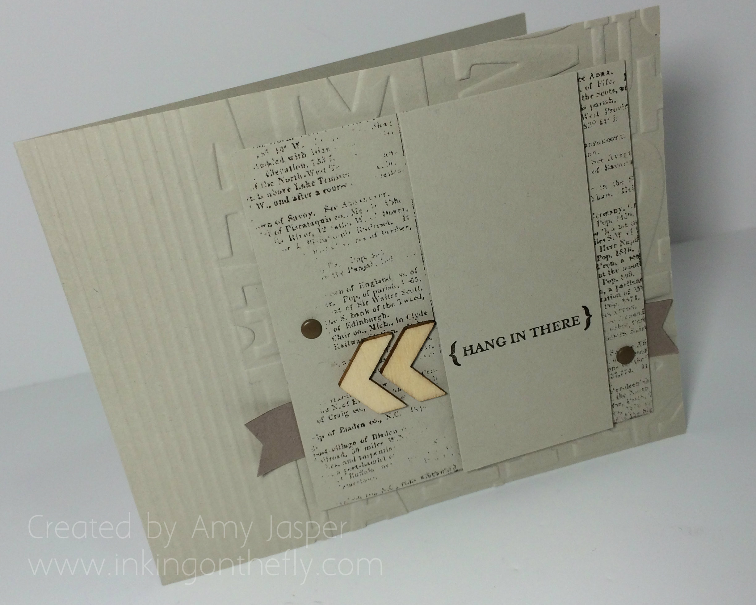
087Amy2As usual, there are many Stampin’ Dimensionals to lift each of the paper layers. If you don’t use these little foam dots, you are sorely missing out on instantly stepping up your projects! Make sure you order some!

I hope you’ll try this challenge. I found it difficult, but I’m sure you’ll breeze through it once you get started. I LOVE my final result and will be proud to give this card to someone who’s going through a rough patch.

Amy.

Designer-Badge


Soft Sky Sympathy

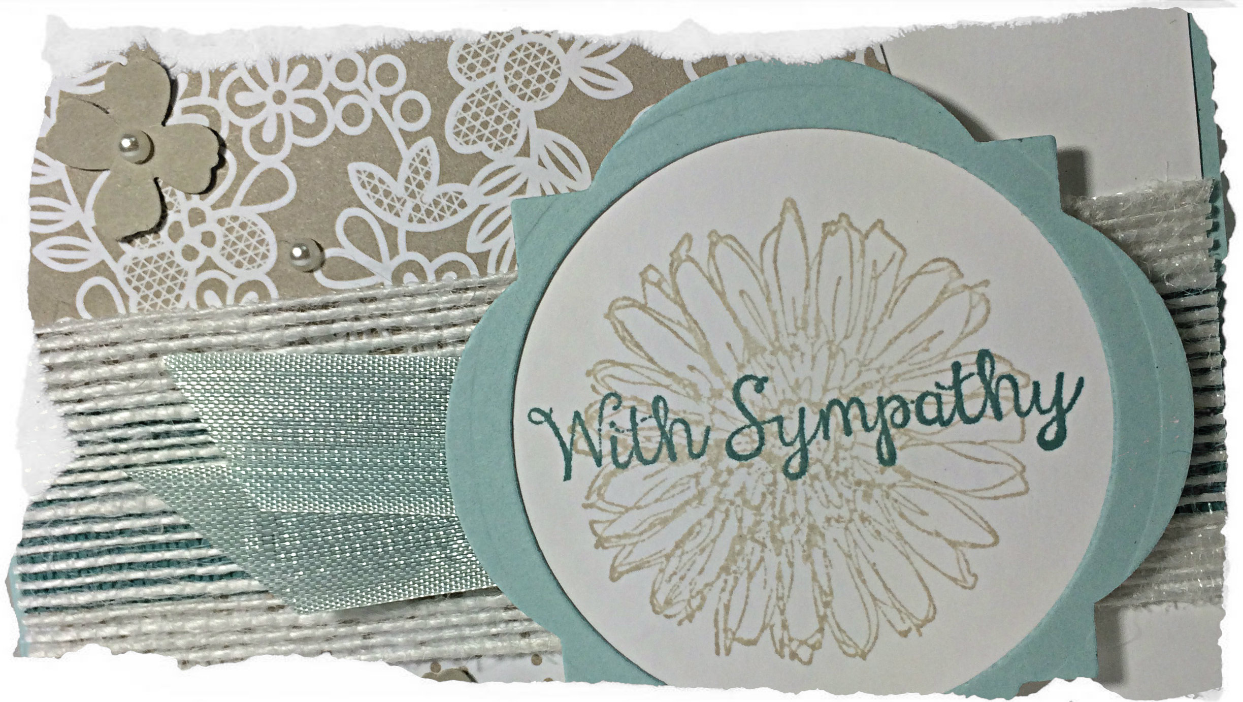
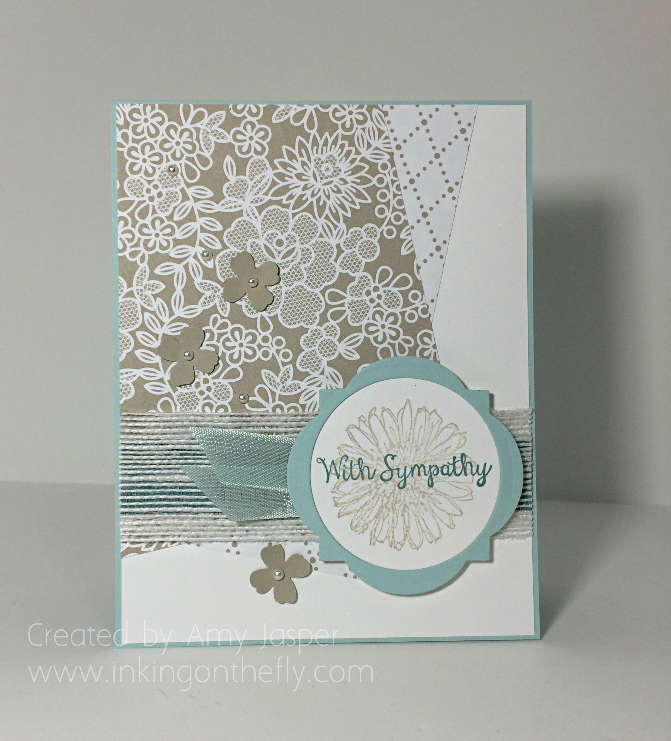
086headerCheck out this sympathy card, designed for the As You See It Challenge blog, featuring Something Borrowed designer series paper, Window Framelits, Soft Sky seam binding ribbon, Lost Lagoon ink, and the Bloom with Hope hostess stamp set; all to be retiring at the end of this month from Stampin’ up!

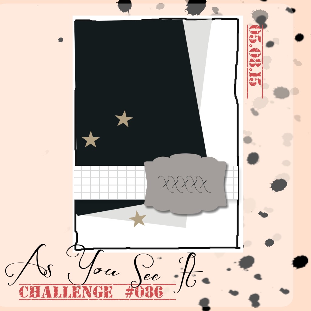
Here’s the sketch that marked the beginnings of this card:

AYSIChallenge086-1024x1024

It’s always good to have a selection of sympathy and get well soon cards on hand as they are a necessity for events that often surprise us on our path in life. Yet these unpleasant events are inevitable and require quick response to ease the hearts and bodies of those in the midst of life’s trials. It’s during these times when we need to rally along side the families and show our support and offer our well wishes. Hand-made cards not only offer a word of encouragement and love, but also offer a piece of ourselves with each layer of paper that is cut and each embellishment that is placed with care and consideration.

Even though I don’t currently have a need for this sympathy card, it too is made with a little bit of myself poured into it and is ready to bless someone with an offering of support.

086Amy

Product retiring: Soft Sky Seam Binding ribbon, Bloom with Hope hostess stamp set, Lost Lagoon Classic Ink, Lost Lagoon Cardstock (under the Jute ribbon), Something Borrowed Designer Series Paper, and the Window Framelits.

Other product used: Soft Sky cardstock, Whisper White cardstock, Jute Ribbon, flower punch from the Itty Bity Accents Punch Pack, Basic Pearls, Sahara Sand Cardstock, Sahara Sand Classic Ink, Circle Framelits, Big Shot, and Stampin’ Up Dimensionals.

Give this sketch a try and show it off by linking it to As You See It Challenge #86! Hope you do!

Amy

Designer-Badge

Retiring Light of My Life

085header

There are so many favourite things that are retiring as the 2014/2015 Stampin’ Up! catalogue comes to a close at the end of May. They need to make room for NEW favourite things!! I’m purposely featuring retiring product in my next few posts so that you won’t miss out on your chance to order these items before they’re gone for good!!

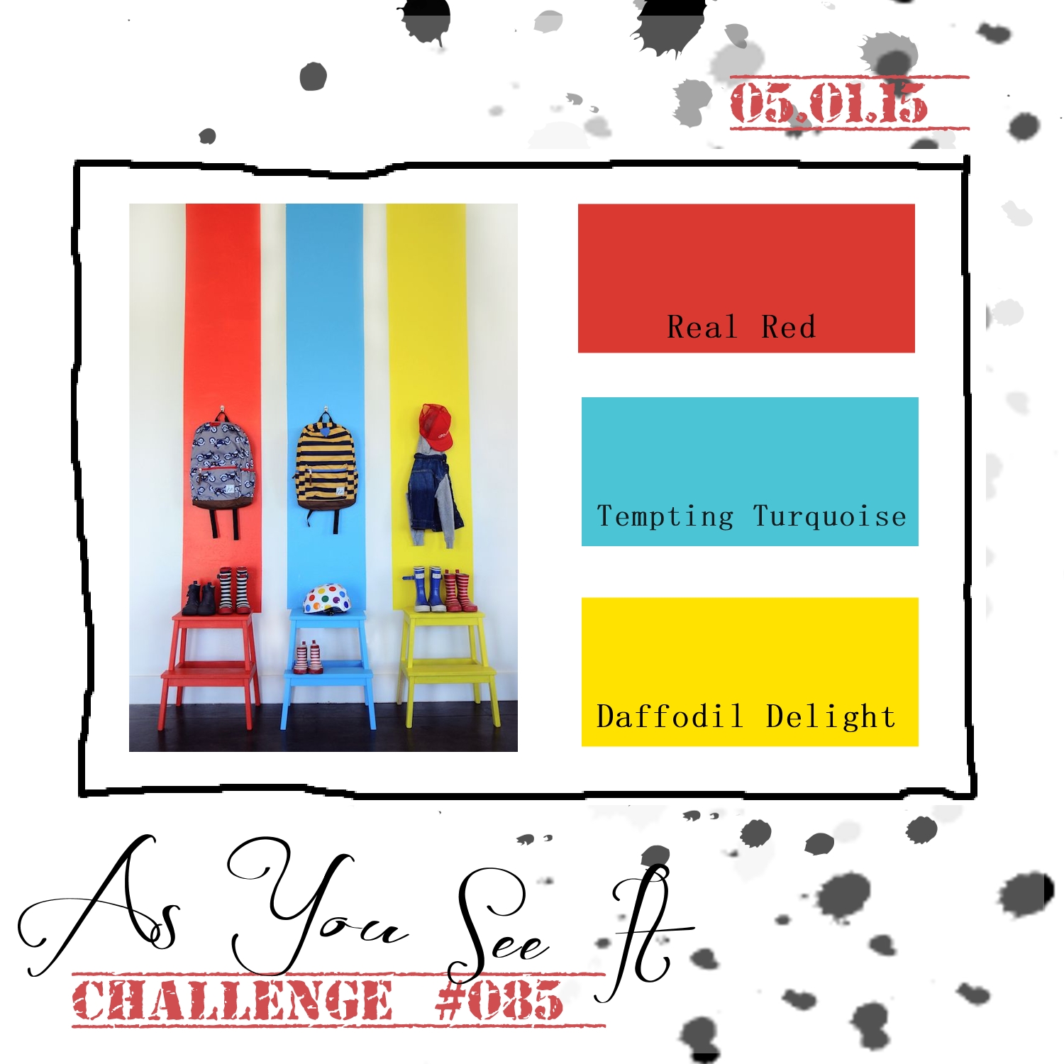
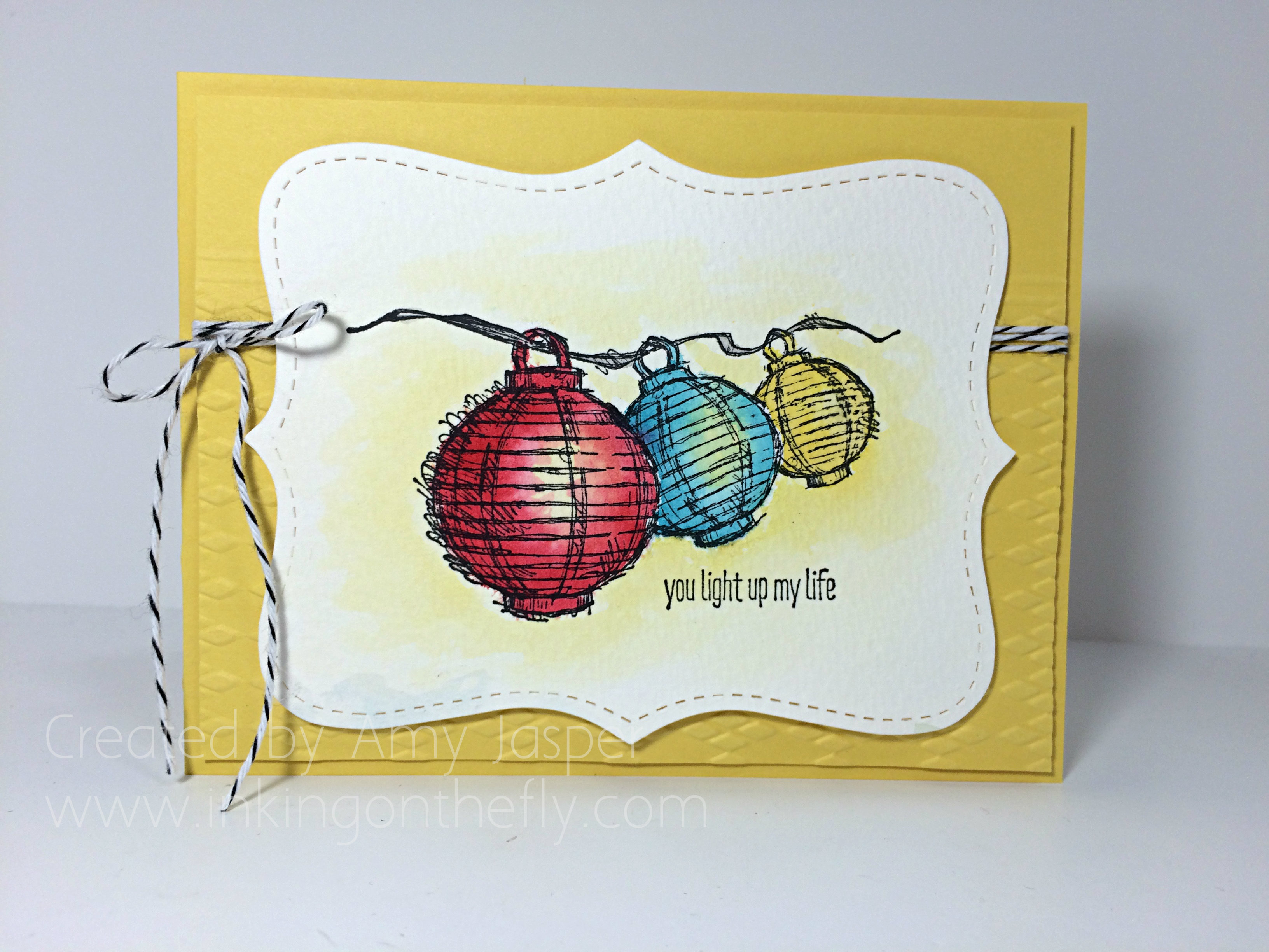
My design for As you See It Challenge #85 features the Today and Everyday stamp set, the Top Note Bigz Die, and the Argyle Embossing Folder, all of which are on the retiring list. The Argyle embossing folder also happens to be 50% off! If you haven’t seen the retiring list, you should definitely have a look. A lot of items are discounted.

AYSIChallenge085

Here are some colours that definitely screamed “FOR THE CHILDREN!!” to me, lol! However, I resisted the urge to make a kid themed card (though these colours are absolutely perfect for that purpose – so crisp and playful).

Instead, I went for bright and happy!

085Amy

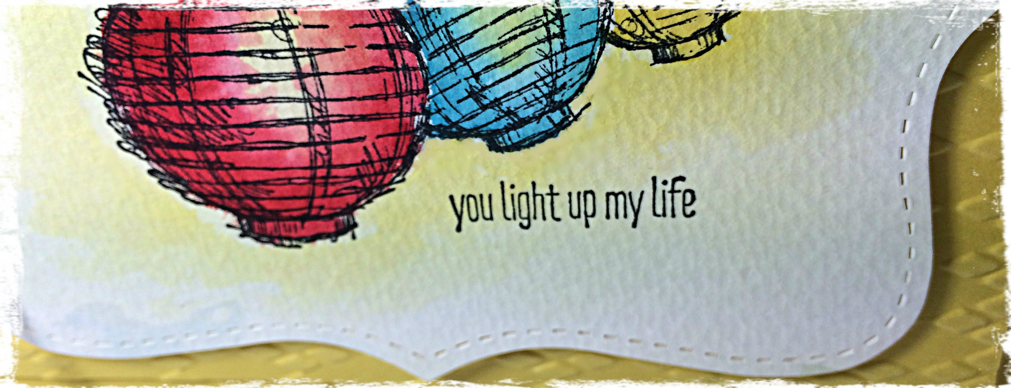
I really wanted to play around with light in my water colouring for this design. I cut my Top Note shape from some Watercolour paper and stamped my image with Jet Black Stazon ink. Starting with Daffodil Delight ink and an Aqua Painter, I highlighted all the areas that I wanted to appear to be glowing with light, focusing on a spot inside the lanterns as well as colour-washing around the lanterns. After allowing that to dry, I went in again with each of the lantern colours (Real Red, Tempting Turquoise, and Daffodil Delight) working around the area where I had already applied the Daffodil Delight highlights and focusing darker, more saturated colour on the edges of each lantern. Less water and more ink allows for greater saturation of colour. I love that I can squish the ink pad when it’s closed so that the ink smudges onto the inside of the lid. Then, when it’s opened, you can use the inside of the lid as a palette for your colouring. You can also just apply a drop of re-inker in the inside of the lid.

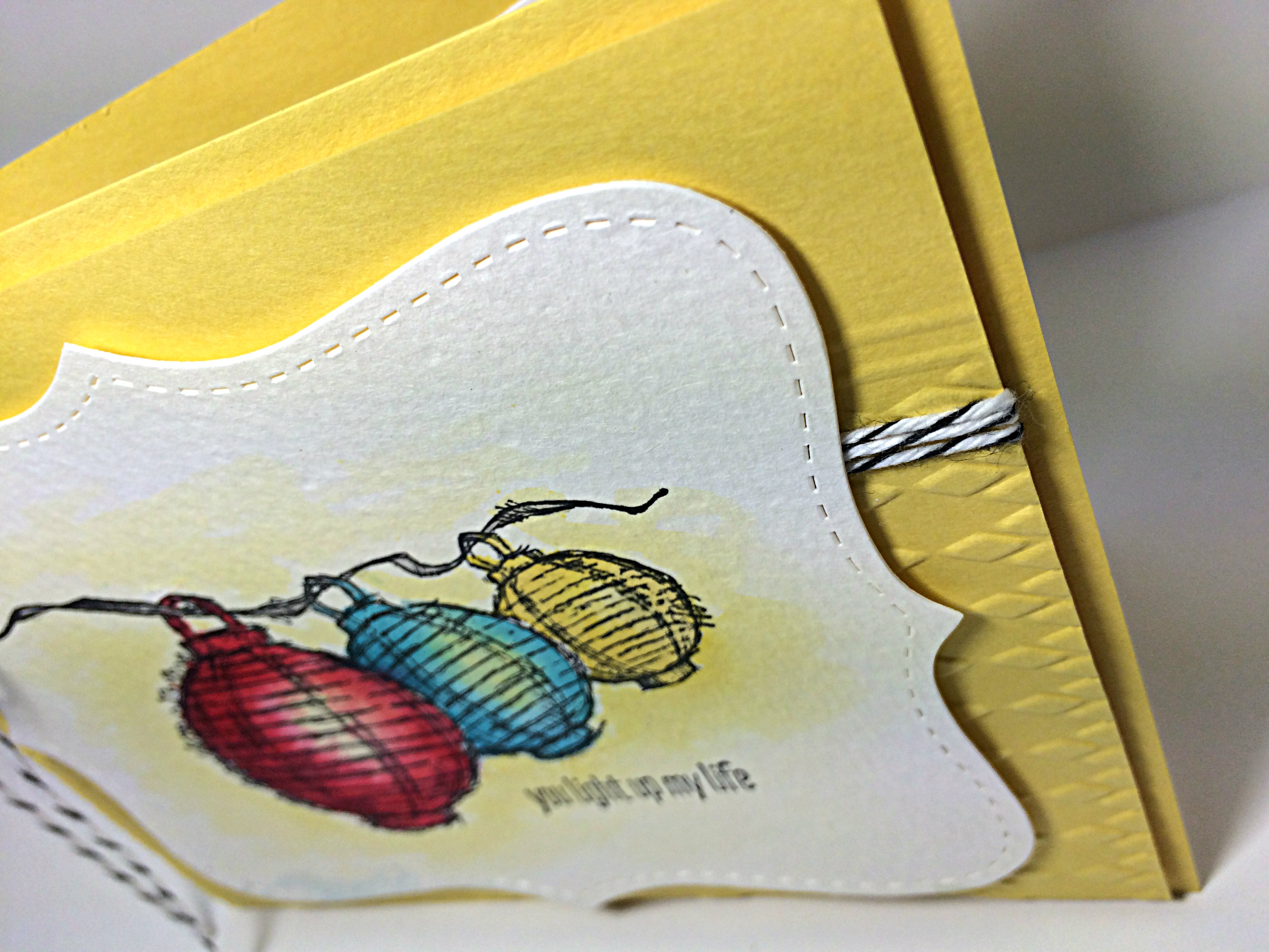
085texture

When the colouring was complete, it was time to work on the second layer of this design. I chose Daffodil Delight cardstock for my base and a layer of the same colour over it with texture for added interest. That’s where the Argyle Embossing Folder comes in. I only put about 2/3 of the piece of cardstock into the folder, leaving that 1/3 untouched and smooth. I like this look. Sometimes, you can have too much of a good thing, so this eases off on the weight that embossing adds to a project. I did my two line scoring technique at the junction of the embossed and the smooth, just to give it a more finished look. Then, the Basic Black Baker’s Twine was wrapped around three times and tied in a bow with lovely long tails.

If you have ever visited my blog before, then you KNOW how much I use and LOVE my Stampin’ Dimensionals. This design has them too, of course! Each layer is popped up on these lovely little hexagon shaped foam stickers. Rarely a flat card you will see in my hand-made collection!

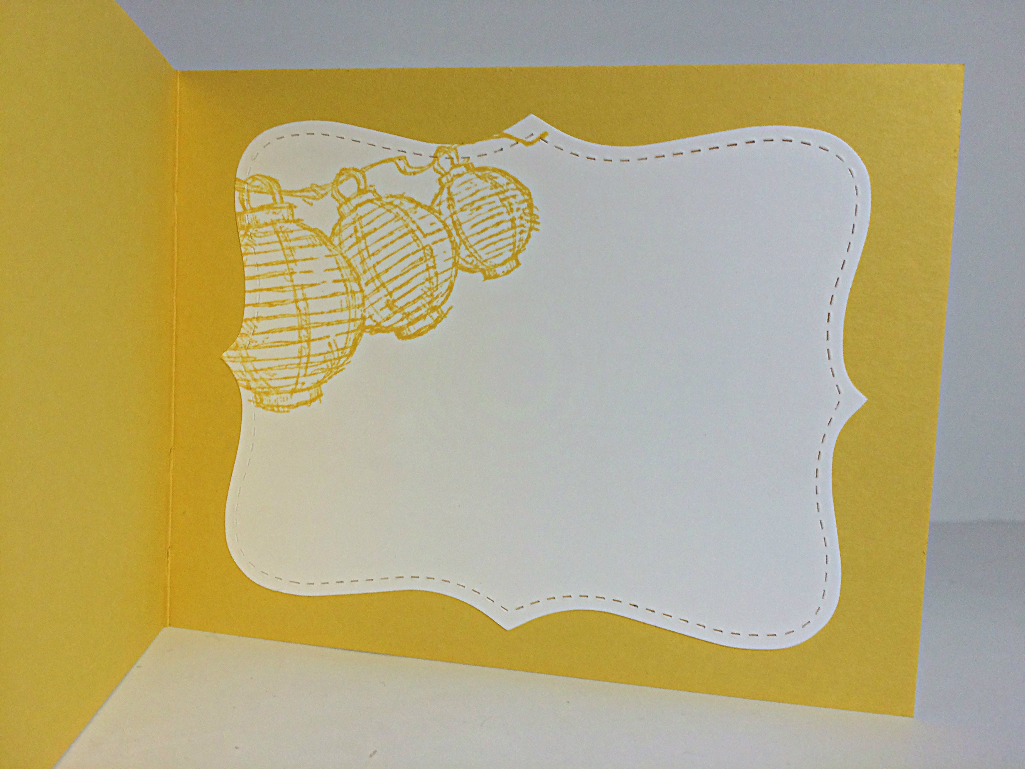
085inside

Lastly, one of my favourite things to do with the Top Note Bigz Die: A decorative inside to finish off my design. The same image on the front was stamped with coordinating Daffodil Delight ink onto a die cut piece of Whisper White cardstock and adhered for a pretty little writing space.

What do you think? What’s on your list of supplies to buy before June 2nd. Some things are already sold out! Be sure to put your order in sooner than later so you aren’t disappointed.

Make sure you give this colour challenge a go. It’s fun, cheerful, bright, happy, crisp, and playful, too. Great colours to cheer someone up with – to light up someone’s life!!

Amy

Designer-Badge