Toile Tidings
The Stampin’ Up! catalogues are not just catalogues of stamping and art supplies that you can purchase, but they are a great resource for ideas and inspiration! My card design today is one that I copied from the cover of the Stampin’ Up! Holiday Catalogue. I changed out the colours a bit and made some other minor changes, but it’s a copy. And I LOVE it!!
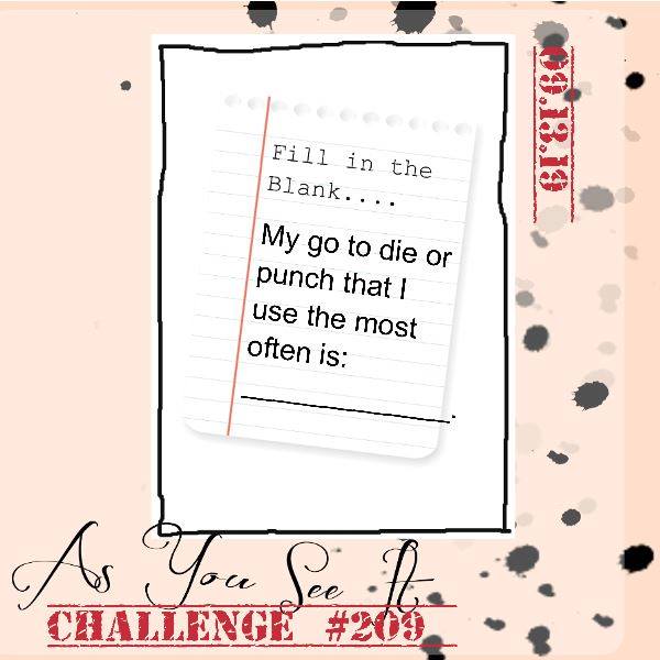
Today’s blog post is also inspired by the As You See It Challenge Blog which challenges participants to create a card using their most used punch or die.
What’s your go-to die or punch?
My favorite is the large 2-1/4″ circle punch from Stampin’ Up! I love how quick and easy it is to use punches instead of a die cutting machine. There are fewer steps to using a punch, which makes it easier and faster to create a card (and especially multiple cards) with a punch, rather than a die.
When I saw the card on the cover of the Stampin’ Up! holiday catalogue, I was immediately drawn to the plaid designer series paper and the square/circle combination with the layers on the card.
Can you spot the card on the cover that inspired me!?
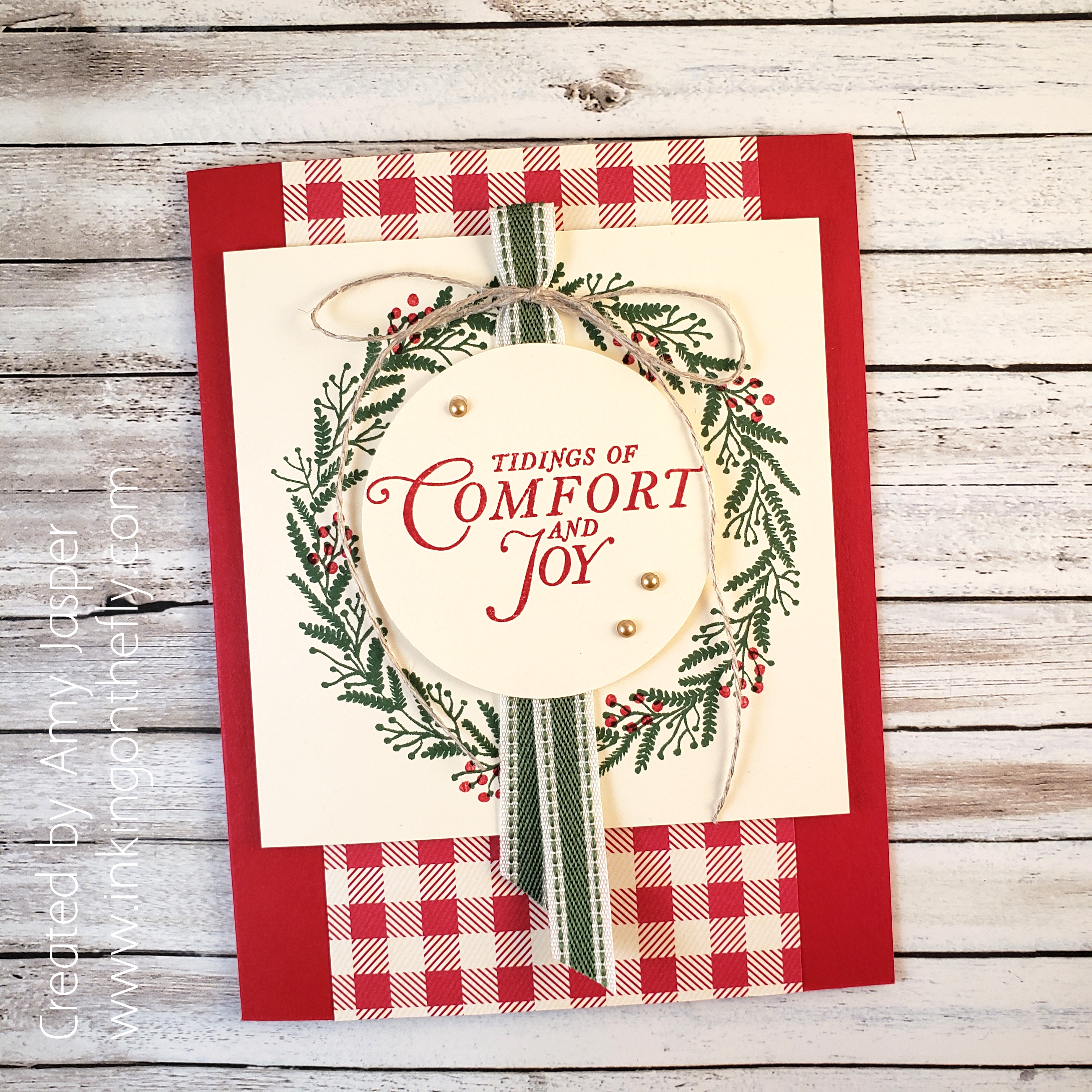
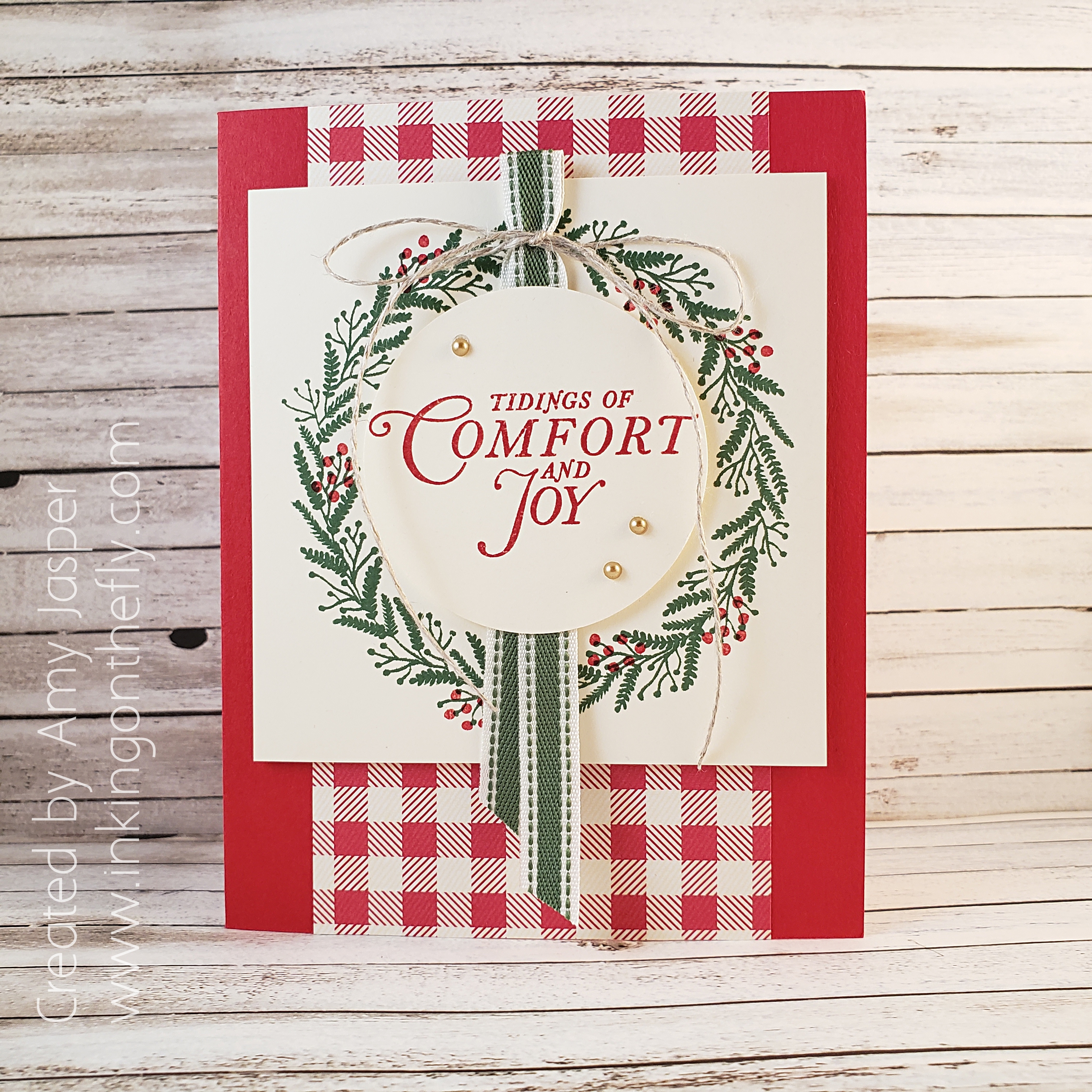
Now, I do have nearly all of the products shown on that sample, but I wanted to put my own spin on the design. I started with Real Red cardstock for the card base, then added the 3″ x 5.5″ piece of the red plaid (or is it gingham?) patterned paper from the Toile Tidings Designer Series Paper pack.
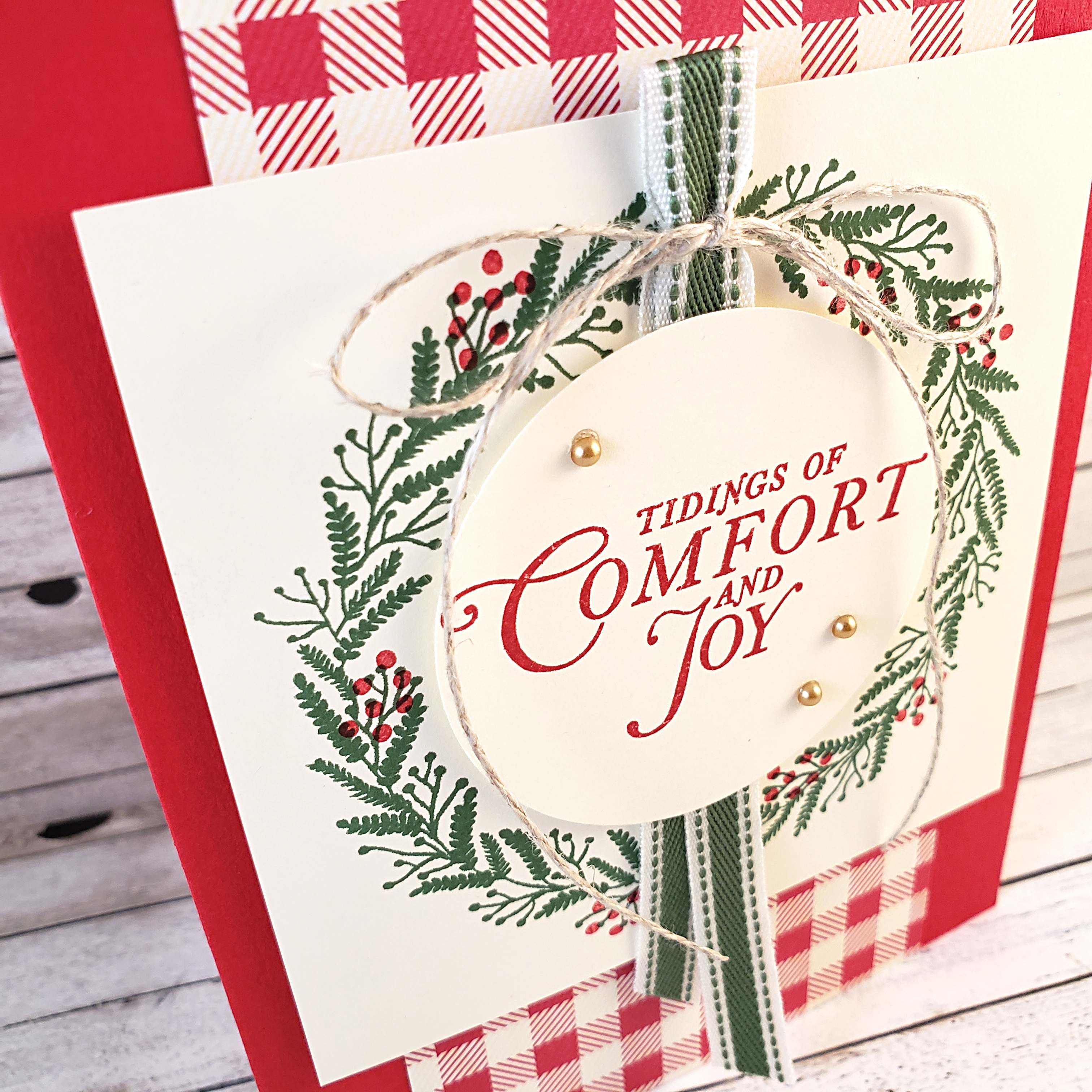
Next was to cut a 3-3/4″ square of Very Vanilla cardstock and stamp the wreath image from the Tidings All Around stamp set in Garden Green ink. To this, I stamped multiple berries from the same stamp set using Real Red ink. The square is adhered to the card front using Stampin’ Dimensionals. Then I added a piece of the Garden Green 3/8″ Double-Stitched Ribbon, approximately 8.5″ long, folded in half over the wreath image. Mini Glue Dots made attaching the ribbon super easy!
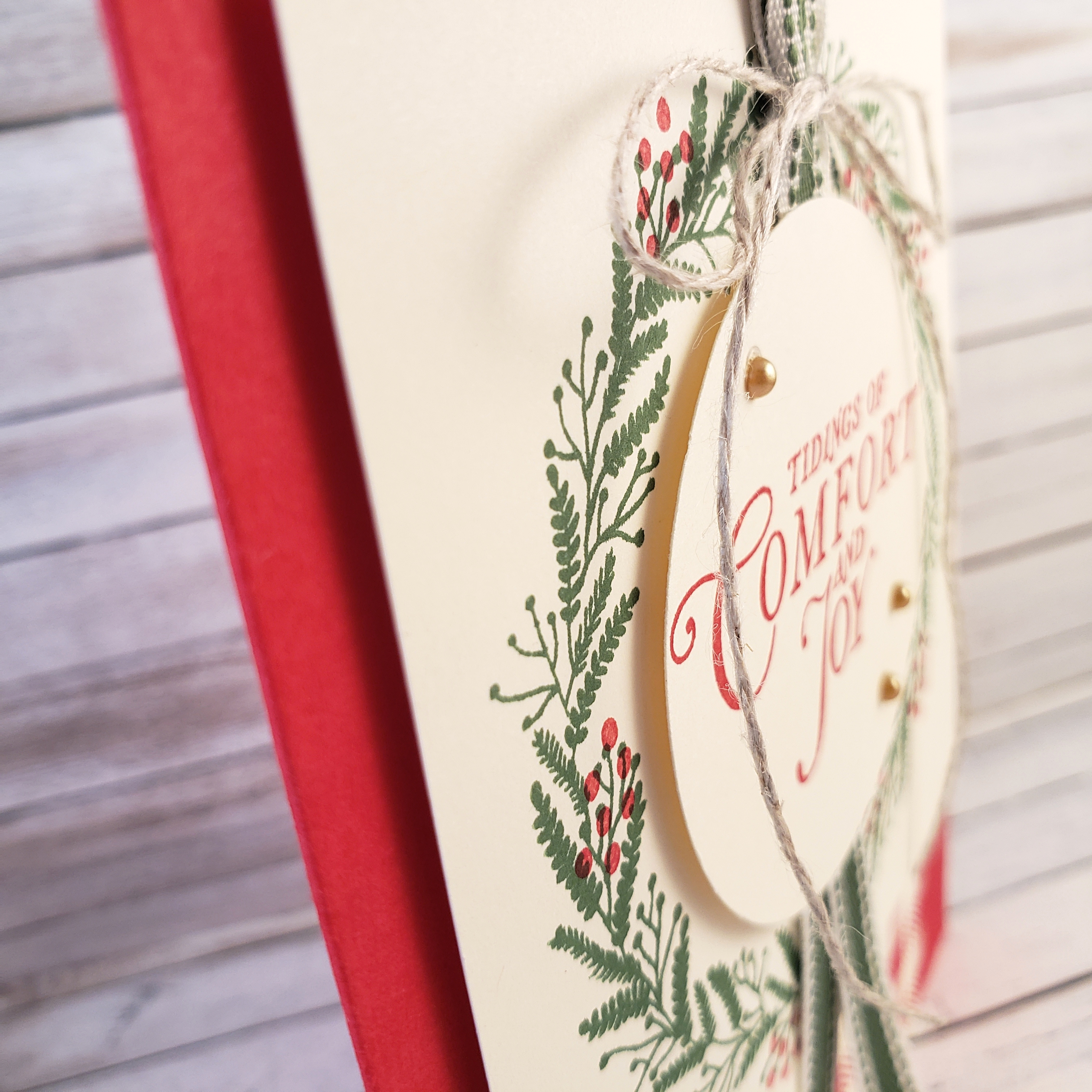
I love how the bow of Linen Thread tied onto the top of the folded ribbon adds an extra touch of a country cottage style. Of course, the circle of Very Vanilla cardstock is created using my favourite 2-1/4″ Circle Punch from Stampin’ Up! First, I stamped the sentiment with Real Red ink onto a piece of Very Vanilla cardstock, then used the punch so that the sentiment would be centered in the circle. This was then attached over the ribbon to the middle of the stamped wreath image with Stampin’ Dimensionals.
The final touch was to add the three gold Metallic Pearls around the sentiment.
Do you have a punch or die that you find yourself using quite a lot more than the others? Let me know in the comments on this post. Or, why not just make a card with it and share it on the As You See It Challenge Blog! We all want to see how you use your go-to cut-out!
As always, you can order these products by going to my Online Store. Just click on the SHOP option on the top menu of the page or click on the SHOP circle on the side bar on your computer or scroll down to find it at the bottom of this post if you’re on your mobile device.


September 15, 2019 @ 7:31 pm
This is just beautiful! I agree that punches are a lot quicker than dies but I don’t have this big one! I love the cheerful traditional colors you used on your Christmas card!
September 26, 2019 @ 10:19 pm
Circle punches are the best! So useful. Thanks for taking the time to comment, Leanne. 🙂
September 15, 2019 @ 12:10 pm
Beautiful take of the card on the cover of the Christmas catalog. I do like yours better in the red. 🙂 Love the way you did the Garden Green ribbon. Love your gorgeous card.
September 26, 2019 @ 10:14 pm
Thank you, JoAnn. So nice of you 🙂
September 15, 2019 @ 9:45 am
Circle punches are super-useful Amy and your card is testament to this! I adore your festive wreath (more than the card you CASE’d for sure!) The red gingham is so Christmassy and I love the country feel that your ribbon gives to this card. Gorgeous and delighted to be working with you on the AYSI Design Team!