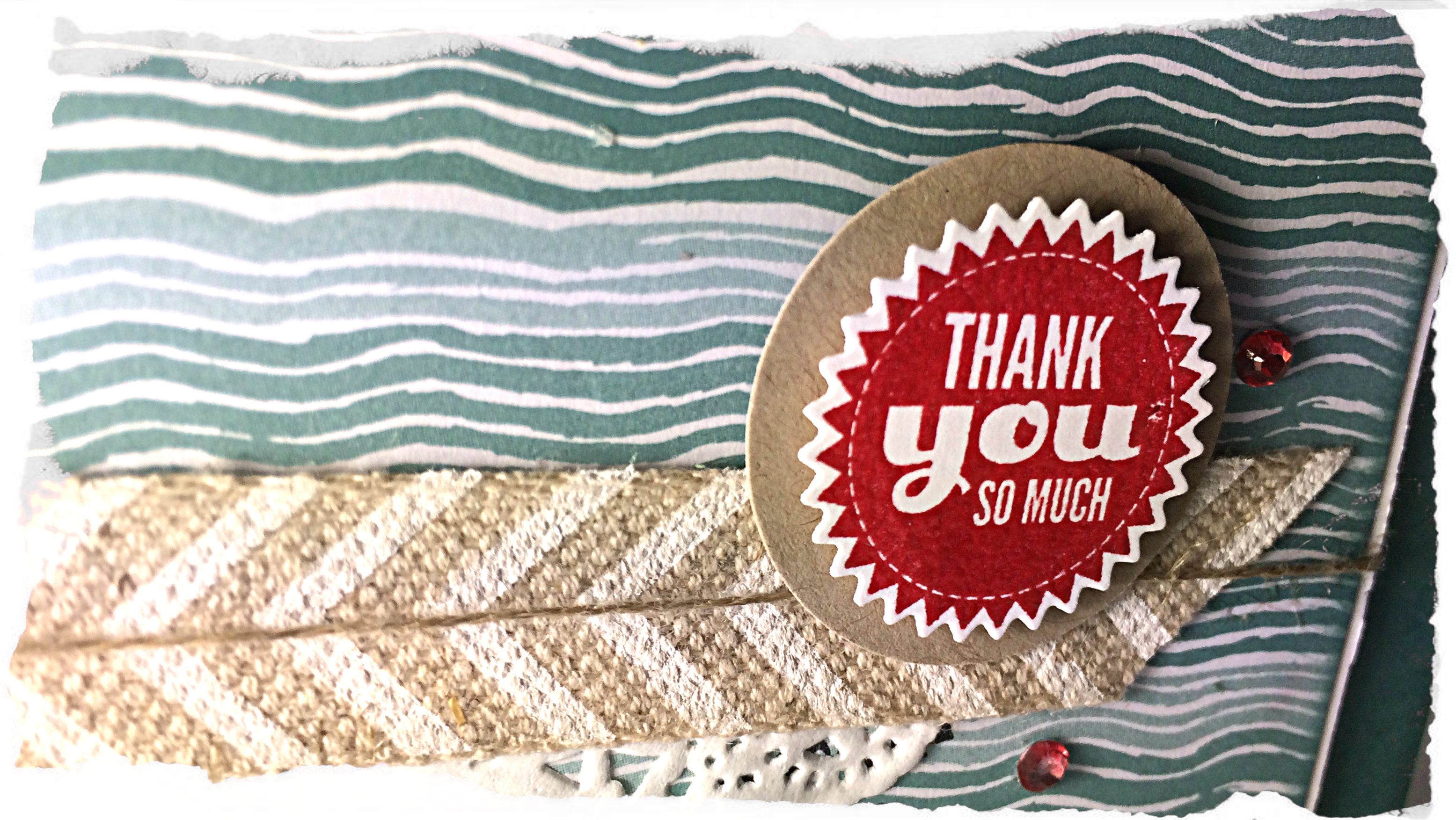
Posts by Amy Jasper:

Starburst Thank You

40header

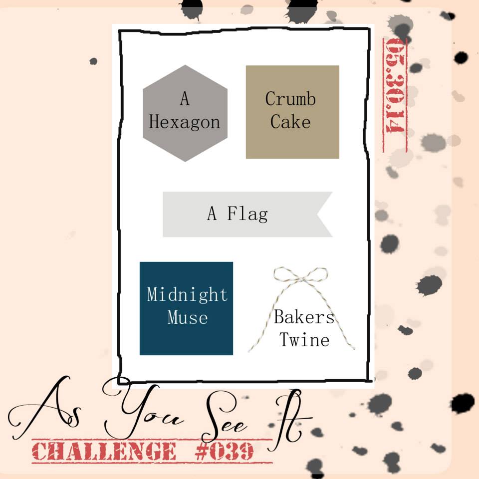
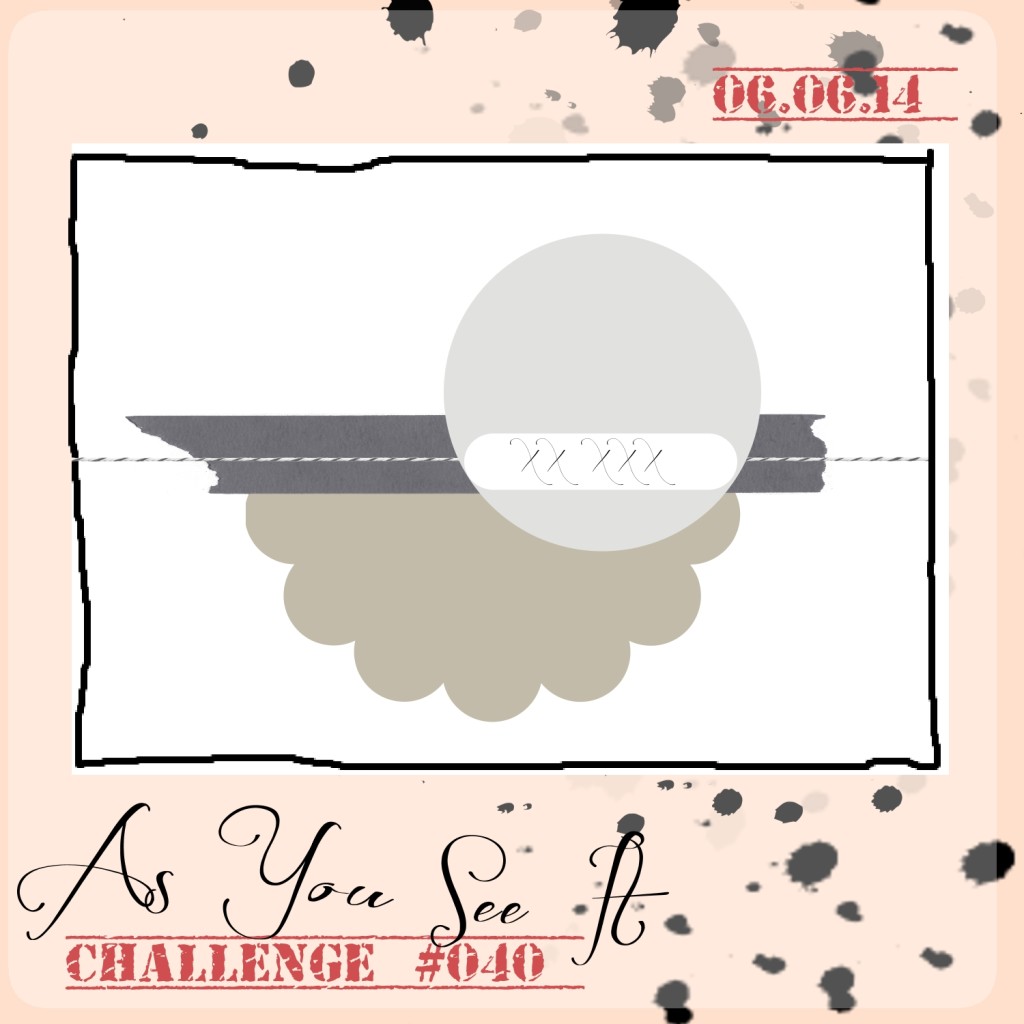
Welcome to my blog where I share my love of designing using Stampin’ Up paper, ink, stamps and tools! It’s yet another Friday and time for As You See It Challenge #40!


AYSIChallenge040

I was playing around with new 2014-16 In Colours and used the lovely and serene Lost Lagoon cardstock for this thank you card. You can also see that I used the new Moonlight Designer Series Paper, too!


40Amy


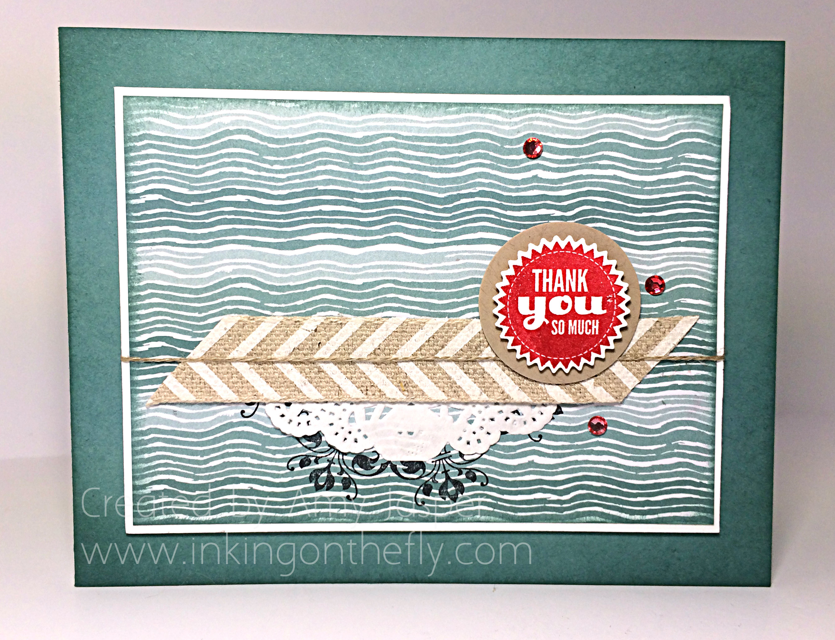
The only thing I would do differently on this card is to remove the Daydream Medallion image that I stamped below the Paper Doily. It was too small in diameter to frame the doily properly and I just think it doesn’t fit well for the overall layout. What do you think?

I also used the Starburst Sayings for the sentiment, which I stamped in Real Red ink, then used clear embossing powder while the red ink was still wet to give it some shine and pop. If you aren’t quick enough, then you can also do this by inking your stamp with Versamark ink first, then inking it with your colour AS WELL before stamping your image. The Versamark slows the drying of the ink and gives you more time to apply and heat set your clear embossing powder. Works like a charm every time!

The ribbon is the gorgeous Natural Chevron ribbon. One side is patterned while the other is just plain, so you almost have two different ribbons in one 🙂

Now those lovely red rhinestones… are they non-SU product!! NOPE! These beauties are Stampin’ Up’s Basic Rhinestones coloured with the new Blendability Cherry Cobbler marker! Colour them, then let them sit for a little bit to set the colour, and VOILA, you have a coloured rhinestone to coordinate with your card! AMAZING!! I love the Blendabilities – so many uses for these new alcohol-based markers.

Do you think you would like to try this As You See It Challenge sketch? I think you would do a brilliant job of it and I would be thrilled to see your project linked to the As You See It Challenge site for us all to see your creative work.  So give it a try and load it to a public site so you can link it to the challenge blog and share it with us. I look forward to being inspired by your personal touch.

Don’t forget to reply to this post so you can have your name entered into the draw for my Stampin’ Up Product Care Package. All replies/comments on this new blogsite from my very first post to June 15th will be entered (only one entry per person per post, so no double dipping to try to get more entries, lol!)

So glad you stopped by! Now GET CREATIVE!!

Amy

Designer-Badge

Night of Navy Papillon

39header


Welcome to my blog where I share my love of designing with paper, ink and tools from Stampin’ Up! It’s another As You See It Challenge card today and it’s an Assortment Challenge!


#39


Sadly, the Midnight Muse cardstock fully retires on June 1st, so I chose to use Night of Navy as a replacement, though I loved Midnight Muse!

Here’s the card that I designed as a sample for the challenge this week.


39Amy


I used the Night of Navy for my card base, with a layer of Whisper White to mat the Crumb Cake Honeycomb embossed (there’s my hexagon!) cardstock. I sponged that Crumb Cake cardstock with a shadow of the Night of Navy ink. The sentiment “thinking of you” from the Four You stamp set is stamped in Night of Navy.  The “i’m so sorry” sentiment from the Teeny Tiny Wishes stamp set is also stamped using Night of Navy ink on the flags/tags. The edges of the flags are sponged with Night of Navy ink. Behind each butterfly image is a piece of Whisper White cardstock with a stamp from the Label Love stamp set that was stamped in Night of Navy ink and punched out with the coordinating Artisan Label punch, then sponged lightly with Night of Navy ink around the edges.

I wanted to use the Coastal Cabana baker’s twine (from my Sale-a-bration supply) for some additional pop of interest and I’m pleased to be able to say that it is in the new catalogue! Yay for coloured twine! I find that twine is just a bit more versatile than ribbon. It can add colour and a linear focus without drawing your eye too much away from other areas of your project.

The Baker’s Twine is balanced by the colour in the butterflies and the flag. I stamped the butterflies from the Papillon Potpourri on Coastal Cabana cardstock with Night of Navy ink, then punched them out with my large Butterfly Punch and sponged Night of Navy ink around the edges. I love them!! They are such a rich and gorgeous two-tone blue. Quite a bit like this tropical Blue Morpho (aka Emperor) butterfly:

800px-Papillon_Bleu_-_Blue_Butterfly_(5861969172)

Image from Wikimedia Commons

A few quick facts that I learned about this beautiful insect when I was looking for a photo to show you:

  • The underside of its wings are brown with eye spots – also beautiful, but less striking compared to the blue on top
  • wing span is from 3″ to 8″ wide! (not the biggest butterfly, though, which has a wingspan of over 12″)
Image from Wikimedia Commons

Image from Wikimedia Commons


A beautiful creature to get a little side-tracked on, lol!

Back to the challenge!! I hope you’ll give this challenge a try. It’s a different stretch to incorporate all of the elements for this assortment challenge, but you will have fun with it, I’m sure! So, make a project, upload it to a site where it can be viewed by anyone (your blog or Pinterest, or other publicly accessed sites), then link it up to Challenge #39 on the As You See It Challenge blog and show us your creative mojo.

“Pardon me, Miss, but I’m afraid your creative mojo is showing”

Don’t forget to leave a reply to this post have your name entered into a draw for a Stampin’ Up Care Package!

Yay, free stuff!!

Signature-Amy


Designer-Badge


So Very Happy Birthday – As You See It Challenge #38

038header

Welcome to my blog where I share my love of designing with Stampin’ Up tools, inks, and stamps! It’s time for another As You See It Challenge!

#38

When I think of a collage, I automatically go to my elementary school days when we cut out images from a magazine and glued them all together in overlapping layers onto a sheet of poster paper.  That’s definitely a collage.  But you can basically think of a collage as a collection of images or elements layered onto a page. They can be organized or be randomly placed. They could be a collection of items that represent a theme, or items that simply coordinate well together. It’s a style of art which I feel like many cards and scrapbook pages already depict just by being layers of paper, embellishments and photos.

I decided to go with stamps for my collage elements. Stamps and ink are what I know best. I think it would be really fun to play around with this theme more and see what else I could make into a collage … maybe a collage of butterflies! Hmmm, YES! The creative mojo is flowin’!! I’ll leave that for another day perhaps, lol!

038Amy

This card makes me happy. It shows off the So Very Happy stamp set that we received from Stampin’ Up at the Leadership Conference in Houston, Tx. They like to spoil us! This set will be available on June 1st withe the launch of the new catalogue.

Layers of Pumpkin Pie, Daffodil Delight, Melon Mambo, and Cool Caribbean ink were sponged for the background, then layers of stamps in those same colours were placed over the ink. I added the Flowering Flourishes image over top in Jet Black Stazon (I didn’t stamp it very evenly, so I coloured over it with my Basic Black Stampin’ Up marker). I used the Window framelit to cut the large label shape, then the Festive Paper Piercing template came into play to help me paper pierce all around the edges of the label. Faux stitching with my White Gel pen completed the look that I wanted!

038close

Over the colourful layers of ink was added a punched out flower (Blossom Punch) in Basic Black cardstock. Then I was able to play with my Blendability markers (available to you on June 1st) to colour the flower stamped from the So Very Happy stamp set and also punched out using the Blossom Punch. I used Cool Caribbean and Daffodil Delight to colour it, then added Dazzling Details to give it some glitter and fun!

I added Dimensionals under the coloured flower and the Window framelit to give the card a bit more pop and interest.

Of course, you can see that the card is square with layers of Basic Black and Cool Caribbean. I will use my Envelope Punch Board to make a custom envelope for this 4.5″ card.

So glad you stopped by to have a look today! Be sure to head on over to challenge #38 and link up your collage project to share your creativity and give us some inspiration over at the As You See It Challenge Blog!

Don’t forget that if you leave a reply here on my new blogsite, you will have your name entered into a draw for a Stampin’ Up care package provided by me! I will draw a winner on the evening of June 15th.

Signature-Amy