As You See It Challenge

Schmooshed Christmas

Haha!! I have no idea if “schmooshed” is a word or if I spelled it correctly, but that is what I call the technique that fellow Stampin’ Up! demonstrator, Tamara, shared with our team at our last meeting. Before I show you my card, here’s the colour inspiration from the As You See It Challenge Blog:
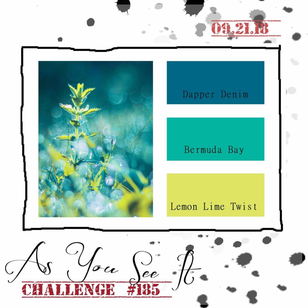
Aren’t these colours gorgeous!!

Dapper Denim is, of course, a recently retired colour, so I switched it out with Blueberry Bushel for my take on this colour inspiration.

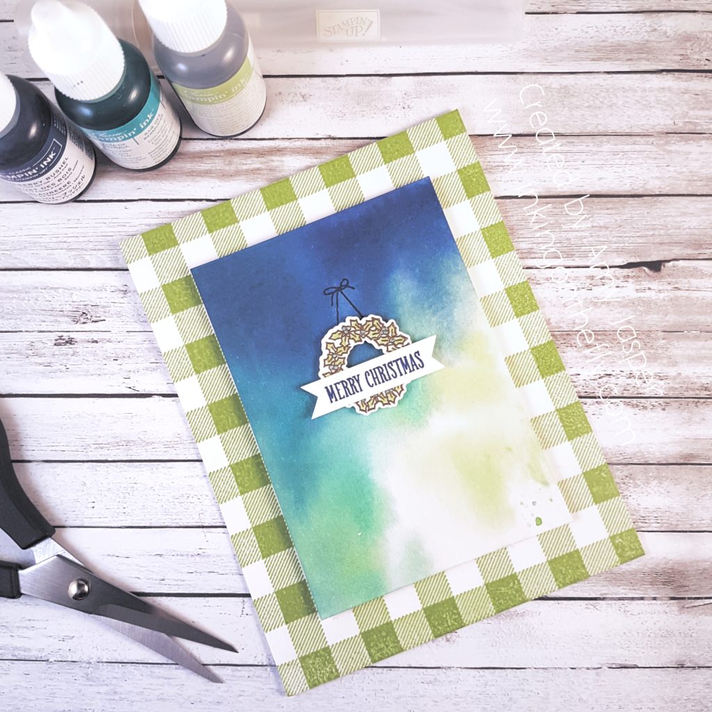
The “schmooshing” took place in a box with a piece of Window Sheet (acetate sheet), on which I dropped a couple drops of each of my re-inkers: Lemon Lime Twist, Bermuda Bay, and Blueberry Bushel. Water was heavily spritzed over the ink drops using the Stampin’ Spritzer until the ink spots blended out. Then the piece of Watercolor Paper was laid on top of the ink to absorb the colours.

There it is!

“Schmooshed!”
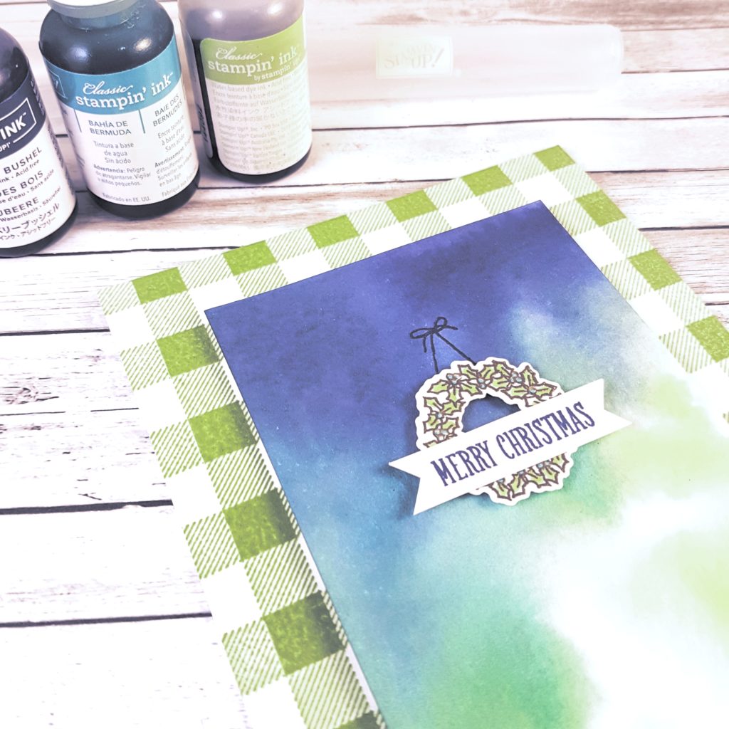
I used the Buffalo Check Background stamp with Lemon Lime Twist ink over the front of the Thick Whisper White card base (LOVE the Buffalo Check stamp!!). The schmooshed piece was attached with Stampin’ Dimensionals. On the card front, you can see that I used the At Home with You stamp set to create the little wreath and sentiment. The wreath was stamped with Versamark ink on Whisper White cardstock, then heat set with Gold Embossing Powder. I coloured in the leaves with Lemon Lime Twist marker and the berries with Bermuda Bay marker. The coordinating dies for the stamp set made it easy to cut out the wreath and attach it to the card with Stampin’ Dimensionals. The sentiment is stamped with Blueberry Bushel ink on a narrow strip of Whisper White cardstock, which I flagged the ends using my Paper Snips.

Easy Peasy Lemon Lime squeazy!
Birthday Squirrel

Though I’m excited to get back into routine after a wild summer, September is always a crazy time in my home. Every year, I seem to forget how stressful the start of school is for my kids (and therefore also for me!)

To add to the stress, my youngest daughter has her birthday right at the beginning of the month and we usually end up postponing her party so we can get invitations to her friends at school and give the parents time to settle into September a bit before having to jump in to the birthday scene! My card today is the design that she and I came up with for her party invitations.

As always, we started with the As You See It Challenge. The theme this time is “back to basics”.

I think Back to Basics with stamping means no fancy tools, just stamps, paper and ink! I remember when I first started stamping and what supplies I had. I didn’t have a Big Shot or dies. I didn’t even have any punches, yet! I stamped at the dining room table into the wee hours of the night while my new baby rocked in her swing and my toddler was asleep in his crib.

Ah. Good memories!

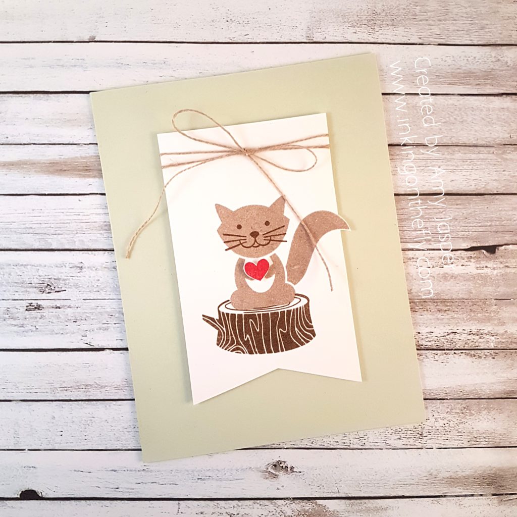
My 10 year old daughter loves the Foxy Friends stamp set. She requested the squirrel image and the wood stump for her invitations. I stamped the squirrel with Crumb Cake ink and his little face was stamped with Soft Suede ink. I then created a mask using a sticky note so that I could stamp the stump to make it appear as though the squirrel is on the stump. To do that, I stamped the squirrel image on the sticky note and trimmed around the image. Then I placed it precisely over my good squirrel image. With the sticky note in place, I used Soft Suede ink to stamp the stump image to overlap the bottom of the squirrel image. Then I removed the sticky note mask and VOILA!, I had  a squirrel sitting on a stump!

Just for fun, I decided to trim down the paper around the squirrel. I used my Stampin’ Up paper trimmer as far as it could go without cutting off the tip of my squirrel’s tail, then I fussy cut around it.

Linen thread is tied in a lovely bow around the top of the Whisper White banner. The banner bottom was hand trimmed with my Paper Snips. The little heart was stamped with Real Red ink and hand cut before placing it in the little squirrel’s hands (paws) with a piece of a Stampin’ Dimensional. The banner was then attached to the Soft Sea Foam card base with more Stampin’ Dimensionals.

Here’s the inside of the invitations. Of course, I still need to add the when and where for the party, but at least we are a few steps closer to getting these invitations to her friends next week.

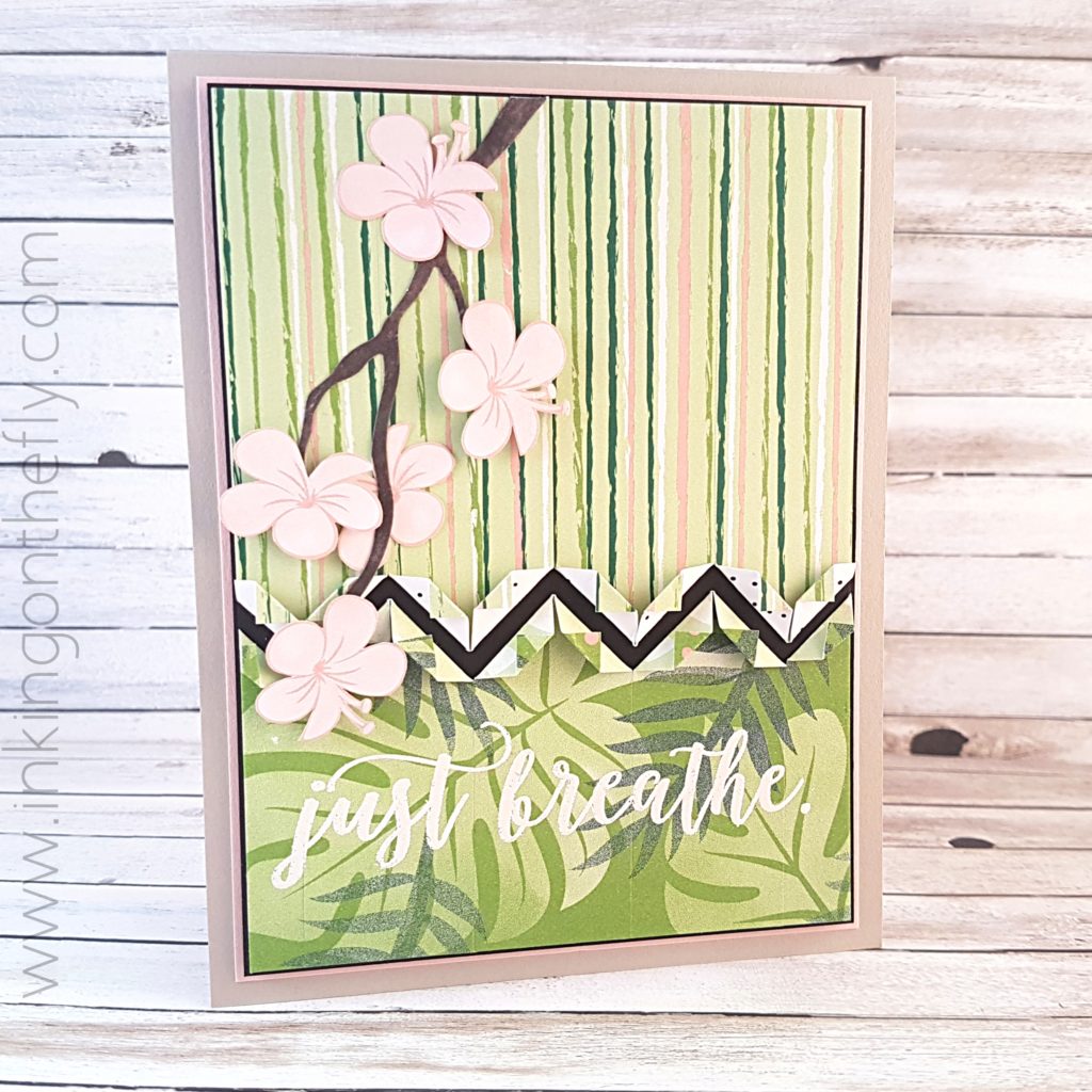
Just Breathe

I had a consultation today to see if I am a good candidate for laser eye corrective surgery. My pupils were still dilated after my exam while I finished up this card design, took my photos, edited them and as I write this even now. I wonder if I’ll look at this tomorrow when my blurred vision and light sensitivity has gone and be horrified at my completed work.

Haha!! I hope not!

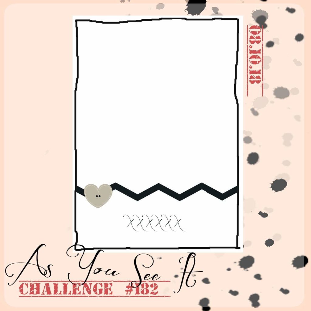
Here’s the sketch for challenge #182 on the As You See It Challenge blog:

The zig-zag makes me think of Charlie Brown from the Peanuts cartoon, but I didn’t take my design in that direction … maybe someone else will run with that idea.

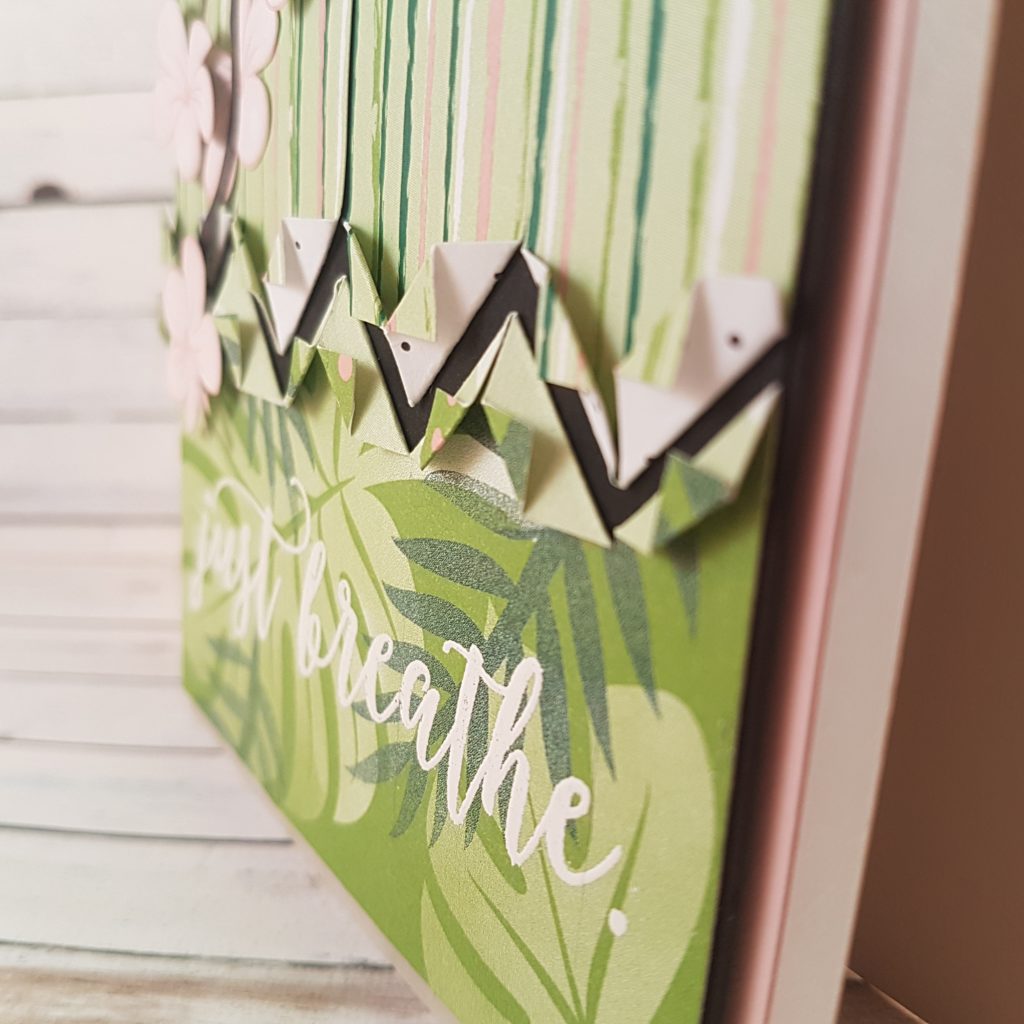
I wanted to try to create that cool zig-zag pattern, though. I decided to try cutting 1″ wide strips and folding the ends into points, then adhering them to the card while still maintaining the pattern. That way, they don’t look like strips, but look like a funky-edged single sheet of patterned paper. I imagine it was like putting up wall paper, but a LOT easier!

After folding and adhering the strips of the Tropical Escape Designer Series Paper from Stampin’ Up! to a piece of Basic Black cardstock, I heat embossed the sentiment with White Embossing Powder. Then I added the branch, die cut with the Seasonal Layers Thinlits from Wood Textures Designer Series Paper. The flowers are fussy cut from the same Tropical Escape paper and attached to the card with Stampin’ Dimensionals or Multipurpose Liquid Glue. A little touch ot Wink of Stella on the flowers adds a little somethin’ somethin’.

The fussy cutting was definitely worth it!

The final step was to matte the layers over Basic Black cardstock, Powder Pink Cardstock and the Sahara Sand cardstock base. Popping the Basic Black layer up with Stampin’ Dimensionals further adds to the dynamic look of this design.

Be sure to try this sketch challenge for yourself and load it up to the As You See It Challenge blog to share with us. We would be thrilled to have you play along!