Love and Fishes
As You See It Challenge has made it easy and fun for us this time!
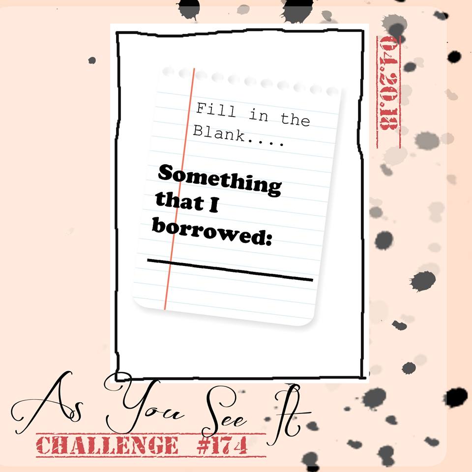 See! How fun is that!!? It’s a great excuse to call up a friend and borrow something that you’ve been coveting in their craft room, lol!
In my case, I was super excited to try out the Jars of Love Stamp Set and their coordinating framelits, Everyday Jars.
 I played around with the jar image on Window sheets for a while, trying some different things with the Blends Markers. Not a lot was working out as planned, so I ended up inking up my jar image with Versamark ink, then inked again with Momento Tuxedo Black ink before stamping on my Window Sheet. Knowing that Stampin’ Up is retiring the current Archival Black ink, I wanted to try the Momento, but then use clear embossing powder over it and heat setting it (very carefully, so I didn’t melt the acetate). It ended up not being very black AND looked a little bit like glass – which sort of worked out.
Once I got my jar image on the Window Sheet, I coloured the back side of the sheet with my Pool Party Blends Marker. Then I cut out multiple jar pieces (4, I think) with the cut out in the center of each jar, so that I could layer them on top of each other, creating a shaker frame with the Window Sheet layer on top and a solid jar on the bottom where I also stamped my li’l fishy in Pumpkin Pie ink.
 Before sealing the shaker frame closed, I added the little Bermuda Bay and Pool Party die cut hearts in the jar. I love that the framelits were designed so you could die cut multiple hears all at once. So smart!
The lid of the jar is stamped in Smoky Slate ink and also die cut before adhering to the top of the jar. I then added the Solid Basic Black Baker’s Twine around the jar and the Corregated Elements tag with another heart on it, this one cut from Flirty Flamingo cardstock.
 The rest of this card is simple layering. The card base is Thick Whisper White, then there is a super thin mat of Crushed Curry cardstock behind a layer of Whisper White. Then there is a thin matt layer of Pool Party cardstock behind another layer of Whisper White. Over that is a wide strip of Wood Textures Designer Series Paper and a super thin strip of Basic Black cardstock. I had a piece of Bermuda Bay cardstock that was already die cut with the large Stitched Shapes Framelit square, so I cut that at a diagonal and layered it over the Wood Texture DSP.
Finally, the completed jar was attached to the card front and the BEST FISHES sentiment was stamped with Momento Tuxedo Black ink.
C’est fini!!
