Techniques

New Year’s Resolutions

I know, I know, nobody really takes New Year’s Resolutions seriously these days. The problem is that we are all gungho to make change and be better, but we often don’t have a plan to make those changes stick. I don’t have the answer for that problem. I can barely stick to a plan in a day, let alone stick to one for a year! I keep trying to find that thing that will turn on the part of my brain that gives me discipline and perseverance. I’ll let you know if I ever do.

In the meantime, I feel like we have to keep trying. Where would we be if we just stopped trying to be better. Nobody would invent things, nobody would make new discoveries, and we probably wouldn’t have any stamps!!! It would be disaster!

I don’t have any official New Year’s Resolutions, but I do know that I will continue to push to be healthy, to be more organised, to spend less time on the internet and more time with my kids, to declutter my house, and to share more of my love of stamping. There are a lot of things that I am always working on. I don’t know that I want to focus on just one thing. And it certainly doesn’t have to be decided for my whole year.
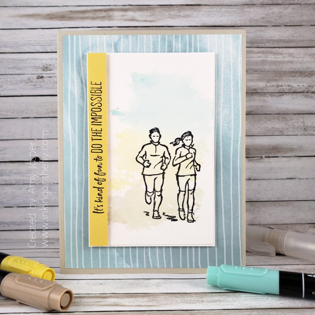
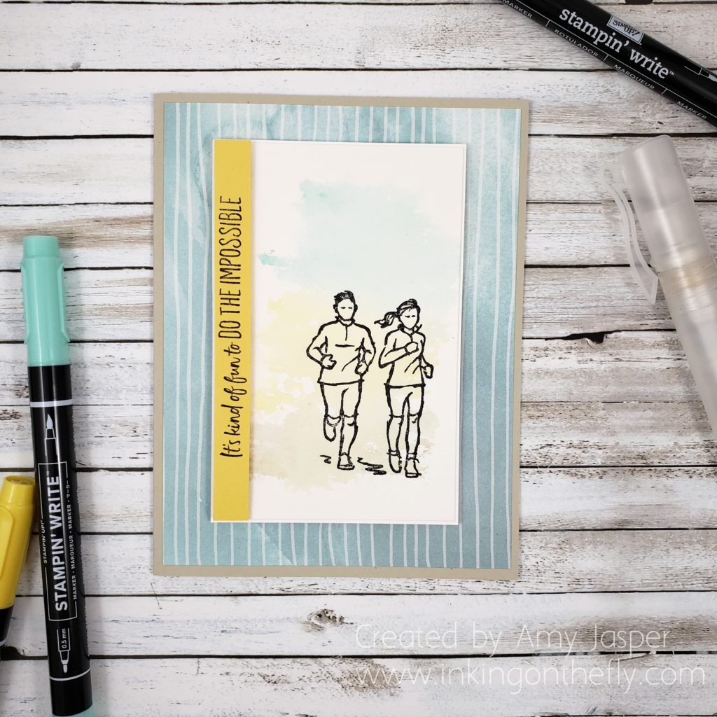
Being healthy is important to me and that’s why I’m drawn to the Do the Impossible stamp set in the new catalogue. I also have some athletes in my life that I can make cards for, using this stamp set.

If you were on my blog yesterday, you would have seen this set altered for a card I designed to give to my niece. That card was pretty involved and shows how making your own cards allows you to personalize it to the recipient. I wanted to show you another design with the same stamp that you can easily replicate. (Because not everyone wants to lay down all that extra ink or even knows what cross-country skiing is!)

The fanciest part of this card is the colour wash background behind the joggers. If you want to see that technique in a Facebook Live video by clicking HERE.

If you don’t want to get caught in the Facebook vortex, the technique involves applying ink with Stampin’ Write Markers to an acrylic block, spritzing it with water using your Stampin’ Spritzer, then “stamping” that colour onto your watercolour paper with the block as your stamp. You might need to blot off some excess water to take control of the look you’re going for, then let the colour wash fully dry before carrying on with the rest of your card.

The rest is simple stamping. Here’s the supply list: Sahara Sand cardstock, Peaceful Poppies Designer Series Paper, Whisper White cardstock, Watercolor Paper, Daffodil Delight Stampin’ Write Marker, Crumb Cake Stampin’ Write Marker, Coastal Cabana Stampin’ Write Marker, Stampin’ Spritzer, Clear Block E, Daffodil Delight cardstock, Jet Black Stazon Ink, Do the Impossible stamp set, Black Stampin’ Mini Dimensionals.
Do you have a New Year’s Resolution? I hope it involves stamping. You know that if you’re in Canada, you can order all you stamping and paper crafting supplies from my Online Store, right!? And that there’s a bunch of new products AND it’s time for Sale-a-bration when you get free stuff just by purchasing stuff that you were already going to get anyway!! How awesome is that!! Go to my ONLINE STORE and have a look!
Moose Birthday

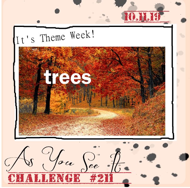
Another challenge card for you today, inspired by the As You See It Challenge Blog.

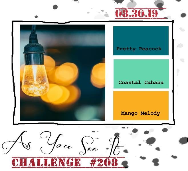
Here’s the theme challenge:

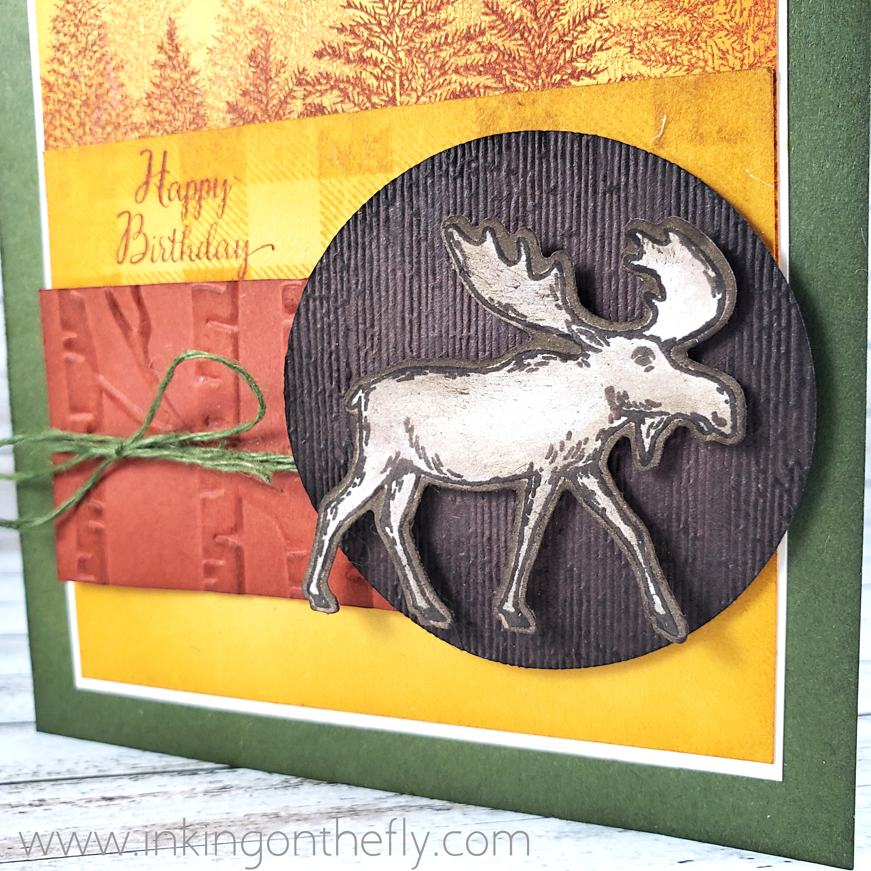
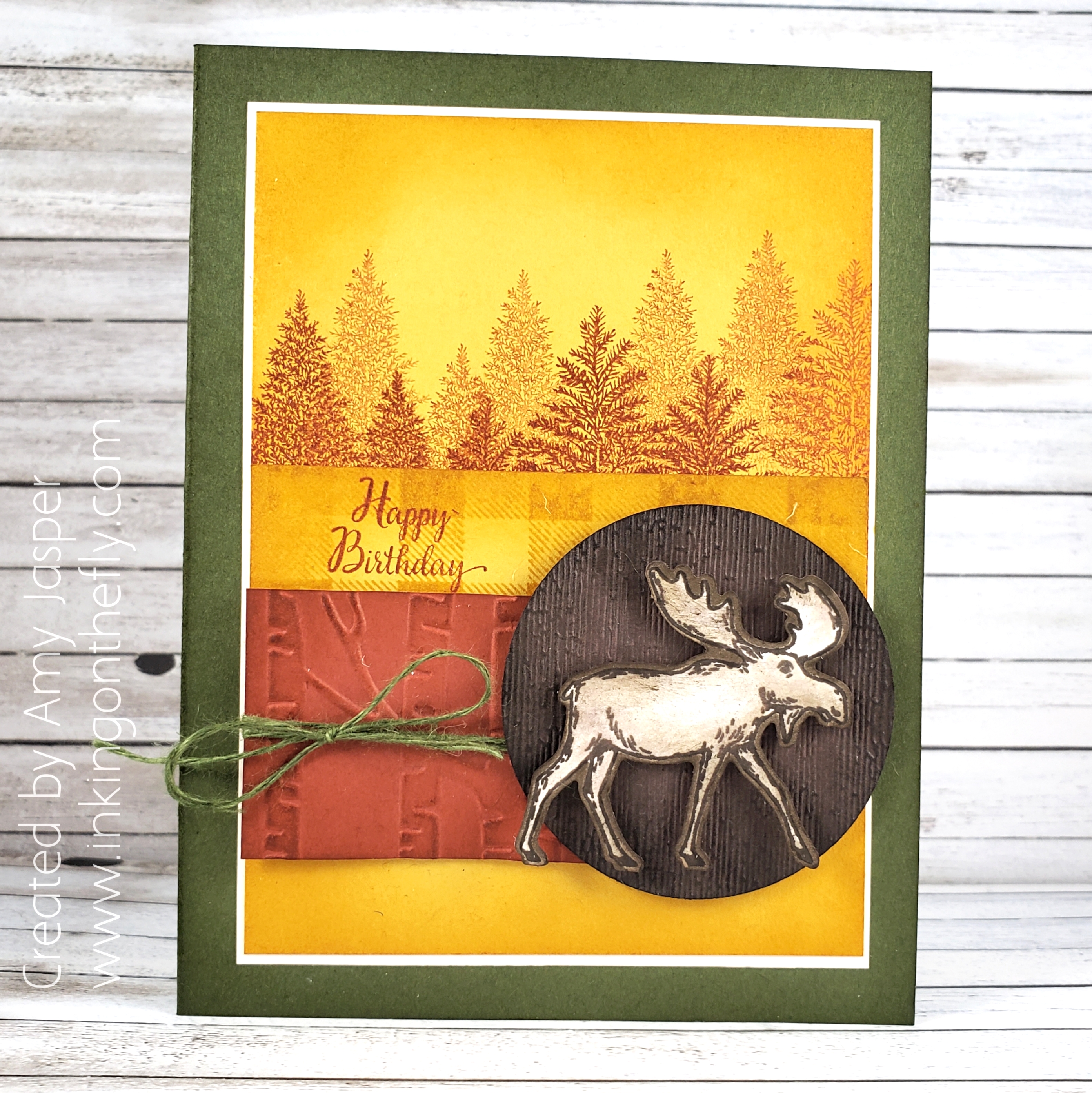
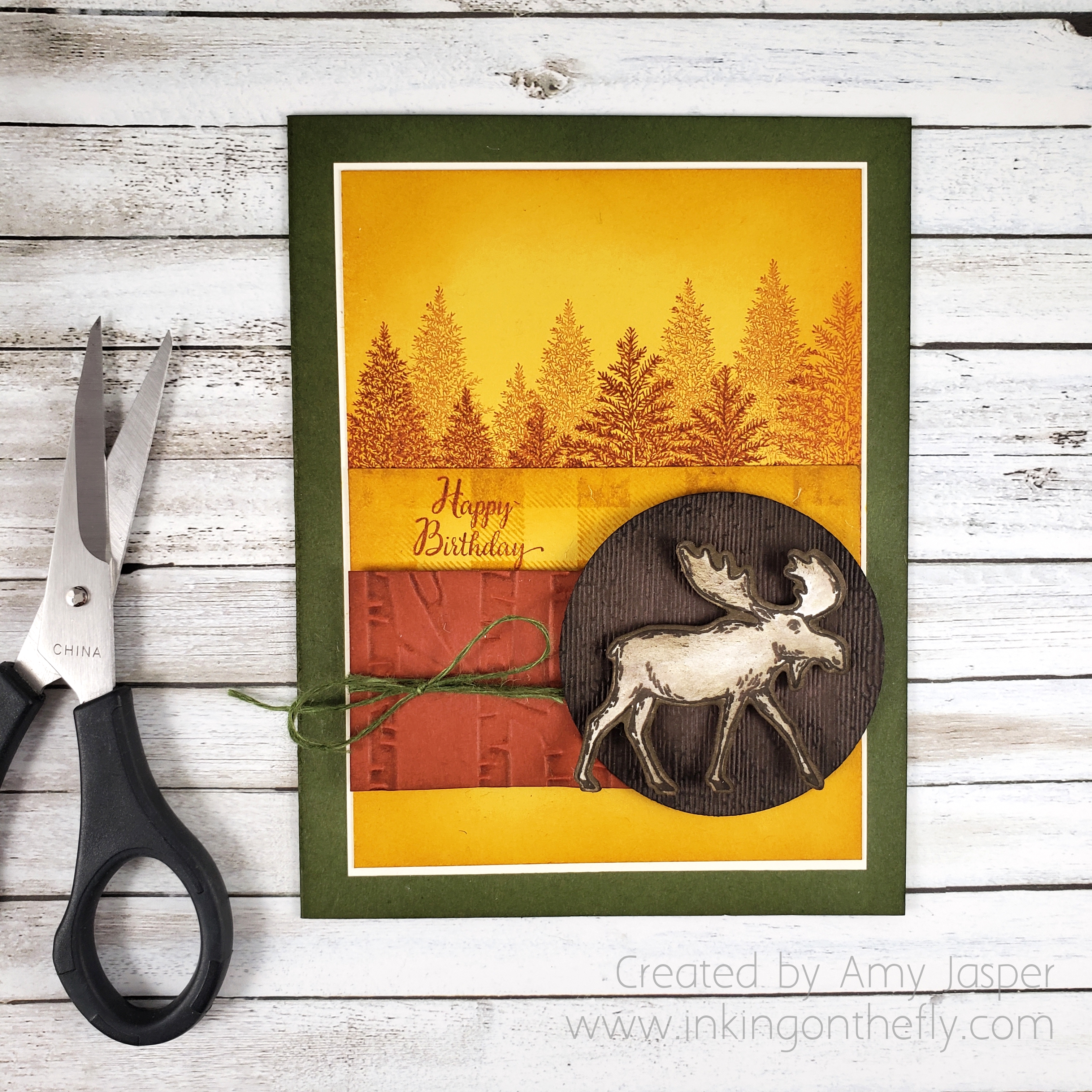
I decided to take the tree theme and go with the autumn colours, using my beloved Merry Moose stamp set from Stampin’ Up!

I love moose! How many other creatures do you know of that are so majestic and awkward-looking at the same time!

The card base is Mossy Meadow. I deepened the colour by sponging Mossy Meadow ink around the edges of the card base. In fact, I was a happy little sponger and did that with all of the paper pieces on this card (excluding the Very Vanilla matte, which I left clean. Each piece has the edges sponged with the coordinating ink.

The Crushed Curry background layer has multiple trees from the Merry Moose stamp set, stamped with Cajun Craze ink. Some are stamped full strength and some are stamped off to create some depth to the scene. I also added a strip of Crushed Curry cardstock, which was stamped with the Buffalo Check background stamp from Stampin’ Up!. For that I used Crushed Curry ink for a tone on tone effect. The Happy Birthday sentiment is from the Stampin’ Up! host stamp set, New Wonders, and is stamped with Cajun Craze ink.

You can also see that I used the Woodland Embossing Folder on the Cajun Craze strip of cardstock and the Subtles Embossing Folder on the circle, which was punched from Early Espresso paper with the 2-1/4″ circle punch.

My moose was stamped with Early Espresso ink on Whisper White cardstock. I used my Blender Pen to drag some of the ink from the lines of the image and shade my moose. I also coloured around the outside of my moose after I punched him out (ooh, that sounds so violent!) with the coordinating Moose Punch. I don’t like leaving a white edge around a cut image very often and choose to coordinate it with whatever the colour is behind it. A bit of sponging was added to the edges of my moose in Soft Suede ink to add a little bit more shading.

The Mossy Meadow linen thread was tied around the Cajun Craze piece of cardstock before adhering it and the Early Espresso circle to my card front with Stampin’ Dimensionals. The moose is also on dimensionals.

As always, you can purchase any of the stamping supplies that I use on my blog. Just click on the SHOP button in the sidebar or in the menu at the top of the page. Not in Canada? No problem. There are Stampin’ Up! Demonstrators all over the world.

Why not give the theme challenge a try? If you do, be sure to upload it to the As You See It Challenge blog and show us your take on the theme!

Rooted Heirloom

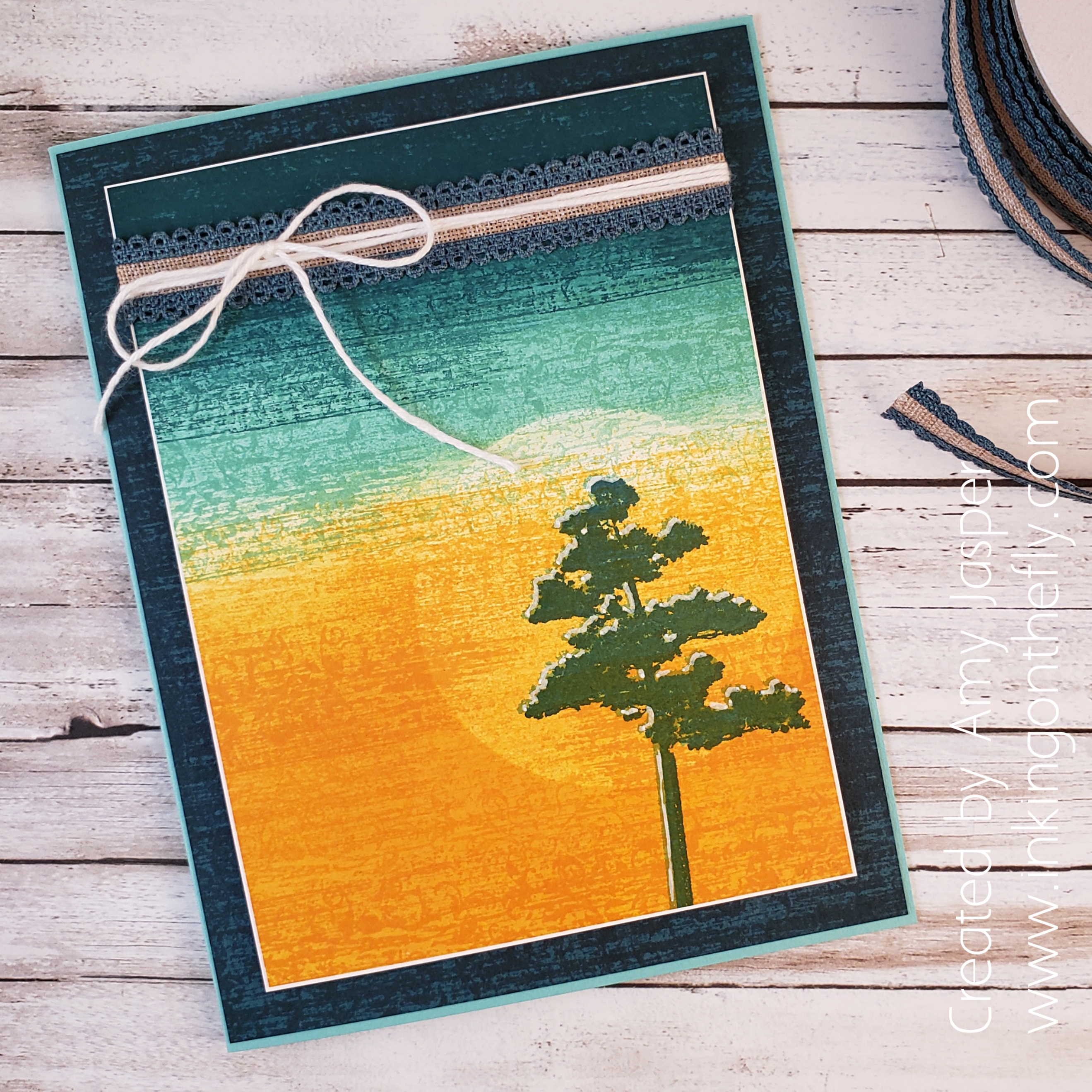
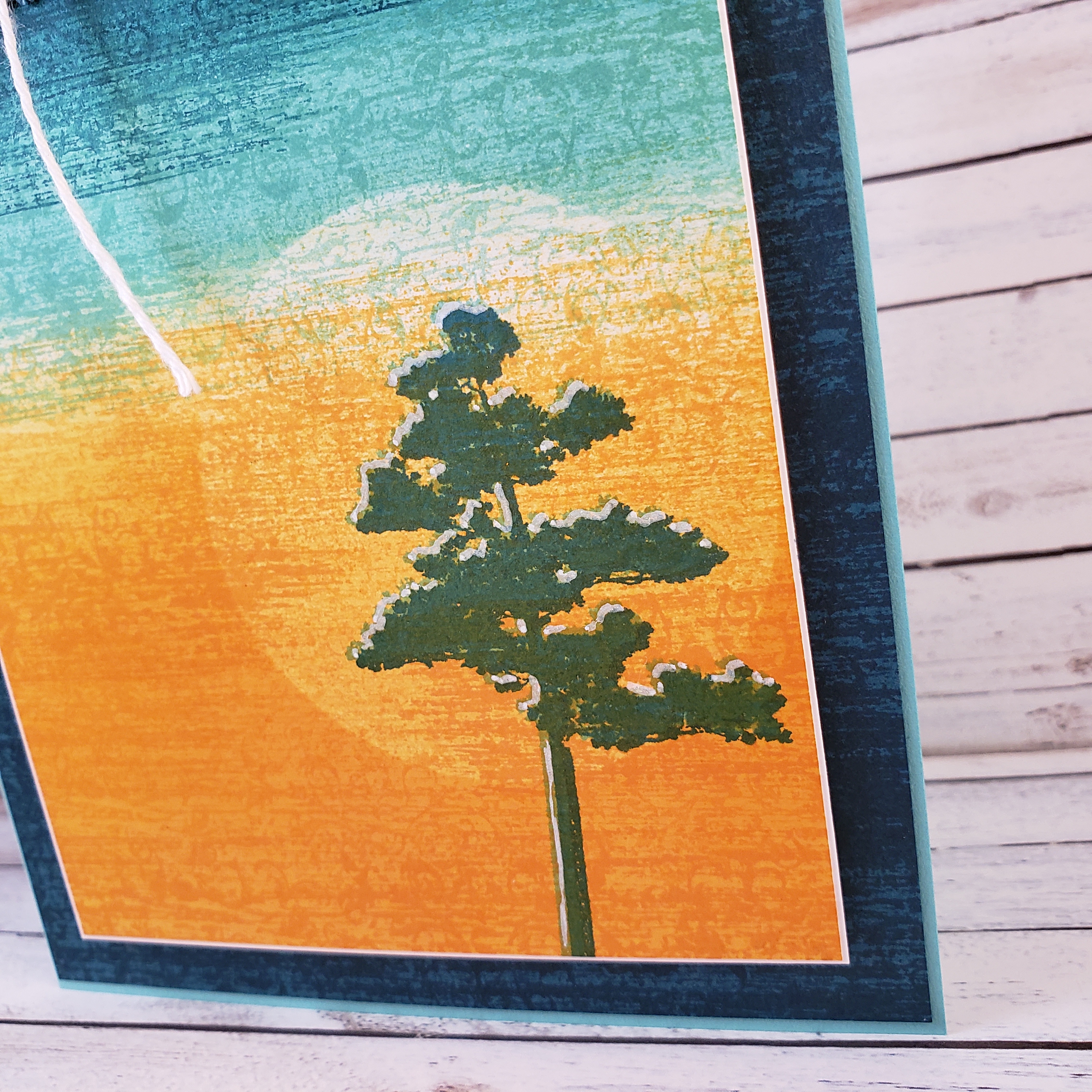
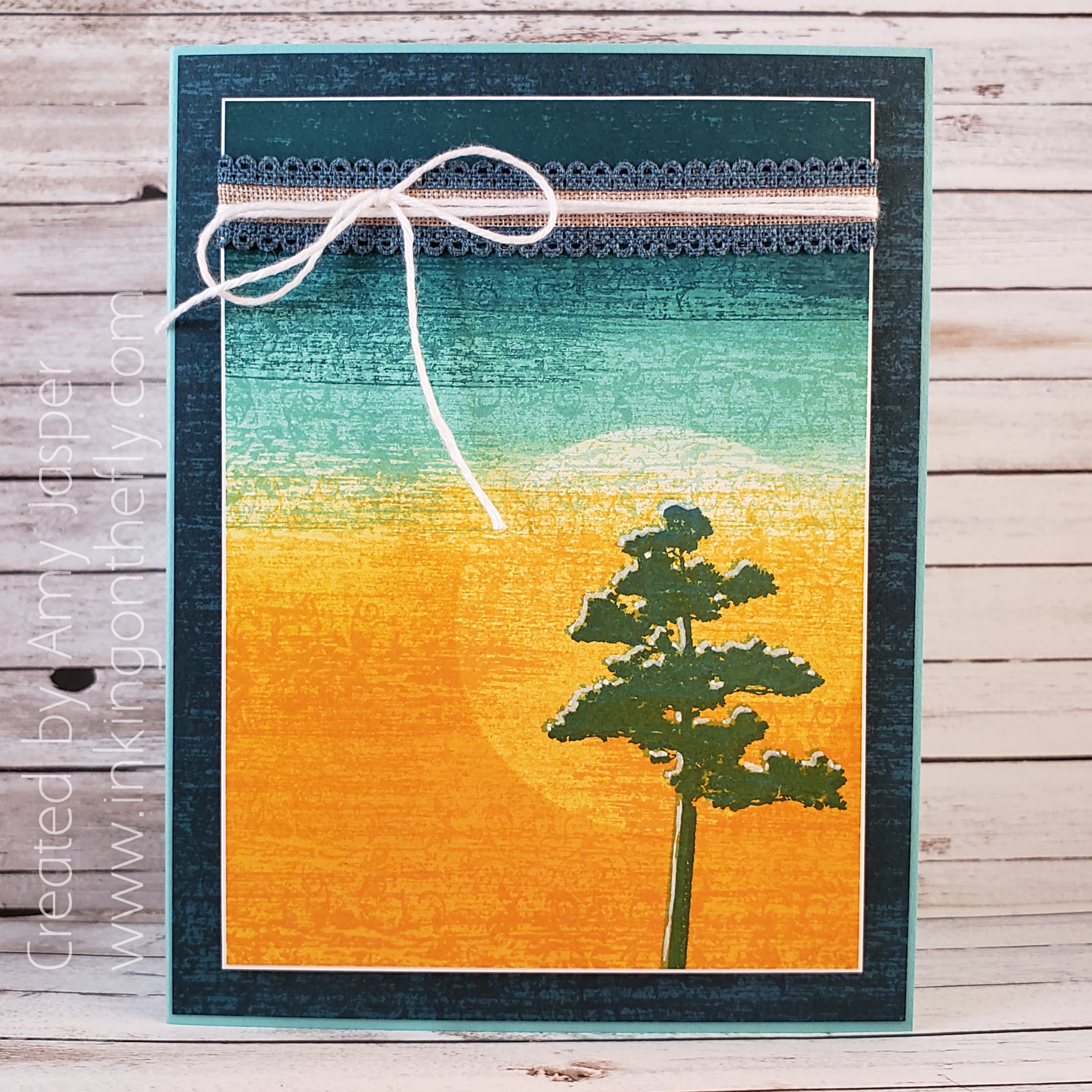
My card today features the Rooted in Nature stamp set and the Woven Heirlooms stamp set by Stampin’ Up! Check out the gorgeous texture created by sponging and stamping!

Here’s the inspirational colour challenge from the As You See It Challenge Blog.

I love this image of warm light and the out of focus background of contrasting colour that creates a bokeh effect. It makes me want to know what else is in the room and who is enjoying that atmosphere. Is it an outdoor wedding? or is it on the front porch of a rustic cabin that overlooks the lake? or maybe it’s in a Greek taverna, and we are looking out at the lamp-lit, stone-paved streets through the large open doorways. I can hear the bouzouki music, the subtle clinking of dishes, and the murmur of intimate table conversations. Wherever it is. I think I’d like to be there. How about you?

My first instinct with this colour scheme was to play with sponging and blending. This had me pulling out my Sponge Brayers from Stampin’ Up!. Here’s my take on this colour challenge.

I tried to find a sentiment to add once all of my sponging and rolling and stamping was done, but nothing seemed to fit without taking away the balance of the overall card design. This one will have to say it all on the inside with my personal note instead.

My first step was to take a piece of Whisper White cardstock and roll Mango Melody ink across the bottom half with my Sponge Brayer. Then I placed a circle piece of Post-It Note that I had punched out using the 2-1/4″ Circle Punch from Stampin’ Up! where I wanted the sun to be. Then more rolling. I added more Mango Melody, then switched to a clean brayer sponge and rolled on some Coastal Cabana, then some Pretty Peacock ink. I removed the Post-It Note and added a bit more Coastal Cabana and Mango Melody until my sun didn’t feel so harsh.

Next, I stamped the tree image from the Rooted in Nature stamp set from Stampin’ Up! using Coastal Cabana ink (it’s in there, I promise). To stamp the image, I used my Stamparatus because I wanted to reposition the paper after stamping and stamp it again with Pretty Peacock ink so that the top of the tree would have a sort of highlight as though the sun was brightening the other side of the tree. It worked, but I added something else at the end. Keep reading!

Once my tree image was in place, I was mostly happy with my artwork, but it was missing something. It was so smooth and … a bit too perfect. I decided to add some texture using the largest stamp image in the Woven Heirlooms stamp set. This I added over the entire paper, being sure to use Mango Melody over the Mango Melody, Coastal Cabana over the Coastal Cabana, and the … well, you get the idea. I stamped like this multiple times until the texture you see came to existence. You can see that I also used this technique on the Pretty Peacock layer of cardstock in the bactkground. Such great texture and suddenly the image was interesting and alive. It makes me think there’s quiet air movement and a lot of heat where that tree lives!

The tree begged for more light, so I used my White Stampin’ Chalk Marker to add highlights between the Coastal Cabana tree and the Pretty Peacock tree images.

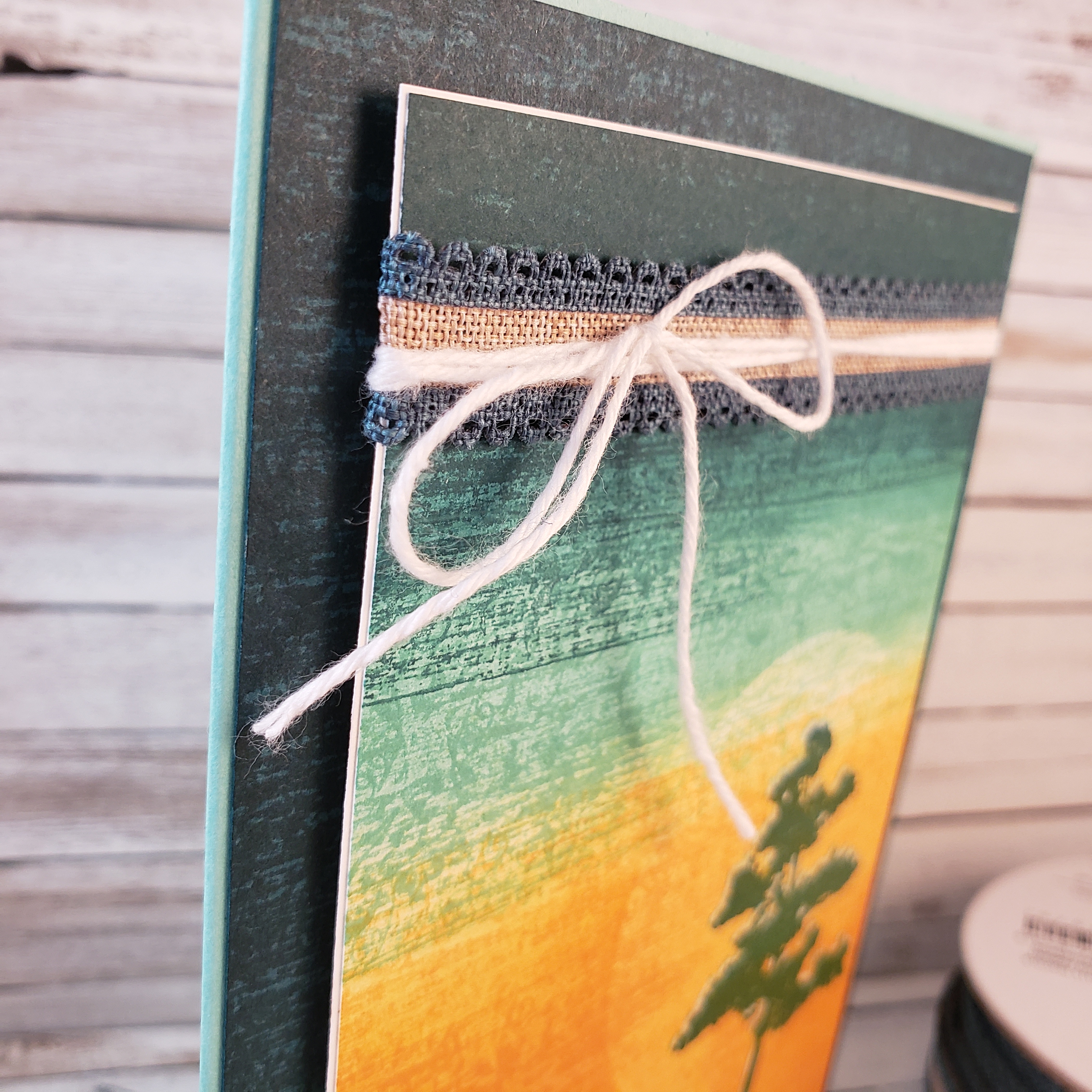
Once my art piece was complete, I knew that I wanted to add some embellishments. That’s where the Pretty Peacock Scalloped Linen Ribbon and the Whisper White Solid Baker’s Twine come in. First, I added a very narrow Whisper White matte layer to delicately frame my art, then I wrapped the linen ribbon around the card front, securing it on the back with Mini Glue Dots. The baker’s twine was wrapped around three times before finishing it with a bow.

Stampin’ Dimensionals hold those layers in place on the stamped Pretty Peacock layer. The card base is Coastal Cabana cardstock.

What would you do with these colours? What does the image inspire in your creative mind? Why not create something and share it with us at the As You See It Challenge Blog.

As always, if you are in Canada, you can order any of these products from me at my online store by clicking on the shop button on this page or the menu at the top of the page.