rooted in nature

Beautiful and Brave

When I watch superhero movies, I see how brave the heroes are – they’re confident in what they’re doing and there’s no hesitation when they step in the way of the evil villain to protect the innocent. How brave and strong they are and how I wish I could be like that – fearless, confident, smart, and full of purpose!

But that’s not actually the full picture of being brave, is it? To be brave is to have the ability to take action even when you’re afraid. You have to build up courage.

There are quite a few women in my life who I look up to for their courage to step out of their comfort zone and take on a new challenge! Often times, they don’t see it. They only see their own insecurities, doubts and fears. The interesting thing that we often forget about being brave is that it doesn’t mean “not being afraid”, it means being afraid – but doing it anyway.
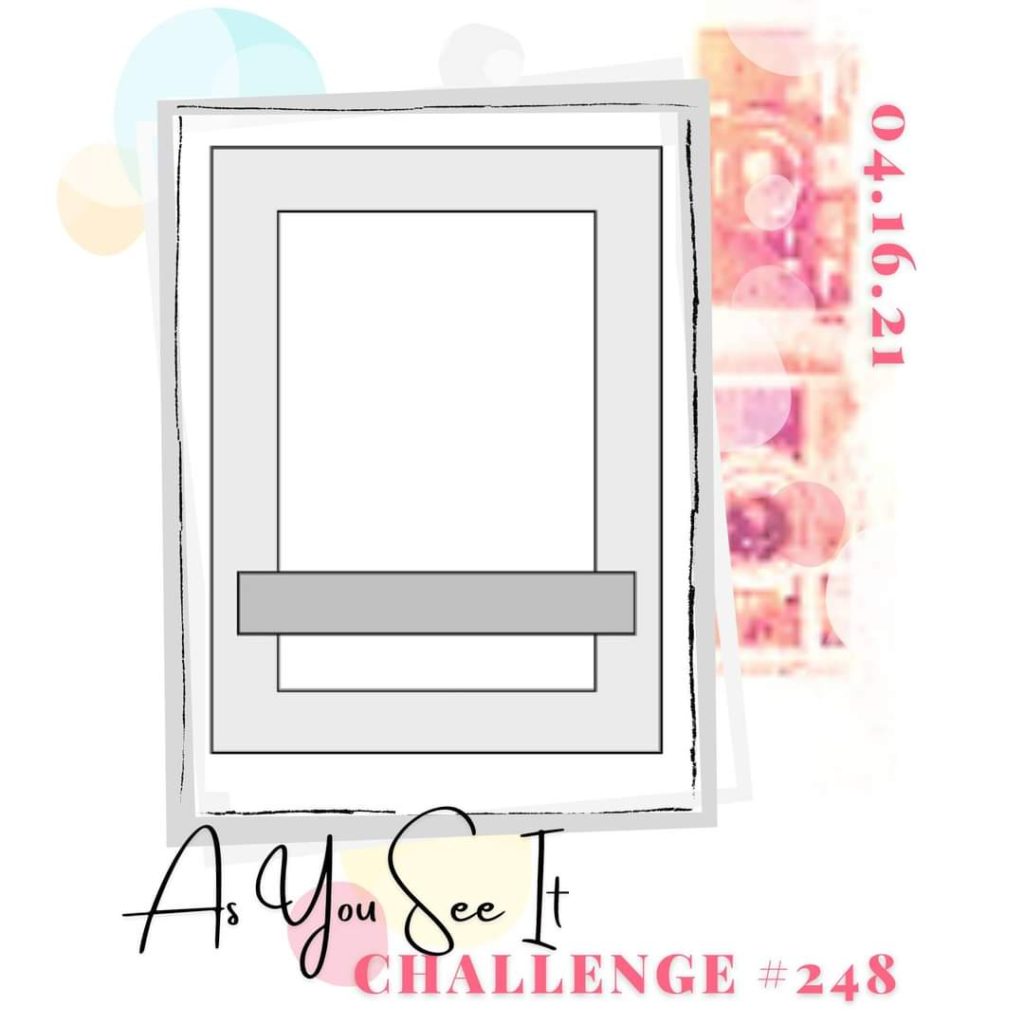
For the As You See It Challenge sketch today, I chose to use the sentiment from the retiring Strong and Beautiful stamp set from Stampin’ Up! and it has me thinking about the brave women in my life. They are an inspiration to me and help me to be a little bit braver by their example.
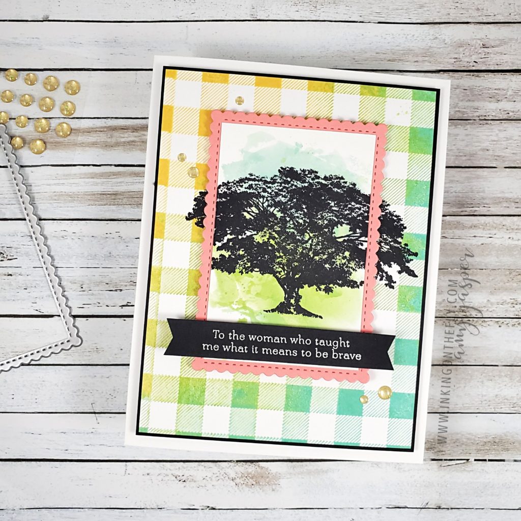
I’ve been doing a lot of die-cutting and paper layers lately and have been feeling like I’m neglecting my ink and stamps, so there’s some fancy inking tricks on this one!

I started by applying Daffodil Delight and Coastal Cabana ink to the Buffalo Check background stamp (retiring soon!). Then I used a piece of paper towel and blended the colours together and pulled off some ink to try to achieve a bit of a distressed look (it still stamped much nicer than I planned). I then added a bit of Granny Apple Green ink to the stamp where the yellow and blue met in the middle to blend the colours even more. With the large stamp facing rubber-side-up, I placed my Basic White cardstock on top of it and pressed evenly all over with my fingertips to transfer the ink to my paper.

I pulled out my Stamparatus stamp positioning tool and placed the checked piece there with a smaller piece of Basic White cardstock over top of it in the center, using the magnets to hold the papers in place. I used Jet Black Stazon Ink on the tree image from the retiring Rooted in Nature stamp set and stamped the image so it stamped on the smaller piece of paper and over the edges onto the larger checked piece. Using the Stamparatus allowed me to stamp it a couple times to get the best image. Good thing I did that, too, because my Stazon ink pad was a bit dry and stamped very poorly the first time! Good thing I had an ink refill on hand!
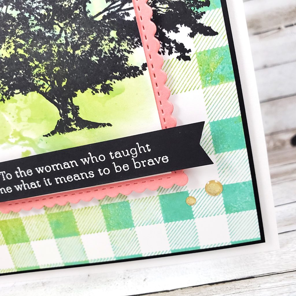
The black tree silhouette looked a bit stark on the small white piece of cardstock, so I grabbed a clear envelope and placed some ink directly from the ink pads of my Granny Apple Green and my Coastal Cabana. With my Stampin’ Spritzer filled with a water and rubbing alcohol solution, I spritzed the clear plastic, then flipped the plastic over and transferred the wet ink to my paper, creating the watercolour effect.
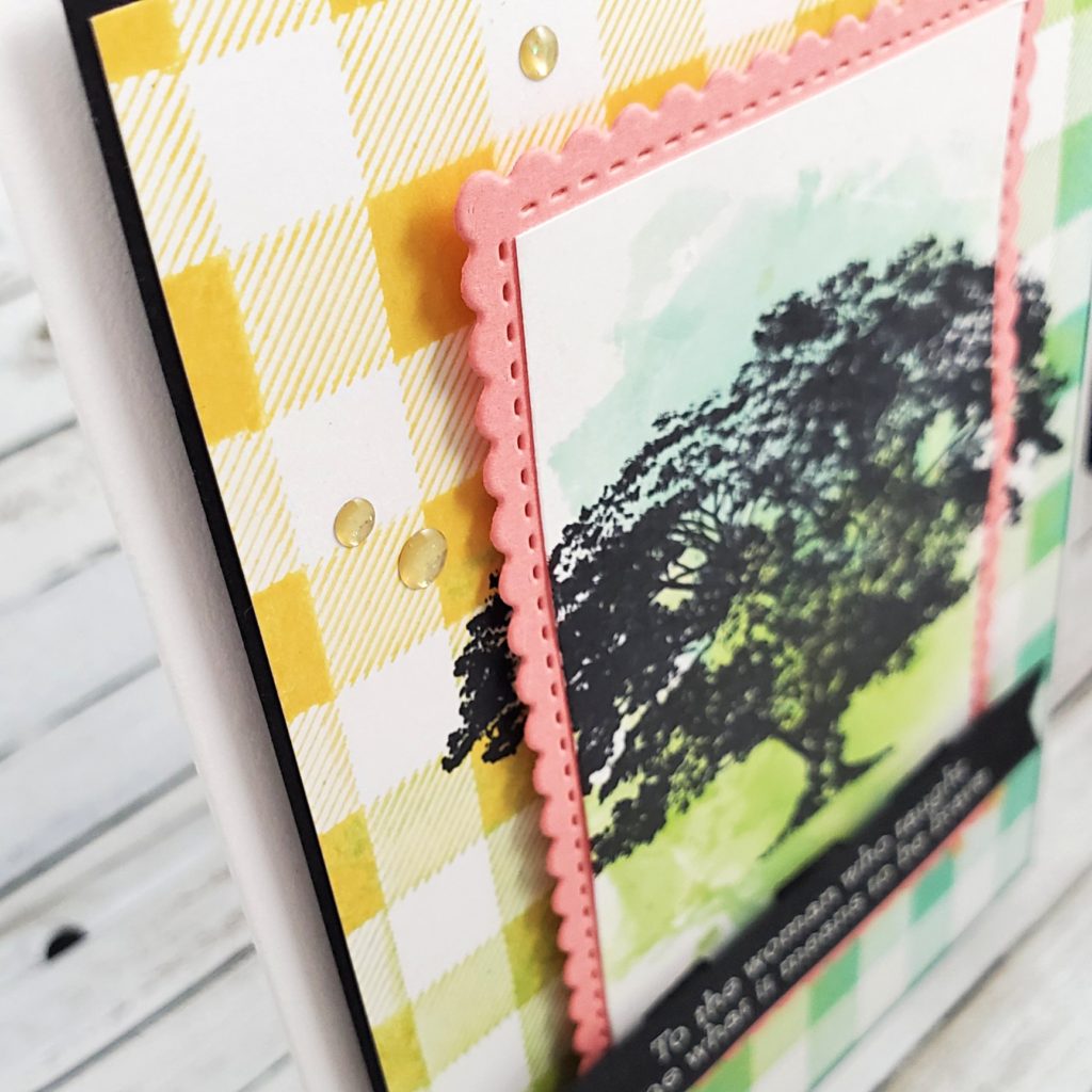
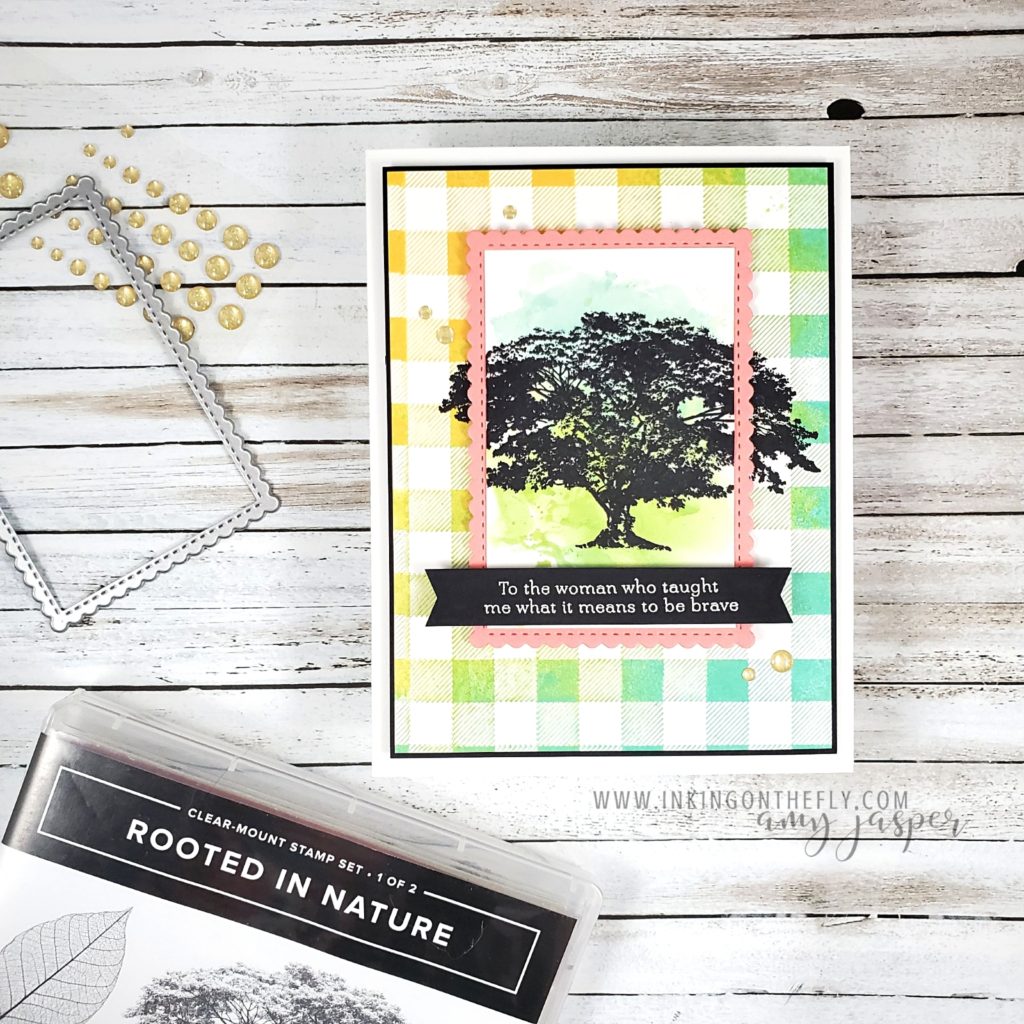
The rest of the card is more straight forward. I adhered the Buffalo Check piece to a slightly larger piece of Basic Black to create a very thin border, then attached it to the Thick Basic White cardbase with Stampin’ Dimensionals. The watercoloured tree image was layered on a Flirty Flamingo die-cut stitched rectangle from the Stitched So Sweetly Dies. These two layers were attached with Stampin’ Dimensionals to the front of the card. Then I stamped the sentiment from the retiring Strong and Beautiful stamp set with Versamark ink on a strip of Basic Black cardstock, applied White Embossing Powder and heat set it with my Heat Tool. I used the Banners Pick a Punch to flag the ends of this piece and adhered it to the front of my card with Stampin’ Dimensionals.

Finally, I added some of the retiring Gold Glitter Enamel Dots to my design.
“I learned that courage was not the absence of fear, but the triumph over it. The brave man is not he who does not feel afraid, but he who conquers that fear.” – Nelson Mandela

If you walked away from an abusive marriage and are now a single working parent, you taught me what it means to be brave. If you came out to your friends and family as LGTBQ+, expecting you’d be rejected by many of them, I am inspired by your courage! If you started a new job, you moved to a different town, you took the city bus for the first time, you did that class presentation, you opened up to someone and let yourself be vulnerable – you have courage!

And sometimes being brave is not about the big moments in our lives. Sometimes, being brave is facing the day-to-day grind so you can have a roof over your head and food on the table. Sometimes, being brave is admitting that you’re struggling and you need help. Sometimes, it’s saying sorry.

I get so inspired when I think of the beautiful and brave people I know. There’s more courage in you than you realize.

There’s more courage in me, too.

Rooted Heirloom

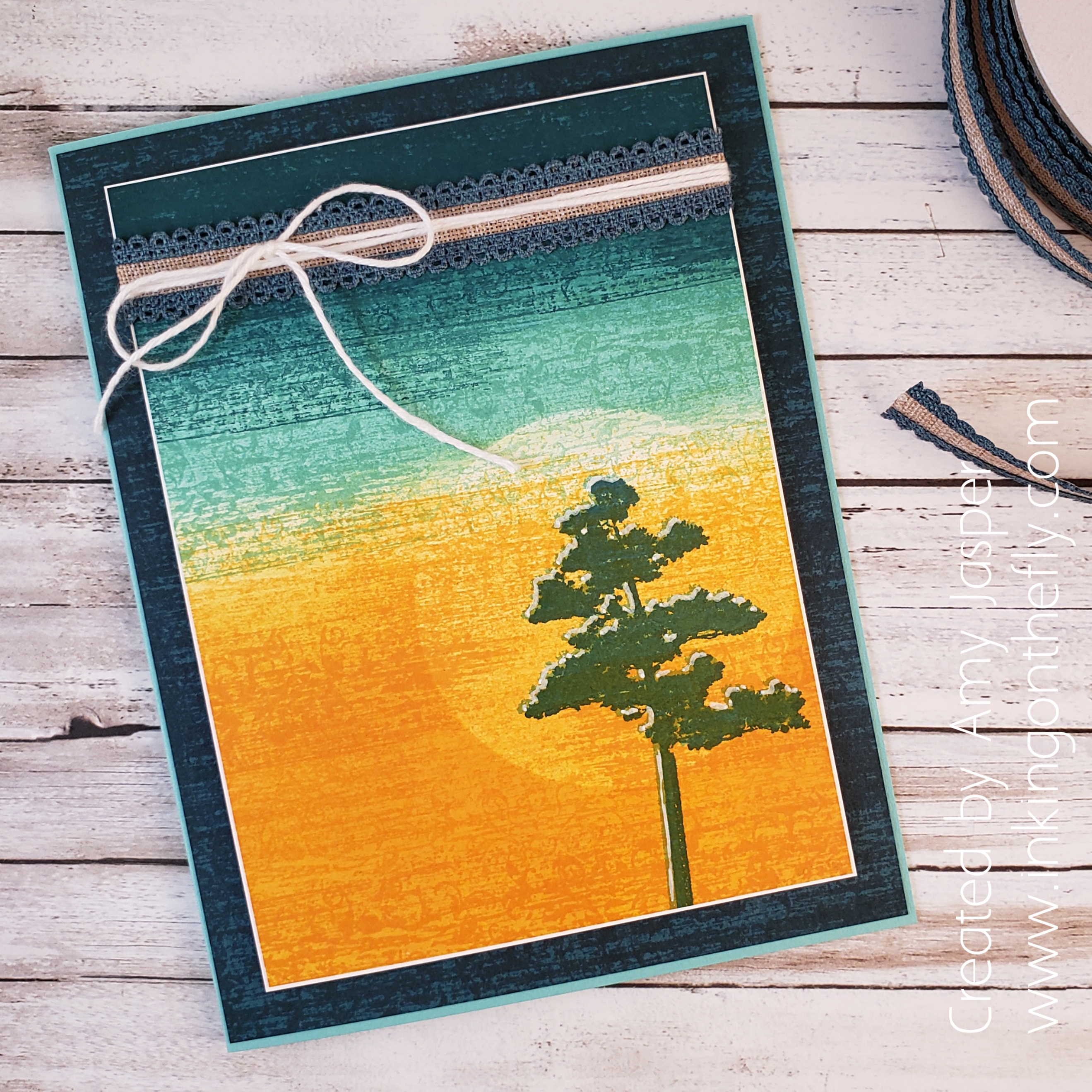
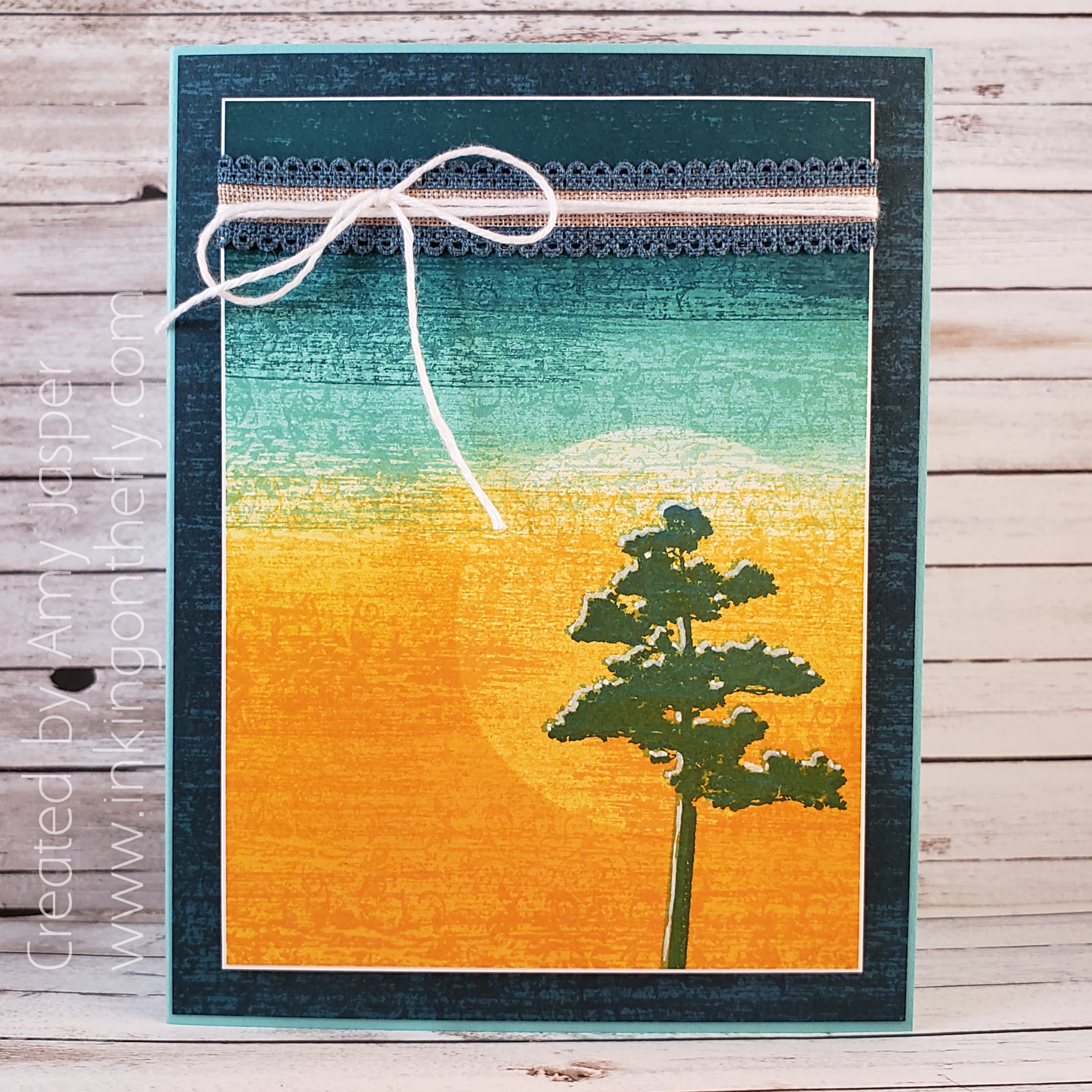
My card today features the Rooted in Nature stamp set and the Woven Heirlooms stamp set by Stampin’ Up! Check out the gorgeous texture created by sponging and stamping!

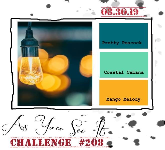
Here’s the inspirational colour challenge from the As You See It Challenge Blog.

I love this image of warm light and the out of focus background of contrasting colour that creates a bokeh effect. It makes me want to know what else is in the room and who is enjoying that atmosphere. Is it an outdoor wedding? or is it on the front porch of a rustic cabin that overlooks the lake? or maybe it’s in a Greek taverna, and we are looking out at the lamp-lit, stone-paved streets through the large open doorways. I can hear the bouzouki music, the subtle clinking of dishes, and the murmur of intimate table conversations. Wherever it is. I think I’d like to be there. How about you?

My first instinct with this colour scheme was to play with sponging and blending. This had me pulling out my Sponge Brayers from Stampin’ Up!. Here’s my take on this colour challenge.

I tried to find a sentiment to add once all of my sponging and rolling and stamping was done, but nothing seemed to fit without taking away the balance of the overall card design. This one will have to say it all on the inside with my personal note instead.

My first step was to take a piece of Whisper White cardstock and roll Mango Melody ink across the bottom half with my Sponge Brayer. Then I placed a circle piece of Post-It Note that I had punched out using the 2-1/4″ Circle Punch from Stampin’ Up! where I wanted the sun to be. Then more rolling. I added more Mango Melody, then switched to a clean brayer sponge and rolled on some Coastal Cabana, then some Pretty Peacock ink. I removed the Post-It Note and added a bit more Coastal Cabana and Mango Melody until my sun didn’t feel so harsh.

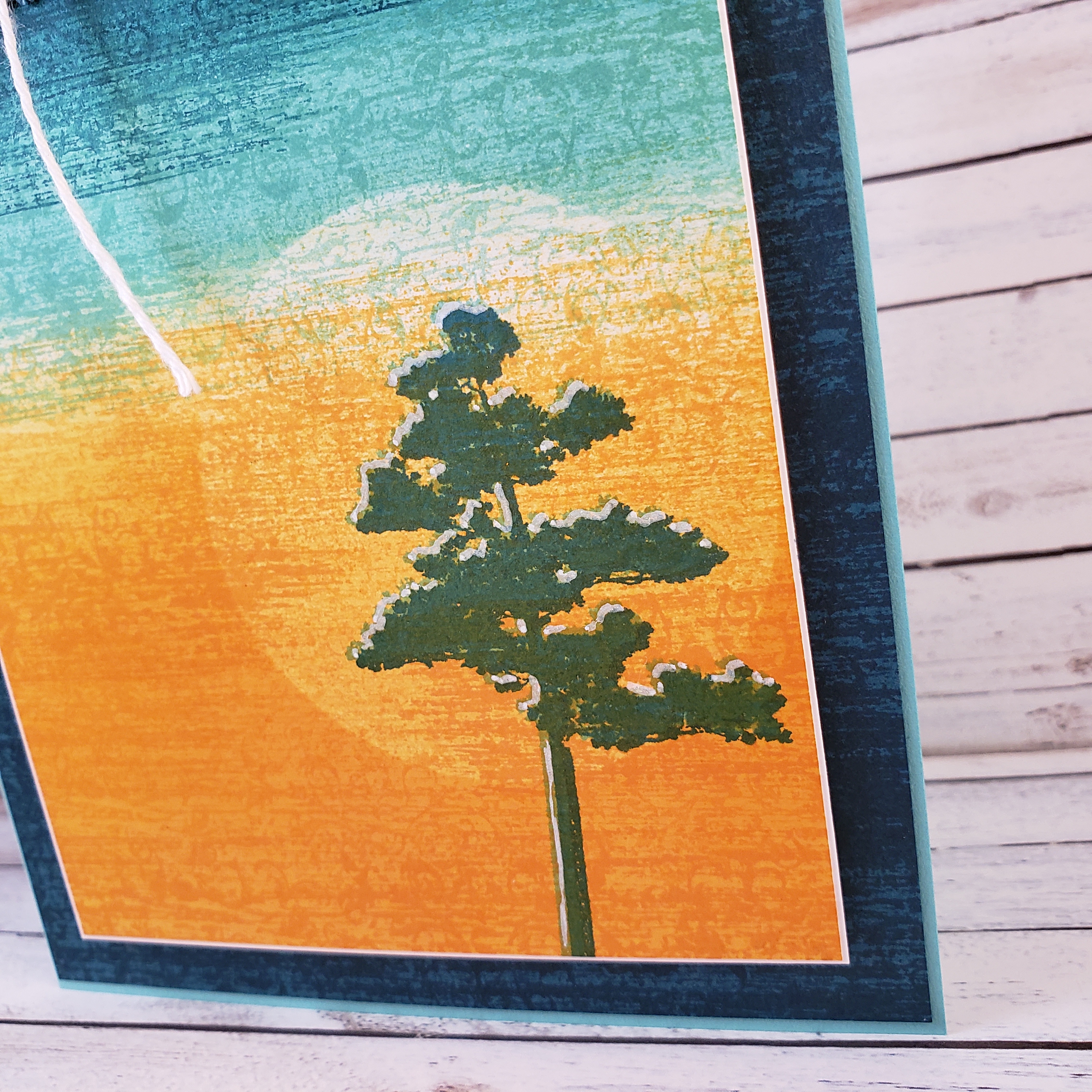
Next, I stamped the tree image from the Rooted in Nature stamp set from Stampin’ Up! using Coastal Cabana ink (it’s in there, I promise). To stamp the image, I used my Stamparatus because I wanted to reposition the paper after stamping and stamp it again with Pretty Peacock ink so that the top of the tree would have a sort of highlight as though the sun was brightening the other side of the tree. It worked, but I added something else at the end. Keep reading!

Once my tree image was in place, I was mostly happy with my artwork, but it was missing something. It was so smooth and … a bit too perfect. I decided to add some texture using the largest stamp image in the Woven Heirlooms stamp set. This I added over the entire paper, being sure to use Mango Melody over the Mango Melody, Coastal Cabana over the Coastal Cabana, and the … well, you get the idea. I stamped like this multiple times until the texture you see came to existence. You can see that I also used this technique on the Pretty Peacock layer of cardstock in the bactkground. Such great texture and suddenly the image was interesting and alive. It makes me think there’s quiet air movement and a lot of heat where that tree lives!

The tree begged for more light, so I used my White Stampin’ Chalk Marker to add highlights between the Coastal Cabana tree and the Pretty Peacock tree images.

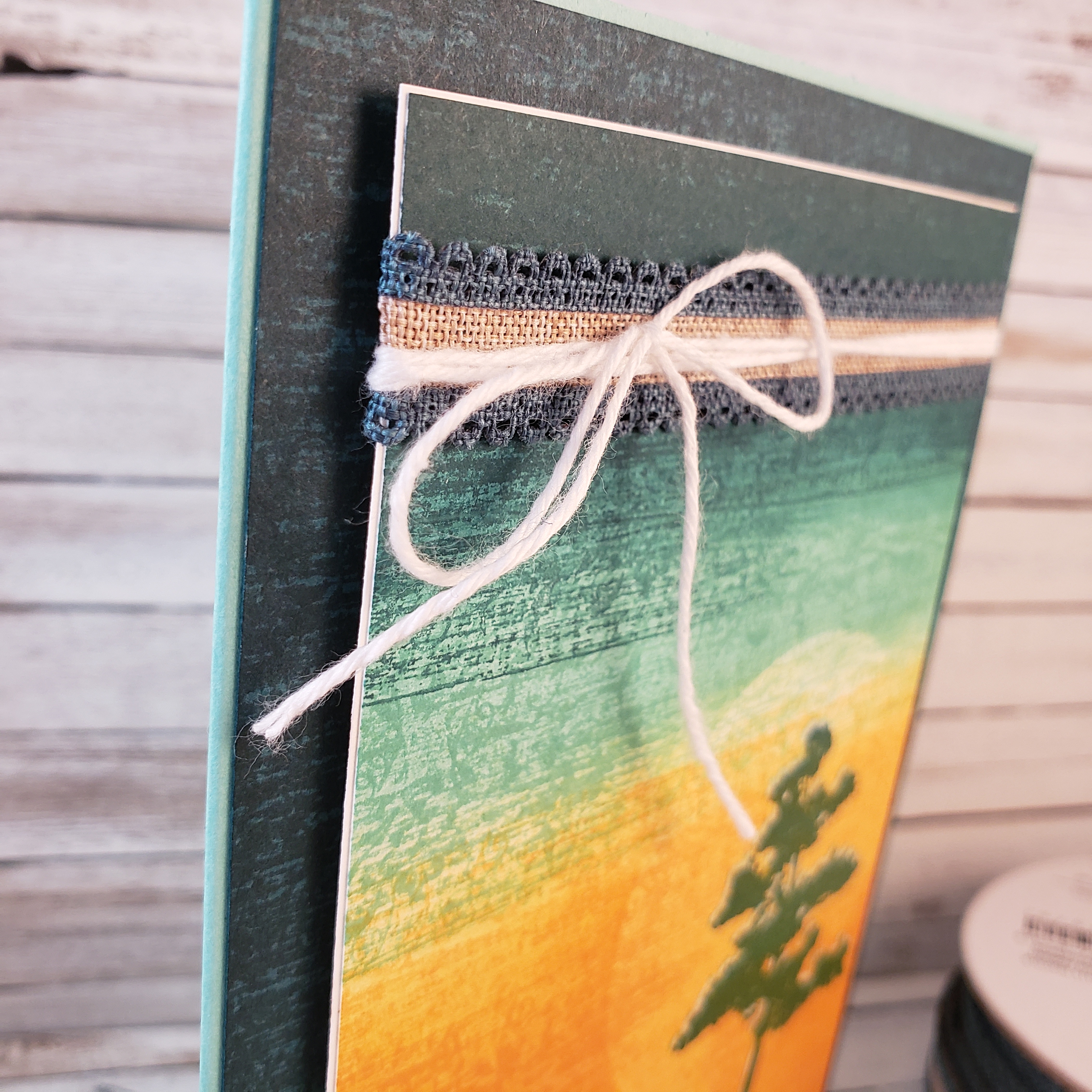
Once my art piece was complete, I knew that I wanted to add some embellishments. That’s where the Pretty Peacock Scalloped Linen Ribbon and the Whisper White Solid Baker’s Twine come in. First, I added a very narrow Whisper White matte layer to delicately frame my art, then I wrapped the linen ribbon around the card front, securing it on the back with Mini Glue Dots. The baker’s twine was wrapped around three times before finishing it with a bow.

Stampin’ Dimensionals hold those layers in place on the stamped Pretty Peacock layer. The card base is Coastal Cabana cardstock.

What would you do with these colours? What does the image inspire in your creative mind? Why not create something and share it with us at the As You See It Challenge Blog.

As always, if you are in Canada, you can order any of these products from me at my online store by clicking on the shop button on this page or the menu at the top of the page.


Rooted in Nature Sand Dollar

Have you ever looked at an image in a stamp set and thought, “That reminds me of a ______!”

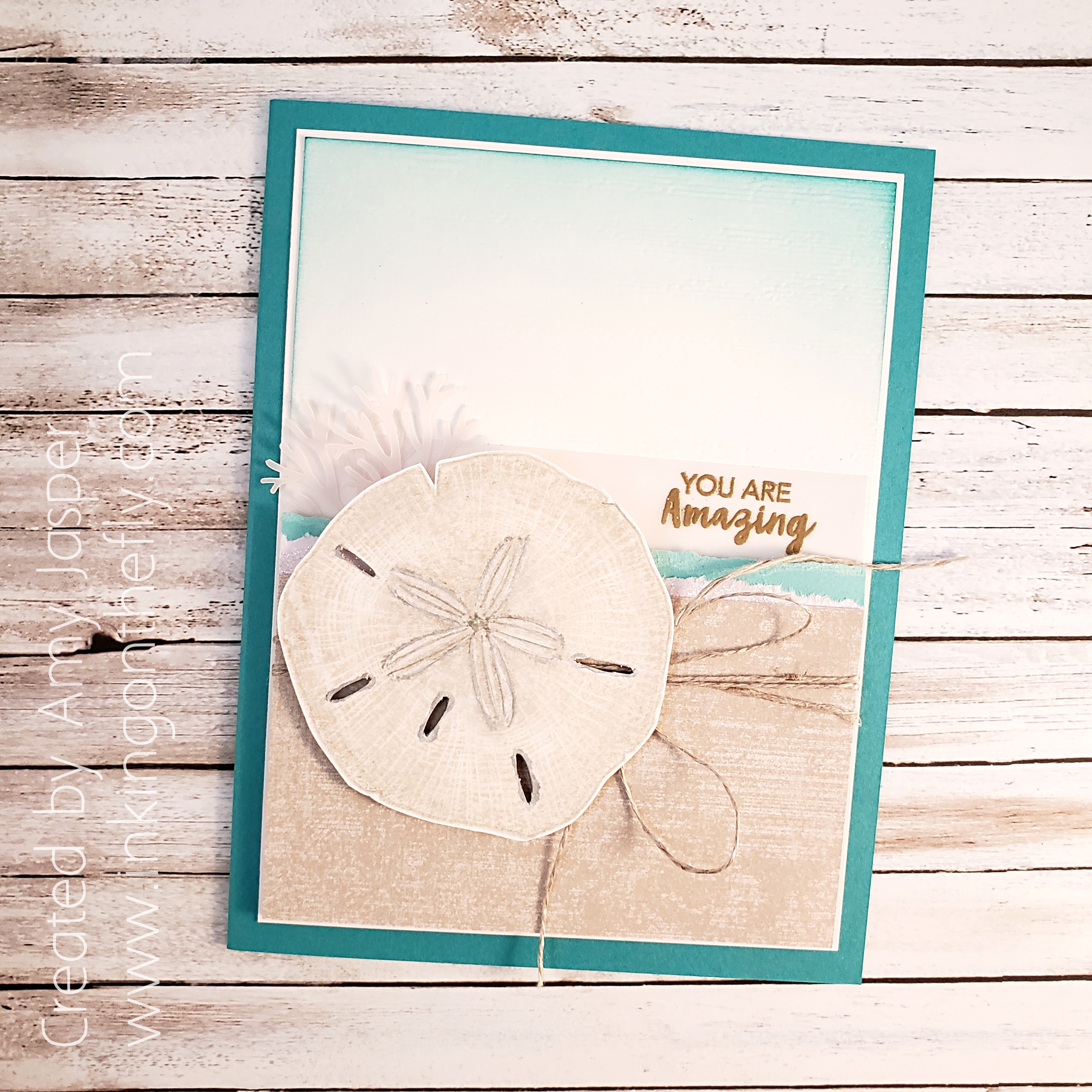
Well, I keep looking at the cross cut wood image in the Rooted in Nature Stamp Set by Stampin’ Up! and am thinking exactly that! It reminds me so much of a sand dollar at the beach. I looked at a few images of sand dollars on Google and decided to try to create one using the stamp as a starting point.

My creative inspiration was from another As You See It Challenge – this one is a beach theme, which, of course, was the perfect opportunity to alter the wood image.

This card used some art skills beyond my usual application for my cards. I also used some supplies from the June Paper Pumpkin kit. If you don’t get Paper Pumpkin, I highly recommend it! If you don’t have a Demonstrator, feel free to use my name to sign up. You get wonderful stamping kits in the mail each month so you can create beautiful hand made cards or home decor with ease. It’s fun and a great escape from the stresses of the world!

Here’s my finished card:

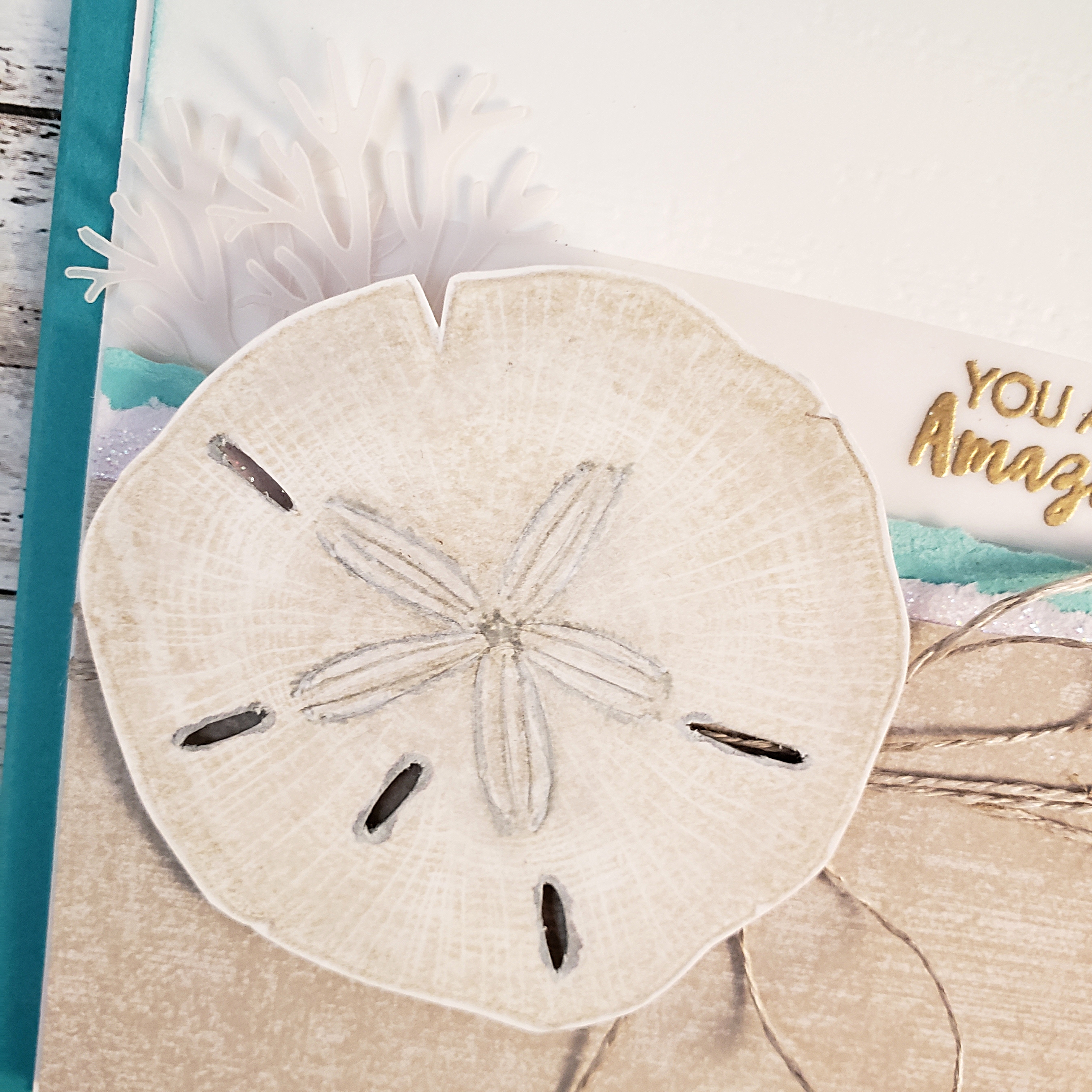
I stamped the wood cut image on Whisper White Cardstock with Sahara Sand ink. Then I had to use some creative art skills to draw the centre image to make it look like the image in a sand dollar. I originally tried to find a stamp or a die that would fit the shape I was looking for, but with no success, I reached for a pencil.

I drew the image that looks like a five petal flower onto the centre of the wood cut stamped image. Then I used the pen end of my Gray Granite Stampin’ Write Marker to darken my pencil drawing. My Blender Pen also got involved to soften my marker lines and create a bit of shading and imperfections that you would find in nature. It took a couple of tries before I got it right, but it was a lot more successful than I thought it would be!

I used my pencil again to draw the long ovals that I wanted to cut with a craft knife. A punch would have been nice, but I didn’t have anything that would work. After carefully cutting these, I used my Gray Granite Stampin’ Write Marker again (this time, I used the brush tip) to darken the edge of the paper inside the holes to give the impression of depth. The colour bled more than I intended it to, but the effect ended up working for me. (Lucky!)

The rest of the card involves paper layering and some heat embossing with Gold Embossing powder on Vellum cardstock. I also sponged some Bermuda Bay ink over the upper portion of one of my Whisper White cardstock layers to create a sort of sky for my beach scene. This with the torn layers of Coastal Cabana, Sparkle Glimmer Paper, and a piece of patterned paper from the Woven Threads Designer Series Paper, along with some Linen Thread tied in a loopy bow, complete my beach-themed card.

Let me know what you think. Did I successfully turn a stamped image of a piece of wood into a sand dollar? Have you ever tried to alter a stamped image to make it look like something else?