Here we are again on a Friday where I get to share my designs for the As You See It Challenge blog. Challenge #57 is a fall theme!
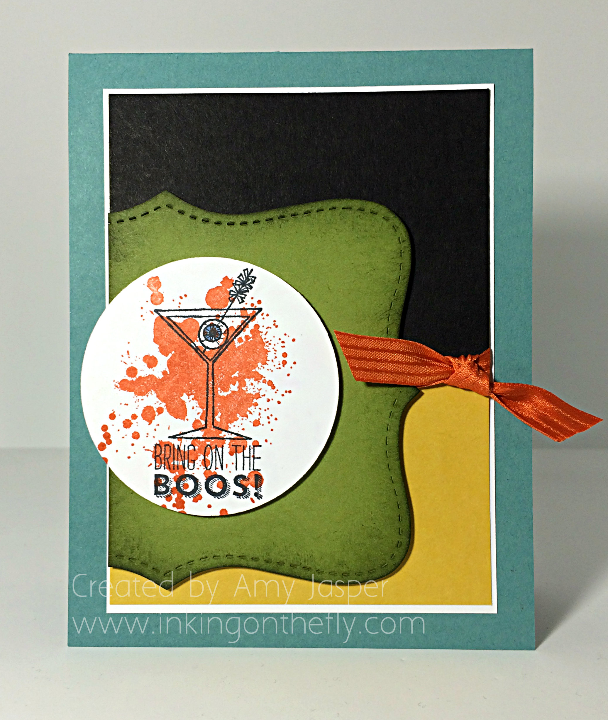
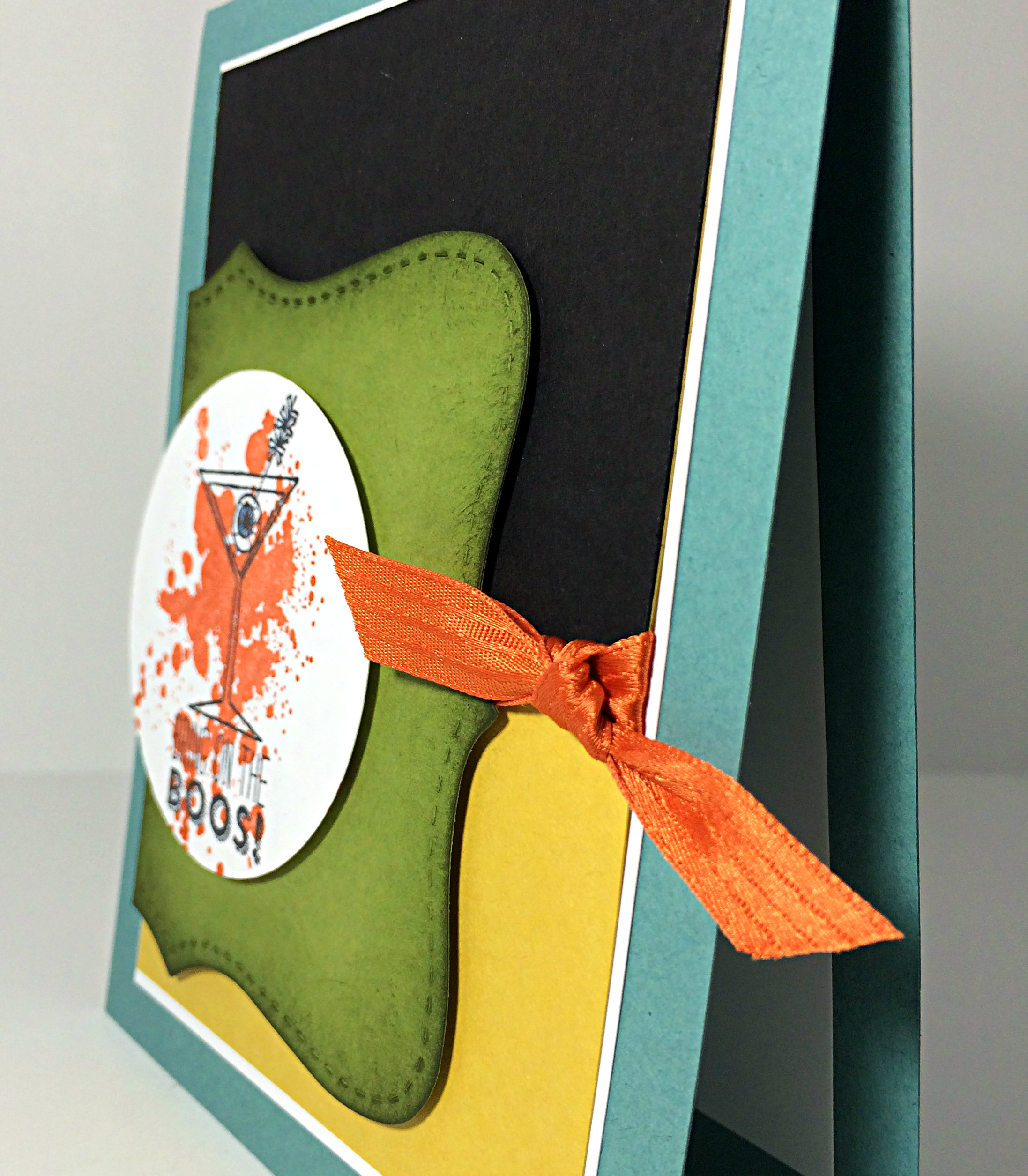
The theme today is fall, but I didn’t feel much like doing the leaf thing and the typical fall colours (though I didn’t COMPLETELY deviate from the theme, lol!). I was minding my own business, leading a class through their 12 Christmas cards, when I decided I’d better take the opportunity of a lull and get my challenge card designed. I grabbed a bin of scraps and looked at the stamp sets we were working with – Ah yes, there was the Making Spirits Bright stamp set! AHA!
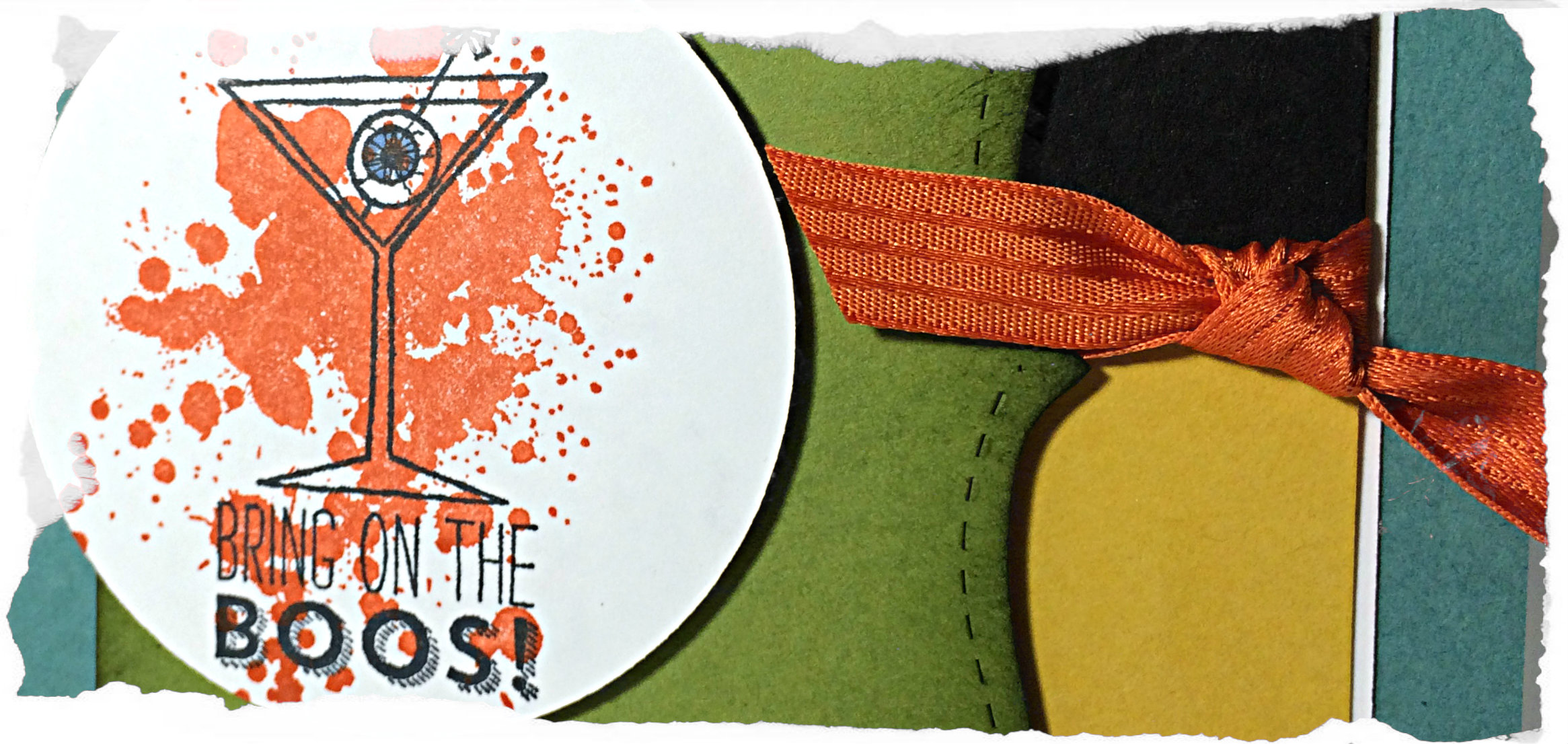
It is for this very stamp that I purchased this cute stamp set with various holiday glasses and sentiments. I just loved the eyeball in place of an olive!
So I still have the traditional green, yellow and orange for fall colours, but I love the addition of the blue and black. Here I have Lost Lagoon for the card base, Hello Honey and Basic Black layers over the Whisper White mat, then an Old Olive piece cut with the Top Note die in the Big Shot and sponged around the edges with a little bit of Mossy Meadow ink. Finally, the Whisper White with a splash of Tangelo Twist ink (stamped with one of the Gorgeous Grunge stamps) to show off the stamped image. I even added a touch of the Medium Night of Navy Blendability marker to the iris of my eyeball (no offense to fellow brown-eyed beauties, I just thought blue would show up a bit better)
You can see in the image above, that I used Stampin’ Up Dimensionals under the Old Olive cut out layer and the Whisper White circle. Flat cards and I are not often friends. I try. Sometimes we gel, sometimes we don’t.
And, Baby Cakes, I even added a fall-themed stamp to the inside of my card! I’m thankful for fun drink glasses with fun things inside them (like eyeballs) and I’m thankful for friends to enjoy them with!
Welcome to my blog where I share my love of designing using products by Stampin’ Up!
If you are a regular follower of my blog, you may have noticed a bit of a pattern on Fridays, lol! Here we are on Friday again and it’s time for another As You See It Challenge design!
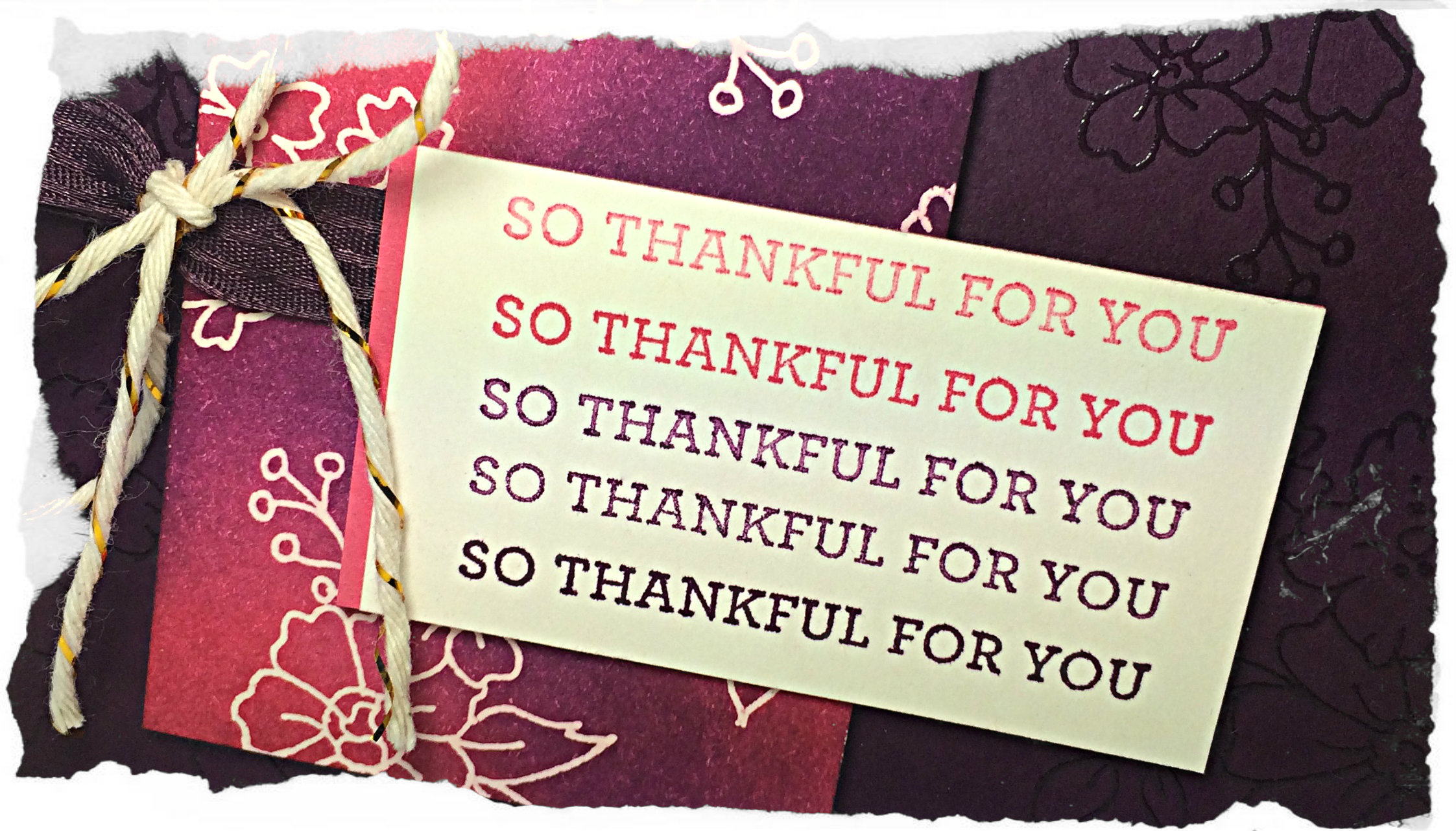
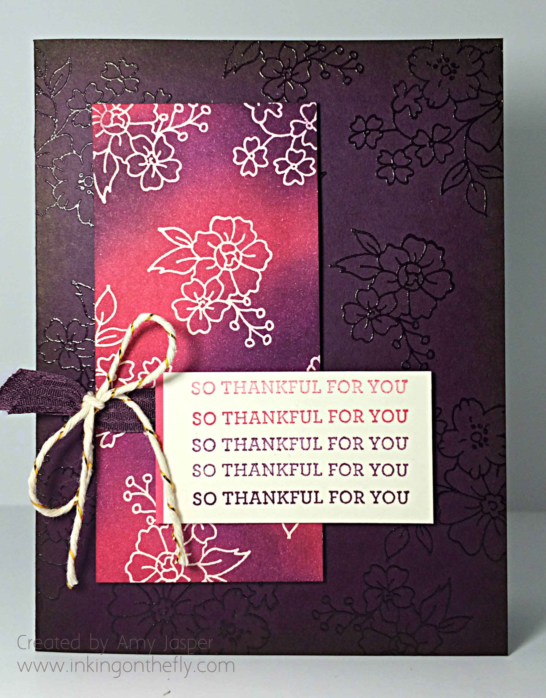
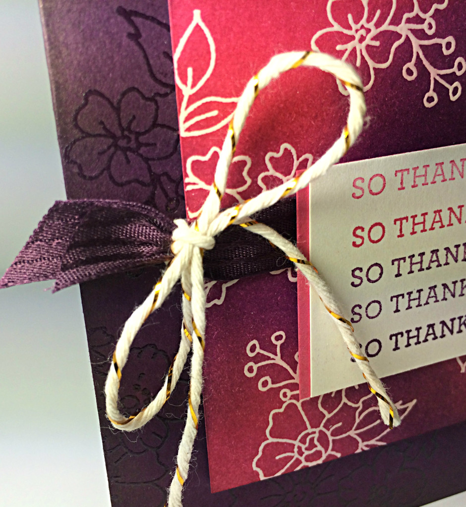
I love Blackberry Bliss. It’s such a rich tone. I normally don’t like to work with purple, but I’m getting better at it. Blackberry Bliss is definitely easier for me than other purples, though (just don’t expect me to pair it with yellow very often!)
I decided to play with the hostess set “I Like You”. When I got this set, I was excited to colour those flowers with my new Blendabilities, but it looks lovely as a line image too, don’t you think?
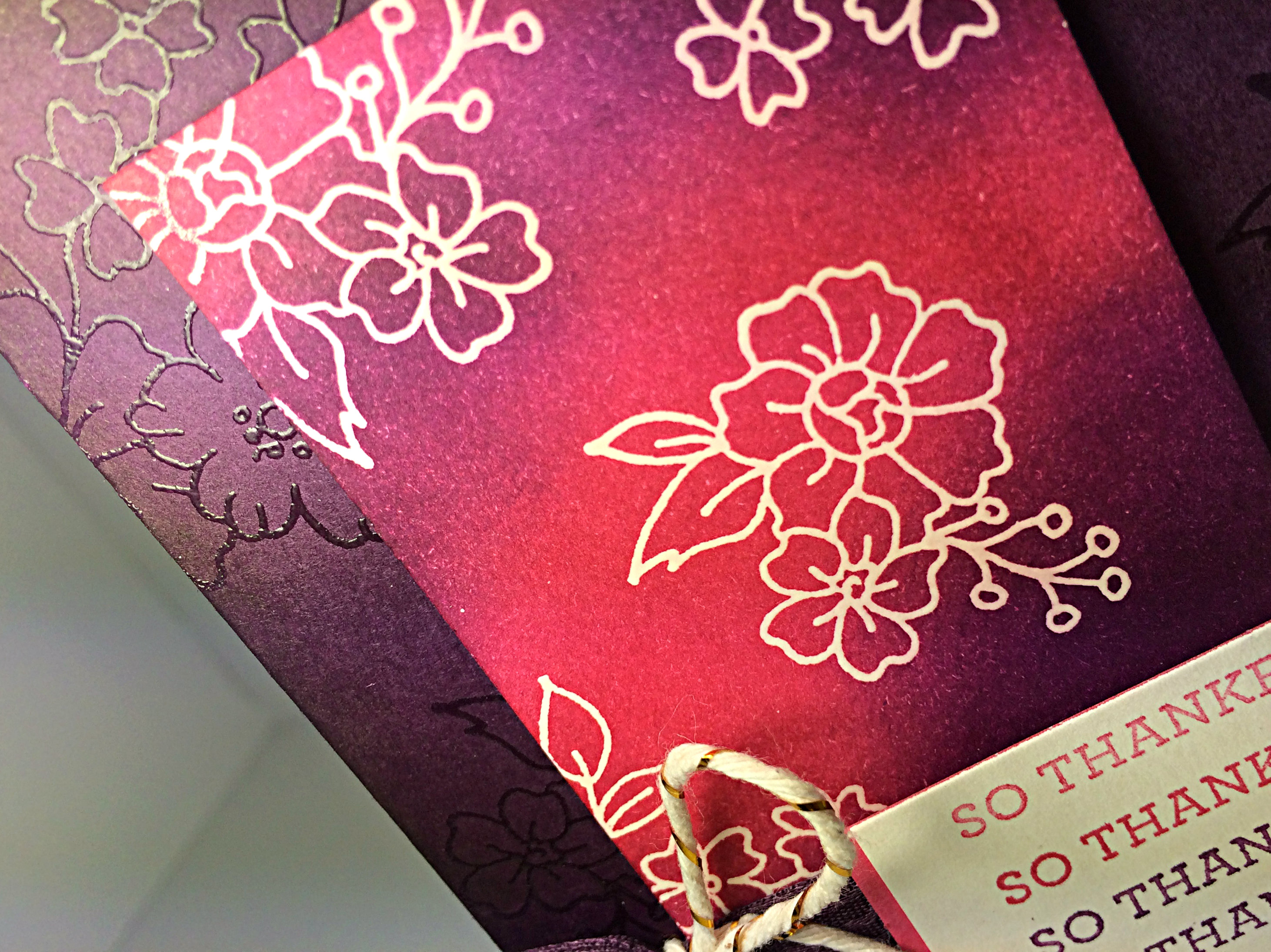
I had some fun embossing with clear embossing powder for this card. I used my Embossing Buddy on two pieces of cardstock: the Blackberry Bliss card base and a rectangular piece of Very Vanilla, then I stamped with my Versamark ink (the cleanest ink pad of THREE that I have as I inevitably muck them up with ink transfer from supposedly ‘clean’ stamps). I embossed with my heat tool and clear embossing powder.
The card base, I set aside, while the Very Vanilla piece was sponged heavily with Blackberry Bliss ink and Strawberry Slush ink. If you’re familiar with this technique, then you know that the water-based ink will not stay on the embossed areas. Just wipe off the traces of ink with a paper towel to reveal the Very Vanilla colour that has been protected by the embossing powder for this Emboss Resist technique.
The sentiment was done using precise stamping with varied amounts of ink. You can use the Stamp-a-ma-jig to help with your placement. I was trying to get an ombre-like gradient of colour each time I stamped the sentiment. I used Strawberry Slush and Blackberry Bliss, stamping off for the lighter images and using full strength ink for the darker images.
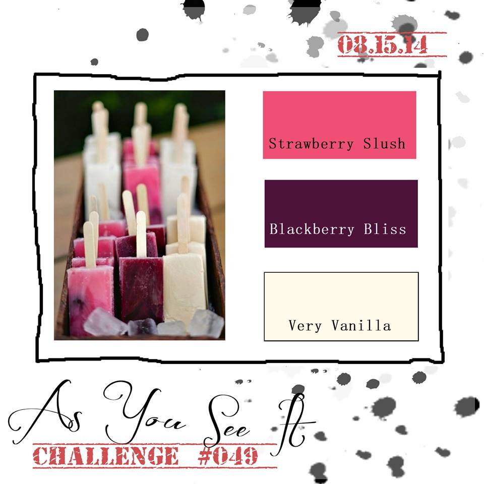
Give this colour combination a try and link up your photo to Challenge #49.
I hope you’ll leave me a comment (this blog refers to them as a “reply”) and let me know your thoughts. I have been missing your encouraging words 🙂
Welcome to my blog where I share my love of designing using paper, ink and stamps from Stampin’ Up! I’m always looking for friends to share papercrafting with – let me know if you’d like to sign up with Stampin’ Up! and join my team or if you’d like to host a workshop in my area and earn FREE stamping supplies!!
It’s time once again for another As You See It Challenge! I decided to play with the Holiday Invitation photopolymer stamp set that Stampin’ Up! gave away to everyone who attended Stampin’ Up! Convention #InspireCreateShare
These assortment challenges are a lot of fun because there are so many possibilities!! I can’t wait to see what people will do with this one. As long as you have all of the elements listed, your project is good to go! It could be a card, a scrapbook page, a journal cover, a garden gnome, WHATEVER! That’s the beauty of an assortment challenge. I hope you’ll play along this week!
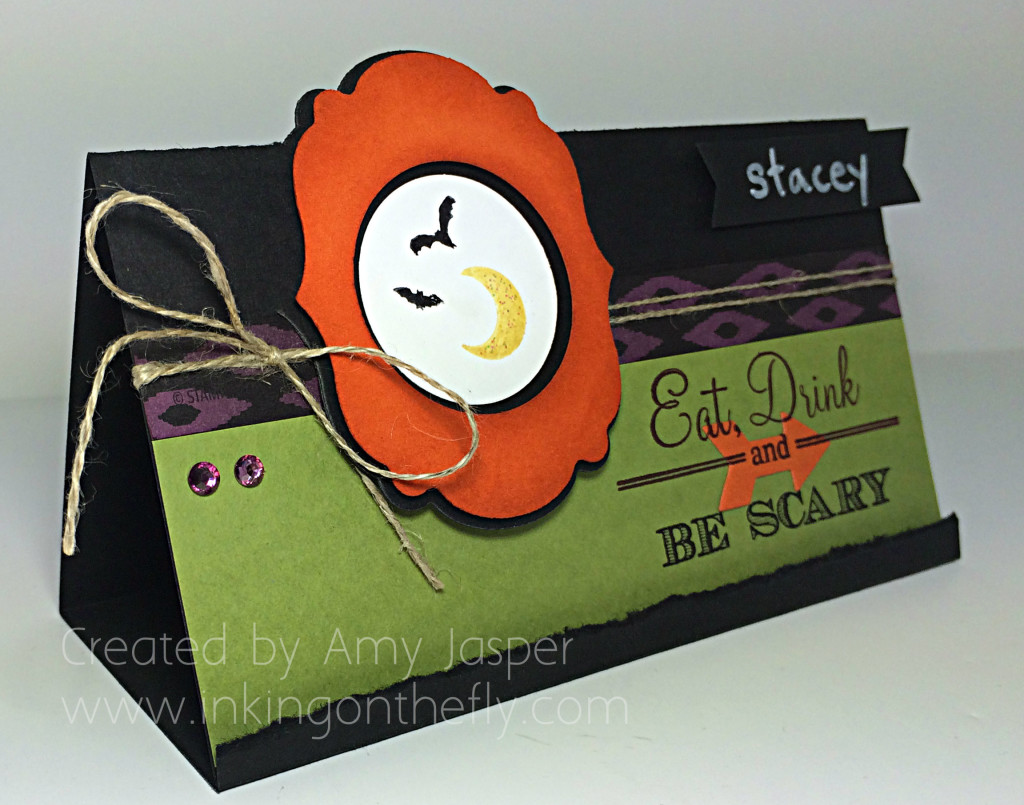
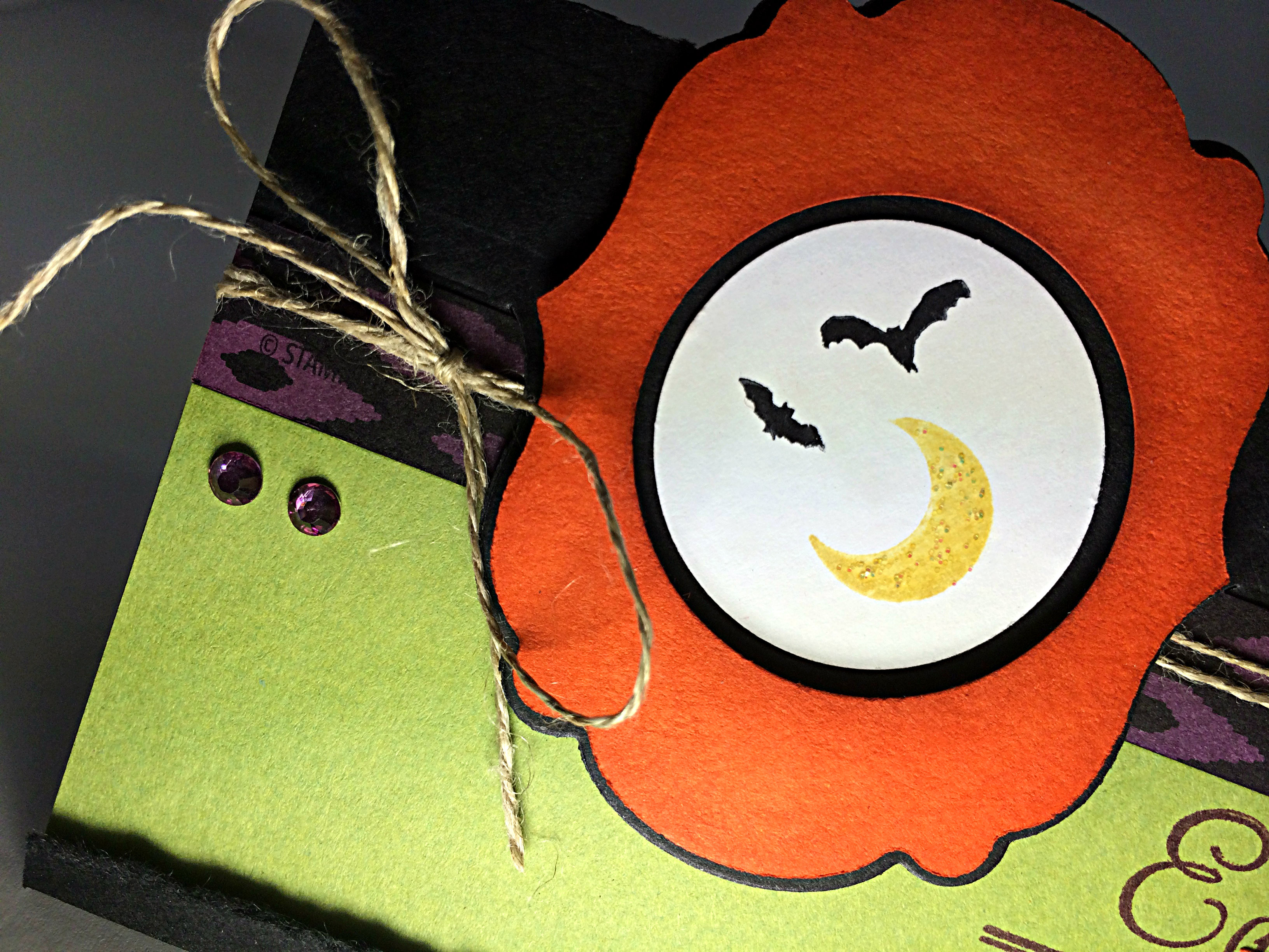
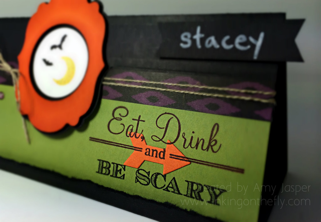
I decided to try making a place card for a table setting. I really love your typical Halloween colours. They are so fun and eery. I would never put these colours together for any other occasion and would think them very odd, in fact. But for creepy, ghoulish, scary fun, these colours are perfect!
I don’t do a lot of Halloween decor, but we love dressing up when we can. For the last few years, I keep on telling myself that I’ll do more for Halloween. More decor, more food fun for the kids, etc, but life always gets in the way and time runs out on me and we barely manage to have candy for the Trick or Treaters and somehow manage to get our kids dressed up at the last minute. Maybe this year, I’ll use my little place cards and host a Halloween party – after all, Halloween does fall on a Friday night … I guess we’ll see. Maybe my place card idea will spur on further preparations.
Prepare or BEWARE!! lol!
My table place card was made with the Label Card thinlit die, but instead of folding it twice, so that it flips as it was designed to do, I folded it only in half. Now, I used a longer piece of cardstock to extend the card as is often done with this thinlit, so that I could have a base to give it extra support. (sorry, no pictures to explain this better, but you can google “label card thinlit extended” if you’re unfamiliar with this)
You can see a torn edge at the bottom of the place card where I folded the edge up and tore the excess off. I did not adhere this together as I wanted to be able to store my place cards flat. That folded edge acts like a stopper to help my card stand up without the extra adhesive.
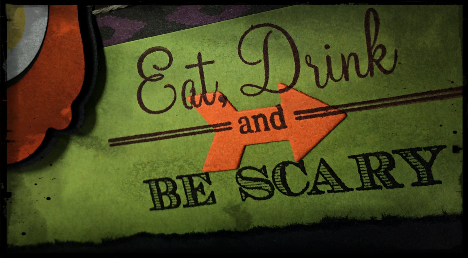
I cut out my Tangelo Twist framelit from the Label thinlit, then used my 1-3/8″ circle punch to make a hole in the center (I actually found that this worked better to punch the hole first, then cut it out with the framelit so that I could center that circle more precisely). This was sponged with Tangelo Twist ink around all the edges then added to the card front with Dimensionals. I stamped my bats and moon after inking up with my Stampin’ Write Hello Honey marker and with my Stazon Black ink pad. This was punched out with my 1-1/4″ circle punch and adhered to the center of my frame. A bit of Dazzling Details was added to my moon for effect.
The strip of patterned paper that you see is a piece of Back to Black Designer Series Paper that I coloured with the darkest shade of the Rich Razzleberry Blendability marker. I used the same marker to colour my Rhinestones!
What do you think of my Tangelo Twist arrow? I really like how cool it looks with the lettering stamped over it. All I did was cut out the arrow, then stamped the image on it (you can be very precise with stamp placement using the photopolymer stamps!), then I adhered it carefully to my card so it would line up with the image that I already stamped! Yes … yes … I can be clever sometimes, lol!
I was going to write the name for my place card directly in the black void in the top right of my project, but was too scared I would ruin everything with my bad printing (does anybody actually like their own printing!!?), so. I made a little tag and punched the edges using my Banner Punch in a clever sort of way, then wrote the name with my Chalk Marker and adhered it to the front of my card with … yes, that’s right … Stampin’ Up! Dimensionals!!
I’m a little long winded today. Sorry about that. If you made it this far, maybe I should give you a prize!! lol! No, no prize for you except the satisfaction of getting through my drivel! YOU DID IT!!
Now go make a project for this assortment challenge and do me proud!! Link it up to the As You See It Challenge #048.
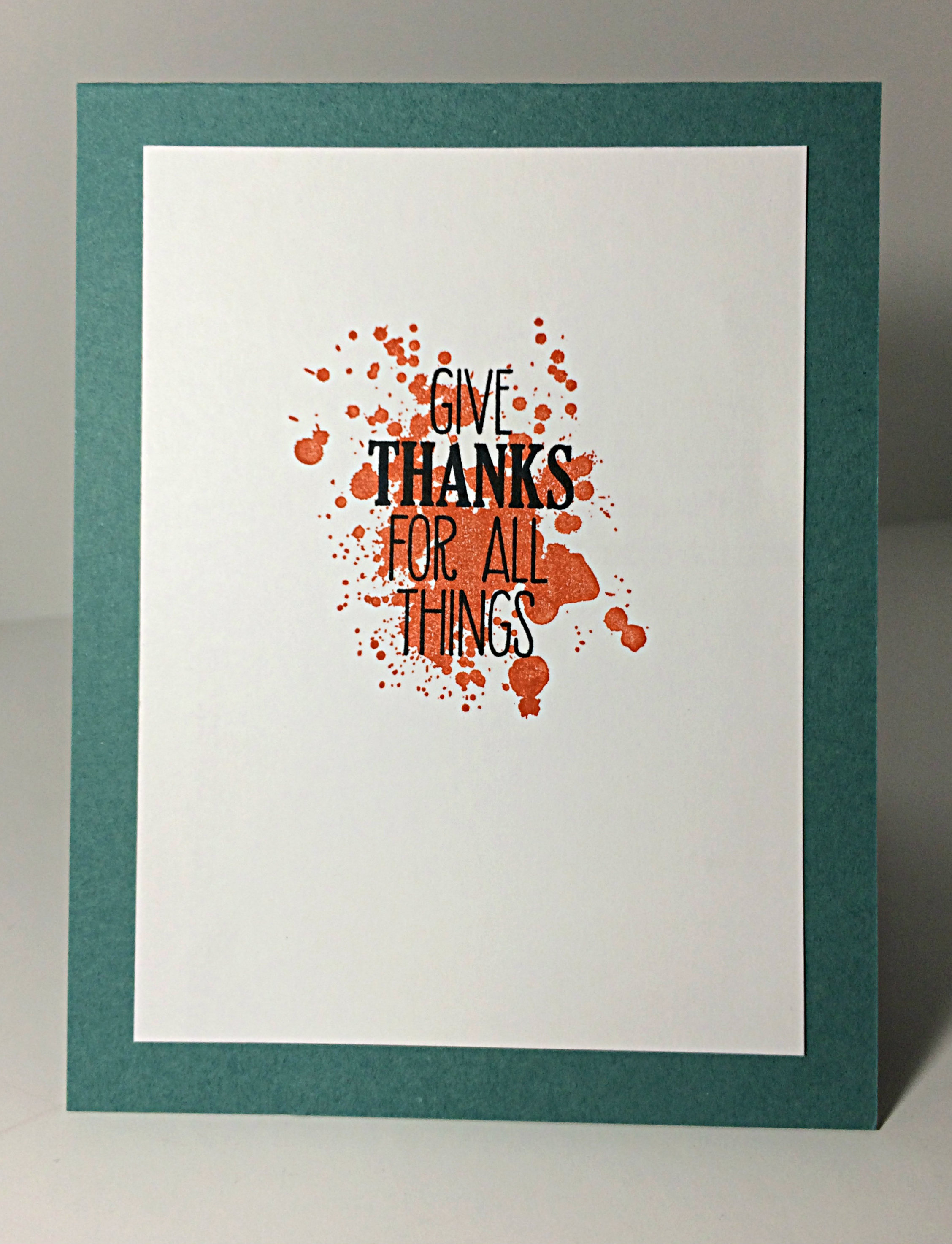 And, Baby Cakes, I even added a fall-themed stamp to the inside of my card! I’m thankful for fun drink glasses with fun things inside them (like eyeballs) and I’m thankful for friends to enjoy them with!