Painted Petal Label
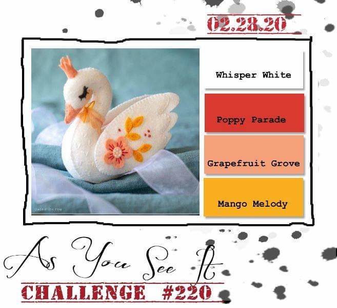
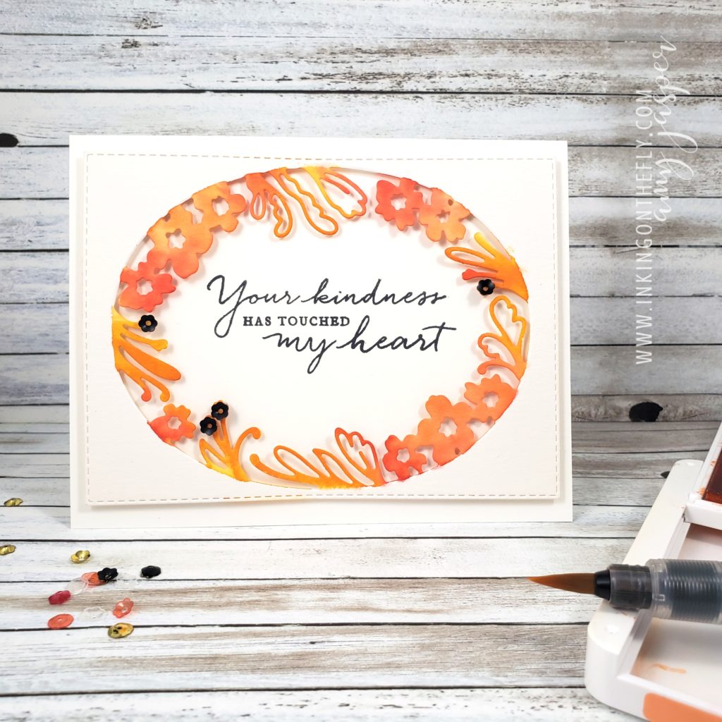
The As You See It Challenge has a very pretty and fresh colour challenge for us today! I thought I would try using the beautiful Petal Label Dies from Stampin’ Up! along with some watercolouring to create my design..
Here’s the colour combo that inspired the card in today’s blog post.
Isn’t it a precious image! The little swan makes me think of the Christmas ornaments my mom made out of felt one year. She never made a swan, but she did make a little dove. I get a lot of my creativity from her, of course. Thanks mom!
I used the Petal Labels Dies and the Stitched Retangle Dies to cut the Watercolor Paper for my card front. I don’t think the 2019-2020 Annual Stampin’ Up! Catalogue gives the Path of Petals Bundle enough air time. It really is a gorgeous bundle and is only part of the Pressed Petals Suite by Stampin’ Up!. The entire suite is so stunningly beautiful, but I feel like it has been lost in the shadows of the many show-stopping suites in the catalogue. I want to give this one a little more attention! The Petal Labels Dies are delicate and beautiful. The Path of Petals Photopolymer stamp set has the most beautiful fonts for the most eloquent sentiments.
I chose to use a Thick Whisper White card base for this card. Let’s be honest here, I use Thick Whisper White A LOT for my card bases. It is so easy to just add a layer to a white base. I don’t need to do anything fancy to the inside and it makes such a clean and crisp card every time! I struggle to use coloured cardstock for my card bases. I think I need to try to branch away from that a bit. Maybe, I’ll try Very Vanilla. LOL!
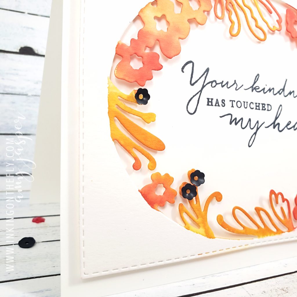
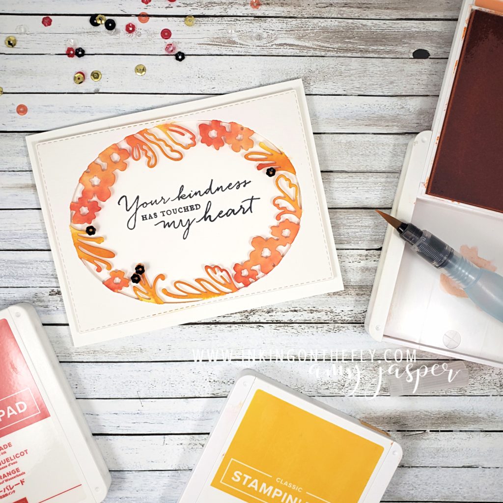
With an Aqua Painter and my three ink colours, Mango Melody, Grapefruit Grove, and Poppy Parade, I added colour to the floral edge of the oval die cut watercolour paper. I started with the lightest colour first, then worked up to the darkest colour. I was careful to colour only the floral shapes, trying to keep a clean edge so the oval area would remain defined.
To some of the fronds, I added black sequins from the Peaceful Poppies Sequins pack using Glue Dots to hold them in place.
On a separate piece of Whisper White cardstock, I stamped the beautiful sentiment from the Path of Petals Photopolymer stamp set using Tuxedo Black Momento Ink. I did stamp it a little bit crooked, but that’s why I did it on a separate piece rather than stamping it directly on the card base!! (I’m smart like that, LOL!). I adhered it (with the sentiment straight) to the water coloured, die cut layer using Stampin’ Dimensionals. I needed to do some trimming with my Paper Snips (since the Whisper White layer was now sticking out, crooked, under the die cut layer), then I was ready to attach those two layers to my card base using my trusty Multipurpose Liquid Glue.
Now it’s your turn. Get into your craft supplies and make a card using these colours (or colours as close to these as you can get). This is an opportunity for you to get creative and use this colour challenge as a jumping off point. Sometimes, you just don’t know where you might land!! Don’t forget to share your finished card on a public internet site (Pinterest, public Facebook Page, public Instagram page, Flicker, Splitcoast Stampers, your blog, etc), then share it with us on the As You See It Challenge Blog! We love to see what you’re creative brain does with the challenges.
As always, if you like any of these products, head on over to my Online Store and get them into your shopping cart! Stampin’ Up! makes it easy to create beautiful things!
If you’re outside of Canada, you can’t legally shop from me, but I hope you will continue to visit. Don’t forget to comment and let me know that you did!!


