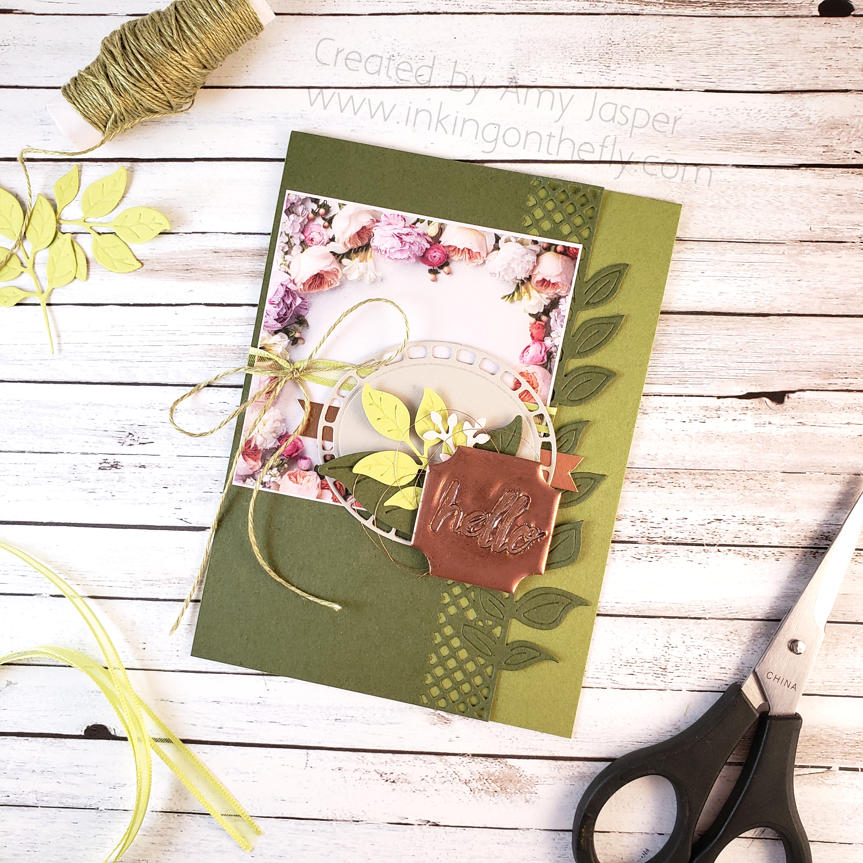
photopolymer

Painted Petal Label

The As You See It Challenge has a very pretty and fresh colour challenge for us today! I thought I would try using the beautiful Petal Label Dies from Stampin’ Up! along with some watercolouring to create my design..

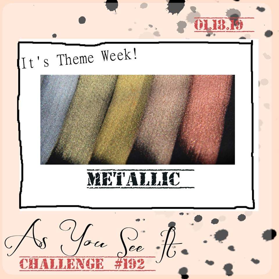
Here’s the colour combo that inspired the card in today’s blog post.

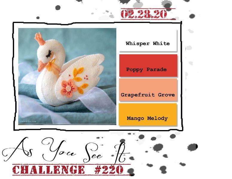
Isn’t it a precious image! The little swan makes me think of the Christmas ornaments my mom made out of felt one year. She never made a swan, but she did make a little dove. I get a lot of my creativity from her, of course. Thanks mom!

I used the Petal Labels Dies and the Stitched Retangle Dies to cut the Watercolor Paper for my card front. I don’t think the 2019-2020 Annual Stampin’ Up! Catalogue gives the Path of Petals Bundle enough air time. It really is a gorgeous bundle and is only part of the Pressed Petals Suite by Stampin’ Up!. The entire suite is so stunningly beautiful, but I feel like it has been lost in the shadows of the many show-stopping suites in the catalogue. I want to give this one a little more attention! The Petal Labels Dies are delicate and beautiful. The Path of Petals Photopolymer stamp set has the most beautiful fonts for the most eloquent sentiments.

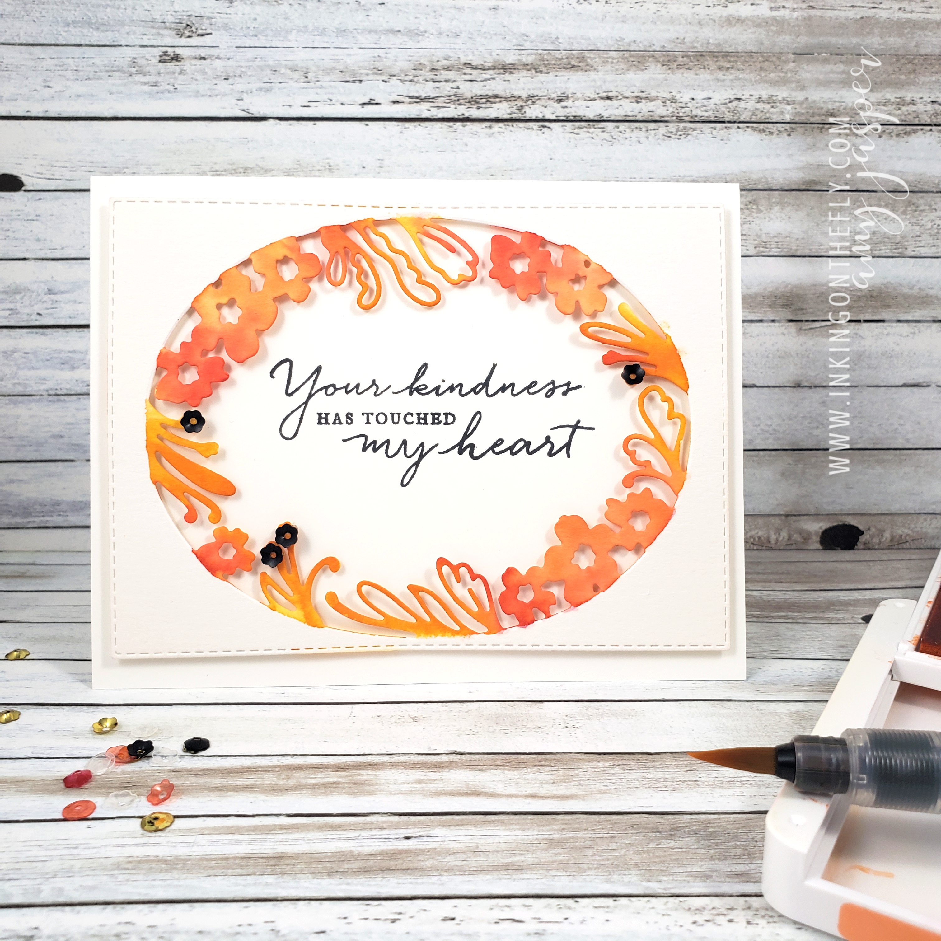
I chose to use a Thick Whisper White card base for this card. Let’s be honest here, I use Thick Whisper White A LOT for my card bases. It is so easy to just add a layer to a white base. I don’t need to do anything fancy to the inside and it makes such a clean and crisp card every time! I struggle to use coloured cardstock for my card bases. I think I need to try to branch away from that a bit. Maybe, I’ll try Very Vanilla. LOL!

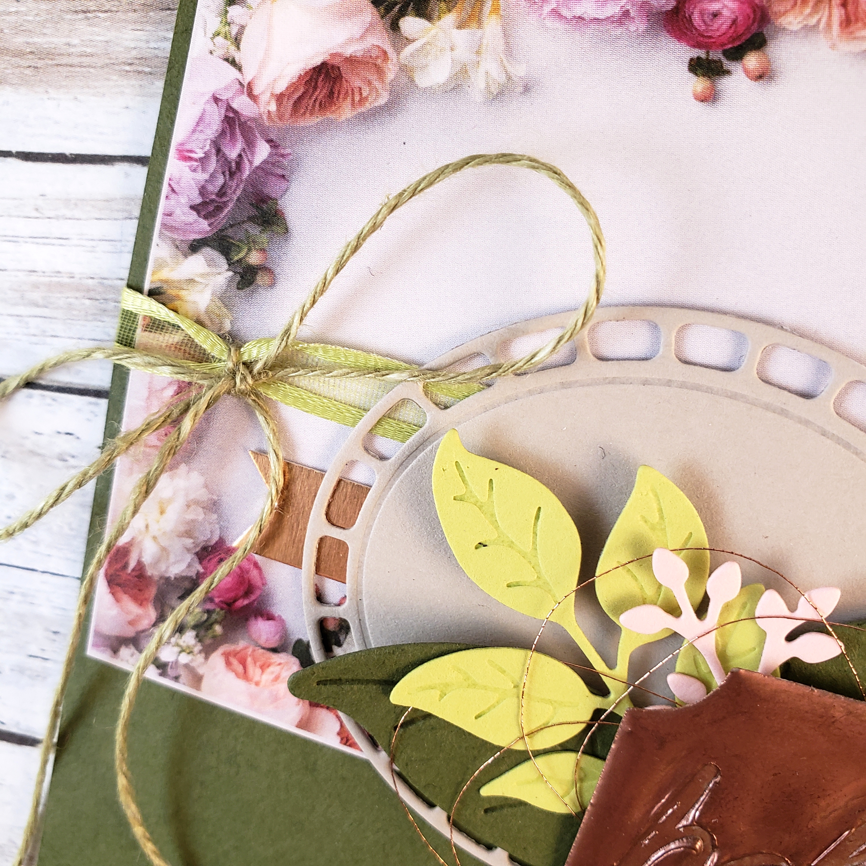
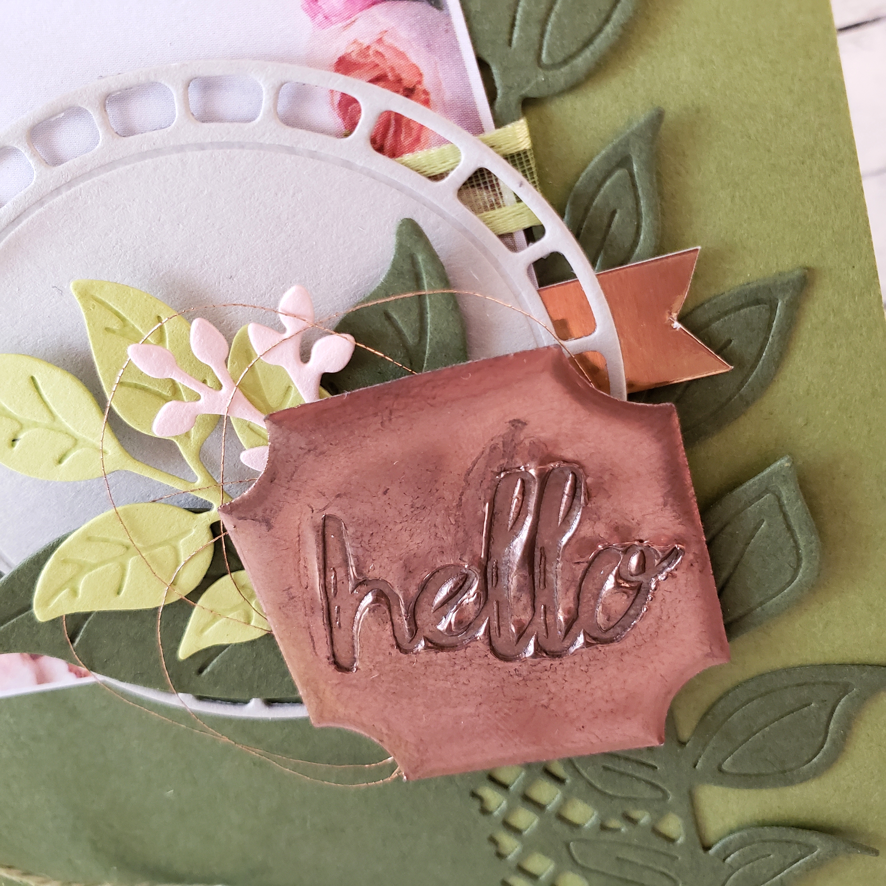
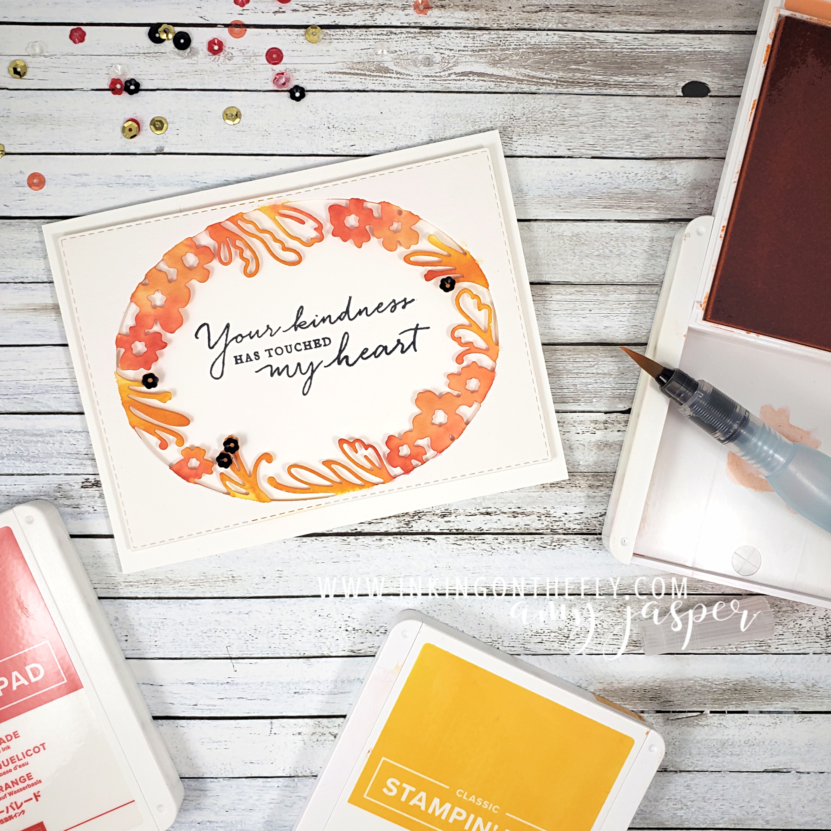
With an Aqua Painter and my three ink colours, Mango Melody, Grapefruit Grove, and Poppy Parade, I added colour to the floral edge of the oval die cut watercolour paper. I started with the lightest colour first, then worked up to the darkest colour. I was careful to colour only the floral shapes, trying to keep a clean edge so the oval area would remain defined.

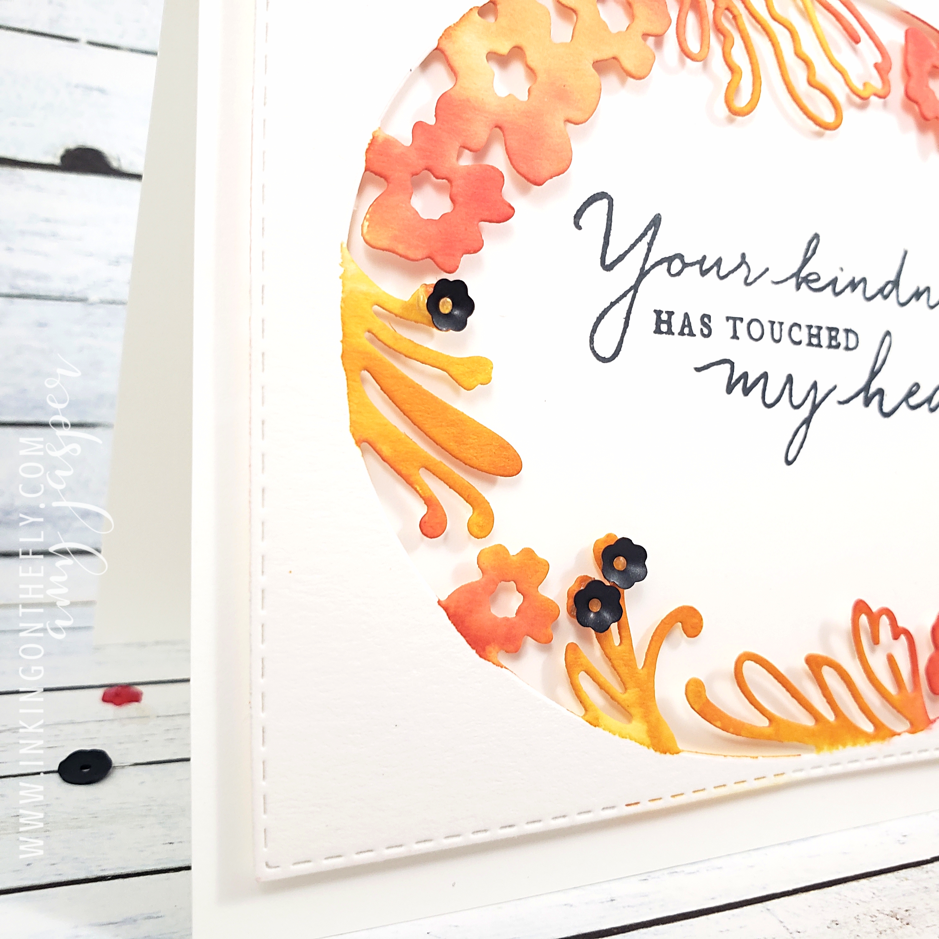
To some of the fronds, I added black sequins from the Peaceful Poppies Sequins pack using Glue Dots to hold them in place.

On a separate piece of Whisper White cardstock, I stamped the beautiful sentiment from the Path of Petals Photopolymer stamp set using Tuxedo Black Momento Ink. I did stamp it a little bit crooked, but that’s why I did it on a separate piece rather than stamping it directly on the card base!! (I’m smart like that, LOL!). I adhered it (with the sentiment straight) to the water coloured, die cut layer using Stampin’ Dimensionals. I needed to do some trimming with my Paper Snips (since the Whisper White layer was now sticking out, crooked, under the die cut layer), then I was ready to attach those two layers to my card base using my trusty Multipurpose Liquid Glue.

Now it’s your turn. Get into your craft supplies and make a card using these colours (or colours as close to these as you can get). This is an opportunity for you to get creative and use this colour challenge as a jumping off point. Sometimes, you just don’t know where you might land!! Don’t forget to share your finished card on a public internet site (Pinterest, public Facebook Page, public Instagram page, Flicker, Splitcoast Stampers, your blog, etc), then share it with us on the As You See It Challenge Blog! We love to see what you’re creative brain does with the challenges.

As always, if you like any of these products, head on over to my Online Store and get them into your shopping cart! Stampin’ Up! makes it easy to create beautiful things!

If you’re outside of Canada, you can’t legally shop from me, but I hope you will continue to visit. Don’t forget to comment and let me know that you did!!

Faux Stamped Metal

Check out today’s card design that shows off the super fun faux metal technique.

It all starts with a challenge, Yo!

Does that make me sound hip, cool, dope? Yeah, probably not.

The As You See It Challenge Blog has a theme for us this week.

I wanted to use a technique that I haven’t played with for a while – faux metal. But it should actually be called “faux stamped metal” because stamping into metal is an actual real thing (all the pretty jewelry!). My card uses Copper Foil, Copper Metallic Thread, and Copper Embossing Powder along with the beautiful florals from the Petal Promenade Designer Series Paper and the Wonderful Floral Framelits Dies.

The card base is Old Olive cardstock, but I ended up working with a 4″ x 5-1/2″ card front rather than my usual 4-1/4″ x 5-1/2″ simply because I cut my next layer narrower than I liked and trimmed the base to fit. I think it looks nice a bit narrower – there’s a slightly increased delicate flair to the design. The second layer (the one that I cut narrower by accident) is Mossy Meadow cardstock, die cut using the edge die from the Wonderful Floral Framelits. So pretty! The third layer is a square piece cut from the Petal Promenade Designer Series Paper. This paper pack has a few sheets which, instead of being a typical full 12″ x 12″ patterned piece of paper, are designed to be used in specific pieces. This square was among 6 squares on the sheet of paper. There were also rectangles and a beautiful floral edge piece that I will use for future crafty projects.

Before adhering the Mossy meadow piece to the card front, I attached the Petal Promenade paper and wrapped a piece of the Lemon Lime Twist ribbon from the Organdy Ribbon Combo Pack around the two pieces of paper.

This ribbon is one of the many items that you can earn for FREE with a $60 purchase of things you know you’re going to buy anyway! (you KNOW you will!!)

I tied the Old Olive Linen Thread (NEW! I love this stuff!) around the Organdy Ribbon in a big ol’ loopy bow!

The Wonderful Floral Framelits dies played their part beautifully for the next layers. Sahara Sand cardstock for the chubby oval, Lemon Lime Twist and Mossy Meadow cardstock for the leaves and Powder Pink for the flower buds. Tucked in behind all that is a strip of Copper Foil paper with hand-cut flagged ends.

Finally, the faux stamped metal piece and the loopy Copper Metallic Thread are attached with Stampin’ Dimensionals over the stems of the leaf collection.

Have you tried creating faux metal before? It takes a little bit of time, but it’s not a difficult technique. Start with punching out a piece of Basic Black cardstock with the Darling Label Punch. The colour of cardstock doesn’t matter, since it will be completely covered with embossing powder. Place the punched piece of cardstock on your Grid Paper and apply Versamark ink to it by pressing the ink pad directly to the paper. Pick up the paper with your craft tweezers and dip it in Copper embossing powder. Still holding it with the tweezers, heat set the powder as you normally would, but then you repeat that process two more times. Yup. You want that embossing powder three layers thick for the next part of the process. Don’t worry too much about the marks left by the tweezers – that will be taken care of with the final heating that comes next.

After applying the three layers of embossing powder, place your embossed piece of cardstock on a heat resistant surface (I use a piece of tile). Again, use your Heat Tool, this time straight above (perpendicular to) your paper so it doesn’t blow away. Heat it until the tweezer marks blend into the rest of the embossing powder and you can see that the powder is fluid and moving with the wind of your Heat Tool (I hold it about one inch away from the surface). Then, without delay, set your Heat Tool aside, grab the stamp and press it into the soft, warm embossing powder. Hold it there until the embossing powder sets a bit, then peel the stamp away from the paper. This will leave an impression of the stamp in the embossing powder, just like stamping on real metal would leave the impression of the stamp in the surface of metal! I used the hello stamp from the Darling Label Punch Box set.

Now that, my friends, is “dope”, Yo!

Check out my online store if you live in Canada and are interested in ordering stamping supplies. I KNOW you can do this dope technique, too!

P.S. – If you’re wondering about any damage that you might cause by putting your stamp into hot embossing liquid, not to worry. I held a class where 7 participants each used the same photopolymer stamp with this technique. After the class, I stamped the same stamp on some cardstock and it still stamped beautifully.

Wild About Vineyards

Another challenge, another half of the month is over! Wow, time goes so fast!

News alert! I am now unemployed!! Whoohoo! This is a GOOD thing, folks. I will now be able to focus on my family, my household, healthy life choices, and, yes, my stamping. Technically, I am employed as an Independent Demonstrator for Stampin’ Up! However, this is more like a hobby that gives me a bit of spending money to pay for my … well, my hobby, lol! I am thankful for the bit of cash that I bring in as a demonstrator to pay for haircuts and vet bills. Perhaps, once my home life is more at a maintenance level, rather than the current “catch up on all the things that have fallen apart since starting a family 13 years ago”, I will be able to put more time into building my business. I am incredibly happy with the last couple of weeks – I have been cleaning, gardening, running errands, cycling, camping, going on field trips, and I am looking and feeling healthier and more satisfied with each day. I am blessed to be able to make this change in my life and I acknowledge all the women who desire to be stay-at-home moms or wives,  but do not have the financial freedom to do so. I wish for you the opportunity to make any changes that you can to live on less so you can spend more time on life. That is my motto for this season in my life, Live on Less, because the things in life that are most important are not the things that cost money, but are the relationships, the experiences, the adventures, and the memories.

The challenge this time is another sketch:My design is a representation of my home here in the Okanagan Valley in beautiful British Columbia, Canada, where we have orchards filled with fruit trees and hills lined with vineyards. I love that I can find wines in my neighborhood liquor store that have been made from grapes that were grown just a moments drive from my house. The coloured image on the card is from the Tuscan Vineyard stamp set from Stampin’ Up!

I decided to use this sketch in a landscape orientation rather than portrait orientation.Wild about Vineyards card design by Amy Jasper www.inkingonthefly.com using Wild About Flowers and Tuscan Vineyard Stamp Sets from Stampin' Up!The image was stamped with Archival Basic Black ink on Watercolor Cardstock, then cut using the largest oval die from the Stitched Shapes Framelit Dies from Stampin’ Up. I coloured the image with the Stampin’ Up Watercolor Pencils and blended the colour on the paper with a Blender Pen. Behind the oval, you can see the 5/8″ Burlap Ribbon and the looped Linen Thread. The burlap was the last 3 inches on my spool, so I cut it into four pieces and tucked it just underneath the oval with Stampin’ Up Mini Glue Dots. For each side of the oval, I tied a large bow of Linen Thread, folded the bow in half so that the loops were together, and attached it with a Mini Glue Dot on the knot to the backside of the oval. This gave a fun loopy look to the thread and added much needed texture to the design.There is a strip of Wood Textures Designer Series Paper behind the oval as well. Behind that, is the Crumb Cake layer, on which I stamped the sentiment from the Wild About Flowers Photopolymer Stamp Set with Early Espresso ink. Because the stamp set is photopolymer, it was easy to get the necessary curve of the stamp on my acrylic block to match the curve of the oval. You may also have noticed that the “Congratulations” from the stamp set usually has a “on your” attached to the same stamp. I simply masked that part off with scotch tape before inking up the stamp, then removing the tape before stamping the sentiment. I like that this allows the card to be a fairly general congratulations card that can be used for retirement, graduation, completing a marathon, surviving the school year (I’m thinking of all the teachers this year who survived fidget spinners, bottle flipping, and general classroom chaos) or even just getting through a rough week and being given a bottle of wine as a reward (believe me, there are weeks when I wish someone would do this for me!)

The Crumb Cake layer also has a bit of detailing added around the edges. I used the Simply Scored Tool and Stylus to create the embossed border around this layer, then lightly sponged some Crumb Cake ink around the edges and over the embossed lines. This added so much more interest to the card, without making the card appear too busy.The rest of the card is just about layering and colour. The card base is Soft Sky, then I used Tempting Turquoise and Lemon Lime Twist as very thin layers to frame the Crumb Cake Layer. Of course, Stampin’ Up Dimensionals are also an important element to most of my card designs. I used Dimensionals under the Tempting Turquoise layer and under the oval to give the card a bit more depth.

The inside of the card has the same base layers as the front of the card: Tempting Turquoise, Lemon Lime Twist, and the scored and sponged Crumb Cake layer.

Now go forth and stamp! Use any of the As You See It challenges as a starting point to get your creative mojo flowin’!!

Save

Save

Save