2017

Music Note of Thanks

I like thank you cards.

I like to say “thank you”.

I am Canadian, after all, eh.  “Thank you” and “sorry” are some of the most frequently spoken words in my vocabulary.

Sorry that I didn’t post a card for the previous As You See It Challenge. Thank you for coming back to visit my blog even though I’m not very consistent in posting.

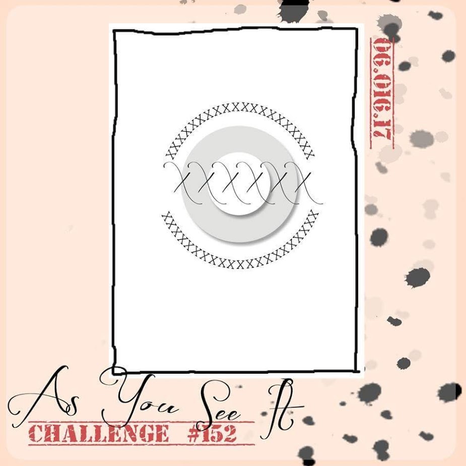
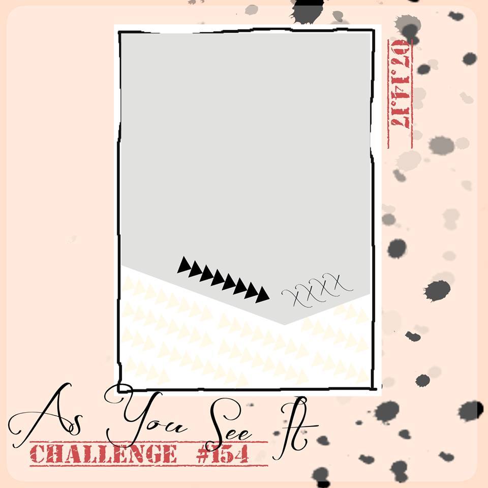
I have a cute and sweet thank you card to share with you today that I designed for the As You See It Challenge blog. Here’s the sketch that inspired this design:

As You See It Challenge #154I wanted to use my new favourite Stampin’ Up! product, the Embossing Paste. I love this stuff so much and need more! More paste and more masks! So fun!

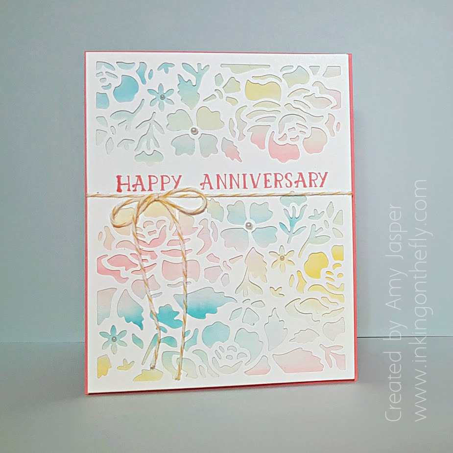
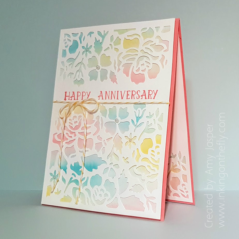
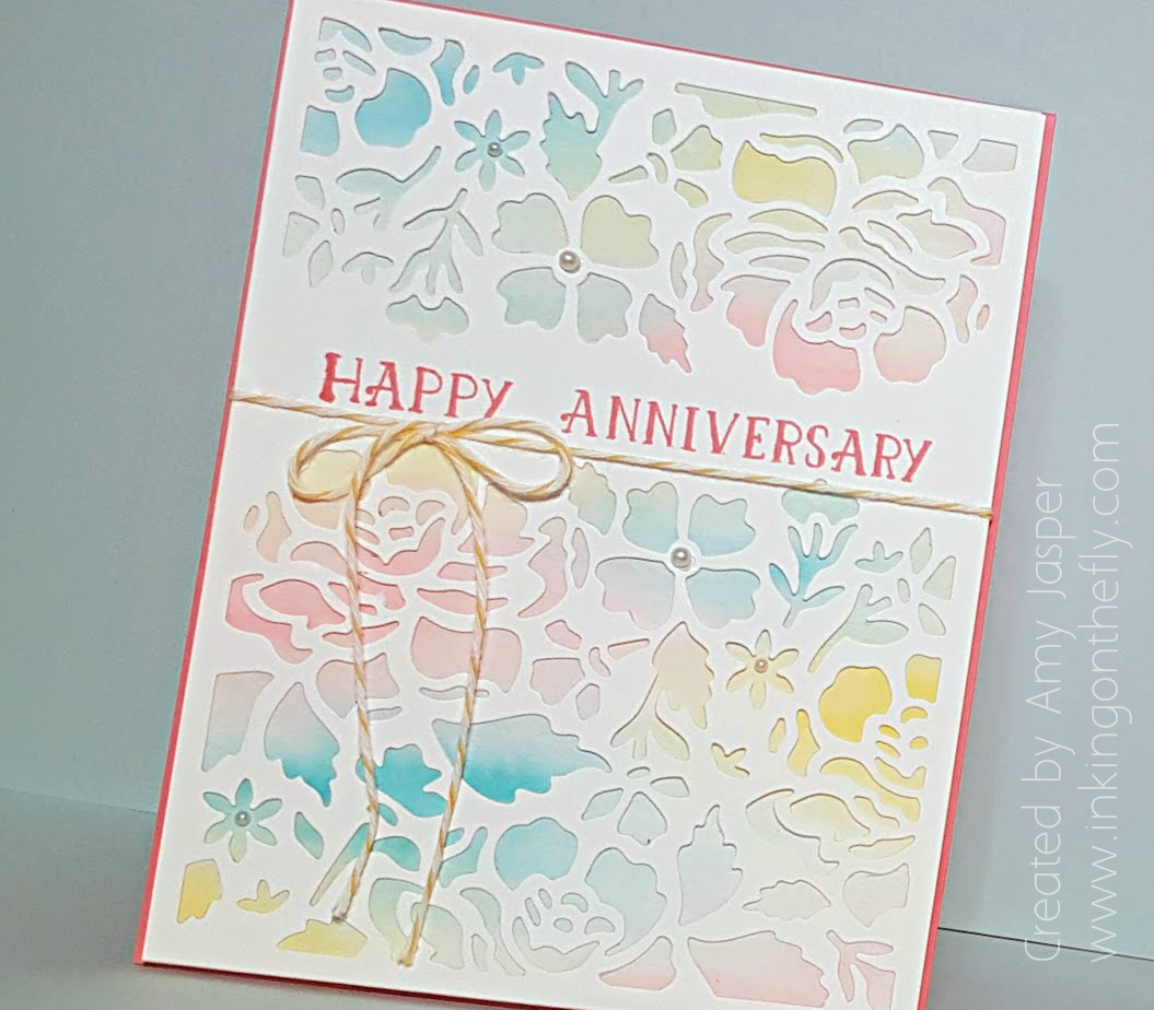
I started this card with the 3.5″ x 4.75″ piece of Whisper White cardstock and dragged my Powder Pink ink pad across the bottom at an angle. Then I dragged the Lemon Lime Twist ink pad across the bottom of the cardstock at the opposite angle. I covered the Lemon Lime section with a scrap piece of paper while I stamped the Sheet Music Background stamp in Powder Pink ink over the Powder Pink section. Then, I covered the area above the Lemon Lime Twist section with a scrap piece of paper so I could use the Lemon Lime Twist ink to stamp the same background stamp over the Lemon Lime Twist area. This turned out way cuter than I expected.

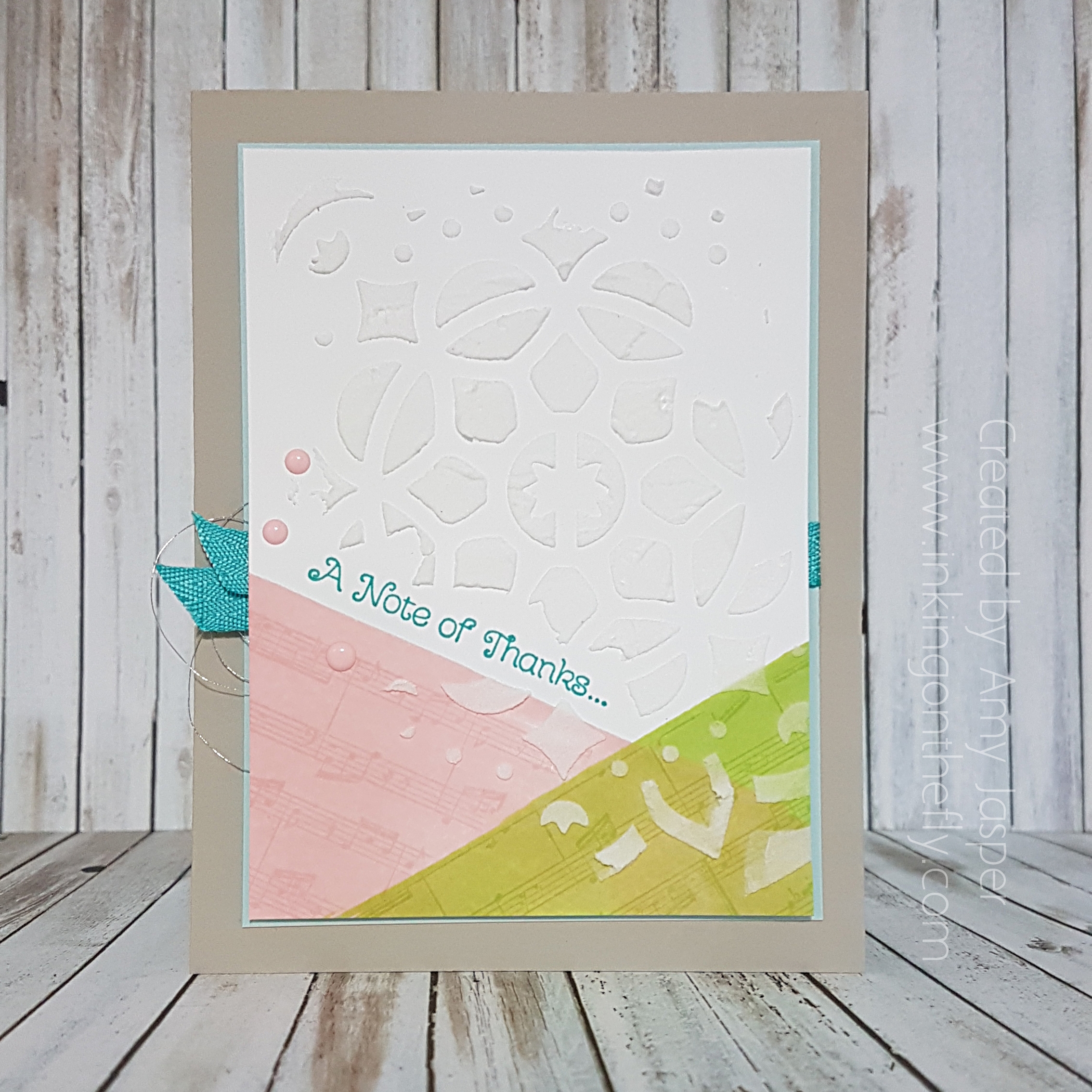
Bermuda Bay ink was used for the sentiment from the Thankful Thoughts stamp set. This sentiment was the perfect pun to use along with the Sheet Music background stamp set (more than one note of thanks!). I was delighted to discover that this sheet music is a section from Beethoven’s Fur Elise. A brilliant score!

Once the stamping was complete, I chose the medallion mask from the Pattern Party Decorative masks from Stampin’ Up!. Even though you can add ink to the embossing paste and make it coloured, I decided to keep it white for a quieter impact. If I were to create this card again, I think I would use some scrap pieces of paper to mask off my angles at the bottom, for a cleaner look. The way it is in this picture adds a little bit of character, though, which I also like.
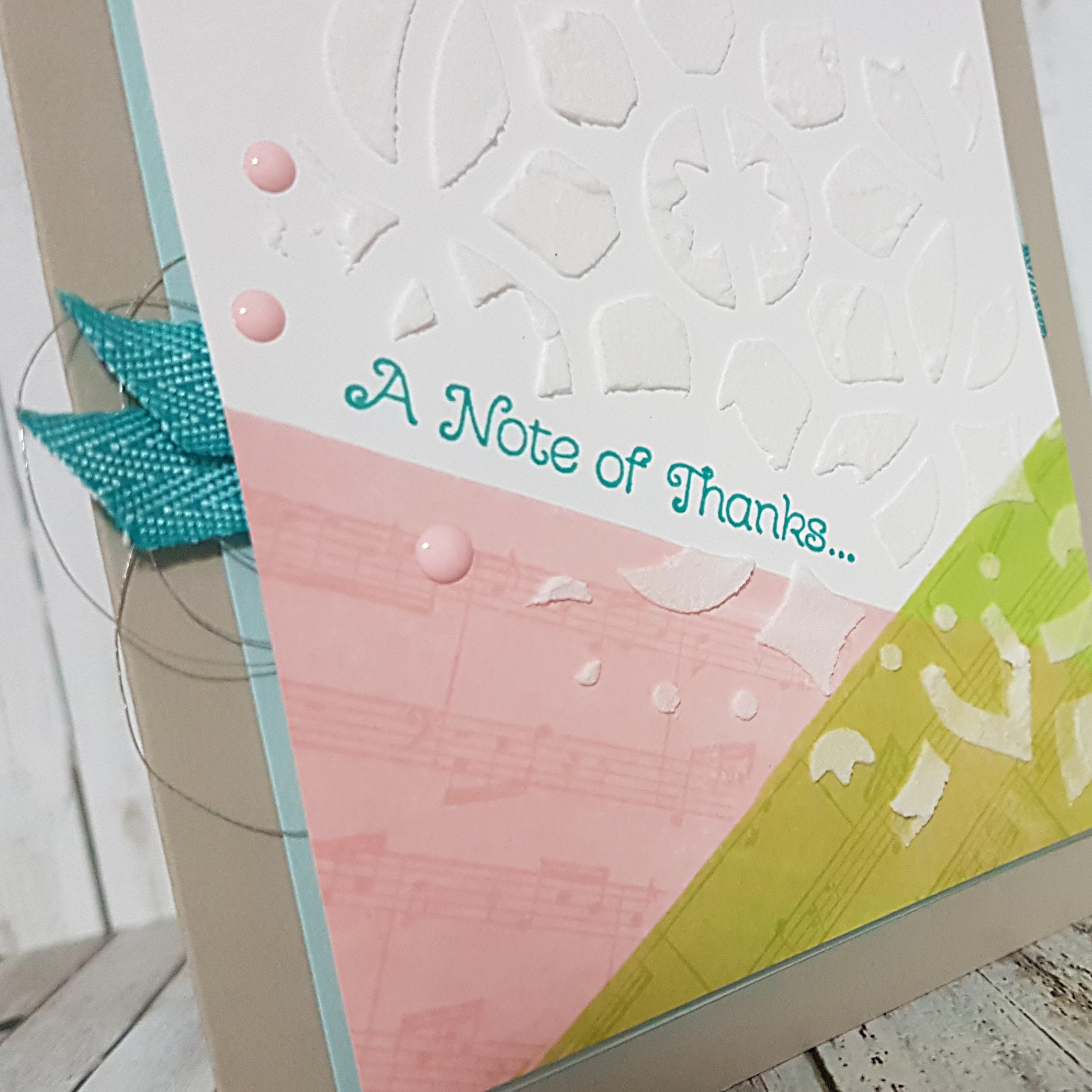
The paste takes about 15 minutes to dry. Once dry, I added a few of the Pink Pirouette Subtles Enamel Shapes. A couple 1.5″ pieces of Bermuda Bay 3/8″ Mini Chevron Ribbon were used to add some extra pop to the card. Each piece was folded in half and attached to the sides of the card. The one on the left side was trimmed with angled ends, folded in half and attached with a couple Mini Glue Dots to the back to the stamped and pasted Whisper White cardstock so that the ends would be peeking out from the left edge of the card front. The one on the right side was simply folded over the edge of the Soft Sky cardstock layer and adhered with Tear and Tape. This gives the impression that the ribbon goes all the way across the card.

It’s a cheat. I’m a rebel that way.

I also added a loop of Silver Metallic Thread to the left side of the card and attached it with Stampin’ Up! Dimensionals to the back of the Whisper White cardstock.
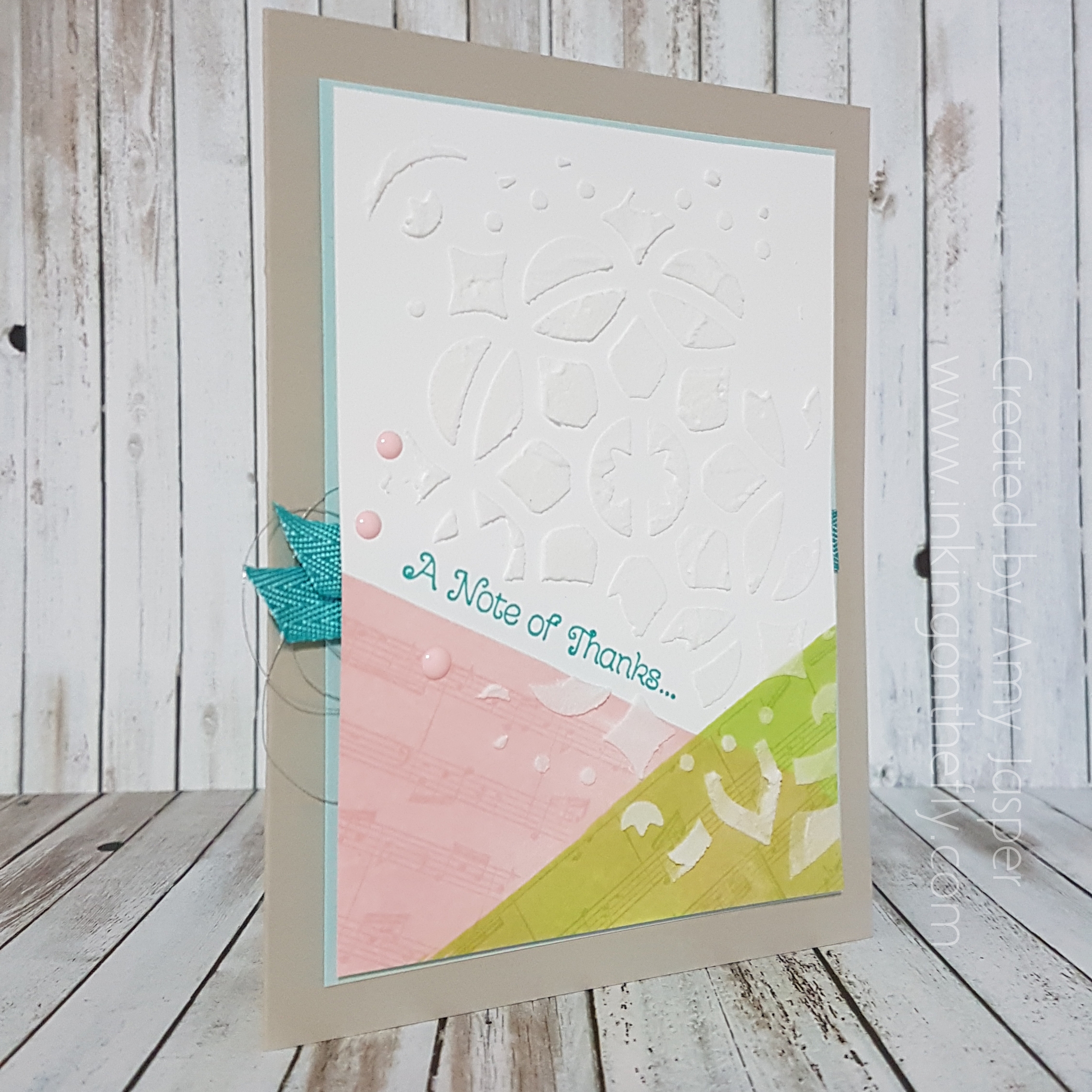
Finally, it was all ready to be assembled. The Whisper White cardstock was attached to the Soft Sky cardstock with Stampin’ Up! Dimensionals. The Soft Sky cardstock was attached to the Sahara Sand card base with Multipurpose Liquid Glue.

Check out the other designs created using this sketch from the As you See It Challenge blog. You just might feel inspired to try it for yourself!

Save

Save

Save

Save

Save

Save

Save

Save

Save

Wild About Vineyards

Another challenge, another half of the month is over! Wow, time goes so fast!

News alert! I am now unemployed!! Whoohoo! This is a GOOD thing, folks. I will now be able to focus on my family, my household, healthy life choices, and, yes, my stamping. Technically, I am employed as an Independent Demonstrator for Stampin’ Up! However, this is more like a hobby that gives me a bit of spending money to pay for my … well, my hobby, lol! I am thankful for the bit of cash that I bring in as a demonstrator to pay for haircuts and vet bills. Perhaps, once my home life is more at a maintenance level, rather than the current “catch up on all the things that have fallen apart since starting a family 13 years ago”, I will be able to put more time into building my business. I am incredibly happy with the last couple of weeks – I have been cleaning, gardening, running errands, cycling, camping, going on field trips, and I am looking and feeling healthier and more satisfied with each day. I am blessed to be able to make this change in my life and I acknowledge all the women who desire to be stay-at-home moms or wives,  but do not have the financial freedom to do so. I wish for you the opportunity to make any changes that you can to live on less so you can spend more time on life. That is my motto for this season in my life, Live on Less, because the things in life that are most important are not the things that cost money, but are the relationships, the experiences, the adventures, and the memories.

The challenge this time is another sketch:My design is a representation of my home here in the Okanagan Valley in beautiful British Columbia, Canada, where we have orchards filled with fruit trees and hills lined with vineyards. I love that I can find wines in my neighborhood liquor store that have been made from grapes that were grown just a moments drive from my house. The coloured image on the card is from the Tuscan Vineyard stamp set from Stampin’ Up!

I decided to use this sketch in a landscape orientation rather than portrait orientation.Wild about Vineyards card design by Amy Jasper www.inkingonthefly.com using Wild About Flowers and Tuscan Vineyard Stamp Sets from Stampin' Up!The image was stamped with Archival Basic Black ink on Watercolor Cardstock, then cut using the largest oval die from the Stitched Shapes Framelit Dies from Stampin’ Up. I coloured the image with the Stampin’ Up Watercolor Pencils and blended the colour on the paper with a Blender Pen. Behind the oval, you can see the 5/8″ Burlap Ribbon and the looped Linen Thread. The burlap was the last 3 inches on my spool, so I cut it into four pieces and tucked it just underneath the oval with Stampin’ Up Mini Glue Dots. For each side of the oval, I tied a large bow of Linen Thread, folded the bow in half so that the loops were together, and attached it with a Mini Glue Dot on the knot to the backside of the oval. This gave a fun loopy look to the thread and added much needed texture to the design.There is a strip of Wood Textures Designer Series Paper behind the oval as well. Behind that, is the Crumb Cake layer, on which I stamped the sentiment from the Wild About Flowers Photopolymer Stamp Set with Early Espresso ink. Because the stamp set is photopolymer, it was easy to get the necessary curve of the stamp on my acrylic block to match the curve of the oval. You may also have noticed that the “Congratulations” from the stamp set usually has a “on your” attached to the same stamp. I simply masked that part off with scotch tape before inking up the stamp, then removing the tape before stamping the sentiment. I like that this allows the card to be a fairly general congratulations card that can be used for retirement, graduation, completing a marathon, surviving the school year (I’m thinking of all the teachers this year who survived fidget spinners, bottle flipping, and general classroom chaos) or even just getting through a rough week and being given a bottle of wine as a reward (believe me, there are weeks when I wish someone would do this for me!)

The Crumb Cake layer also has a bit of detailing added around the edges. I used the Simply Scored Tool and Stylus to create the embossed border around this layer, then lightly sponged some Crumb Cake ink around the edges and over the embossed lines. This added so much more interest to the card, without making the card appear too busy.The rest of the card is just about layering and colour. The card base is Soft Sky, then I used Tempting Turquoise and Lemon Lime Twist as very thin layers to frame the Crumb Cake Layer. Of course, Stampin’ Up Dimensionals are also an important element to most of my card designs. I used Dimensionals under the Tempting Turquoise layer and under the oval to give the card a bit more depth.

The inside of the card has the same base layers as the front of the card: Tempting Turquoise, Lemon Lime Twist, and the scored and sponged Crumb Cake layer.

Now go forth and stamp! Use any of the As You See It challenges as a starting point to get your creative mojo flowin’!!

Save

Save

Save

Watercolour Floral Anniversary

I admit. There are many times when I find a great card online and I shamelessly copy it. In the stamping world, of course, we call it CASEing: Copy And Share Everything! My design for you today is a CASE of a card I saw and loved; simple and elegant, with a touch of whimsy. If you want to see the inspiration, click here.

And who doesn’t love the look of some watercolouring, anyway!?

The As You See It Challenge Blog has a theme challenge this week.

My card design uses the lovely Flirty Flamingo for the card. I used the Flirty Flamingo cardstock for the base and I used the Flirty Flamingo ink for the sentiment from the Number of Years photopolymer stamp set from Stampin’ Up!

To create the watercolour background, I first used an Aqua Painter to wet the entire surface of the Watercolor Paper from Stampin’ Up! It needs to be wet enough that the water sits on the surface without pooling, but not so wet that your colour just slides to the edges of the paper.

Then I picked up Flirty Flamingo Ink with my Aqua Painter and spread out a few brushstrokes of colour here and there on the Watercolor Paper. I wiped off the Aqua Painter before picking up some Tempting Turquoise ink and added some random swashes of it to the Watercolor Paper. Again I wiped off the colour before moving on to add some Daffodil Delight to the page until the page was full. With each colour that I added, I also took the time to carefully pull a little bit of one colour into the other on the page so they would blend together a little bit rather than having a sharp line between colours. This gave me some soft green, hazy purple and quiet peach tones in my palette.While I waited for my watercolouring to dry, I used my Detailed Floral Thinlit dies, my Big Shot (you definitely want the Precision Plate with these dies!) to cut the floral detail out of the Whisper White cardstock. I stamped the sentiment from the Number of Years stamp set by Stampin’ Up on the card with Flirty Flamingo ink.

When the watercolour was completely dry, I adhered the die cut Whisper White piece of cardstock to the Watercolor Paper with some Multipurpose Liquid Glue (not too much!). The Crushed Curry Baker’s Twine was then tied around these adhered layers before attaching them to the card base using Stampin’ Dimensionals. Basic Pearls were added to a few of the flower centers as a finishing touch.I also used the same technique for the inside of the card, but only used the smallest of the two floral dies from the Detailed Floral Thinlits.

Seriously folks, if you haven’t done any watercolouring by now, you MUST. Go right now and order some Watercolor Paper and some Aqua Pens. You won’t regret having these tools in your supplies!

Be sure to also play along with the As You See It Challenge using this anniversary theme. You never fail to inspire me with your creativity. So bring it!

Save

Save