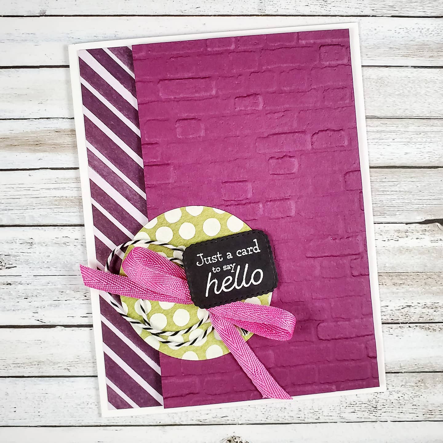
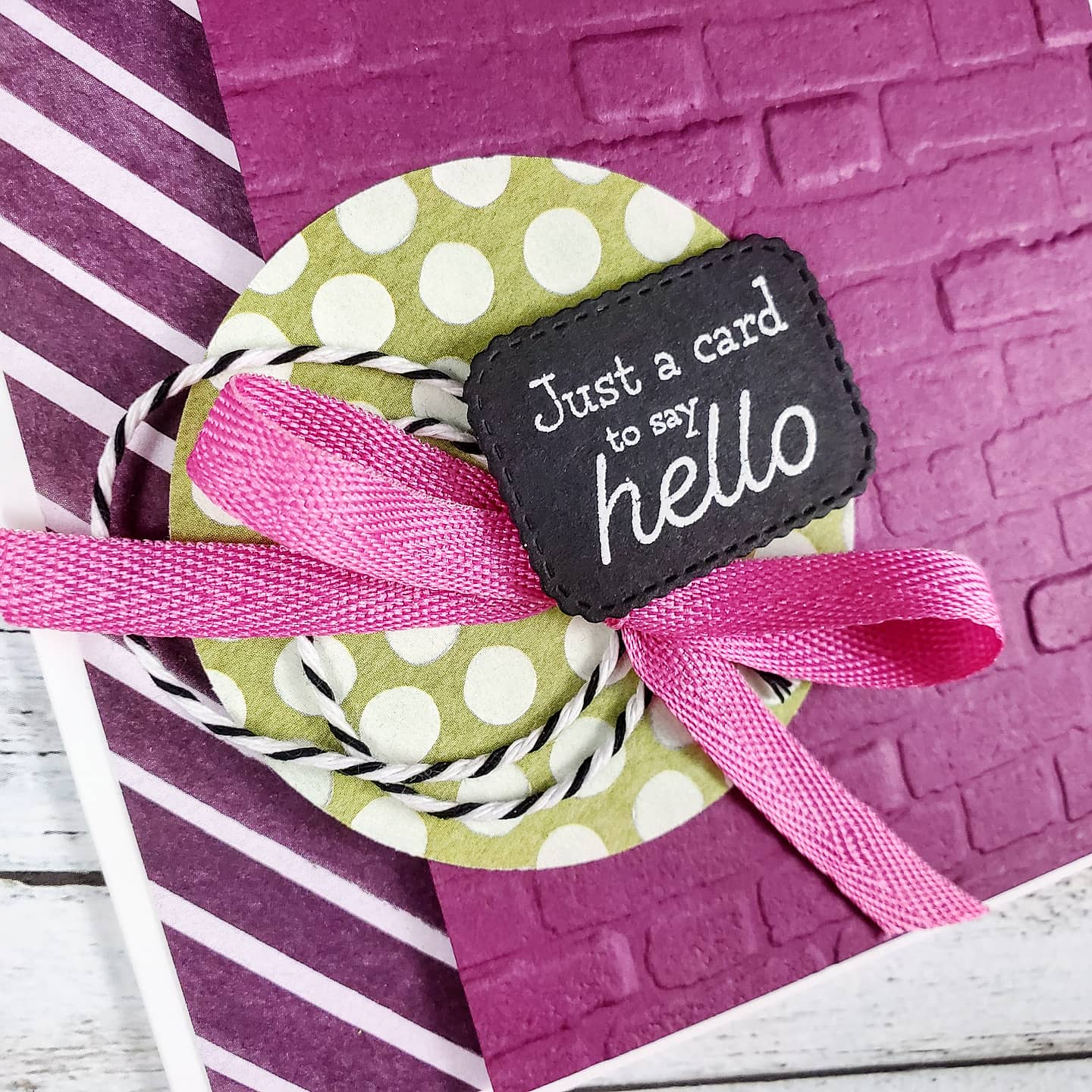
I used a Thick Basic White card base and added a 1″ strip of designer series paper to the left of the card. The Rich Razzleberry cardstock on the right side was embossed in the Cut & Emboss Machine using the Brick & Mortar 3D Embossing Folder and attached with Stampin’ Dimensionals. Fabulous texture! The polka dot piece of patterned paper from the Ice Cream Corner Designer Series Paper was cut with the 2 1/4″ Circle Punch from Stampin’ Up! and adhered directly to the Razzleberry layer.
The true delight is in the loops of black and white baker’s twine from the Playful Pets Trim Combo Pack, combined with the bright Magenta Madness 1/4″ Twill Ribbon tied in a bow and the black label with the White Embossed sentiment. The label and sentiment come from the Many Messages Bundle. The big background stamp has a wonderful collection of sentiments and the die cuts them all out at once! It’s brilliant!
You can find all these products on my online store with Stampin’ Up!
The next Stamp Camp event will be May 15th! If you’re in Canada, then be sure to save the date and watch for registration info!
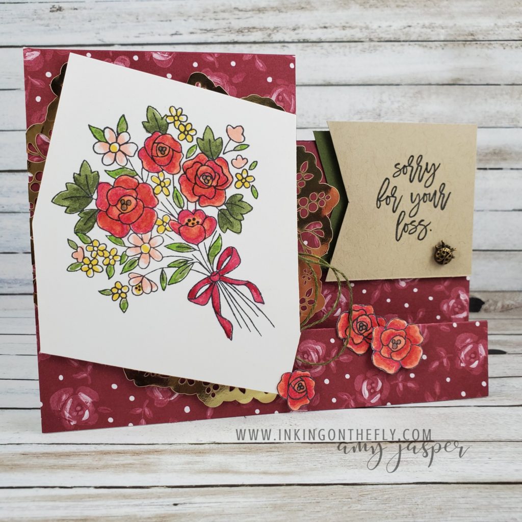
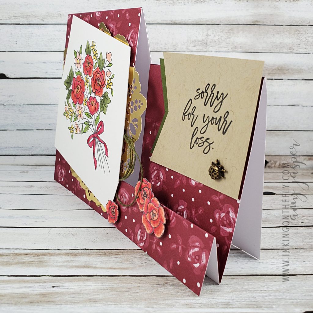
I had some fun with the February 2021 Paper Pumpkin kit: Bouquet of Hope and created a side-step card design with some of the supplies and the stamp set in the kit. You can watch the video of my awkward process making this card by going to my videos on my Facebook Page. I didn’t have much of a plan when I started this card, other than knowing it would be a step card fun fold – thus, the awkwardness!
The video shares my process and provides the initial measurements to create the base of the side-step design. I still want to try to work with the other card bases in the kit to make some more of these fun folds with the other two colours in the kit.
I stamped the sentiment and the bouquet image with Tuxedo Black Momento ink. The image was coloured with Stampin’ Blends Markers.
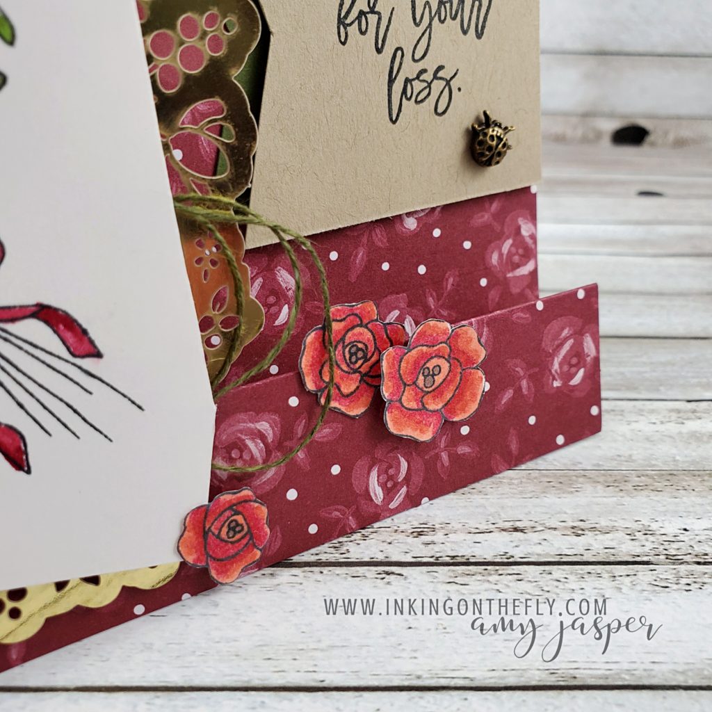
While making this card, I couldn’t decide what I wanted to do on the front step on the right side. I tried ribbon and various strips of paper, but everything I tried was too bold or seemed to change the overall feel of the design. In the end, I stamped the bouquet a second time on a scrap piece of Basic White cardstock, coloured the three roses with my Blends Markers (Calypso Coral with a touch of Light Cherry Cobbler). I fussy cut the roses and added them to that front step. It felt like just the right thing to finish this design!
Check out my Facebook Live Video for the measurements and give this design a try.
Today is the last day to subscribe in time to get the March Paper Pumpkin kit delivered to you. Start your subscription by clicking HERE!
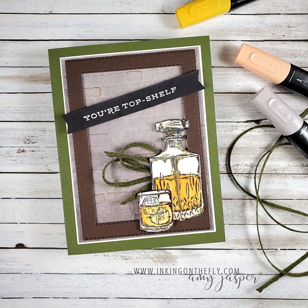
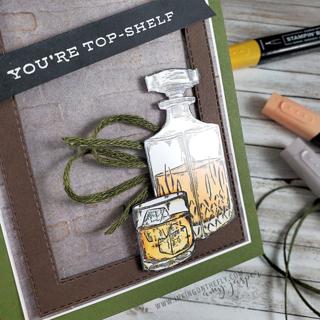
Check out this Stampin’ Up!® card with earth tones and a whiskey theme featuring the Whiskey Business stamp set.
Lots of women drink whiskey (I know I do!) and love the colours in the earth’s palette, so to say my card today is designed for a man would be inaccurate. I don’t think that certain colours or styles are for men and others are for women and I would LOVE to see us move away from that. I have also struggled with saying that something is masculine or feminine – who decides that anyway? That said, it is super challenging to re-train our thinking and our descriptive language out of using these terms. When someone tells me that something looks masculine, I know exactly what they mean – brown, navy, gray, black, green, rust and maybe shades of darker reds and oranges. It often also implies textures like wood, stone, and leather. Themes like cars, sports, hunting, fishing, whisky, beer, and barbecues. Thus being caught between wanting to avoid using “masculine” or “feminine” as descriptive terms and recognizing these as commonly understood descriptives.
My card today is made with rich earth tones and textures, modern lines, and a whiskey theme. You might choose to give it to your dad for Father’s Day, or to your friend along with a bottle of her favourite scotch whiskey for her birthday (yes, please! LOL!).
One of the patterns from the In Good Taste Designer Series Paper looks like granite or cement, which I embossed using the Brick & Mortar 3D Embossing Folder. I lightly sponged it with Crumb Cake ink to highlight the bricks and warm up the gray of the patterned paper. This was adhered to a piece of Basic White and then to the Mossy Meadow card base.
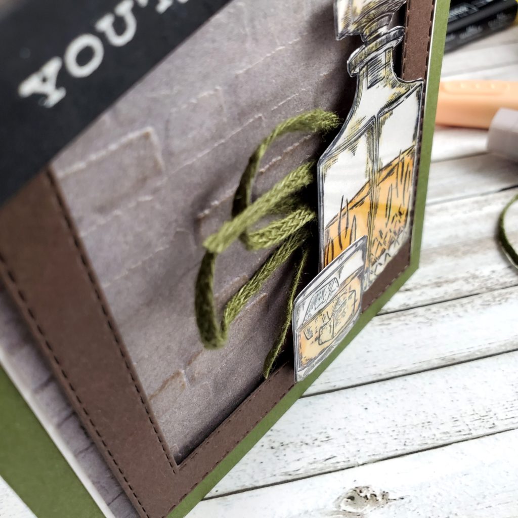
To create a frame, I used two of the Stitched Rectangle Dies with Early Espresso cardstock and adhered it to the card with Stampin’ Dimensionals. The images were stamped on Basic White cardstock with Tuxedo Black Momento ink and coloured with my Stampin’ Blends Markers. I used Light Mango Melody and Light Pumpkin Pie to create the amber liquid. Sparse use of the Light Gray Granite with the Light Mango Melody help to achieve some shading on the decanter and the whiskey tumbler. I stamped the same images on some Window Sheets with Black StazOn ink. I fussy cut tight around all the images and adhered the Window Sheet image to the Basic White image using sparing dots of Multipurpose Liquid Glue. The decanter is adhered directly to the Early Espresso Stitched Rectangle frame and the tumbler is on Stampin’ Dimensionals over the bottle.
I tied a piece of Mossy Meadow Linen Trim in a loose bow, folded it in half and tucked it under the decanter with a glue dot. The sentiment is stamped on the Basic Black cardstock with Versamark Ink, then powdered with White Embossing powder and heat set to the smooth glossy finish with the Heat Tool. I flagged the ends by hand with my Paper Snips and adhered the sentiment to the card front with Stampin’ Dimensionals over the frame.
This was my first time to finally use the Whiskey Business stamp set from Stampin’ Up! and I’m so happy with how it turned out!