Floral Retirement
It’s time for ….
AN UBER CARD!!
Every now and then my husband asks me to design a card for staff at the university who are moving on to bigger and better things – like retirement! This is when I get to design what I call a book card; that is a larger card (usually 5″x7″, like the one today) with multiple pages inside for a large group of people to sign. I like to do the accordion binding, but sometimes I do different bindings with stitching, o-rings, or flip designs. The card I have to show you today has an accordion binding with three pages.
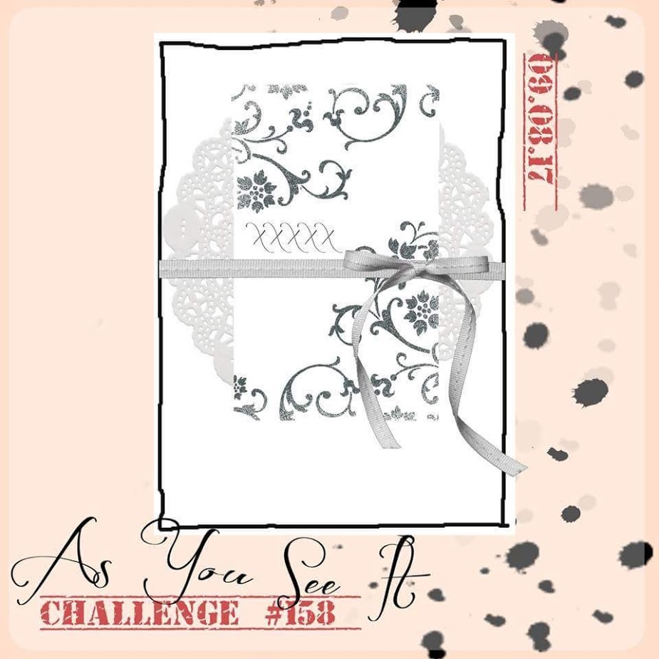
I chose to use the As You See It Challenge colour combination as a starting point for the design as my husband didn’t have much to give me to go on. I like to customize the card to the person, if possible.
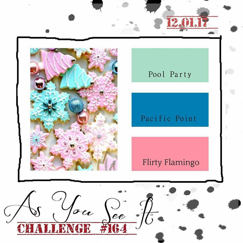 I really struggle with blue and pink colour combos, but I think it worked out with the Whisper White and Sahara Sand neutrals that I chose to add to the mix on my Uber Card.
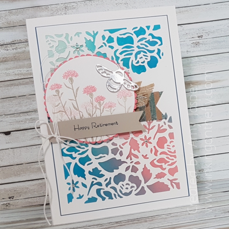
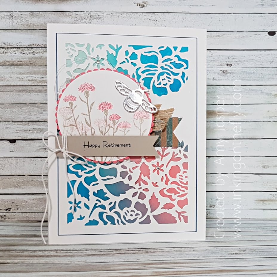 It is a 5″x7″ card with a 1/4″ depth (basically, it has a 1/4″ spine, like a book). The card base is created with Stampin’ Up’s Thick Whisper White Cardstock. I used Pacific Point cardstock as a very thin mat layer under the layer of Whisper White Floral Thinlit die cut. Peeking out from under the die cut, you can see the sponging of the three challenge colours, Pacific Point, Pool Party, and Flirty Flamingo that I did on Stampin’ Up’s beautiful Glossy White cardstock! I love how well the colour blends on this glossy paper!
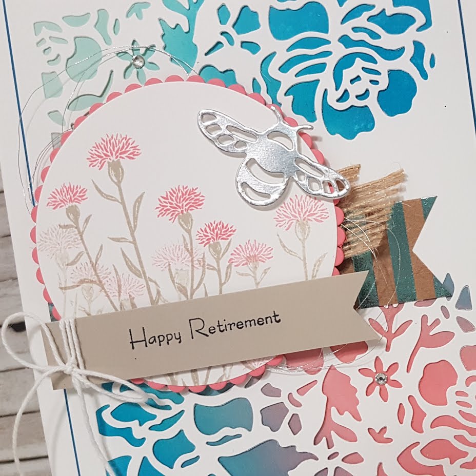 The Flirty Flamingo scalloped circle and the Whisper White circle are cut using the Layering Circle Framelit Dies. The images from the Wild About Flowers stamp set were stamped on the Whisper White circle using Sahara Sand and Flirty Flamingo ink. The circles were attached together with Tombo Multipurpose Liquid Glue and adhered over the 5/8″ Burlap Ribbon and the Foil Frenzy Specialty Designer Paper banner with Stampin’ Up Dimensionals. Behind the circles, you can also see the Silver Metallic Thread in swooshy loops (such a pretty addition to almost any card).
The Happy Retirement sentiment is from the Teeny Tiny Wishes stamp set and was stamped on the Sahara Sand banner with Tuxedo Black Momento Ink. The ends of both paper banners were perfectly cut using the Triple Banner Punch (Thank you, Stampin’ Up!). Whisper White Baker’s Twine was just the right touch to wrap and tie on the Sahara Sand banner before attaching it to the circle with Stampin’ Dimensionals.
The sweet little Silver Foil bee was die cut with the Detailed Dragonfly Thinlit Dies and also attached with Stampin’ Dimensionals.
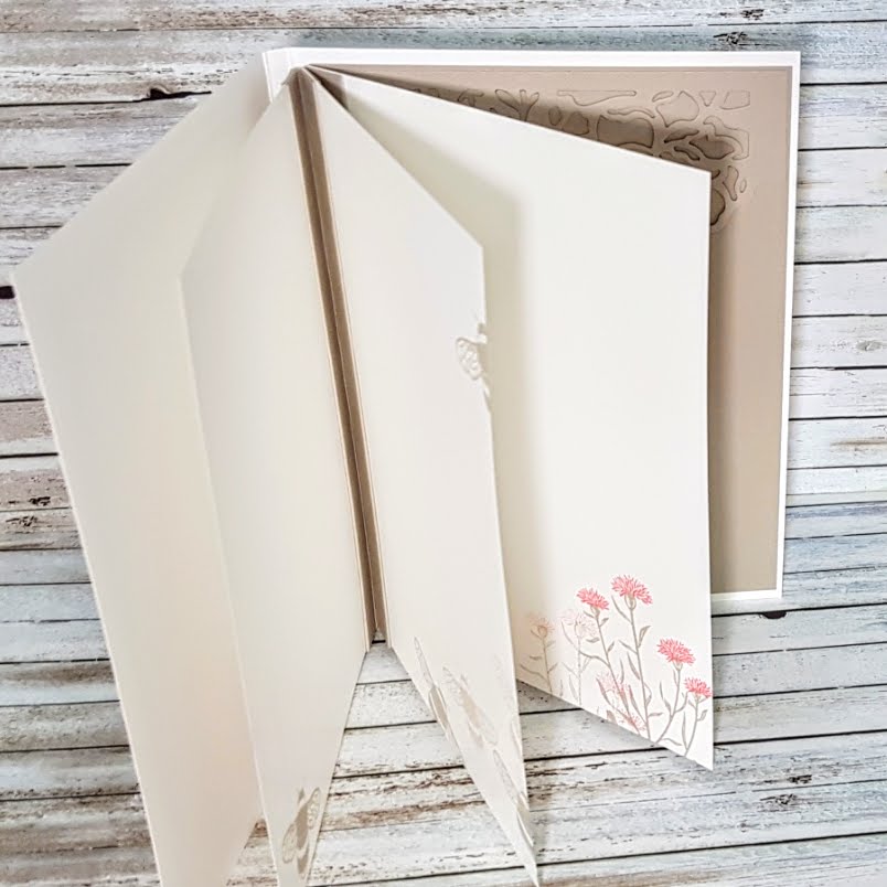 The inside of this Uber Card, is created with an accordion fold binding technique. This is done by scoring the cardstock of choice at half inch intervals, then gluing them together with your pages caught between every second fold. I keep meaning to do a tutorial video of this technique! If you bug me with comments on this, I just might get around to it more quickly (just sayin’, lol!)
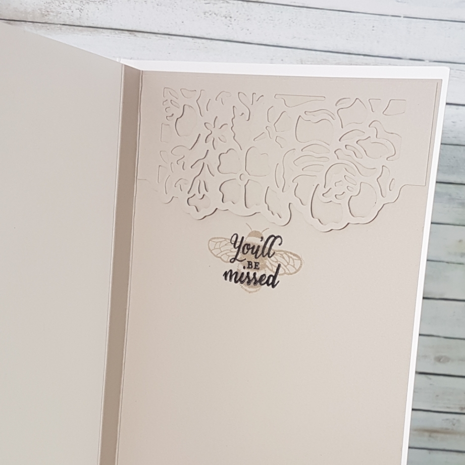 For a secure binding, I left a section of the accordion folded cardstock free of scoring so it could be used as a full back page. The little bee from the Dragonfly Dreams stamp set was stamped in Sahara Sand ink with the You’ll be Missed sentiment from the Wild about Flowers over it with black ink.
I really struggled with mucking up my paper with ink repeatedly! So frustrating!! The pretty little Detailed Floral die above the bee is covering up one of those smudges. I also added extra stamped bees on my inside pages to cover up annoying smudges. Even the front of the card ended up with a blasted smudge of Sahara Sand ink on the Whisper White cardstock!!! All I could do there was dab it with my White Chalk Marker, letting it dry, then repeating until the smudge was mostly hidden unless the light caught it just so. I have had to use that Chalk Marker technique a few times for small smudge repairs. It’s definitely better than redoing the entire card and most people won’t notice the tiny flaw that remains. If they do, they chalk it up (pun intended, lol!) as a unique flaw in a hand made product.
 If you’re interested in a video tutorial on how to make an accordion fold binding like I used in this card, write it in the comments on this blog post.
Also, if you have any tips on hiding ink smudges (or avoiding them), please add it to the comments on this post as well. I would love to hear any wisdom that you have to share!
