card

Thankful in Berry Tones

049header

Welcome to my blog where I share my love of designing using products by Stampin’ Up!

If you are a regular follower of my blog, you may have noticed a bit of a pattern on Fridays, lol! Here we are on Friday again and it’s time for another As You See It Challenge design!


#49

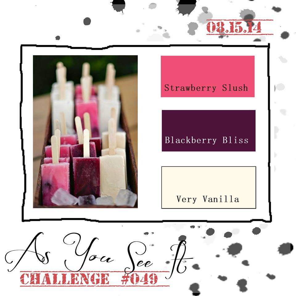
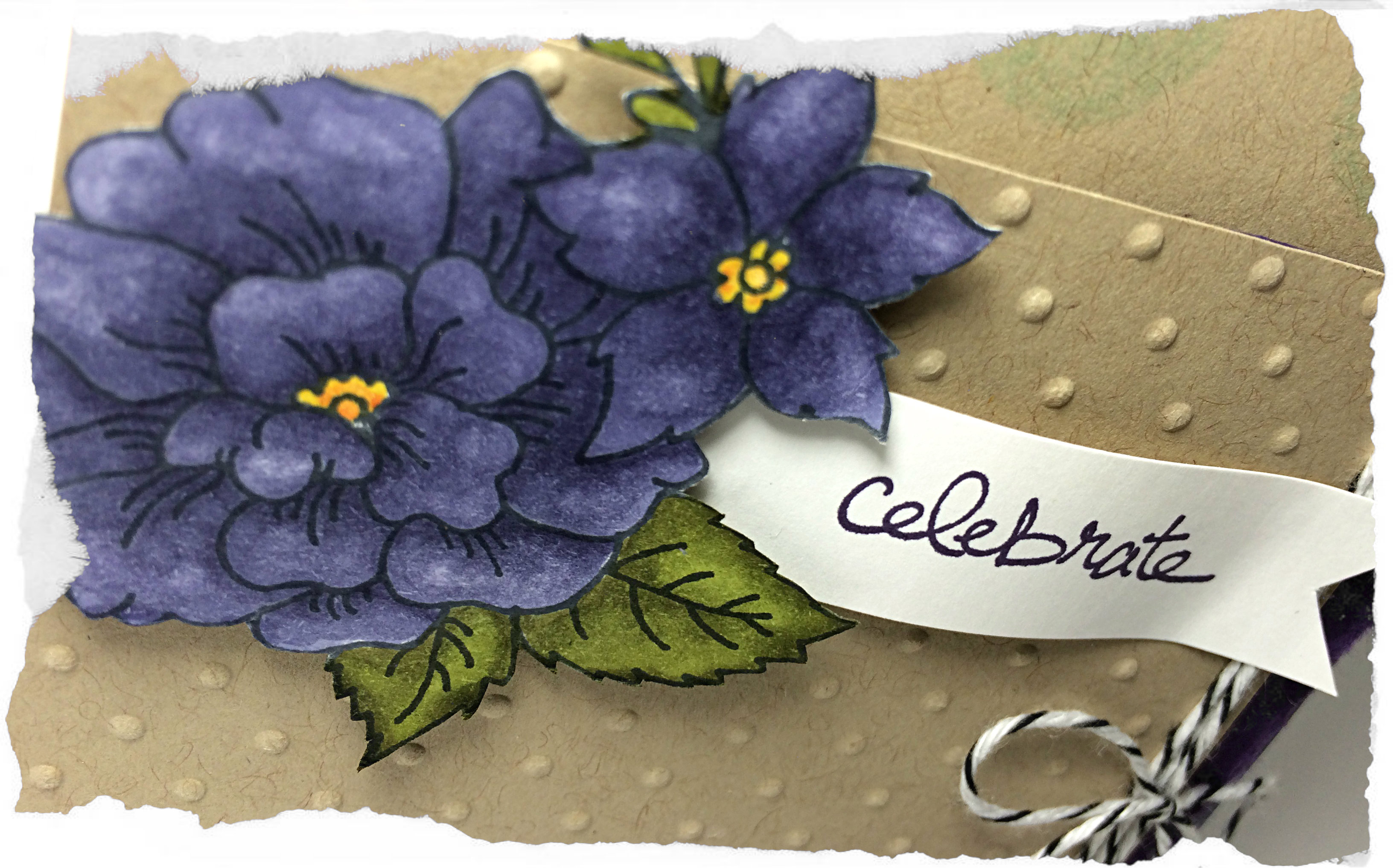
I love Blackberry Bliss. It’s such a rich tone. I normally don’t like to work with purple, but I’m getting better at it. Blackberry Bliss is definitely easier for me than other purples, though (just don’t expect me to pair it with yellow very often!)

049Amy

I decided to play with the hostess set “I Like You”. When I got this set, I was excited to colour those flowers with my new Blendabilities, but it looks lovely as a line image too, don’t you think?

I had some fun embossing with clear embossing powder for this card. I used my Embossing Buddy on two pieces of cardstock: the Blackberry Bliss card base and a rectangular piece of Very Vanilla, then I stamped with my Versamark ink (the cleanest ink pad of THREE that I have as I inevitably muck them up with ink transfer from supposedly ‘clean’ stamps). I embossed with my heat tool and clear embossing powder.

The card base, I set aside, while the Very Vanilla piece was sponged heavily with Blackberry Bliss ink and Strawberry Slush ink. If you’re familiar with this technique, then you know that the water-based ink will not stay on the embossed areas. Just wipe off the traces of ink with a paper towel to reveal the Very Vanilla colour that has been protected by the embossing powder for this Emboss Resist technique.

049technique close

The sentiment was done using precise stamping with varied amounts of ink. You can use the Stamp-a-ma-jig to help with your placement. I was trying to get an ombre-like gradient of colour each time I stamped the sentiment. I used Strawberry Slush and Blackberry Bliss, stamping off for the lighter images and using full strength ink for the darker images.

049closetwine

Give this colour combination a try and link up your photo to Challenge #49.

I hope you’ll leave me a comment (this blog refers to them as a “reply”) and let me know your thoughts. I have been missing your encouraging words 🙂

Amy.

Designer-Badge


Celebrate with Wisteria

046header

Welcome to my blog where I share my love of designing with Stampin’ Up! paper, rubber stamps, inks and tools!

I still have one more post of Convention photos to share with you, but now that I’m home again, it’s difficult to find the time to load the photos and share them with you. It was great fun to get away with my Stampin’ Up girls. Now I’m back to the real world and it’s real busy! If I want to reach the Grand Vacation to the Mediterranean (it’s a HUGE jump for me, so we’ll see how it goes), then I need to make time for my Stampin’ Up! business. Hope you’ll help me for the ride!!

It’s been a couple weeks since we had an As You See It Challenge. Have you missed us?

AYSIChallenge046-1024x1024

This sketch is super cute, don’t you think? If I had the fringe scissors (which, shockingly, I don’t … yet!), I would have used them for that little side fringe. Instead, I chose to do the ol’ fashioned tearing technique.

046Amy

Purple isn’t my favourite colour to work with, but this card decided it wanted to be purple. I tried really hard to make it Island Indigo and Pool Party, but it didn’t let me.

I used a Wisteria Wonder card base. You can see that I used two layers of Crumb Cake cardstock. One is matted with a thin layer of Whisper White cardstock with some large polka dots. These were added using the Dots and Stripes Mask. I positioned the dots mask over my cardstock, then spritzed it with Pool Party ink that I had mixed in a Stampin’ Up! spritzer with a bit of rubbing alcohol. I added the splotches of Elegant Eggplant ink with my Gorgeous Grunge stamp set only after I accidentally dropped my ink pad on the corner of my cardstock (oops). Oh well, it worked out in the end, lol!

The smaller layer of Crumb Cake cardstock was embossed with the Perfect Polka Dots embossing folder. I added the torn piece of Elegant Eggplant to the edge of that and tied on the Black Baker’s Twine before adhering it with Stampin’ Up Dimensionals to the card.

046closeThe flower is from the hostess set called “I Like You”. It’s perfect to use with the new Blendabilities. In this case, I used the Wisteria Wonder, Old Olive, and a combination of Daffodil Delight and Pumpkin Pie for the center of the flowers.

The sentiment on the banner is from the Good Greetings stamp set (not yet available) which I received for free from Stampin’ Up! for team leadership. I love free stuff!! I used my Bone Folder to curve the banner and give it a bit of shape before adhering it to my card.

Now it’s your turn! Give the sketch a try and share your creation on the As You See It Challenge page for Challenge #46. I can’t wait to be inspired by your design!

Amy

Designer-Badge

Dressed in Green

043header

Welcome to my blog where I share with you my love of designing using Stampin’ Up! paper, inks, stamps, and tools. Today I show you how I step up my 10 minute card.

It’s Friday! Time for a challenge that is super fun, but probably one of the hardest for me. On the one hand, I love the 10 minute speed challenges because they force me to produce a card quickly and help to reroute some of my fussy creative brain waves. On the other hand, I find it very difficult to take my hands off at or around the 10 minute mark because there are things to keep fussing with, lol!

I also wanted to participate in the Paper Players sketch this week. I think I’ve only participated in one or two challenges other than the As You See It Challenge blog for which I am a designer. It felt like it was time 🙂

#43    PP201

I wanted to turn the Paper Players sketch on its side.  For my shades of green, I used the new Mossy Meadow with the lovely Pear Pizzazz. With the Basic Black and the Black and White Designer Series Paper, I thought it turned out pretty good after 9 minutes and 56 seconds (phew, that colouring with the Old Olive Blendabilities nearly put me over!)

043Amy

9:56

Though there is really nothing wrong with this card, I wanted to add some pop, so I thought I would use the opportunity to show you how you can step up a simple card with some colour.

Here’s the stepped up card that I used in the Paper Players challenge:

042improved

Yes, this card feels complete. This card pleases my eye. This card did not take less than 10 minutes!

You can see that I added some Daffodil Delight and Cherry Cobbler to the scooter lights using my Blendability pens. I also shaded the tires with Basic Grey and Smoky Slate Stampin’ Up Markers (the tires on the speed challenge card were darkened with a black pen that I had nearby – no time to find my markers, lol!). I even added a bit of Smoky Slate marker to the shadow of the scooter.

Here’s a close up of the two side-by-side, so you can see the difference:

043Amycolouring042improvedcolouring

You know, now that I see them side-by-side, they both look alright.

As for the rest of the stepped up card, I used some Hello honey satin ribbon and a couple of arrows from my Label Card Thinlits – one in Whisper White and one in Hello Honey cardstock.

The card has a few layers up on Dimensionals, which don’t always show up in my photos. If you look closely, you might notice that the entire center piece, framed in Whisper White, is lifted up on Stampin’ Up! Dimensionals. As is the Window Framelit image and the Whisper White arrow. I cannot emphasize how much of an improvement Dimensionals add to a project. If you don’t have them, GET THEM!!

I hope you will try the As You See It challenge this week. You might even consider the next Paper Players challenge, too. They just might help reroute your creative brain and get the artsy mojo flowin’!

Amy

Designer-Badge