card

Snowflakes Fall Slowly

061header

I have a card for today’s colour challenge that uses the Snowflake Card Die from Stampin’ Up! with some atypical snowflake colours and I think it turned out beautifully!

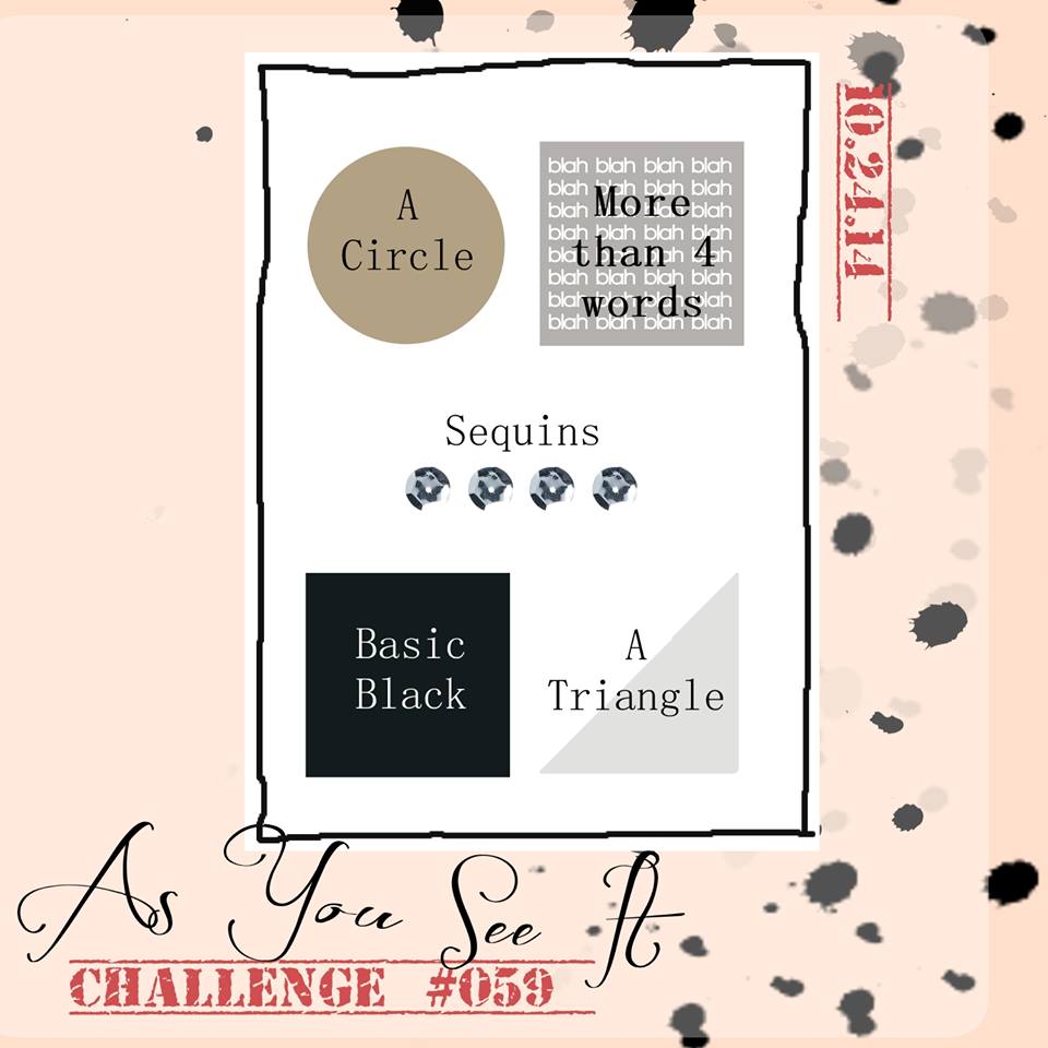
Check out this palette:

#61

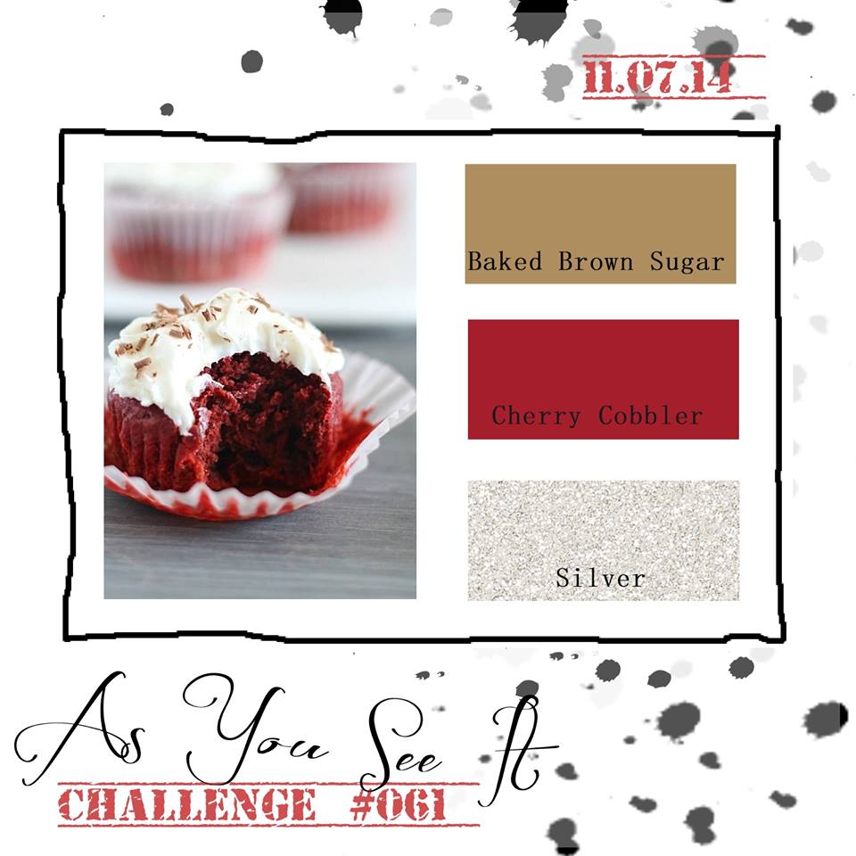
When you think of beautiful snowflakes, do you imagine them in red and brown? Not usually. You probably think of white, silver, or blue if you have snowflakes on an art project. However, these challenge colours: Baked Brown Sugar, Cherry Cobbler, and Silver give a warm earthy feel to something normally cold and crisp. Snowflakes fall slowly and quietly, they dampen the noise in the street, all while you are warm and cozy by the fire in your living room. These are cozy colours of sitting by the fireplace on a cold, snowy day.

I have been aware that I need to slow down a bit lately and have been completely unsuccessful. In fact, I think I’ve had more going on in the last month than I’ve had in a long time! The autumn months are always busy in the stampers world with all of the Christmas preparations. It’s busier with the kids in the fall as well. I find that whenever I’m able to delete something from my time table, another thing comes along to fill its place. I was asked the other day what I do for downtime, to recharge, and I realized it’s been so long that I don’t even KNOW what I do for downtime. Part of that is the busy life of a mom of 3 ever-going kids – I’m always one or two (or 23) steps behind everything! It’s gotten a bit out of hand lately. The house is a disaster with piles of stuff all over the place, boxes of stamping supplies still waiting to be put away after events long gone, school papers from the kids, clothes in boxes that need to go to charity – I’ve lost things in the clutter and have found myself forgetting things while attempting to juggle the activities and events for me and my family.

But … I watched a bird today. It wasn’t doing anything special – just silently flying above the noise of the cars zipping around on street below, in its own world, just being a bird. I think it was playing on a breeze up there. I wanted to be like that. Just ‘in the moment’, not caring about anything or anyone. Enjoying ‘being’.

So, I take notes from the bird and ponder a snowflake falling slowly and quietly, and I am going to try to be more like that for a while. To slow down. To enjoy some ‘being’. And a part of that will be to take a break from my stamping events so I can catch up on the needs of my household and my family. I might even light the fire in our living room and have a cup of tea. Why not? Crazier things have happened before, lol!

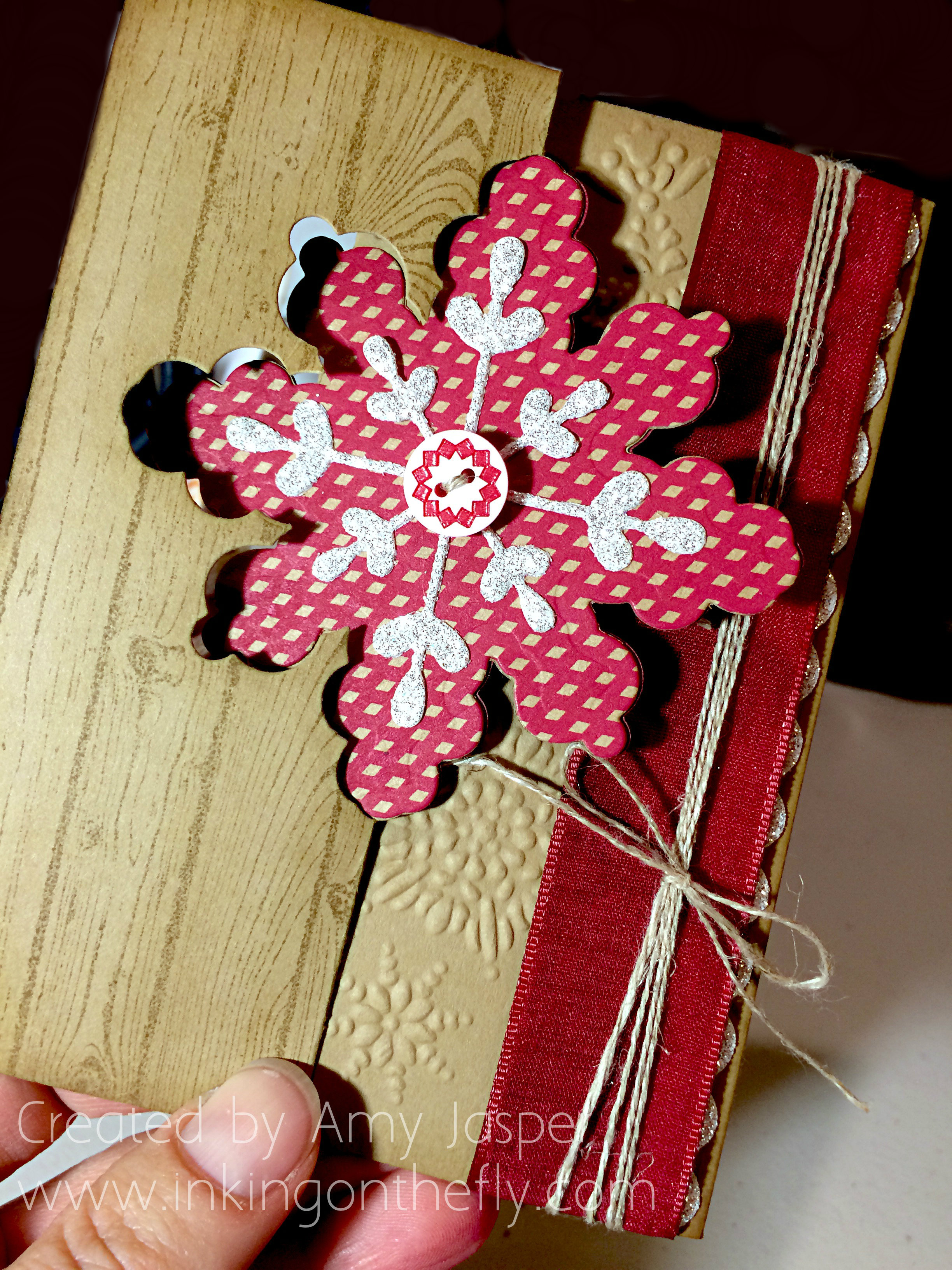
I designed my card while I was away at the Creative Escape Retreat at Rockridge Canyon in Princeton, BC. The photo below shows the card closed. I used the Snowflake Card thinlit in the Big Shot to cut the card base but using a full 5.5″ x 8.5″ piece of cardstock so that the thinlit would not cut it on the one end (I’m sure you’ve seen these sorts of dies used this way before – if not, google ‘extended flip card’ and you should find a tutorial’)

061Amy

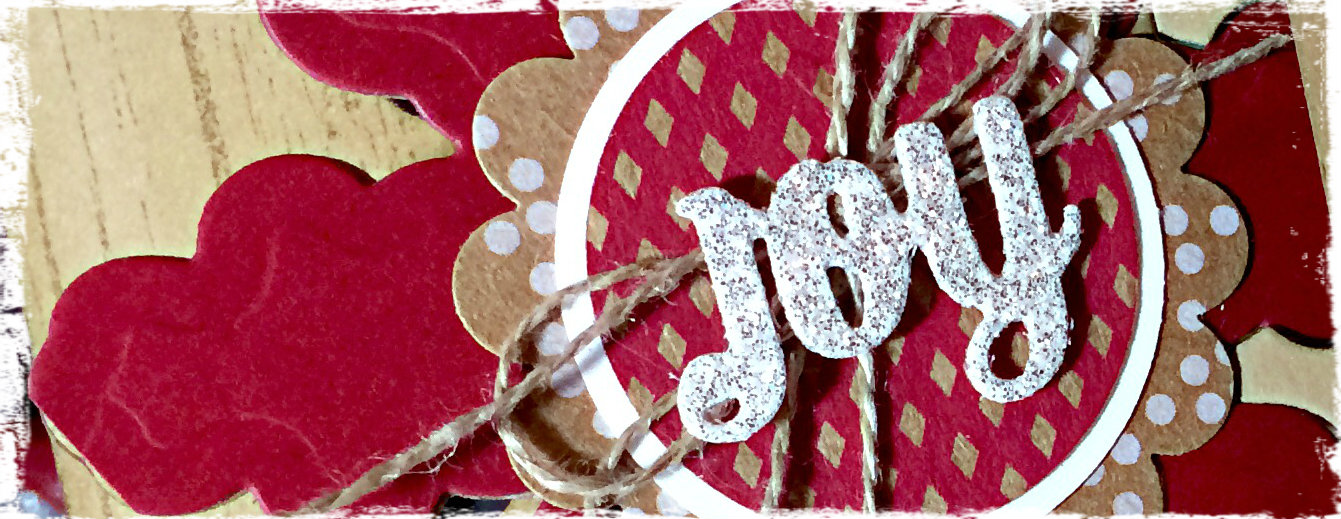
The die set for the Snowflake Card thinlits includes the die for the Silver Glimmer snowflake in the center of this card as well as the Joy and the mini snowflake that are inside the card. It has a bunch of die shapes that are all very useful.

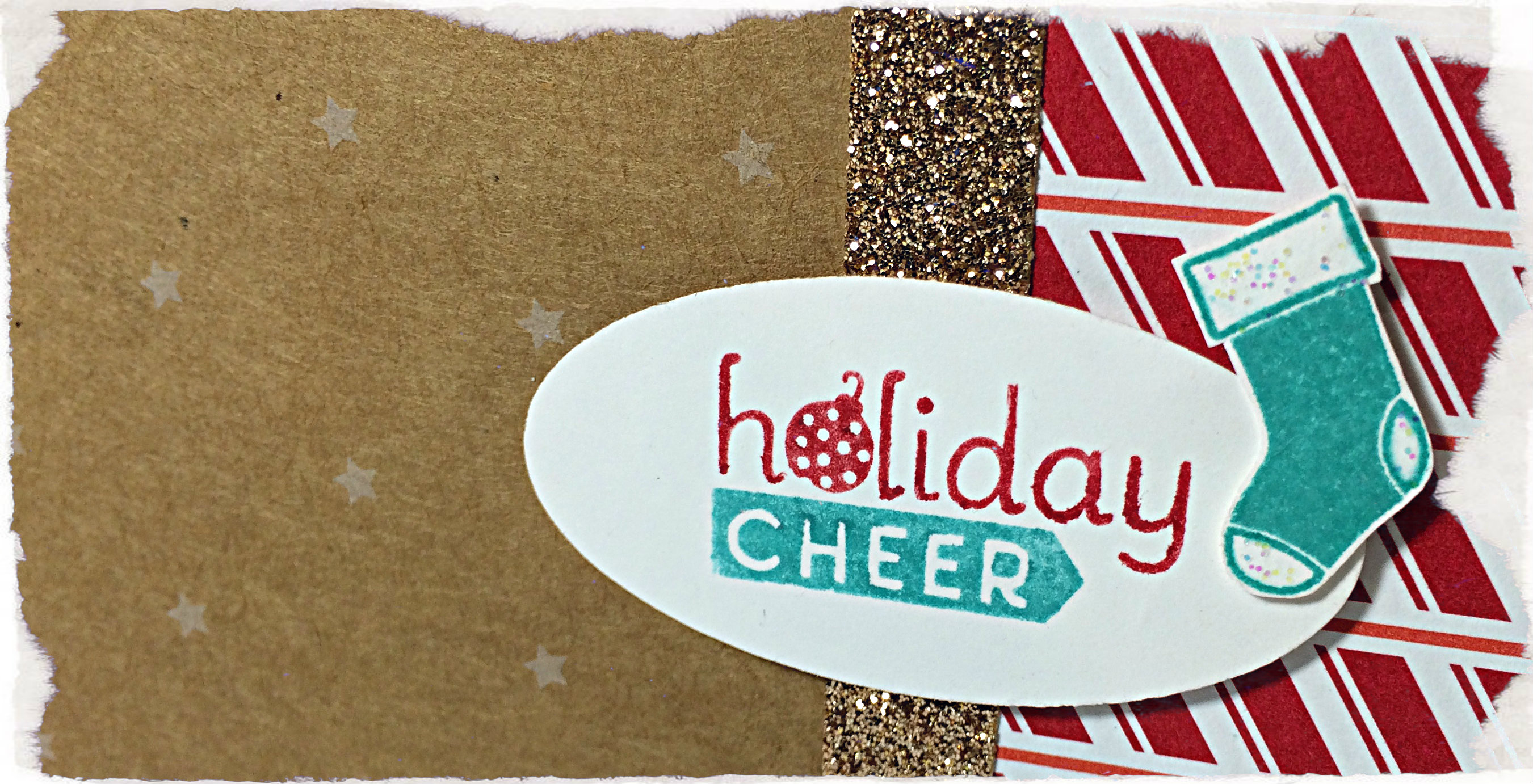
Oh, my goodness, I used a ton of things on this card:

Baked Brown Sugar cardstock, Cherry Cobbler cardstock and Under the Tree Specialty Designer Series Paper. Nordic Designer buttons. Cherry Cobbler 1″ Sheer Linen Ribbon. Linen Thread. Silver Glimmer Paper. Scallop Edge Border Punch. Hardwood Background Stamp with Baked Brown Sugar Ink. Northern Flurry Embossing Folder. Sponging with Baked Brown Sugar ink. 1 3/4″ scallop punch. 1 3/8″ circle Punch. 1 1/4″ circle punch. Snowflake Card thinlit dies. Big Shot (by far, my most FAVOURITE TOOL!!). Sticky Strip, Tombo Liquid Multipurpose Glue, and Stampin’ Dimensionals (another favourite supply item.

The photo below shows the card with the snowflake flipped to it’s other side as the card is opened.

061open1
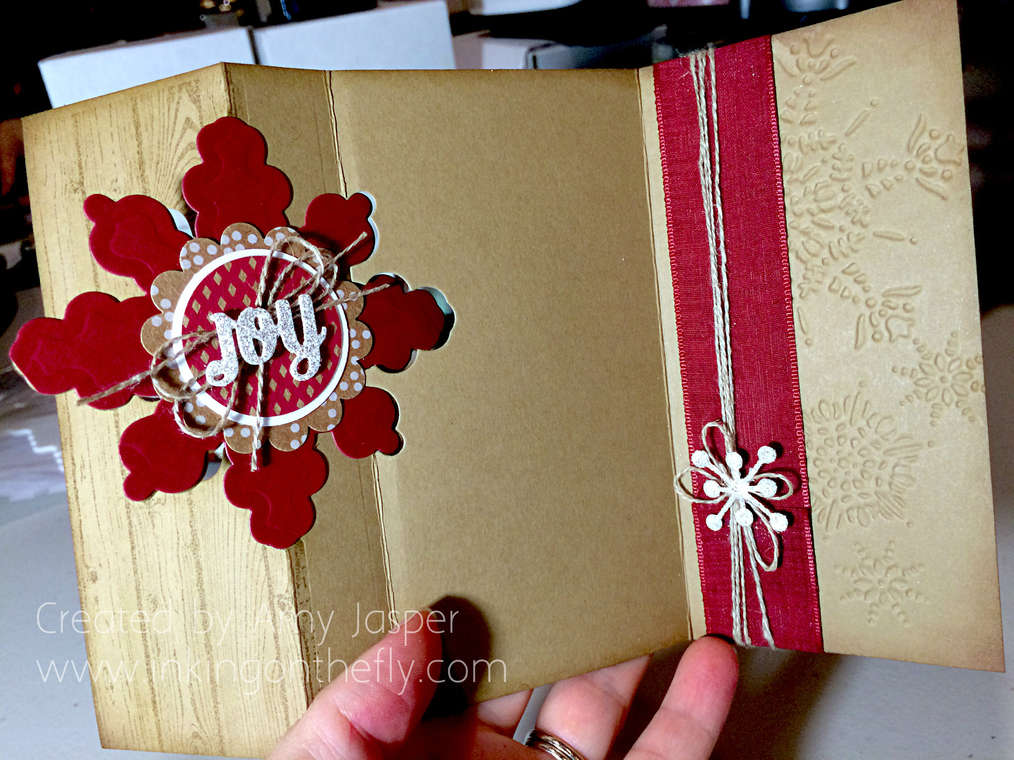
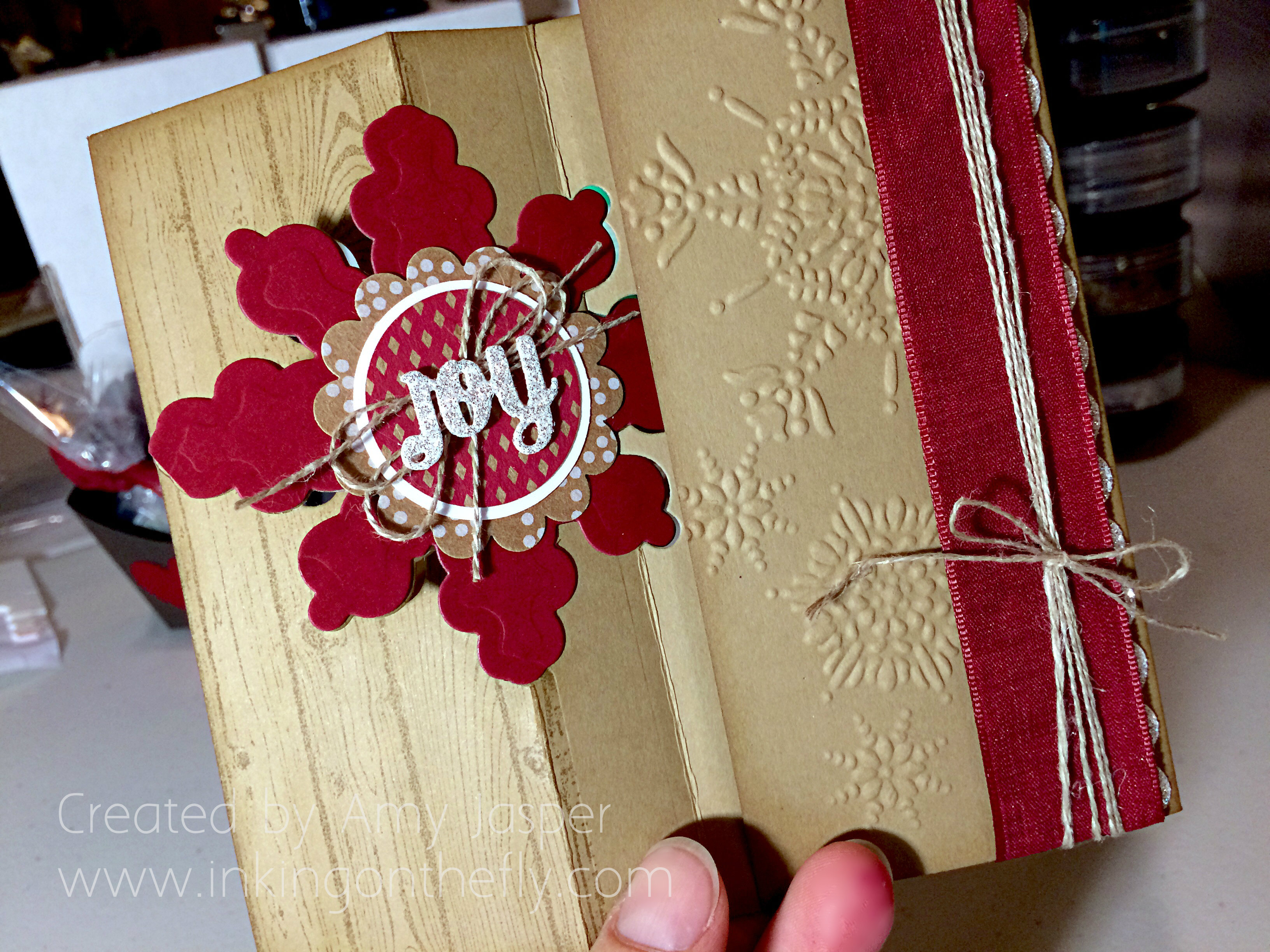
The next photo shows the card fully opened to reveal the available writing space and the entire inside of the card.

You might be wondering how I cut the large Cherry Cobbler snowflake when there isn’t a die that fits in that space. I used the full thinlit die for the card base and laid it on a piece of Cherry Cobbler cardstock that was just big enough to fit that section of the thinlit. I ran that through the Big Shot, which leaves you with a partially cut large snowflake. I then removed the partially cut piece of Cherry Cobbler cardstock and repositioned it by 90 degrees so that when I ran it through the Big Shot again, it would cut the areas that weren’t cut the first time.  Because the top and bottom of the shape are exactly the same as the sides of the shape, this works! Easy peasy!! (Maybe not as easy to understand with written words, sorry I don’t have a quick photo tutorial for you).

061open2I hope you give this colour combo a try and link it up to the As You See It Challenge blog! I love to see what you come up with!

Amy

Designer-Badge


Better than Nacho Libre

060header

Here we are again with another card for the As You See It Challenge Blog. Oh how I struggled with this sketch, but I loved using the little saying from the Project Life by Stampin’ Up Holiday Cheer stamp set.

#60Though the sketch is Halloween inspired, I am geared into Christmas already. So a Christmas card is what I did. I’m not very happy with it, but it’s better than how it looked before I decided to turn it on it’s side!!

Do you remember the movie Nacho Libre with Jack Black. I found it very funny! That sort of humour suits me just fine.

nacho-libreBefore I turned my card design on its side, I found that with all of those stars in combination with the Real Red and the Bermuda Bay colours, it became very American, but in a Nacho Libre sort of way (though, I’m pretty sure he was not American, lol!). The strip of Champagne Glimmer Paper looked like a belt with the oval sentiment in the centre; and the flashy red patterned paper from the Nordic Noel Designer Series paper looked like fancy wrestler pants! So I absolutely HAD to turn it sideways to avoid the confusion!

Tilt your head to the left and see if you can imagine what I saw!!

060Amy

Even though it’s better than my Nacho Libre version, this is not my favourite card.  Maybe it just needs some loopy thread like in my card a couple weeks ago. Yes, I might go back and add that!

This card used the Lucky Stars embossing folder on Whisper White cardstock. I used Bermuda Bay to mat the Under the Tree Specialty Designer paper (with those cute tiny stars on it) along with the strip of Nordic Noel Designer Series Paper and the strip of Champagne Glimmer paper.

The Holiday Cheer sentiment is from the Project Life “Holiday Cheer” stamp set. I used my Stampin’ Write markers to ink the “holiday” in Real Red and the “cheer” in Bermuda Bay ink and (after huffing on it with my breath to re-moisten the ink) stamped it on Whisper White cardstock, which I then punched out with the Large Oval punch. The cute stocking is also from the Project Life Holiday Cheer stamp set, stamped with Bermuda Bay ink and hand-cut. I added a bit of Dazzling Detail glitter to the stocking as well.

Of course I used Stampin’ Up Dimensionals as well. They are under the Bermuda Bay layer and under the oval and the stocking.

Now I want to watch Nacho Libre again!

I hope you’ll play along this week and show me how to make this sketch amazing!! Upload your designs to the As You See it Challenge blog and give me some inspiration!

Amy

nachoquote1


Work of Art

059headerCheck out my design this week using the Trust God stamp set with a little flare. This card shows off my artistic side using layers of sponging, stamped images, and even a bit of a watercolour technique. I had fun with it. It might just end up in a frame and given as a gift.

Do you ever consider that a card you’ve designed could be a gift? You really should. With the love and attention that each card receives as you choose your colour scheme, your layout, the mood of your project and the sentiment that speaks to the one who receives it – your card is an offering of a part of you. We think of greeting cards as a means of communicating our thoughts and well-wishes to the recipient. But they are so much more than that! If we wanted only to communicate, we could write a note on a plain piece of paper and give that instead.

No, our cards are more than a written note. They are a piece of us – an extension of our hearts, of our love, of our personality. I think that’s why I can’t give away a card that I don’t like. It just doesn’t fit; it feels wrong!

(sometimes I can’t give away a card that I really love either – because it’s so much of me. It’s like it needs to go to the perfect person; one who would understand the love that I am giving away)

My design today is inspired by this week’s As You See it Challenge. Assortment challenges can be a bit more difficult at times, but they are also an opportunity to really stretch those tight creative muscles.

AYSI#59

(I like the “more than four words” element. The blah blah blah blah made me chuckle.)

Somehow, I knew what I wanted to do with this card right away. I envisioned a sunburst image made up of a circle surrounded by triangles as rays of light. Light makes me think of God (Light of the world), so I immediately looked at my Trust God sentiments to see what would fit in the circle. The sentiment I chose fit perfectly considering that my card itself would be a bit artistic, than paper crafty.

059AmyI really wish you could see this one in person. I am really pleased with how it turned out! Photos never do cards justice. They are always better in your hand.

It began with a circle cut with my Circle framelits from a sheet of Watercolour paper. I inked up the sunburst stamp from the Kinda Eclectic stamp set in Strawberry Slush ink, then spritzed it with a fine mist of water until I was able to see a few droplets of water on the rubber. This I stamped on the watercolour paper and allowed it to dry before stamping the sentiment from the Trust God stamp set in Jet Black Stazon ink. I first tried to mat the image using the next size up of the Circle Framelits, but that was just too much black. So I took the black circle that I didn’t want and punched out a circle from it with my 2.5″ Circle Punch. I was left with a remaining ring of black, which I decided was going to be used on my card!!

The card base is Basic Black cardstock. On it is the sponged and stamped layer that was transformed from Calypso Coral cardstock, to the finished result that you see on my card. Using Stampin’ Up sponges, I added Tangerine Tango, Strawberry Slush, Melon Mambo, and Rich Razzleberry ink until the cardstock was filled with rich colour. I also sponged Tuxedo Black Momento ink all around the edges of the cardstock. This draws the eye in and, I think, gives a more finished look to the paper.

The triangles from the Geometrical stamp set were stamped in Real Red and Melon Mambo around the circle. I also stamped the dots image from the Kinda Eclectic stamp set and the sketched line image from the Gorgeous Grunge stamp set using Rich Razzleberry ink. The leaves from the Kinda Eclectic stamp set were stamped with Tuxedo Black Momento ink.

Once I was happy with my image placement, I adhered the layers. The matted circle is raised up with Stampin’ Up dimensionals (whatever would I do without these precious sticky-foam risers!)

059goldcircles

The final touch was to add the gold sequins. I prefer to use Crystal Effects for my sequins as it dries clear and is no longer sticky when dry (unlike other Stampin’ Up adhesives that stay sticky where it isn’t covered). The sequins on their own just didn’t seem like enough, so I grabbed my Gold Stampin’ Dazzle Marker (who names these things?) and with shaky hands, worried I would ruin my ENTIRE card, I added little hand-drawn circles so they could play with the big kids. I only had to add one or two extra sequins to cover up little circles that got out of hand.

And there you have it.

I hope you will give this challenge a try. Just head on over to the As You See It blog, check out the other designers’ projects, then get in your crafty space and make something! Don’t forget to link it to the challenge page so we can all be inspired by your take on this one!

I’m heading off for a stamping weekend at a the beautiful Rockridge Canyon Conference and Retreat Centre! I hope to finish the weekend with lots of projects that I can share with you over the next few weeks or through classes that I will offer in the next couple months. I’m so excited for some ultimate design time!!

Hope you get some amazing design time this weekend, too!

Amy

Designer-Badge