Hand Embossed Wedding
Tip Top Taupe is my new favourite neutral colour. The new annual Stampin’ Up catalogue launches on June 2nd along with a whole new set of 2015-2017 In Colours, like Tip Top Taupe!
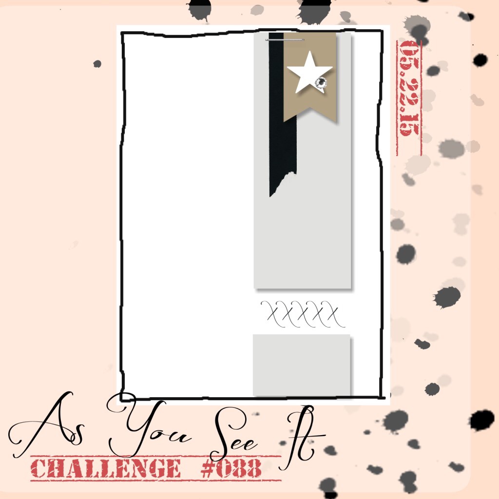
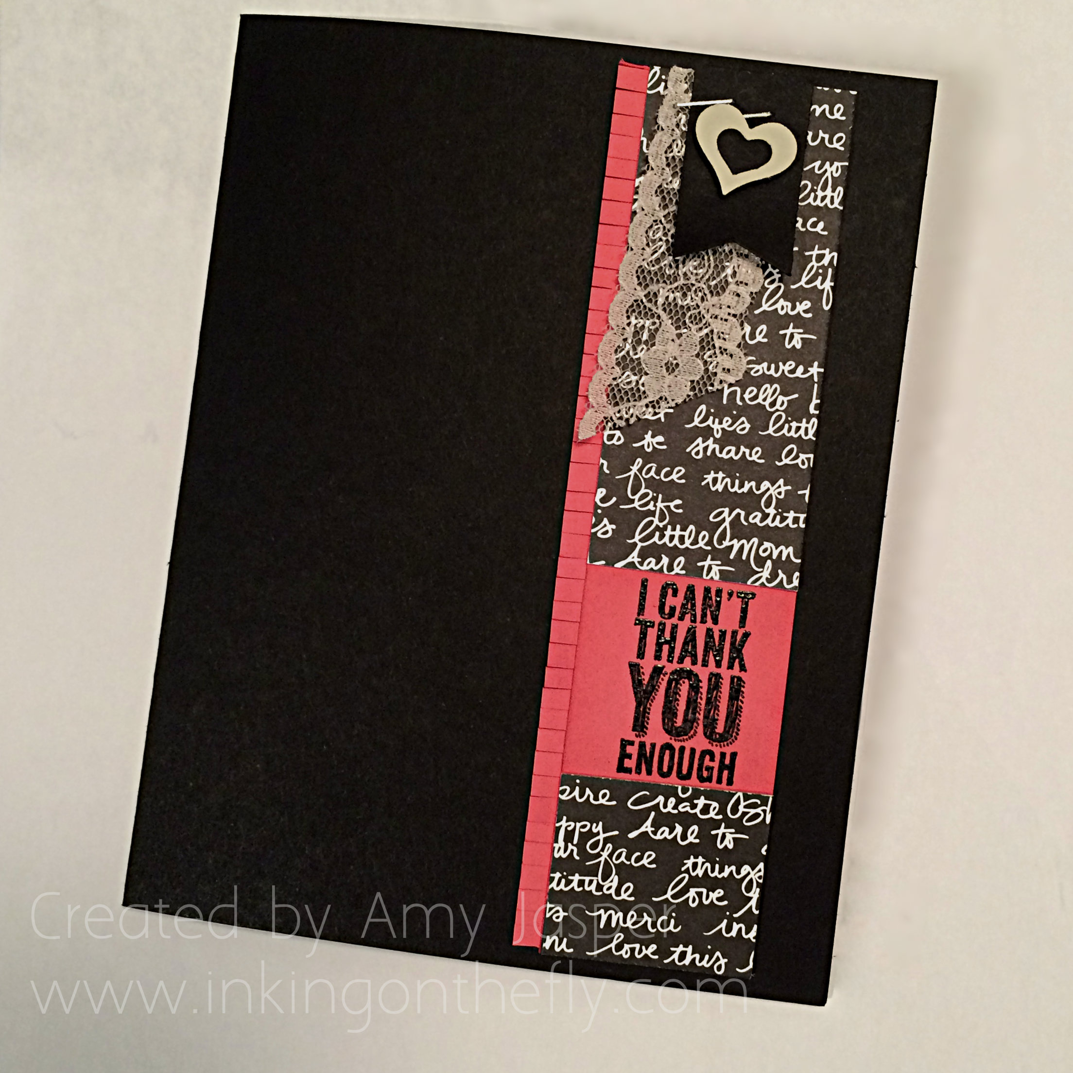
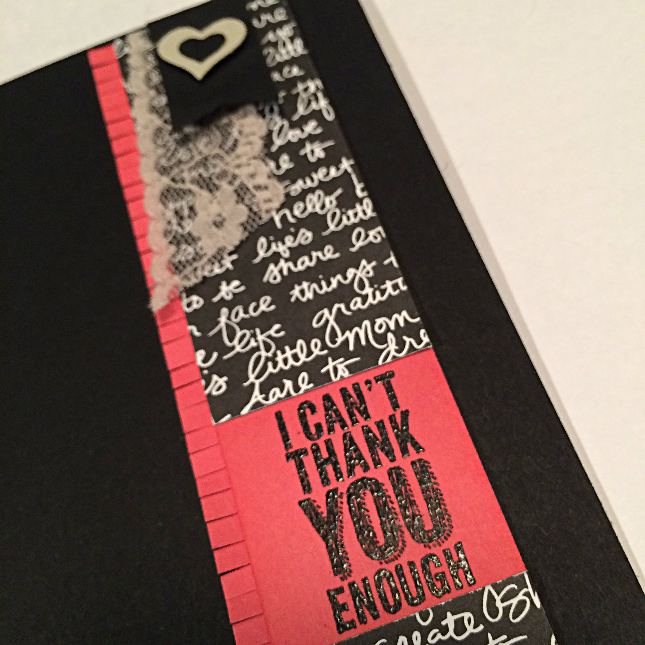
I am a designer for the As You See It challenge blog and have the privilege of sharing a card with you each week according to the challenge put out by AYSI. Here’s your inspirational sketch for this week:
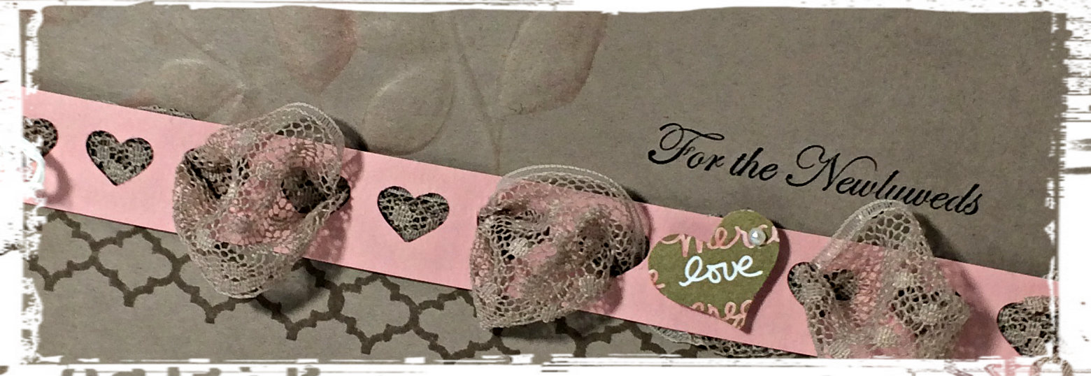
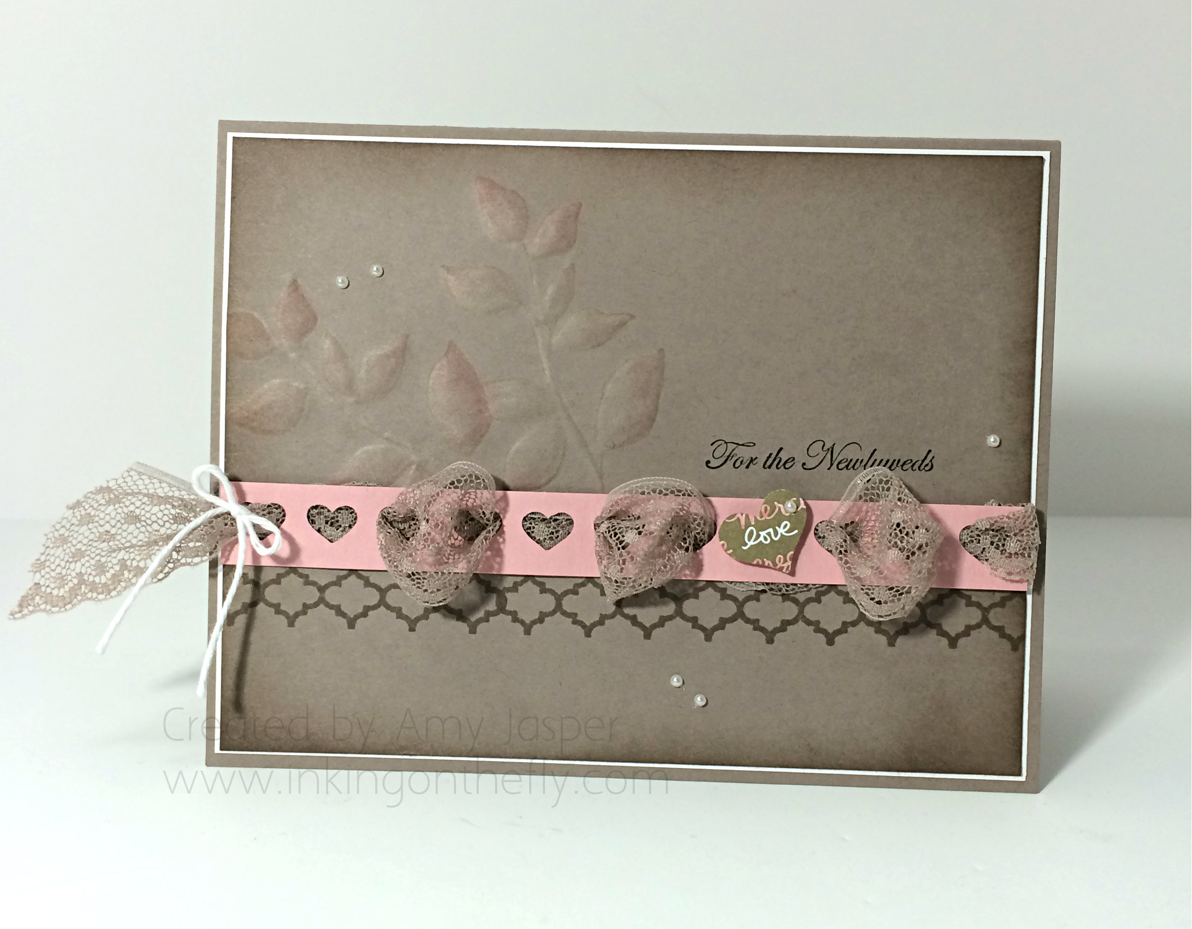
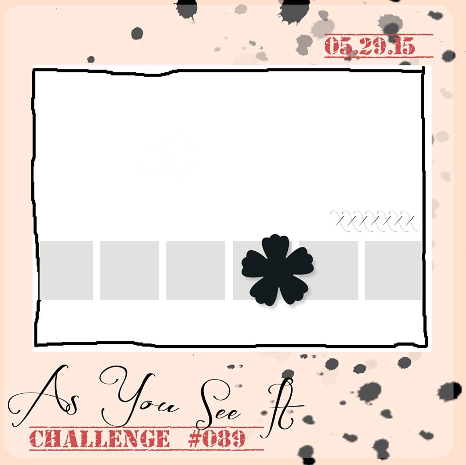 This layout inspired me to try a weaving technique with the Tip Top Taupe 1″ Dotted Lace Trim and the Hearts Border Punch with Blushing Bride cardstock. What a beautiful combination those two colours make! I also thought I would try a hand-embossing technique using a stylus and the Stampin’ Pierce Mat.
Check it out!
Can you see how the leaves from the Summer Silhouettes stamp set are raised? I stamped them first with Blushing Bride ink; stamping off on a scrap piece of paper to lighten the colour, then adding more ink on the tips of the leaves before stamping on my cardstock. I used the Simply Scored Stylus to outline the image on the front of the card, then I flipped the cardstock over and traced over the outline again and filled it in by rubbing the fatter end of the stylus in small circular patterns. All this was done over the Stampin’ Pierce mat as you need a surface that has a bit of give to it, while still offering stability.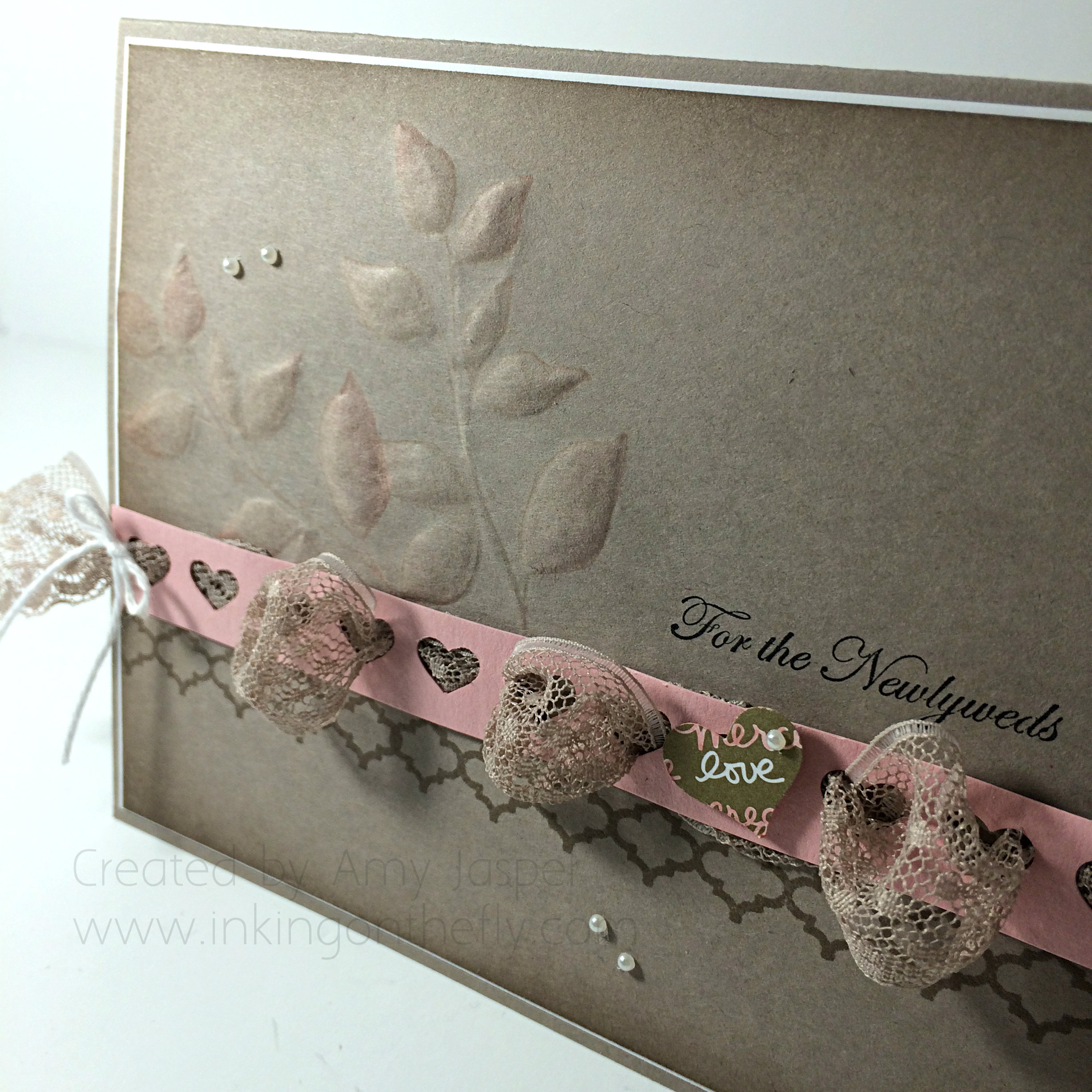 The most challenging parts of this card for me: adhering the bulk of the lace between the taupe layer and the punched layer without making a mess, and lining up the mosaic patterned stamp (also from the Summer Silhouette stamp set) as it needed to be stamped twice in Tip Top Taupe ink to make it across the card. A Stamp-a-ma-jig would have been the smart way to go, but I decided to try it without and only messed it up once!
Also used on this card: A thin mat of Whisper White cardstock, Whisper White Baker’s Twine, Basic Pearls, the sentiment is from Teeny Tiny Wishes and is stamped in Jet Black Stazon ink, Tip Top Taupe ink was sponged around the edges of the taupe layer, and the small heart from the Itty Bitty Accents Punch Pack was used to punch out a bit of love from the gold lettered paper of the Neutrals Colour Collection paper which I coloured with my Blushing Bride Stampin’ Write Marker.
So, be sure to check out the As You See It Challenge blog and play along!
I hope you’ll leave a comment and let me know what you think of my take on the sketch. What do you think of the puffed sections of lace? Do they work or are they silly? Have you tried embossing by hand before? How successful were you and what tools did you use?
I’d love to hear from you!
Amy
