challenge

Everything is Pumpkin Spice

BAAAHHHHH! IT’S SEPTEMBER!! Where did the summer go!?

I am sad that the warm days are coming to an end, but I admit that I love the fall. It is my most favourite season of the year. There’s just one thing that is a little bit annoying …. everything is pumpkin spice! Pumpkin spice lotion (no real surprise here), pumpkin spice oolong tea (yup, I can go with that), pumpkin spice Oreo cookies (okay… ),  Instant Oatmeal (I’d probably give that a try), Hershey’s Kisses (um… I’ll pass), Pumpkin Spice Peeps (no thank you),  pumpkin spice Cheerios (definitely not!), Pumpkin Spice Popcorn (it’s Boomchickapop popcorn, so it’s probably really good, actually!), and even Pumpkin Spice Pringles potato chips (yikes!)! It doesn’t really stop there, but I won’t go on. You can also find spoof photos for Pumpkin Spice cigarettes, rifle cartridges, mouth wash, feminine hygiene products, contraceptives, and weed killer!

I’m pretty sure it all started with Starbucks and their Pumpkin Spice Latte that is adored and sought after by so many of you latte junkies out there. I’m actually not a fan of having cinnamon or nutmeg in my lattes. If I choose flavouring at all, I order the cascara latte (my fave when it’s available) or the toffee nut latte.

As far as pumpkin spice goes – bring on the pumpkin pie!! That’s all I need.

… and maybe a scented candle.

… and those Boomchickapop popcorn (if you can get your hands on some, send them my way!)

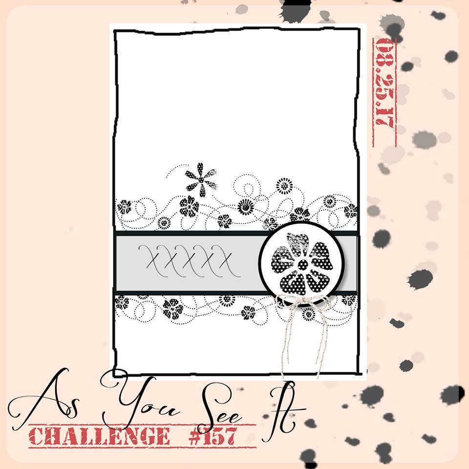
Okay, enough about all things pumpkin spice! Here’s the As You See It Sketch Challenge.
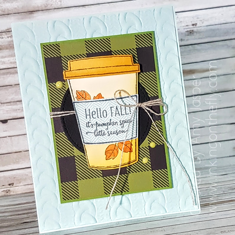
I love my coffee stamps. This card uses the Merry Cafe stamp set and the Coffee Cafe stamp set with the Coffee Cups Framelits dies.
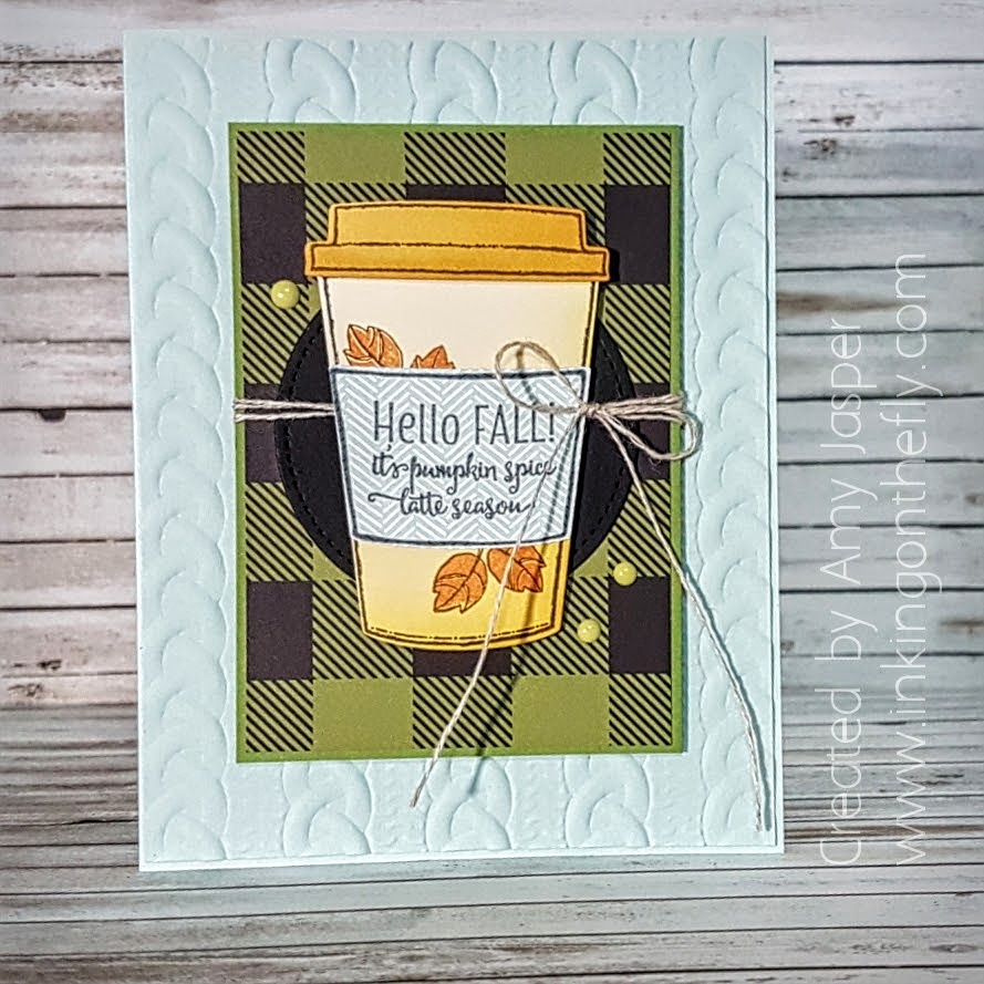
You can see the beautiful Cable Knit embossing folder in Soft Sky cardstock on the card base. I love the large gingham/plaid patterned paper from the Merry Little Christmas Designer Series Paper Stack! I used patterned paper from the Color Theory paper stack for the coffee cup and the lid. The sleeve for the coffee cup is stamped on a piece of patterned paper from the Coffee Break designer series paper.
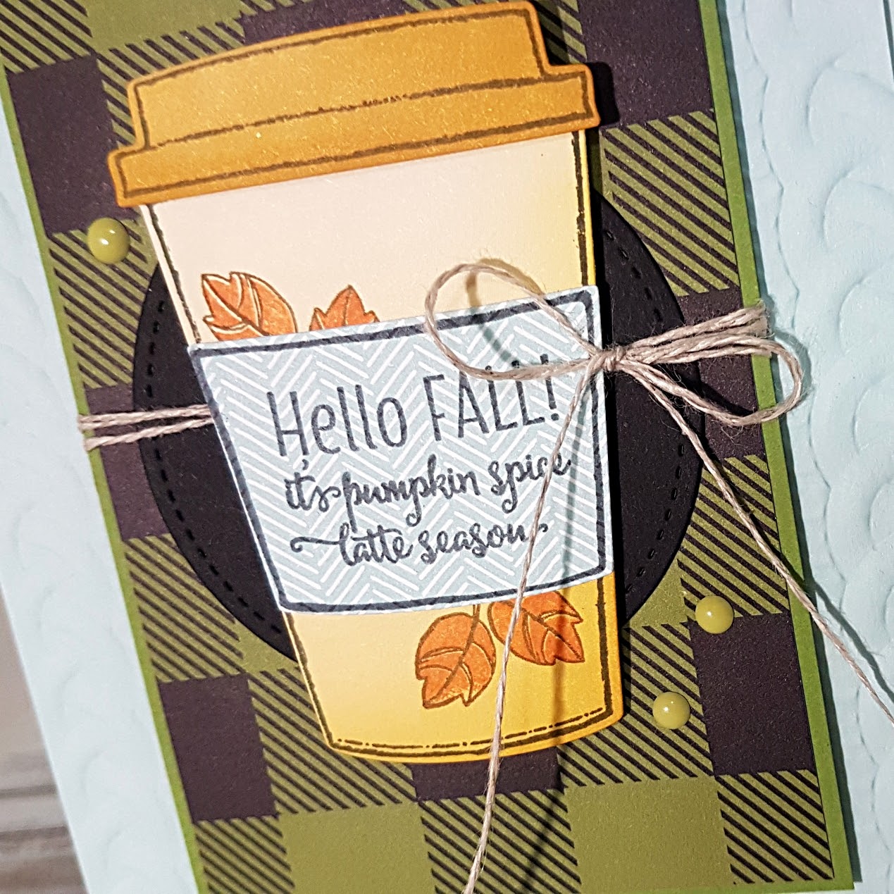
A little bit of sponging with Crushed Curry ink on the base of the coffee cup and on the edge of the lid adds some depth to the colours. Linen Thread is the perfect fall touch to wrap behind the coffee cup over the Old Olive and Basic Black layers. The Pear Pizzazz Enamel Shapes are just a fun pop of playfulness. And I love the stitched edge on the Basic Black circle that was die cut using the Big Shot and the Stitched Shapes Framelits. The stitching marks make a boring black circle much more interesting, don’t you think?
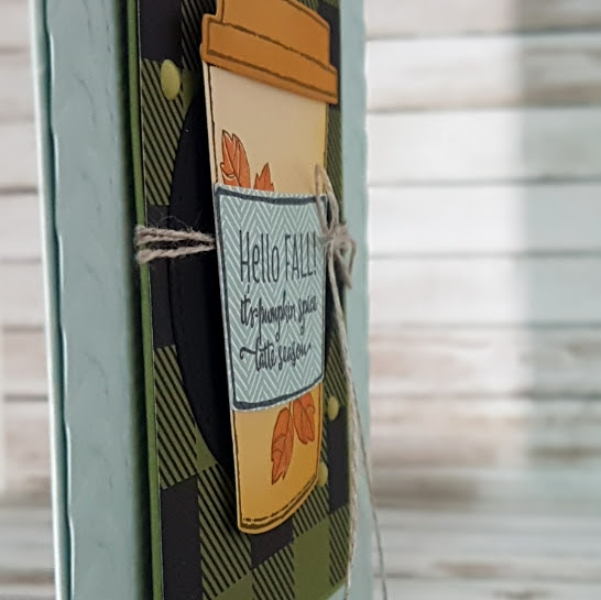
Stampin’ Up Dimensionals really make things pop on a card. Flat cards are a rare thing for me. I love my Dimensionals, particularly the new Mini Dimensionals that Stampin’ Up put out. The smaller size allows for much more functionality and for a longer lasting package (without cutting them in half!!)
If you like doing sketch challenges, make sure you try this sketch and share it with us at the As You See It Challenge blog. We love seeing what you’ve created. So be sure to post a picture of your creation on a public social media site and link it to the As You See It blog!

Happy Stamping!

***Like these products? If you live in Canada, you can order Stampin’ Up! products from me just by clicking on the SHOP button on this website ***
Save

Save

Save

Coloured Embossing Paste

I’ve been spending some time online keeping a close eye on the forest fire that is burning just about a 15 minute drive from my home. I video-recorded the belongings in my home for insurance records. I also put aside important documents like birth certificates and passports. People (some of them are my friends) and their livestock have been evacuated.

The wind changed yesterday and our neighbourhood is filled with hazy smoke. In BC, we’ve had more than 1000 forest fires since April 2017 (that’s more than one million hectares of land!) and more than half of them are caused by human carelessness. Often it is cigarettes tossed out the window of a moving vehicle, sometimes is a spark of a hot vehicle on dry grass, sometimes it’s from a poorly attended campfire. If you travel to Canada in the summer (it’s beautiful here in the Okanagan when the air is clear of smoke), be aware of your smoking habits. It’s often the cigarettes out the window that threaten neighbourhoods. That is likely the cause of the fire that could threaten my own home today, if the wind blows unfavourably. So, please be in the habit of butting your cigarettes in your vehicle, don’t smoke in our forests or grasslands AT ALL, and don’t flick your butt, EVER! You may not have the same risks in the area where you live, but good habits could protect you and the  people you love, wherever you are.

I also ask that everyone be on watch for people who are not being responsible and say something to them. Report them, if need be. It’s not worth risking our lives, our homes, our pets, our beautiful forests or the creatures who live in them. It breaks my heart to think of all of those who have been affected by fires over the last few years.

My card design today is not intentionally related to this topic, although, I read the sentiment and realize that it is! LOL! I did not plan this at all!

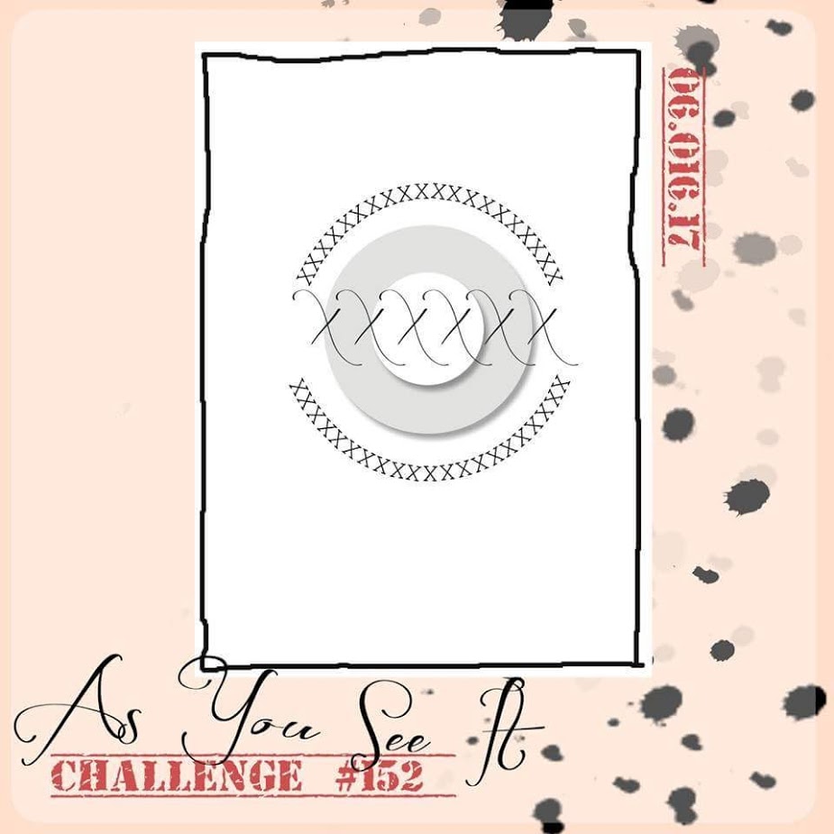
Here is the As You See It Challenge sketch from which my design was inspired:

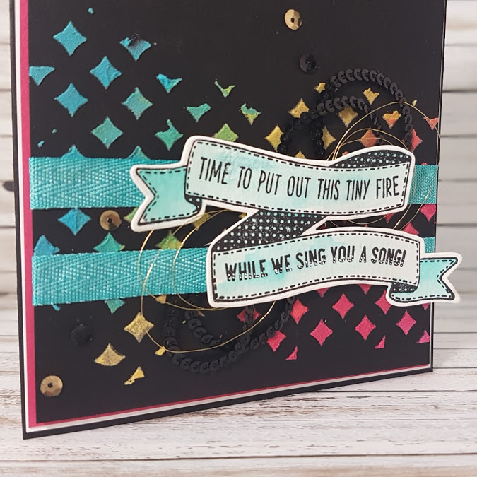
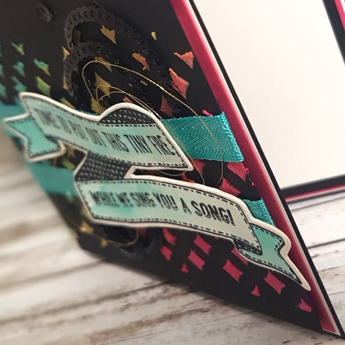
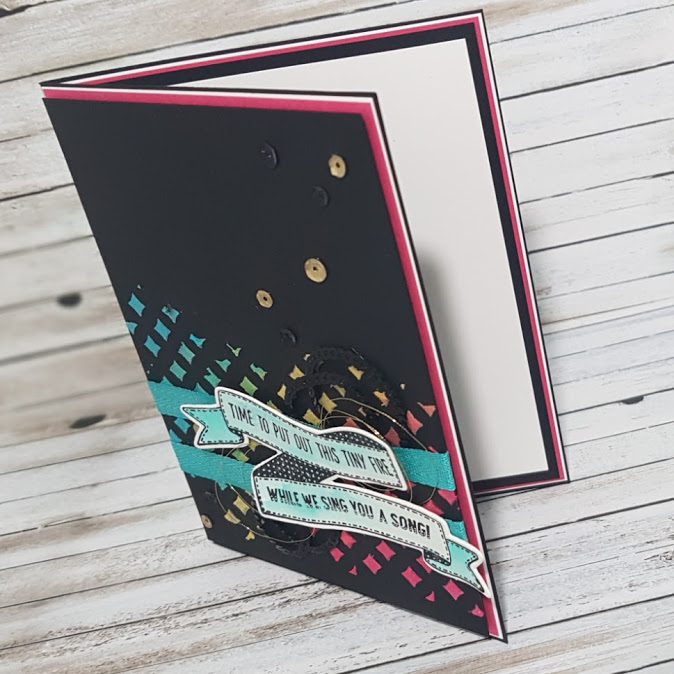
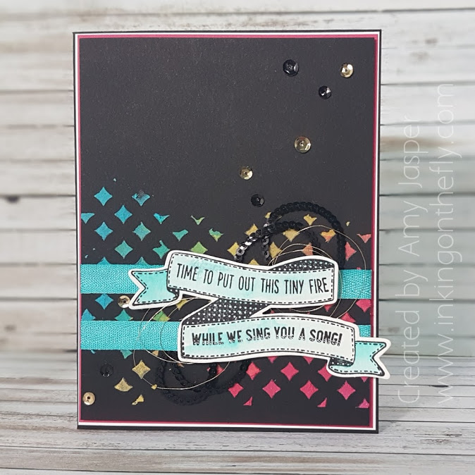
Here is my fire-safety card, lol! The sentiment is from the Birthday Banners stamp set.

I used a small amount of Embossing Paste from Stampin’ Up! in three separate little containers. Then I added a tiny drop of colour to each of them: Daffodil Delight, Melon Mambo, and Tempting Turquoise. I mixed each one until the colour was fully blended into the paste before spreading each colour over the diamond- shaped mask from the Patterned Party Decorative Masks. I love how each colour blends ever so slightly into the next.

The sentiment and banner were stamped in Stampin’ Up! Archival Black on Watercolor Paper. I was careful to make sure it was fully dry before adding a Bermuda Bay colour wash over the banner area. I also added some little white decorative dots to the words on the bottom banner using my White Chalk Marker (not sure if I like that as much).

The 3/8″ Mini Chevron Ribbon in Bermuda Bay was added behind the banner along with the Black Mini Sequin Trim and the Gold Metallic Thread. The banner and metallic thread was adhered with Stampin’ Up Dimensionals, while the ribbon and sequin was attached on a strip of Tear and Tape.

I added the Metallics Sequin using the Fine-tip Glue Pen, then assembled my layers:

Card base is Basic Black cardstock, then a delicate layer of Whisper White and a slightly wider layer of Melon Mambo cardstock. The completed top layer of Basic Black with the embossing paste and sentiment were attached to the Melon Mambo cardstock with Stampin’ Up Dimensionals.

I used the same layering to complete the inside of the card, finishing with a layer of Whisper White cardstock for writing a personal message to the recipient.

I’m writing this late this morning and a bit hurried as I have to take my kids to swimming lessons and I haven’t finished video-recording my craft room supplies or my ski equipment. I think I will take my dog to swimming lessons today, just in case (we will have to watch the kids through the windows from outside, of course).

Try this As You See It sketch for yourself and show us what you come up with by uploading it to you As You See It challenge website.

And be fire-safe!! Candles, too!!

Save

Wild About Vineyards

Another challenge, another half of the month is over! Wow, time goes so fast!

News alert! I am now unemployed!! Whoohoo! This is a GOOD thing, folks. I will now be able to focus on my family, my household, healthy life choices, and, yes, my stamping. Technically, I am employed as an Independent Demonstrator for Stampin’ Up! However, this is more like a hobby that gives me a bit of spending money to pay for my … well, my hobby, lol! I am thankful for the bit of cash that I bring in as a demonstrator to pay for haircuts and vet bills. Perhaps, once my home life is more at a maintenance level, rather than the current “catch up on all the things that have fallen apart since starting a family 13 years ago”, I will be able to put more time into building my business. I am incredibly happy with the last couple of weeks – I have been cleaning, gardening, running errands, cycling, camping, going on field trips, and I am looking and feeling healthier and more satisfied with each day. I am blessed to be able to make this change in my life and I acknowledge all the women who desire to be stay-at-home moms or wives,  but do not have the financial freedom to do so. I wish for you the opportunity to make any changes that you can to live on less so you can spend more time on life. That is my motto for this season in my life, Live on Less, because the things in life that are most important are not the things that cost money, but are the relationships, the experiences, the adventures, and the memories.

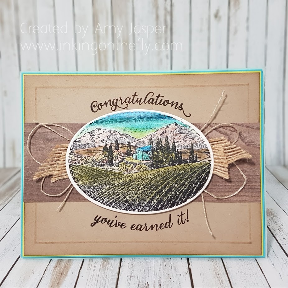
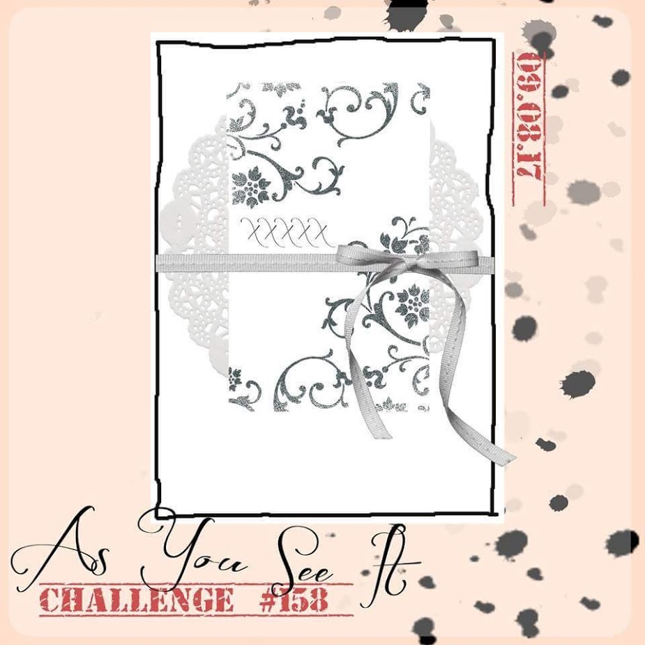
The challenge this time is another sketch:My design is a representation of my home here in the Okanagan Valley in beautiful British Columbia, Canada, where we have orchards filled with fruit trees and hills lined with vineyards. I love that I can find wines in my neighborhood liquor store that have been made from grapes that were grown just a moments drive from my house. The coloured image on the card is from the Tuscan Vineyard stamp set from Stampin’ Up!

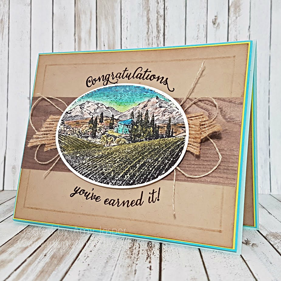
I decided to use this sketch in a landscape orientation rather than portrait orientation.Wild about Vineyards card design by Amy Jasper www.inkingonthefly.com using Wild About Flowers and Tuscan Vineyard Stamp Sets from Stampin' Up!The image was stamped with Archival Basic Black ink on Watercolor Cardstock, then cut using the largest oval die from the Stitched Shapes Framelit Dies from Stampin’ Up. I coloured the image with the Stampin’ Up Watercolor Pencils and blended the colour on the paper with a Blender Pen. Behind the oval, you can see the 5/8″ Burlap Ribbon and the looped Linen Thread. The burlap was the last 3 inches on my spool, so I cut it into four pieces and tucked it just underneath the oval with Stampin’ Up Mini Glue Dots. For each side of the oval, I tied a large bow of Linen Thread, folded the bow in half so that the loops were together, and attached it with a Mini Glue Dot on the knot to the backside of the oval. This gave a fun loopy look to the thread and added much needed texture to the design.There is a strip of Wood Textures Designer Series Paper behind the oval as well. Behind that, is the Crumb Cake layer, on which I stamped the sentiment from the Wild About Flowers Photopolymer Stamp Set with Early Espresso ink. Because the stamp set is photopolymer, it was easy to get the necessary curve of the stamp on my acrylic block to match the curve of the oval. You may also have noticed that the “Congratulations” from the stamp set usually has a “on your” attached to the same stamp. I simply masked that part off with scotch tape before inking up the stamp, then removing the tape before stamping the sentiment. I like that this allows the card to be a fairly general congratulations card that can be used for retirement, graduation, completing a marathon, surviving the school year (I’m thinking of all the teachers this year who survived fidget spinners, bottle flipping, and general classroom chaos) or even just getting through a rough week and being given a bottle of wine as a reward (believe me, there are weeks when I wish someone would do this for me!)

The Crumb Cake layer also has a bit of detailing added around the edges. I used the Simply Scored Tool and Stylus to create the embossed border around this layer, then lightly sponged some Crumb Cake ink around the edges and over the embossed lines. This added so much more interest to the card, without making the card appear too busy.The rest of the card is just about layering and colour. The card base is Soft Sky, then I used Tempting Turquoise and Lemon Lime Twist as very thin layers to frame the Crumb Cake Layer. Of course, Stampin’ Up Dimensionals are also an important element to most of my card designs. I used Dimensionals under the Tempting Turquoise layer and under the oval to give the card a bit more depth.

The inside of the card has the same base layers as the front of the card: Tempting Turquoise, Lemon Lime Twist, and the scored and sponged Crumb Cake layer.

Now go forth and stamp! Use any of the As You See It challenges as a starting point to get your creative mojo flowin’!!

Save

Save

Save