embossing

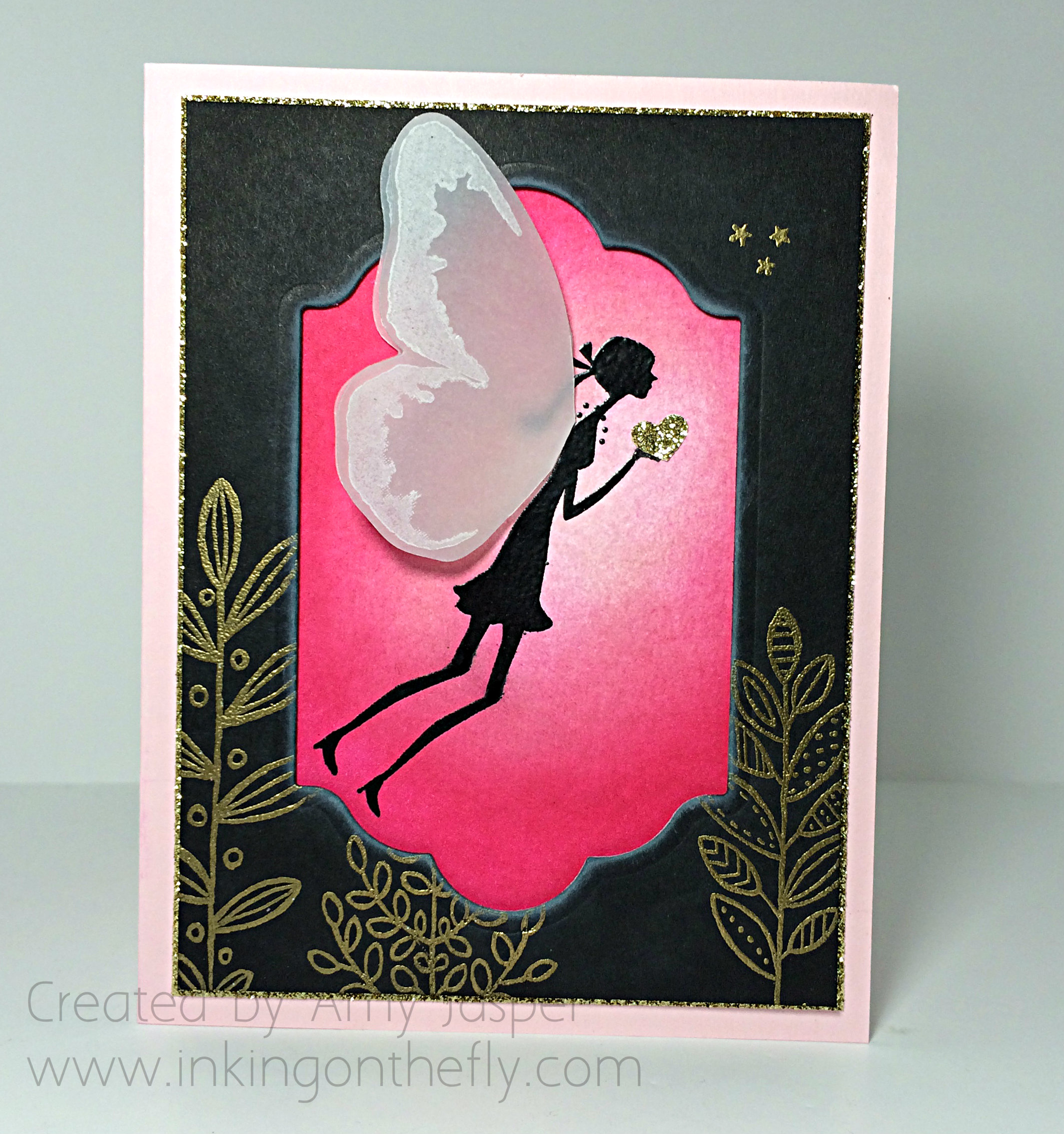
A Fairy for Lola

I’m so excited to share my card with you today. Because today, I get to show my support for a brave 9 year old girl whom I’ve never met. Lola has been battling Leukemia since 2011. You can learn more about her on the Team Lola Facebook Page.

The As you See It Blog has dedicated the card challenge to Lola this week. I hope you will show your support to her and her family by making a card for her, too. Just imagine the smile on that beautiful face as she sees all of the cards and projects created just for her!

Lola, I chose to use pink and to put a fairy on my card for you. Not everyone knows that Gold is the colour to represent childhood cancer, so I have lots of gold on my card for you, too. I hope you like it!
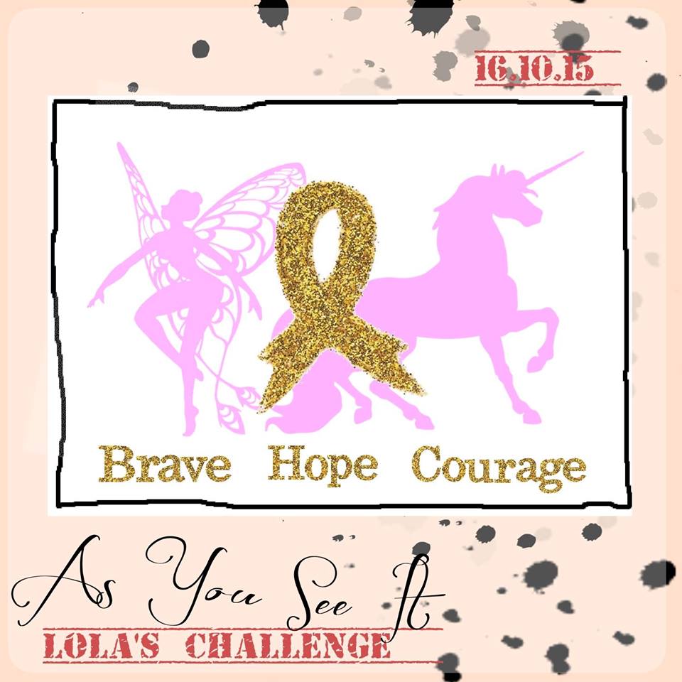
Lola's challengeI love fairies, so of the images for this challenge, I decided to do a fairy card.

Only problem was that I didn’t have any fairy stamps – I have butterflies (lots of butterflies), I have dragonflies, I have dinosaurs, I have robots and I even have gnomes, but no fairies and no unicorns anywhere. But I did have a retired stamp set that I’ve loved forever that had images of people – specifically, of the girl variety of people.
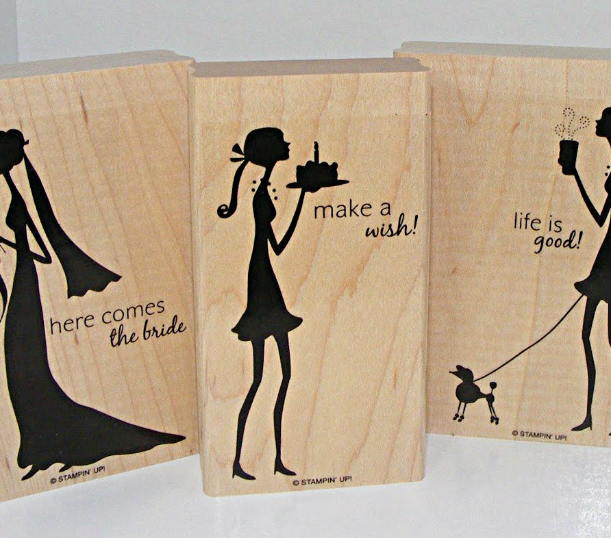
Shes all thatThe set is called “She’s All That” and, though it’s not available from Stampin’ Up anymore, you can actually purchase it on Ebay.

Now, the image wasn’t perfect for my needs; as you can see, she was originally walking upright and holding a cake! However, I was able to do a bit of crafty work to stamp the image without her cake and with her legs bent to give a bit of the impression that she was not touching the ground. All I’m going to say is that it involved some scotch tape and the Stamp-a-ma-jig from Stampin’ Up.

Amy Jasper www.inkingonthefly.com

If I had the Confetti Hearts border punch, I would have had multiple little hearts blowing off her hand like kisses in the wind.

I don’t have that punch.

Instead, I used the Hearts Border Punch and took one of the little hearts from that for my fairy to hold.
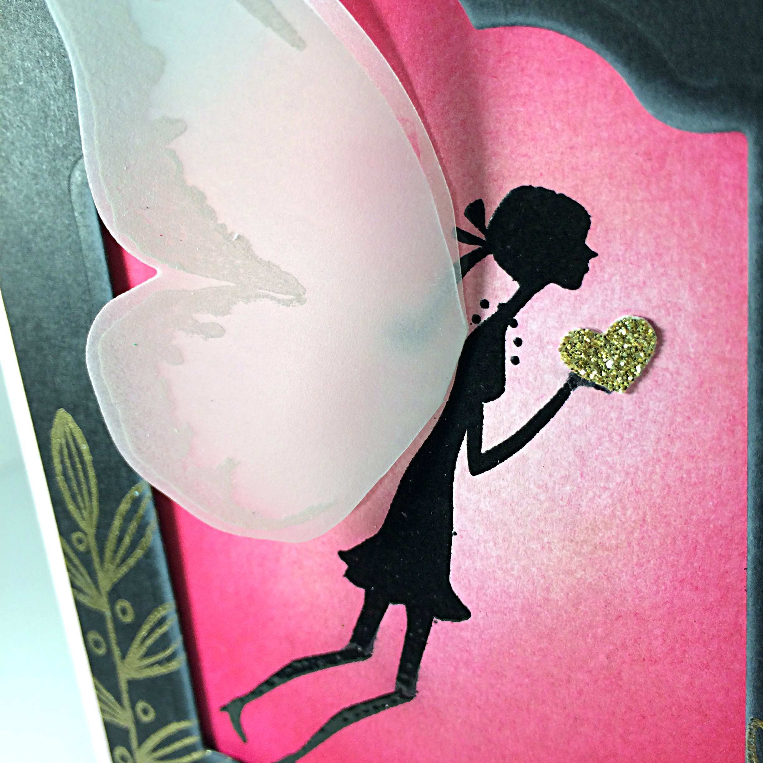
Amy Jasper www.inkingonthefly.comThere are a lot of artistic elements to this card (which means I was having a lot of fun!). I first stamped the girl on Whisper White cardstock with Versamark ink so I could heat set Black Embossing Powder over the image so she could be very black and shiny. Then I got to work with a sponge and three pink inks (Pink Pirouette, Blushing Bride, and Melon Mambo) to sponge my background.

The fairy wings are created with Vellum Cardstock, White Stazon ink, the Watercolour Wings stamp set and my Big Shot with the Bold Butterfly framelits. The butterfly die cut image was then folded in half and the body of the butterfly was trimmed away before adhering the wings to my wee lassie. I used Fast Fuse, but you can totally see it if you lift that top wing out of the way.

My black frame was created with Basic Black cardstock, the Big Shot, and the largest of the Lots of Labels framelits. After cutting out the center of the cardstock, I used my Lighthearted Leaves stamp set with Versamark ink (by the way, I always use my Embossing Buddy before I stamp for heat embossing!) and stamped them on the card, heat setting them with Gold Embossing Powder. I also added the three wee stars from the Jingle All the Way stamp set and embossed them with gold.
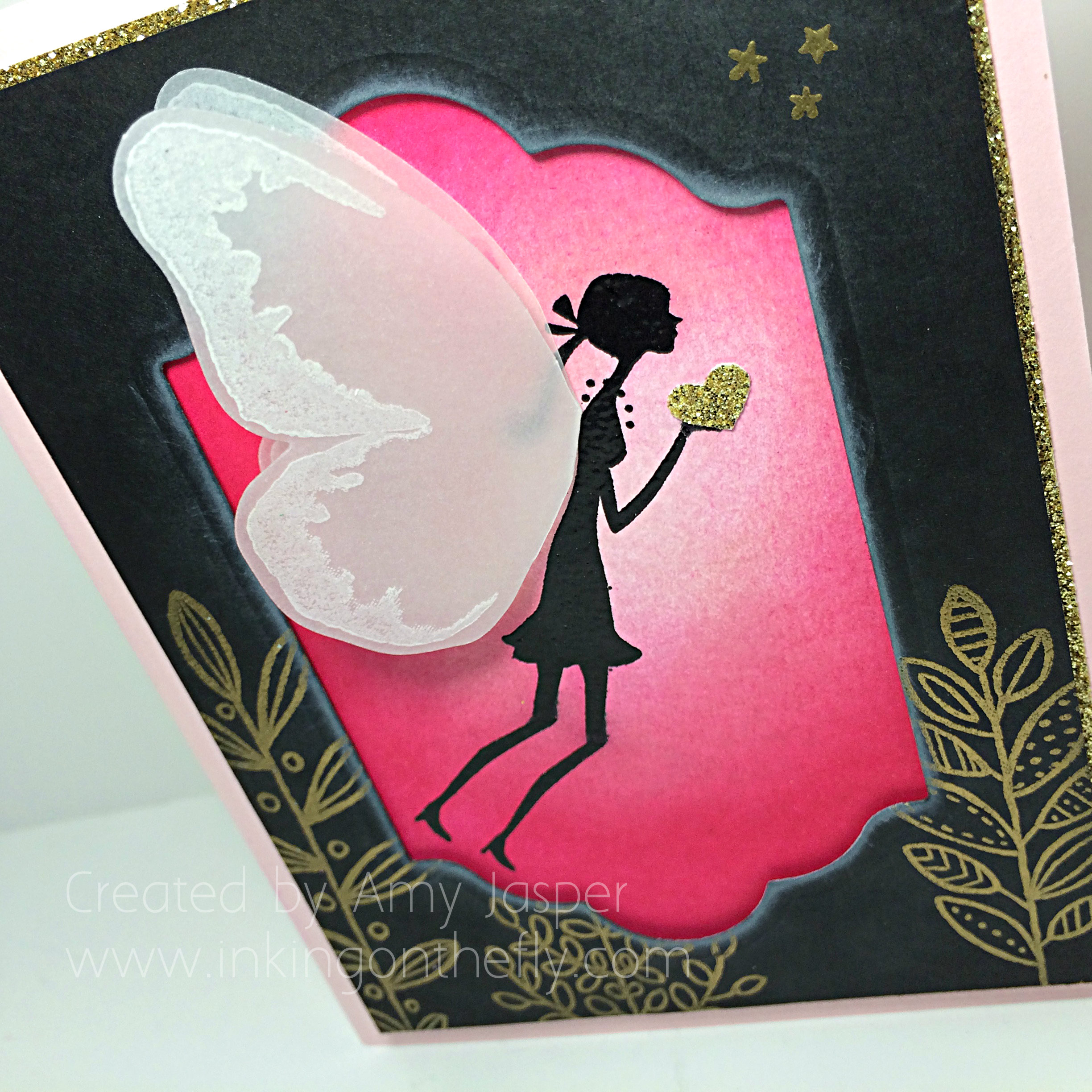
Amy Jasper www.inkingonthefly.comWhisper White Craft ink was lightly sponged around the inside edge of the frame, which was then adhered over the fairy image using Stampin’ Dimensionals. All of this was matted with Gold Glimmer paper before adhering it to the Pink Pirouette cardstock card base.
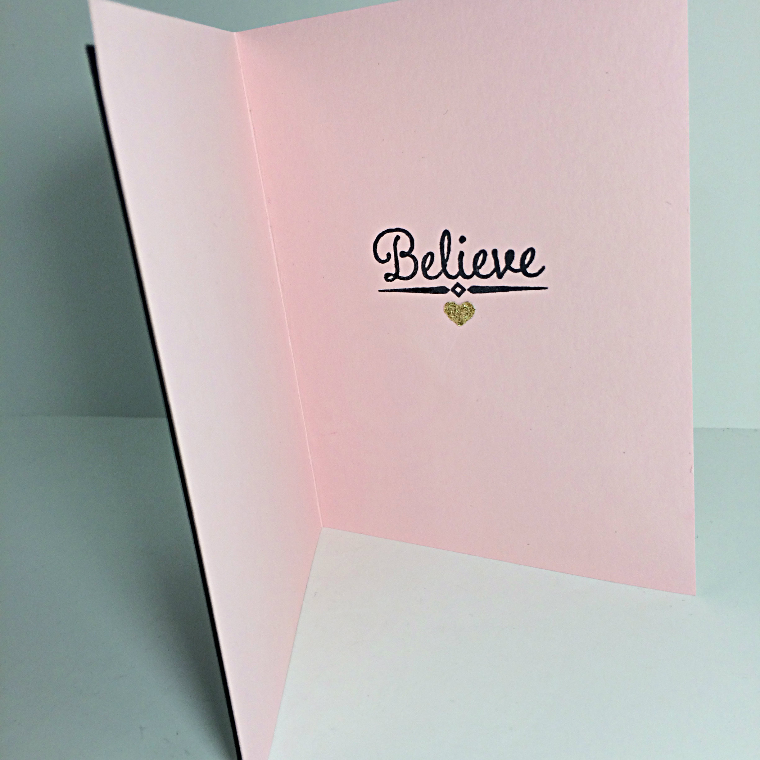
LolainsideOn the inside of this card, I stamped the ‘believe’ sentiment and added another Gold Glimmer heart to embellish it.

I do believe in fairies, I do, I do!

Hang in there, Lola. We’re all rootin’ for you, praying for you, and sending love your way.

And, dear readers, don’t pass on the opportunity to bless a brave girl with digital cards of support and encouragement. Do the challenge this week and share your finished project on the As You See It Challenge blog so Lola can enjoy your gift to her!
Amy Jasper www.inkingonthefly.com

Glade Jul

I used to work at a care home for people with brain injuries and dementia, primarily elderly men and women who were at risk of wandering and getting lost or of being confused to the point that they could become aggressive. I was a student nurse at the time, so was often asked to simply visit with the residents and help maintain a calm environment. Sometimes, I would walk around the hall with a very very VERY tall, elderly Norwegian man and he would correct me on what little Norwegian I knew. I would count to ten with him “en, to, tre …” or sing with him.

My favourite thing would be to walk arm in arm with him and sing “Silent Night” in Norwegian. “Glade jul, hellige jul …”. Silent Night is one of my most loved Christmas carols. I think fondly of that time with that lovely man.

I never did see him act out in violence when I was there. Probably a good thing, since he was so very very tall.

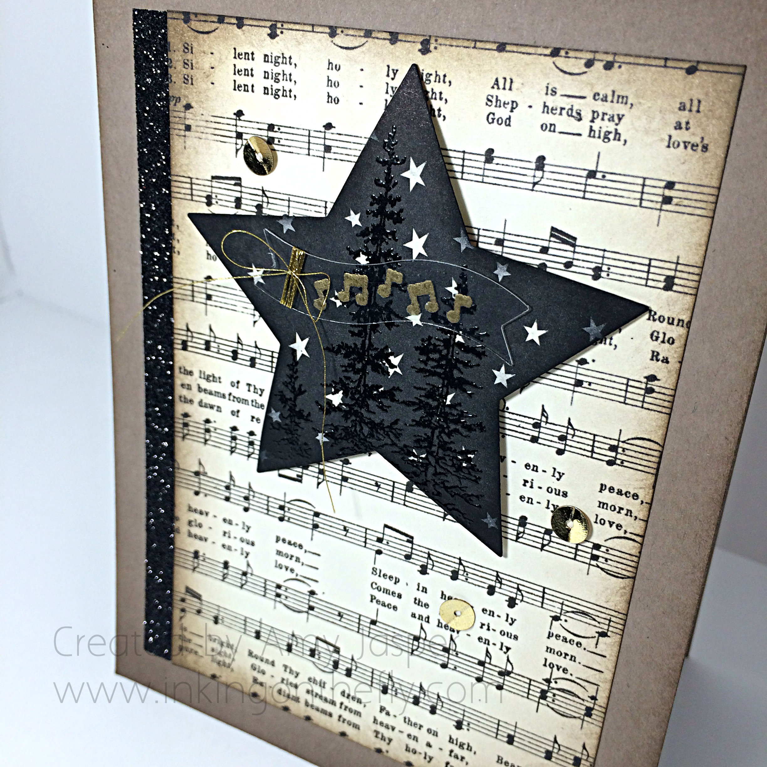
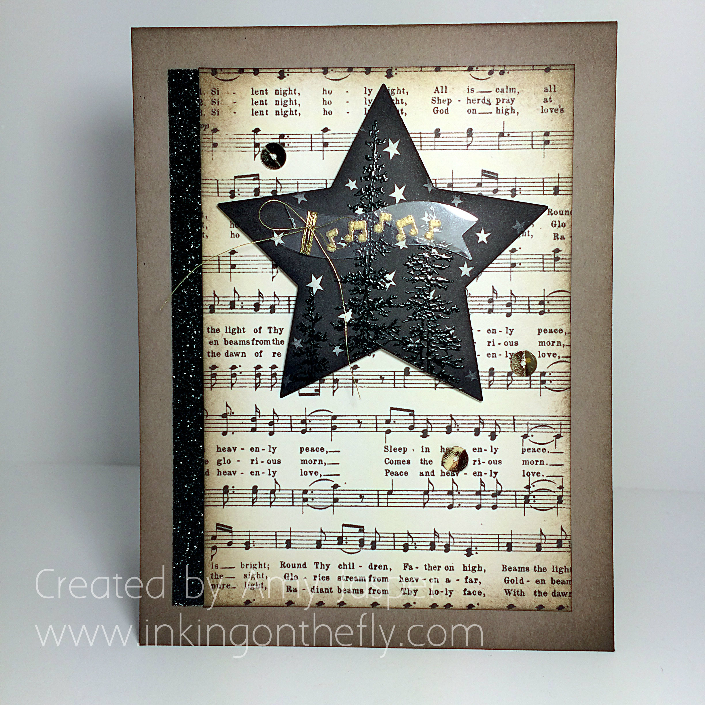
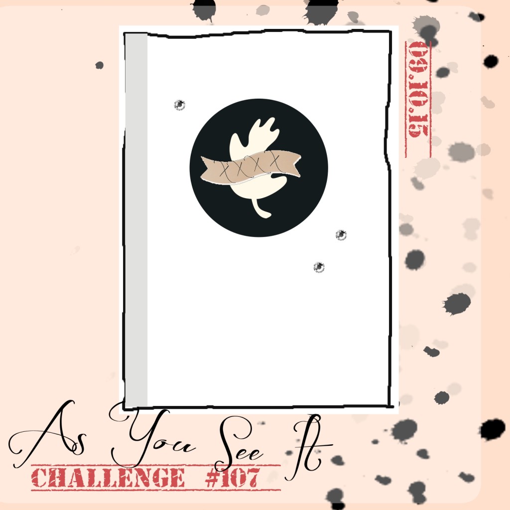
My card for you today is inspired first by this sketch from the As You See It Challenge Blog and second by my favourite Christmas carol, “Silent Night”.

107I just love the patterned paper with the notes on it in the Home for Christmas Designer Series Paper from Stampin’ Up! I wish we could by sheets and sheets of that one pattern for this time of year!

107anothertime

Tip Top Taupe cardstock was used for this card base with a bit of light sponging in Tip Top Taupe ink around the edges of the cardstock. I also sponged some Tip Top Taupe ink around the edges of the sheet music patterned paper from the Home for Christmas Designer Series Paper. This was adhered along side the strip of Black Glimmer paper (not just for Halloween!!) to the card base.

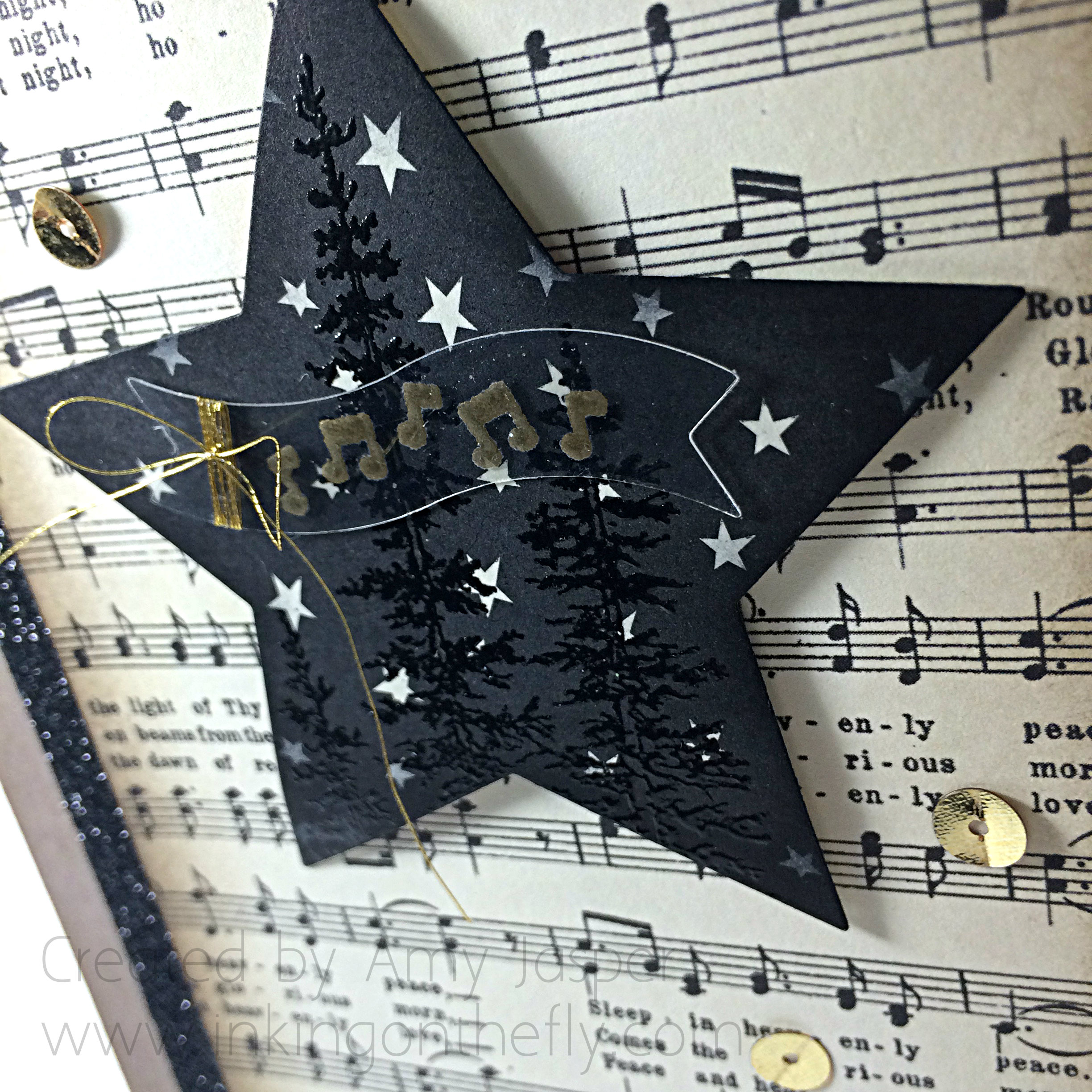
But my favourite elements on this card are all in the middle with that star! I stamped the tree image from the Wonderland Stamp Set in Versamark ink and heat embossed it with Black Embossing powder. All this on the Happy Haunting piece of Designer Series Paper. WHAT! Yes, folks, I used Halloween paper on a Christmas card! The vanilla stars on the black background represent a beautiful ‘silent night’. I sponged some Tuxedo Black Momento ink around the edges of the star and adhered it to the card with some Stampin’ Dimensionals so it could be raised off the page a wee bit.

107Close2

My friend, Stacey, was working with me in my craft room while I was designing this one and it was her suggestion to use the Window Sheet for the banner element. It was the perfect way to add a banner as per the sketch, without taking away from the image on the star.

I stamped the notes from the Jingle All the Way stamp set with Versamark ink onto the clear acetate Window Sheet, then heat set it with Gold Embossing powder. This was die cut using my Big Shot and the Bitty Banner framelit before very carefully wrapping the Gold Metallic Thread around the end and tying it into a bow. A Mini Glue Dot hides behind this cluster of gold thread to adhere the Window Sheet banner to the star.

107AmyJ

For the final touch, the three Gold Sequin pieces were added to the card using my Fine-Tipped Glue Pen.

Glad you could check out my blog today. You can purchase stamping supplies online by clicking the “shop now” button on this page. Or you can contact me by email to order or ask questions.

Don’t forget to also check out the creations from other designers on the As You See It Challenge blog. They have some lovely versions of this very same sketch.

Here are some beautiful Norwegian voices singing ‘Silent Night’ for you. Enjoy:

Beautiful Friend

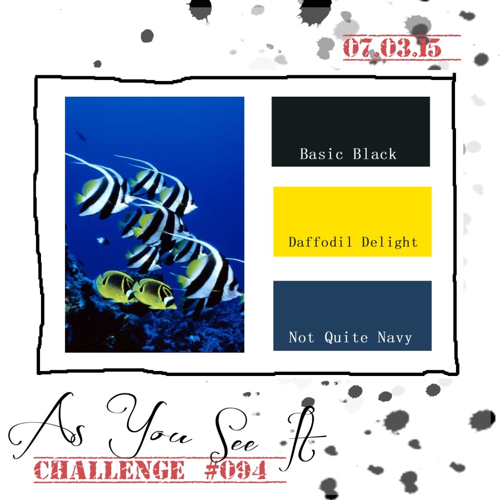
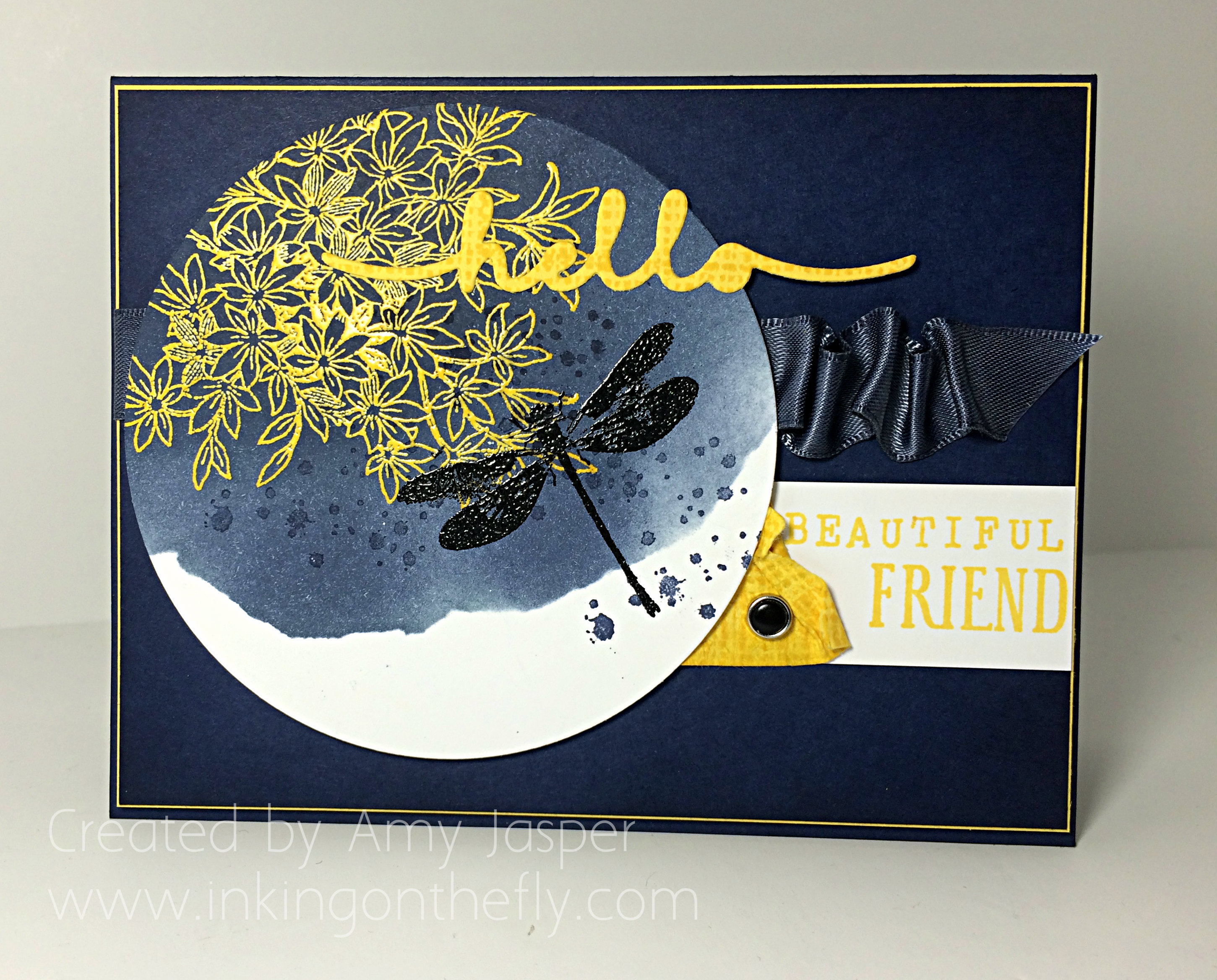
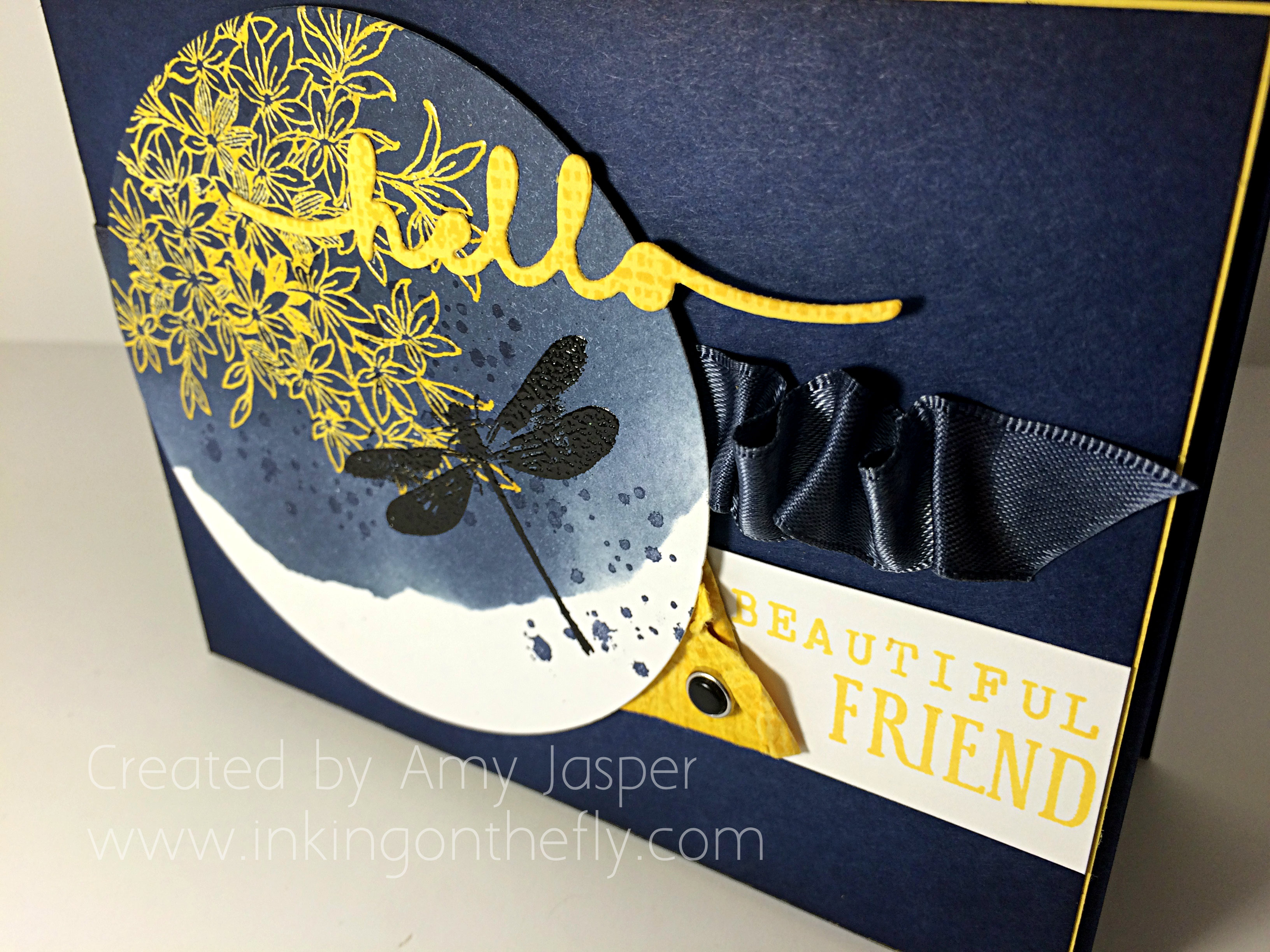
94headerWelcome to my blog where I have the joy of sharing my love of designing with paper and ink using my beloved supplies from Stampin’ Up! Today’s design shows off the new Awesomely Artistic stamp set and begins with an As You See It colour challenge.

AYSIChallenge094-1024x1024I love the whimsical beauty that a dragonfly image automatically adds to artwork, whether it’s a photograph, a painting, a scrapbook layout, or a card design.

This colour combination calls for Not Quite Navy, which is a colour that has retired from Stampin’ Up’s colour collections. It was a favourite of mine. However, since it isn’t available, I chose the next best thing: Night of Navy. It’s a lovely rich navy blue, that when a bit of the same colour of ink is sponged around the edges, it makes it even more rich and gorgeously deep!

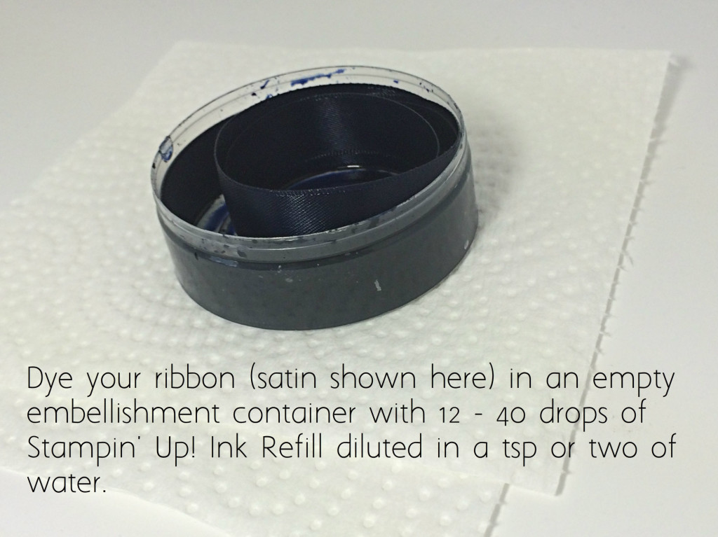
AYSI#94 by Amy JasperI wanted to add some ribbon to my card, but didn’t have anything that worked. Since necessity is the mother of invention, I chose to dye some satin ribbon to match my project!

Tips to dye ribbonTips:

  1. Use gloves. I am pretty good at keeping my hands and my workspace clean, but dying ribbon is a messy process. Gloves will be a member of my craft studio from now on.
  2. Use a small container. A small container allows you to be frugal with your ink refill. A small ziplock baggie works great and gives you freedom to squish your ink and ribbon around, ensuring total coverage. I chose to use an empty embellishment container and coiled my ribbon inside. It was very cool to watch the colour wick up the ribbon until it was saturated.
  3. More ink gives a darker colour. I started with 12 drops of ink refill and a couple teaspoons of water and my ribbon came out a lovely steel blue, but it wasn’t quite as dark as I wanted. I added 20 more drops of ink to the same container and placed my coiled ribbon in it again. This gave me the desired colour.
  4. Dry the ribbon. If your ribbon is wet, it will colour anything it touches. You can lay your ribbon on a paper towel and let it dry overnight. If you’re impatient (like me), you can dab it on a paper towel until most of the wet comes off, then hold in in your (un-gloved) hand and use your heat tool over it like a blow dryer (not too close). Holding it in your hand will prevent you from melting your ribbon (because you will feel the heat on your hand). If your ribbon isn’t dry, you will see marks of ink on your project as you add your ribbon. Also, it will not adhere well if you use glue dots or other adhesive to attach a bow.
  5. Different ribbon give varied results. Satin ribbon takes colour beautifully. Others will take colour differently, so test it out and see how it goes. Some ribbons are treated with sizing, which make them repel water, so they require extra work to get them to absorb the colour. You can wash them ahead of time in the sink or just take the time to massage in the colour (plastic bag technique would be the best container choice in this case).
  6. Not always true to colour. Some inks won’t give true colour on your ribbon. Sometimes it’s the ribbon, but sometimes it’s as though the ink separates. For example, I have seen Chocolate Chip ink end up a dusty rose pink colour when used on ribbon!

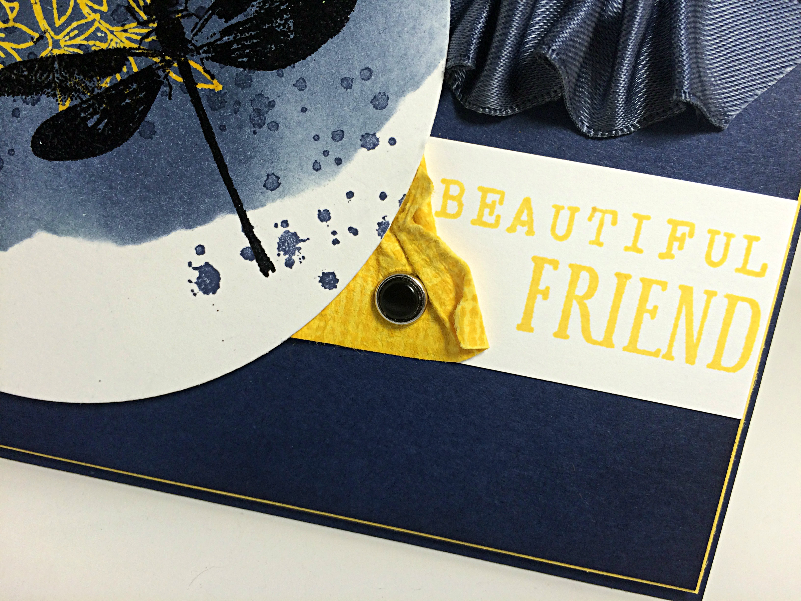
094sentimentI ruched the ribbon using a length of Tear Tape to adhere it as I ruffled and attached, ruffled and attached. The photo above also shows the piece of Daffodil Delight cardstock, which I textured by running it between my bone folder and my thumb multiple times until the fibres in the paper began softening. I actually softened it enough that I could separate it into two layers which makes a sort of suede-like finish (can’t really see it in the photo). This process makes the paper really pliable for a nice distressed look. I stamped it with the textured image from the Awesomely Artistic stamp set for an added amount of colour and texture.

And I’m quite pleased with the use of the black Candy Dot in the Candy Dot brad! I can’t remember the last time I used one of these brads with the Candy Dots! It looks great!

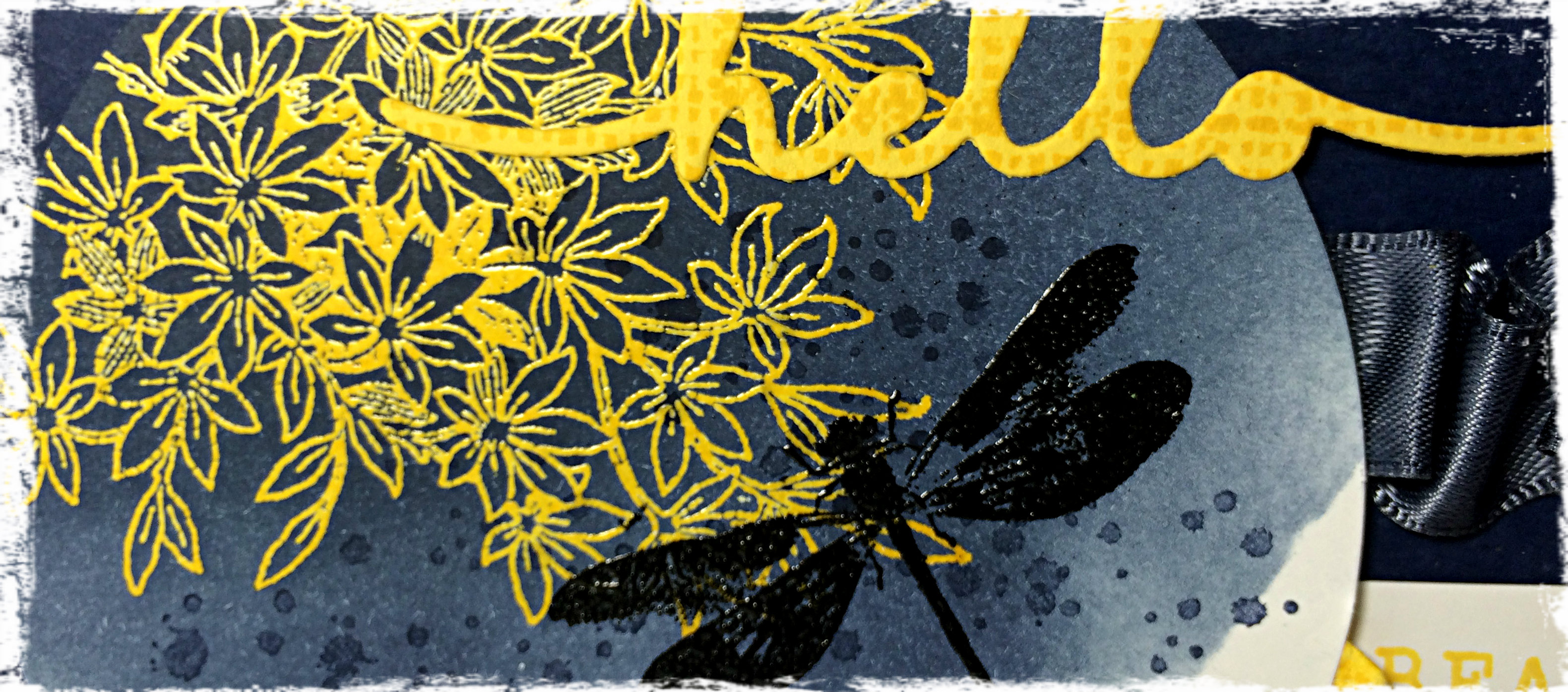
The sentiment is a combination of the Greeting Thinlits “hello”, which I created using Daffodil Delight cardstock with that same texture stamp image over it; the “beautiful” is created using the Rotary Alphabet stamp; and the “friend” image from the Awesomely Artistic stamp set.94angle

I was very pleased with my circle section of this card. I started by rubbing my Embossing Buddy over the paper and stamping the floral image from the Awesomely Artistic stamp set by first inking the stamp with Versamark ink, then inking over that with Daffodil Delight ink. This allows the ink to stay “wet” longer so I could cover it with Clear Embossing powder and heat-set it with my Heat Tool. Once set, I added Night of Navy ink over it with a sponge and circular motions. Torn pieces of sticky note paper were applied as a mask to create the vacant area on the circle.

After sponging to my heart’s content, I used my Embossing Buddy again and stamped my dragonfly with Jet Black Stazon. Then I applied Black Embossing Powder and used my Heat Tool. I applied the Night of Navy splatter with the splatter image stamp from the same stamp set.

The thin mat of Daffodil Delight cardstock was a great finish to the overall card. It looked so plain before adding that splash of light. That Daffodil Delight mat is on Stampin’ Dimensionals, as is the circle of Whisper White cardstock with the dragonfly image.

94AmyJasperI had the pleasure of stamping with a friend while creating this card. I think that’s why the sentiment says “hello beautiful friend” – because I was thinking of her. She was my muse for the day. Thanks Gwen!

What would you do with this colour combination? Try it and share it with the As You See It Challenge blog! We love to see what you create!

Amy

Designer-Badge