technique

Colourful Well Wishes

090headerWelcome to my blog where I share my love of designing with my Stampin’ Up paper, inks and stamps! Check out how I used the hearts mask from the Hearts and Stars Masks set for today’s card.

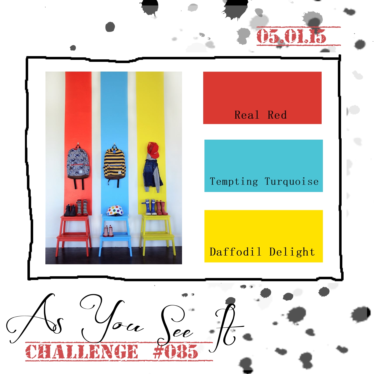
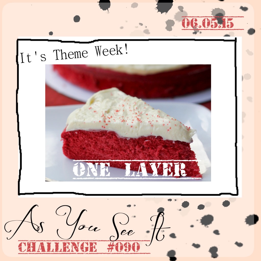
Here’s the challenge that I started with from the As You See It Challenge Blog.

#90One layer cards are a very scary thing for me. I’m sure I’ll have nightmares tonight!

Ok, they aren’t that bad (but, seriously, way more challenging than you might think!).

That’s the challenge today; a one layer card. As a lover of Stampin’ Up Dimensionals, this was so so hard. But, it’s all about being challenged so you can develop your skills and stretch your creative muscles!! So, don’t shy away from this one.

I decided to stick with a basic Whisper White card base after a few attempts with other colours and ideas (and a few smudges and crooked stamping).

090Amy
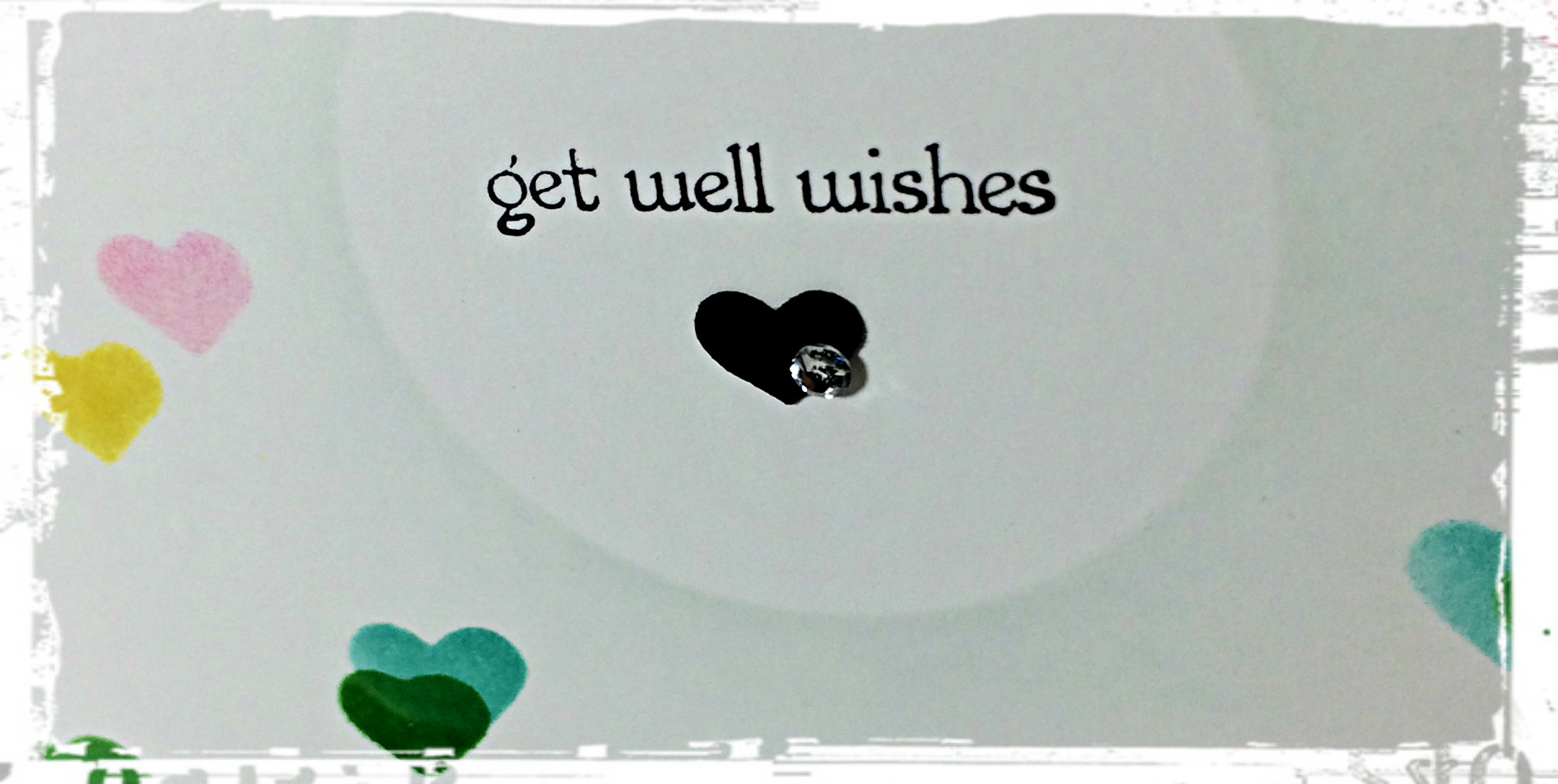
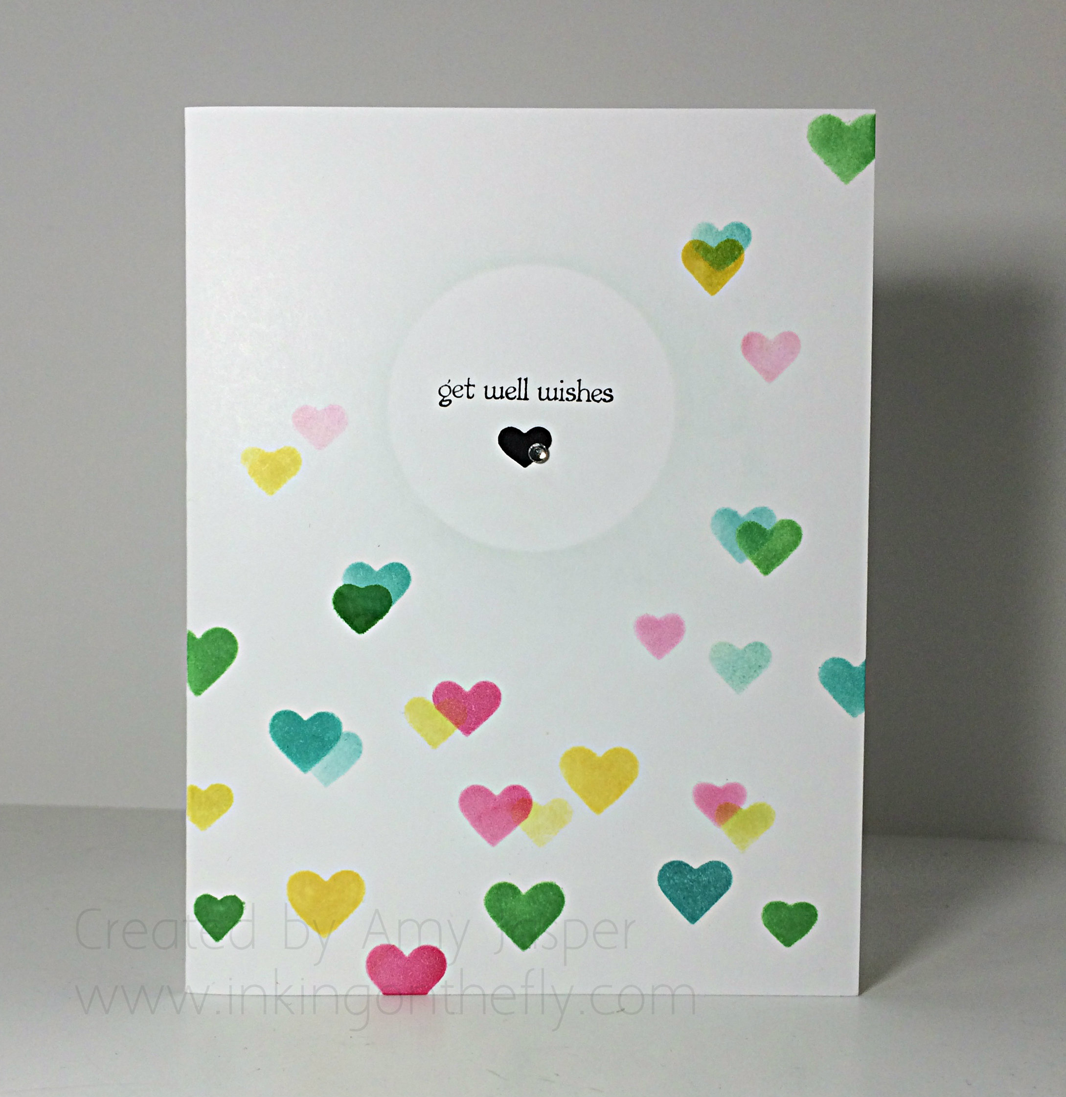
I used the hearts from the Hearts and Stars Masks and, with Sponge Daubers, applied the following inks: Daffodil Delight, Melon Mambo, Bermuda Bay, and Crushed Cucumber. Then I shifted the mask to allow me to strategically place overlapping hearts in random places to get this kind of colourful bokeh look.

I was careful to leave a vacant area in the center of the card while doing the hearts so I could have a spot for my sentiment (from the Teeny Tiny Wishes stamp set). The “get well wishes” sentiment was stamped with Jet Black Stazon ink. I wanted to try to create a focal point for the words, so I placed a 1-3/4″ punched out circle of paper over the area and lightly sponged with Soft Sky ink around it before removing it again (TIP: you can put a tiny bit of SNAIL under the mask to help it stay in place, but even then, I still hold it very firmly while I sponge around it).

090close
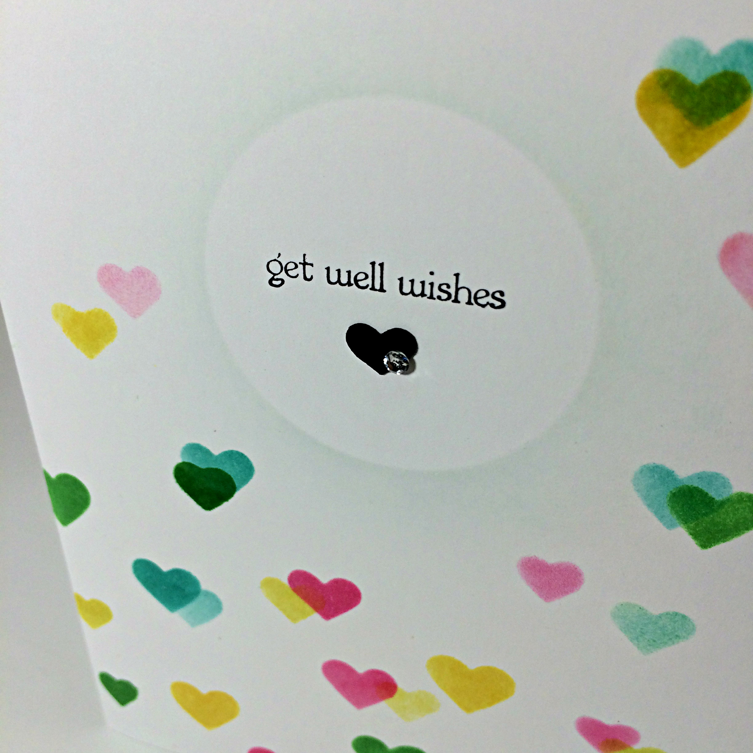
The cute little black heart is from using the Bordering Hearts punch and was attached with my beloved Multipurpose Liquid Glue (just the tiniest amount, though, so it won’t squish out around the heart and stay sticky forever and ever and ever). Over that, a single sweet little Basic Rhinestone.

The scary thing about one layer cards, is that if you make a mistake, that’s it! The gig is up! Start over! I started over with my gig, um, I think 4 times, (6, if you count my first attempts with watercolour paper). Yeesh!

You know what though. I think this would be a great card to make multiples of and have on hand. It’s sweet and simple and extremely cost effective! So, give a one layer card a try and let me know how it goes.

Don’t forget to upload your picture to a public site like Pinterest, then link it to the As You See It Challenge #90 and show off your hard work!!

Amy.

Hand Embossed Wedding

089header

Tip Top Taupe is my new favourite neutral colour. The new annual Stampin’ Up catalogue launches on June 2nd along with a whole new set of 2015-2017 In Colours, like Tip Top Taupe!

I am a designer for the As You See It challenge blog and have the privilege of sharing a card with you each week according to the challenge put out by AYSI. Here’s your inspirational sketch for this week:

#89This layout inspired me to try a weaving technique with the Tip Top Taupe 1″ Dotted Lace Trim and the Hearts Border Punch with Blushing Bride cardstock. What a beautiful combination those two colours make! I also thought I would try a hand-embossing technique using a stylus and the Stampin’ Pierce Mat.

Check it out!

089Amy

Can you see how the leaves from the Summer Silhouettes stamp set are raised? I stamped them first with Blushing Bride ink; stamping off on a scrap piece of paper to lighten the colour, then adding more ink on the tips of the leaves before stamping on my cardstock. I used the Simply Scored Stylus to outline the image on the front of the card, then I flipped the cardstock over and traced over the outline again and filled it in by rubbing the fatter end of the stylus in small circular patterns. All this was done over the Stampin’ Pierce mat as you need a surface that has a bit of give to it, while still offering stability.089angleThe most challenging parts of this card for me: adhering the bulk of the lace between the taupe layer and the punched layer without making a mess, and lining up the mosaic patterned stamp (also from the Summer Silhouette stamp set) as it needed to be stamped twice in Tip Top Taupe ink to make it across the card. A Stamp-a-ma-jig would have been the smart way to go, but I decided to try it without and only messed it up once!

Also used on this card: A thin mat of Whisper White cardstock, Whisper White Baker’s Twine, Basic Pearls, the sentiment is from Teeny Tiny Wishes and is stamped in Jet Black Stazon ink, Tip Top Taupe ink was sponged around the edges of the taupe layer, and the small heart from the Itty Bitty Accents Punch Pack was used to punch out a bit of love from the gold lettered paper of the Neutrals Colour Collection paper which I coloured with my Blushing Bride Stampin’ Write Marker.

So, be sure to check out the As You See It Challenge blog and play along!

courage

I hope you’ll leave a comment and let me know what you think of my take on the sketch. What do you think of the puffed sections of lace? Do they work or are they silly? Have you tried embossing by hand before? How successful were you and what tools did you use?

I’d love to hear from you!

Amy

Retiring Light of My Life

085header

There are so many favourite things that are retiring as the 2014/2015 Stampin’ Up! catalogue comes to a close at the end of May. They need to make room for NEW favourite things!! I’m purposely featuring retiring product in my next few posts so that you won’t miss out on your chance to order these items before they’re gone for good!!

My design for As you See It Challenge #85 features the Today and Everyday stamp set, the Top Note Bigz Die, and the Argyle Embossing Folder, all of which are on the retiring list. The Argyle embossing folder also happens to be 50% off! If you haven’t seen the retiring list, you should definitely have a look. A lot of items are discounted.

AYSIChallenge085

Here are some colours that definitely screamed “FOR THE CHILDREN!!” to me, lol! However, I resisted the urge to make a kid themed card (though these colours are absolutely perfect for that purpose – so crisp and playful).

Instead, I went for bright and happy!

085Amy

I really wanted to play around with light in my water colouring for this design. I cut my Top Note shape from some Watercolour paper and stamped my image with Jet Black Stazon ink. Starting with Daffodil Delight ink and an Aqua Painter, I highlighted all the areas that I wanted to appear to be glowing with light, focusing on a spot inside the lanterns as well as colour-washing around the lanterns. After allowing that to dry, I went in again with each of the lantern colours (Real Red, Tempting Turquoise, and Daffodil Delight) working around the area where I had already applied the Daffodil Delight highlights and focusing darker, more saturated colour on the edges of each lantern. Less water and more ink allows for greater saturation of colour. I love that I can squish the ink pad when it’s closed so that the ink smudges onto the inside of the lid. Then, when it’s opened, you can use the inside of the lid as a palette for your colouring. You can also just apply a drop of re-inker in the inside of the lid.

085texture

When the colouring was complete, it was time to work on the second layer of this design. I chose Daffodil Delight cardstock for my base and a layer of the same colour over it with texture for added interest. That’s where the Argyle Embossing Folder comes in. I only put about 2/3 of the piece of cardstock into the folder, leaving that 1/3 untouched and smooth. I like this look. Sometimes, you can have too much of a good thing, so this eases off on the weight that embossing adds to a project. I did my two line scoring technique at the junction of the embossed and the smooth, just to give it a more finished look. Then, the Basic Black Baker’s Twine was wrapped around three times and tied in a bow with lovely long tails.

If you have ever visited my blog before, then you KNOW how much I use and LOVE my Stampin’ Dimensionals. This design has them too, of course! Each layer is popped up on these lovely little hexagon shaped foam stickers. Rarely a flat card you will see in my hand-made collection!

085inside

Lastly, one of my favourite things to do with the Top Note Bigz Die: A decorative inside to finish off my design. The same image on the front was stamped with coordinating Daffodil Delight ink onto a die cut piece of Whisper White cardstock and adhered for a pretty little writing space.

What do you think? What’s on your list of supplies to buy before June 2nd. Some things are already sold out! Be sure to put your order in sooner than later so you aren’t disappointed.

Make sure you give this colour challenge a go. It’s fun, cheerful, bright, happy, crisp, and playful, too. Great colours to cheer someone up with – to light up someone’s life!!

Amy

Designer-Badge