technique

Bloom with Hope

050header

Welcome to my blog where I share my love of designing with Stampin’ Up! ink, paper, stamps and tools!

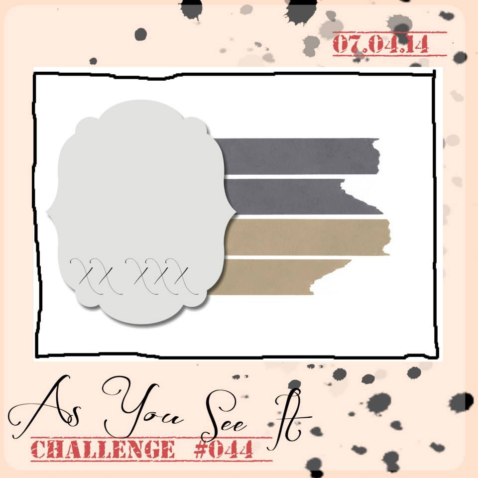
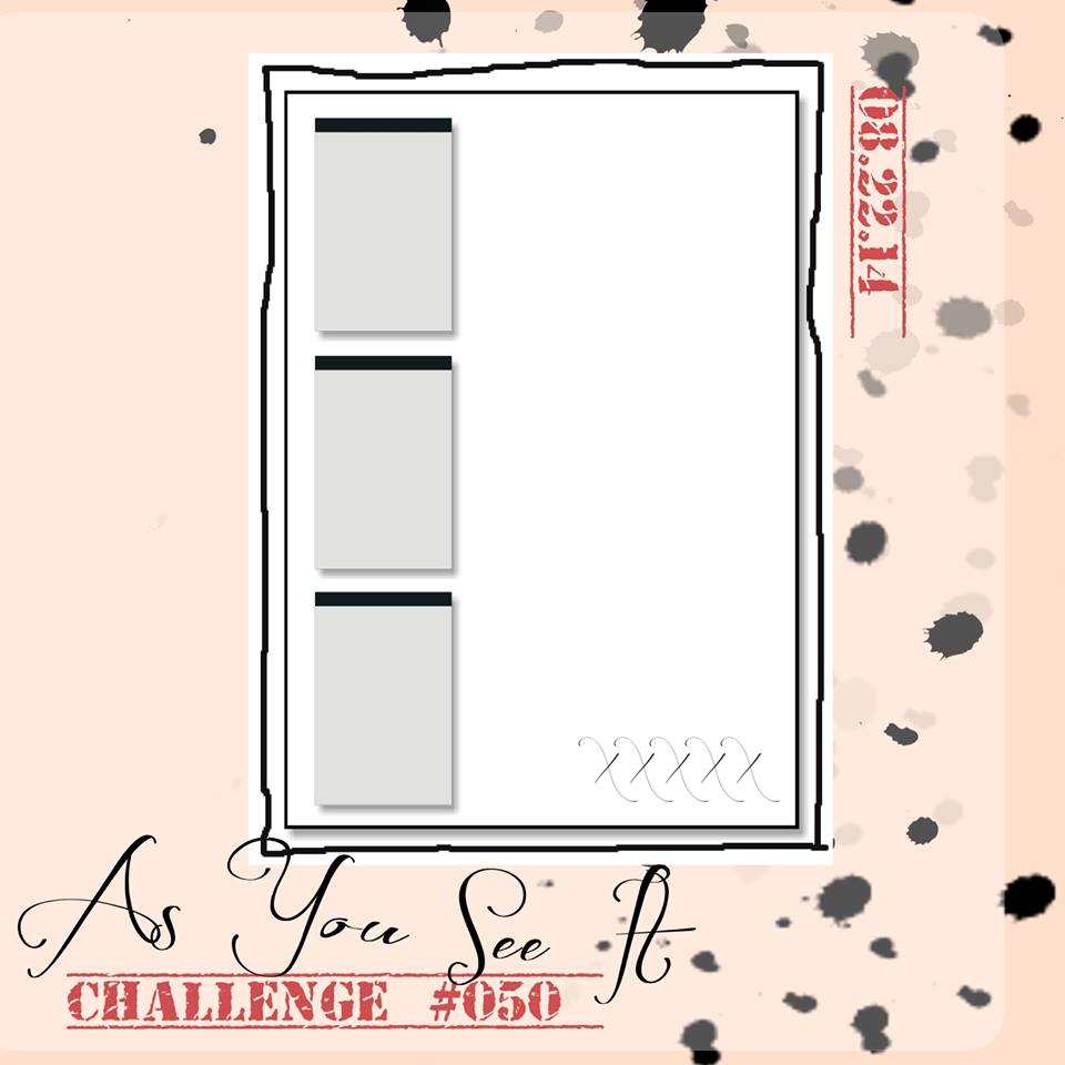
Are you up for something a little different from my usual style? My design today is clean, simple and pretty (at least I think so). The As You See It Challenge blog has a sketch challenge for you this week. I knew right away how I wanted to play with those little rectangles to the left of the design and it would involve flowers!

#50

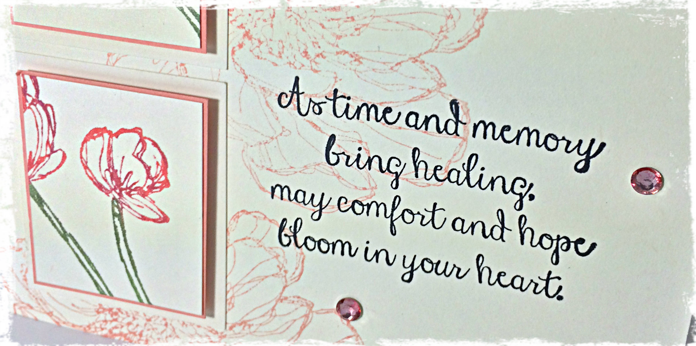
I wanted my card to be simple and elegant. I had intended on keeping it neutral in colour, but ended up giving it a splash of Crisp Cantaloupe – still soft, still elegant, but adds a touch of feminine grace, too.

050Amy

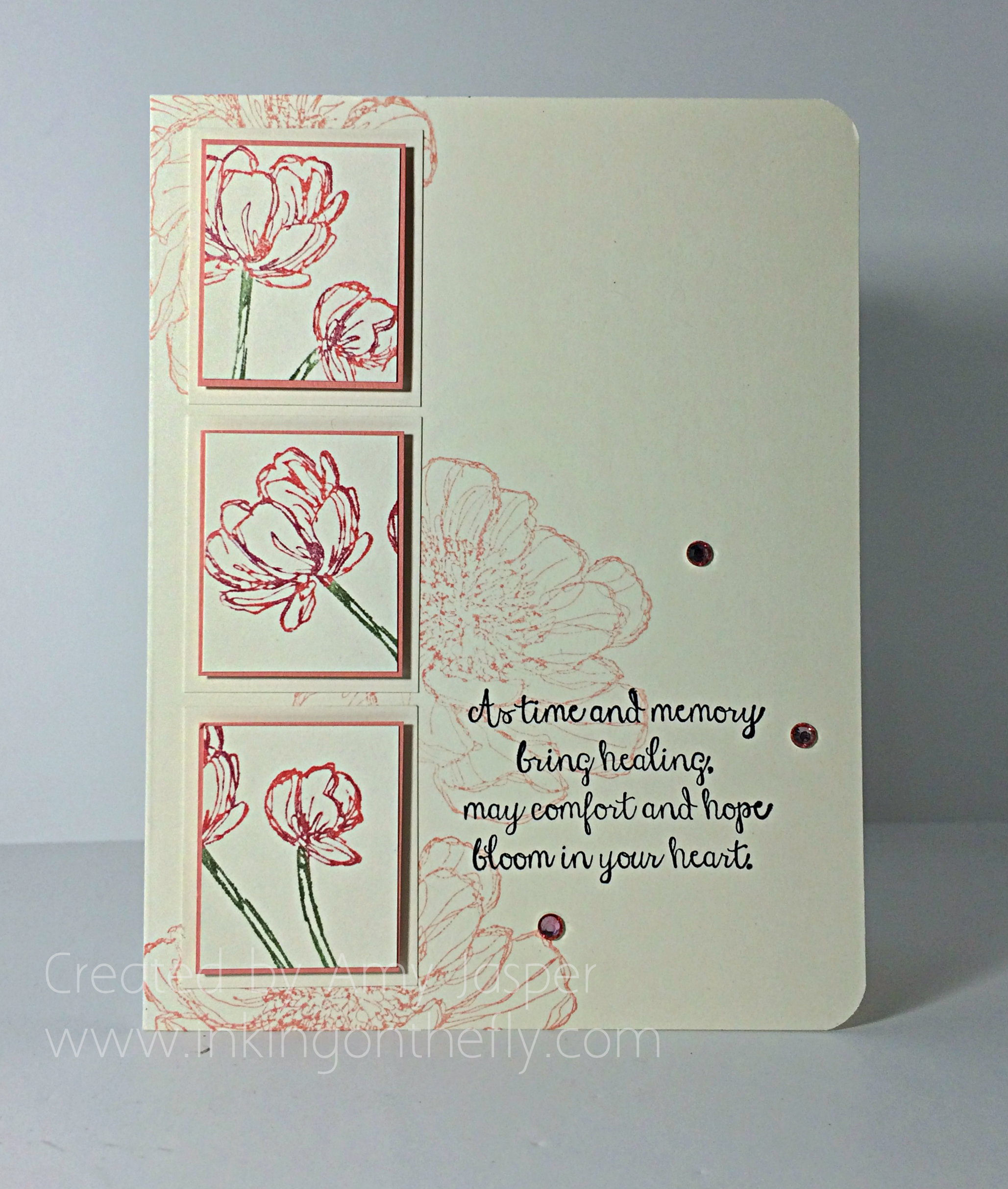
I love the Rhinestones!! I coloured them with the medium Calypso Coral Blendability marker. Before I added them, the card was too heavy on the left side. They add balance.

The stamp set I used is the Bloom with Hope hostess set. It is a beautiful set, but you can only purchase it with your hostess dollars when you host a workshop. I’d love to do this card with you and your guests so you can get this gorgeous collection of stamps for free!

050close

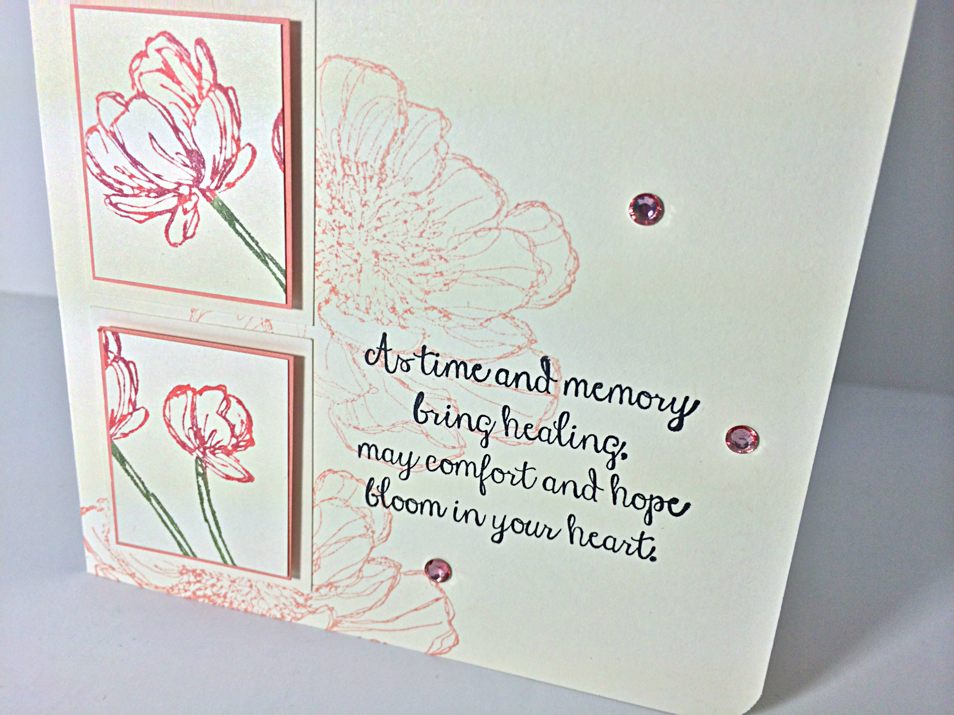
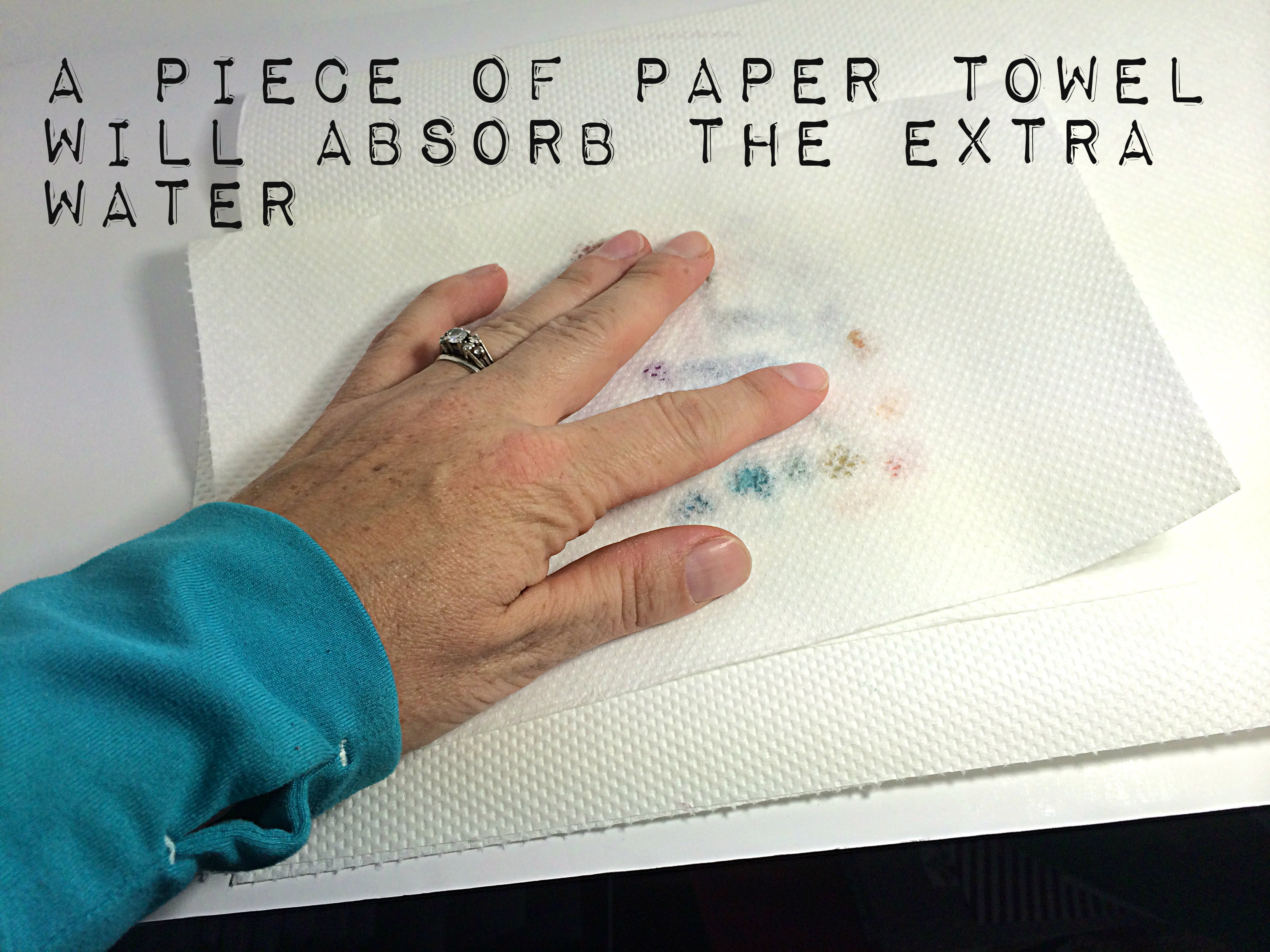
I used Very Vanilla for my base card. I honestly am not drawn to vanilla (well, unless it’s ice cream!), but it is much softer than Whisper White and definitely works for a sympathy card. I stamped the large flower on the card base with Crisp Cantaloupe, stamping it off once on a scrap piece of paper so it would be a softer image. Then I used my Stampin’ Write Markers to colour my rubber stamps directly before stamping the images that are on the rectangles. I used Crisp Cantaloupe and Wild Wasabi first, then randomly added daubs of Rich Razzleberry to the blooms and Mellow Moss to the stems.  Don’t forget, that whenever you colour your rubber with the markers, you should ‘huff’ on the rubber before stamping your image on your cardstock. This will ensure that the ink is re-moistened and will give you the image quality that you intend.

If you have no idea what I’m talking about, ‘huffing’ involves a heavy exhale of your breath onto the rubber while it’s close to your open mouth. While we take the time to colour directly on the rubber stamp, the areas that you coloured first start to dry.  The slight moisture from your breath that would normally fog a mirror is enough to re-activate the ink’s moisture on the rubber. It sounds weird, but is a necessary step with this technique.

050inside

I layered my rectangles with the thinnest mat of Crisp Cantaloupe cardstock as possible, then matted it again with a wider Very Vanilla. You can see I used Stampin’ Dimensionals to pop up each of the Crisp Cantaloupe layers.

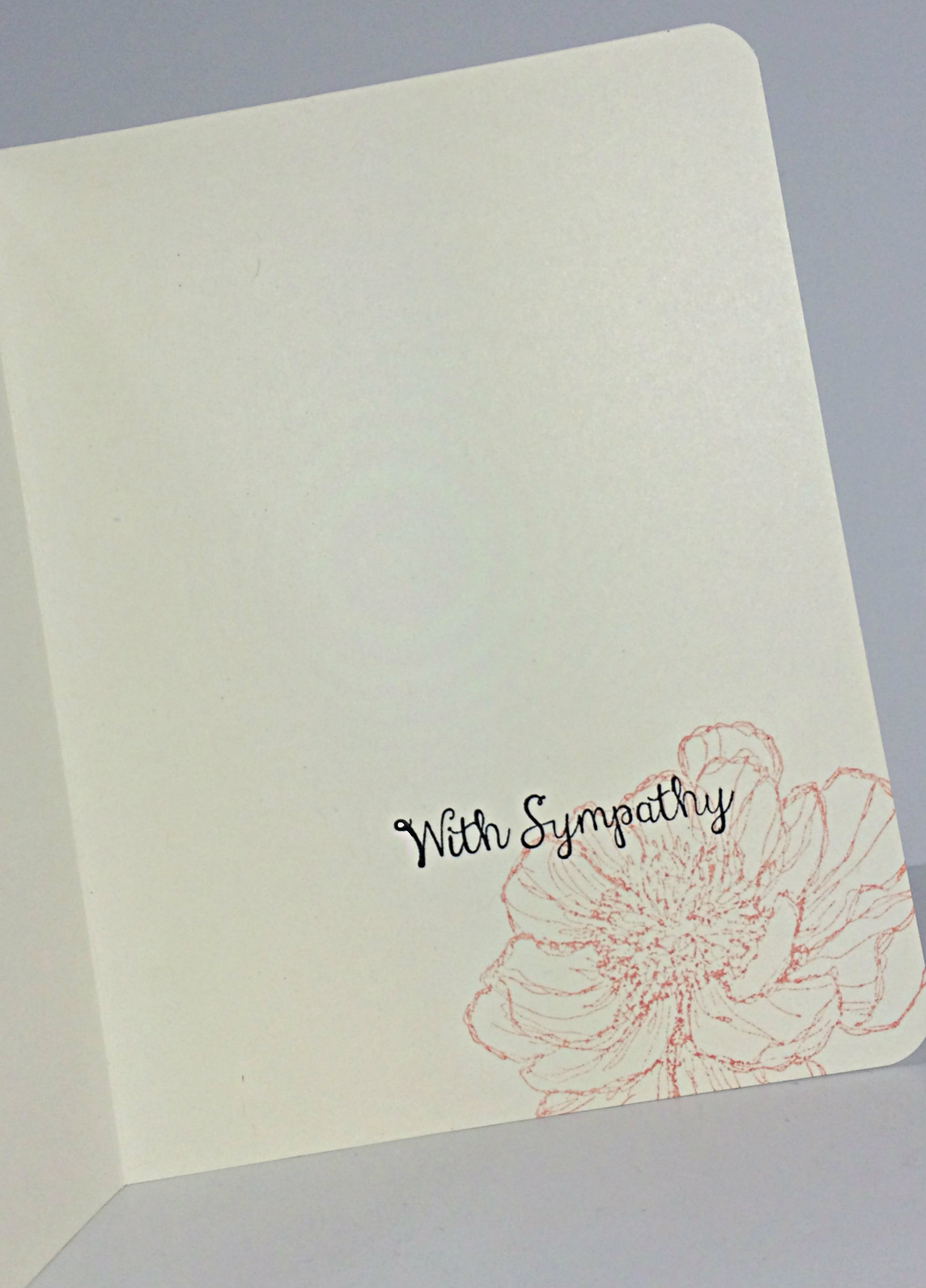
Finally, I used the corner rounder punch on my Envelope Punch Board to round the corners of my card and I stamped my sentiments with Jet Black Stazon ink.

Don’t forget to try this layout for yourself, whether it’s for a card, a scrapbook page, or artwork for your wall. You can take a photo of it, load it to a public site (Pinterest works well), then link it to Challenge #50 on the As You See It Challenge blog!

I’m not exaggerating when I tell you that we are inspired by every card that you share with us. Everyone has their own tricks and style to share, whether they know it or not: the way your tear your cardstock, a colour combination that I’ve never thought of before, little added touches, how you tie your ribbon – I am always learning from other people’s creativity. I hope you will share yours with us on the challenge blog!

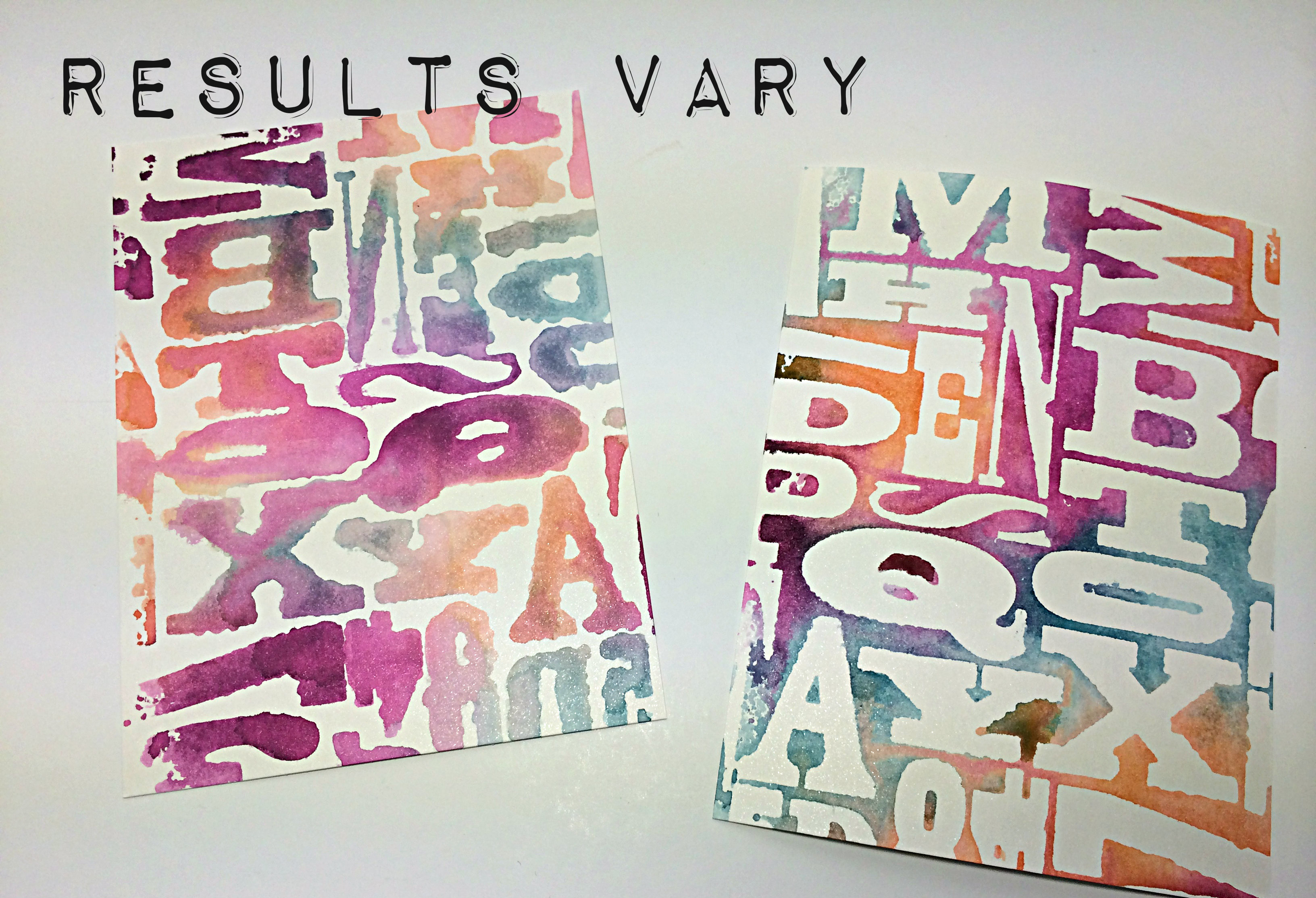
As a side note: for the first time, I’m having trouble with taking photos with my iphone. I hope it’s just the light-coloured card design, but I had to fuss with my lighting and angles more than usual to avoid weird lines and halos. You can see one of those halos in the center of my last photo. Taking a good photo of your card is about good lighting, the right shadows, a crisp image, and quality product (avoiding ink smudges or halos, cutting ribbon and cardstock with sharp blades, and making sure that things intended to be straight on your product are actually straight!) – things to keep in mind when you upload to Pinterest.

Sign up this week to be a Stampin’ Up! demonstrator, like me, and join my team!! Stampin’ Up! is offering the kit for the usual $125, tax and shipping free, but you can choose $190 in product for your kit instead of the usual $155 of product. The kit is already a great deal, but now it’s even better!! Check out the SHORT AND SWEET sign up offer by clicking on the link and learn more about it and other promotions currently available.

Happy Stamping!

Amy.

Designer-Badge


Thankful in Berry Tones

049header

Welcome to my blog where I share my love of designing using products by Stampin’ Up!

If you are a regular follower of my blog, you may have noticed a bit of a pattern on Fridays, lol! Here we are on Friday again and it’s time for another As You See It Challenge design!


#49

I love Blackberry Bliss. It’s such a rich tone. I normally don’t like to work with purple, but I’m getting better at it. Blackberry Bliss is definitely easier for me than other purples, though (just don’t expect me to pair it with yellow very often!)

049Amy

I decided to play with the hostess set “I Like You”. When I got this set, I was excited to colour those flowers with my new Blendabilities, but it looks lovely as a line image too, don’t you think?

I had some fun embossing with clear embossing powder for this card. I used my Embossing Buddy on two pieces of cardstock: the Blackberry Bliss card base and a rectangular piece of Very Vanilla, then I stamped with my Versamark ink (the cleanest ink pad of THREE that I have as I inevitably muck them up with ink transfer from supposedly ‘clean’ stamps). I embossed with my heat tool and clear embossing powder.

The card base, I set aside, while the Very Vanilla piece was sponged heavily with Blackberry Bliss ink and Strawberry Slush ink. If you’re familiar with this technique, then you know that the water-based ink will not stay on the embossed areas. Just wipe off the traces of ink with a paper towel to reveal the Very Vanilla colour that has been protected by the embossing powder for this Emboss Resist technique.

049technique close

The sentiment was done using precise stamping with varied amounts of ink. You can use the Stamp-a-ma-jig to help with your placement. I was trying to get an ombre-like gradient of colour each time I stamped the sentiment. I used Strawberry Slush and Blackberry Bliss, stamping off for the lighter images and using full strength ink for the darker images.

049closetwine

Give this colour combination a try and link up your photo to Challenge #49.

I hope you’ll leave me a comment (this blog refers to them as a “reply”) and let me know your thoughts. I have been missing your encouraging words 🙂

Amy.

Designer-Badge


Coffee is a Perk

044header

Welcome to my blog where I share my love of designing using Stampin’ Up! paper, ink, stamps, and tools! I design for the As You See It Challenge blog and it’s time for challenge #44!

I love coffee, especially latte’s from Starbucks. My new summer treat is a Caramel Ribbon Frapp! So so soooooo yummy!

#44

Because I love coffee, I thought I would get some use out of my new Perfect Blend stamp set. I stamped the coffee cup image once on Whisper White cardstock with the Momento black ink, then coloured it with the Daffodil Delight Blendability markers and cut it out with my Paper Snips. Then I stamped the image again so I could cut out just the lid and attach it with Dimensionals.  I stamped the image a third time on the Moonlight Designer Paper, so I could cut out just the coffee sleeve and attach it with Dimensionals as well (after adding the Coastal Cabana baker’s twine, of course).

044Amy

You can see that I used the Epic Day washi tape, the BACK side of the Chevron Natural ribbon (which I stamped on with Stazon Black ink using the sentiment from the An Open Heart stamp set), Bermuda Bay 1/8″ taffeta ribbon, and finally a folded strip of Daffodil Delight patterned paper from the Brights Patterned Paper Stack.

The card base is Crumb Cake cardstock, which has an embossed outline 1/8″ all around the card that was created by using the Simply Scored tool and stylus. I matted that cool background with a thin layer of Bermuda Bay cardstock.

As for the cool background… how ’bout a quick photo tutorial:

044tutorial1My challenge card uses the Honeycomb folder, but this would work for any embossing folder. And you don’t even need the Big Shot for this because it doesn’t get embossed! Just pick which side of the folder you want to use (keep in mind that the raised area that you sponge is what will press colour onto your cardstock).044tutorial2

Spritzing with water is fun! The amount of water you add will determine how blended your colours are. If you want a softer, more watercoloured look, then use lots of water and make it more puddly. If you want a bolder colour, then spritz it only until the colour starts to bead on the folder. You’ll get a different look entirely based on the amount of water.

044tutorial3

Lay your cardstock over the ink and press gently with your hands. I used Shimmery White cardstock as it takes water well, but is more white than watercolour paper is … I tried this with Whisper White as well, but it warps the paper a bit – still works, though.

044tutorial4When you remove your cardstock, it will be quite runny if you used a lot of water. No worries…044tutorial5You can pick up that extra water by carefully pressing some paper towel over the image to absorb the excess.044tutorial6I used a little bit more water on the left image than I did on the right image. Also, you should take note that with this particular folder (the Alphabet Press), it actually makes a big difference because the image on the left has backwards letters, lol!044tutorial 6So, this is the final result. I used Tangelo Twist, Blackberry Bliss and Island Indigo inks on this one. My card above used Coastal Cabana, Calypso Coral, Lost Lagoon, and Hello Honey inks.

Let me know what you think and, please, play along with the sketch challenge this week! I am always inspired by every card I see and I look forward to being inspired by yours!

So go on over to the As You See It Challenge Blog and load up your design of this week’s sketch!!

Amy.

Designer-Badge