As You See It Challenge

Coffee is a Perk

044header

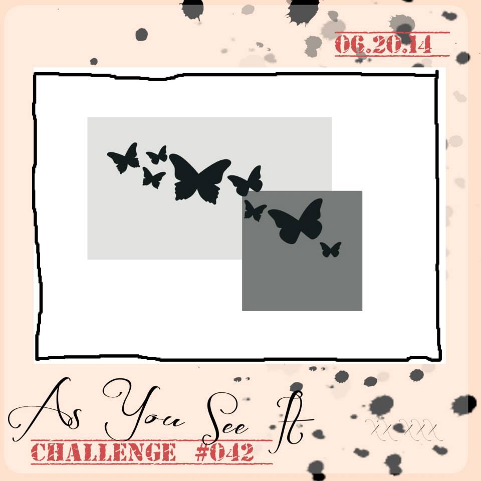
Welcome to my blog where I share my love of designing using Stampin’ Up! paper, ink, stamps, and tools! I design for the As You See It Challenge blog and it’s time for challenge #44!

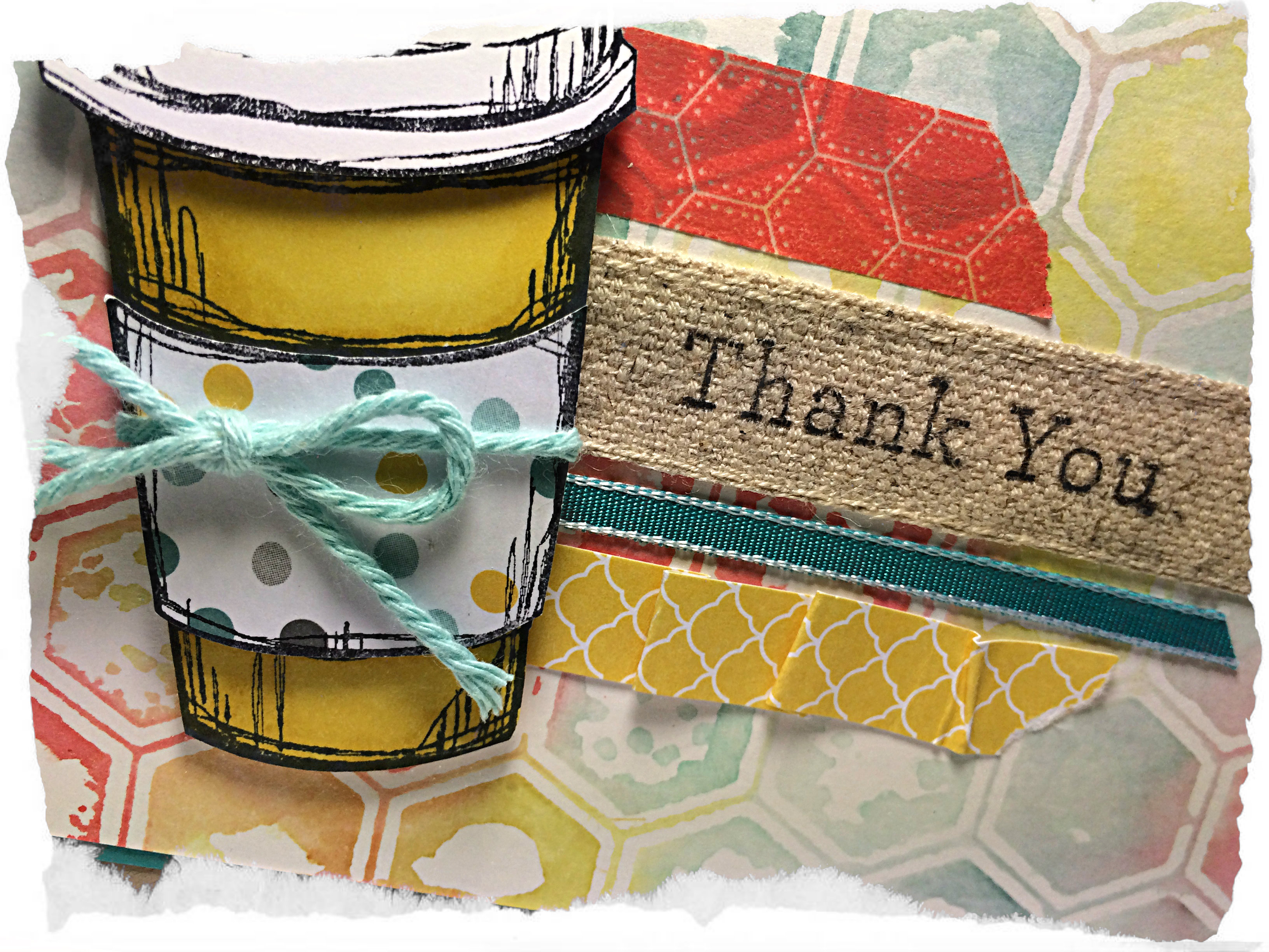
I love coffee, especially latte’s from Starbucks. My new summer treat is a Caramel Ribbon Frapp! So so soooooo yummy!

#44

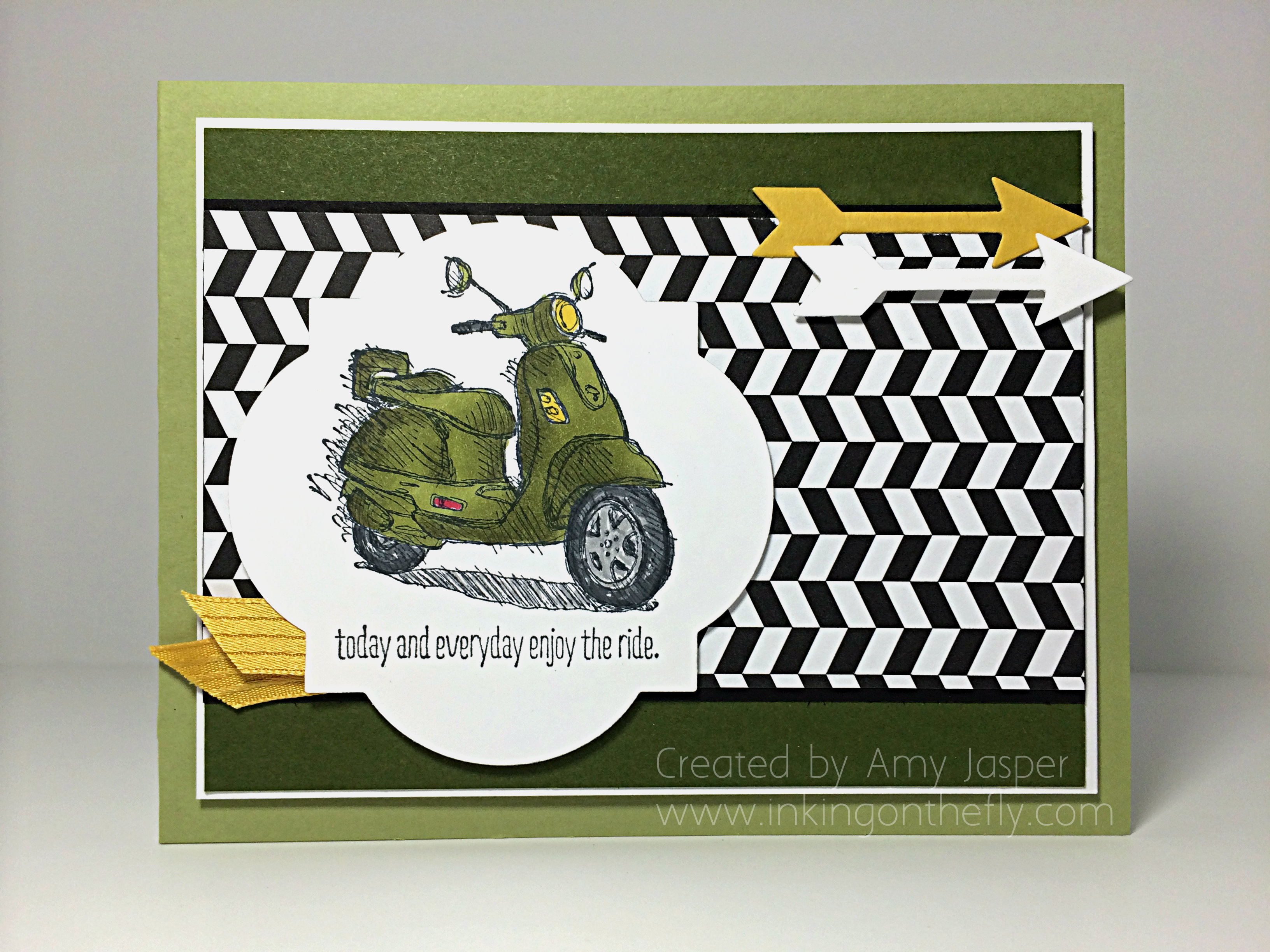
Because I love coffee, I thought I would get some use out of my new Perfect Blend stamp set. I stamped the coffee cup image once on Whisper White cardstock with the Momento black ink, then coloured it with the Daffodil Delight Blendability markers and cut it out with my Paper Snips. Then I stamped the image again so I could cut out just the lid and attach it with Dimensionals.  I stamped the image a third time on the Moonlight Designer Paper, so I could cut out just the coffee sleeve and attach it with Dimensionals as well (after adding the Coastal Cabana baker’s twine, of course).

044Amy

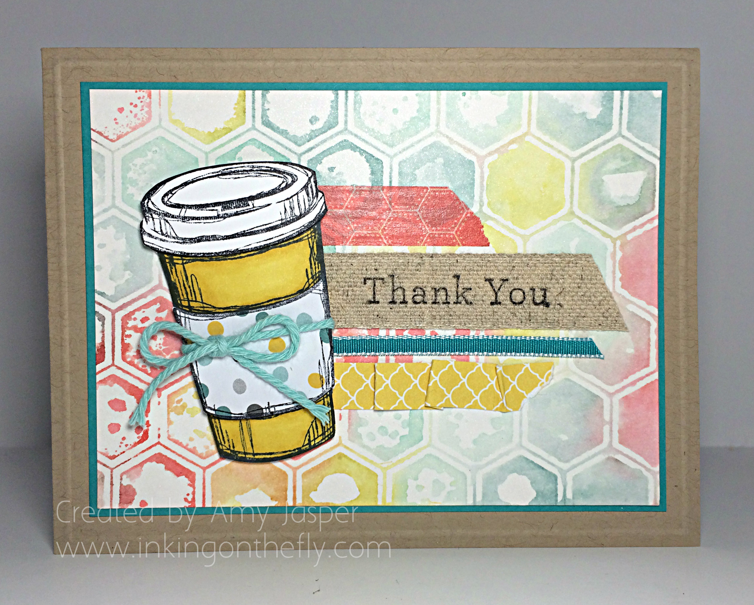
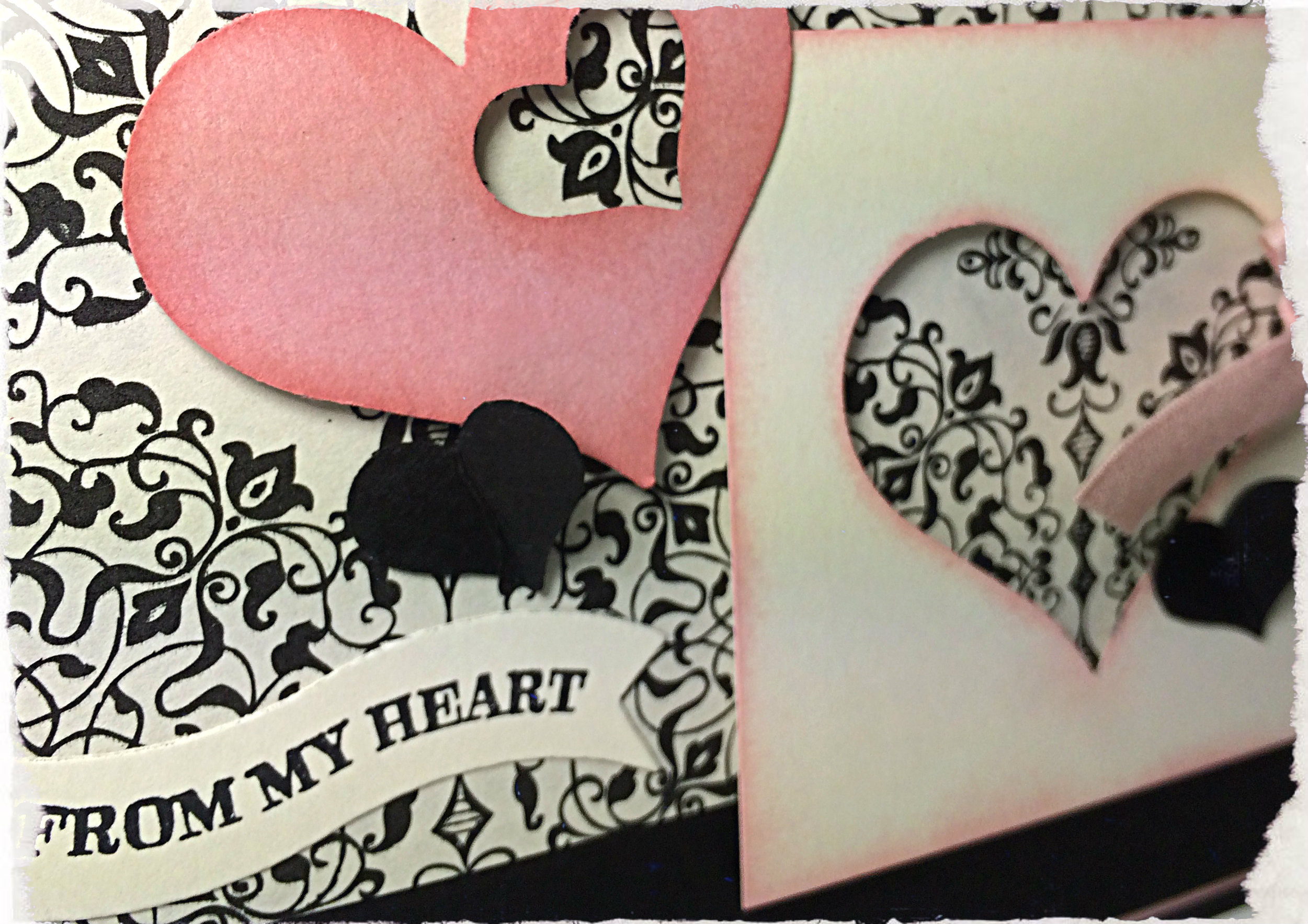
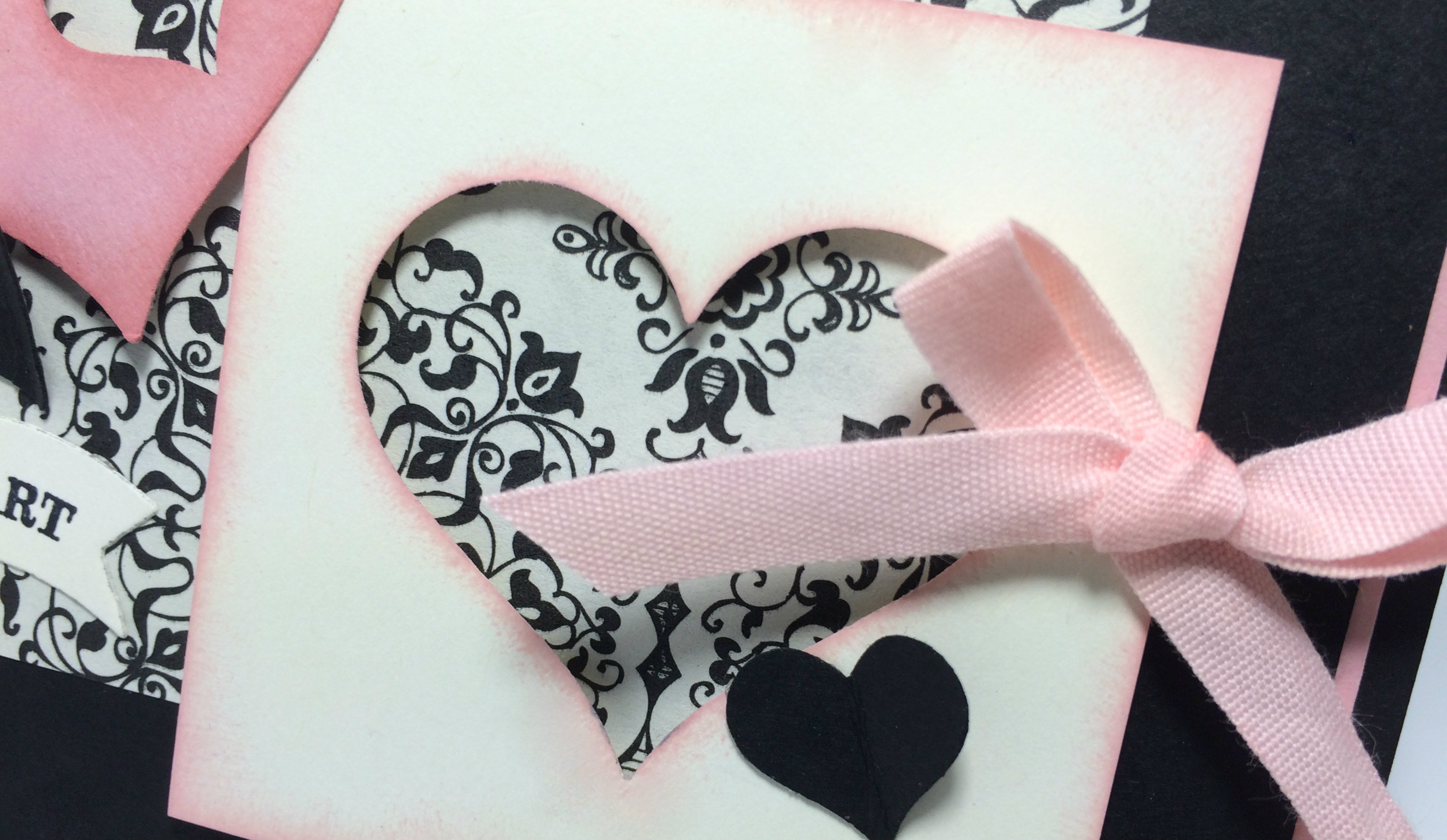
You can see that I used the Epic Day washi tape, the BACK side of the Chevron Natural ribbon (which I stamped on with Stazon Black ink using the sentiment from the An Open Heart stamp set), Bermuda Bay 1/8″ taffeta ribbon, and finally a folded strip of Daffodil Delight patterned paper from the Brights Patterned Paper Stack.

The card base is Crumb Cake cardstock, which has an embossed outline 1/8″ all around the card that was created by using the Simply Scored tool and stylus. I matted that cool background with a thin layer of Bermuda Bay cardstock.

As for the cool background… how ’bout a quick photo tutorial:

044tutorial1
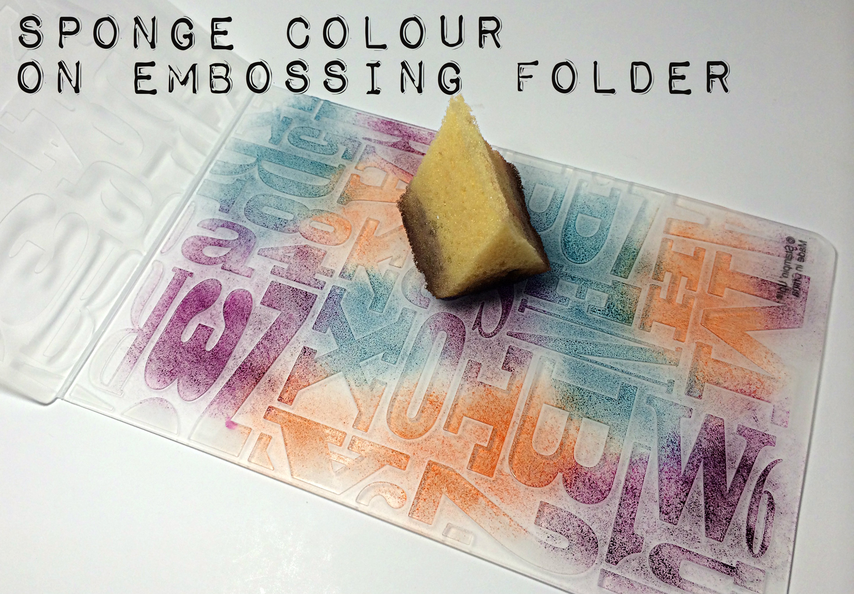
My challenge card uses the Honeycomb folder, but this would work for any embossing folder. And you don’t even need the Big Shot for this because it doesn’t get embossed! Just pick which side of the folder you want to use (keep in mind that the raised area that you sponge is what will press colour onto your cardstock).044tutorial2

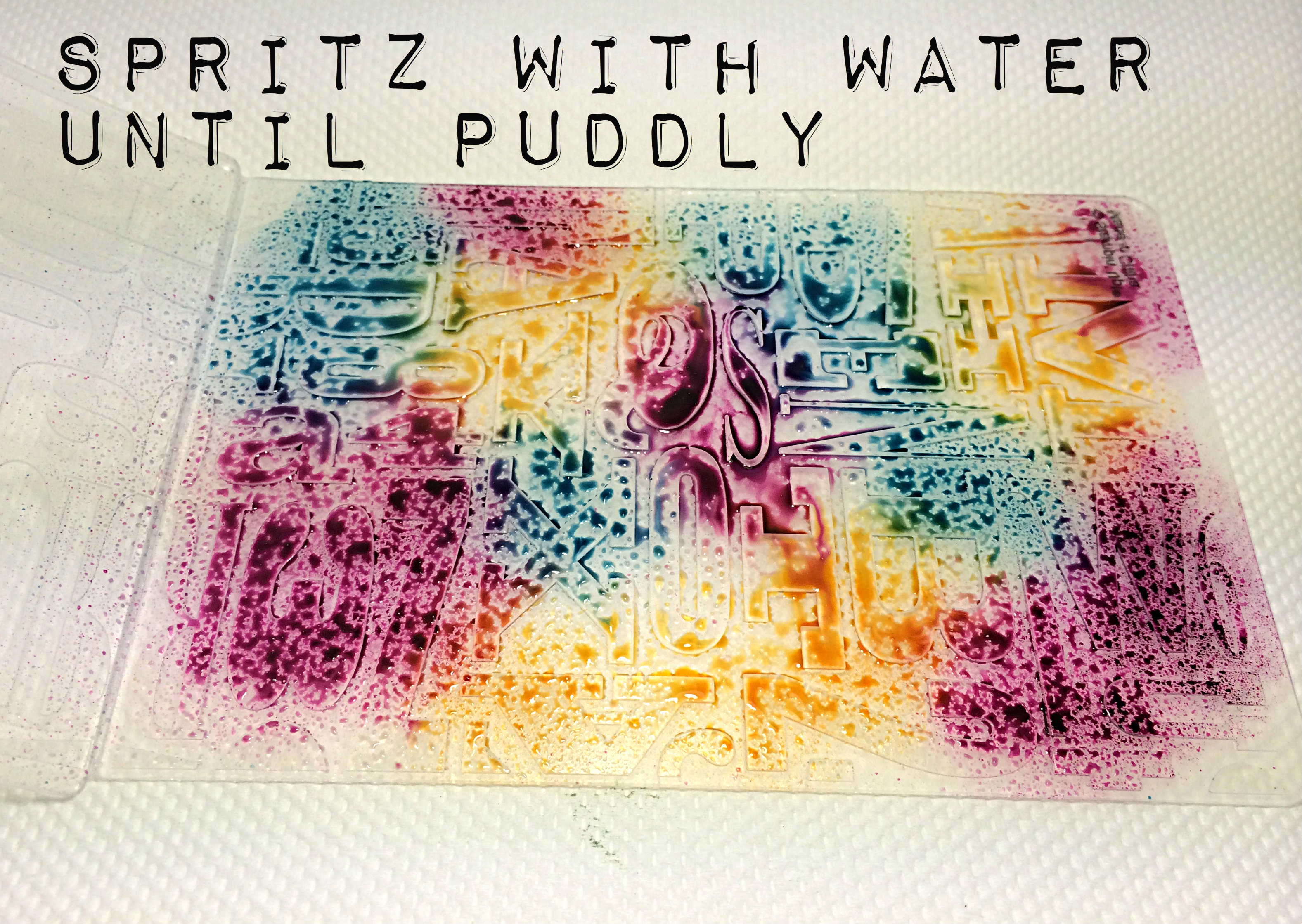
Spritzing with water is fun! The amount of water you add will determine how blended your colours are. If you want a softer, more watercoloured look, then use lots of water and make it more puddly. If you want a bolder colour, then spritz it only until the colour starts to bead on the folder. You’ll get a different look entirely based on the amount of water.

044tutorial3

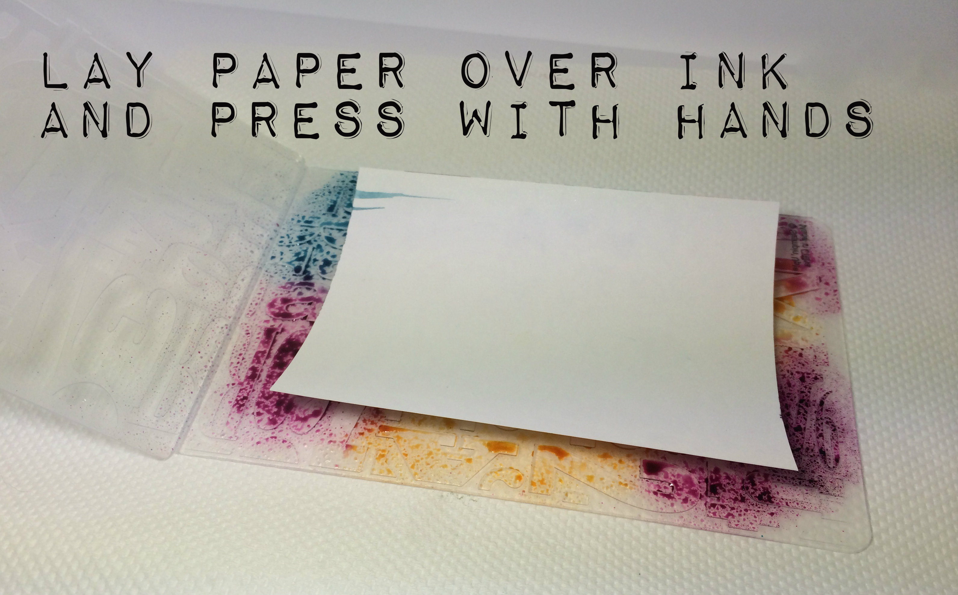
Lay your cardstock over the ink and press gently with your hands. I used Shimmery White cardstock as it takes water well, but is more white than watercolour paper is … I tried this with Whisper White as well, but it warps the paper a bit – still works, though.

044tutorial4
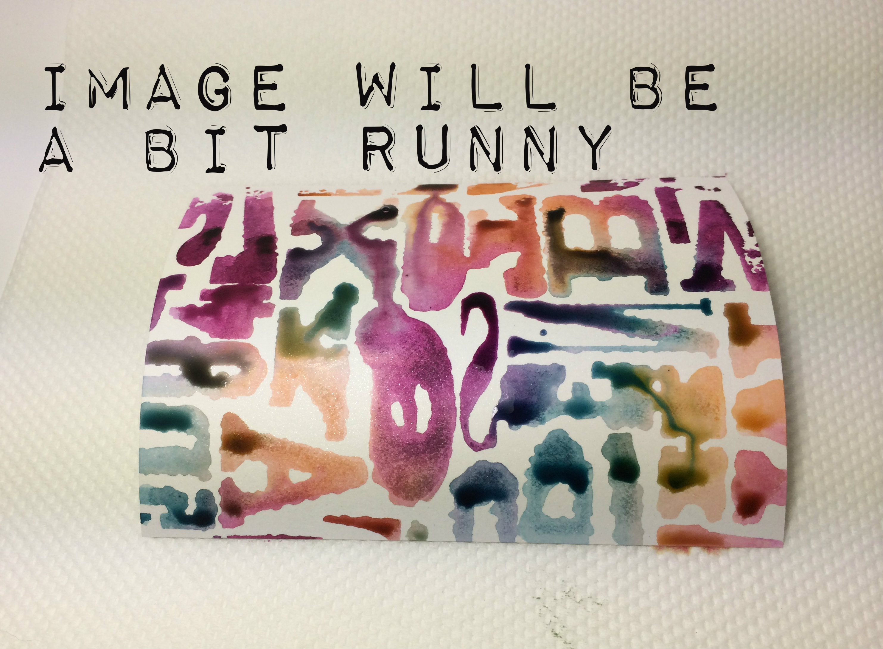
When you remove your cardstock, it will be quite runny if you used a lot of water. No worries…044tutorial5
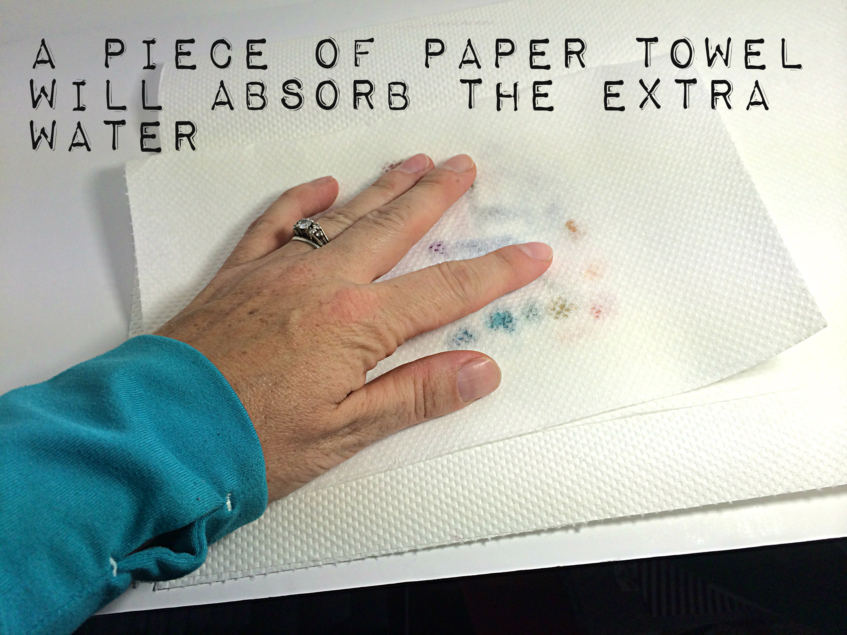
You can pick up that extra water by carefully pressing some paper towel over the image to absorb the excess.044tutorial6
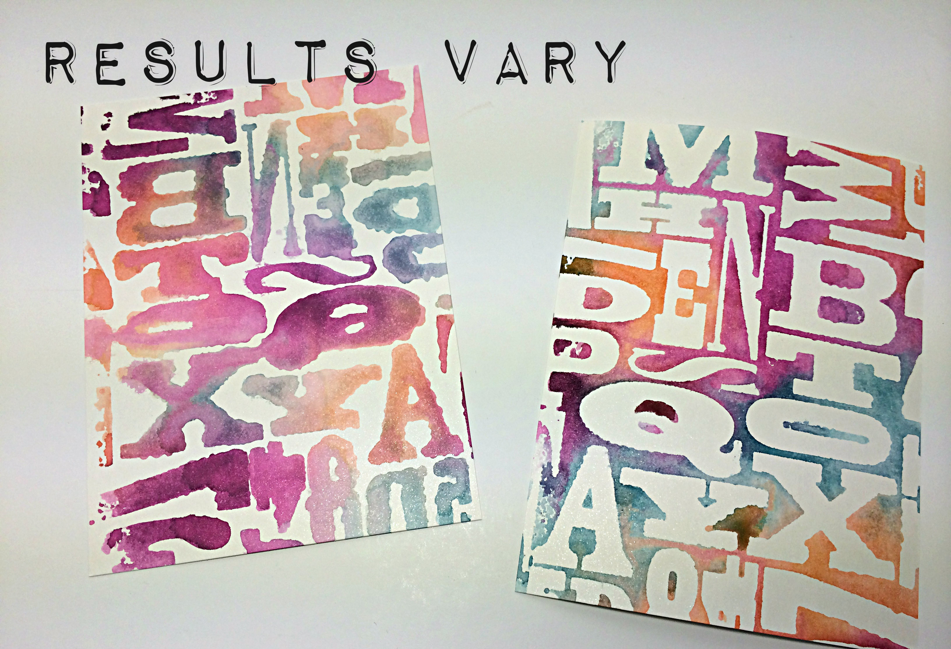
I used a little bit more water on the left image than I did on the right image. Also, you should take note that with this particular folder (the Alphabet Press), it actually makes a big difference because the image on the left has backwards letters, lol!044tutorial 6
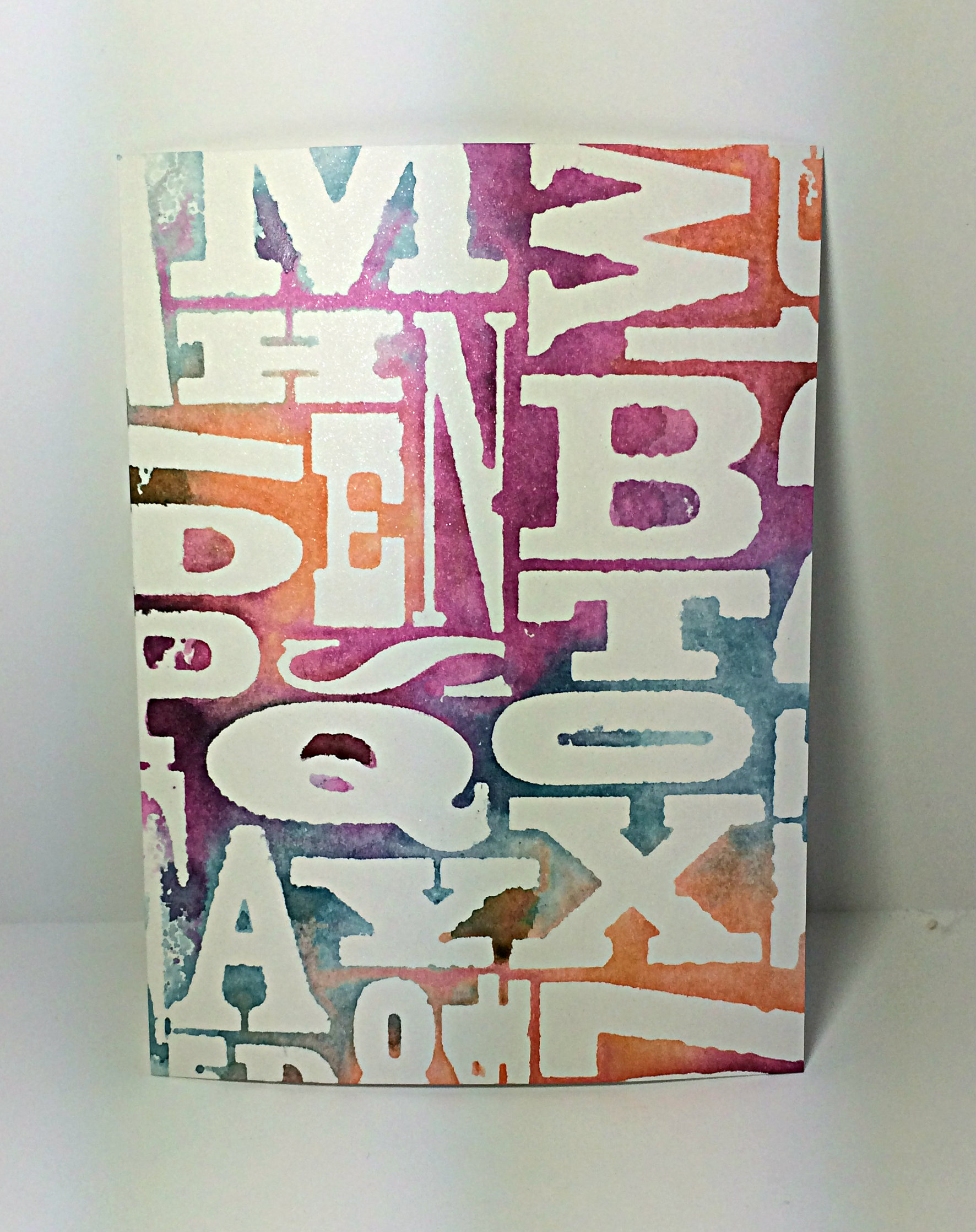
So, this is the final result. I used Tangelo Twist, Blackberry Bliss and Island Indigo inks on this one. My card above used Coastal Cabana, Calypso Coral, Lost Lagoon, and Hello Honey inks.

Let me know what you think and, please, play along with the sketch challenge this week! I am always inspired by every card I see and I look forward to being inspired by yours!

So go on over to the As You See It Challenge Blog and load up your design of this week’s sketch!!

Amy.

Designer-Badge


Dressed in Green

043header

Welcome to my blog where I share with you my love of designing using Stampin’ Up! paper, inks, stamps, and tools. Today I show you how I step up my 10 minute card.

It’s Friday! Time for a challenge that is super fun, but probably one of the hardest for me. On the one hand, I love the 10 minute speed challenges because they force me to produce a card quickly and help to reroute some of my fussy creative brain waves. On the other hand, I find it very difficult to take my hands off at or around the 10 minute mark because there are things to keep fussing with, lol!

I also wanted to participate in the Paper Players sketch this week. I think I’ve only participated in one or two challenges other than the As You See It Challenge blog for which I am a designer. It felt like it was time 🙂

#43    PP201

I wanted to turn the Paper Players sketch on its side.  For my shades of green, I used the new Mossy Meadow with the lovely Pear Pizzazz. With the Basic Black and the Black and White Designer Series Paper, I thought it turned out pretty good after 9 minutes and 56 seconds (phew, that colouring with the Old Olive Blendabilities nearly put me over!)

043Amy

9:56

Though there is really nothing wrong with this card, I wanted to add some pop, so I thought I would use the opportunity to show you how you can step up a simple card with some colour.

Here’s the stepped up card that I used in the Paper Players challenge:

042improved

Yes, this card feels complete. This card pleases my eye. This card did not take less than 10 minutes!

You can see that I added some Daffodil Delight and Cherry Cobbler to the scooter lights using my Blendability pens. I also shaded the tires with Basic Grey and Smoky Slate Stampin’ Up Markers (the tires on the speed challenge card were darkened with a black pen that I had nearby – no time to find my markers, lol!). I even added a bit of Smoky Slate marker to the shadow of the scooter.

Here’s a close up of the two side-by-side, so you can see the difference:

043Amycolouring042improvedcolouring

You know, now that I see them side-by-side, they both look alright.

As for the rest of the stepped up card, I used some Hello honey satin ribbon and a couple of arrows from my Label Card Thinlits – one in Whisper White and one in Hello Honey cardstock.

The card has a few layers up on Dimensionals, which don’t always show up in my photos. If you look closely, you might notice that the entire center piece, framed in Whisper White, is lifted up on Stampin’ Up! Dimensionals. As is the Window Framelit image and the Whisper White arrow. I cannot emphasize how much of an improvement Dimensionals add to a project. If you don’t have them, GET THEM!!

I hope you will try the As You See It challenge this week. You might even consider the next Paper Players challenge, too. They just might help reroute your creative brain and get the artsy mojo flowin’!

Amy

Designer-Badge

Groovy Love

041header

Welcome to my blog where I share the creations that I have designed using the tools and supplies from Stampin’ Up!

I don’t know if I ever explained why I call my blog “Inking on the Fly”. It all started with ladybugs.

I love ladybugs.

They represent the complex beauty of the great outdoors (which I also love). I have a tattoo on my right hip of a ladybug that was etched in all it’s permanency about 18 years ago and I still love it and it still suits me. My first blog was called “Ladybug Landing”, but I decided that it did not have a descriptive element to it that had anything at all to do with paper crafting and rubber stamping! So, I thought of “inking on the fly” and then dropped the “ladybug landing” part altogether when I started this new blog.

As a busy mom of 3 kids (10, 8, and 5) who also works part time and tries to maintain my stamping business, my yard, my house, and my family’s well-being, I don’t have a lot of time for creating with my craft supplies anymore. When I do have time to design, I find that it is brief and rushed more often than not. So, when I “ink”, I am often doing it “on the fly” … how does this apply to ladybugs, you ask? …. Well, they fly, too, silly!!

Here’s the challenge this week. As you See it Challenge #42

#42

I was definitely inking on the fly when I created my card for this one. We have a camping trip planned for which I have done NOTHING to prepare. I have washed a few clothes and made a grocery list and menu. I have not packed ANYTHING! I guess inking isn’t the only thing I do on the fly, lol!

042Amy

Ain’t it purdy!!

Notice the new 1/4″ Blushing Bride Cotton Ribbon and the new Sweetheart Punches? The little punch is from the Itty Bitty Accents Punch Pack. The big heart is all on its own. Both have that sweet little curved tip on their tails – I guess that’s the “sweet” part of the sweethearts.

I used Basic Black cardstock for my card base, then a layer of Blushing Bride cardstock to thinly frame another layer of Basic Black. Over this, I placed a rectangular piece of the fabulous Typeset Specialty Designer Paper. Then I played with the hearts!

I punched a Sweetheart from the square piece of Very Vanilla cardstock and sponged lightly with my sponge dauber and Blushing Bride ink around all the edges. I tied the ribbon through the punched out heart and attached the Vanilla cardstock piece with Stampin’ Up Dimensionals to the card front.

042 heartclose

The small heart punch from the Itty Bitty Accents punch pack was used for all of the small hearts. I sponged Blushing Bride ink over the edges of those that were punched from the Blushing Bride cardstock. The large Blushing Bride heart is attached with Dimensionals while the small hearts were each creased in the middle and only attached to the card by the left lobe of the heart.

Finally, I added the sentiment from the Groovy Love stamp set. I stamped it on Very Vanilla cardstock with Stazon Black ink and die cut it in my Big Shot with the Bitty Banners framelits that matched the shape.

I hope you like it.

I’m sorry that I haven’t posted what the winner receives for her prize from my draw. I will have to post that after the weekend. I’m doing too many things on the fly these days, lol!

Go on over to www.asyouseeitchallenge.com and have a look. There is a new challenge every Friday for you to stretch your creative muscles on. See what you can come up with for the sketch this week and follow the directions to link it before Wednesday night. We want to be inspired by the way you see it!

(do you sometimes ink on the fly, too?)


Amy


Designer-Badge