Techniques

The Sweetest Thing

Happy New Year!!

I took a break over the holidays to spend time with my family. My kids aren’t back in school until Monday and we have taking advantage of the time with restful pajama days wherever we can fit them in. These are special moments in my house. We eat too many sweets and unhealthy foods and sit around all day – sometimes we play board games (the kids like their new Bananagrams game) or watch movies or just waste time on our cell phones, the computer, or tablets. I enjoy wasting time, but eventually, the guilt seeps in and the restlessness starts to take over and I need to get up and do something. I don’t mind this at all, though, because that’s the time when I actually WANT to do something. I spend so much time in my life doing things that I don’t want to do, that it’s nice to have it turn around on me like this once in a while.

Even though my craft room is such a disaster that I have to carefully maneuver around the many boxes, papers, and tools strewn all over the floor and I have to push aside the neglected loose stamps, scrap papers, and tossed aside ink pads, I managed to get a card done for you today. And I wanted to. I was excited to. I needed to do something. It feels good to craft again after the holiday break!

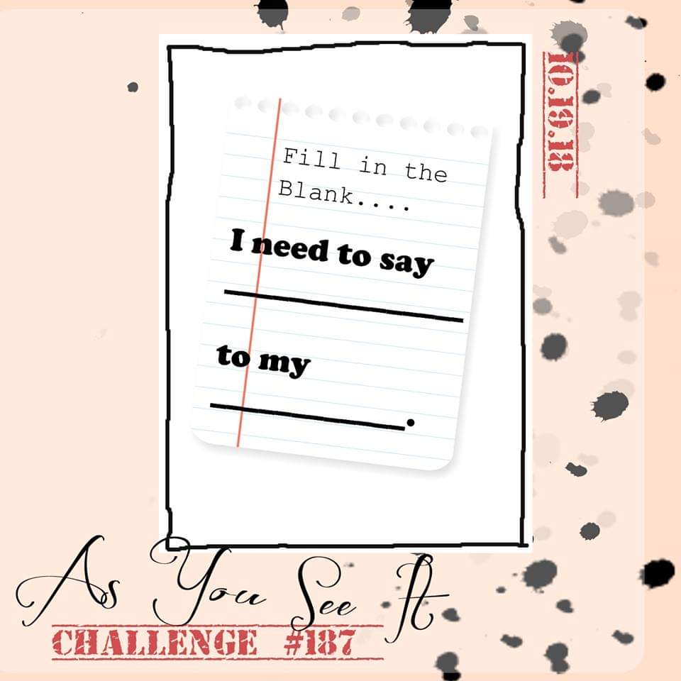
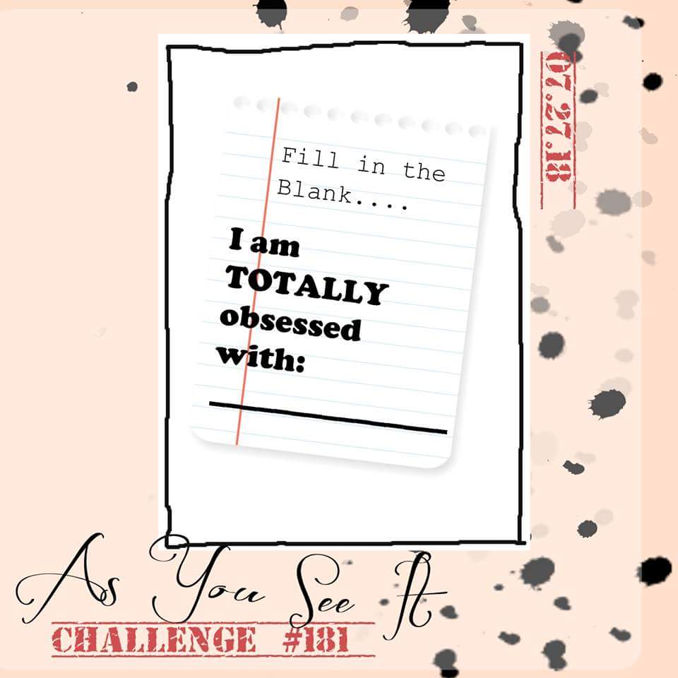
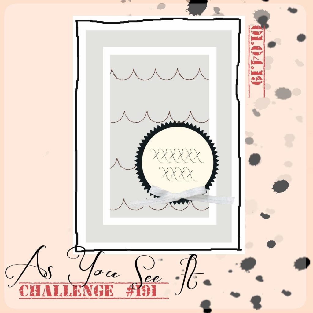
The card design today, starts with a challenge, as most of my blog posts tend to do. The As You See It Challenge has a sketch for us this time:

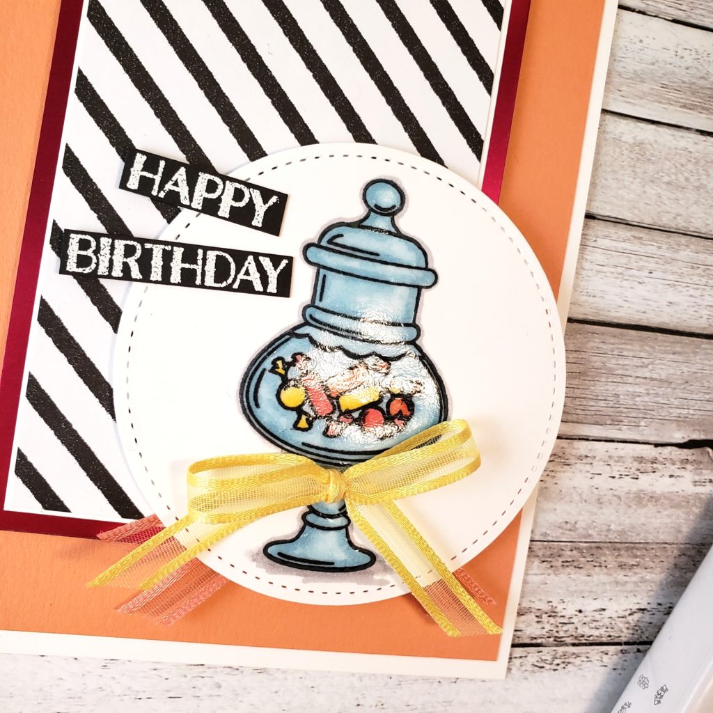
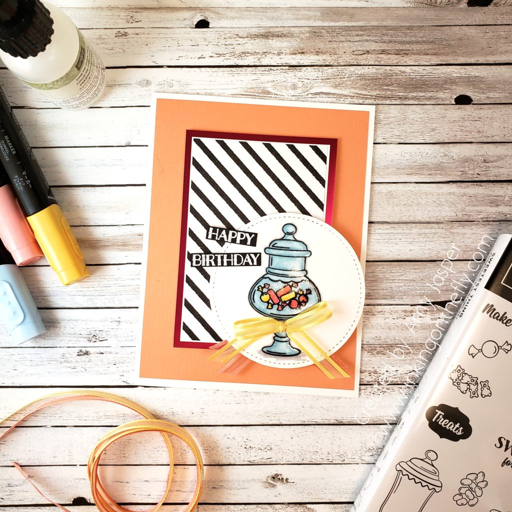
The Sweetest Thing stamp set from the new Occasions Calalogue was not a set that immediately jumped out at me. However, the more I looked at it, the more I thought it would suit my personal needs and the crafty needs of my customers. My youngest child is a sugar monkey. Some of my customers have young kids, grand-kids, and there are a couple ladies who make birthday cards for kids at their church. This stamp fits all those needs as well as just a fun card for my friends and family on their birthdays! Maybe I’ll actually be able to get birthday cards mailed out this year!

I knew immediately that the black and white diagonal striped pattern from the Butterfly Gala Designer Series Paper would be really sharp with the Lovely Lipstick Foil Paper. You can get both of these items for FREE through the Sale-a-bration promotion. How cool is that!?

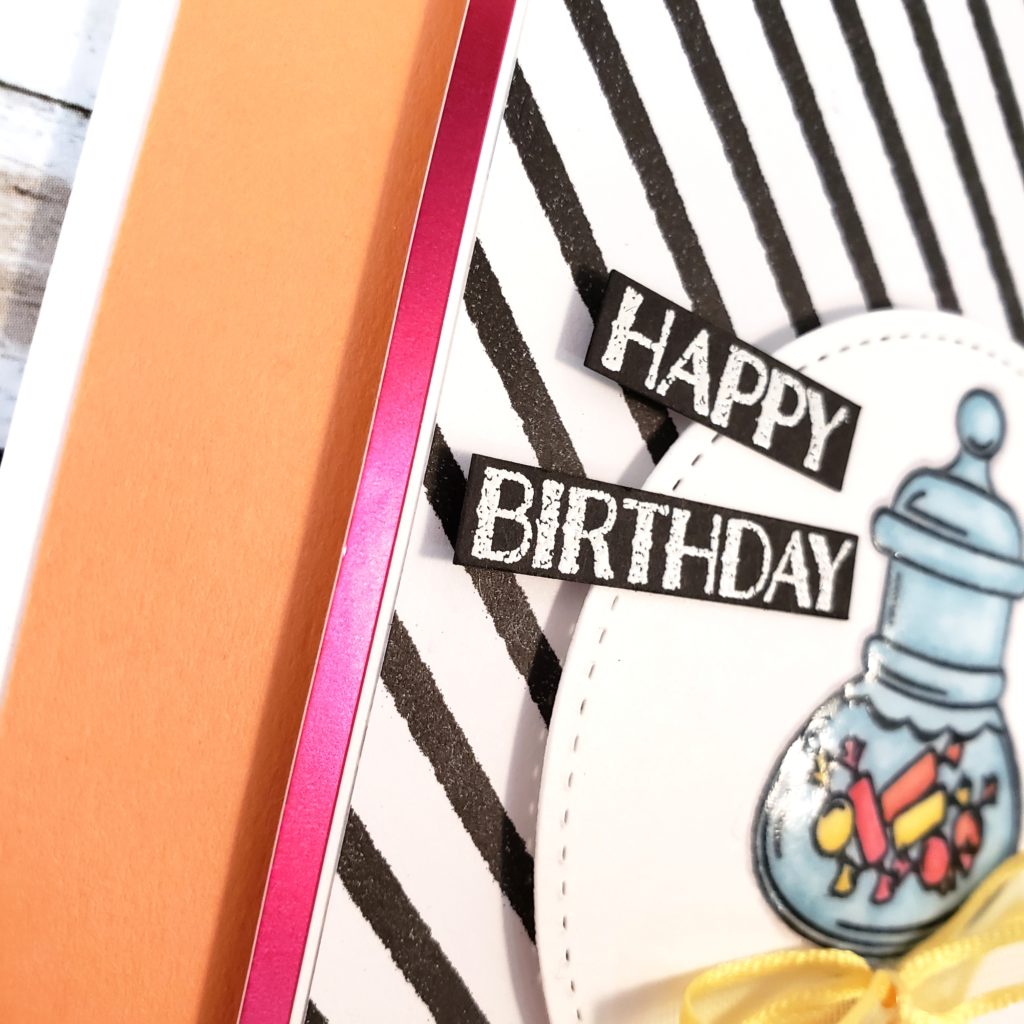
Let’s talk about the candy. I stamped the candy jar and the candies from the Sweetest Thing stamp set onto Whisper White cardstock with Tuxedo Black Momento ink, then die cut it with the Big Shot and one of the circles from the Stitched Shapes Framelits Dies. I coloured the candies with Daffodil Delight, Calypso Coral, and Lovely Lipstick using my Blends Markers. Then I coloured the jar and around the candies with my newly purchased Balmy Blue Blends Markers. I even did a very careful outline and shadow using the light Smokey Slate Blends Marker. To give the look of glass and make the colours pop, I then used my Fine-Tip-Glue Pen and worked on each section of the jar from one side to the other, until I covered the entire jar with a layer of the clear glue. This needed a bit of drying time, so I set it aside and worked on the Happy Birthday sentiment.

I stamped the sentiment with Versamark ink on Basic Black cardstock, after rubbing the Embossing Buddy over the surface to reduce the risk of my powder sticking to where it doesn’t belong. Then I heat set White embossing powder. I carefully cut the sentiment apart using my paper trimmer (I had to cut it very close) and was ready to add it to my card front.

The glue doesn’t take too long to dry, so it was ready for my assembly. The card base is Thick Whisper White cardstock, then I applied a layer of Grapefruit Grove cardstock. The Lovely Lipstick Foil Paper, thin matte of Whisper White cardstock, and the diagonal strips patterned paper, are all attached to the Grapefruit Grove with Stampin’ Dimensionals. The circle die is attached to the cardfront with MORE Stampin’ Dimensionals with a sneaky bit of Grapefruit Grove ribbon from the Sale-a-bration Organdy Ribbon Combo Pack peeking out underneath. I tied a finger bow with the Daffodil Delight Organdy Ribbon (also part of the combo pack) and adhered it to the jar with a Glue Dot.

Finally, I adhered my sentiment with a Stampin’ Dimensional on one side (where it needed to be raised off the cardfront) and a sparse dab of Tombow Multipurpose Liquid Glue on the other (where it needed to be all snuggly on the circle die).

Many of the supplies on this card are from the Sale-a-bration brochure and are items that you can only get for FREE with any $60 purchase during the Sale-a-bration period. This is a favourite time for many customers and demonstrators in the Stampin’ Up! family. Free stuff is always a good thing!!

Be sure to go to my online store where you can order Stampin’ Up! products or you can just go there to peruse the pretty things and contact me via email to order. If you are outside of Canada, then sadly you cannot order from me, but leave me a comment on my blog and say “hi”. I like to know that I’m not just talking to myself, LOL!
Congrats on Greece

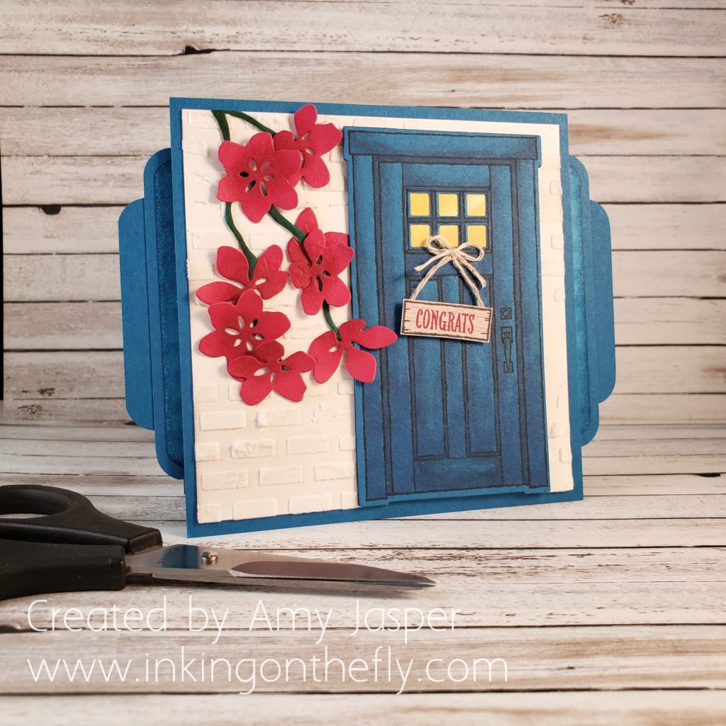
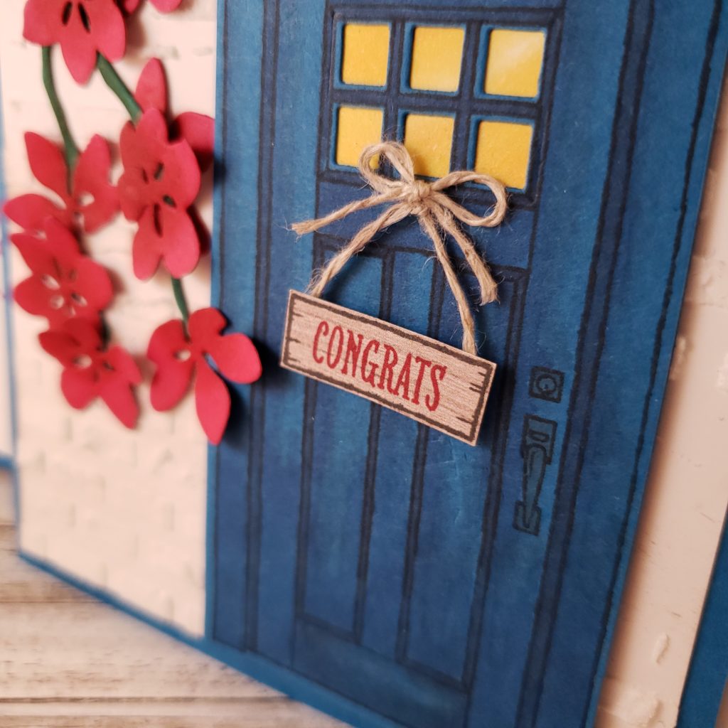
Do I have a fancy card for you today!!

Here’s part of the inspiration from the As You See It Challenge blog:

The other part of my inspiration is my friend, hairdresser, and fellow Stampin’ Up! Demonstrator who earned the trip to GREECE!! She worked so hard this past year and SHE DID IT! I am amazed and wowed by her success and I have not yet made her a congratulations card.

So, to fill in the blanks, I need to say CONGRATS ON GREECE to SUSANNE! (sunnstampin.com)

It’s also very important that I put a shout out to the video where I found this amazing card design. Samantha Clayton at Mixed Up Craft on YouTube has a wonderful tutorial that I followed for the base and inner workings of this card. I loved her instructions and found her very easy to follow. I will post a link to her video at the bottom of this page so you can follow it as well.

I choose to change the measurements of the card so that it could fit (just) into a regular Stampin’ Up! envelope. My card is 4-1/4″ high instead of the 4-1/2″ high card that Samantha makes in her video.

Because my friend, Su, will be going on a trip to Greece, FOR FREE!, my card is Greece inspired. My husband and I went to Greece 18 years ago on our honeymoon and one of my favourite places was the island of Mykonos. I remember the maze of a town with the stone pathways, the white buildings, the blue doors, and the bright flowers in full bloom. I’m so excited that Su gets to go to that very town. She’ll love it!

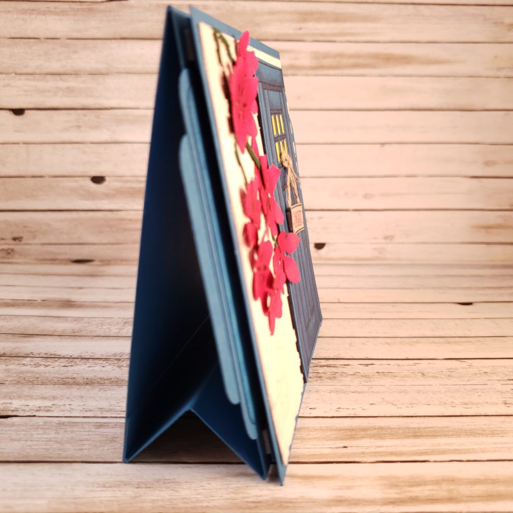
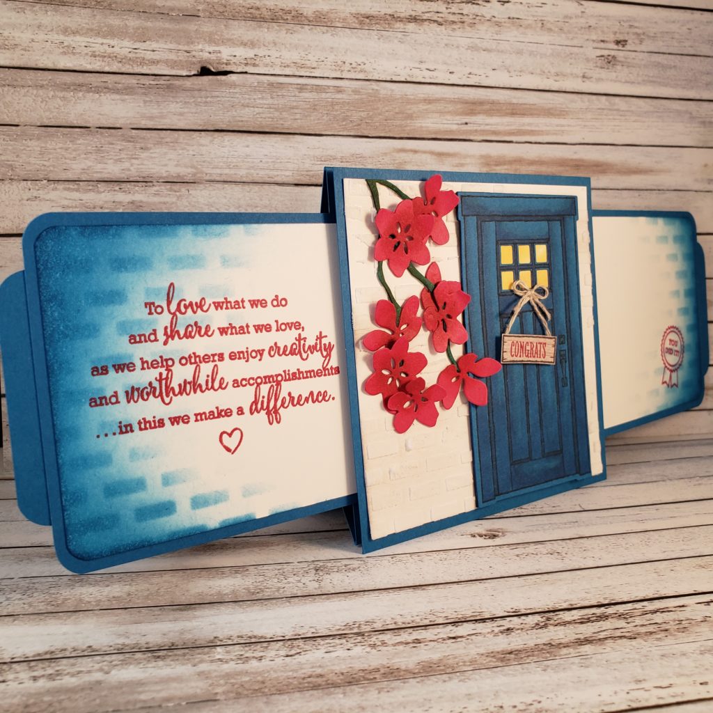
One of the things I like about this card design, is that it has it’s own built in stand. I have made many cards similar to this one in the past, but they either had to be attached to a normal card front or they laid flat like a postcard. This stand is a fabulous idea.

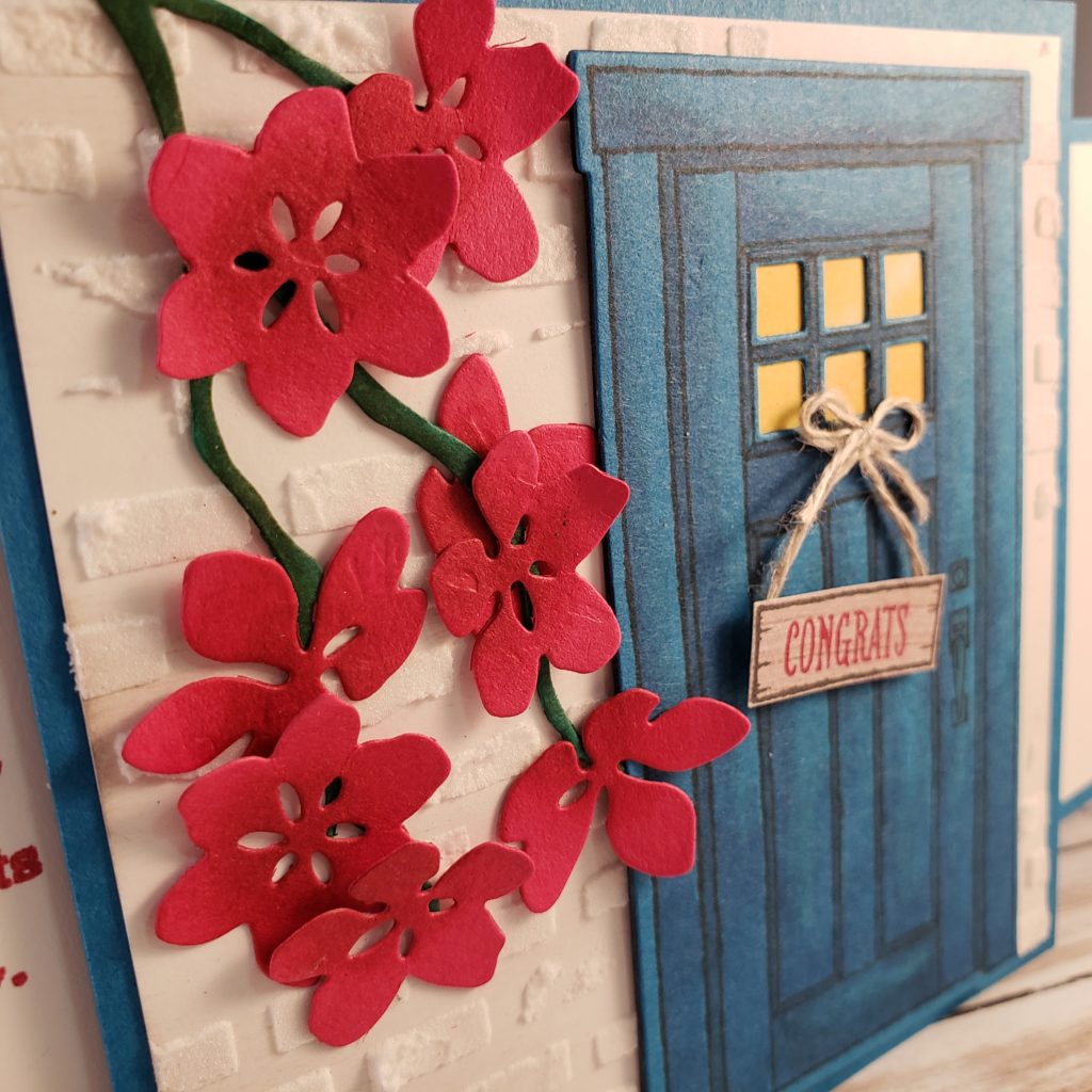
The other VERY cool thing about this card is that the tabs on each side pull out to reveal MORE! I used Pacific Point cardstock for the base colour of this card. It’s not exactly “Greece Blue”, but I think it’s the closest one that Stampin’ Up! has. The door is created with images from the At Home With You stamp set and die cut with the coordinating At Home Framelits Dies. I used Embossing Paste and the brick pattern from the Pattern Party Decorative Masks to create the white walls on the card front. I used the same brick mask, but sponged Pacific Point ink through it onto the Whisper White cardstock. Then I sponged more Pacific Point ink over the edges of the cardstock. Those slide out panels also have stamped images which are no longer available. Stampin’ Up! statement of the heart is on the left panel, while the You Did It image is from a stamp set designed just for demonstrators.

The Lovely Lipstick cardstock flowers are cut using the Seasonal Layers Thinlits as is also the Shaded Spruce cardstock branch.

The door is cut from Pacific Point cardstock, but I also used my Night of Navy Stampin’ Blends to add a little depth to the surface of the door image.

If you are interested in knowing more about other specifics on this card, be sure to leave me a comment.

As promised, here is the link to Mixed Up Craft so you can see how this card is made.

Letter Board Card

What are you obsessed with? That is the challenge for the As You See It Challenge blog this round. I actually had to do some soul searching to figure out if I was obsessed with anything in the first place, then determine which of the many obsessions I discovered I have was worthy of a card design.Here are some items that I had on my list:

  1. Fitness (running, cycling, hiking, strength, endurance)
  2. Wine
  3. Outdoors (nature, sunshine, peace, escape)
  4. Doctor Who
  5. Self-discovery (reflection, self-care, solitude, self-improvement, resilience)
  6. Words (witty, inspirational, punny, jokes)
  7. Coffee
  8. My phone (this is actually an unhealthy obsession – I’m working on it … sort of)

There were a few others, but we’ll just stop there.

I thought more specifically about my obsession with words and realized that it has become focused on letter boards. Have you seen any letter board images on Pinterest or Instagram? They seem to be the latest thing and have definitely caught my attention. I don’t have my own letter board, but it is on my Christmas wish list! How fun to create sayings that suit your mood or your current state of mind. Or maybe some words that reflect how you want to feel or think?

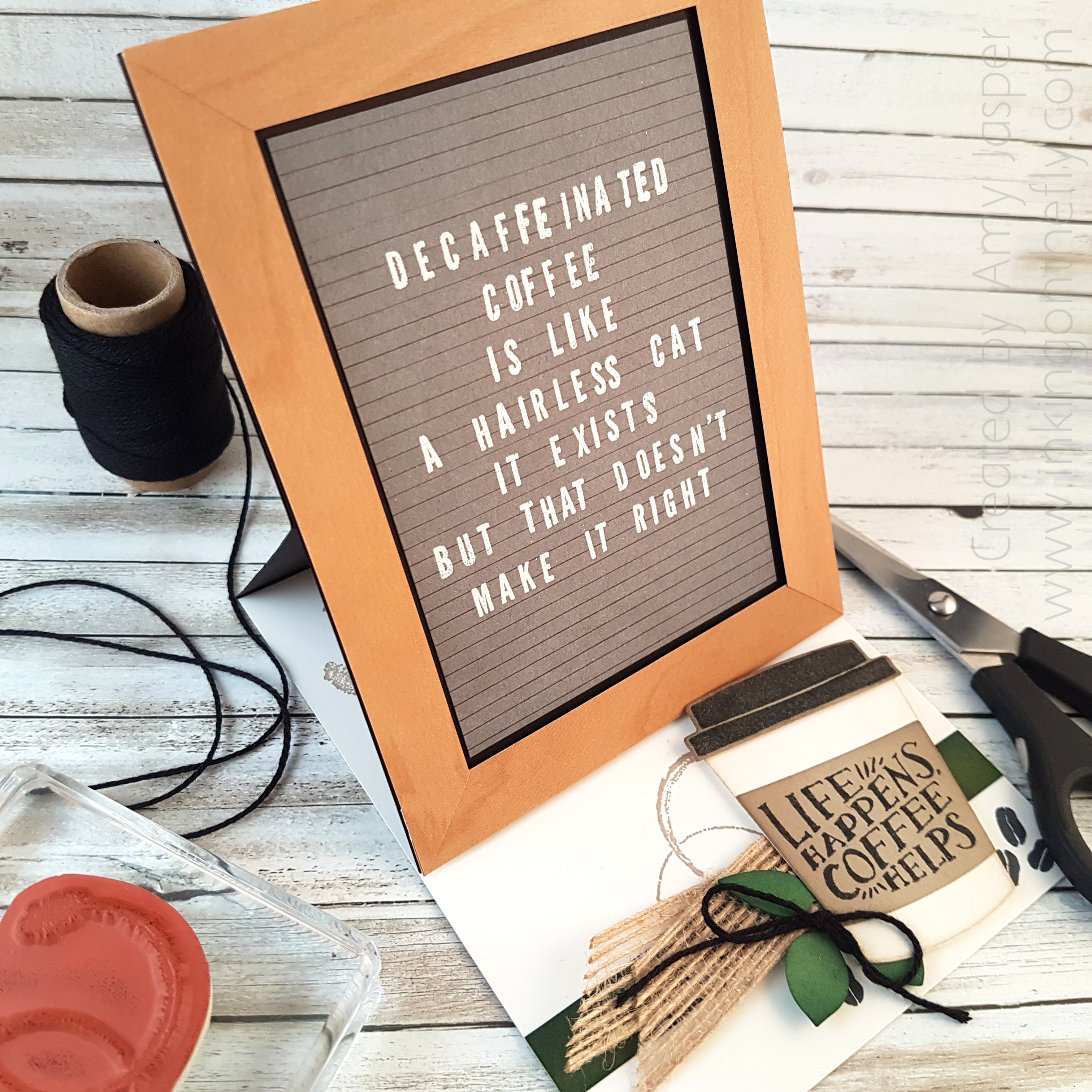
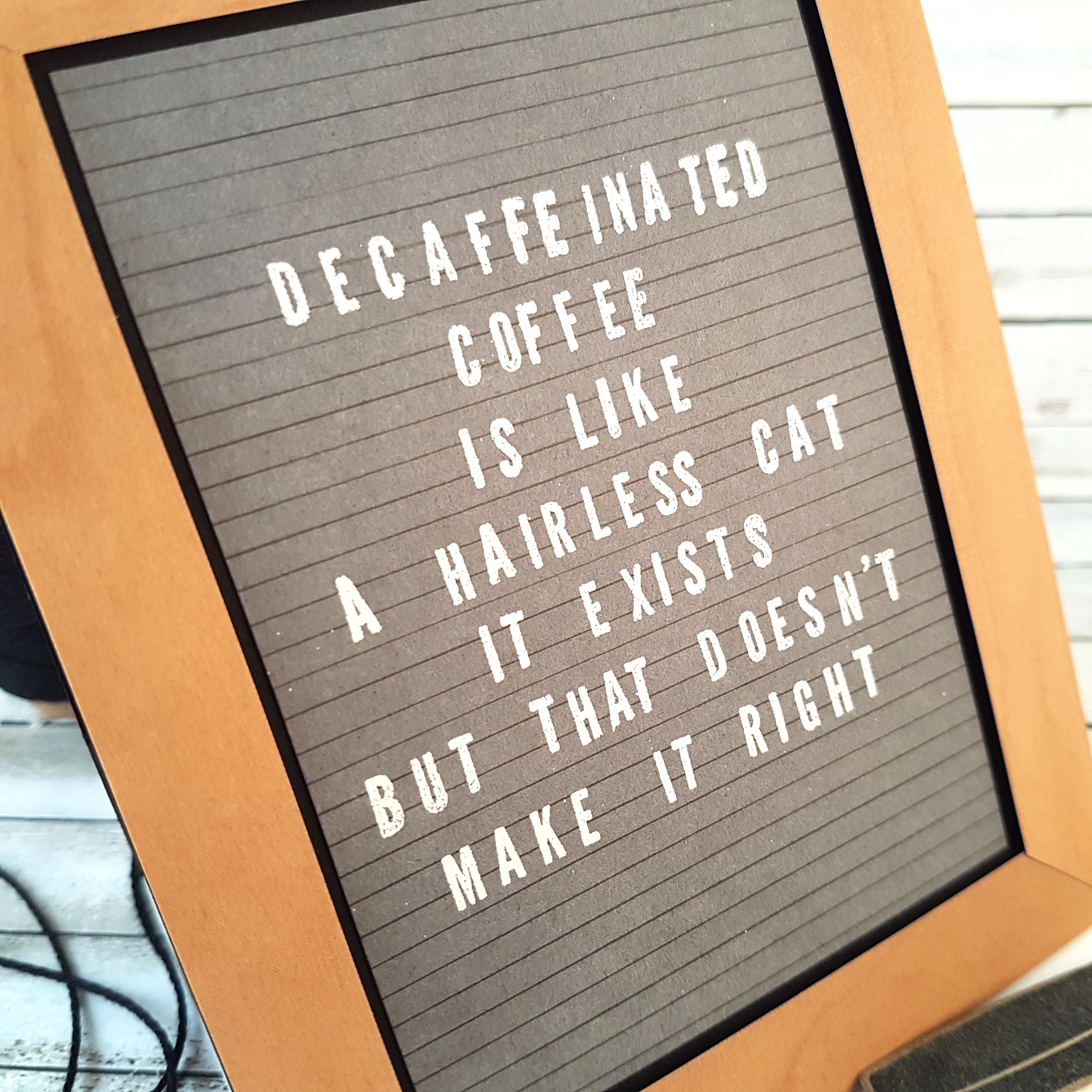
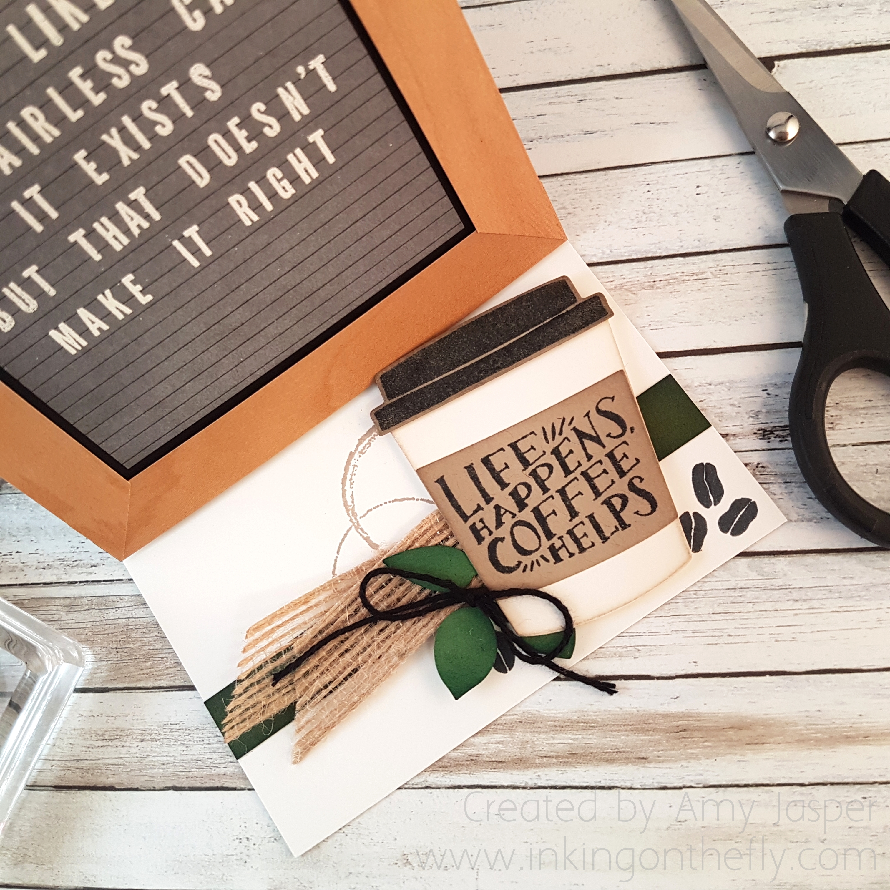
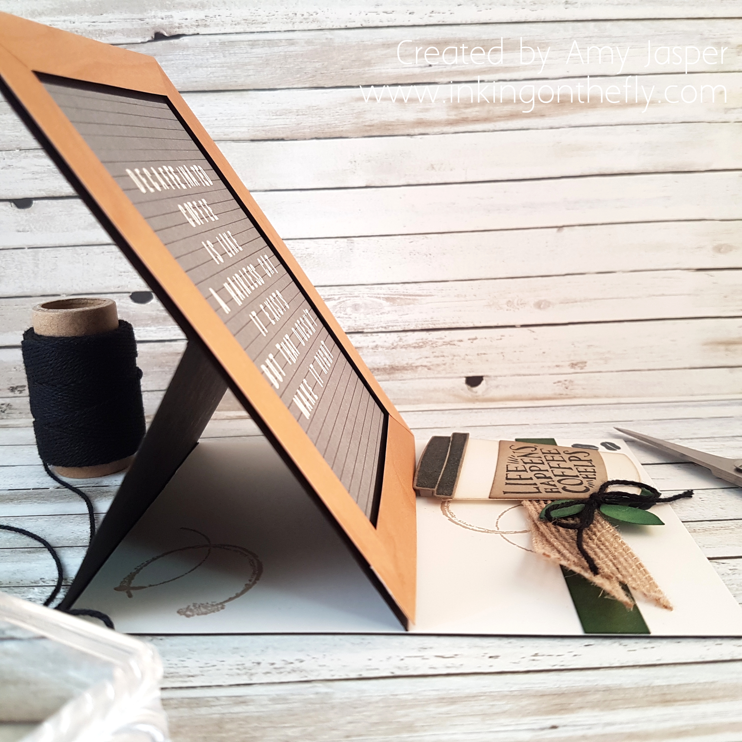
Here’s my card, inspired by the latest As You See It challenge:I chose to try to create my own letter board card with a funny saying I found on Pinterest. Conveniently, the saying also allows me to bring in another obsession I have – coffee. LOL!

Most letter boards have black felt backgrounds with white lettering. I have seen others that are grey, some that are white with black letters, and even pink ones with white letters.

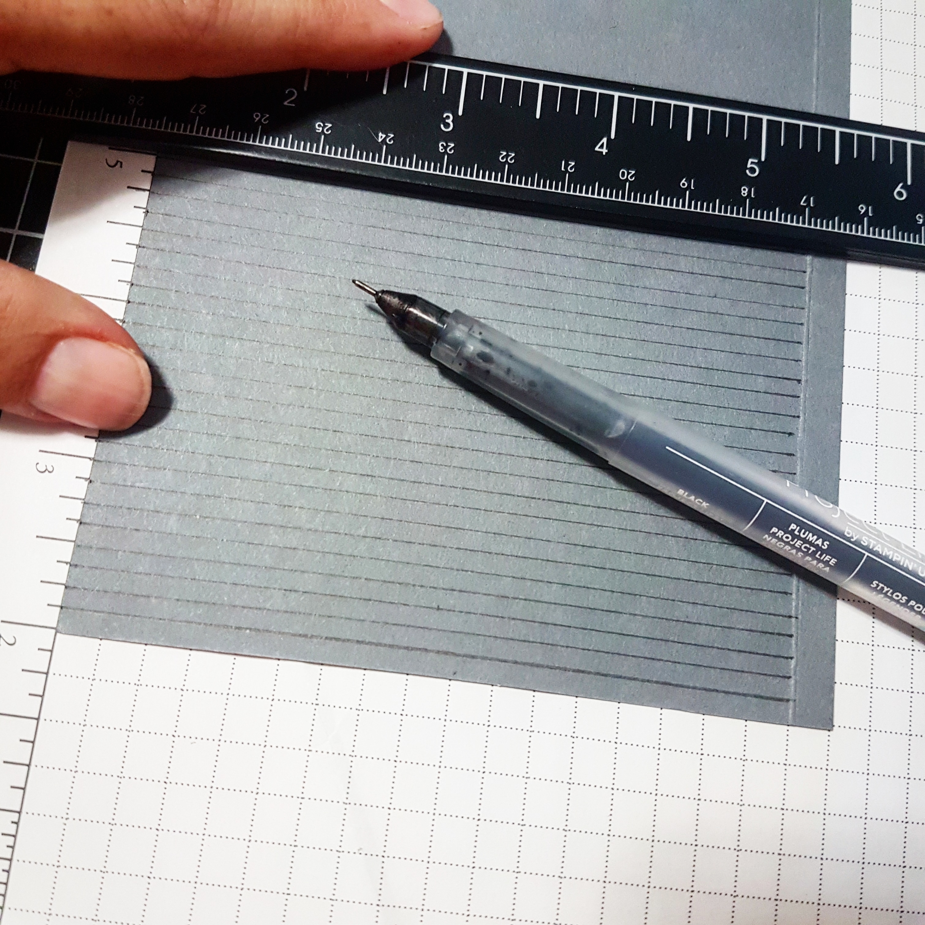
I started with trying to create the appearance of a letter board first. For that, I used a black journaling pen and a ruler and drew lines across the Basic Grey cardstock.The letters used are from the Make a Difference stamp set from Stampin’ Up! It required some finesse to get them all straight – not an easy task and definitely the most time consuming part of this design.

The Embossing Buddy was an absolute must for all this embossing!!

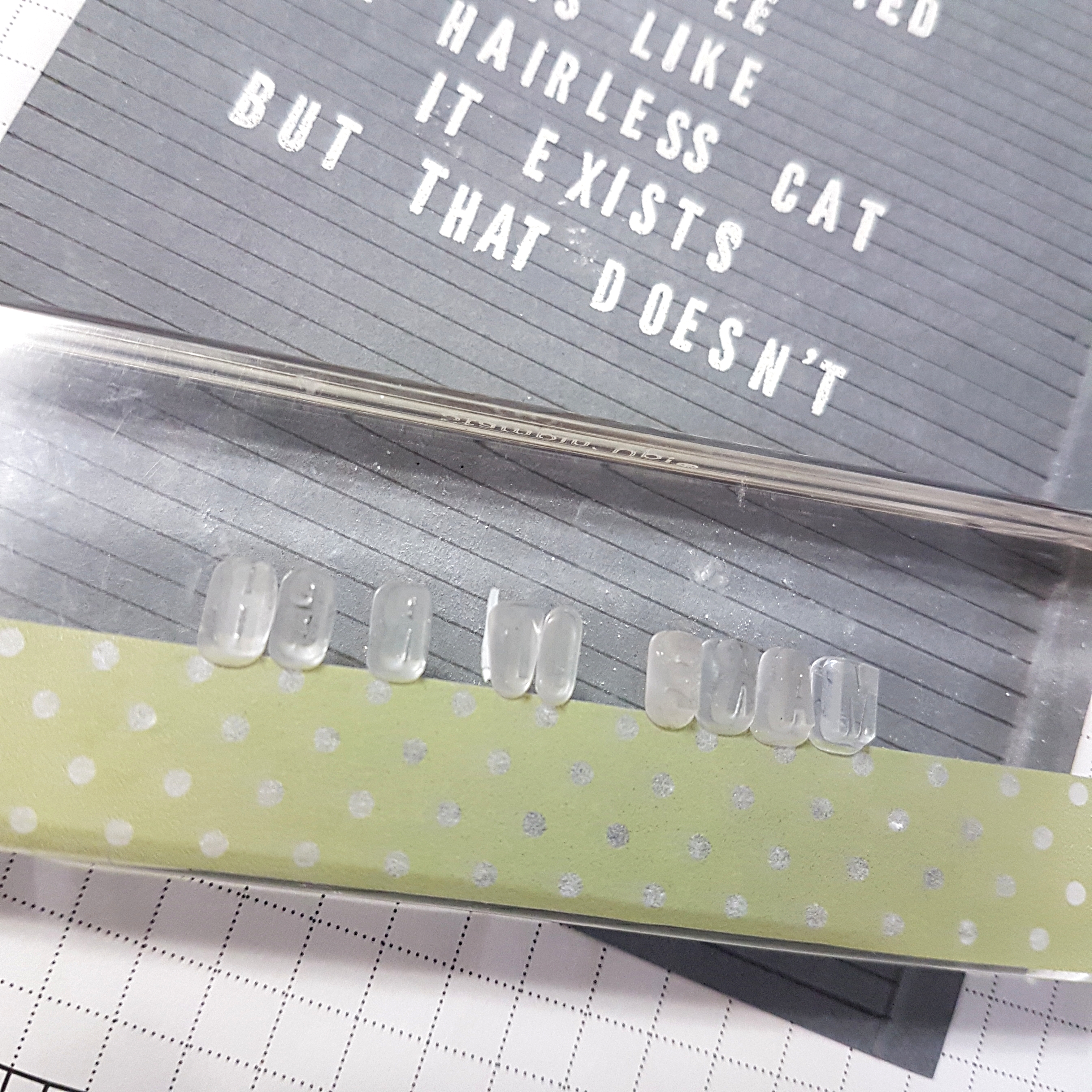
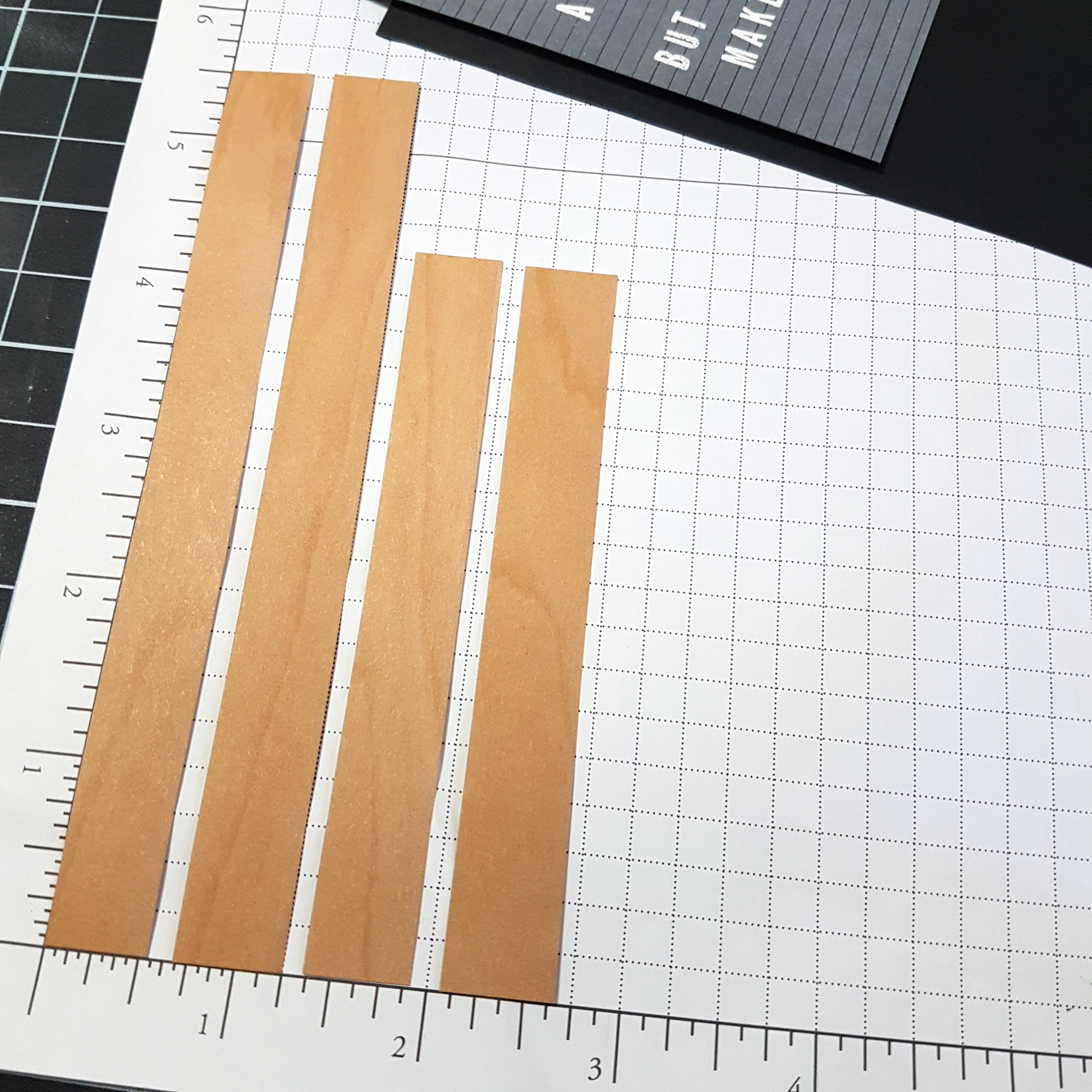
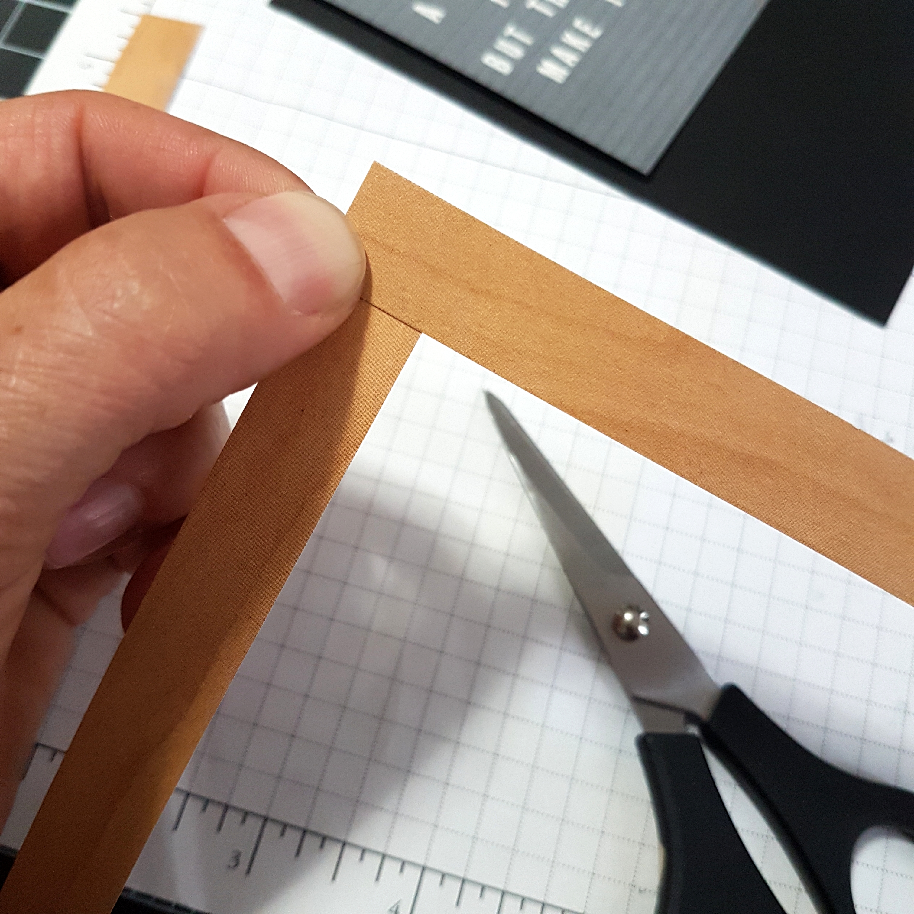
I did one line at a time, wiping my cardstock with the Embossing Buddy, stamping the letters in Versamark ink, sprinkling with White Embossing Powder, tapping off the excess, then heat setting the powder with the Heat Tool. One line. Then I would take out my Embossing Buddy and start the process again with the next line. Eventually, I realized if I placed a piece of washi tape on my block, it made it a bit easier to get my words straight. It was challenging to create the words with appropriate spaces for any letters that I needed more than one of, then add any missing letters afterward.The next thing to do was to create a frame for my letter board. Many of the boards I’ve seen have a simple natural light-coloured wood frame. Thankfully, Stampin’ Up! has just the right paper with lots of wood patterns to choose from! The Wood Textures Designer Series paper is one of my favourites and it is included in the Buy 3, Get One Free offer for paper packs now until the end of July.To create the look of a frame, I cut the desired length of paper for the size of frame I wanted. Two pieces cut at 5-1/2″ and two pieces cut at 4-1/4″. I made each piece 9/16th wide so that I could keep a black matte visible around my 3″ x 4-1/4″ letter board cardstock. I wanted to create the appearance of mitered corners, so I held two strips of the Wood Texture paper together and cut from the inner corner to the outer corner with my Paper Snips.

I really only needed to trim one end of each of the strips of paper. That way the angled end of one strip of the frame could overlap the straight cut end of the same corner. This allows for a nice clean corner that looks like a well-glued mitered wood frame. The strips were attached using Stampin’ Up Dimensionals to give a three dimensional appearance, just like an actual frame.

The thing that really makes this design work, is making it an easel card. If you’ve never made an easel card, be sure to google it and find a quick tutorial. It is a super easy thing to do.

My card base is made with Basic Black Cardstock. I used a piece of Whisper White cardstock as a layer inside the card as a blank canvas on which to create the lower portion of the easel design. For this, the Coffee Cafe stamp set and coordinating thinlits from Stampin’ Up! were the perfect choice! I also used an image from the Timeless Textures stamp set from Stampin’ Up! that looks like a coffee cup stain.

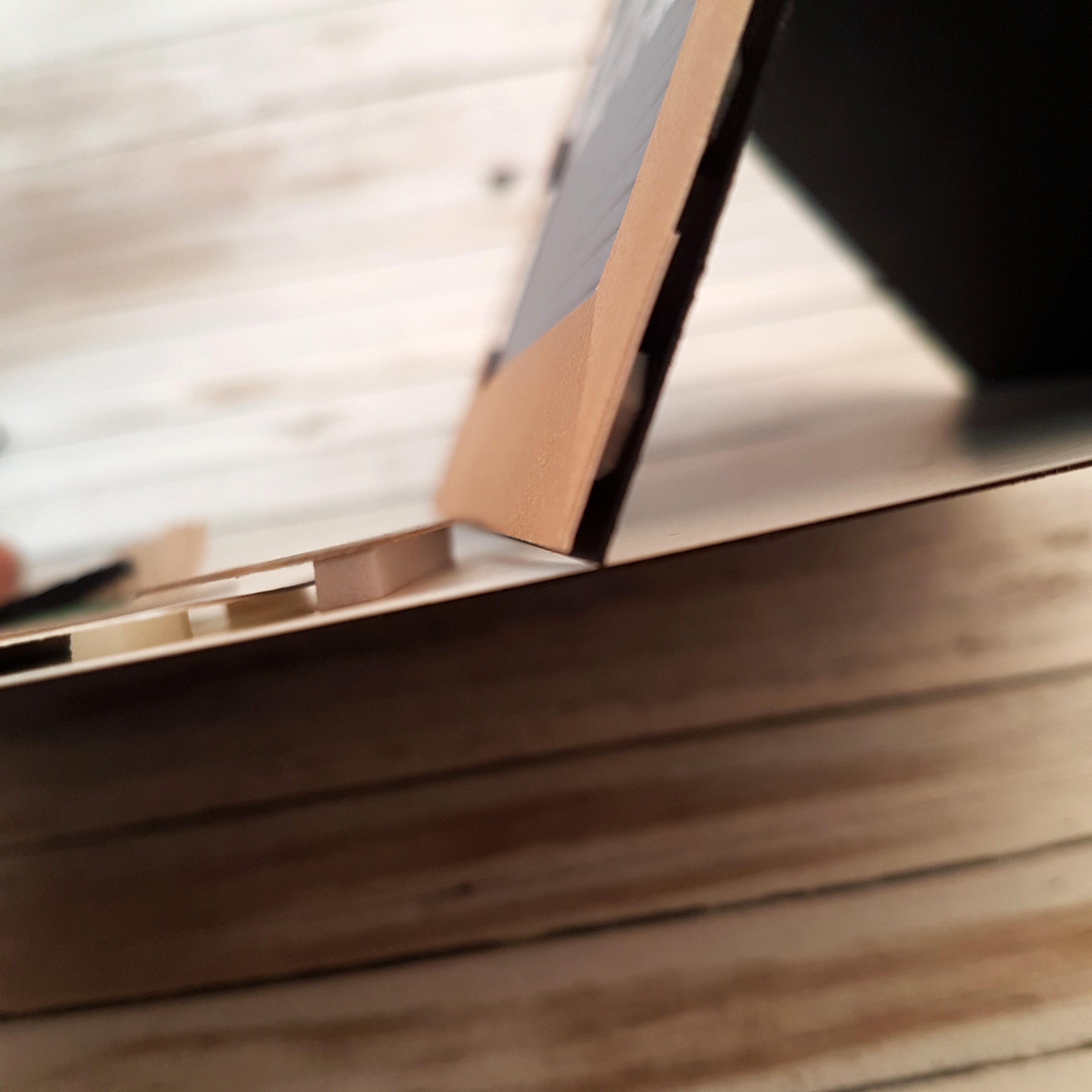
To prop up the front of the easel well, I made sure to add extra loft to the lid of the coffee cup with a piece of Adhesive Foam Strips. Additional Stampin’ Up! products used include: Leaf Punch, Solid Black Bakers Twine, 5/8″ Burlap Ribbon, Mossy Meadow cardstock, Garden Green cardstock, Crumb Cake cardstock, Stampin’ Sponges, Tranquil Tide ink (sponged on the Garden Green leaves and the Mossy Meadow paper strip), Crumb Cake ink (for the coffee stain image and sponging around the coffee cup, lid, and sleeve), Tuxedo Black Momento ink (for stamping the coffee happens sentiment, coffee beans, and coffee cup lid).Now it’s your turn. What are YOU obsessed with? Share it on the As You See It Challenge blog as a card design and/or leave a comment on this blog post!