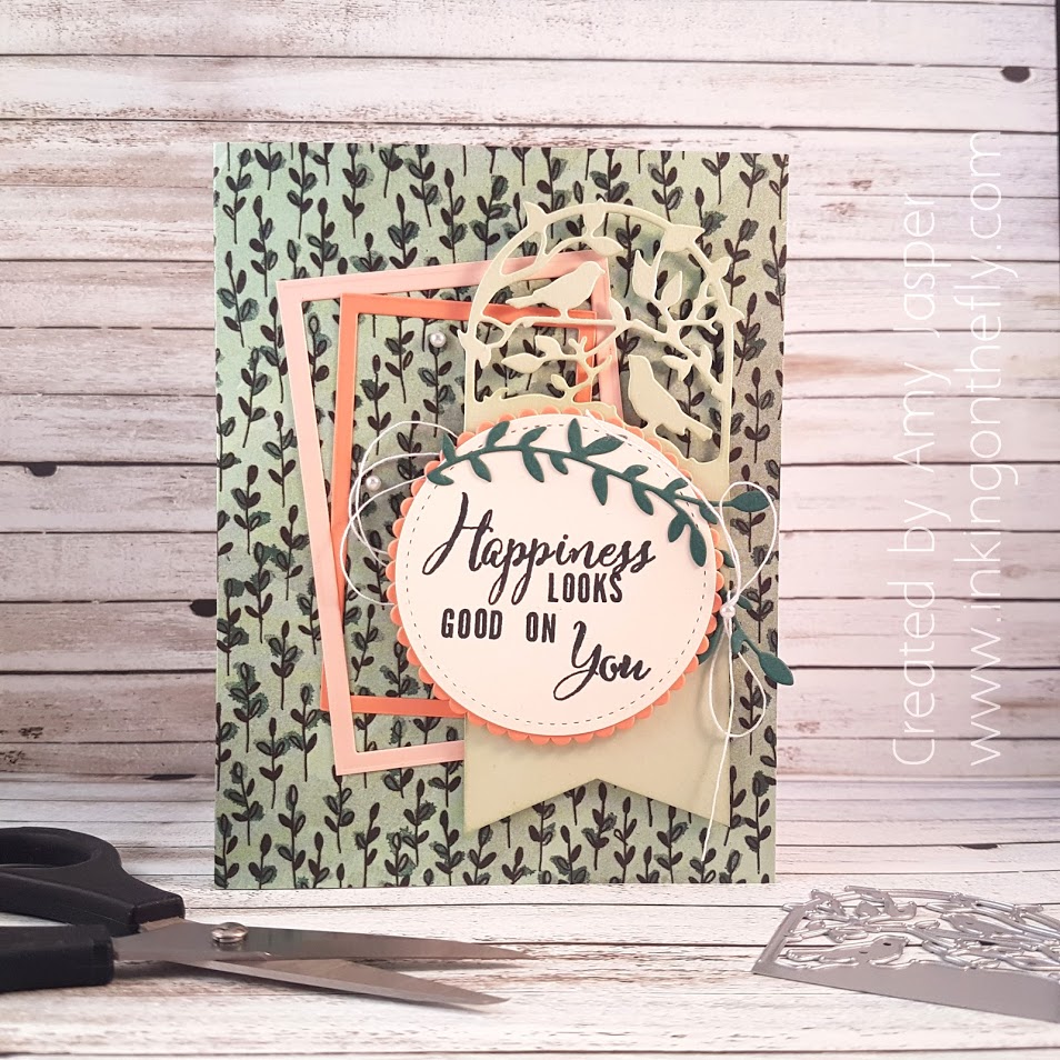
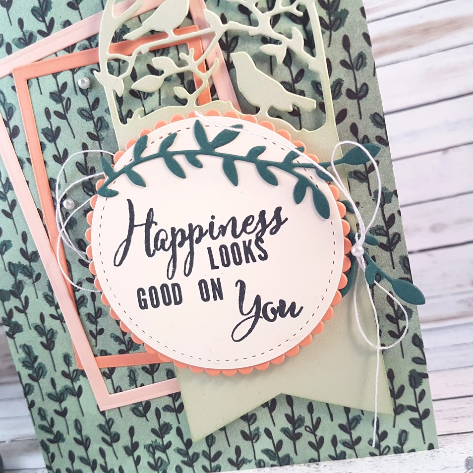
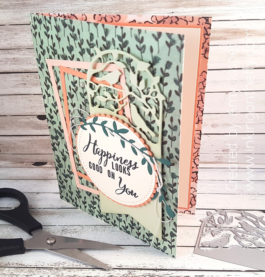
Letter Board Card
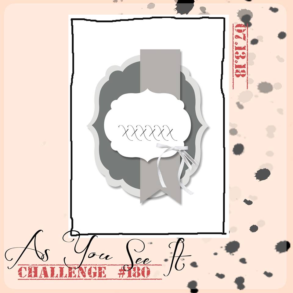
What are you obsessed with? That is the challenge for the As You See It Challenge blog this round. I actually had to do some soul searching to figure out if I was obsessed with anything in the first place, then determine which of the many obsessions I discovered I have was worthy of a card design.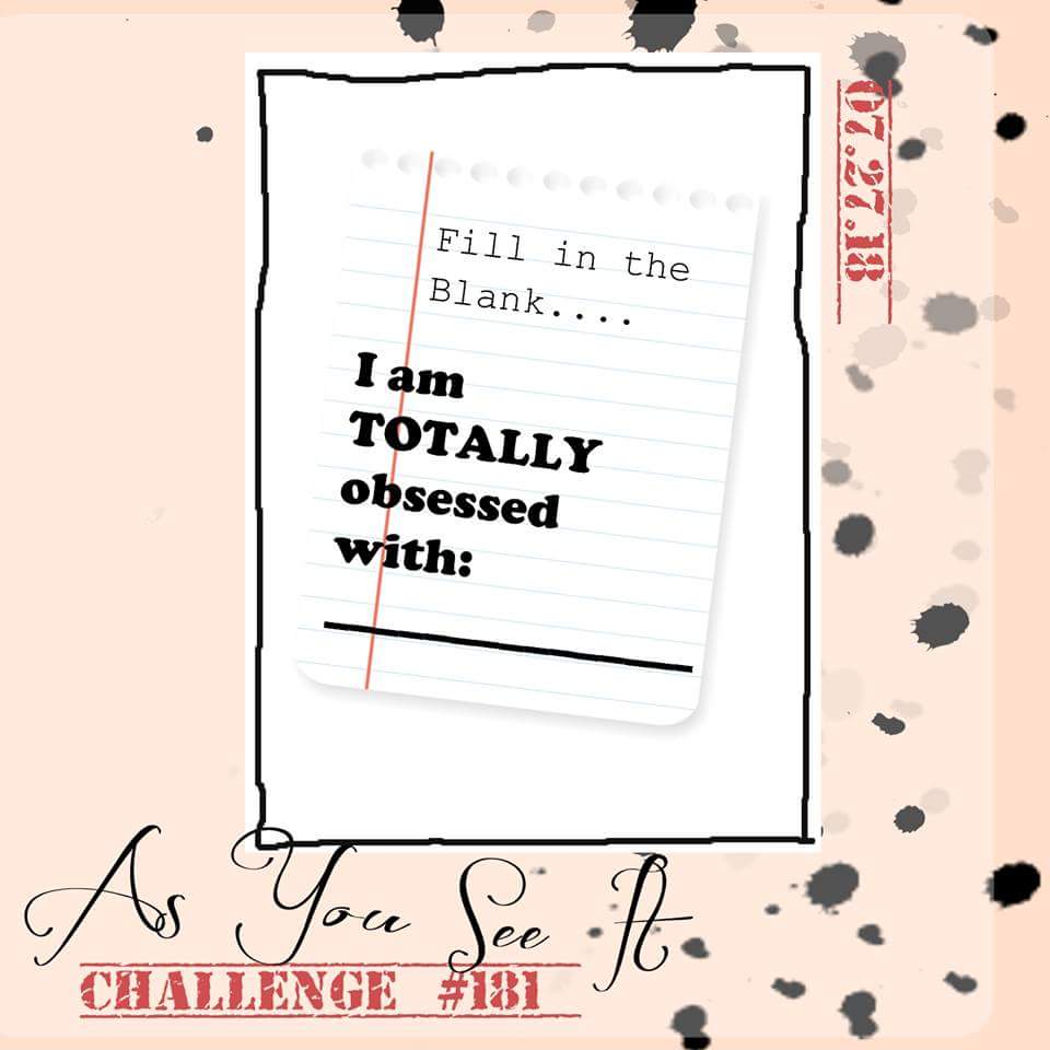 Here are some items that I had on my list:
- Fitness (running, cycling, hiking, strength, endurance)
- Wine
- Outdoors (nature, sunshine, peace, escape)
- Doctor Who
- Self-discovery (reflection, self-care, solitude, self-improvement, resilience)
- Words (witty, inspirational, punny, jokes)
- Coffee
- My phone (this is actually an unhealthy obsession – I’m working on it … sort of)
There were a few others, but we’ll just stop there.
I thought more specifically about my obsession with words and realized that it has become focused on letter boards. Have you seen any letter board images on Pinterest or Instagram? They seem to be the latest thing and have definitely caught my attention. I don’t have my own letter board, but it is on my Christmas wish list! How fun to create sayings that suit your mood or your current state of mind. Or maybe some words that reflect how you want to feel or think?
Here’s my card, inspired by the latest As You See It challenge: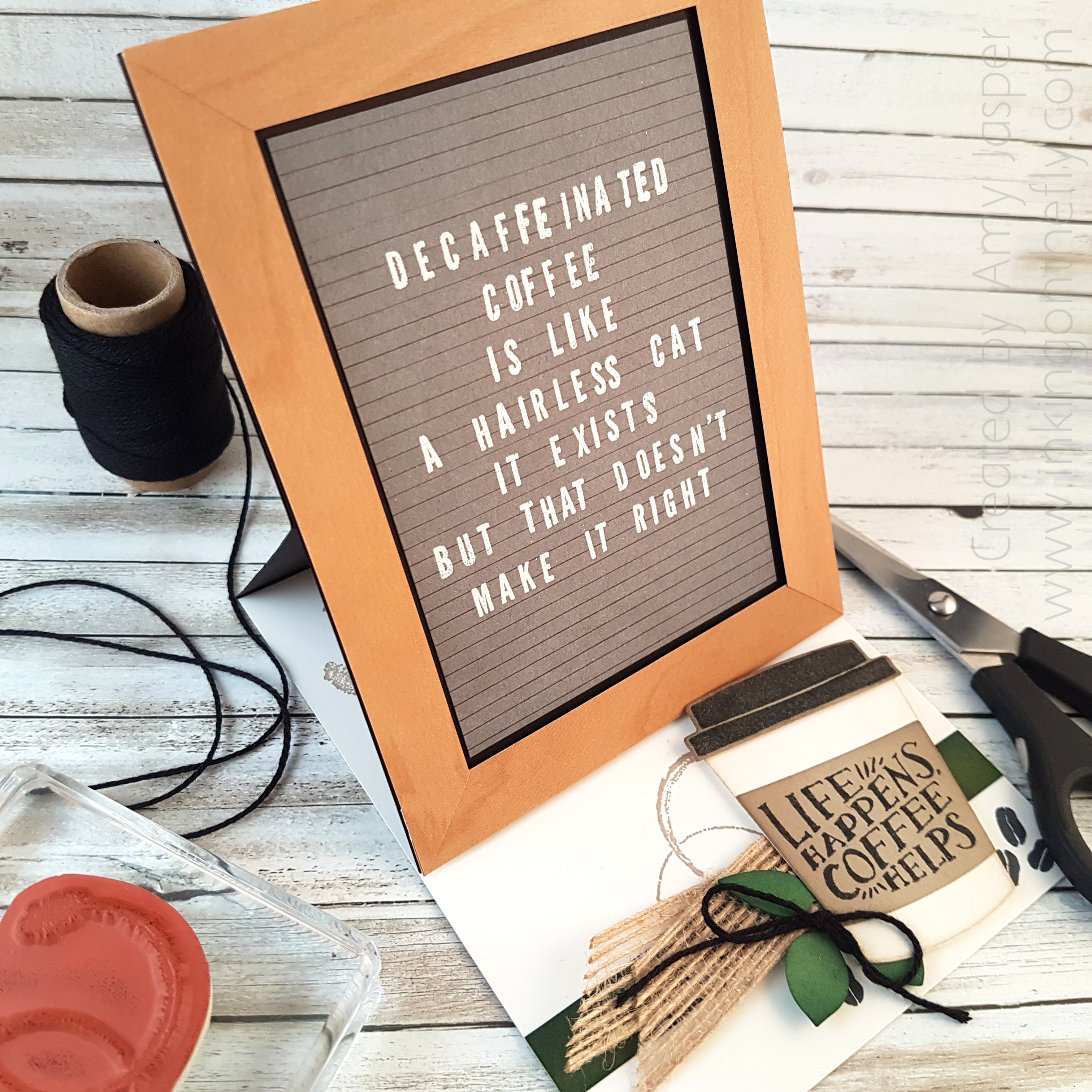 I chose to try to create my own letter board card with a funny saying I found on Pinterest. Conveniently, the saying also allows me to bring in another obsession I have – coffee. LOL!
Most letter boards have black felt backgrounds with white lettering. I have seen others that are grey, some that are white with black letters, and even pink ones with white letters.
I started with trying to create the appearance of a letter board first. For that, I used a black journaling pen and a ruler and drew lines across the Basic Grey cardstock.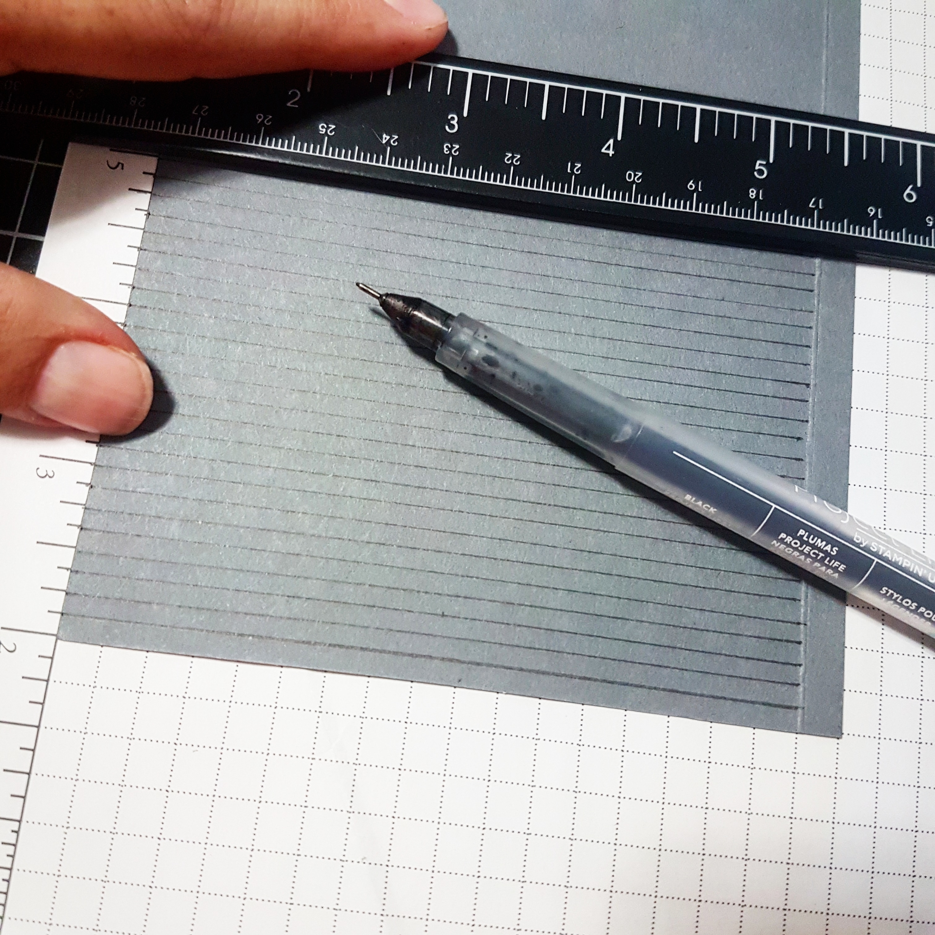 The letters used are from the Make a Difference stamp set from Stampin’ Up! It required some finesse to get them all straight – not an easy task and definitely the most time consuming part of this design.
The Embossing Buddy was an absolute must for all this embossing!!
I did one line at a time, wiping my cardstock with the Embossing Buddy, stamping the letters in Versamark ink, sprinkling with White Embossing Powder, tapping off the excess, then heat setting the powder with the Heat Tool. One line. Then I would take out my Embossing Buddy and start the process again with the next line. 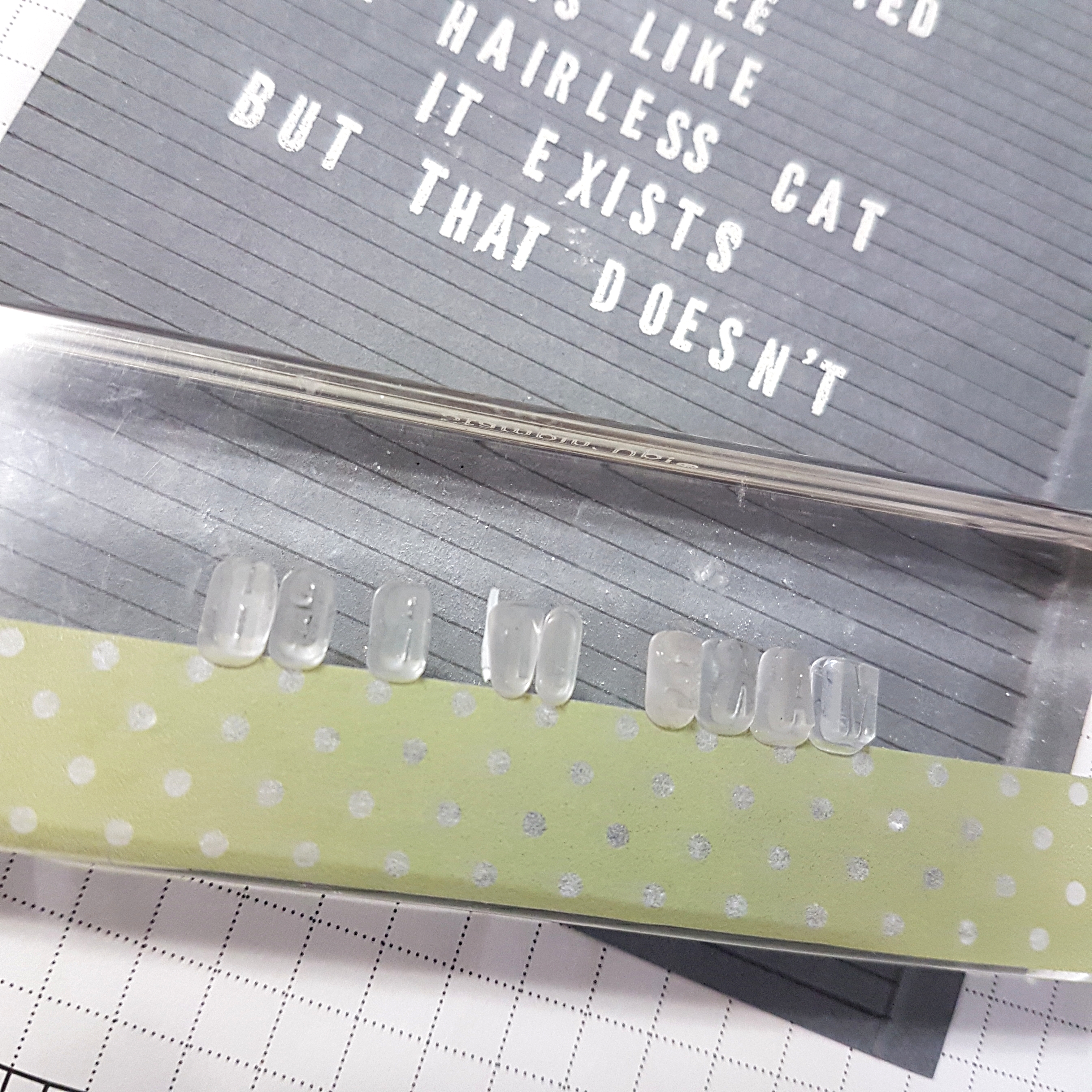 Eventually, I realized if I placed a piece of washi tape on my block, it made it a bit easier to get my words straight. It was challenging to create the words with appropriate spaces for any letters that I needed more than one of, then add any missing letters afterward.
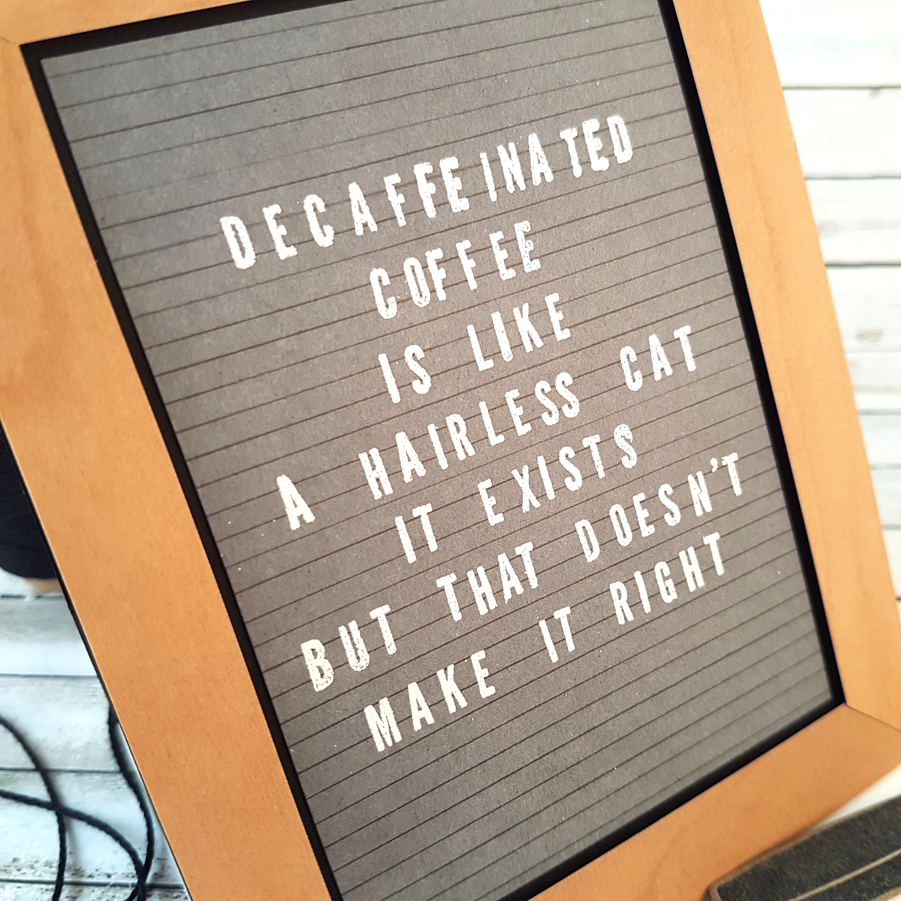 The next thing to do was to create a frame for my letter board. Many of the boards I’ve seen have a simple natural light-coloured wood frame. Thankfully, Stampin’ Up! has just the right paper with lots of wood patterns to choose from! The Wood Textures Designer Series paper is one of my favourites and it is included in the Buy 3, Get One Free offer for paper packs now until the end of July.
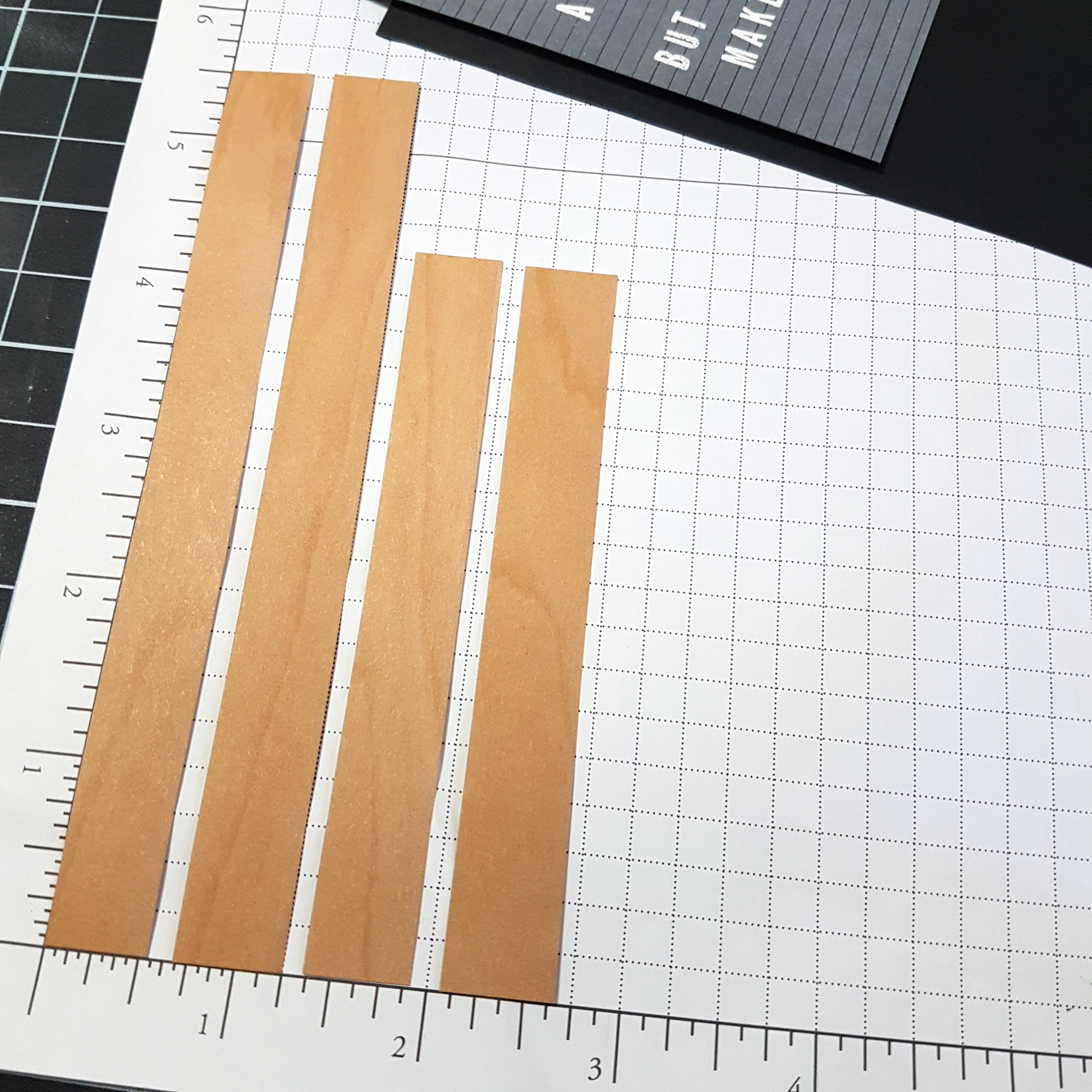 To create the look of a frame, I cut the desired length of paper for the size of frame I wanted. Two pieces cut at 5-1/2″ and two pieces cut at 4-1/4″. I made each piece 9/16th wide so that I could keep a black matte visible around my 3″ x 4-1/4″ letter board cardstock. I wanted to create the appearance of mitered corners, so I held two strips of the Wood Texture paper together and cut from the inner corner to the outer corner with my Paper Snips.
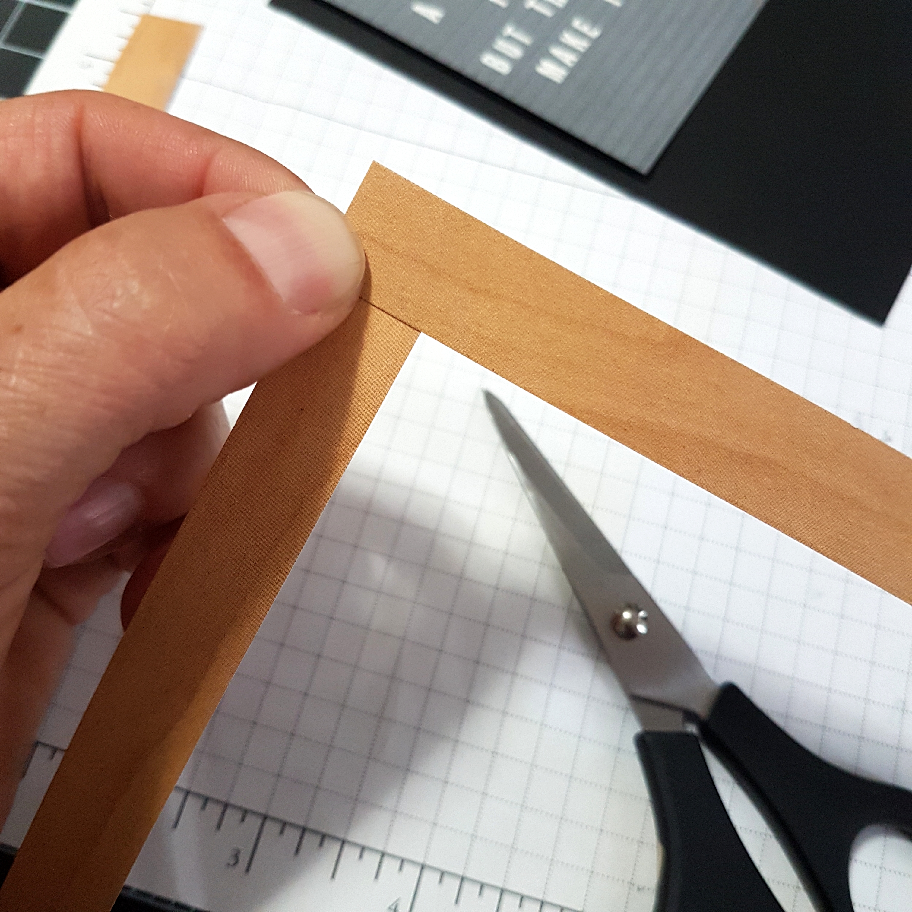 I really only needed to trim one end of each of the strips of paper. That way the angled end of one strip of the frame could overlap the straight cut end of the same corner. This allows for a nice clean corner that looks like a well-glued mitered wood frame. The strips were attached using Stampin’ Up Dimensionals to give a three dimensional appearance, just like an actual frame.
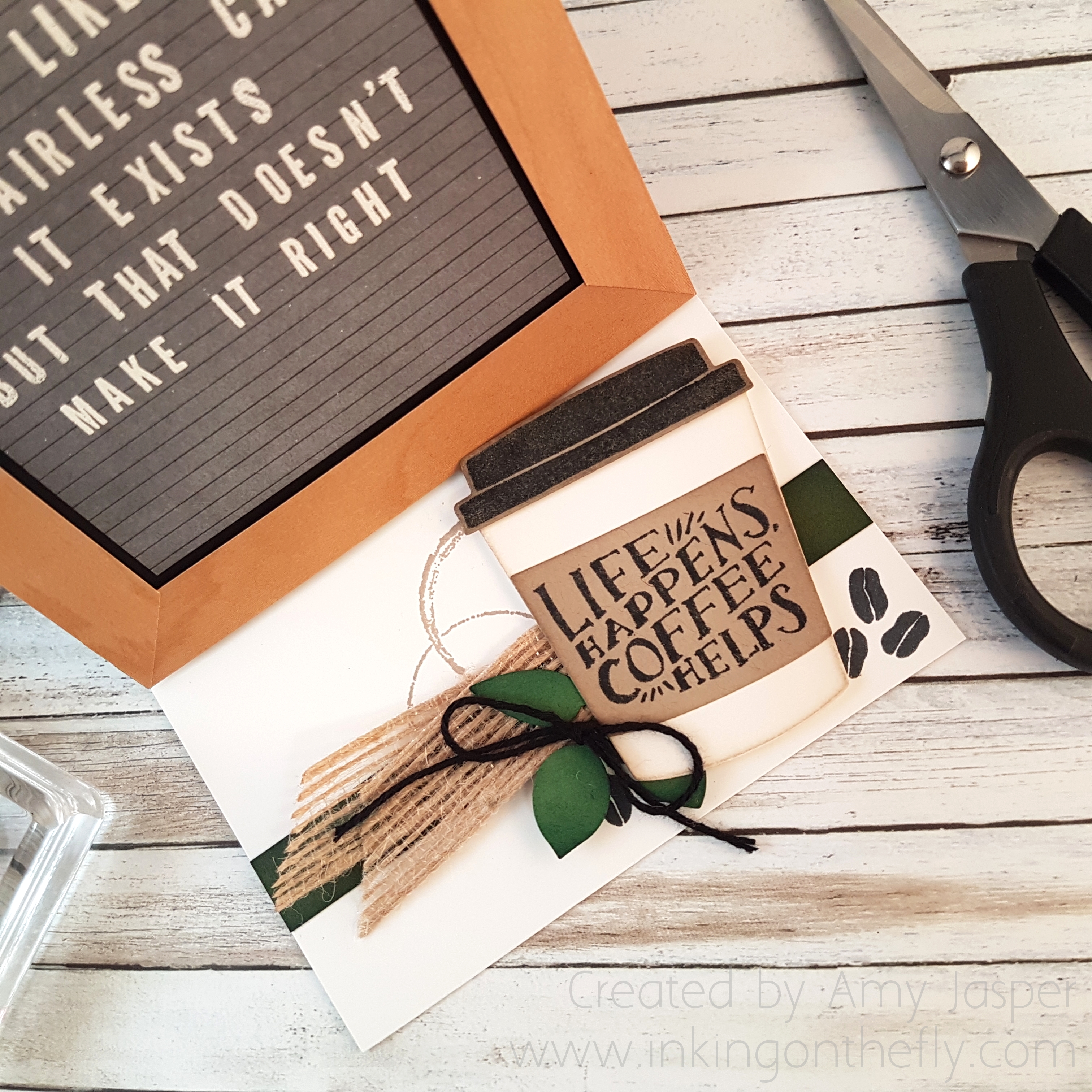 The thing that really makes this design work, is making it an easel card. If you’ve never made an easel card, be sure to google it and find a quick tutorial. It is a super easy thing to do.
My card base is made with Basic Black Cardstock. I used a piece of Whisper White cardstock as a layer inside the card as a blank canvas on which to create the lower portion of the easel design. For this, the Coffee Cafe stamp set and coordinating thinlits from Stampin’ Up! were the perfect choice! I also used an image from the Timeless Textures stamp set from Stampin’ Up! that looks like a coffee cup stain.
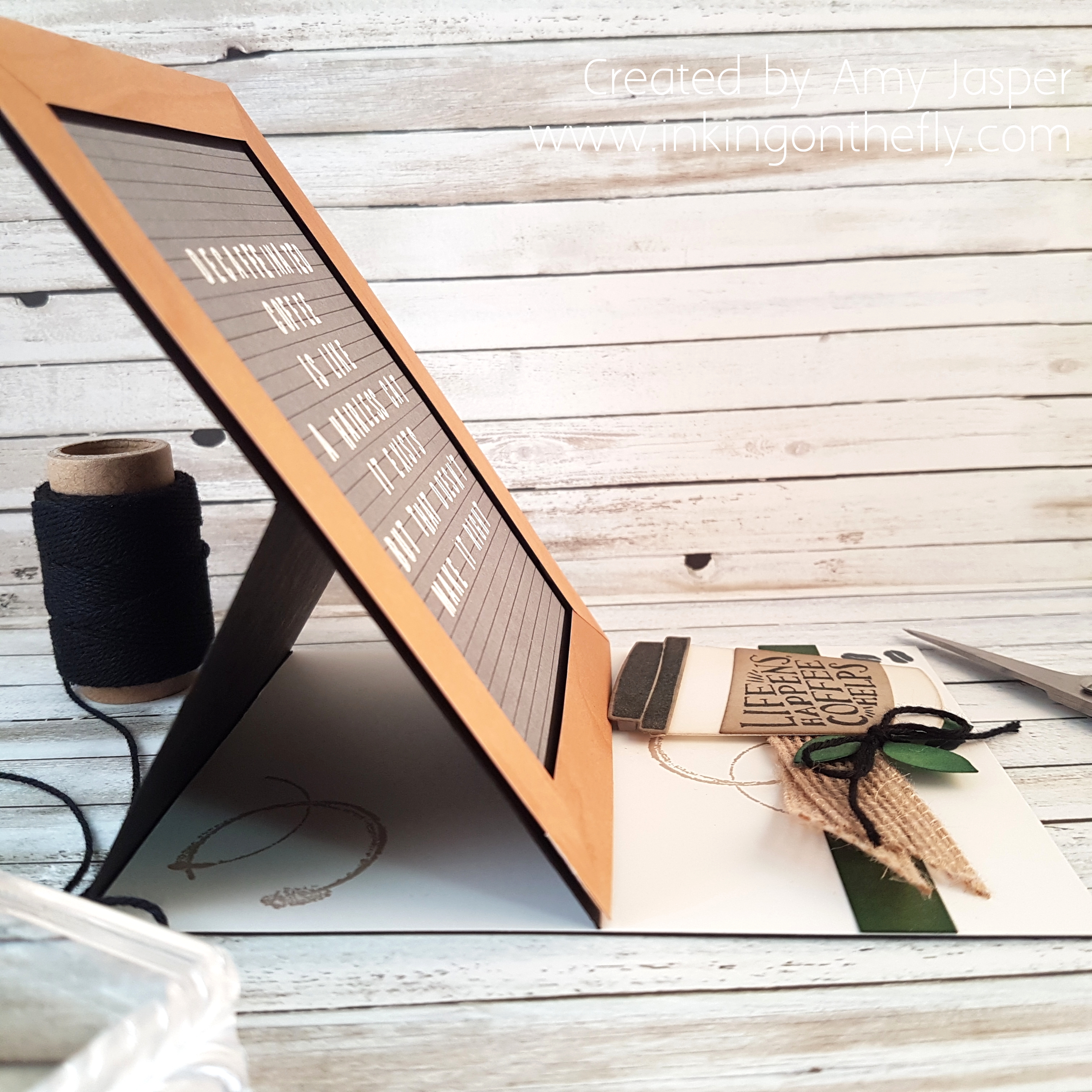 To prop up the front of the easel well, I made sure to add extra loft to the lid of the coffee cup with a piece of Adhesive Foam Strips.
 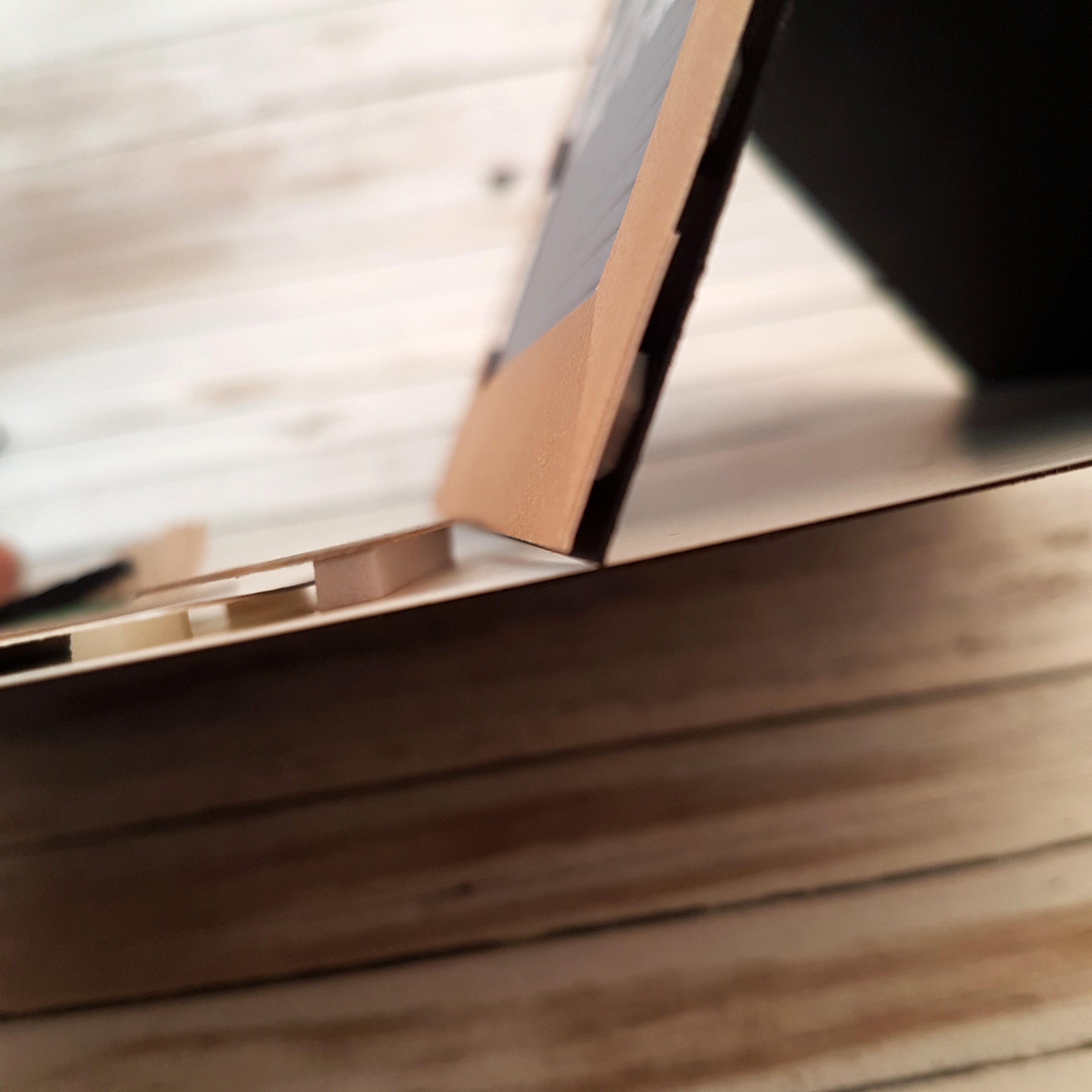 Additional Stampin’ Up! products used include: Leaf Punch, Solid Black Bakers Twine, 5/8″ Burlap Ribbon, Mossy Meadow cardstock, Garden Green cardstock, Crumb Cake cardstock, Stampin’ Sponges, Tranquil Tide ink (sponged on the Garden Green leaves and the Mossy Meadow paper strip), Crumb Cake ink (for the coffee stain image and sponging around the coffee cup, lid, and sleeve), Tuxedo Black Momento ink (for stamping the coffee happens sentiment, coffee beans, and coffee cup lid).Now it’s your turn. What are YOU obsessed with? Share it on the As You See It Challenge blog as a card design and/or leave a comment on this blog post!