Enjoying Life
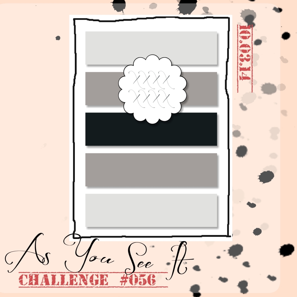
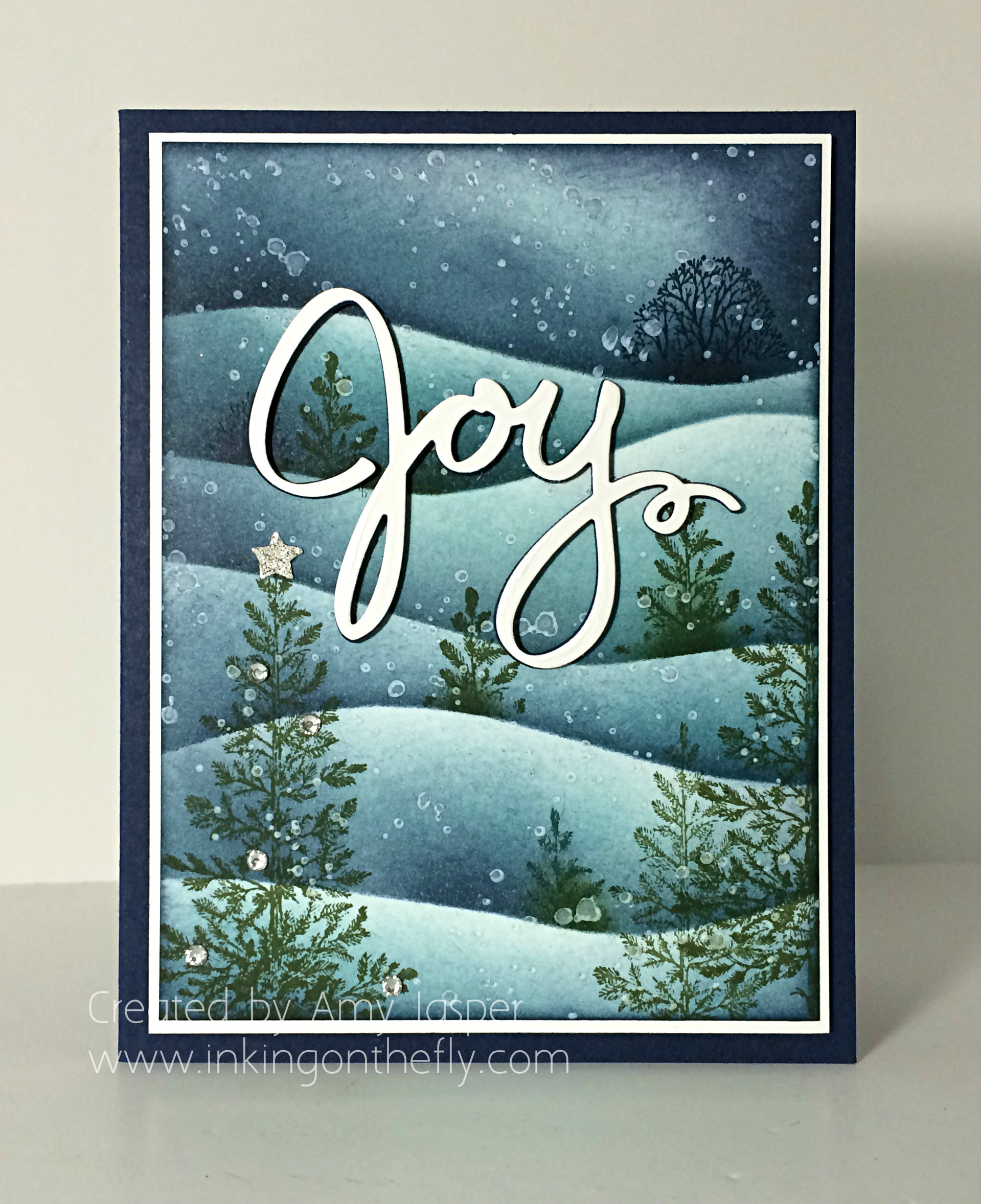
Welcome to my blog! My design today is a 5×7″ card for As You See It Challenge #068 featuring the From My Heart stamp set and the Back to Black designer series paper.
I’ve been taking a break from crafty expectations and obligations for the past couple of weeks. It’s time to jump back into all the “doing”, but the sentiment on this card represents the need to not forget the “being”. I have enjoyed playing Rock Band on the Play Station 3 with my family, playing charades, playing boardgames, going skiing, eating too much food and making spirits bright.
“I will not allow my busy life to interfere with my creative living”, has been my motto for this past year. It still applies, but I also need to add that I won’t allow my busy life to interfere with quality time with my family. I thought that was a given, but I think it’s important to remind myself that I need to take the opportunities to play games and enjoy my kids and my husband. Sometimes, I find myself denying them because I’m too busy with things that need to get done. Obligations and expectations that are put upon me mostly … by me.
Do you enjoy the passing of time? Or do you get caught up in the tasks and all the things that you want to accomplish in a day? Could it be that you let too much time pass and nothing gets done? Maybe you got it all figured out and have found balance between family, work, home, and all the things. I’d love to hear your secrets.
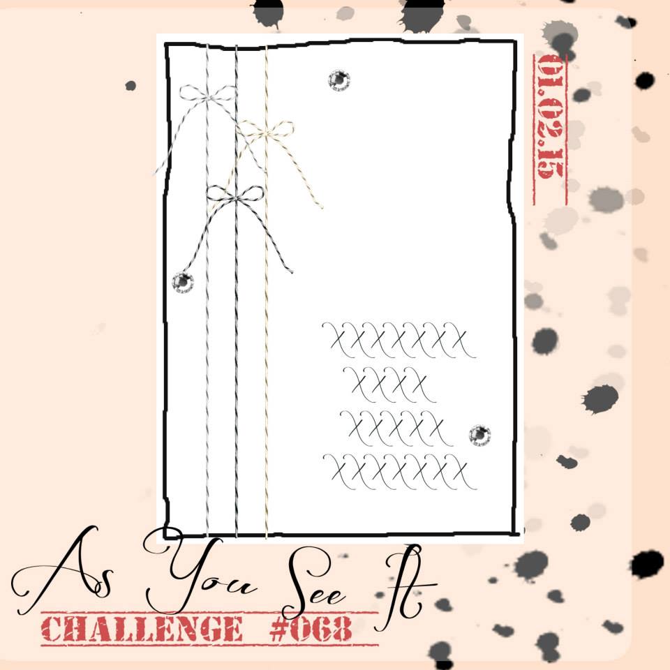
It’s a fun sketch with lots of possibilities. You can check out the diversity of our designers over at the As You See It Challenge to see what they’ve done with this one. I wanted my card to be simple, and it is … sort of. I ended up complicating it with twisted layers. LOL!
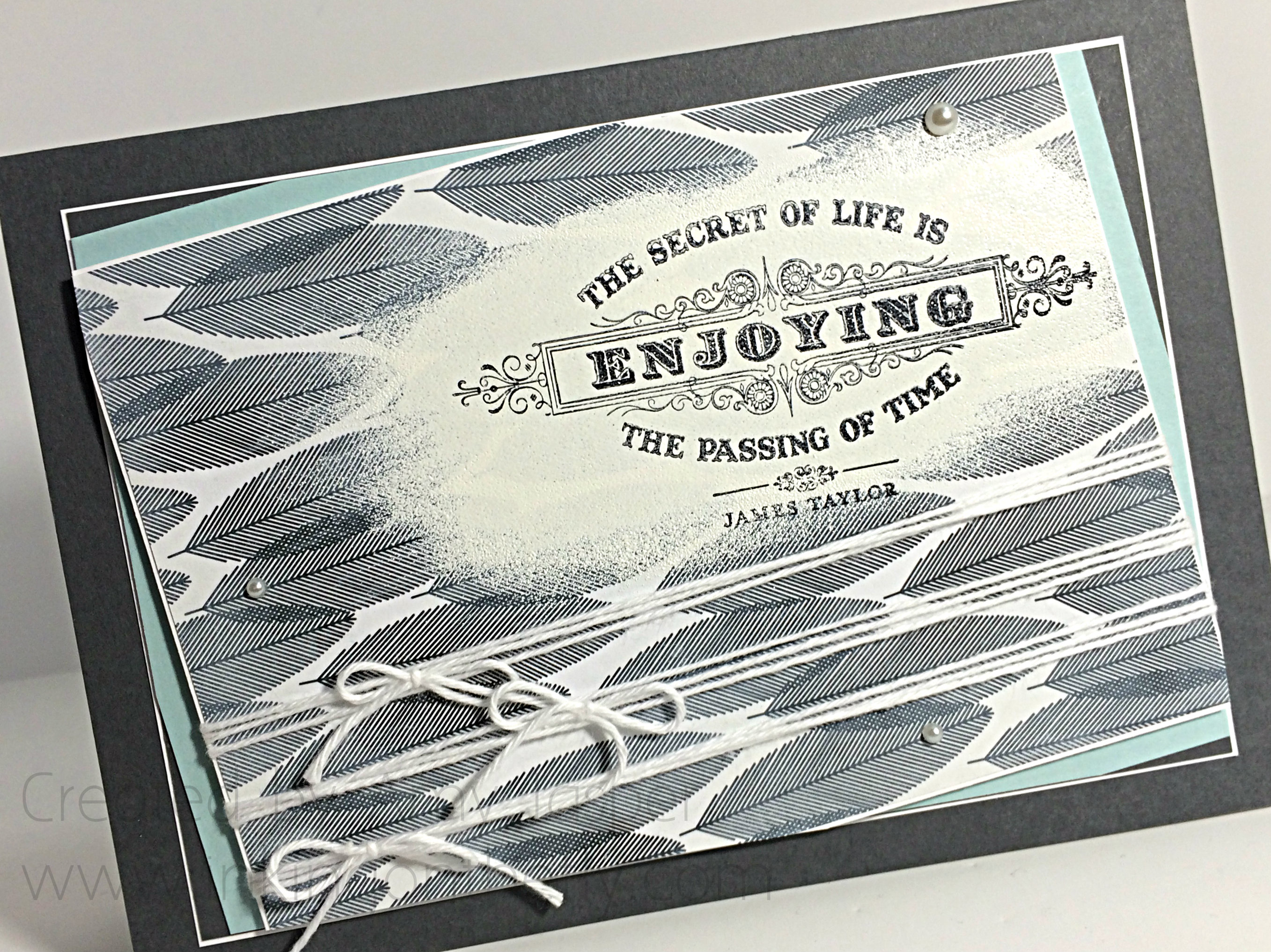
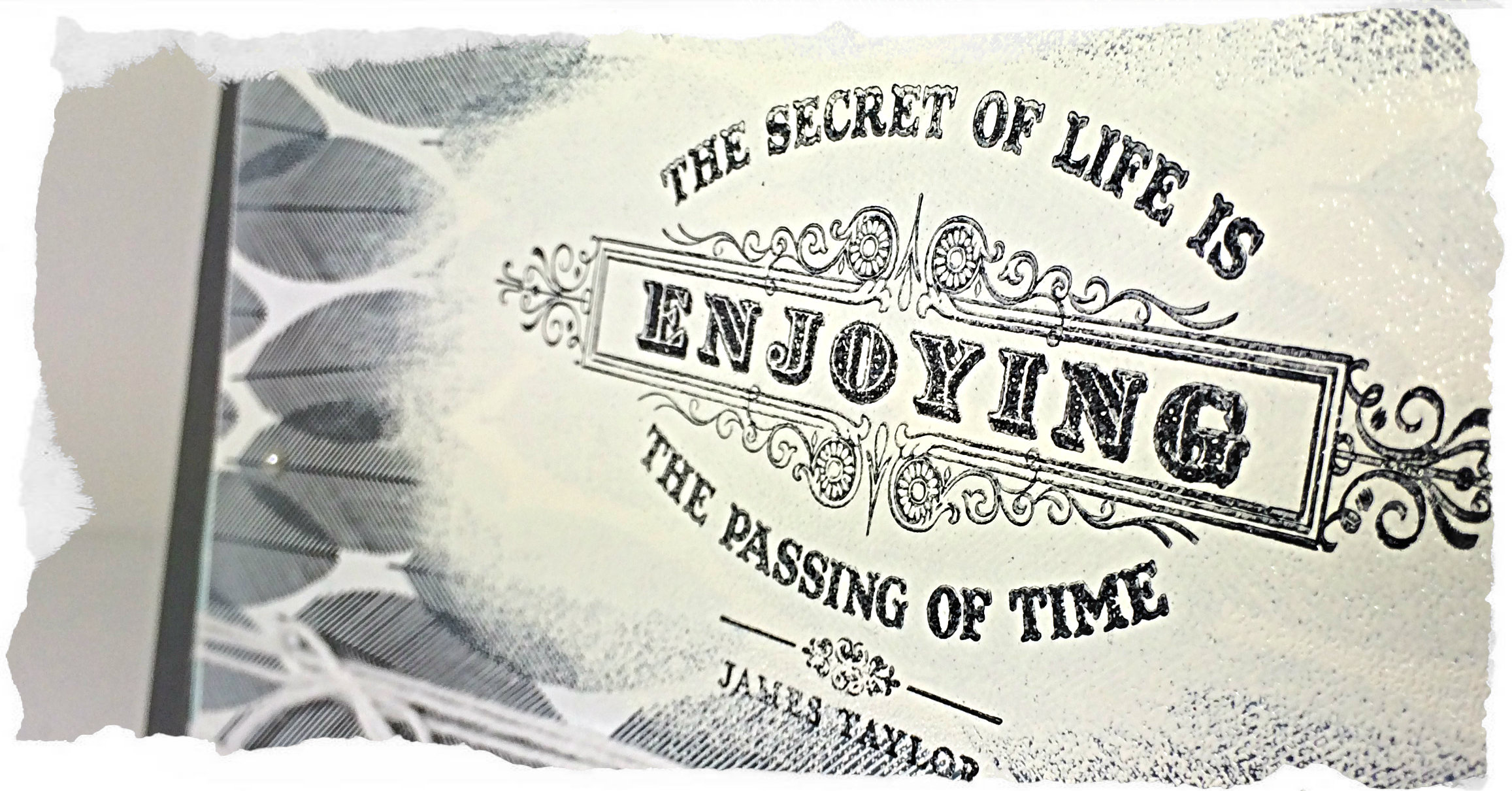
I started with the idea of using Whisper White craft ink over a section of the Back to Black Designer Series Paper, so that my sentiment could be seen. I found that the thin layer of ink wasn’t quite enough to fade out the black and white design, so I used Versamark ink directly to the paper, then used White Embossing powder over the area and melted it with my Heat Tool.
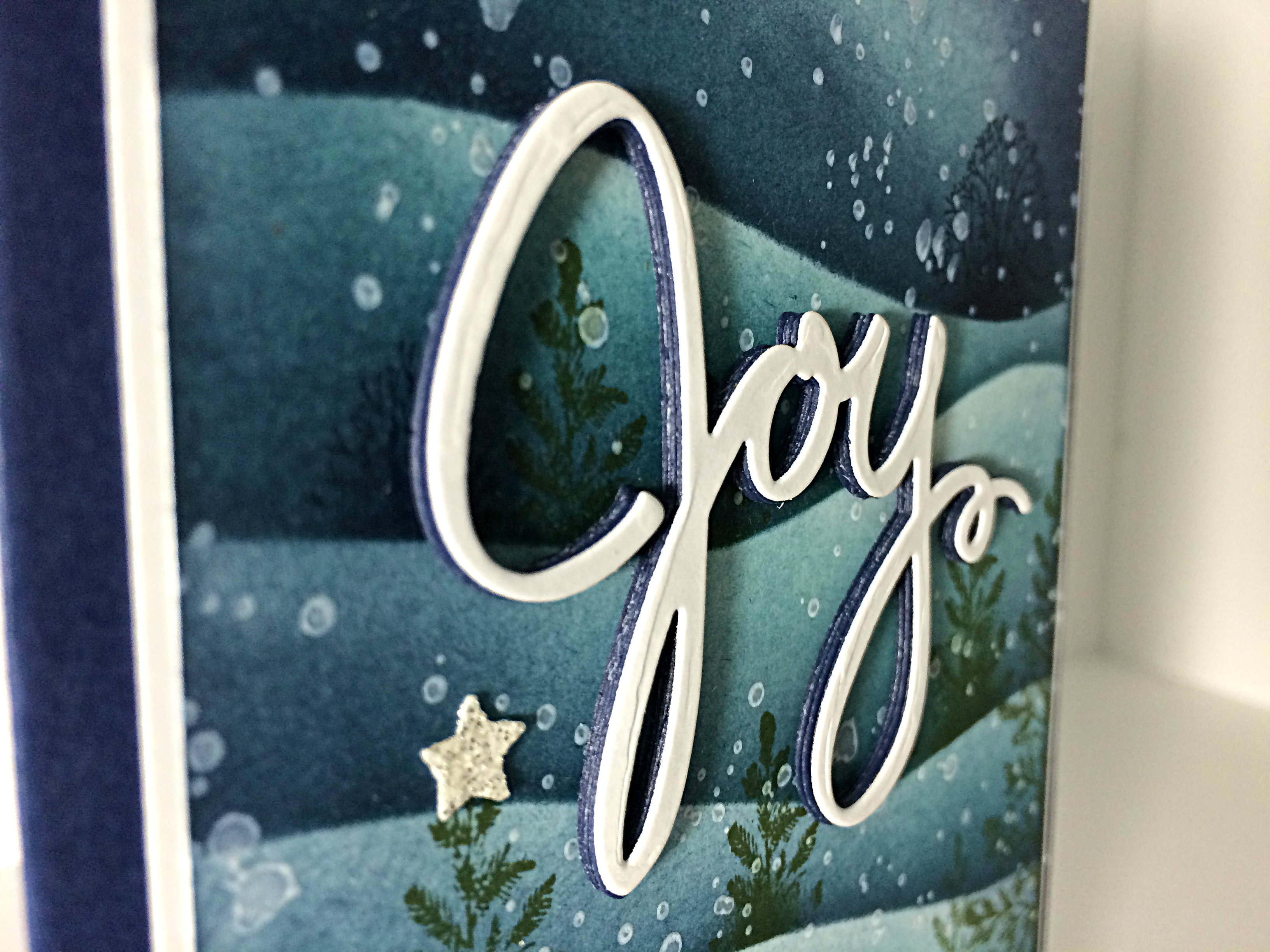
After giving the powder a minute to cool, I stamped the sentiment from the “From My Heart” stamp set over the white embossing with Stazon Jet Black ink. Still, the black and white pattern in the background seemed to harsh. I decided to fade it out with a bit of Whisper White craft ink. I added the ink directly from the ink pad to the paper, focusing on the edges, then I used a sponge to soften the ink, giving a softer look to the paper.
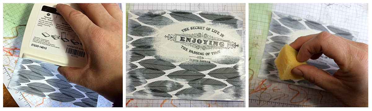
After all that, I ended up cutting off a lot of the sponged areas as I worked on my card. I’ll definitely use that technique again, though. I quite like the softer look and I suspect it will work beautifully on other patterned paper as well.
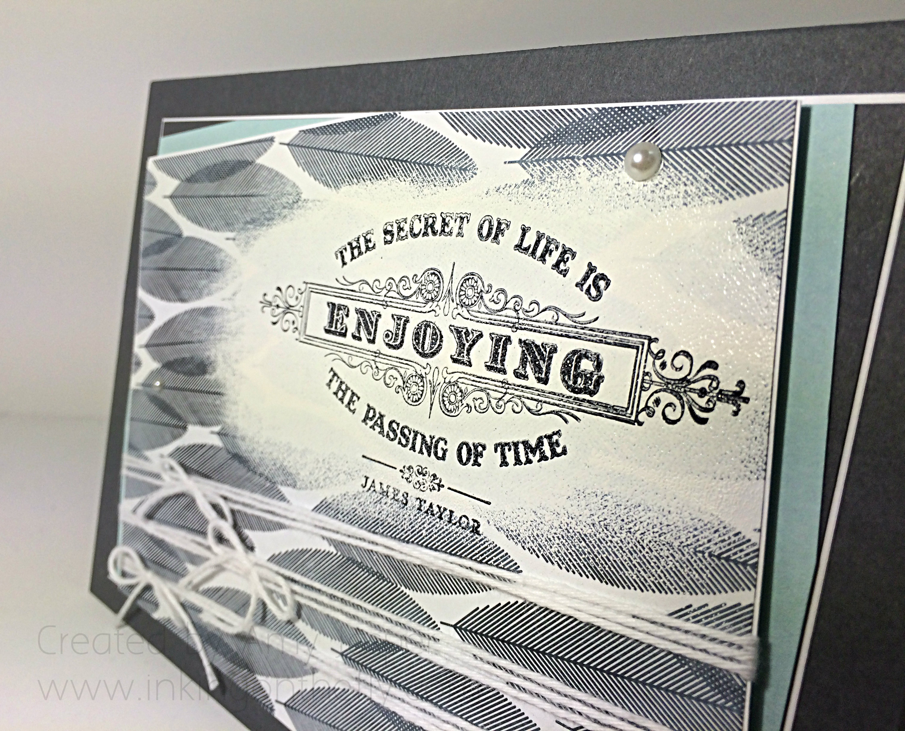
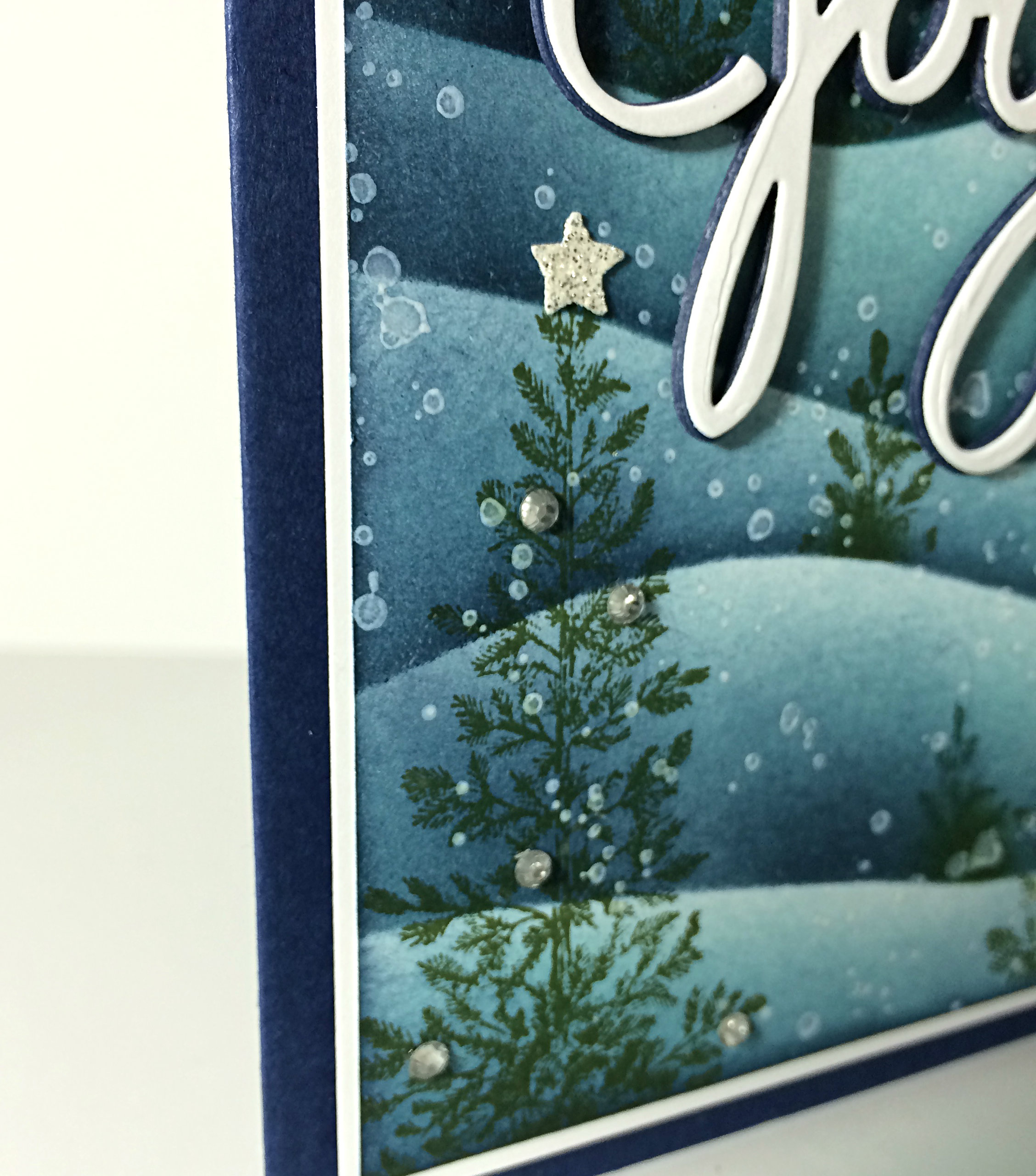
I used Whisper White bakers twine and Basic Pearls for the embellishments. Basic Gray, Soft Sky and Whisper White cardstock were used along side the Back to Black Designer Series Paper. I chose to mostly use thin white borders to show the layered edges. I even pulled those angles and thin edges to the inside of this 5×7 card.
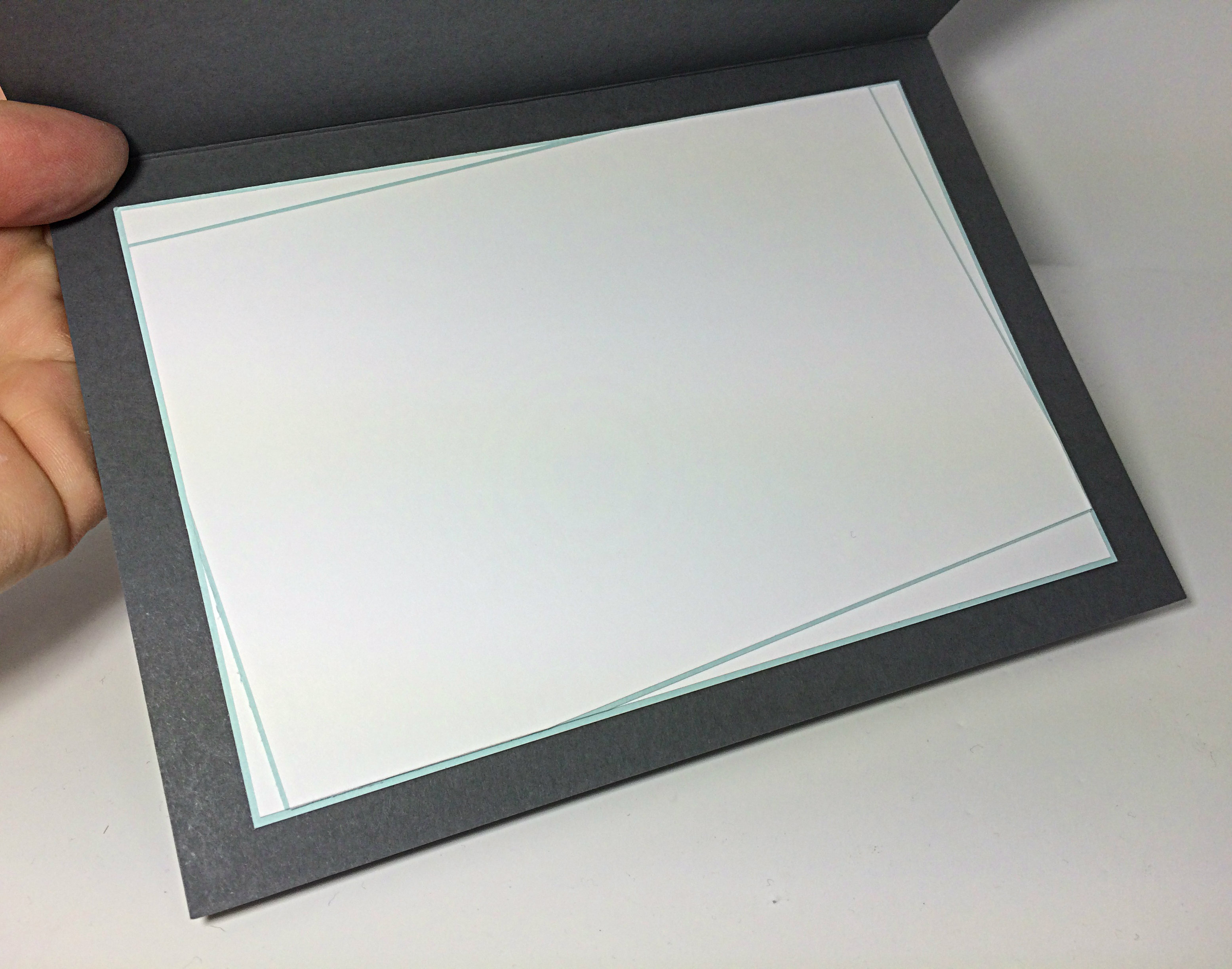 I’m trying to make sure that I complete the inside of my cards as soon as I’m done the design as it can be very frustrating to grab a nice card to quickly write in as you run out the door (this happens more often than not, for me), only to find that you forgot to add a writing space inside the dark coloured card base. sheesh!
Because my card is 5×7″, I also needed to use a handmade envelope, which I did using my Envelope Punchboard. I decided to avoid squishing the card by making my envelope slightly fatter. To do this, I added 1/8″ of an inch to the paper size required to make a 5×7″ card, then when punching and scoring, I started with the usual score guide number first, then added a second punch and score on mark that is 1/8″ more. So, the envelope punch board guide says that I needed to punch and score at the 4 inch mark. I did that, then punched and scored again at the 4.1/8″ mark and carried on around my paper following the directions on the punchboard, but adding that second 1/8″ bigger mark. Folding those little score lines can be fussy because they are so close together.
 Glad you came by for a visit today.
Be sure to show off your card using the As You See It sketch this week by linking it to the challenge site.
Hope you do!
Amy.
![]()