You Make My Life Better

When I saw this “fill in the blank” challenge, I wasn’t sure what my answer would be. I have to be honest and admit that I don’t send cards nearly enough and I fall behind very easily. I still have a graduation card to send from June 2019!! (oh my gosh, that’s so embarrassing!!). Basically, my real answer to this fill in the blank question is “My favourite card to send is any card that I actually get in the mail!”

But I thought I should be more specific, because how can I make a card that represents THAT?

… okay, I just got an idea …

… but that’s beside the point!! LOL!

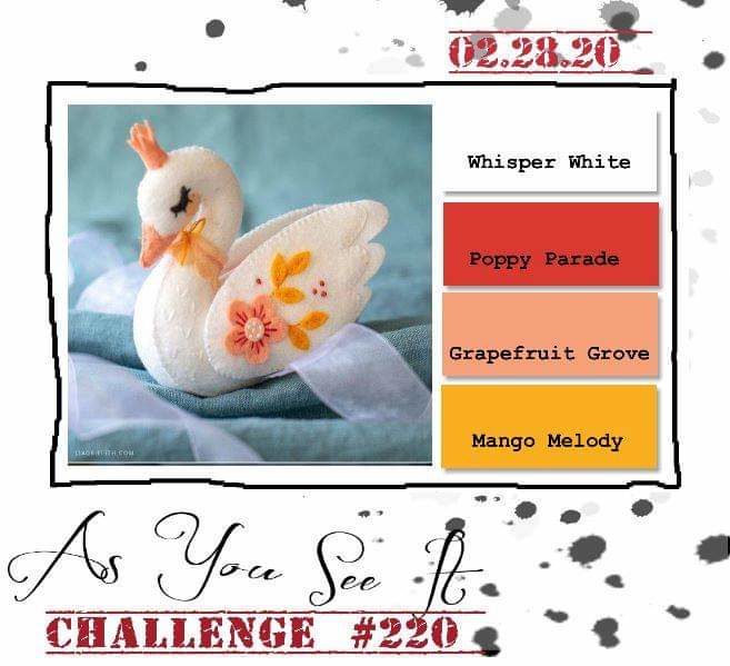
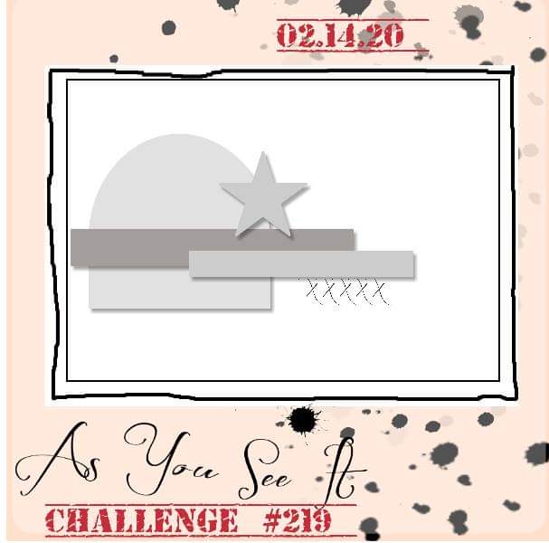
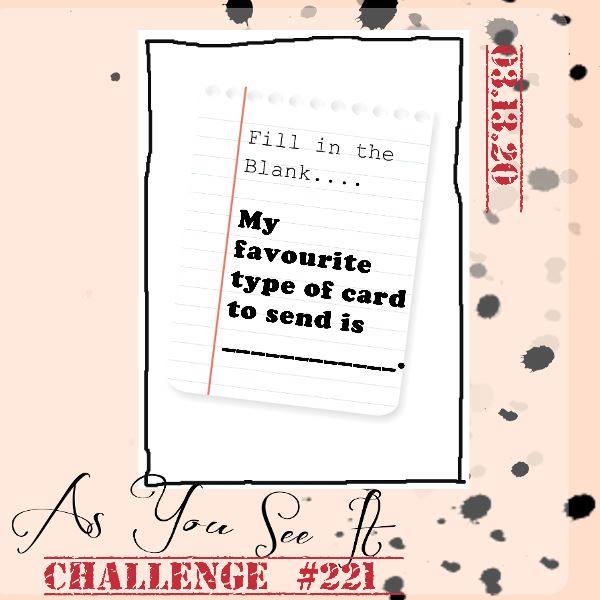
Here’s the As You See It Challenge that inspired my card today.

So, to be more specific, when I do remember to send a card, the type of card that is my favourite to send is a “just because” card. They’re my favourite because they’re unexpected and can only be considered a direct-from-the-heart card. A card for no reason except to let the person know that they were on your mind is probably the most genuine and meaningful to me.

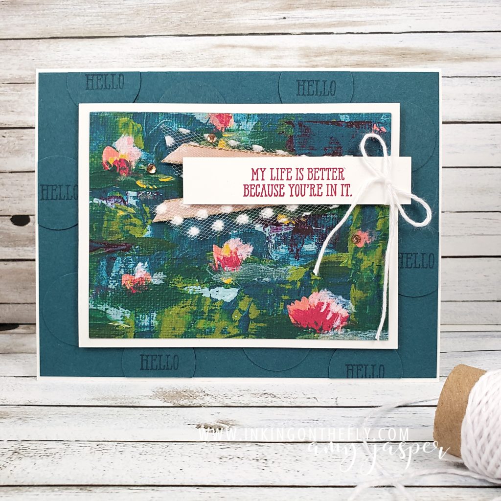
I chose to create a card with a sentiment from the Well Said stamp set from Stampin’ Up!. I was thrilled to win this stamp set at a Stampin’ Up! event in Vancouver. I love that it has so many sentiments for all sorts of occasions and that it has a coordination set of dies, the Well Written Dies, that are also words! I love the power of words, so please excuse me as I take a moment to express a little squeal of delight!

EEP!

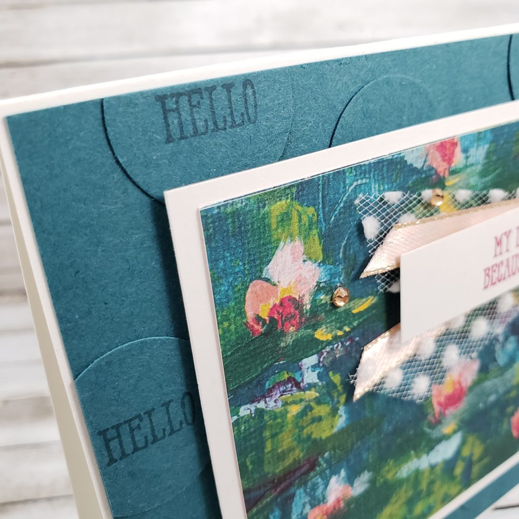
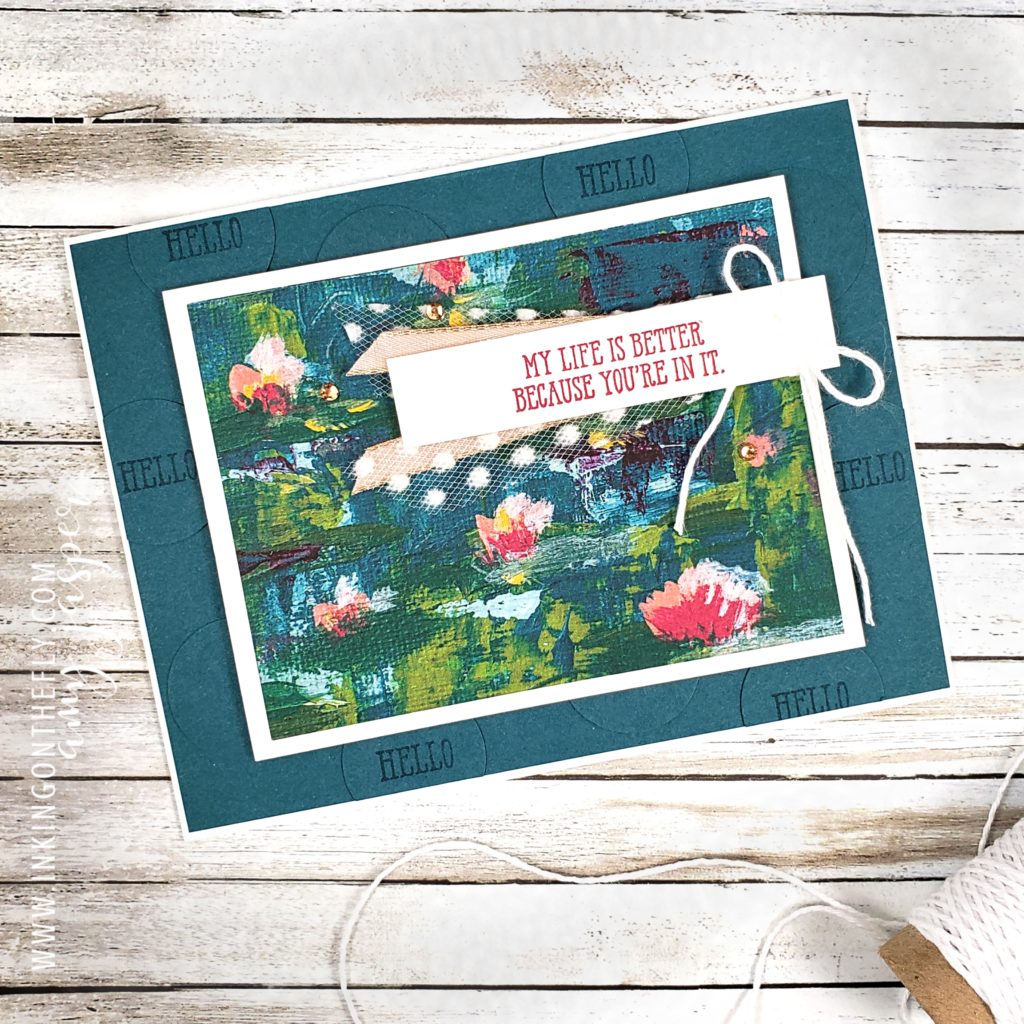
I used the standard Thick Whisper White cardstock for my card base. The next layer is Pretty Peacock cardstock, but I fancied it up with some texture by adding Pretty Peacock circles to that layer using my 1″ Circle Punch. Some of the circles have HELLO in them, another sentiment from that Well Said stamp set, stamped with Pretty Peacock ink. It’s a simple add, but one that creates so much more interest on the card.

The next layer is attached with Stampin’ Dimensionals and is the basic Whisper White cardstock as a matte to the Lilly Impressions Designer Series Paper. This paper is only available as a FREE item with a $60 purchase during Sale-a-bration. That amazing Well Said stamp set just so happens to be $61, so if you choose to purchase that stamp set before the end of March, you’d be able to also get that beautiful paper or another Sale-a-bration item as well! How cool would that be!

The sentiment (from the Well Said stamp set, in case you missed that, LOL!) is stamped on a piece of Whisper White cardstock with Lovely Lipstick ink. I tied a bow of the Whisper White Baker’s Twine on the end of this strip of Whisper White and attached it to my card with more Stampin’ Dimensionals. Before adhering it, I tucked two different ribbons under the banner piece: the Whisper White 5/8″ Polka Dot Tulle and the Petal Pink 1/4″ Metallic-Edge Ribbon. Three Champagne Rhinestone Basic Jewels add a great final touch of sparkle to the design.

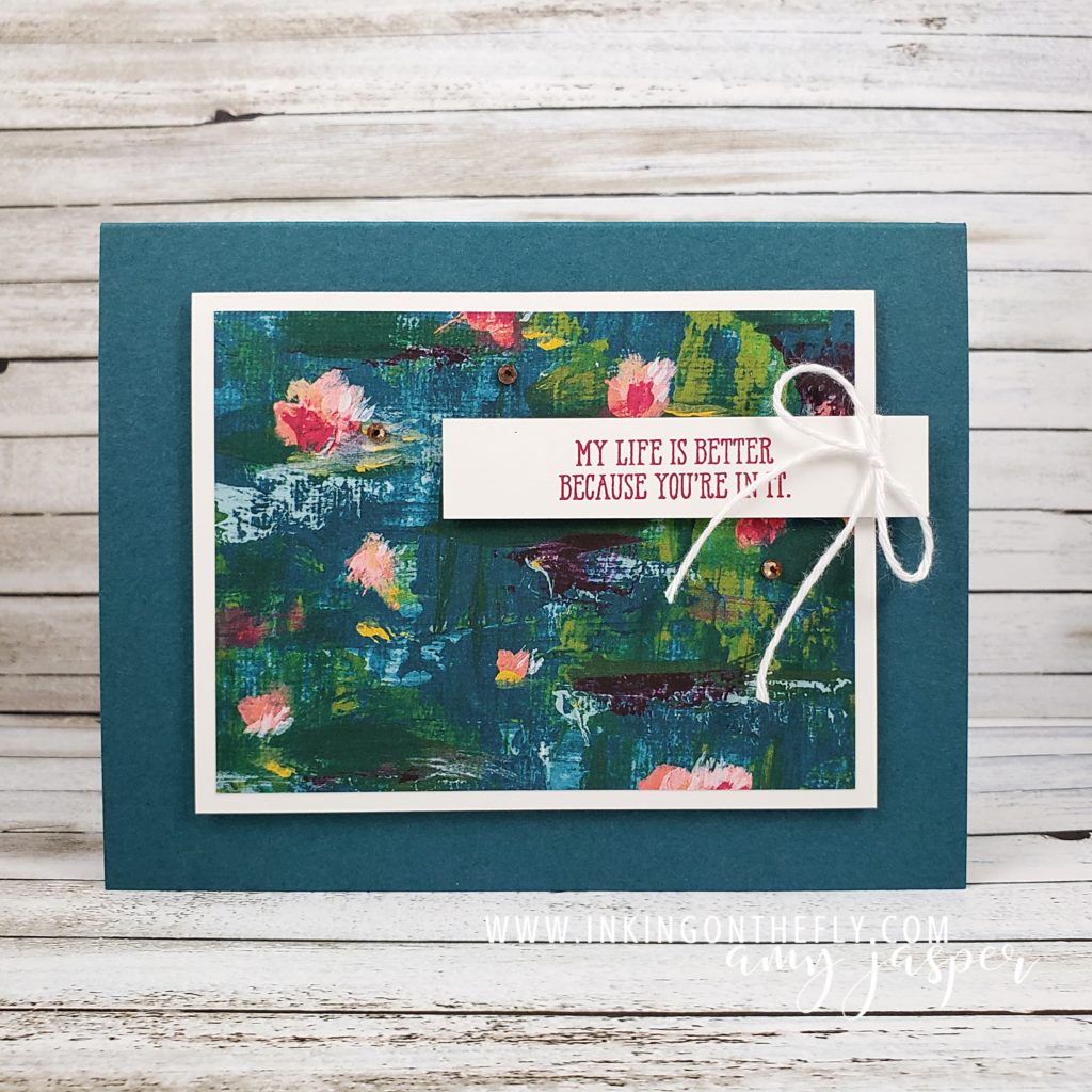
One of the many great things about making your own cards, is that you can make them as simple or as involved as you like. Here is a version of this very same card design using fewer steps and fewer products.

Give the challenge a go and share it with us at the As You See It Challenge Blog. We love to see your creations!

As always, all of the products used to make these cards are available for you to purchase at my Online Store. Head on over there to browse Stampin’ Up! products and order your favourites! (if you live outside of Canada, you will need to order from a demonstrator in your country, but thank you so much for supporting me by visiting my blog!)
Painted Petal Label

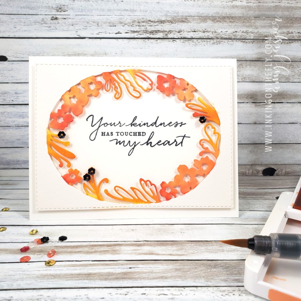
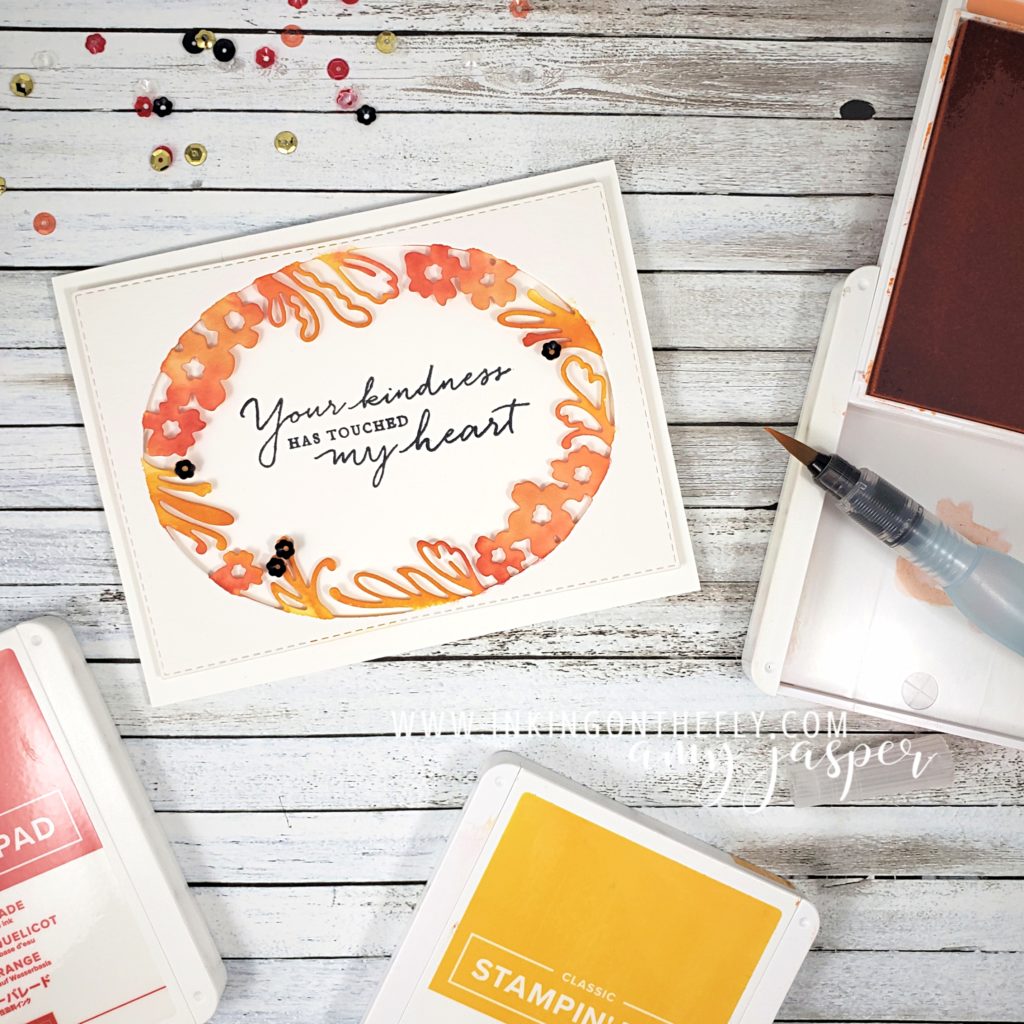
The As You See It Challenge has a very pretty and fresh colour challenge for us today! I thought I would try using the beautiful Petal Label Dies from Stampin’ Up! along with some watercolouring to create my design..

Here’s the colour combo that inspired the card in today’s blog post.

Isn’t it a precious image! The little swan makes me think of the Christmas ornaments my mom made out of felt one year. She never made a swan, but she did make a little dove. I get a lot of my creativity from her, of course. Thanks mom!

I used the Petal Labels Dies and the Stitched Retangle Dies to cut the Watercolor Paper for my card front. I don’t think the 2019-2020 Annual Stampin’ Up! Catalogue gives the Path of Petals Bundle enough air time. It really is a gorgeous bundle and is only part of the Pressed Petals Suite by Stampin’ Up!. The entire suite is so stunningly beautiful, but I feel like it has been lost in the shadows of the many show-stopping suites in the catalogue. I want to give this one a little more attention! The Petal Labels Dies are delicate and beautiful. The Path of Petals Photopolymer stamp set has the most beautiful fonts for the most eloquent sentiments.

I chose to use a Thick Whisper White card base for this card. Let’s be honest here, I use Thick Whisper White A LOT for my card bases. It is so easy to just add a layer to a white base. I don’t need to do anything fancy to the inside and it makes such a clean and crisp card every time! I struggle to use coloured cardstock for my card bases. I think I need to try to branch away from that a bit. Maybe, I’ll try Very Vanilla. LOL!

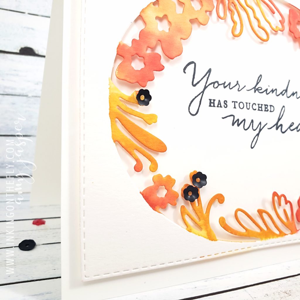
With an Aqua Painter and my three ink colours, Mango Melody, Grapefruit Grove, and Poppy Parade, I added colour to the floral edge of the oval die cut watercolour paper. I started with the lightest colour first, then worked up to the darkest colour. I was careful to colour only the floral shapes, trying to keep a clean edge so the oval area would remain defined.

To some of the fronds, I added black sequins from the Peaceful Poppies Sequins pack using Glue Dots to hold them in place.

On a separate piece of Whisper White cardstock, I stamped the beautiful sentiment from the Path of Petals Photopolymer stamp set using Tuxedo Black Momento Ink. I did stamp it a little bit crooked, but that’s why I did it on a separate piece rather than stamping it directly on the card base!! (I’m smart like that, LOL!). I adhered it (with the sentiment straight) to the water coloured, die cut layer using Stampin’ Dimensionals. I needed to do some trimming with my Paper Snips (since the Whisper White layer was now sticking out, crooked, under the die cut layer), then I was ready to attach those two layers to my card base using my trusty Multipurpose Liquid Glue.

Now it’s your turn. Get into your craft supplies and make a card using these colours (or colours as close to these as you can get). This is an opportunity for you to get creative and use this colour challenge as a jumping off point. Sometimes, you just don’t know where you might land!! Don’t forget to share your finished card on a public internet site (Pinterest, public Facebook Page, public Instagram page, Flicker, Splitcoast Stampers, your blog, etc), then share it with us on the As You See It Challenge Blog! We love to see what you’re creative brain does with the challenges.

As always, if you like any of these products, head on over to my Online Store and get them into your shopping cart! Stampin’ Up! makes it easy to create beautiful things!

If you’re outside of Canada, you can’t legally shop from me, but I hope you will continue to visit. Don’t forget to comment and let me know that you did!!

Watercolor Pencil on Navy

When I first saw this sketch, I wanted to use the Honey Bee Bundle with the Honey Bee stamp set and the Detailed Bee Dies. However, I thought EVERYONE would do that since the one shape looks like the bee hive image from the set. Besides, I shared a card last time using that bundle – I need to give all my stamp sets a turn to shine. I thought I’d better go a different route. I looked through my stamps to see what would inspire me and saw my untouched Happy Birthday To You stamp set that I got for free during Sale-a-bration.

If you don’t know what Sale-a-bration is, you MUST go to my ONLINE STORE and find out how easy it is to get free stamp sets, paper and embellishments! Just stop reading this and take a moment to check it out. Then come on back.

I’ll wait.

I KNOW, RIGHT!! Sale-a-bration is awesome! You need supplies anyway, why not get them during the promotion and get one of those free items along with it? I love it when my spending can stretch a little further!

My design today is inspired by a sketch from the As You See It Challenge Blog. I am lucky enough to be one of the designers on that blog, so I get to share a card with you every two weeks. My job as part of the As You See It Design Team is to give you some examples of the sketch, theme, or whatever the creative-mojo-maker has for us that day.

You can see that obvious shape that looks like that bee hive, can’t you? Feel free to go with that and create a card with the Honey Bee Bundle, if you want. I wouldn’t mind seeing how you do it, anyway, because there are so many different ways to work with this sketch, even if we all used the same stamp set! That would be a very interesting challenge as well, don’t you think?

Instead of working with the bee hive shape, I went with the birthday cake image. I didn’t realize that another designer on our team had the same idea for her card, but it’s interesting to see how our cards turned out so differently.

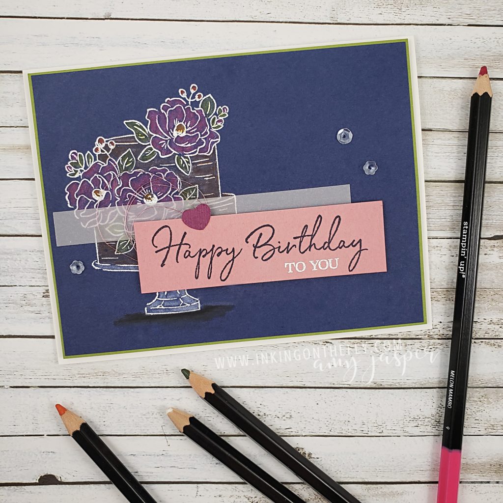
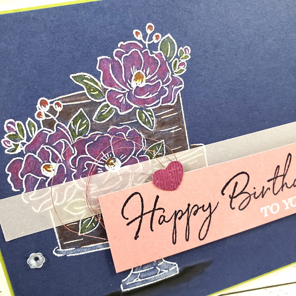
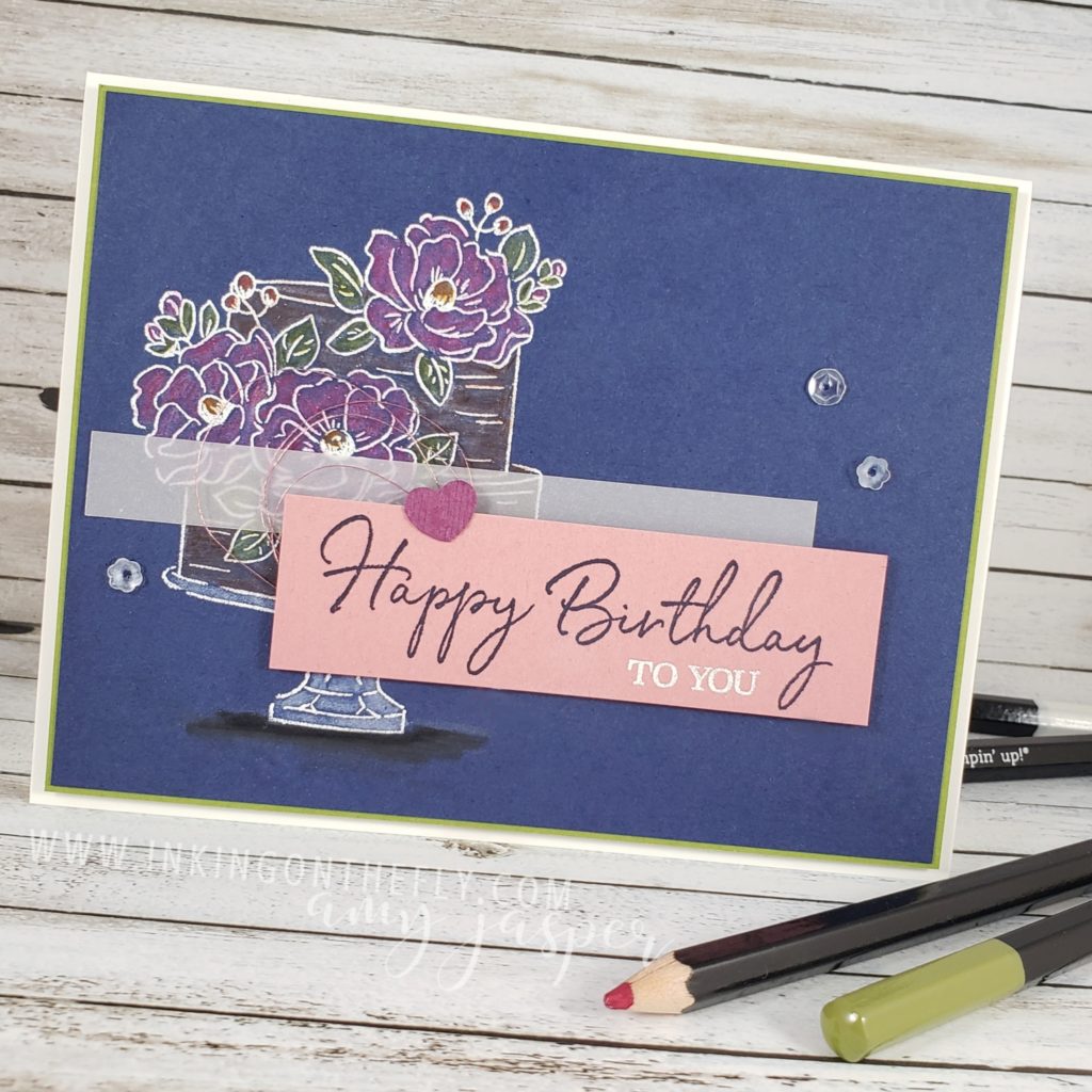
I used Night of Navy cardstock, stamping the cake image with Versamark ink, then heat embossing White Embossing Powder for a white image on the dark cardstock. I then used my white watercolour pencil from my Stampin’ Up! Watercolor Pencils to colour the entire image. This gives me a bit of a base, allowing the colour that I add over-top to be more vibrant on the navy cardstock. Over the white, I colored with Melon Mambo, Old Olive, Pumpkin Pie,  Early Espresso (chocolate cake! Yum!,) a bit of Real Red, and used Basic Black at the base of the cake stand for shadow. I didn’t use the white pencil there, though, as it wasn’t necessary. A Stampin’ Up! Blender Pen over each colour smooths out my scribbles.

I like how the colours changed on the Night of Navy cardstock. The Melon Mambo looks closer to Rich Razzleberry, Old Olive looks more like Mossy Meadow.

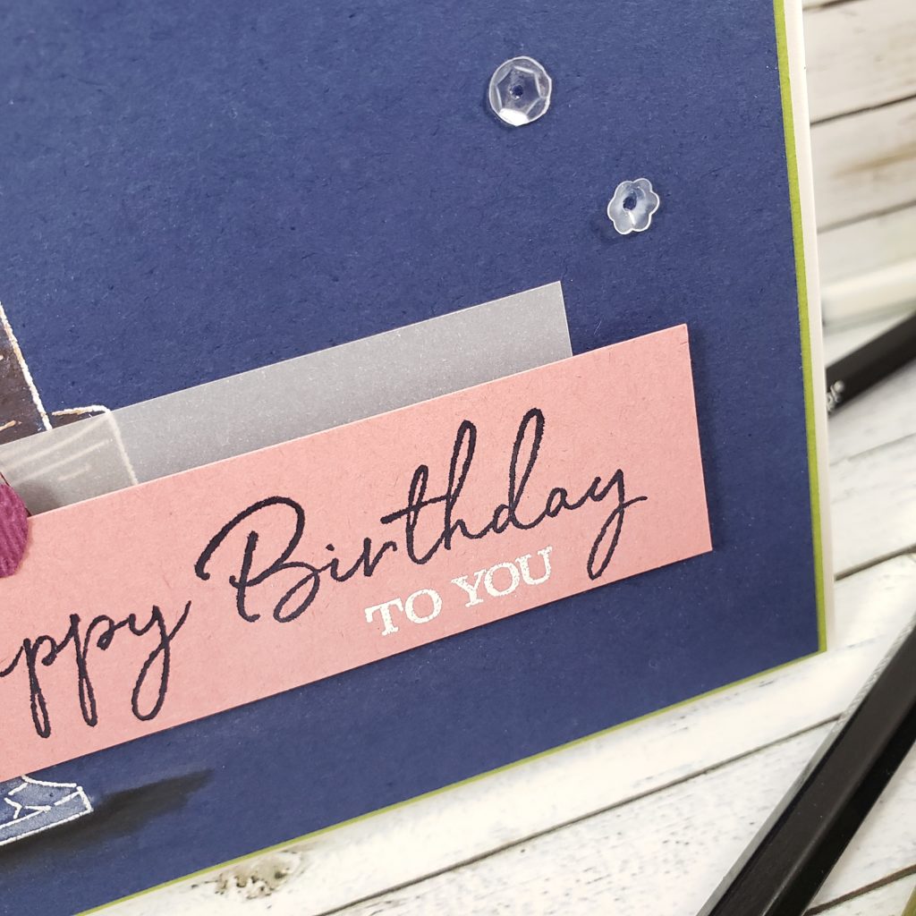
The sentiment is also from the Happy Birthday To You stamp set, which I stamped on the Rococo Rose cardstock with Night of Navy ink. I stamped the “to you” from the stamp set with Versamark ink and heat embossed it with the White Embossing Powder.

The rest is mostly layering and embellishments. The little heart was punched out of Rich Razzleberry cardstock using the Dog Builder Punch from Stampin’ Up!. To add some texture, I ran it through my die-cutting machine in the Subtle 3D Embossing Folder. I looped some Rose Metallic Thread underneath and attached the sentiment and heart over the strip of Vellum Cardstock with Stampin’ Dimensionals. The Night of Navy layer is adhered to a matte of Old Olive, which is layered on the Thick Whisper White card base with Stampin’ Dimensionals.

Finally, I added 3 of the clear sequins from the Peaceful Poppies Sequins pack, attaching them with a dab of glue from the Fine-Tip Glue Pen.

You can see what the other designers came up with over at the As You See It Challenge Blog and then you can create a card using the sketch and share it with us. We love to see your creative spin on the challenges.

Now, go create something!