As You See It

Purple for Christmas

We all have our go-to colours. The ones we know will lead us with a devout certainty to creating something beautiful. My colours are often blues and greens with soft neutrals and white to pull it all together. Those are my loyal colours. I trust them. I know what to expect from them. I know who they play nicely with.

But there are a few colours who aren’t trustworthy. They are the trouble-makers. They only want to play with very specific friends and become irritating when they are around any others. This is how I feel about purple. Not all purples wreak havoc, but most do. Currently, the worst of these hooligans is a colour called Gorgeous Grape. The purplest of all the purples. The worst of the worst.

You might want to defend purple in this moment, saying purple has been a comfort to you. Perhaps you would rather point your finger at orange instead. (how dare you! LOL!)

I think we all have an offending colour that we avoid using in our self-expression. We use what inspires us and makes us feel happy. It’s amazing how powerful a colour can be!

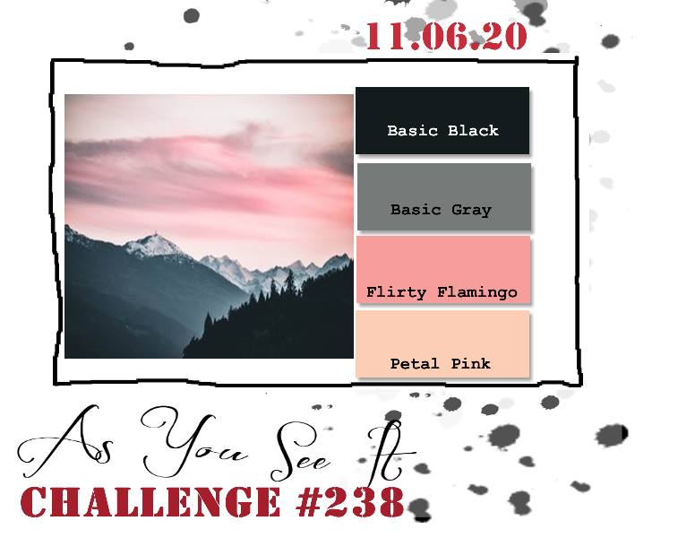
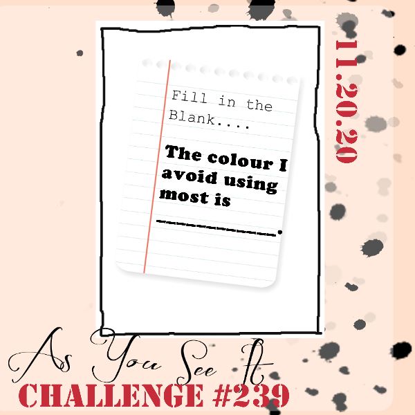
This brings me to announcing the fill in the blank challenge from the As You See It Challenge blog for which I have the pleasure of being a designer: The colour I avoid using most is _____.

Oof! This was a tough one. I really struggle with using purple in my card-making. It doesn’t inspire me and I only feel safe pairing it with gray and white. Well, I decided that this was my chance to play with it and give it a respectful effort. I would bring purple and “not gray” together. I didn’t really know what “not gray” was going to be, yet, but I was determined!

And you know what? I really like this card!

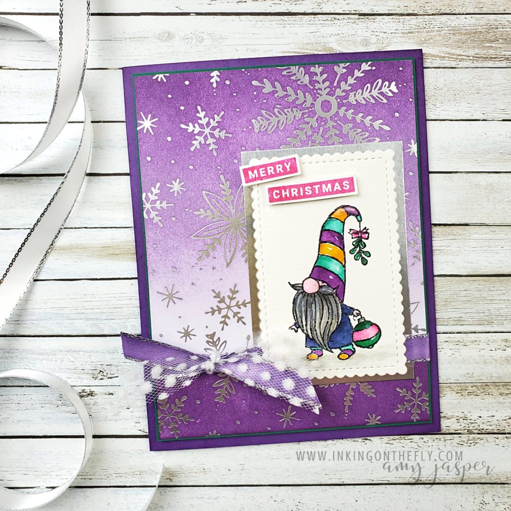
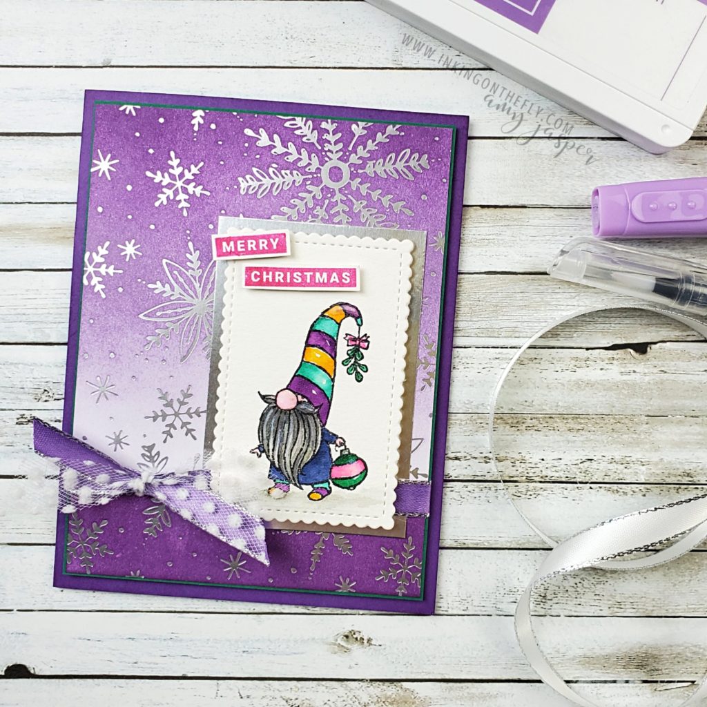
I started out with a piece of Feels Like Frost Designer Series Paper, which I sponged with Gorgeous Grape in an ombre from dark to light. I was off to a pretty safe start with purple and silver.

Next I stamped my little Christmas gnome from the Gnome for the Holidays stamp set on watercolor paper with Stazon Jet Black Ink and pulled out my set of Water Painters and got to water colouring my little bearded bearer of Christmas delight. I took my time and enjoyed the process of choosing my colours and waiting patiently for sections to dry so my colours wouldn’t bleed into one another. I even finished it off with some Wink of Stella to give my gnome image some holiday shimmer! Unfortunately, the Wink of Stella detail doesn’t show up well in these photos. You’ll have to take my word for it that it adds a an additional touch of whimsy.

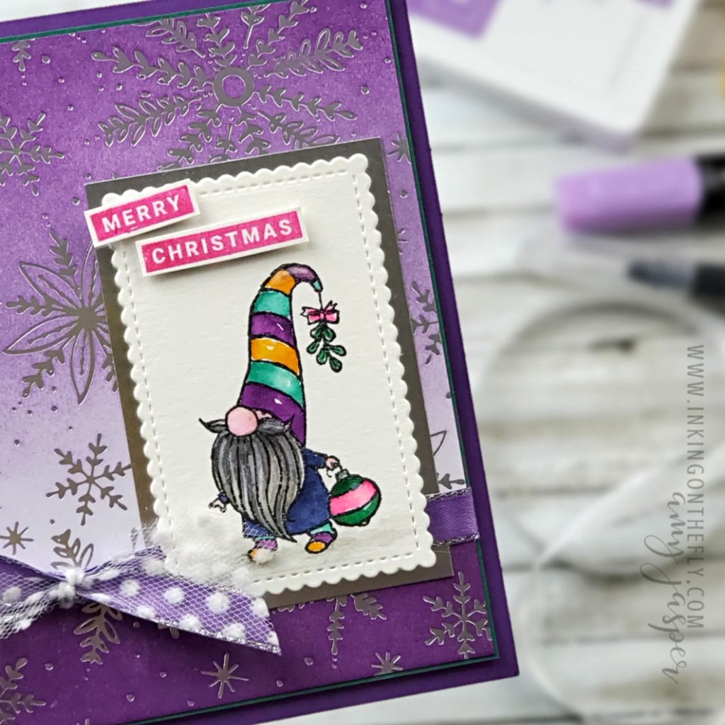
I added even MORE purple to my design by using the dark Highland Heather Blends Marker to colour the Silver Metallic Edged Ribbon. I love how you can make any white ribbon coordinate with your paper using markers! You’ll notice where the ribbon is wrapped around the card, the lightly sponged designer series paper suddenly becomes a darkly sponged area. That was a simple chopping off the top of my sponged paper and moving it to the bottom. I did a lot of crazy thing to make this darn purple work for me, by golly!

I’m not going to get into all of the products and techniques I used to make this card. It’s pretty late and time to cozy up in my blankets and pillows. If you have any questions about products I used or how I did anything on this design, I’d be happy to have a conversation in the comments. Ask away!

I hope you’ll take on this challenge. I warn you, though. It’s not an easy challenge. Give yourself time to get to know the colour you’ve been avoiding. This is your opportunity to learn more about it, who it plays well with and who causes it to be nasty and miserable. Maybe, like me, you’ll be surprised what you’ve come up with.

I wonder if I’d like this card even more if I made it “not purple”

Framed Winter Scene

I had the joy of my 14 year old daughter staying home with me on Wednesday for “take your kid to work day”. Basically, she got to stamp with me and I got to talk about what I love about Stampin’ Up! with her! It was a delight to work on this As You See It challenge together. I showed her how to use the Sponge Brayer to create a sunset sky and she thought it was very cool when I splattered water on the ink to create white spots that look like snow!

I was going to have her write part of this blog post, as she is quite the wordsmith, but we ran out of time. I’ll have to convince her to write for you another day.

Today’s challenge is a colour combination. I love pinks and greys together, so this was right up my creative alley!

I think these colours are stunning together! So soft and warm. I used the tree stamp from the Campology stamp set. I hadn’t used my new stamp set yet, so I was super excited to have the chance to break it in!

As you probably noticed, I decided that my sunset winter scene would be suitable as a framed piece of artwork. This would still make an amazing card, but I decided to create a 5×7″ art piece that I could display through the winter months.

I used my Sponge Brayer with Petal Pink and Flirty Flamingo ink to create the sunset sky. Then added some wisps of shadowy clouds with a sponge and some Basic Gray ink. I flicked water over this to create the falling snow effect. The trees from my Campology Stamp Set were stamped with Momento Black ink and the trunks were coloured in with a Light Basic Black Blends Marker.

I even added some additional white dots of snow using the Chalk Marker.

This sponged and stamped piece was layered over a thin matte of Whisper White and Basic Gray cardstock and adhered to the Whisper White/Plush Poinsettia Specialty Paper background with Stampin’ Dimensionals.

The Petal Pink frame was cut using the Stitched Rectangle Dies and adhered to the Plush Poinsettia Specialty Paper with Foam Adhesive Strips so it would frame the winter scene.

The sentiment from the Itty Bitty Christmas stamp set was stamped on Basic Gray cardstock, then heat embossed with White Embossing Powder and my Heat Tool. I sponged Tuxedo Black Momento Ink over the sentiment to make that white embossing really pop! This was adhere to the front of my artwork with more Stampin’ Dimensionals over a swirl of Linen Thread that I placed on the left side of the sentiment.

The final touch was to tie a double finger bow with the White Crinkle Ribbon and attach it and the Glitter Star Ornament over the swirl of Linen Thread with Glue Dots.

I popped it in a frame over a photo of my son when he was a baby (he was so chubby and smiley!!). When winter is done, I’ll switch the artwork out and put my son’s chubby little grinning face back on display!

I love this colour combination! I think you should try it to and share it with us at the As You See It Challenge Blog! We love seeing your beautiful creations!

As always, you can purchase any of the Stampin’ Up! products that I feature here on my blog. Just click on the SHOP button on my website and see all the gorgeous supplies that Stampin’ Up! has to make your crafting experience the best it can be!

Stay safe and get crafty!!

The Sun Will Come Out Tomorrow

This challenge was so hard!! I know what movies I like and I can make a card, but trying to combine the two was a completely different thing!

The challenge is a fill in the blank.

There are 12 steps to making a card for this challenge:

  1. Choose a movie from your long list of favourites
  2. Think about how you can represent that movie on a card
  3. Find a stamp set that will work with your idea
  4. Find a stamp set that will work with your idea
  5. Find a stamp set that will work with your idea
  6. . . . . . . . . .
  7. Choose a different movie
  8. Find a stamp set that will work with your idea
  9. . . . . . . . . .
  10. Just find a stamp set that will work with any of your many favourite movies
  11. . . . . . . . . . nevermind
  12. Make a card without any stamps and hope for the best.

Okay, so it turned out different than my first idea and even my second idea, but I actually stuck with the same movie. I just could NOT find any stamps that worked for me. I was probably trying too hard.

I won’t make you guess which movie. I wanted so badly to piece a bunch of different sentiments together to have it say “the sun’ll come out tomorrow”, but after extensive searching, I had to give up and use the word “smile” from the Daisy Lane stamp set. So, my card design goes along with “the sun’ll come out tomorrow” but the sentiment represents “you’re never fully dressed without a smile”. This is one of my all time favourite movies.


ANNIE (1982)

There have been a few attemps to remake this movie, but none of them even hold a candle to this one. Carol Burnett was perfectly crazy and amazing!

I ended up doing a whole bunch of crazy sponging on my card to create the clouds on Balmy Blue cardstock. I used torn pieces of paper as a mask and sponged Whisper White Craft ink, then sponged on some Balmy Blue where I wanted some colour variations in the sky and to soften my harsh lines. I also used a craft knife to cut along the top of a “cloud” so I could tuck my sun in behind it. (because it isn’t coming out until tomorrow, you know!)

I used the Stitched Rectangle Dies, the Parisian Embossing Folder (it’s hard to see on the white cardstock in these photos), and the Layering Circle Dies. Whisper White cardstock, Pacific Point cardstock for a thin matte, and So Saffron for the sun (which I sponged the edges of using Daffodil Delight ink). The sentiment was stamped with Versamark on the Basic Black cardstock and was heat set with White Embossing powder.

Do you see that sheet music? I expressed how I love sheet music patterned paper, so she gave me some actual sheet music! How fun is that!

As always, if you are in Canada and you like some of the products you see in my blog, you can purchase from me by clicking on the shop button on my page.

This challenge was really hard. Are you up for it? I bet you can do it! Give it a go and show it off at the As You See It Challenge Blog. We’d love to see how you worked one of your favourite movies into a card.