embossing

Inspired Thank You

055headerSo glad you could stop by today and check out my design for the As you See It Challenge Blog. I used the Kinda Eclectic stamp set for this unique framelit card.

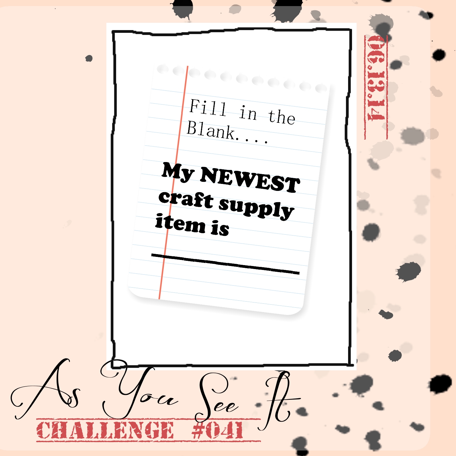
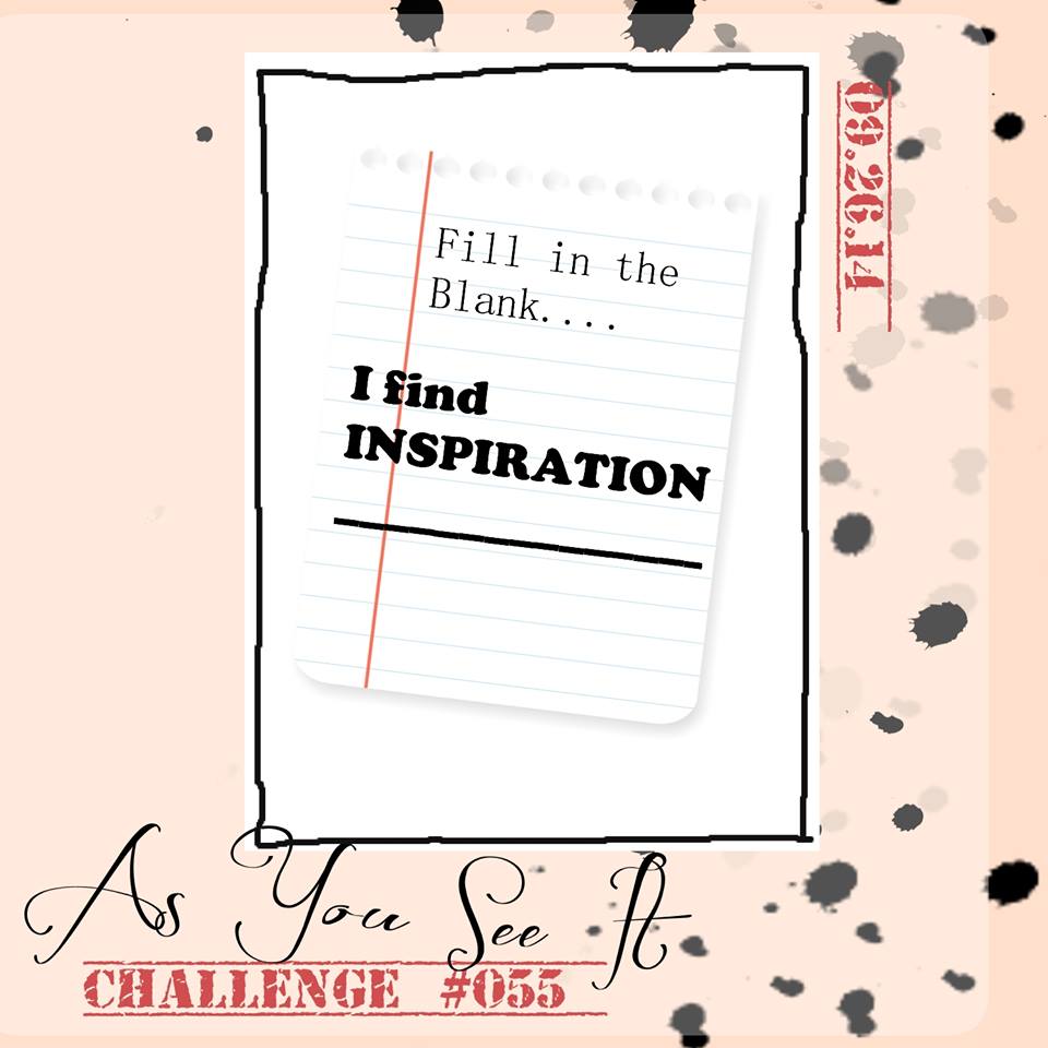
The challenge today is a little different as it’s a “fill in the blank” challenge. Where do you find inspiration?

#55Oh, so many places!

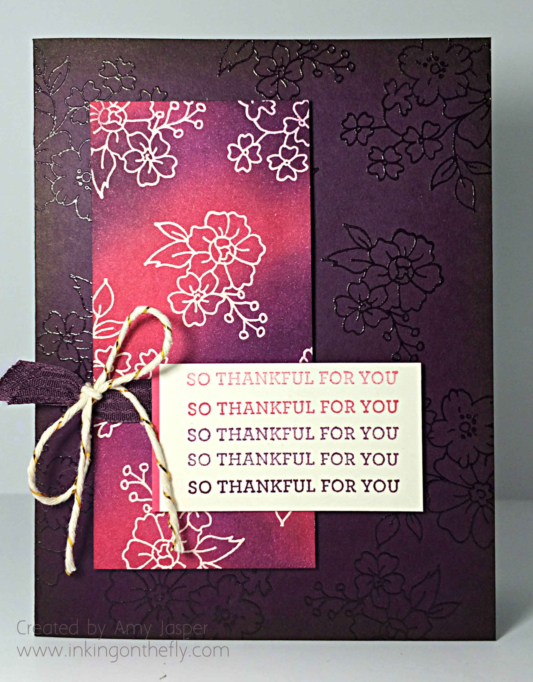
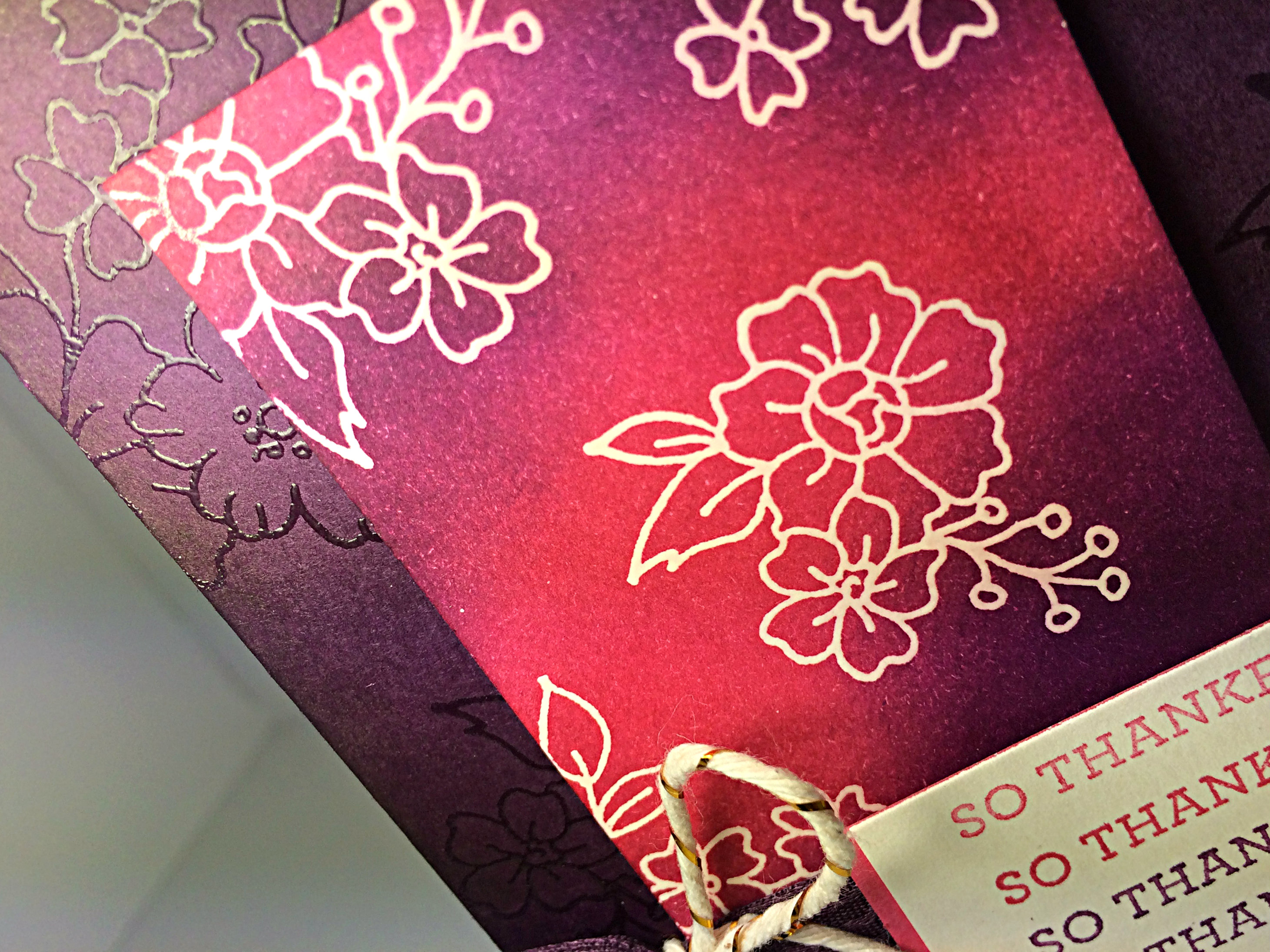
This particular card was inspired by online sources. I was looking for a technique to show my Monthly Stampers group for September and I came across a tutorial on how to use your framelits to cut a fancy edge on your card. I found this video on Pinterest that explains how to use a framelit to cut only the edge of your card.

055Amylessbright
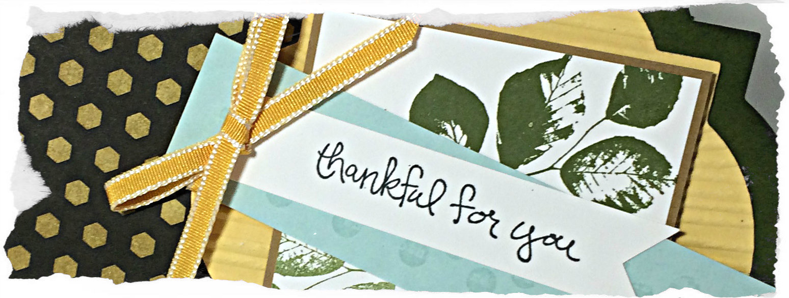
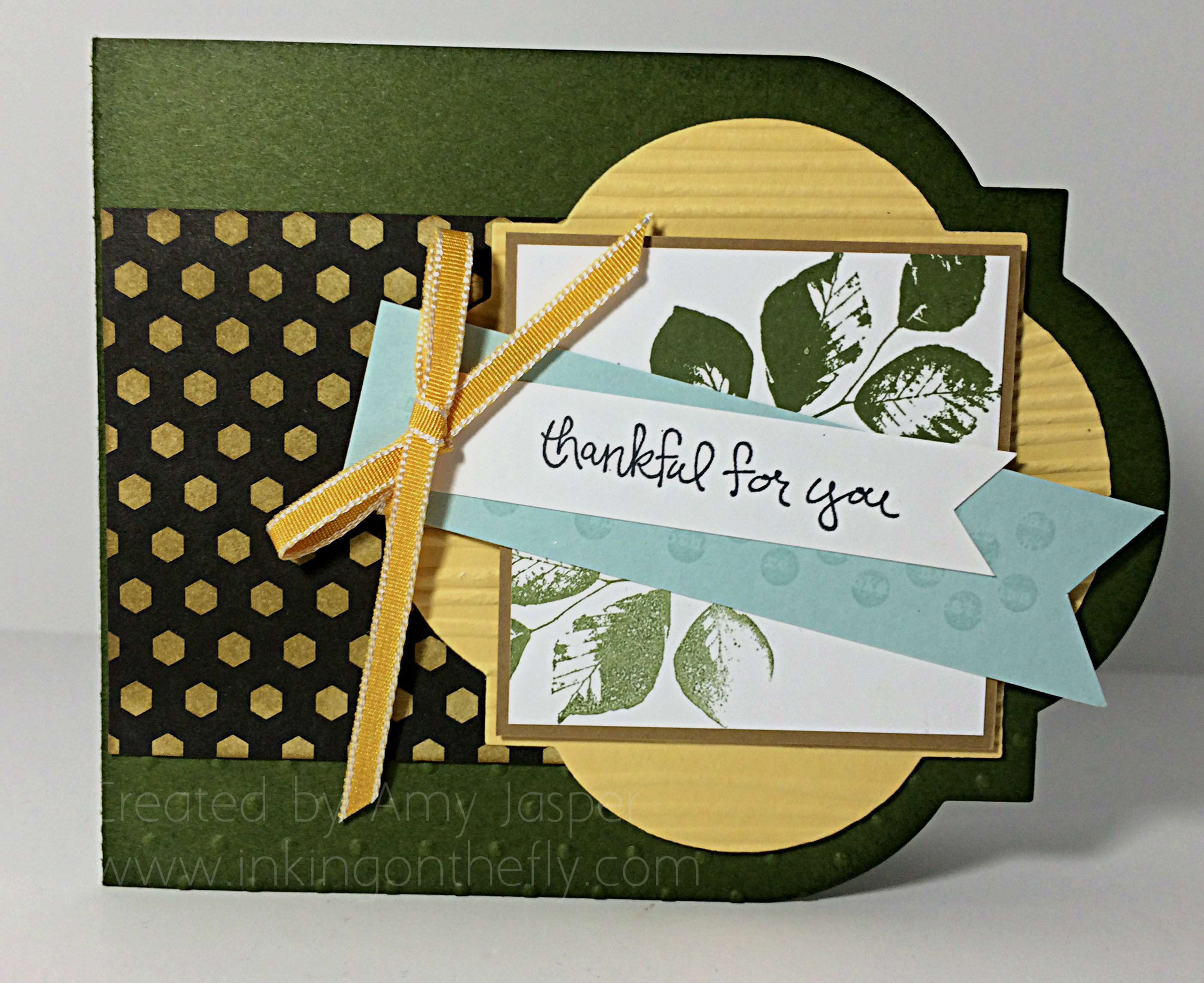
I also found inspiration through Pinterest when I saw a fabulous display of colour combinations using Mossy Meadow, which is the green card base you see here. The colour combination was a lovely fall colouring, but without the potentially dreary colours that are more traditional for fall. This one included Mossy Meadow, So Saffron, Soft Sky, and Baked Brown Sugar.

055sideview
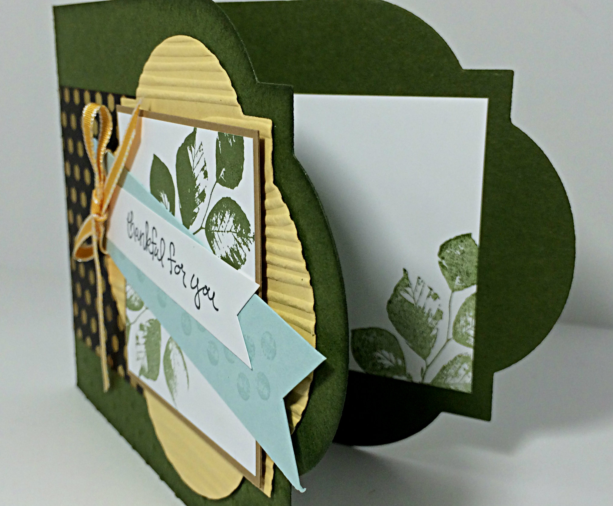
Bits and pieces of this design are also inspired by various projects that I’ve seen using this particular stamp set.

I find inspiration all over the place: Pinterest, Google searches, card swaps, Splitcoast Stampers, and random images or art that I see. I have a Pinterest board that is titled “Creative Inspiration” where I have interesting art work, colour combinations, techniques or just something interesting that reminds me of a Stampin’ Up product. I get lots of ideas from looking at other blogs and cards that you post on the As You See It Challenge Blog! So keep posting!

My card was designed for my technique class/monthly stampers group. We used the Window framelits, Good Greetings hostess stamp set, Kinda Eclectic stamp set, Woodgrain Embossing folder, Polkadot embossing folder, sponges with Mossy Meadow ink on the Mossy Meadow cardstock, Back to Black Designer series paper (which we altered by sponging heavily with the Baked Brown Sugar ink), and the Crushed Curry 1/8″ taffeta ribbon.

I hope you’ll share your inspiration with us for Challenge #55 at the AYSI Challenge Blog! I look forward to being inspired!!

Amy.

Designer-Badge


Thankful in Berry Tones

049header

Welcome to my blog where I share my love of designing using products by Stampin’ Up!

If you are a regular follower of my blog, you may have noticed a bit of a pattern on Fridays, lol! Here we are on Friday again and it’s time for another As You See It Challenge design!


#49

I love Blackberry Bliss. It’s such a rich tone. I normally don’t like to work with purple, but I’m getting better at it. Blackberry Bliss is definitely easier for me than other purples, though (just don’t expect me to pair it with yellow very often!)

049Amy

I decided to play with the hostess set “I Like You”. When I got this set, I was excited to colour those flowers with my new Blendabilities, but it looks lovely as a line image too, don’t you think?

I had some fun embossing with clear embossing powder for this card. I used my Embossing Buddy on two pieces of cardstock: the Blackberry Bliss card base and a rectangular piece of Very Vanilla, then I stamped with my Versamark ink (the cleanest ink pad of THREE that I have as I inevitably muck them up with ink transfer from supposedly ‘clean’ stamps). I embossed with my heat tool and clear embossing powder.

The card base, I set aside, while the Very Vanilla piece was sponged heavily with Blackberry Bliss ink and Strawberry Slush ink. If you’re familiar with this technique, then you know that the water-based ink will not stay on the embossed areas. Just wipe off the traces of ink with a paper towel to reveal the Very Vanilla colour that has been protected by the embossing powder for this Emboss Resist technique.

049technique close

The sentiment was done using precise stamping with varied amounts of ink. You can use the Stamp-a-ma-jig to help with your placement. I was trying to get an ombre-like gradient of colour each time I stamped the sentiment. I used Strawberry Slush and Blackberry Bliss, stamping off for the lighter images and using full strength ink for the darker images.

049closetwine

Give this colour combination a try and link up your photo to Challenge #49.

I hope you’ll leave me a comment (this blog refers to them as a “reply”) and let me know your thoughts. I have been missing your encouraging words 🙂

Amy.

Designer-Badge


Excuse me, I mustache you a question …

041header
Welcome to my blog where I share my love of designing using Stampin’ Up paper, tools, inks and stamps! I wanted to share what I recently did with my new Mustache Framelit and Little Letters Thinlits! All this for the As You See It Challenge blog for which I am one of the designers.

It is time for another challenge from the As You See It Challenge Blog!

AYSIChallenge041

I really like challenges like this one because it’s left WIDE OPEN!! Because of the recent new catalogue, I actually have a lot of new craft supplies, but in my last box received from UPS were a few things that I was particularly excited about trying: My new Little Letters Thinlits dies and my Larger Than Life Alphabet & Numbers Photopolymer set. I really love all alphabets because they provide so many possibilities! These are also quite cost effective alphabets in comparison to getting them in alternate forms. The thinlits are much much less costly than they would be if they were offered as a Bigz Die set (though Bigz dies do offer the cutting of many more materials, while thinlits are limited primarily to paper products). The photopolymer alphabet sets (as in the case of the Larger Than Life set) is less costly than the red rubber stamps in either the clear mount or wood mount options.

041Amy

I love how the Little Letters thinlits can also be lined up on a piece of paper to cut one word – ALL AT ONCE!! This framed art showed how the thinlits can be used to add the letter A in black cardstock, but it also shows how they can be used to take away the shape of the letters from the grid patterned paper (from the new Typeset Specialty Designer Series paper) to reveal the Gold Foil Paper underneath.

041question

I lost the center of my letter “Q” for a bit there, but had a little party when I found it on the window ledge where I’d “put it away where I would find it”! The entire time that I was creating this framed project, I kept saying “I mustache you a question” at random moments to my friend, Gwen who was stamping with me at the time. I even made up a song (oh if only I could write music, it would open up so many fun possibilities!):


 “I mustache you a question,

It won’t take very long.

I mustache you a question,

I mustache it in song”


I should have paid more attention in piano lessons, lol!

041mustache

The adorable Mustache Framelit was one item from the new Catalogue that I just couldn’t pass up. I used Basic Black cardstock and, after cutting it out with the mustache framelit, I used my Perfect Polka Dots embossing folder to add texture and make it even more fun. The mustache is, of course raised up with Stampin’ Up Dimensionals.

Those beautiful gold embossed letters are from the Larger Than Life Alphabet and Numbers set. I love the boldness of these letters!

041Amy

Now the entire is framed with a thin mat of Gold Foil paper that also shows through the cutout of the letters spelling “question”. Then I have it matted with Basic Black cardstock and finally matted again with the 8×10 piece of Naturals Ivory cardstock so that it would fit in the black frame.

I love it and it makes me smile! I hope it does the same for you!

What is your most recent craft supply item? This is an easy one for you to submit to the challenge blog! Who doesn’t want to create something with their new supplies?!! All you have to do is put it on Pinterest or your blog and link it up to the challenge!

Don’t forget to leave a comment and have your name entered into the draw. Only a few days left before the draw date on Sunday, June 15th!

Thanks for stopping by!

Amy


Designer-Badge