Work of Art
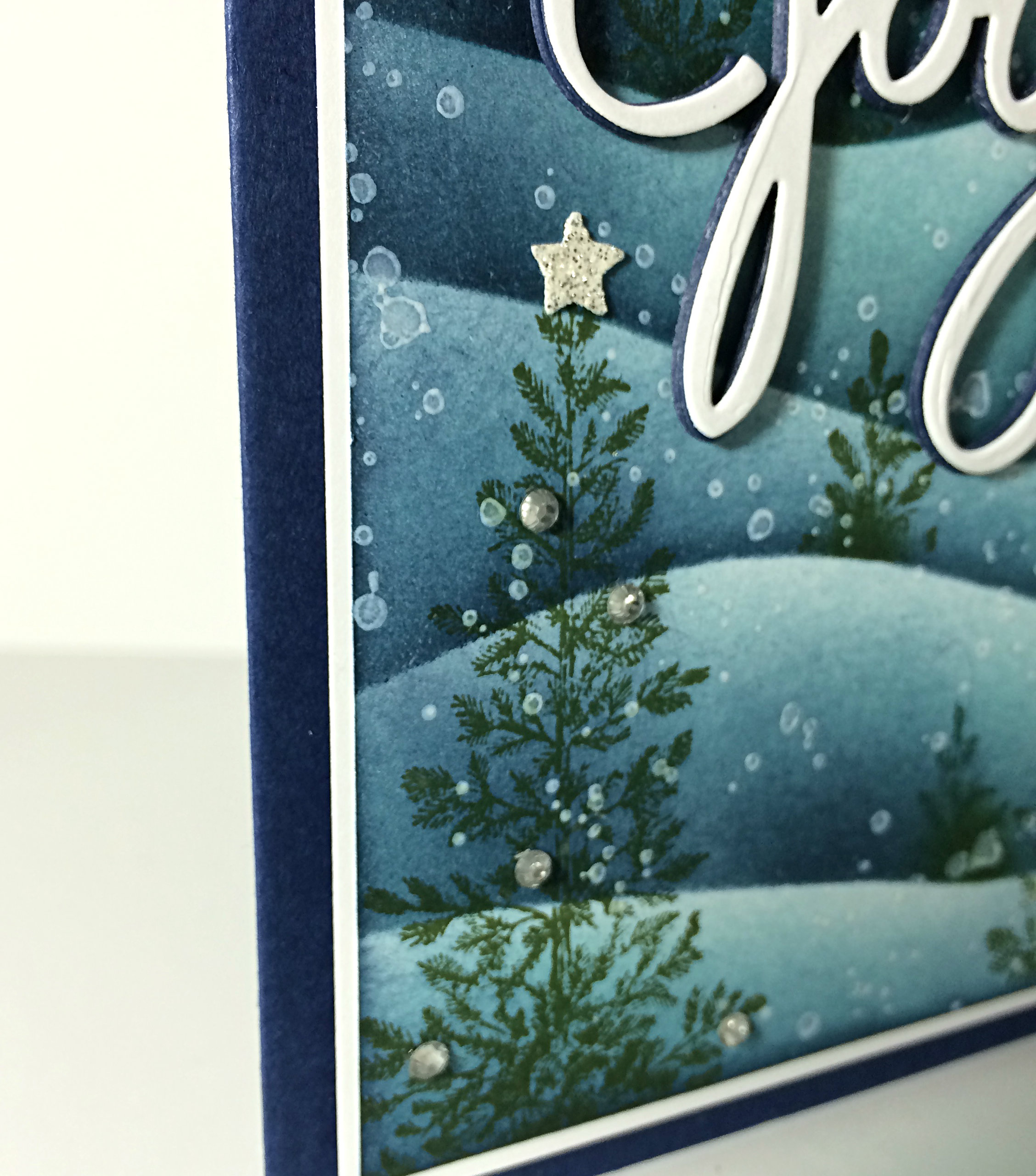
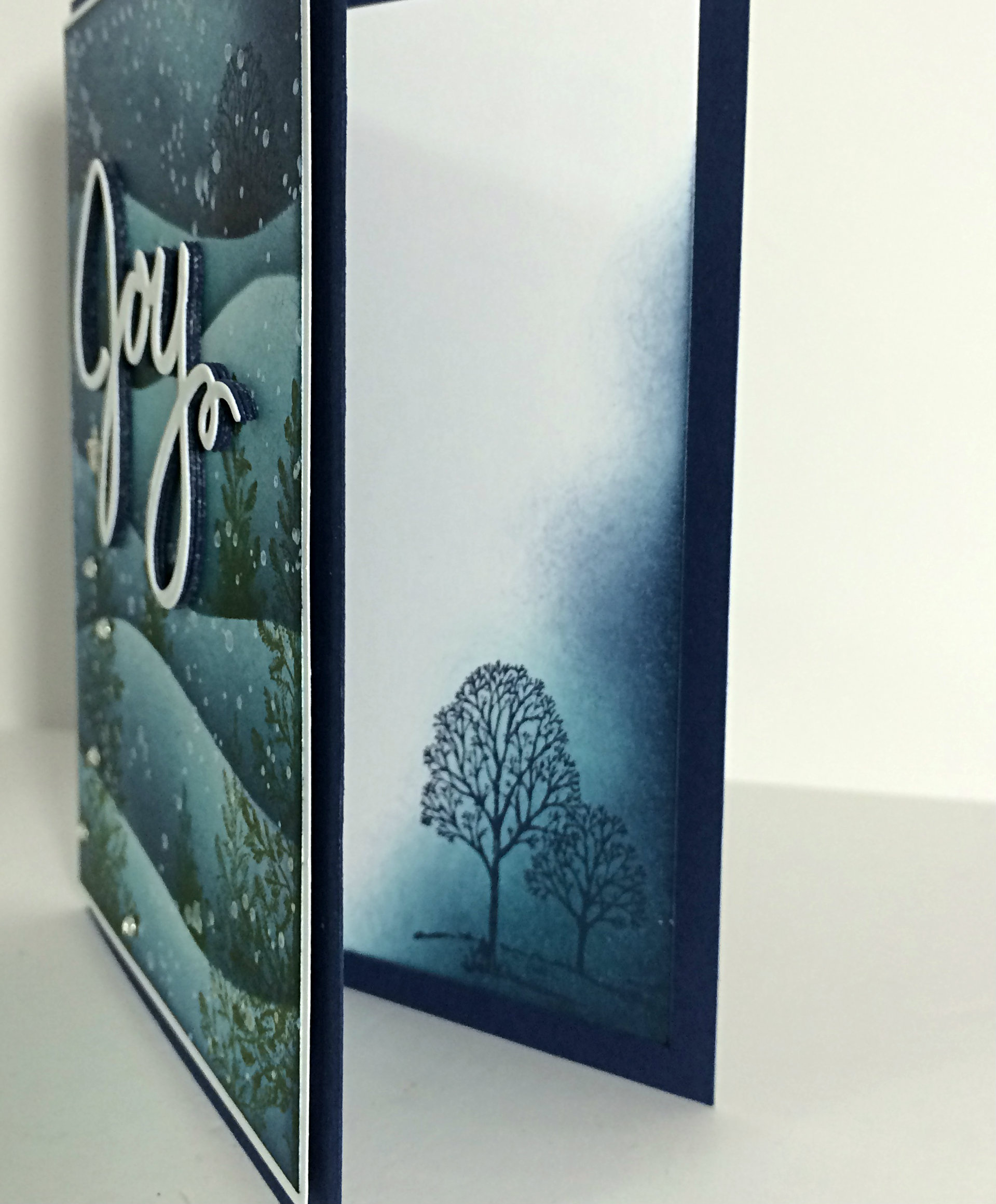
 Check out my design this week using the Trust God stamp set with a little flare. This card shows off my artistic side using layers of sponging, stamped images, and even a bit of a watercolour technique. I had fun with it. It might just end up in a frame and given as a gift.
Do you ever consider that a card you’ve designed could be a gift? You really should. With the love and attention that each card receives as you choose your colour scheme, your layout, the mood of your project and the sentiment that speaks to the one who receives it – your card is an offering of a part of you. We think of greeting cards as a means of communicating our thoughts and well-wishes to the recipient. But they are so much more than that! If we wanted only to communicate, we could write a note on a plain piece of paper and give that instead.
No, our cards are more than a written note. They are a piece of us – an extension of our hearts, of our love, of our personality. I think that’s why I can’t give away a card that I don’t like. It just doesn’t fit; it feels wrong!
(sometimes I can’t give away a card that I really love either – because it’s so much of me. It’s like it needs to go to the perfect person; one who would understand the love that I am giving away)
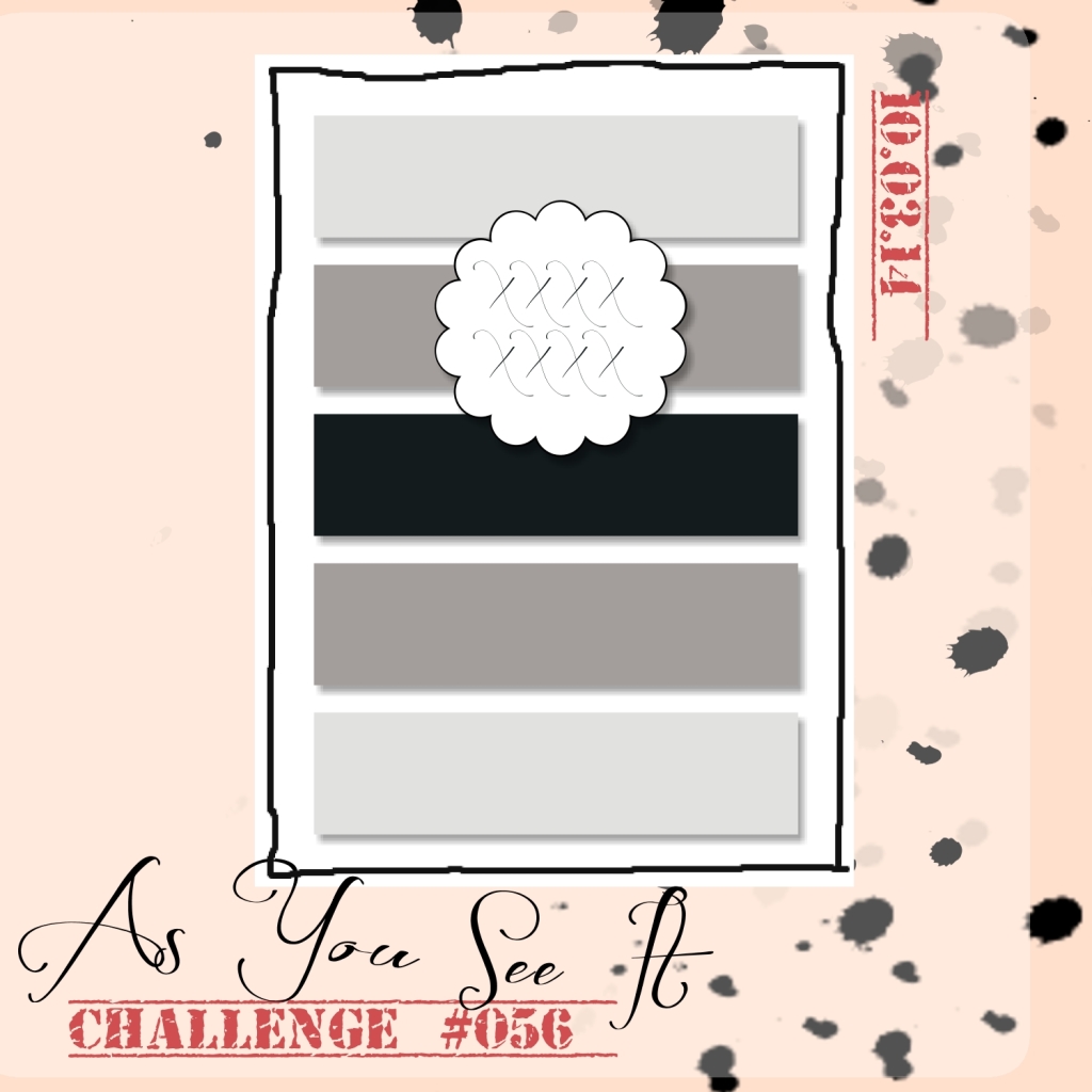
My design today is inspired by this week’s As You See it Challenge. Assortment challenges can be a bit more difficult at times, but they are also an opportunity to really stretch those tight creative muscles.
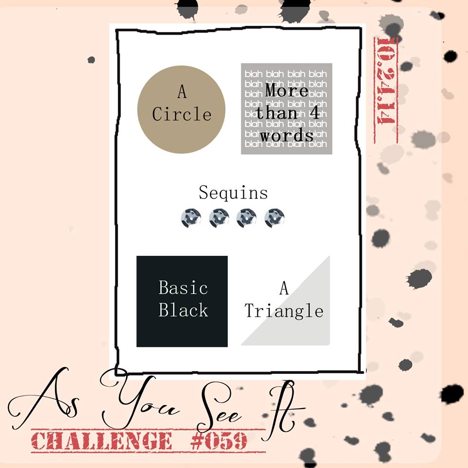
(I like the “more than four words” element. The blah blah blah blah made me chuckle.)
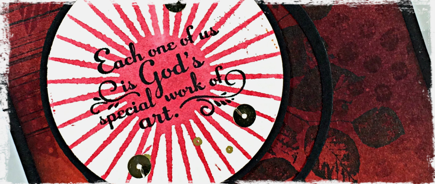
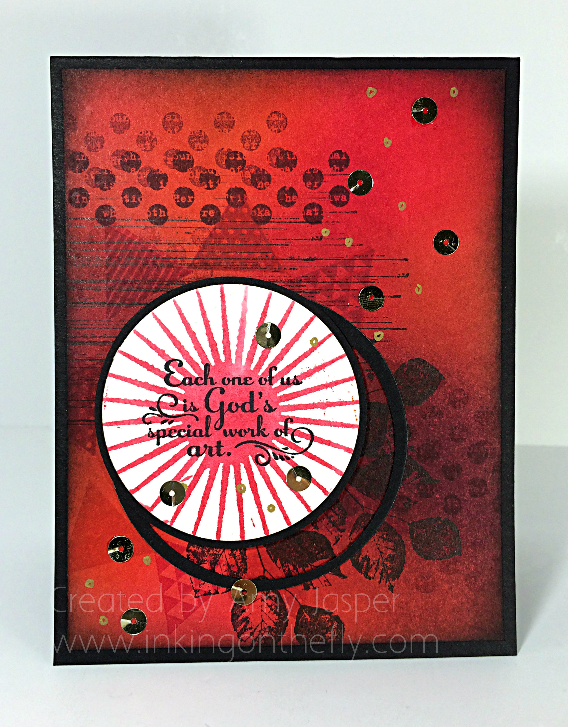
Somehow, I knew what I wanted to do with this card right away. I envisioned a sunburst image made up of a circle surrounded by triangles as rays of light. Light makes me think of God (Light of the world), so I immediately looked at my Trust God sentiments to see what would fit in the circle. The sentiment I chose fit perfectly considering that my card itself would be a bit artistic, than paper crafty.
 I really wish you could see this one in person. I am really pleased with how it turned out! Photos never do cards justice. They are always better in your hand.
It began with a circle cut with my Circle framelits from a sheet of Watercolour paper. I inked up the sunburst stamp from the Kinda Eclectic stamp set in Strawberry Slush ink, then spritzed it with a fine mist of water until I was able to see a few droplets of water on the rubber. This I stamped on the watercolour paper and allowed it to dry before stamping the sentiment from the Trust God stamp set in Jet Black Stazon ink. I first tried to mat the image using the next size up of the Circle Framelits, but that was just too much black. So I took the black circle that I didn’t want and punched out a circle from it with my 2.5″ Circle Punch. I was left with a remaining ring of black, which I decided was going to be used on my card!!
The card base is Basic Black cardstock. On it is the sponged and stamped layer that was transformed from Calypso Coral cardstock, to the finished result that you see on my card. Using Stampin’ Up sponges, I added Tangerine Tango, Strawberry Slush, Melon Mambo, and Rich Razzleberry ink until the cardstock was filled with rich colour. I also sponged Tuxedo Black Momento ink all around the edges of the cardstock. This draws the eye in and, I think, gives a more finished look to the paper.
The triangles from the Geometrical stamp set were stamped in Real Red and Melon Mambo around the circle. I also stamped the dots image from the Kinda Eclectic stamp set and the sketched line image from the Gorgeous Grunge stamp set using Rich Razzleberry ink. The leaves from the Kinda Eclectic stamp set were stamped with Tuxedo Black Momento ink.
Once I was happy with my image placement, I adhered the layers. The matted circle is raised up with Stampin’ Up dimensionals (whatever would I do without these precious sticky-foam risers!)
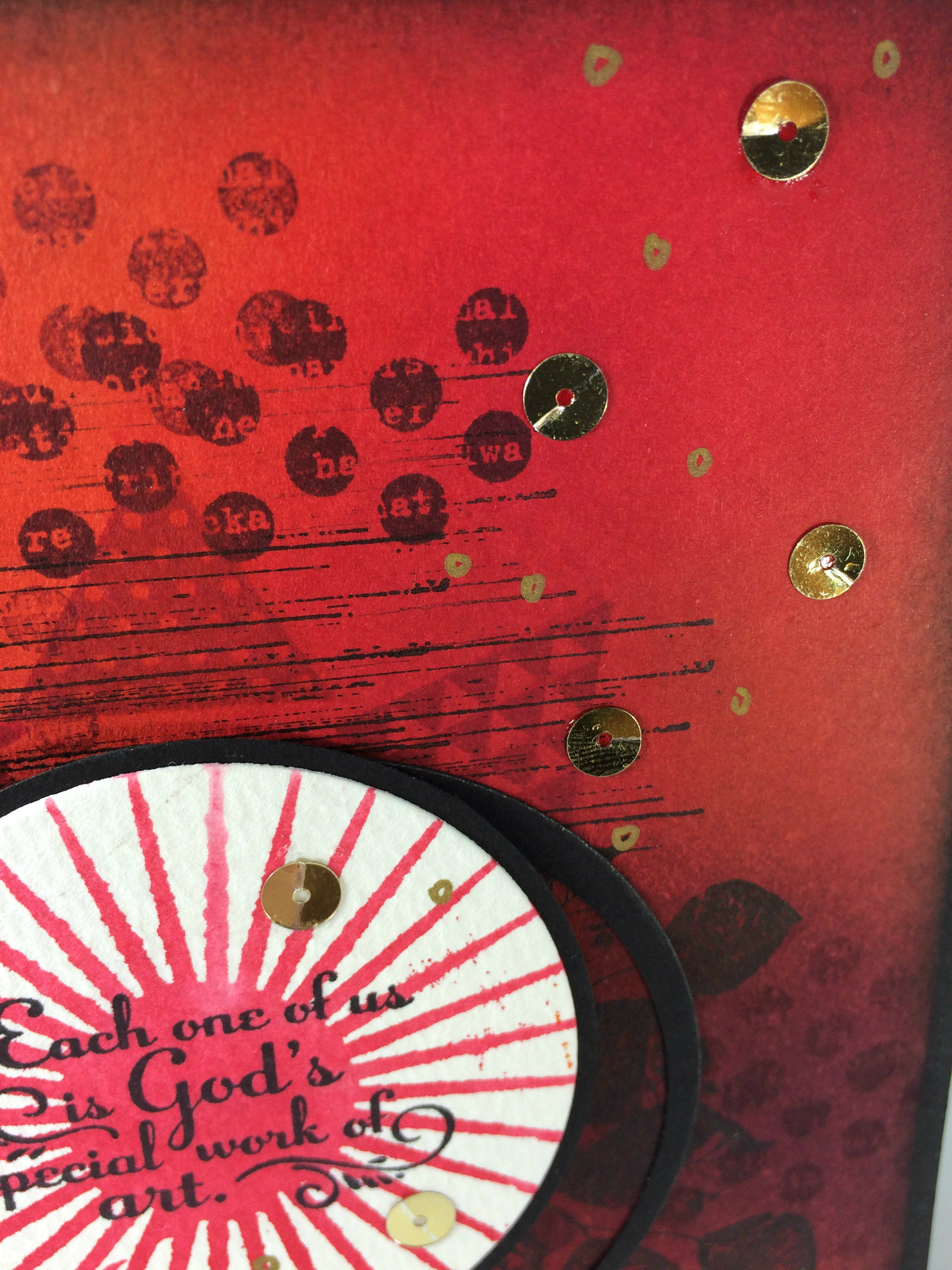
The final touch was to add the gold sequins. I prefer to use Crystal Effects for my sequins as it dries clear and is no longer sticky when dry (unlike other Stampin’ Up adhesives that stay sticky where it isn’t covered). The sequins on their own just didn’t seem like enough, so I grabbed my Gold Stampin’ Dazzle Marker (who names these things?) and with shaky hands, worried I would ruin my ENTIRE card, I added little hand-drawn circles so they could play with the big kids. I only had to add one or two extra sequins to cover up little circles that got out of hand.
And there you have it.
I hope you will give this challenge a try. Just head on over to the As You See It blog, check out the other designers’ projects, then get in your crafty space and make something! Don’t forget to link it to the challenge page so we can all be inspired by your take on this one!
I’m heading off for a stamping weekend at a the beautiful Rockridge Canyon Conference and Retreat Centre! I hope to finish the weekend with lots of projects that I can share with you over the next few weeks or through classes that I will offer in the next couple months. I’m so excited for some ultimate design time!!
Hope you get some amazing design time this weekend, too!
Amy
![]()