Gorgeous Grunge

Time for Tinsel

And here we are, in British Columbia, Canada, with the frosty cold weather finally upon us, the crunchy snow squeaking under our feet, the “whoah-that-was-close” feeling when you slip on a patch of ice and catch yourself just in time, the thoughts of Christmas decorations and all the crafty plans to make the season bright, and the cozy pleasure of drinking rum and Eggnog by the fire.

This is a season filled with warmth of heart. Family, friends, good deeds, and good food, all contribute to internal warmth when the weather outside is frightful.

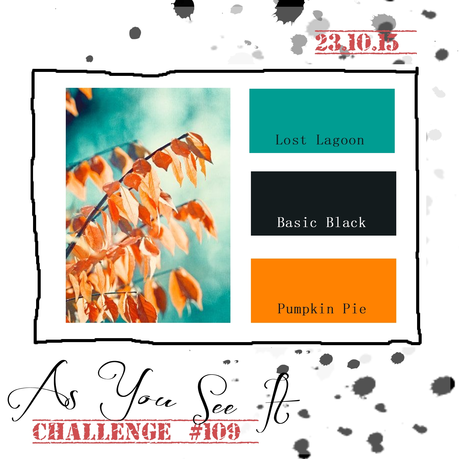
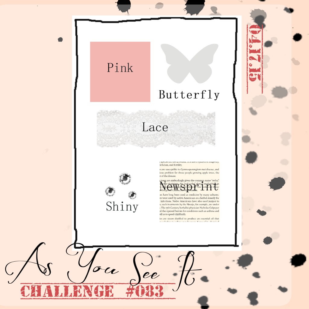
Christmas cards are part of the sharing of that warmth – warming the hearts of others. The colour challenge for today’s As You See It Challenge might help you warm someone from the inside out!

AYSIChallenge114-1024x1024

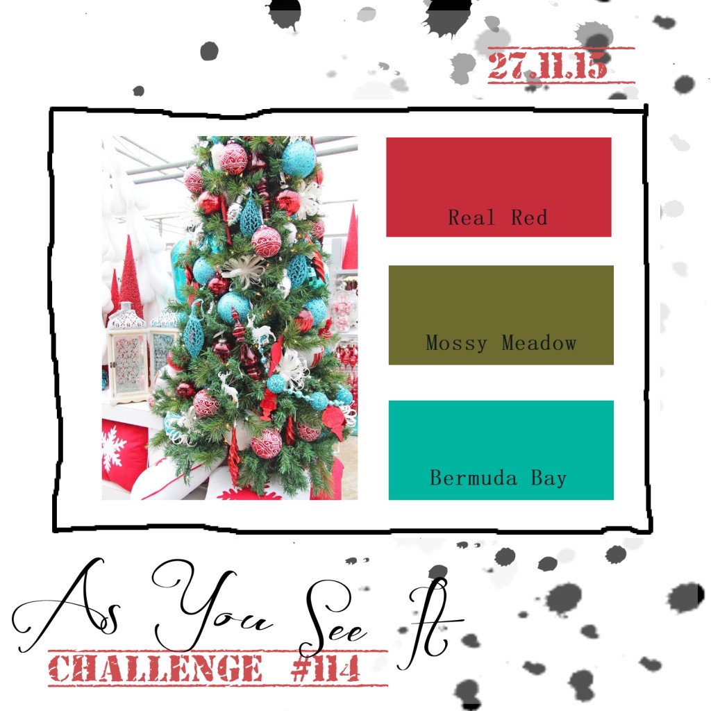
Love these crazy colours. The Real Red and Bermuda Bay combo is wild and playful, while the Mossy Meadow is the “calm it down” addition to the trio.

I decided to work with a lot of white space to make my card bright and wintery with pops of colour to keep it fun!

114angle

I used the Whisper White Thick Cardstock for the card base (LOVE that stuff!), then did a narrow mat layer of Whisper White under the decorated layer of Whisper White that is paper pierced all around the edge using my Paper Piercing Tool, Stampin’ Pierce Mat, and my Updated Essentials Paper Piercing Pack. That layer is raised on Stampin’ Dimensionals to allow the shadow beneath it to accentuate the paper piercing detail.

114starclose

The decorated layer of Whisper White was stamped using the splotch images from the Gorgeous Grunge Stamp Set. I used Bermuda Bay and Mossy Meadow ink. Then I added the strip of the Holiday Fancy Foil Designer Vellum, before placing my star image with the sentiment.

The sentiment is from the Versatile Christmas Stamp Set and is stamped in Jet Black Stazon Ink on Whisper White cardstock. This was then carefully die cut with one of the stars from my Star Framelits. I then used my Paper Piercing Tool again with the template to add the paper piercing detail on the star.

114starsThe star was adhered to the card front with Stampin’ Dimensionals.

The little stars were created with the Confetti Stars Punch from Whisper White cardstock and Red Foil paper. These were adhered with the very beloved Fine-Tip Glue Pen, perfect for adhering all your little detail items to your projects!

The Red Pom Pom trim and the Bermuda Bay Baker’s Twine were the perfect compliment to the playfulness of this card design.

114Amy1Be sure to stop by this Tuesday to see what I have for blog candy!! It’s coming!

Have a great weekend! Be sure to play along this week with this fun colour combination. I hope you share what you come up with by linking it to the As You See It Challenge Blog. I can’t wait to see!!

Orange Watercolour Wash

Last week, the As You See It Design team honoured Lola, a little girl in the midst of her 5 year battle with Leukemia. We asked that you would create cards with fairies, unicorns, pink, gold, or glitter so that she could view them digitally and enjoy the love and best wishes that they represent. The challenge itself is complete, but the link to load your cards is still active on the website until November 16th. If you haven’t posted a card yet, there’s more time available to shower Lola with kindness. I hope you will take the time to make a card for her and upload it to the As You See It page HERE. She will get to view all of the cards. I know it will put a big smile on her face to see how many people are cheering her on!

For today’s challenge, we have a colour combination.

AYSIChallenge109

I chose to use these colours to make a birthday card. One might call it a masculine birthday card, but I don’t like to generalize. This card could be used for anyone who appreciates these colours or this style of card.

Orange Watercolour Wash birthday cardEver since I discovered, while doing the card for a previous post, how much I like this Watercolour Wash background stamp on an angle, I keep wanting to use it! This time I inked it up with my Pumpkin Pie, Lost Lagoon, and Tuxedo Black Momento ink pads. I sponged on the stamp to soften the edges between colours, then stamped it on two layers of Whisper White cardstock at the same time. This allowed me to use the smaller piece for the 2 U sentiment as a layer while still maintaining the continuity of the colour wash over the entire card front.

Orange Watercolour Wash Birthday Card up closeThe letter ‘U’ is from the Larger than Life photopolymer stamp set, which was stamped with Versamark ink and heat embossed with Basic Black embossing powder. I die cut the ‘2’ with my Big Shot and Little Numbers Thinlits and adhered it with my Fine-Tip Glue Pen. The Happy Birthday sentiment is from the Tin of Cards stamp set.

The splatter image from the Gorgeous Grunge stamp set was added in Tuxedo Black Momento ink to the background before adding my layers.

I’m in love with the simple looping of thread and twine on my cards, so I took the black thread out of my Basic Black Baker’s Twine and looped it to add some needed texture to this one.

This card will be added to my Tin of Cards tin as one to save for my family. My nephew and my brother both have birthdays coming up in December. One down, one to go!

Be sure to upload your take on this colour challenge to the As You See It Challenge page. It doesn’t have to be a card, either!!

Butterfly Fancy Gate-Fold Card

083header

Just a quick post today with a card that was more of a prototype than a finished piece. I was hoping to tweak it a bit before sharing it with you, but hopefully you’ll see where I’m going with it!

Here’s the challenge from the As You See It Challenge blog this week – an assortment challenge!!

AYSIChallenge083-1024x1024

I wanted to try to create a card for this one to mimic a very simple concept that I saw online for a birthday invitation. It was a gate-fold card with a butterfly opening. So, I pulled out my Butterfly Thinlit Dies and started to figure it out. This card was my first attempt:

083Amy083open

It was a bit of an awkward fumble to extend the cardstock beyond 11″ in order to make room for the butterfly cut out. This one ended up with a lot of fussy cutting to make it work. I then tried creating a second card with less pink on it (this is a LOT of pink for me, lol!).

083blue083blueopen

So, I went from all pink to almost no pink (just the In-Colour Sequins), but still I don’t feel like I’ve hit the mark with the design or the technique to get there. The second card uses two 5.5″x11″ pieces of cardstock to get the effect on the front. A bit of a cleaner finish that works, but I still want to work on this card design a bit more. I’ll keep you posted.

What do you think? Is this something you’d like to try?

What would you create using the elements of this Assortment Challenge? Can’t wait to see it!

Amy.

Designer-Badge