masking

Pedal Pusher Reflection

Life is full of re-evaluations, reflection, and adaptation. I am smack dab in the middle of all of that as I try to figure out the priorities and values in my life. Sometimes, my stamping has to take the back burner while my family or other adventures take over. I want to learn how to play the guitar, I want to sew more, I want to be more active – these things will take some of my time, but I still want to stamp. I’ve been less consistent on my blog because of my ventures in life and I can’t be sure how each week will look for me on my blog. However, today, I do have a card to share with you!

I started with these beautiful bright happy and inspiring colours from the As You See It Challenge blog.

127
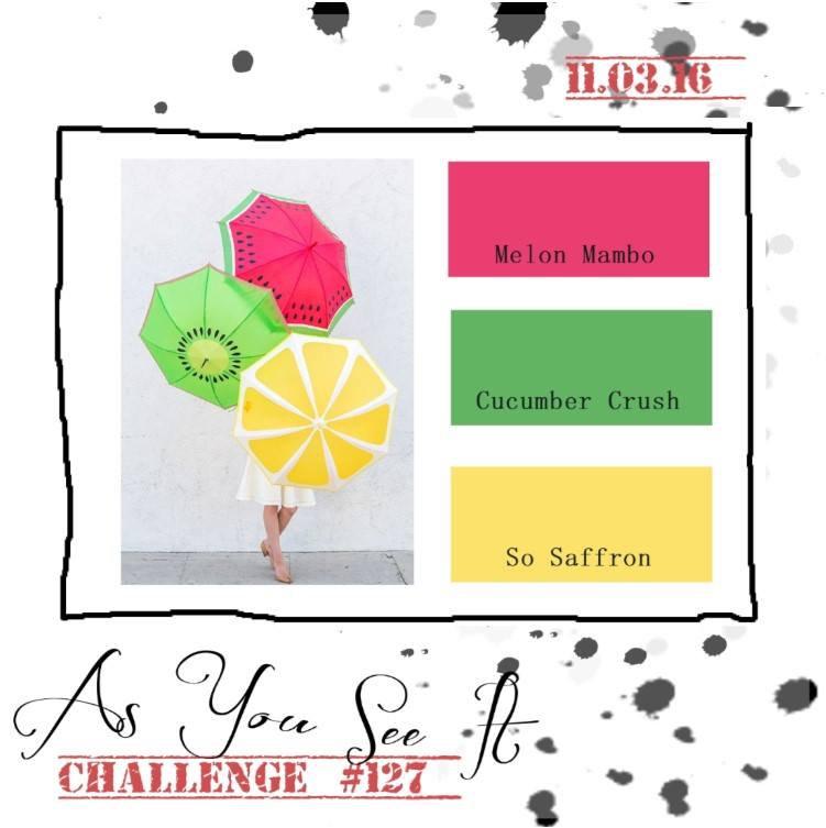
I love all of the Sale-a-bration free products from Stampin Up! The stamp set that I used for this card is one of the more recent stamp sets you can now get for free with a $60 purchase. It’s adorable and perfect for this happy spring colour challenge!

Pedal Pusher Reflection card by Amy Jasper www.inkingonthefly.com
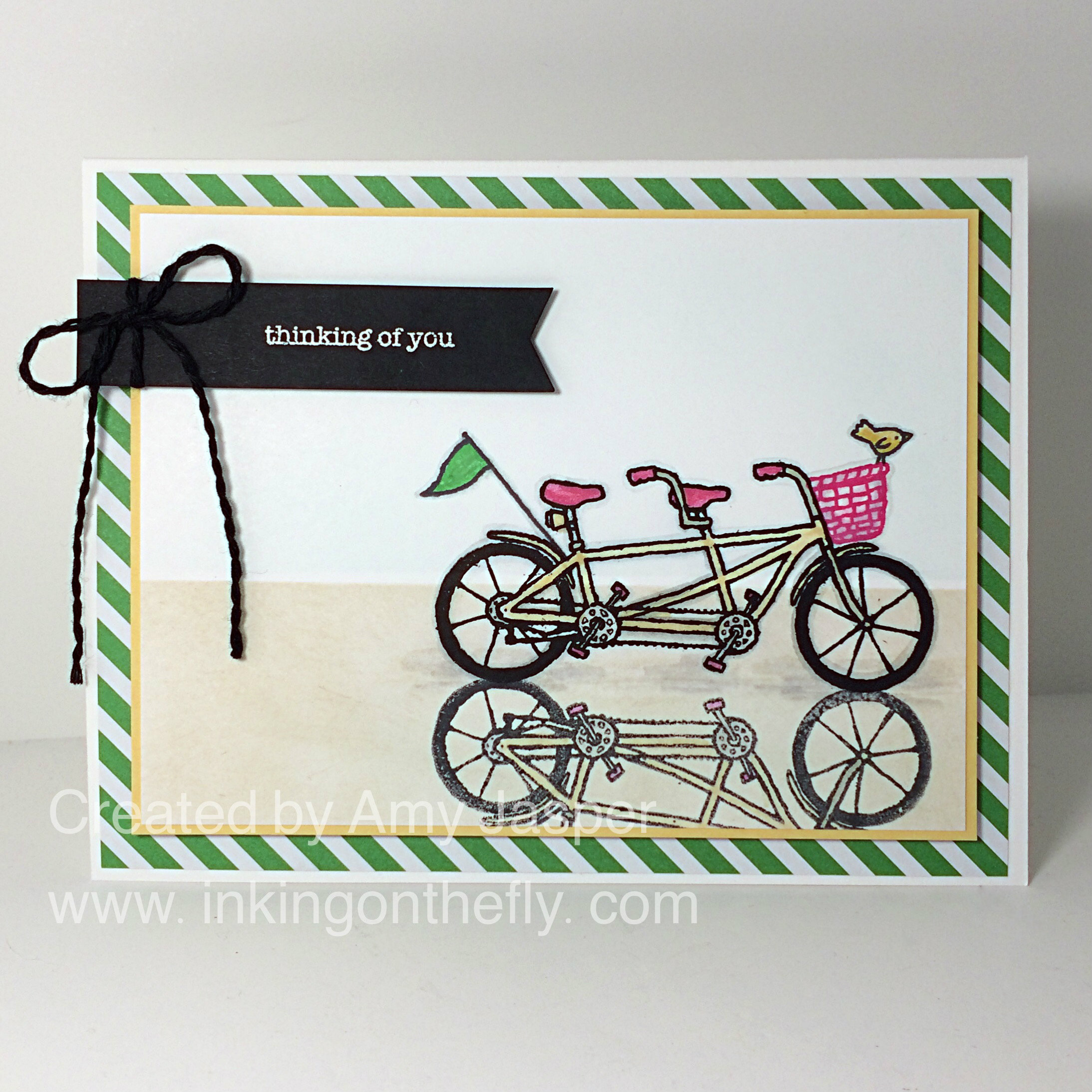
Don’t you just love these colours!! I was so excited to learn that the Stampin Up Silicone Craft Mat can also be used as a surface to transfer a reflected image on a project. All I had to do was stamp the image on the silicone mat with Jet Black Momento ink, then huff on the stamped image, turn the Silicone Craft Mat over, line it up with my original image on my page, then press the Silicone Craft Mat on the cardstock to transfer the image! It worked like a charm! It’s important to use a water-based ink like the Momento Black so that it won’t dry too fast before you can position it AND so it will not leave a permanent image on your Silicone Mat.

Pedal Pusher Reflection card close up of reflection www.inkingonthefly.com
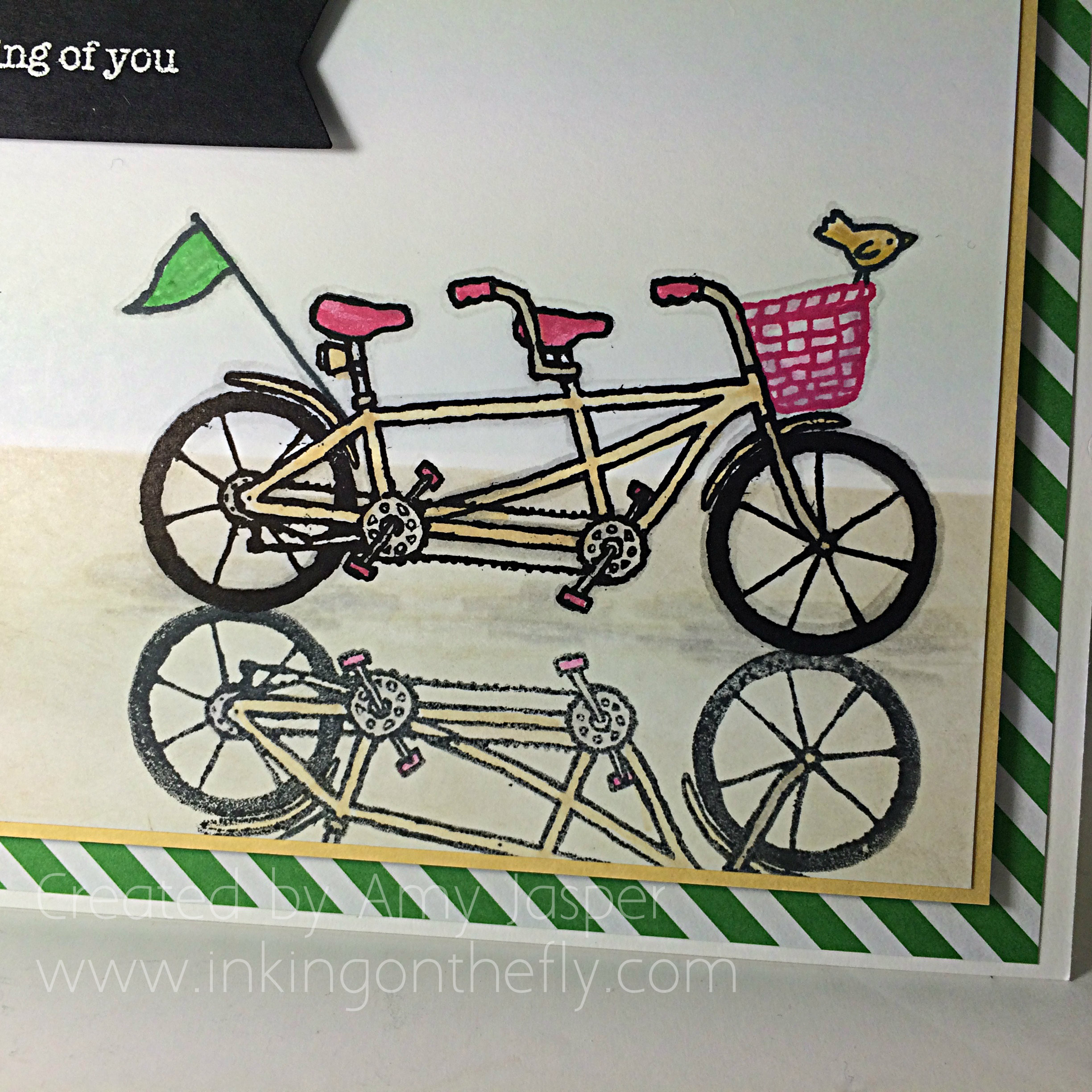
I coloured my original image (it was stamped with Archival Black ink) using my Stampin’ Write Markers. As I often do, I used Smoky Slate to do an outling of my image as it adds a shading that makes the image pop a bit on the page – it doesn’t look so flat that way. The reflection image was coloured using a Blender Pen and the same colours on the main image so that the colours would be faded in the reflection in the sand.

I chose this small “thinking of you” sentiment from the Teeny Tiny Wishes stamp set from Stampin’ Up for two reasons: first, because I wanted something small and simple so it wouldn’t take away from the rest of the card; second, because I was commissioned to create some “thinking of you” cards for my husband’s co-worker. A bicycle for two represents teamwork, so if you don’t have one of the cyclists, it would be harder to pedal. I think it’s a great analogy to working together, don’t you?

Pedal Pusher Reflection card close up of separated twine www.inkingonthefly.com
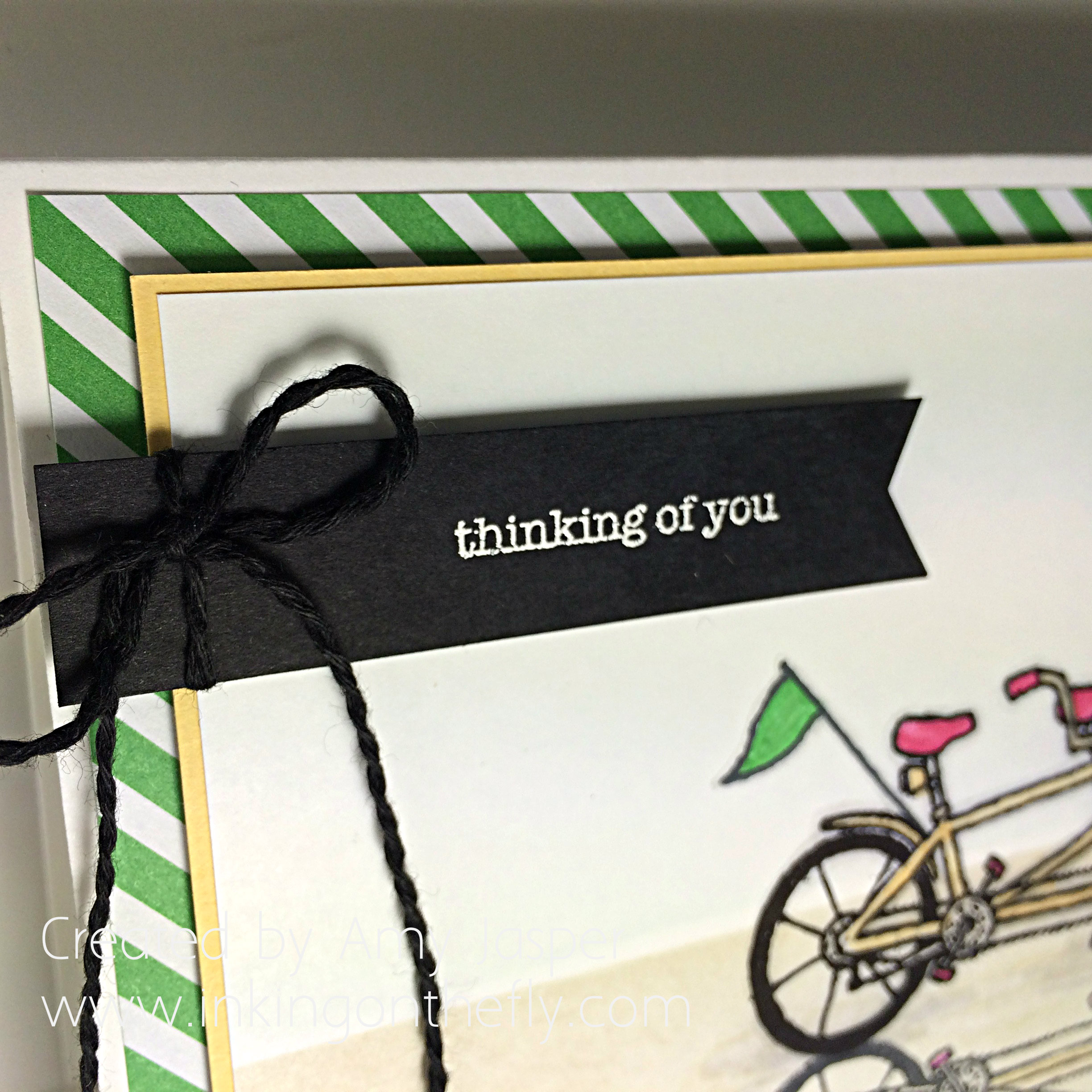
The sentiment is stamped with Versamark ink and embossed with White Embossing powder and my Heat Tool. The twine is from the Baker’s Twine Combo pack. I just separated the black strands from the Melon Mambo strands and voila! A whole new look!

Pedal Pusher Reflection card by Amy Jasper www.inkingonthefly.com All supplies from Stampin' Up!
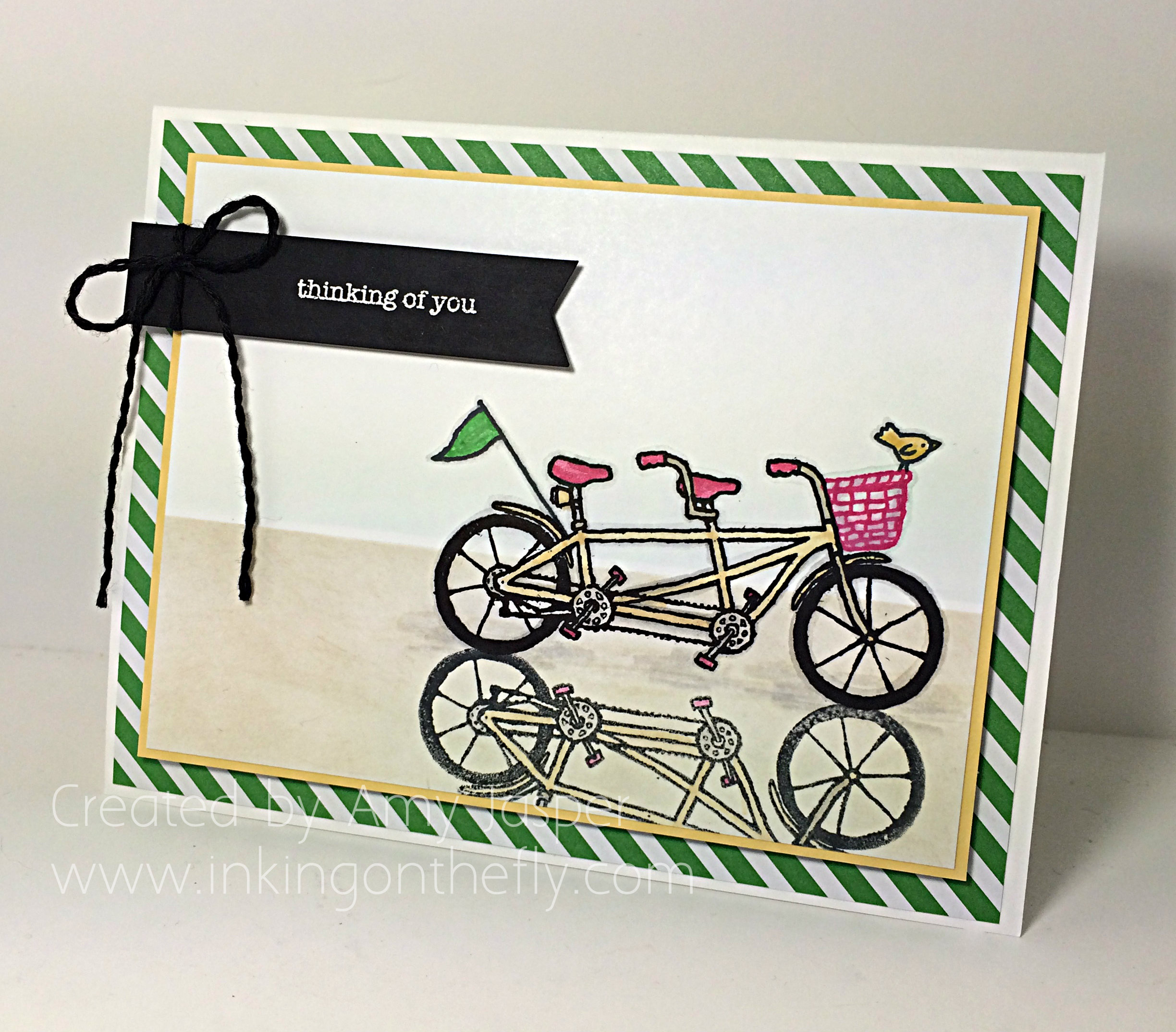
Some of you might be wondering where the Cucumber Crush diagonal stripes came from. Well, I actually was a bit wasteful with my paper and took the horizontal striped paper from the 2015-2017 In Color Envelope Paper and cut out what I needed on a diagonal. I love the look! I’m sure I can get use out of the scraps, anyway!

I know I didn’t touch on all of the elements of this card, but I think I covered a lot. If you have any questions, feel free to ask! I’m happy to tell you more!

If you love this stamp set as much as I do, just click on my SHOP button on this page and order product that you know you want anyway, so you can choose this stamp set for FREE! Just $60 and this set or any other Sale-a-bration set can be yours! Who doesn’t love free stuff!

Beautiful Friend

94headerWelcome to my blog where I have the joy of sharing my love of designing with paper and ink using my beloved supplies from Stampin’ Up! Today’s design shows off the new Awesomely Artistic stamp set and begins with an As You See It colour challenge.

AYSIChallenge094-1024x1024I love the whimsical beauty that a dragonfly image automatically adds to artwork, whether it’s a photograph, a painting, a scrapbook layout, or a card design.

This colour combination calls for Not Quite Navy, which is a colour that has retired from Stampin’ Up’s colour collections. It was a favourite of mine. However, since it isn’t available, I chose the next best thing: Night of Navy. It’s a lovely rich navy blue, that when a bit of the same colour of ink is sponged around the edges, it makes it even more rich and gorgeously deep!

AYSI#94 by Amy JasperI wanted to add some ribbon to my card, but didn’t have anything that worked. Since necessity is the mother of invention, I chose to dye some satin ribbon to match my project!

Tips to dye ribbonTips:

  1. Use gloves. I am pretty good at keeping my hands and my workspace clean, but dying ribbon is a messy process. Gloves will be a member of my craft studio from now on.
  2. Use a small container. A small container allows you to be frugal with your ink refill. A small ziplock baggie works great and gives you freedom to squish your ink and ribbon around, ensuring total coverage. I chose to use an empty embellishment container and coiled my ribbon inside. It was very cool to watch the colour wick up the ribbon until it was saturated.
  3. More ink gives a darker colour. I started with 12 drops of ink refill and a couple teaspoons of water and my ribbon came out a lovely steel blue, but it wasn’t quite as dark as I wanted. I added 20 more drops of ink to the same container and placed my coiled ribbon in it again. This gave me the desired colour.
  4. Dry the ribbon. If your ribbon is wet, it will colour anything it touches. You can lay your ribbon on a paper towel and let it dry overnight. If you’re impatient (like me), you can dab it on a paper towel until most of the wet comes off, then hold in in your (un-gloved) hand and use your heat tool over it like a blow dryer (not too close). Holding it in your hand will prevent you from melting your ribbon (because you will feel the heat on your hand). If your ribbon isn’t dry, you will see marks of ink on your project as you add your ribbon. Also, it will not adhere well if you use glue dots or other adhesive to attach a bow.
  5. Different ribbon give varied results. Satin ribbon takes colour beautifully. Others will take colour differently, so test it out and see how it goes. Some ribbons are treated with sizing, which make them repel water, so they require extra work to get them to absorb the colour. You can wash them ahead of time in the sink or just take the time to massage in the colour (plastic bag technique would be the best container choice in this case).
  6. Not always true to colour. Some inks won’t give true colour on your ribbon. Sometimes it’s the ribbon, but sometimes it’s as though the ink separates. For example, I have seen Chocolate Chip ink end up a dusty rose pink colour when used on ribbon!

094sentimentI ruched the ribbon using a length of Tear Tape to adhere it as I ruffled and attached, ruffled and attached. The photo above also shows the piece of Daffodil Delight cardstock, which I textured by running it between my bone folder and my thumb multiple times until the fibres in the paper began softening. I actually softened it enough that I could separate it into two layers which makes a sort of suede-like finish (can’t really see it in the photo). This process makes the paper really pliable for a nice distressed look. I stamped it with the textured image from the Awesomely Artistic stamp set for an added amount of colour and texture.

And I’m quite pleased with the use of the black Candy Dot in the Candy Dot brad! I can’t remember the last time I used one of these brads with the Candy Dots! It looks great!

The sentiment is a combination of the Greeting Thinlits “hello”, which I created using Daffodil Delight cardstock with that same texture stamp image over it; the “beautiful” is created using the Rotary Alphabet stamp; and the “friend” image from the Awesomely Artistic stamp set.94angle

I was very pleased with my circle section of this card. I started by rubbing my Embossing Buddy over the paper and stamping the floral image from the Awesomely Artistic stamp set by first inking the stamp with Versamark ink, then inking over that with Daffodil Delight ink. This allows the ink to stay “wet” longer so I could cover it with Clear Embossing powder and heat-set it with my Heat Tool. Once set, I added Night of Navy ink over it with a sponge and circular motions. Torn pieces of sticky note paper were applied as a mask to create the vacant area on the circle.

After sponging to my heart’s content, I used my Embossing Buddy again and stamped my dragonfly with Jet Black Stazon. Then I applied Black Embossing Powder and used my Heat Tool. I applied the Night of Navy splatter with the splatter image stamp from the same stamp set.

The thin mat of Daffodil Delight cardstock was a great finish to the overall card. It looked so plain before adding that splash of light. That Daffodil Delight mat is on Stampin’ Dimensionals, as is the circle of Whisper White cardstock with the dragonfly image.

94AmyJasperI had the pleasure of stamping with a friend while creating this card. I think that’s why the sentiment says “hello beautiful friend” – because I was thinking of her. She was my muse for the day. Thanks Gwen!

What would you do with this colour combination? Try it and share it with the As You See It Challenge blog! We love to see what you create!

Amy

Designer-Badge

Celebrate it!

093headerWelcome to my blog where I have the privilege to share my love of designing with Stampin’ Up products. Check out the beautiful Timeless Elegance designer series paper on this inspiring card for today’s project.

This card began with As You See It Challenge #093:

AYSIChallenge093

This card is to celebrate achievement that comes from hard work and perseverance, but also from turning your dreams into plans. 093Amy

While designing it, I was thinking of goal-setting and the chaos of a summer schedule now that the kids are out of school. I’m not great with goals, but I REALLY want to be. Goals have the potential to give me the focus I need to accomplish things that are important to me, my family, my business, and my day job. The crazy summer months with scheduling child care, juggling my work schedule so that either my husband or I are home with the kids as much as possible, getting as much camping in as possible, and keeping my stamping friends creating even through their own busy summers, all makes goal-setting even more of a priority.

My husband refers to this sort of planning as “sharpening your axe”.  Apparently it was Abraham Lincoln who used this phrase:

abe

We need to take the time to reflect on habits in our past and determine where improvement needs to take place. This can be prioritizing, goal-setting, planning, scheduling, reflecting, learning, gathering supplies, and even just taking a break to refresh ourselves. It can be hard to take the time for these things when our lives are busy, but this is when it is even more essential. Without “sharpening your axe”, you are likely to be less efficient, less effective, less productive, and more likely to burn out or become overwhelmed.

So one of my goals this summer is to start each week with some quiet time where I can sit down and sharpen my axe. It will start with a basic to do list, then prioritizing, planning and scheduling. With a flexible plan (you always need to allow wiggle room to foster relationships), I can have a great summer and start some new habits. And, feel successful in my accomplishments.093angleI hope to be able to read this statement at the end of the summer and glow a little bit, knowing that it applies to me!

As for the details on this one:

Basic Black, Very Vanilla and Blushing Bride cardstock were used for the colour combination. I love the Timeless Elegance Designer paper – soo pretty. The strip of Blushing Bride Cardstock across the front of the card is embossed using the Boho Embossing folder and the Big Shot machine. I sponged Blushing Bride ink around the edges of the piece so that the embossing would “pop” that much more. The Venetian Crochet Trim is just peeking out under that strip of embossed cardstock for an added touch. I chose Basic Black, Blushing Bride, and a small piece from the Typeset Specialty Designer paper to create the little 5/8″ wide little banners. The Banner Punch comes in handy to snip perfect little banner ends.

093banners

The sentiment is one of my favourites from the Feel Good stamp set. I stamped it using Jet Black Stazon ink on the Very Vanilla cardstock. It was cut into a circle using the Big Shot and Circle Framelits. To add a light sponging of Blushing Bride ink, I left the framelit in place and used a Sponge Dauber in gentle circular motions. This leaves a subtle, but effective, thin outline on your die cut shape.093again

Of course, most of my cards are not complete without using Stampin’ Dimensionals somewhere! I used them to raise up the Blushing Bride mat on the Basic Black card base. I also used them under the circle shape with the sentiment.

What do you think? Is this a card that I can give you at the end of the summer? How will you sharpen your axe so you can reach your goals?

Amy

cants into cans