technique

Watercolour Carousel

Watercolouring is such a beautiful look and can seem like a difficult venture. But it doesn’t have to be a challenge. This card is created using a simple watercolour technique combined with the emboss resist. Easy peasy!Watercolour Carousel card by Amy Jasper www.inkingonthefly.com
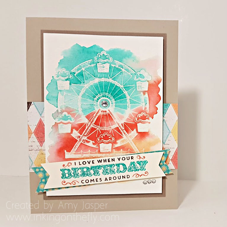
I started by stamping the carousel image from the Carousel Birthday stamp set with Versamark ink on Stampin Up’s Watercolor Cardstock. Then I added some clear embossing powder to the image, tapped off the excess and heat set it with my Heat Tool until the image was clear and shiny.

Next, I applied water over the image. Just clear water using my Aqua Painter for a mess-free experience. I put the water only where I wanted my colour and applied it quite liberally to get the watercolour cardstock good and wet!

The inks came next: First I picked up some Bermuda Bay with my Aqua Painter and applied it to the top most section of my wet cardstock. I didn’t have to move the ink around very much as the water I had applied first did most of the work for me. I cleaned off my brush and picked up some Calypso Coral ink and applied it to the middle section of the area being careful to avoid having it touch the Bermuda Bay too much (that would just get muddy looking and nobody likes a muddy fairground!). Lastly, I cleaned off my brush again and used it to apply some Peek-a-boo Peach ink to the lower portion of my watered cardstock. To get the best colour saturation, I made sure that I used a drop of Ink Refill in the lid of each of these colours. This allowed me to pick up a nicely concentrated amount of ink on my Aqua Painter brush.
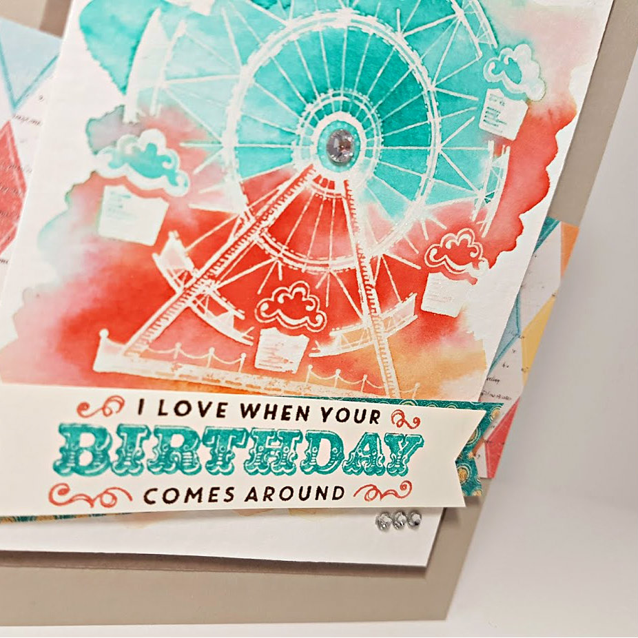
watercolour carousel card by Amy Jasper www.inkingonthefly.comWhen I was happy with my colours, I set that aside to dry and continued with the rest of the card. The image doesn’t end up coloured with the rest of the paper because the embossing repells the ink, not allowing it to saturate those areas of the watercolour cardstock.

Sahara Sand cardstock was used for the card base, then a layer of Tip Top Taupe. The patterned paper used is from the Cupcakes and Carousels Designer Series Paper Stack from Stampin’ Up. I used one larger strip across the front of the card and another smaller strip as an accent behind the Very Vanilla banner. The sentiment, also from the Carousel Birthday stamp set, was inked using my Stampin’ Up Markers (Bermuda Bay, Early Espresso, and Calypso Coral), on which I “huffed” with my breath to re-moisten the ink before stamping it on the Very Vanilla cardstock.

When my watercoloured image was dry, I could add it as my next layer using Stampin’ Up Dimensionals. The banner ends were hand cut with my Paper Snips; the patterned paper banner adhered directly, while the Very Vanilla banner with the sentiment was adhered using Stampin’ Up Dimensionals.

Almost done! It just needed some bling, so I added a strip of three Basic Rhinestones just below the right side of the banner and one single larger Basic Rhinestone to the center of the carousel image.

watercolour carousel card by Amy Jasper www.inkingonthefly.comI hope you like it. I sure do! It’s sooo pretty!

Be sure to leave me a hello and let me know if you’ve tried this watercolouring technique before and how it worked out for you.
Save

Save

Save

Cleverness with Vellum

Ah. It’s good to be back and have something to share. I hope you will be patient with me and my sporadic posts. I’m hoping to post at least every two weeks from now on, in line with the new As You See It Challenge schedule. I hope you will keep coming back to check things out.

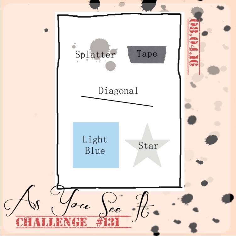
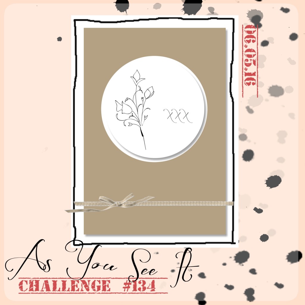
Here’s the sketch for today’s challenge:

#134aysiI decided to play this one up a bit and try a technique that I found online. I can’t for the life of me, remember who posted the tutorial that I followed to create this card, otherwise, I would have just posted a link to her video. If you know who, please say so in the comments. I have a simple picture tutorial to guide you through how this design is made. It’s pretty awesome!!

(June 2017 edit: One reader found the tutorial for me! It was Jennifer McGuire and you can find it by clicking here. Special thanks to Jessica G. for taking the time to share the link in the comments. <3 Thanks Jessica!)

Here’s my card:

IMG_9551

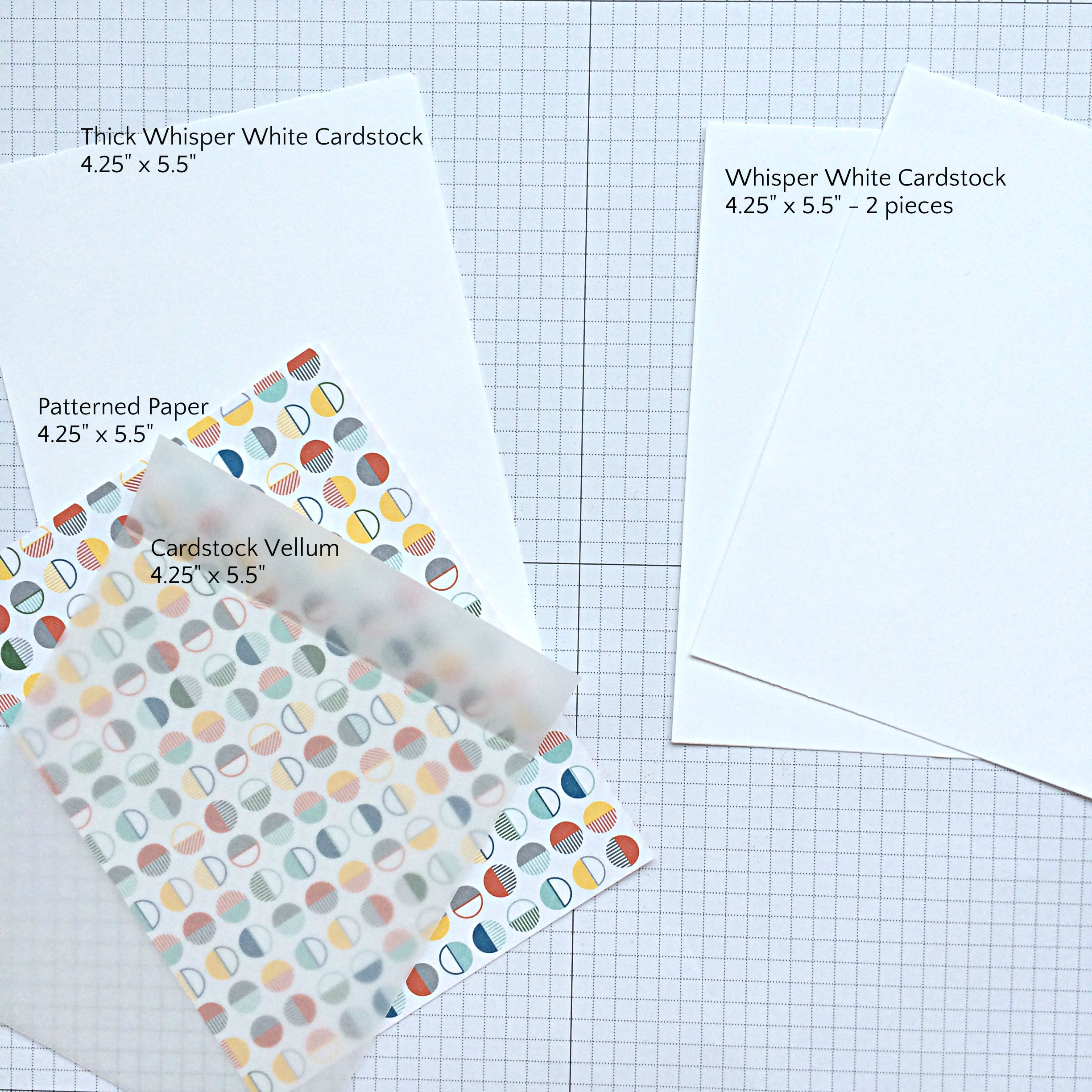
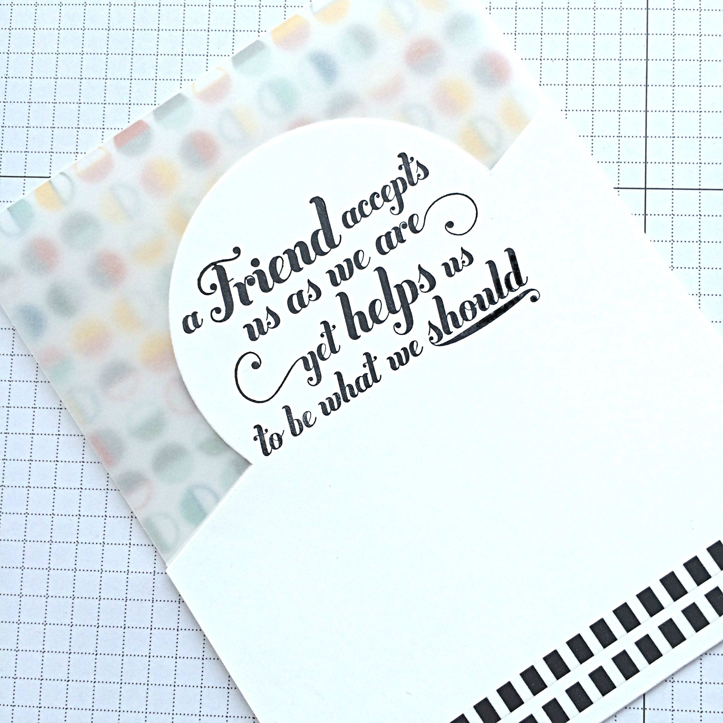
I used Thick Whisper White Cardstock, Schoolhouse Designer Series Paper, and Cardstock Vellum with Whisper White Cardstock for the card base. Here’s a photo tutorial to show how you can create this kind of Cleverness with Vellum:

#134 what you needThe Cardstock Vellum is scored 1″ from the top.

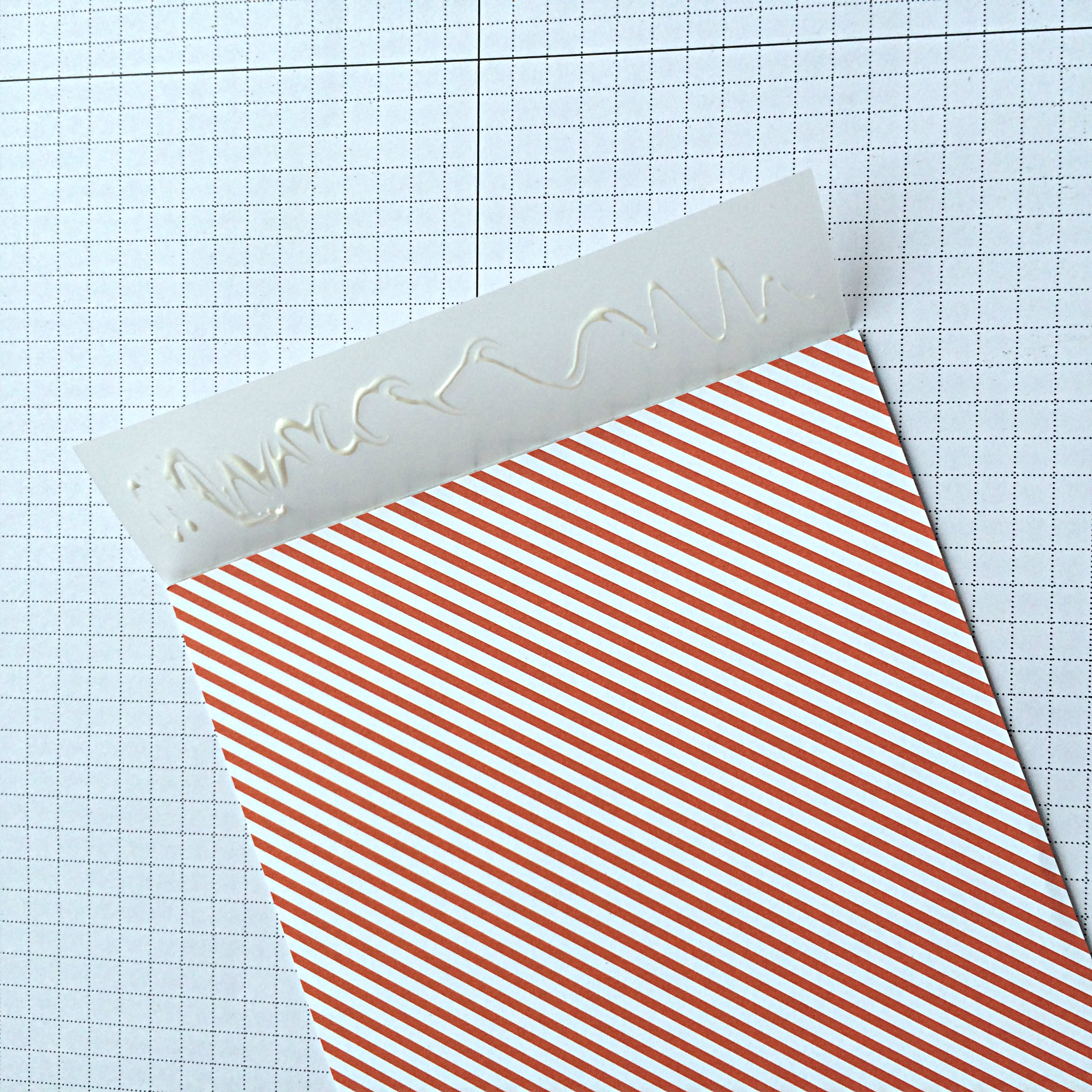
#134.2Use your Bone Folder to make that score line into a crisp fold, then adhere the 1″ flap to the wrong side of your Designer Series Paper (DSP). I like the look of a bright and bold DSP.

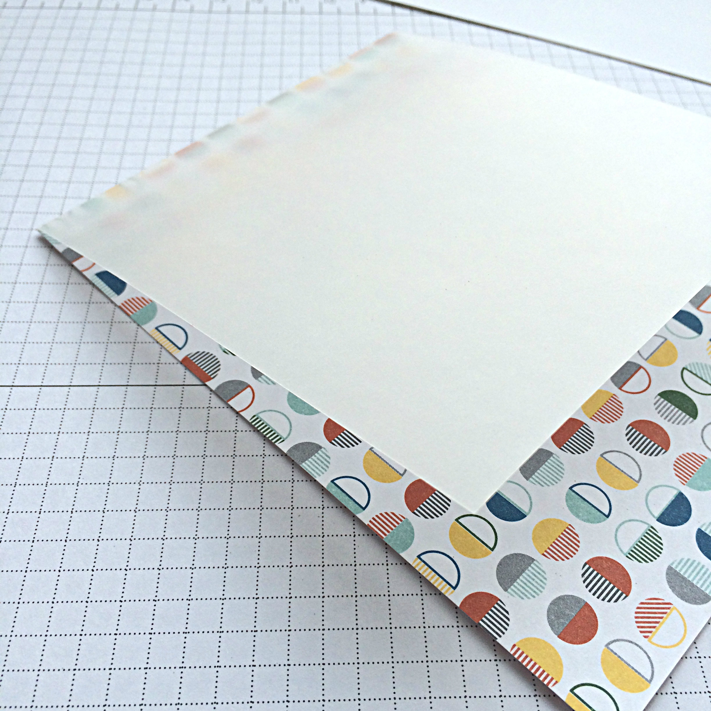
#134.3You will end up with the right side of your DSP looking like this, with the Vellum attached at the top.

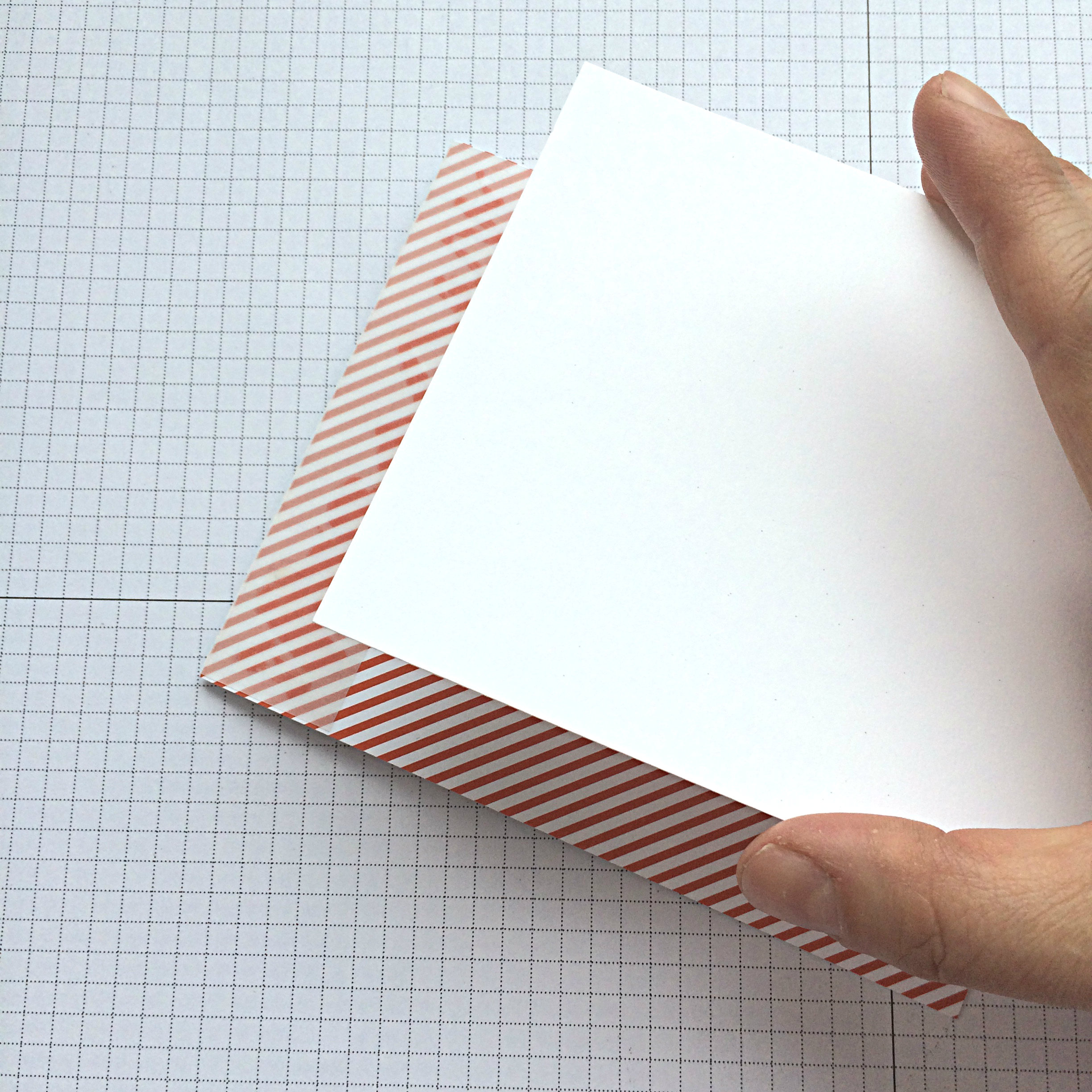
#134.4Then you will attach a piece of cardstock (I used the Thick Whisper White) to the wrong side of your DSP. Not only will this give your cardbase more structure, but it will also hide the 1″ piece of Vellum and your adhesive marks.

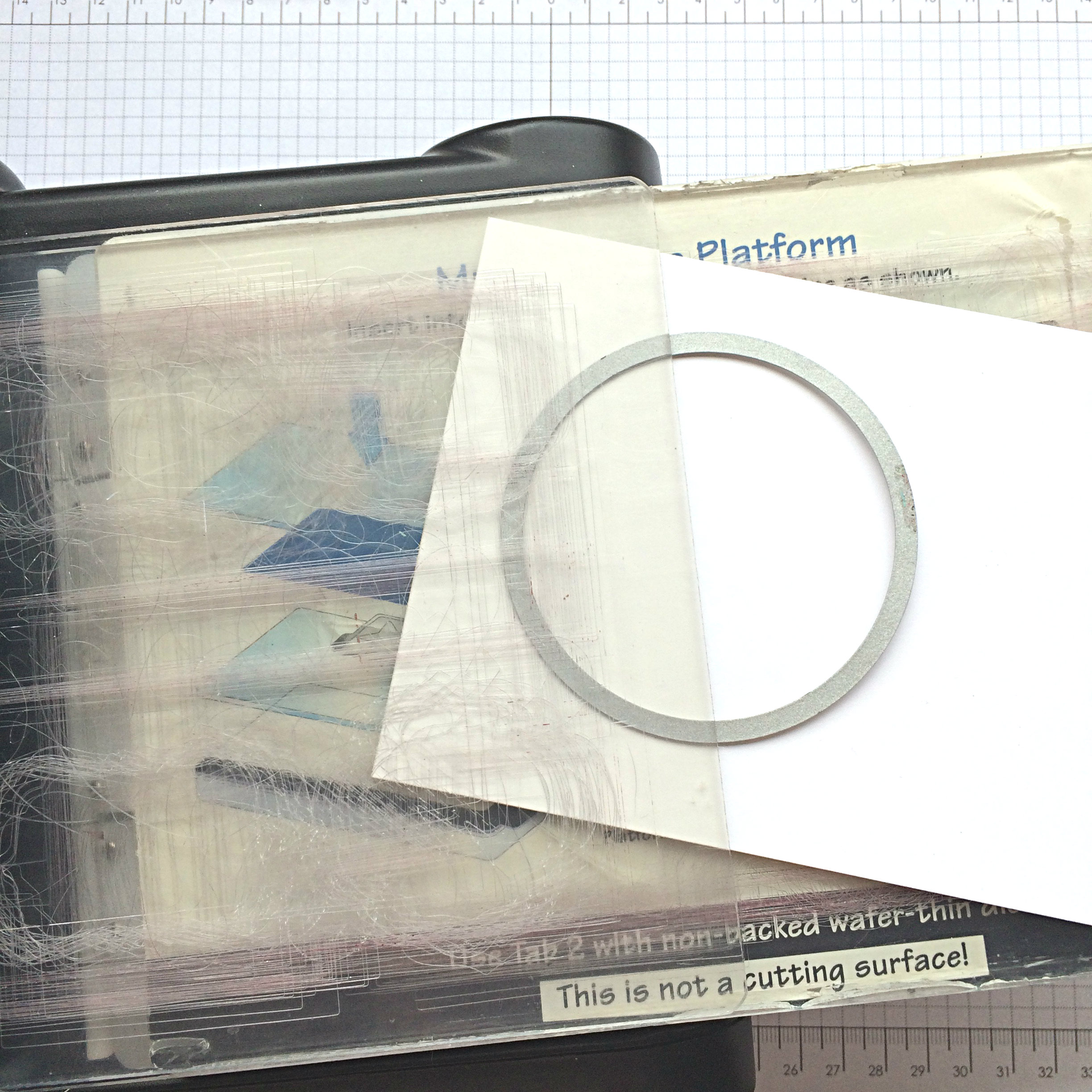
#134.5The next step is to cut the top of your two Whisper White cardstock pieces. I cut them both at the same time so that they will match each other EXACTLY. Because the Whisper White Cardstock is so thin, the die cuts through both layers with ease.

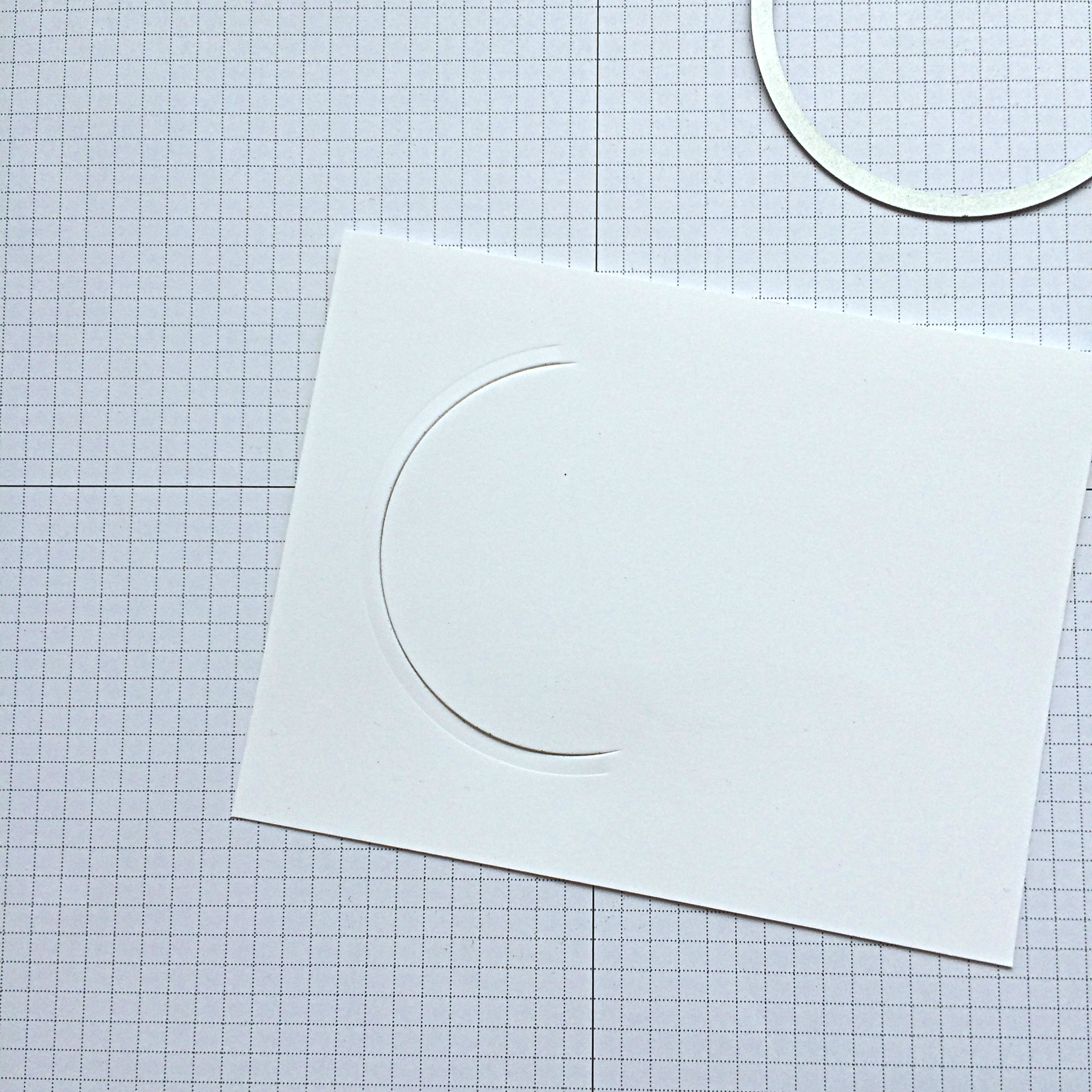
To create the half circle shape at the top, place your circle framelit where you want it, then only have the top plate cover where you want the cut part to be. It won’t cut where there isn’t any pressure. Doing it on an angle like this is an option that makes the card playful and fun.

#134.6This is what it will look like when you take the two pieces of whisper white out. Keep them together for the next step, too.

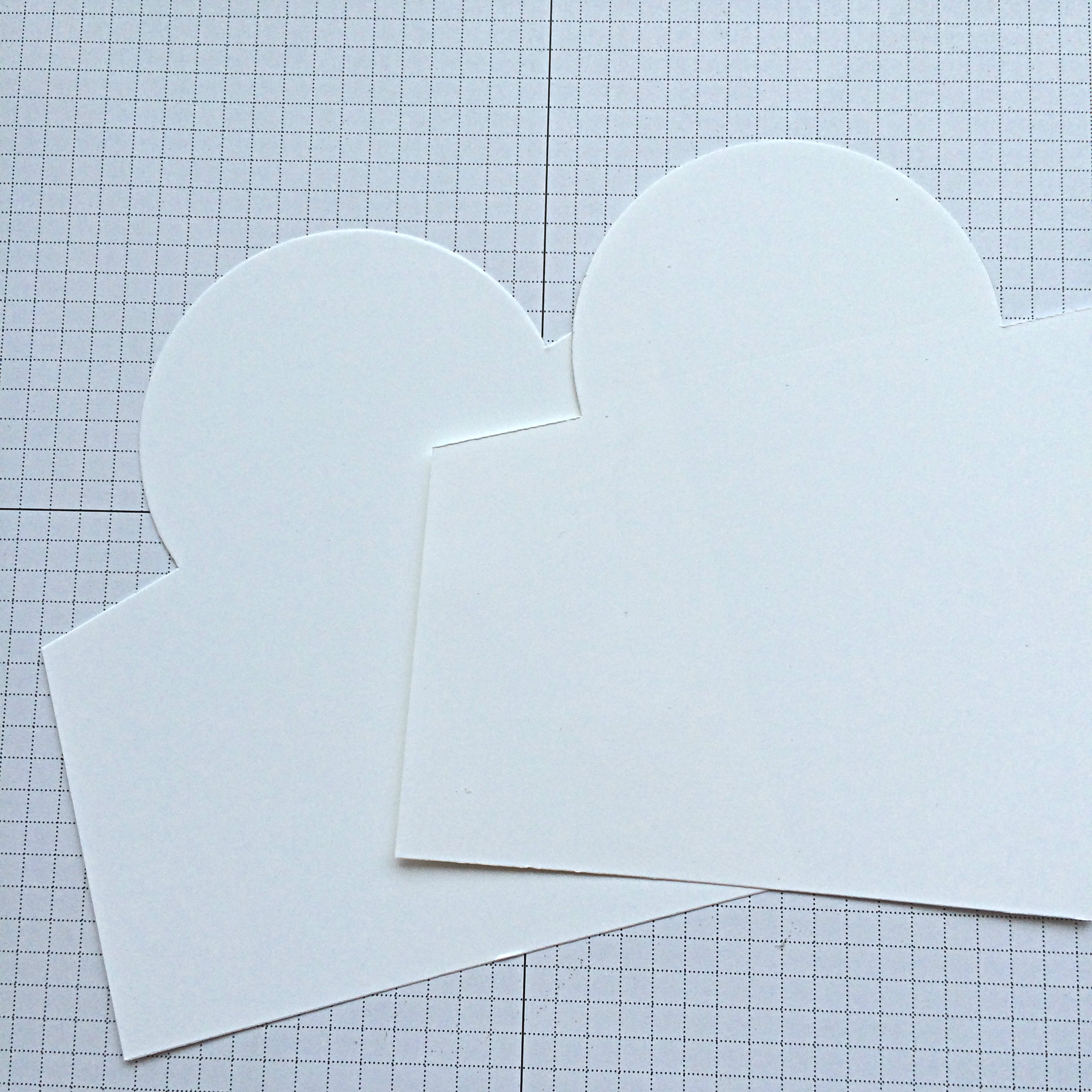
#134.7Place the two pieces of Whisper White cardstock in your cutter, so that the ruler cutting area lines up with the ends of the half circle cut in your cardstock. You will use the sliding trimmer blade to cut one side, then the other, keeping the paper in place. Be sure to lift the blade in between, so you don’t cut the circle clean off!!

#134.8Now you will have two identical pieces to attach to your vellum on the card front! The cleverness ensues!!

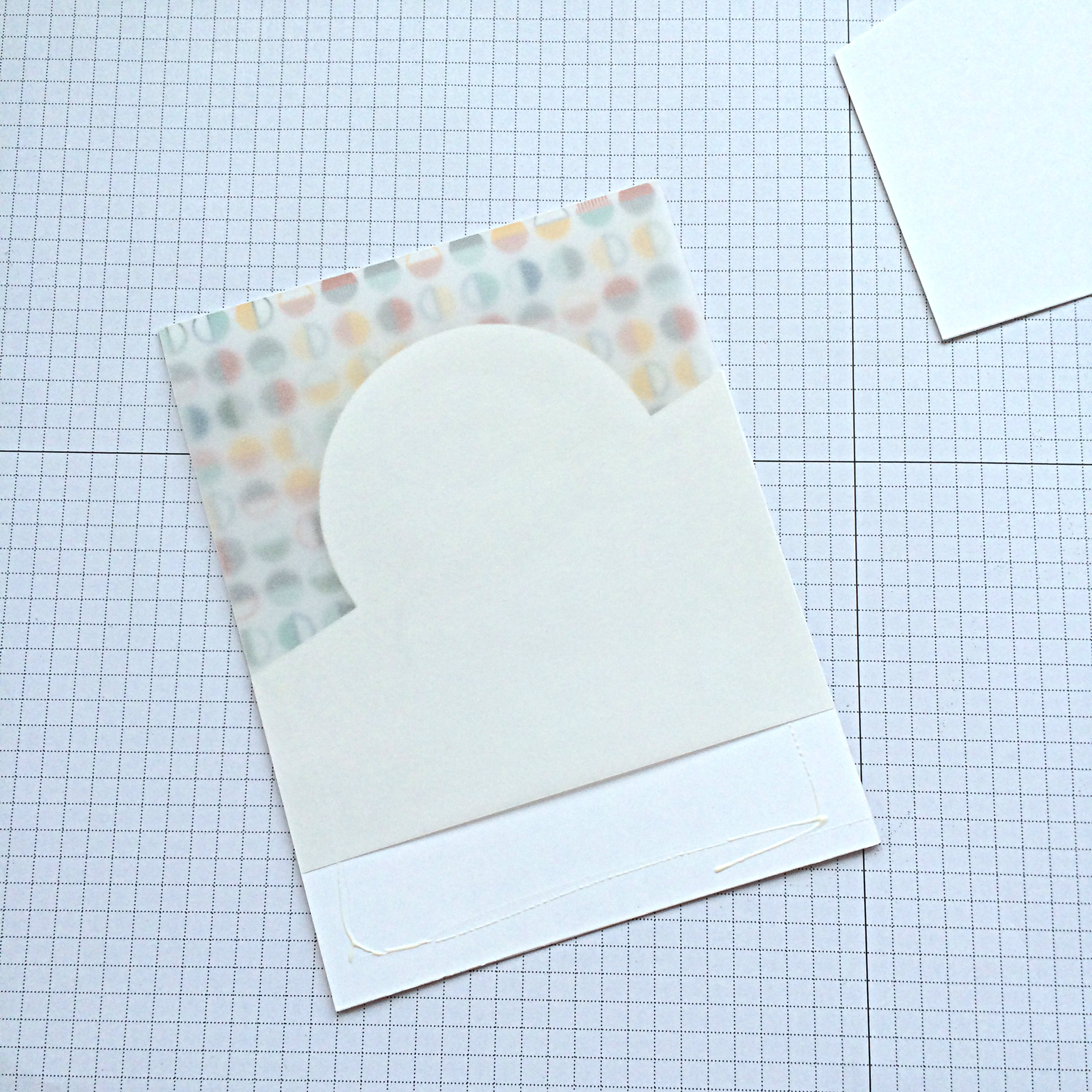
#134.9It’s easy to attach the two cut Whisper White pieces. Just apply adhesive to the front of one, hold the Vellum up and out of the way while you lay your piece over the patterned paper piece (adhesive side up!). Then lay the Vellum layer down flat over it. Then you can stamp and washi tape your other piece before adhering it over top to create a vellum sandwich.

#134.10The stamp set used here is the Feel Goods set. Sadly, it is retiring at the end of May, so if you love it, GET IT!

The washi tape at the bottom of the card is from the “This is the Life” Project Life kit from Stampin’ Up! This is on the retiring list as well AND is on sale.

IMG_9551Now that you’ve read through this tutorial and know how to make the bones of this card, try it out and see what you can create. I added a bit of flourish with a Gold Basic Metal Button (retiring), Black Baker’s Twine, Gold Metallic Thread, and two die cut leaves using the Rose Garden Thinlits: one cut from Vellum Cardstock, the other cut from Tangelo Twist Cardstock.

Be sure to check out the other cards created by our Design Team over at the As You See It Challenge Blog. And now there are no excuses, you have two whole weeks to participate in the challenge – hey, you could even submit more than one!

You can also click on the SHOP NOW button on this website to see what else is on the retiring list.

Stamp happy

&

don’t let your busy life

interfere with your creative living!

Save

Happy Birthday Pop-up

This week’s As You See It Challenge is an assortment challenge! Check it out!

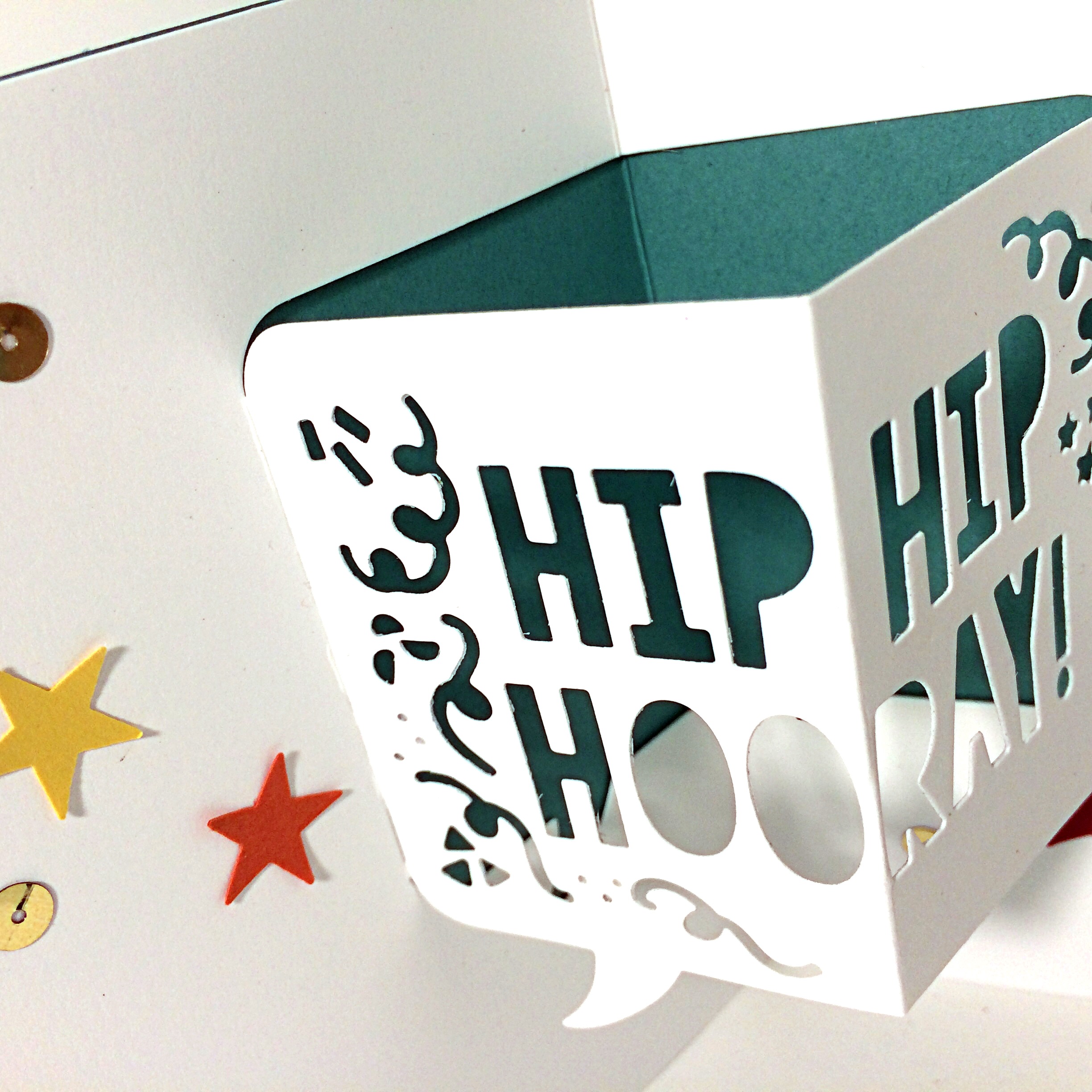
131I wanted to use the Party Pop-Up thinlits this week. I love how easy it is to make a cool pop-up card with these! So fun!

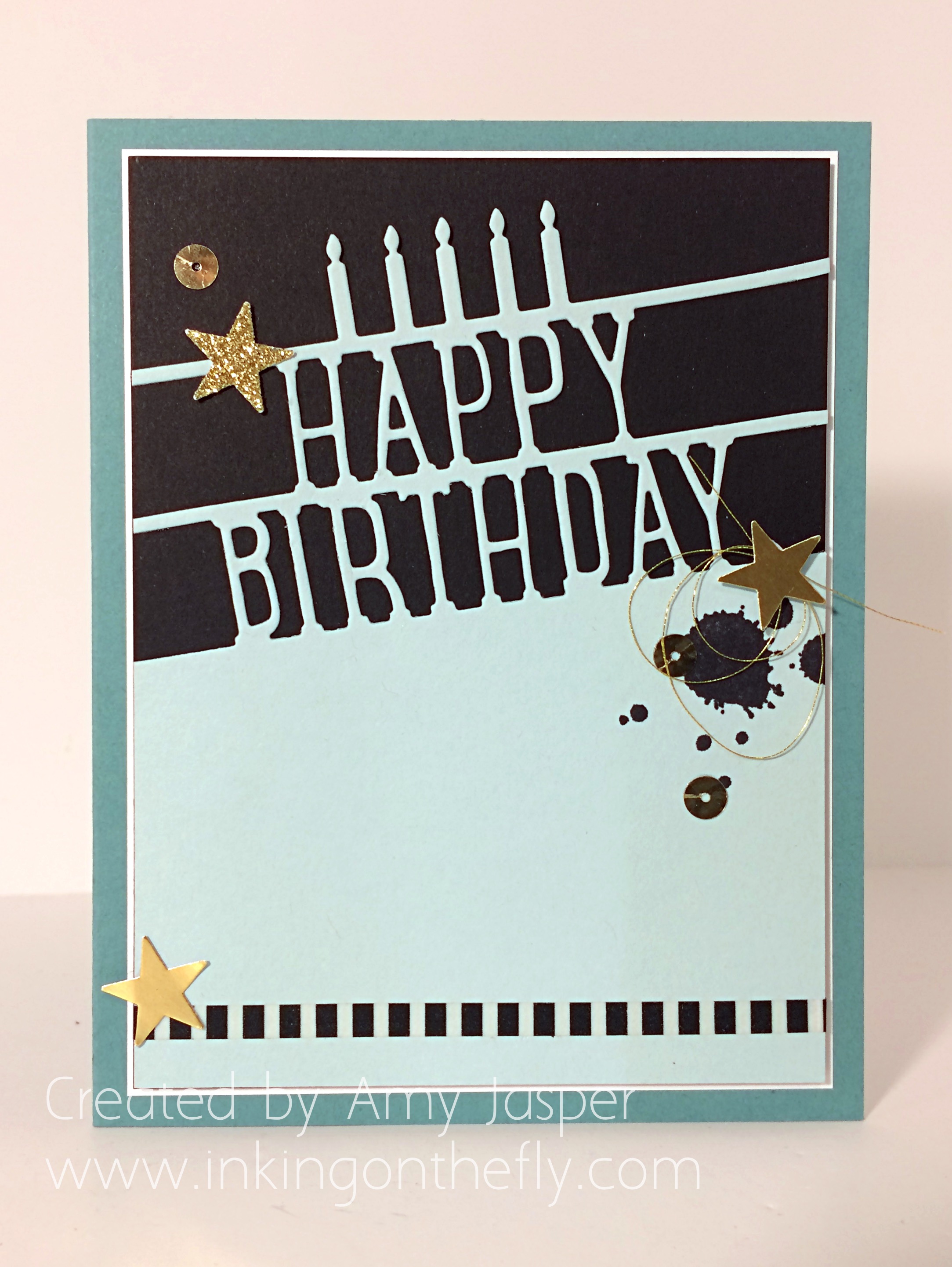
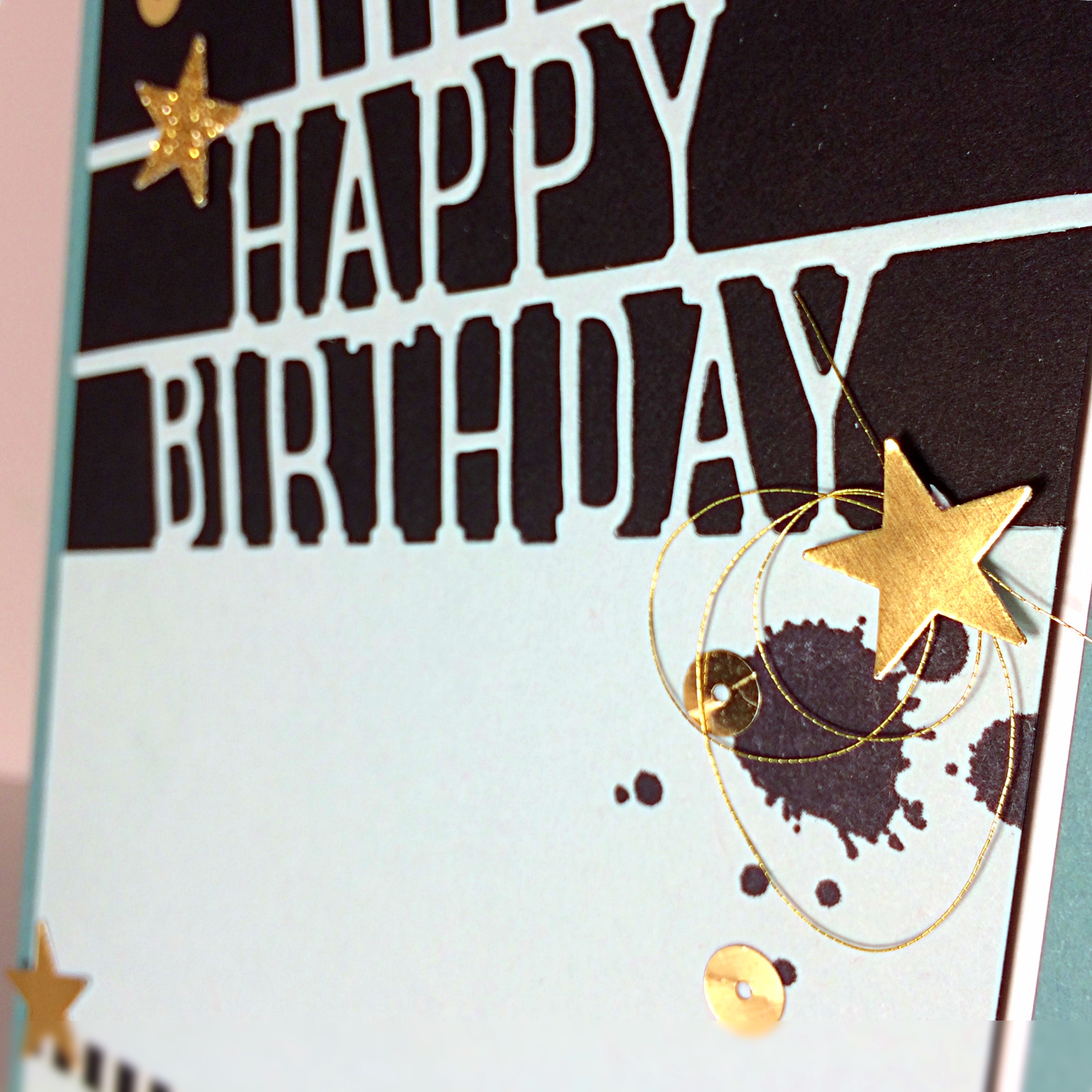
Birthday Pop-Up Card by Amy Jasper www.inkingonthefly.comThe outside of the card is simple layering, but I used a partial die cutting technique to only cut part of the Happy Birthday die for the front of the card. Sorry, I don’t have a tutorial for you (yet). The striped washi tape at the bottom of this card is from the “This is the Life” Project Life Accessory pack. It almost looks like the paper has been cut out!

I used Lost Lagoon cardstock from the 2014-16 In Colors, which are retiring at the end of May! (Oh, how I will mourn for the loss of Blackberry Bliss!)

Birthday Pop-Up Card by Amy Jasper www.inkingonthefly.comSoft Sky and Basic Black Cardstock along with stars of Gold Glimmer, Gold Foil paper, some Gold Sequins, and a splash of Gold Metallic Thread, adorn the front. I used Archival Black ink with the spatter from the Gorgeous Grunge stamp set. In fact, this is the ONLY stamping I did on this card.

Birthday Pop-up card by Amy Jasper www.inkingonthefly.comI kept the inside simple with Whisper White cardstock and a few stars. This way, there is lots of room to write, if you need it.

Birthday Pop-Up Card inside by Amy Jasper www.inkingonthefly.comSuper cute, super fun, and super easy!

If you don’t have these Party Pop-Up Thinlits dies, you should get them!

And get some stamping done this week! Play along with the challenge and stretch your creative mojo!