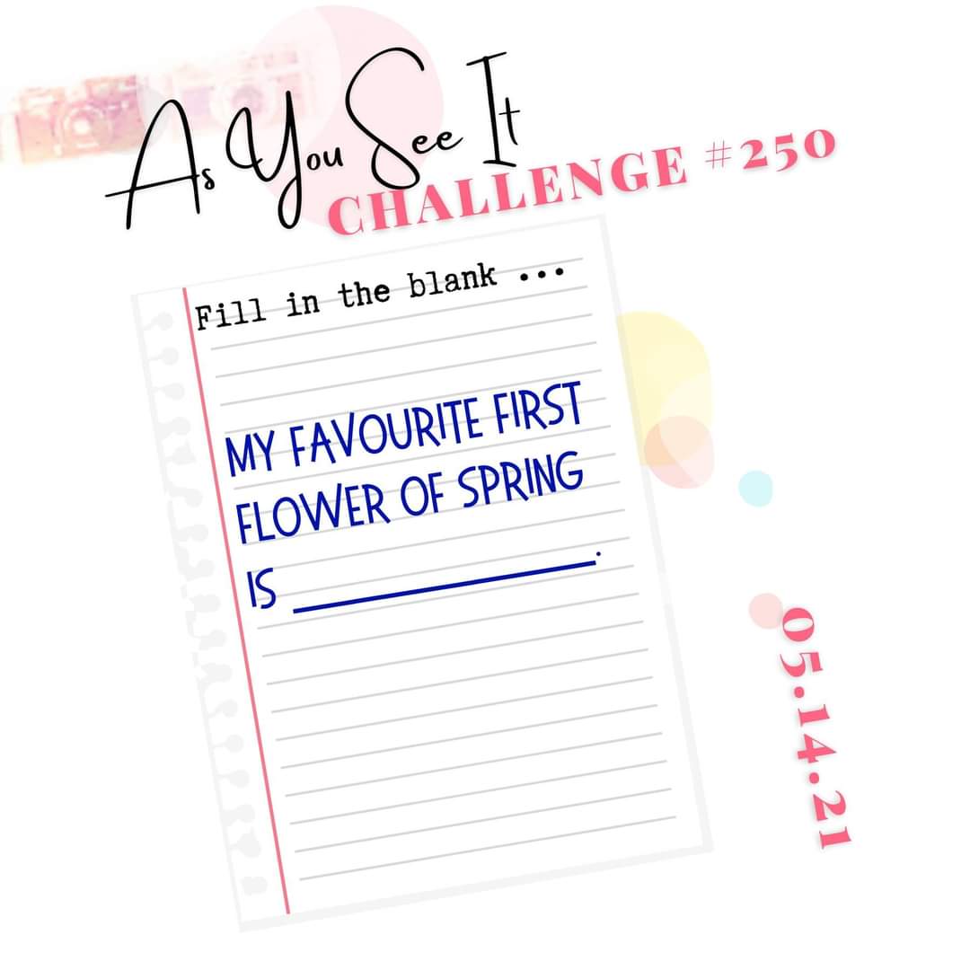
The card I have to share with you today was designed for the As You See It Challenge blog. We have a “fill in the blank challenge” for you!
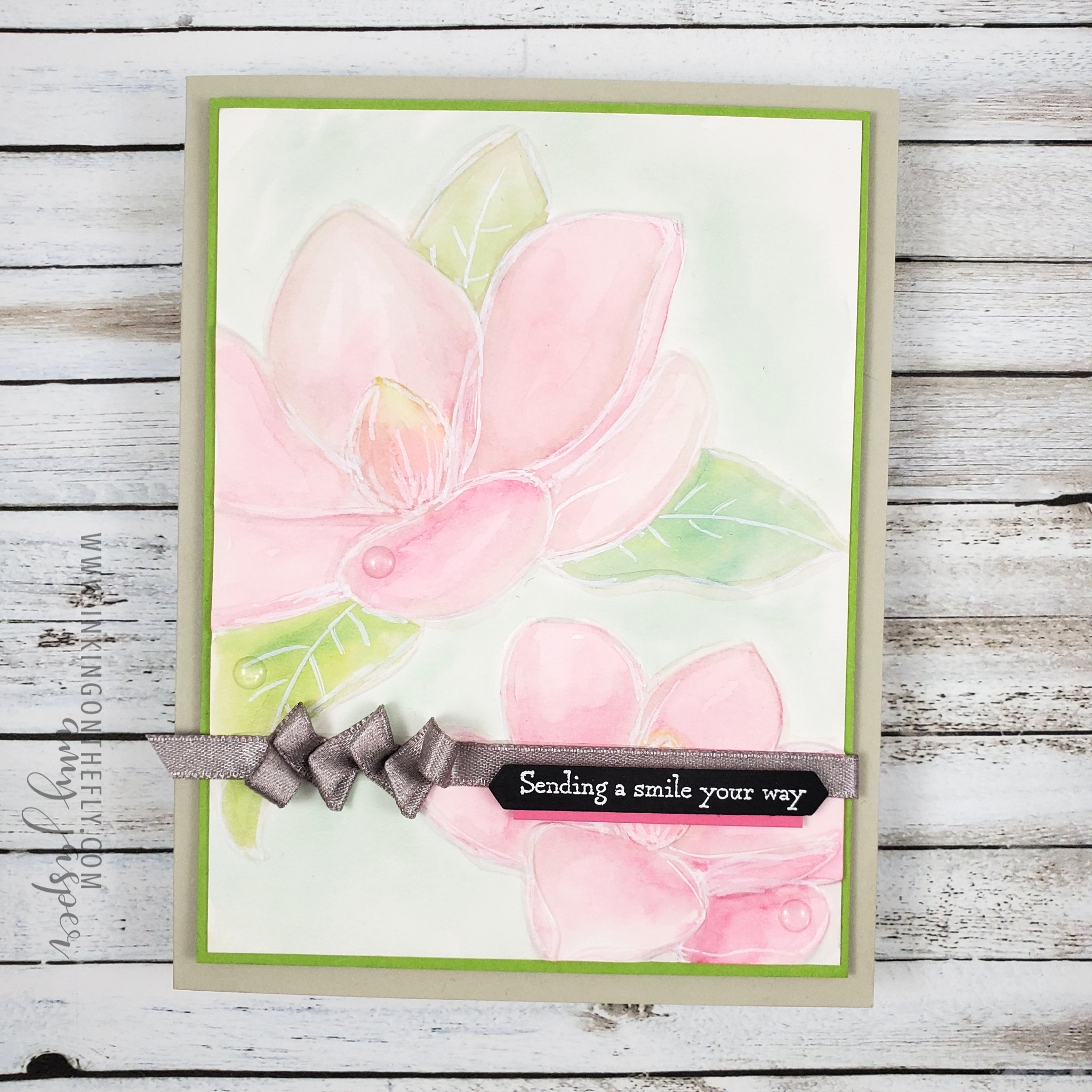
The magnolia trees are one of the first trees to flower in the Okanagan Valley. Some people call them tulip trees, but that’s just a pet name because of the shape of the blooms on the tree. The blooms don’t last very long, but they sure are pretty!
I love seeing all the flowers and new green growth in the spring. It offers the promise of warm summer days to come.
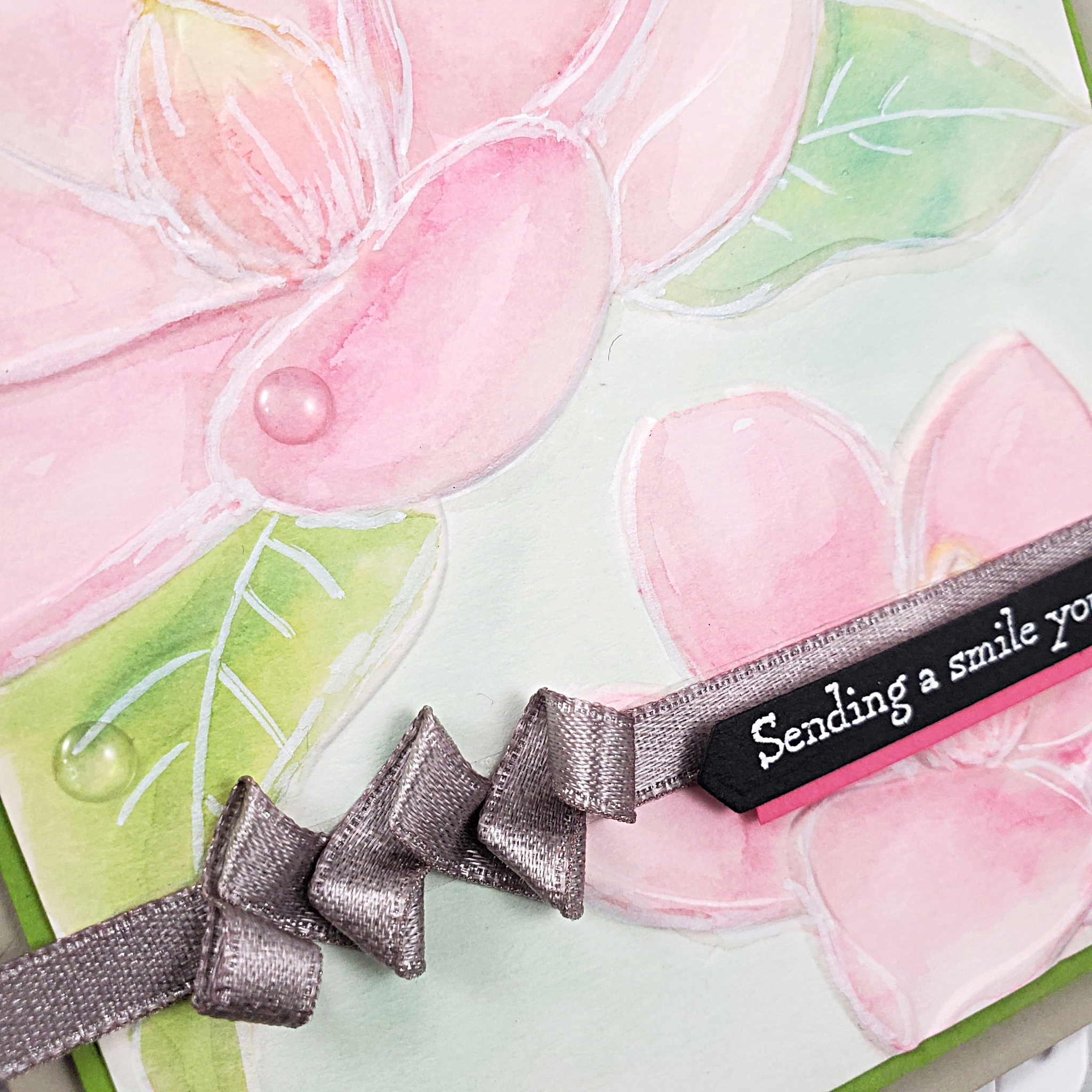
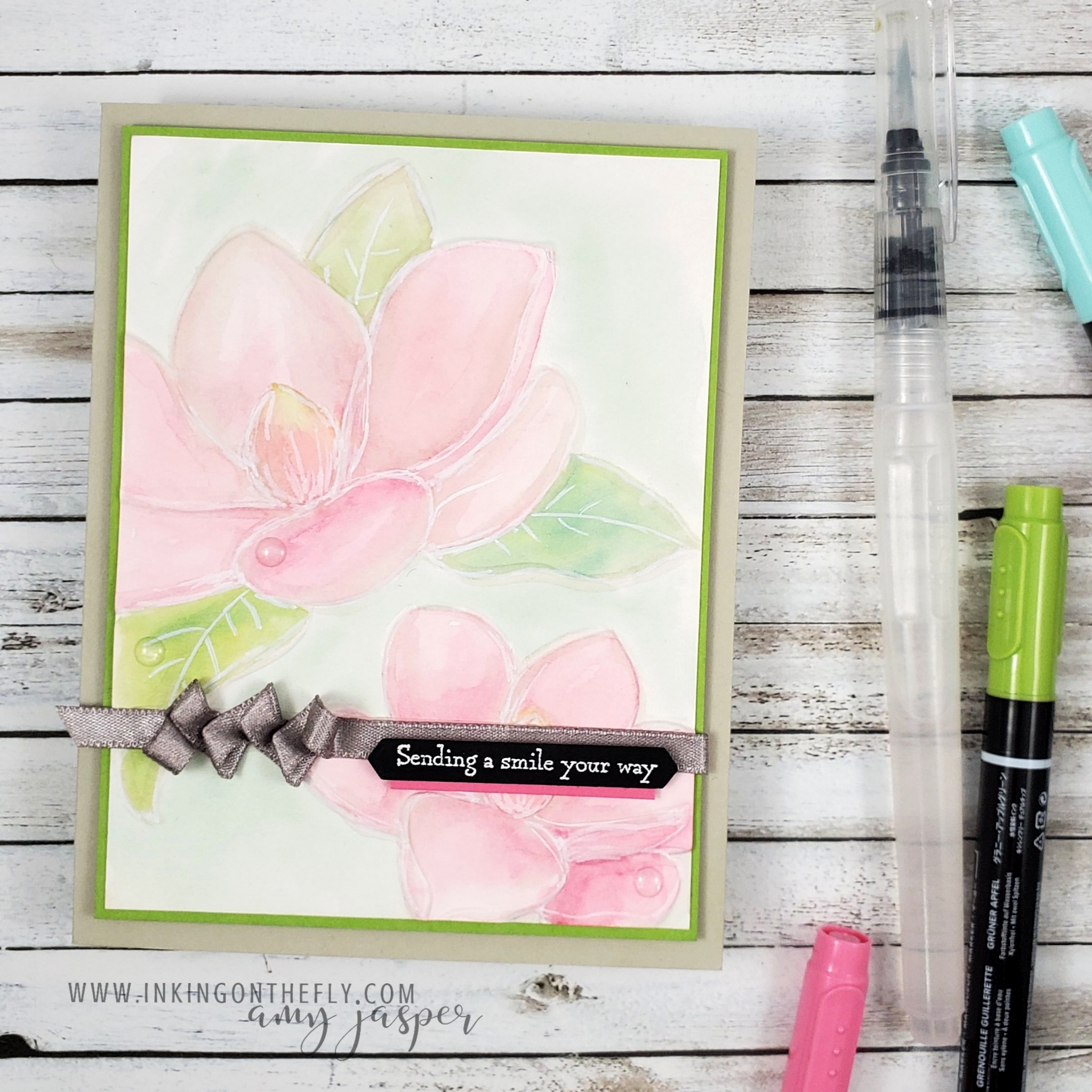
I used the Magnolia Embossing folder with Watercolor Paper and watercoloured the image with Polished Pink Ink for the blossoms, Granny Apple Green and Bermuda Bay for the leaves, and Pool Party for the area around the flowers. I also added a touch of Mango Melody to the flower centers and a hint of Gray Granite for subtle shading. After the ink dried, I added some highlights with my Chalk Marker to the flowers and leaves. The embossing detail seemed to get a bit lost from adding water, so I lined it up in my embossing folder and ran it through the Cut and Emboss Machine again, resulting in a much crisper embossed image.
What’s your favourite flower in the spring? Why not let us know at the As You See It Challenge blog by sharing a card with us there! We love seeing your beautiful and inspiring creations!
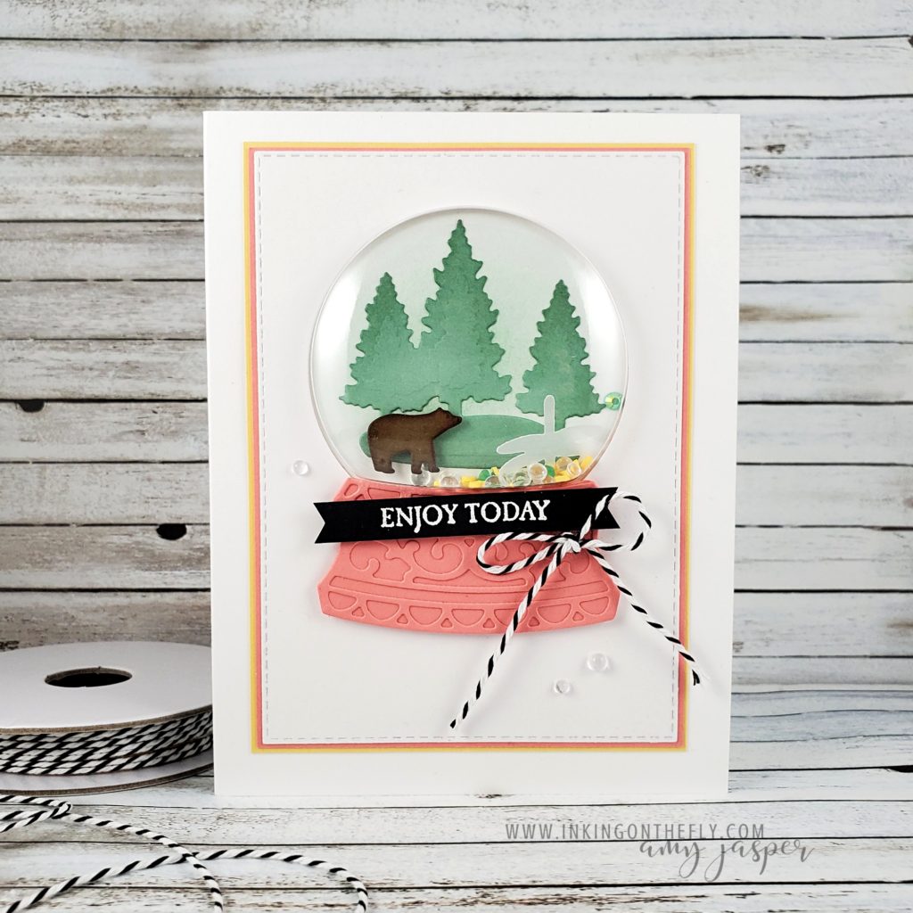
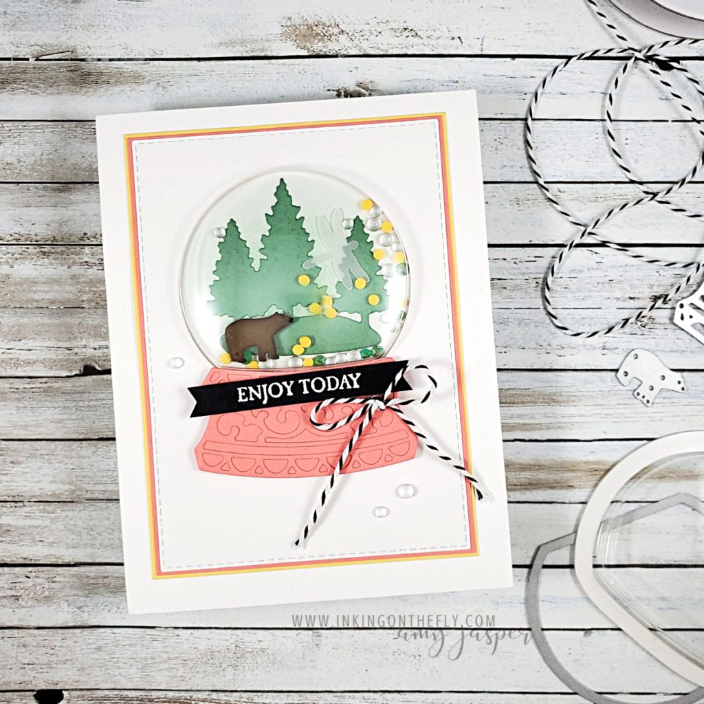
The Snow Globe Scenes Dies and the Shaker Domes used on this card are retiring AND they’ve been significantly discounted! If you like them, order them before they’re gone forever! There are two stamp sets that go with these dies as well: Zoo Globe and Still Scenes. My card is an example of how you can use the dies to create a card that has nothing to do with winter.
The As You See It Challenge today is a colour challenge which makes me think of ice cream! However, I really wanted to showcase these retiring dies before they’re gone, so I didn’t follow my ice cream instincts.
Ice cream is kind of a big deal to me – I loooove good ice cream!
To create my card, I used a Blending Brush to apply Mint Macaron Ink to the front of the Thick Basic White card base. Mint Macaron Ink was also sponged on the edges of the Mint Macaron die-cut trees before adhering them to the front of the card. A bit of Soft Suede Ink sponged onto the edges of my little Soft Suede die-cut bear gives him a bit more definition before placing him where he could meander below the trees.
Adding the bit of colour on the edges gives these die-cuts a bit of a pop!
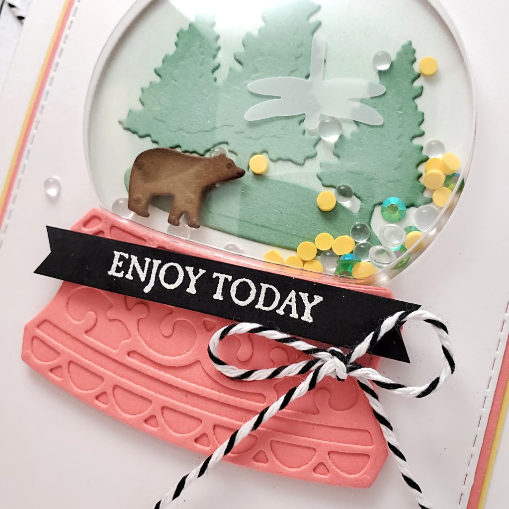
The next steps took some forethought as I wanted the three layers of cardstock to frame the shaker dome. I didn’t want to put in the effort to die cut the dome shape in all three layers AND have them line up with one another.
To avoid this, I used the die to cut the dome shape out of the top layer of Basic White only, which I had also cut with my Stitched Rectangle Dies. Knowing that the next two layers of Flirty Flamingo and So Saffron cardstock would be conveniently hidden behind that top layer, I used that first layer as a stencil and drew a pencil outline to indicate where I needed it. I cut around that area (no need to make it pretty), and did that with both of those layers.
Ah! So much easier than trying to line up all three layers with a die-cut centre!
With my layers ready, I added a few little shaker pieces on my trees. There are some yellow pieces from the Ice Cream Corner Sprinkles, some of the Flowers for Every Season Gems, and one little Vellum dragonfly, punched using the Dragonflies Punch. It’s fun to have some variety! I peeled of the backing of the Shaker Dome and laid it down to stick to the card base. The three cardstock layers were adhered together before peeling off the backing from the front of my Shaker Dome and adhering those layers to the card front around the dome.
SO CUTE! I love how pretty these colours are together.
The base of my globe was cut with the dies using Flirty Flamingo cardstock. The two pieces were glued together and attached to the cardfront using Stampin’ Dimensionals. I added the heat embossed sentiment from the Campology stamp set and tied on the black and white trim from the Playful Pets Trim Combo Pack. As a finishing touch, I adhered a few of the clear gems from the Flowers for Every Season Gems to my card front with my handy dandy Multipurpose Liquid Glue.
This design makes me want to get out and meander beneath the trees, just like that little bear is doing!
I think the mountains are calling me. 🙂
Don’t forget to grab these dies and the shaker domes on my online store before they’re gone forever. The stamp sets and the gems are soon to retire as well. If you love them, don’t miss your chance. They will be available until May 3rd or until they sell out, whichever comes first.
Access my Canadian online store by clicking on the SHOP circle on my blog. You can also go to the menu at the top of the page and click on the SHOP option.
When I watch superhero movies, I see how brave the heroes are – they’re confident in what they’re doing and there’s no hesitation when they step in the way of the evil villain to protect the innocent. How brave and strong they are and how I wish I could be like that – fearless, confident, smart, and full of purpose!
But that’s not actually the full picture of being brave, is it? To be brave is to have the ability to take action even when you’re afraid. You have to build up courage.
There are quite a few women in my life who I look up to for their courage to step out of their comfort zone and take on a new challenge! Often times, they don’t see it. They only see their own insecurities, doubts and fears. The interesting thing that we often forget about being brave is that it doesn’t mean “not being afraid”, it means being afraid – but doing it anyway.
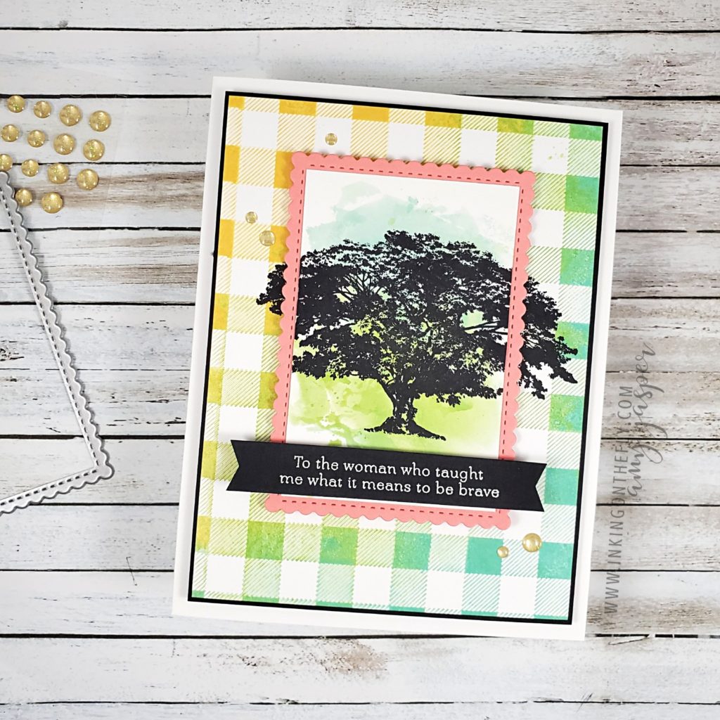
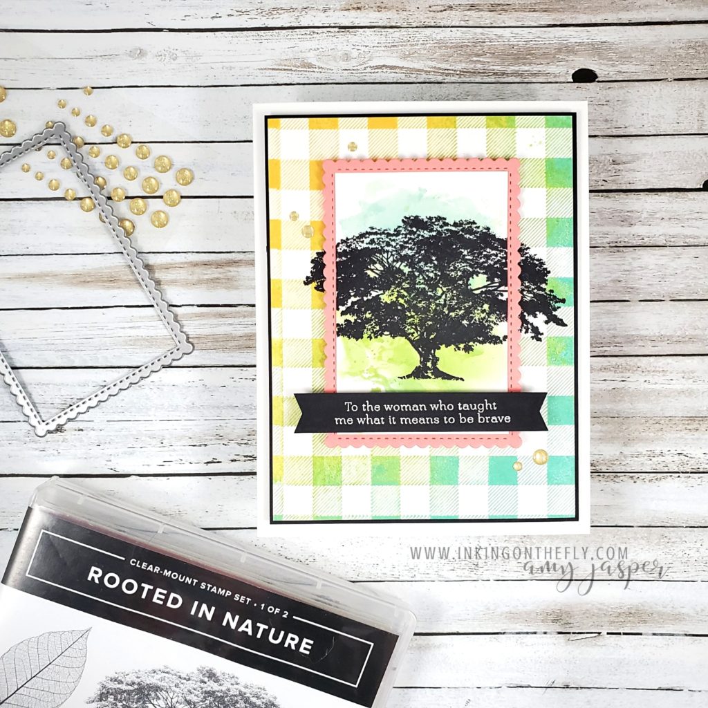
For the As You See It Challenge sketch today, I chose to use the sentiment from the retiring Strong and Beautiful stamp set from Stampin’ Up! and it has me thinking about the brave women in my life. They are an inspiration to me and help me to be a little bit braver by their example.
I’ve been doing a lot of die-cutting and paper layers lately and have been feeling like I’m neglecting my ink and stamps, so there’s some fancy inking tricks on this one!
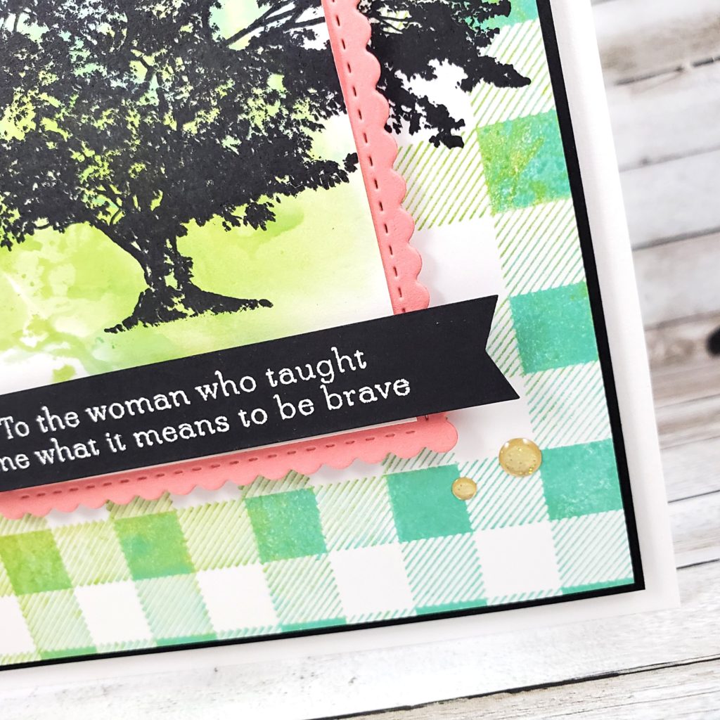
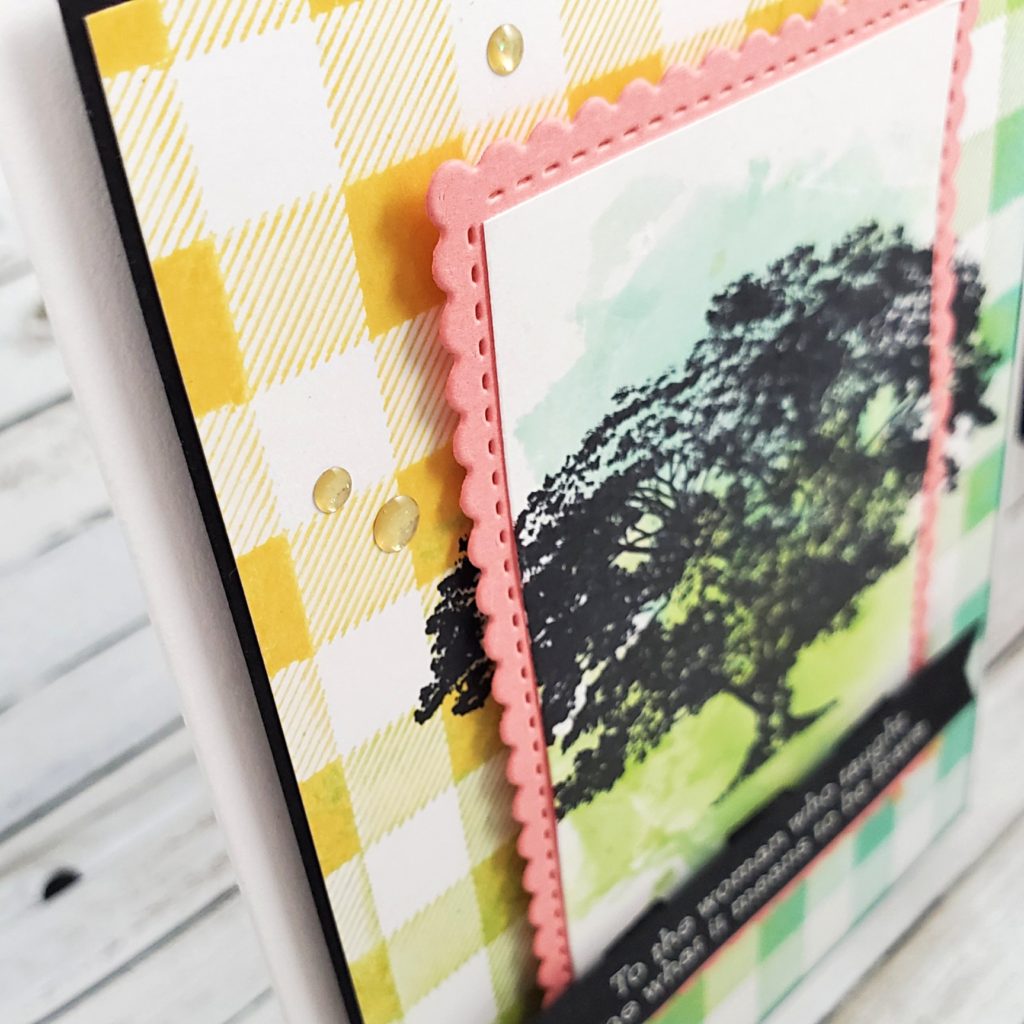
I started by applying Daffodil Delight and Coastal Cabana ink to the Buffalo Check background stamp (retiring soon!). Then I used a piece of paper towel and blended the colours together and pulled off some ink to try to achieve a bit of a distressed look (it still stamped much nicer than I planned). I then added a bit of Granny Apple Green ink to the stamp where the yellow and blue met in the middle to blend the colours even more. With the large stamp facing rubber-side-up, I placed my Basic White cardstock on top of it and pressed evenly all over with my fingertips to transfer the ink to my paper.
I pulled out my Stamparatus stamp positioning tool and placed the checked piece there with a smaller piece of Basic White cardstock over top of it in the center, using the magnets to hold the papers in place. I used Jet Black Stazon Ink on the tree image from the retiring Rooted in Nature stamp set and stamped the image so it stamped on the smaller piece of paper and over the edges onto the larger checked piece. Using the Stamparatus allowed me to stamp it a couple times to get the best image. Good thing I did that, too, because my Stazon ink pad was a bit dry and stamped very poorly the first time! Good thing I had an ink refill on hand!
The black tree silhouette looked a bit stark on the small white piece of cardstock, so I grabbed a clear envelope and placed some ink directly from the ink pads of my Granny Apple Green and my Coastal Cabana. With my Stampin’ Spritzer filled with a water and rubbing alcohol solution, I spritzed the clear plastic, then flipped the plastic over and transferred the wet ink to my paper, creating the watercolour effect.
The rest of the card is more straight forward. I adhered the Buffalo Check piece to a slightly larger piece of Basic Black to create a very thin border, then attached it to the Thick Basic White cardbase with Stampin’ Dimensionals. The watercoloured tree image was layered on a Flirty Flamingo die-cut stitched rectangle from the Stitched So Sweetly Dies. These two layers were attached with Stampin’ Dimensionals to the front of the card. Then I stamped the sentiment from the retiring Strong and Beautiful stamp set with Versamark ink on a strip of Basic Black cardstock, applied White Embossing Powder and heat set it with my Heat Tool. I used the Banners Pick a Punch to flag the ends of this piece and adhered it to the front of my card with Stampin’ Dimensionals.
Finally, I added some of the retiring Gold Glitter Enamel Dots to my design.
“I learned that courage was not the absence of fear, but the triumph over it. The brave man is not he who does not feel afraid, but he who conquers that fear.” – Nelson Mandela
If you walked away from an abusive marriage and are now a single working parent, you taught me what it means to be brave. If you came out to your friends and family as LGTBQ+, expecting you’d be rejected by many of them, I am inspired by your courage! If you started a new job, you moved to a different town, you took the city bus for the first time, you did that class presentation, you opened up to someone and let yourself be vulnerable – you have courage!
And sometimes being brave is not about the big moments in our lives. Sometimes, being brave is facing the day-to-day grind so you can have a roof over your head and food on the table. Sometimes, being brave is admitting that you’re struggling and you need help. Sometimes, it’s saying sorry.
I get so inspired when I think of the beautiful and brave people I know. There’s more courage in you than you realize.
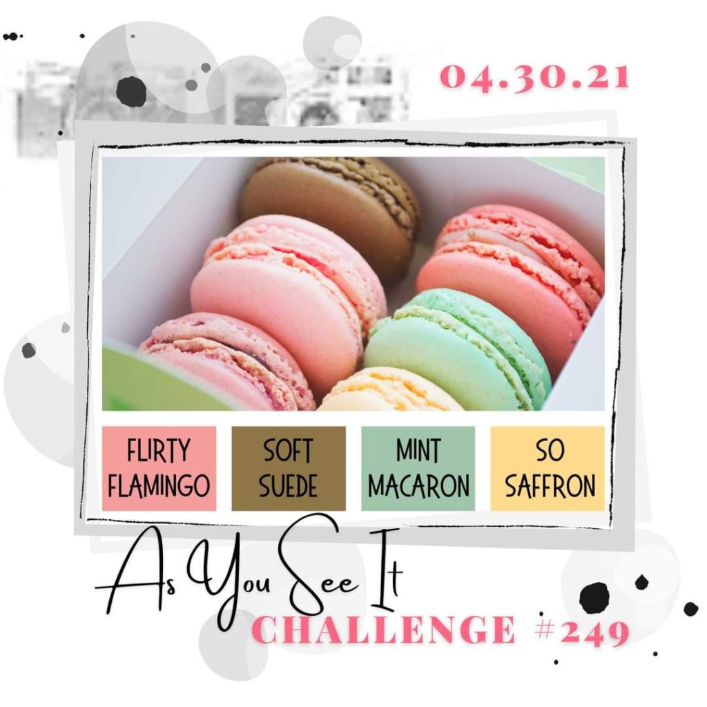 To create my card, I used a Blending Brush to apply Mint Macaron Ink to the front of the Thick Basic White card base. Mint Macaron Ink was also sponged on the edges of the Mint Macaron die-cut trees before adhering them to the front of the card. A bit of Soft Suede Ink sponged onto the edges of my little Soft Suede die-cut bear gives him a bit more definition before placing him where he could meander below the trees.