As You See It Challenge

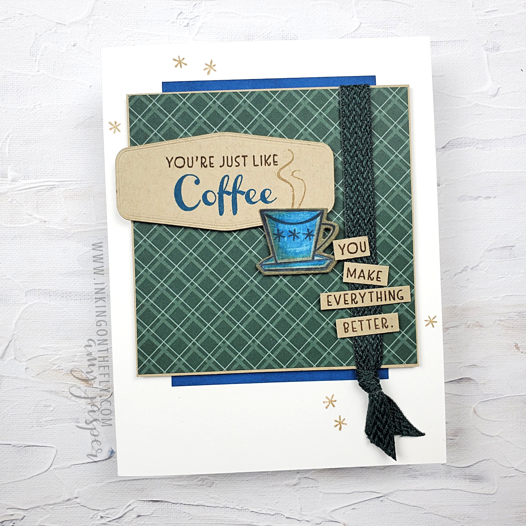
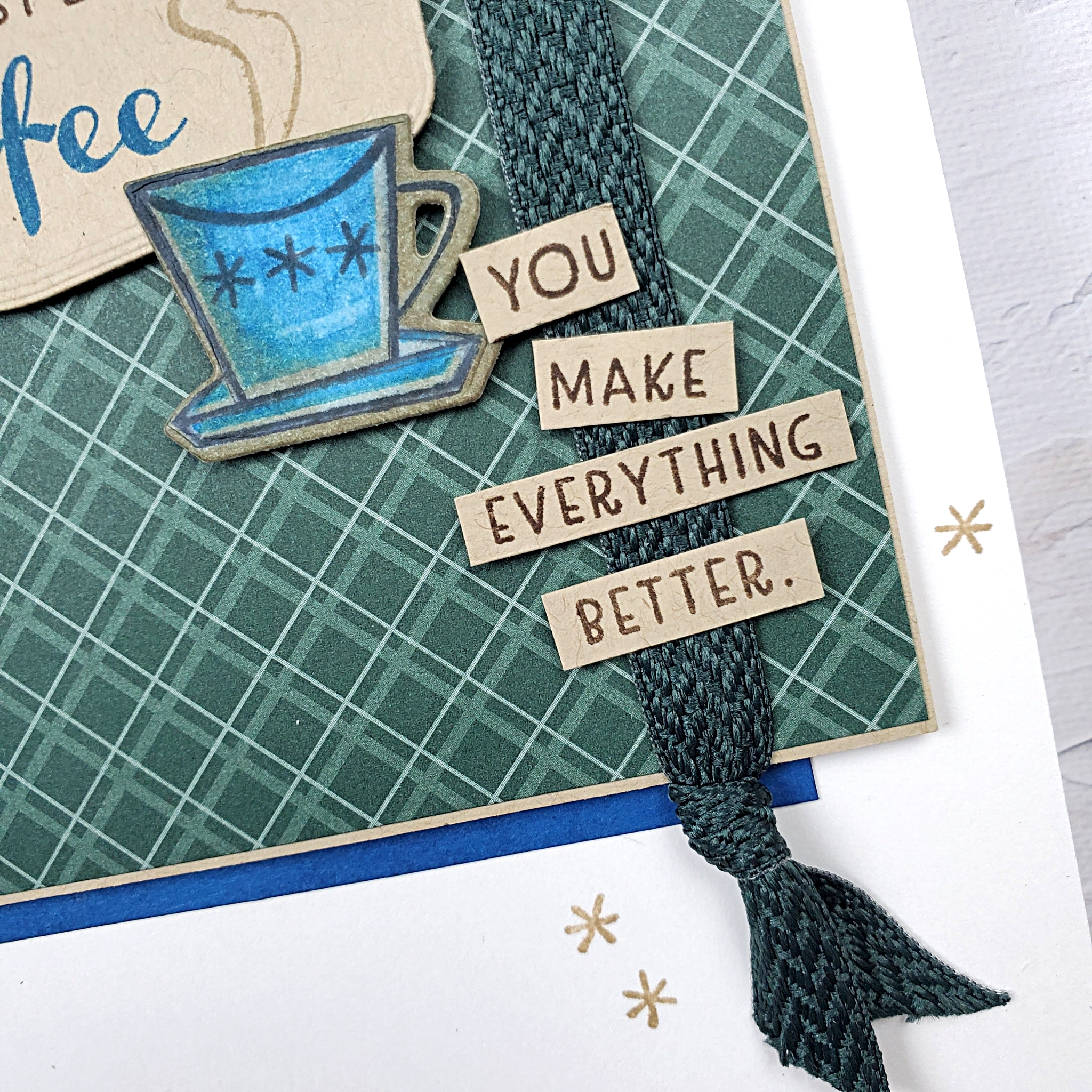
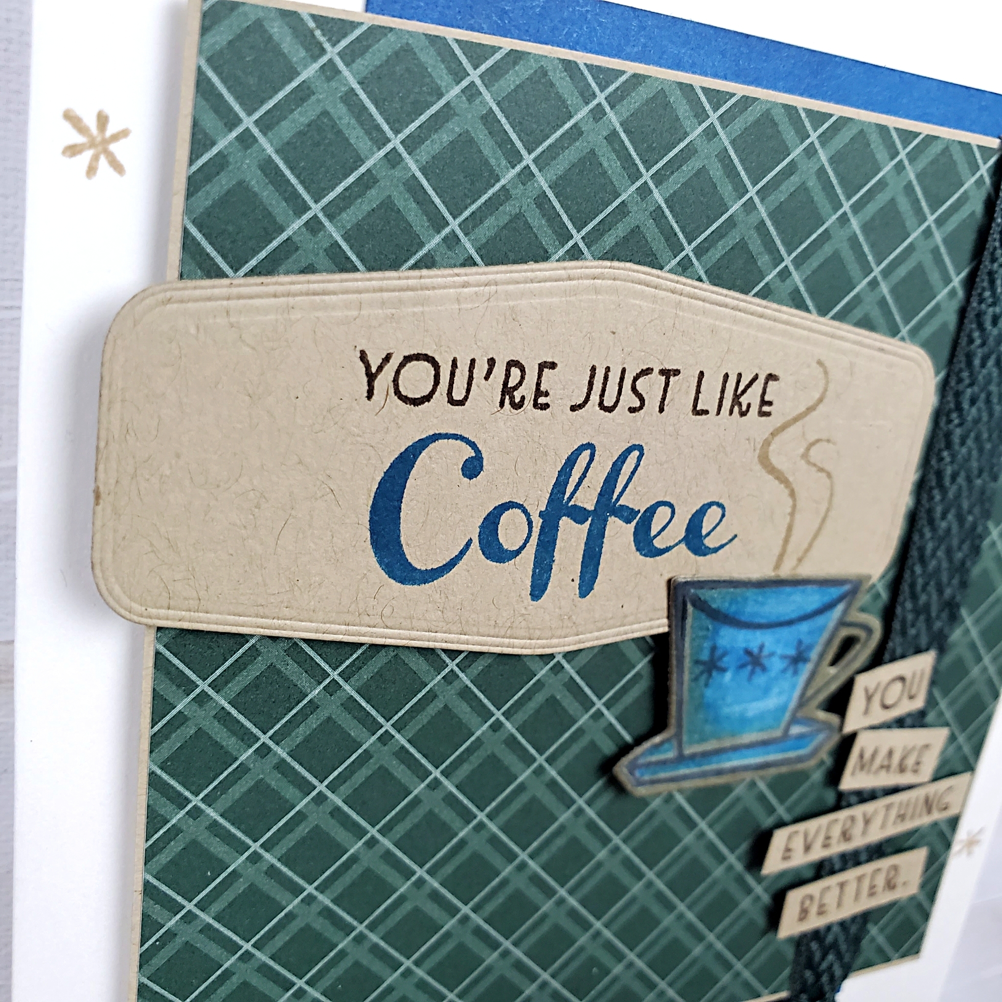
My How-to Video Makes this Fun Pop-up-flap Card Easy

I love pop-up cards and this design is one of my absolute favourites! I first discovered this style of pop-up by watching a video tutorial shared by Mitosu Crafts. You should definitely check out their great ideas on YouTube.

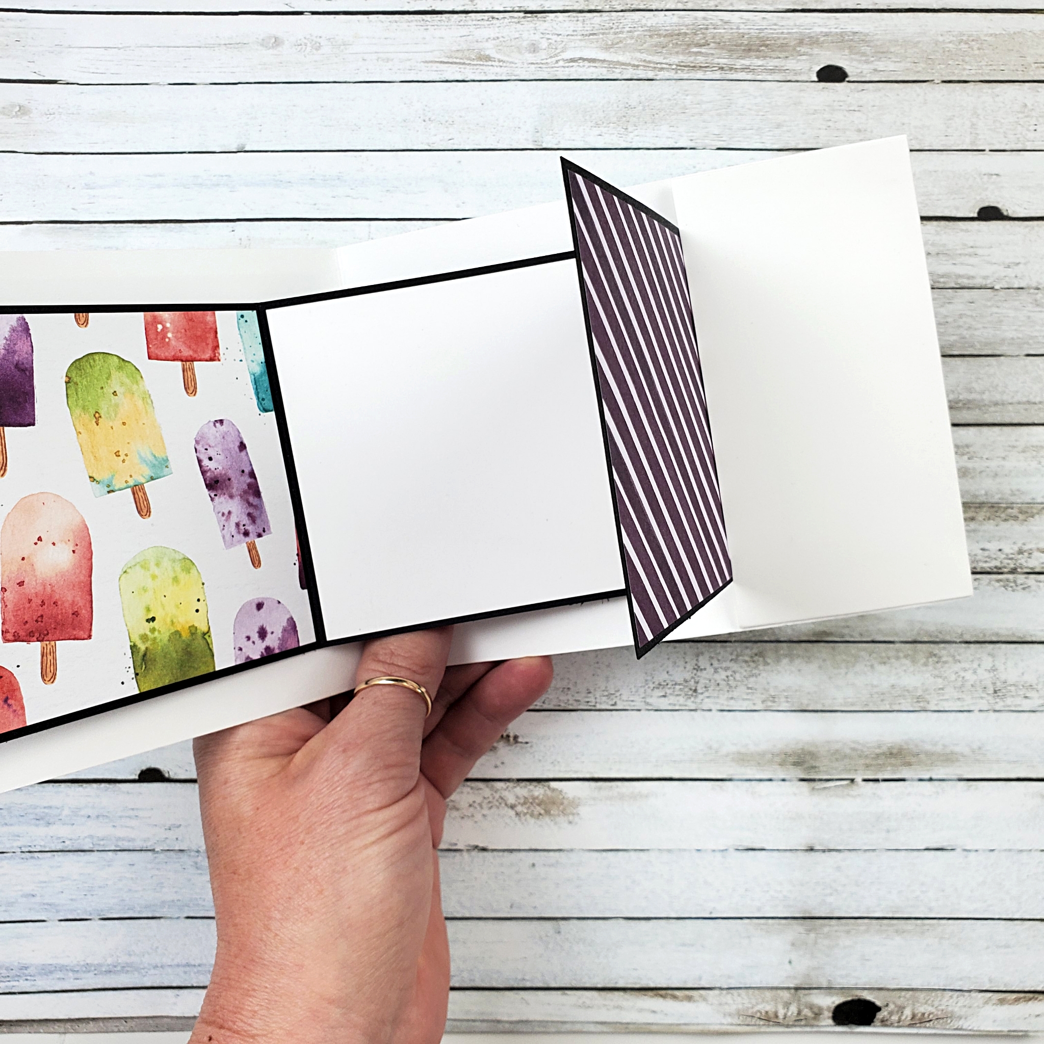
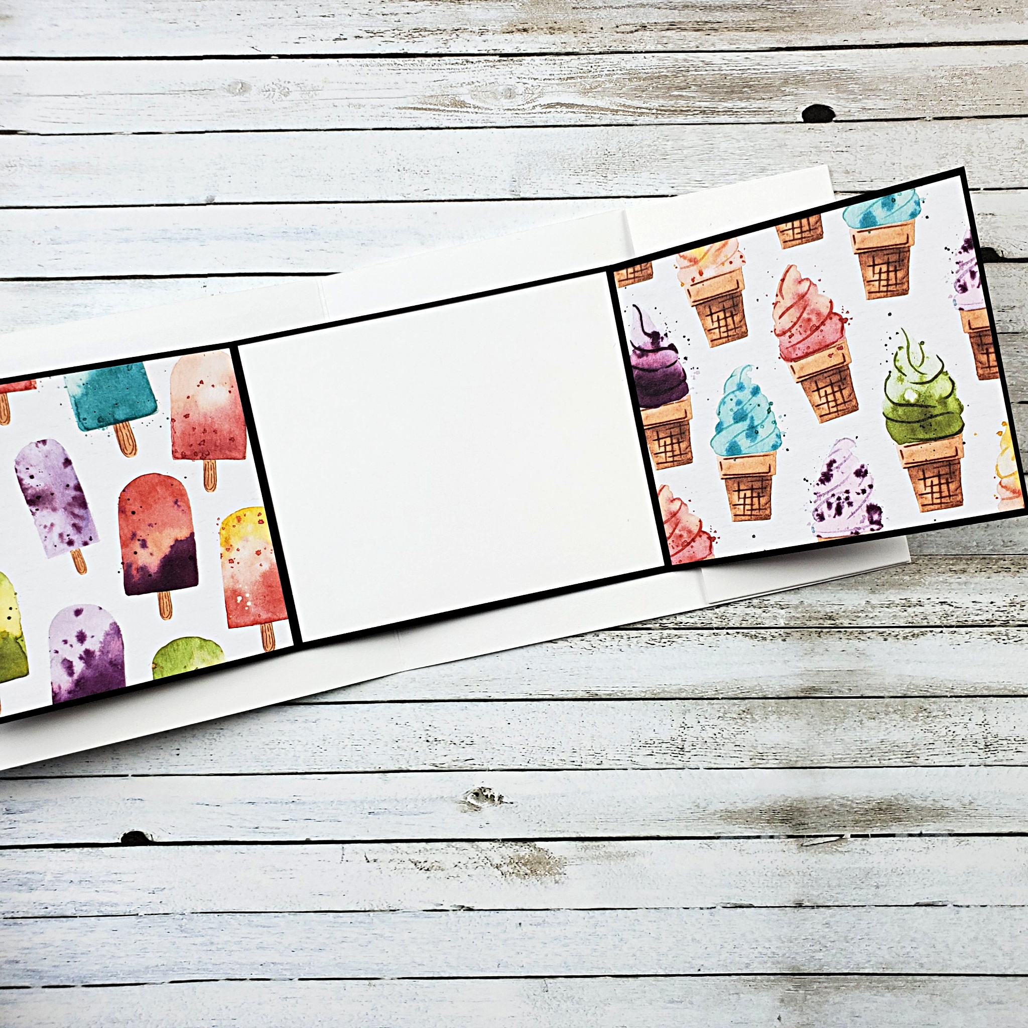
I didn’t follow their directions exactly. Instead, I made a few adaptations to the pop-up mechanism to make it a little less bulky and, hopefully, a little bit simpler.

The ice cream patterned paper pack is no longer available from Stampin’ Up! I don’t think that will be a problem for you because I know you’re very clever crafters and will be able to make a beautiful card with different paper. In fact, I’d like to make another card like this one and use some of the bright and cheerful paper from the Pattern Party Paper Pack. It has 48 sheets of 12″ x 12″ paper that you can only get with Host Rewards from hosting a workshop or placing an order for yourself that’s over $200 CAD.

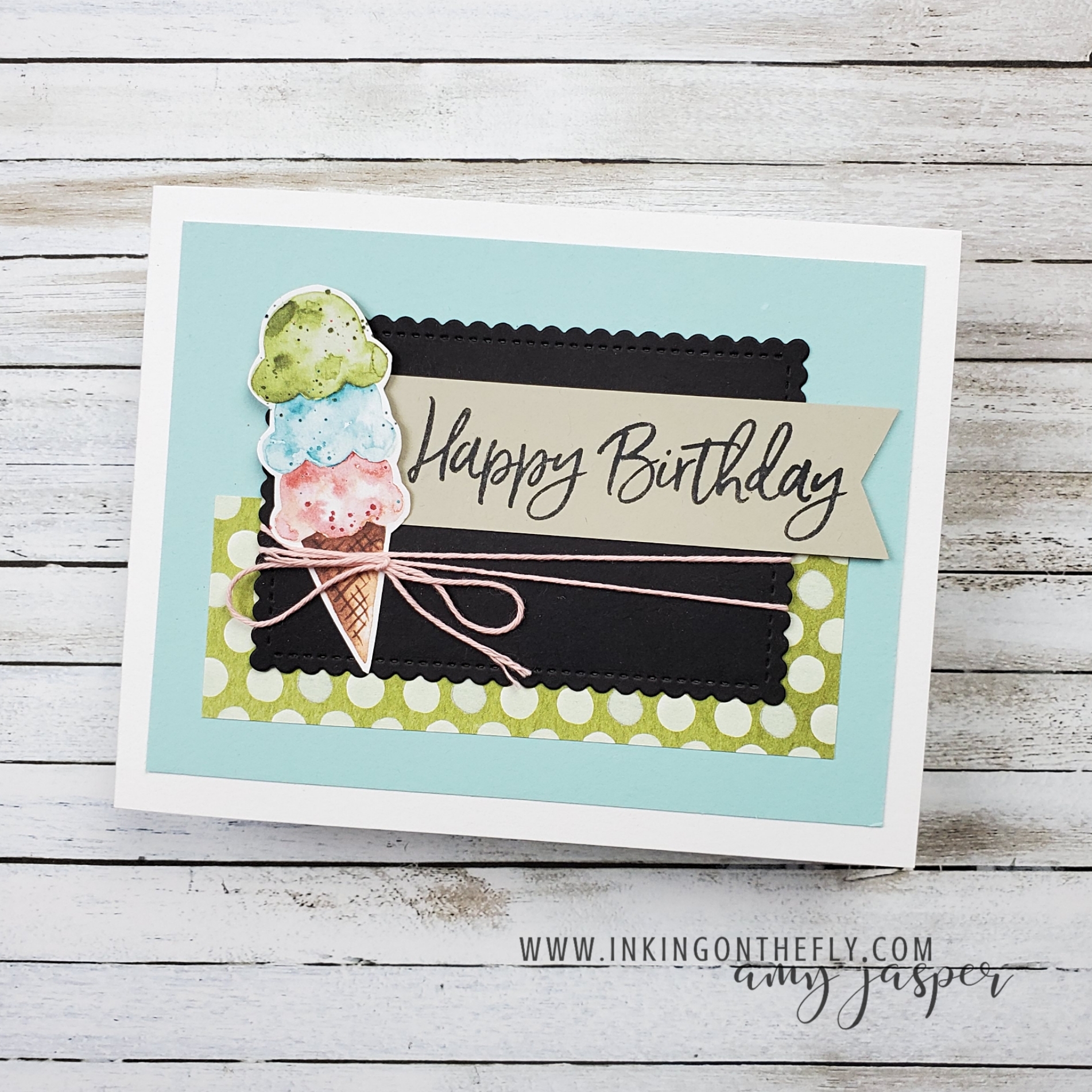
The ice cream cones on the front of this design are also from the retired Ice Cream Corner paper, but can easily be replaced using the Ice Cream Cone Builder Punch and the Sweet Ice Cream stamp set from Stampin’ Up!.

Follow along with my video tutorial below and give this pop-up card a try. I think you’ll be pleasantly surprised to find that it’s easier to make than you think! You’ll fine the cutting measurements at the bottom of this post.

Measurements for the Card Front

4 ¼” x 11” Thick Basic White, score at 5 ½”
5” x 3 ¾” Pool Party
1 ½” x 4 ¼” Ice Cream Corner paper
Fussy-cut ice cream cone from Ice Cream Corner paper
3 ⅝” x 2 ⅜” Basic Black Stitched So Sweetly die-cut
3 ¾” x 1” Sahara Sand
21” Baker’s Twine

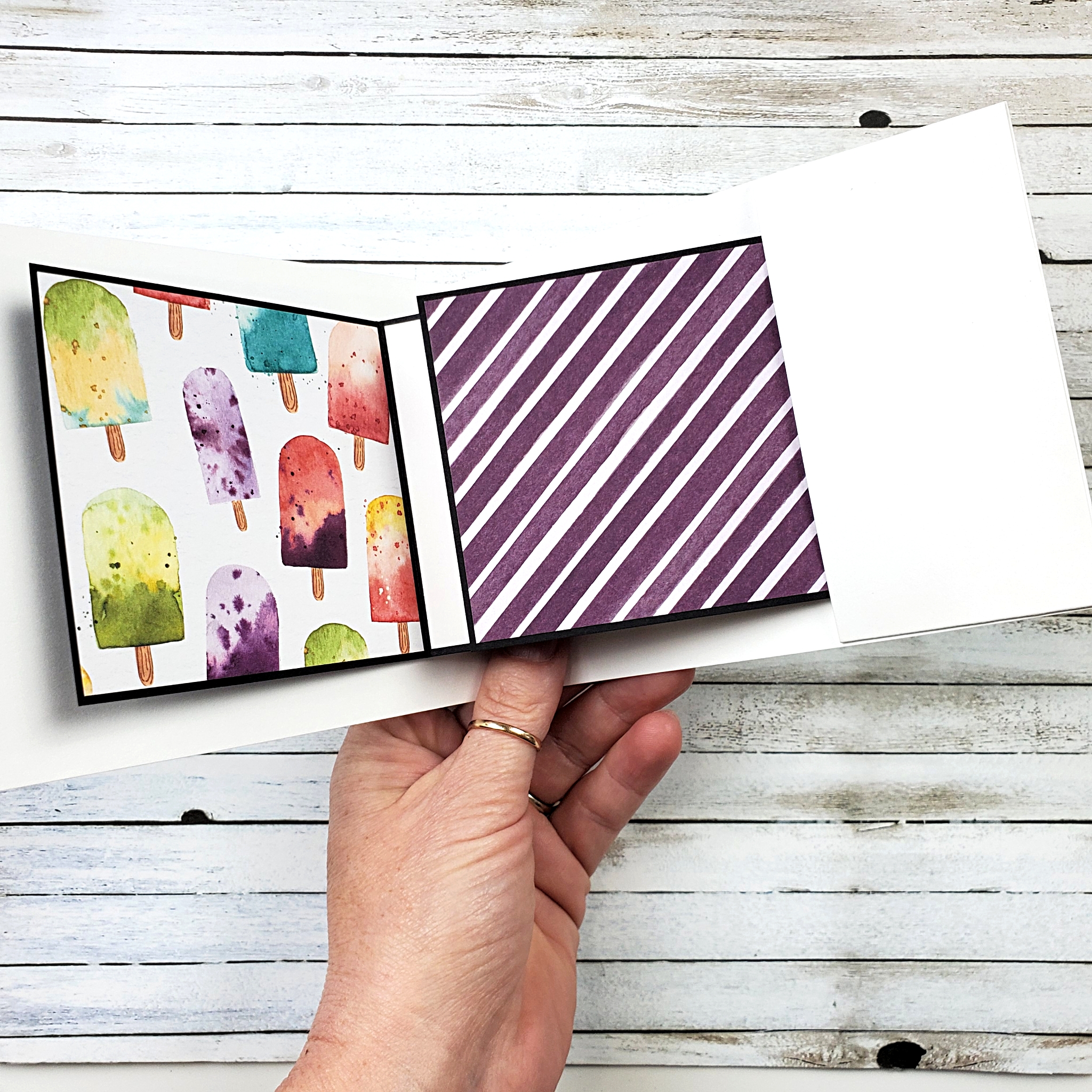
Measurements for the Inside

2 ⅛” x 5” Thick Basic White, score at ⅜”, 4 ⅝”
2” x 3” Thick Basic White, score at 1”, 2”, 2 ½”
11” x 3 ¼” Basic Black, score at 3 ½”, 7 ½”
3 ⅞” x 3 ⅛” Basic White
2” x 2 ½” Clear envelope (or plastic bag)
3 ⅜” x 3 ⅛” Ice Cream Corner DSP (x3)

Dads Make Everything Better

What do dads and coffee have in common? Okay, I know that not all dads are like coffee, but the dads in my life definitely make everything better – just like coffee does!

As mentioned in my previous post, I’m experiencing a lot of pain in my left shoulder. This is making typing more difficult as the position seems to aggravate my injury. I am typing with both hands at the moment (YAY!), but I can feel the tendons in my shoulder complaining more and more, as each minute passes.

I will have to keep this brief.

Today’s masculine-themed card was created for the As You See It Challenge blog.

The Evening Evergreen patterned paper from the In Color Designer Series Paper was the start of my design. I paired it with some Crumb Cake and used a Basic White cardstock base to prevent the entire design from ending up overly dark.

The Pacific Point cardstock and ink also brightens the design. I did end up using a Blending Brush with a wee bit of Misty Moonlight ink on the Pacific Point cardstock just to soften the intensity of the colour. This allowed it to match the stamped and coloured imaged on the card, as the colour is not as true when stamped on Crumb Cake cardstock.

Product List

  • Nothing’s Better Than stamp set
  • Pacific Point ink
  • Early Espresso ink
  • Crumb Cake ink
  • Basic White cardstock for the coffee cup
  • Crumb Cake Blends Markers for shading on the coffee cup
  • Tuxedo Black Momento Ink for the coffee cup outline
  • Stampin’ Dimensionals and Mini Glue Dots

Go to my online store anytime to order supplies in Canada. Leave a comment for me if you have any questions regarding this project. You are always welcome to send me an email or connect with me through my Facebook page as well. I love hearing from you!

I have started physio treatment for my shoulder and am hoping to get back to normal daily function. Being able to sleep through the night without being woken up every couple hours from the pain will make a huge difference to my ability to handle the day. I’m going to take after my dad and be a good patient and do all the exercises, stretches and other things that my physiotherapist prescribes. My dad is a great source of inspiration for a lot of things.

Kind of like coffee.

Spring Chicken

The Hey Chick Stamp set is so much fun! This chicken with the wild feathers on its head is definitely my favourite of the images in the set!

A few years ago, I made a special pop-up card with the Hey Chick stamp set. You can see that card by clicking HERE.

The sentiment from the Happiest of Birthdays stamp set is the perfect size and style for this card design. The Chick Dies add so much more to this card with the die-cut chicken, the Basic White chicken coop, and the Silver Foil chicken wire.

This layered card has all the elements necessary to show you how you can make a card and play along with the As You See It Challenge blog. Can you identify all five of the elements on my card?

  1. Birthday – The sentiment is from the Happiest of Birthdays stamp set and stamped on Calypso Coral cardstock with Versamark ink.
  2. Heat Embossing – White Embossing Powder is added to the sentiment and heat set with the Heat Tool.
  3. Ribbon/Twine – A bow of Navy Baker’s Twine from the Well Suited Twine Combo Pack is attached with a Glue Dot.
  4. Patterned Paper – The Misty Moonlight patterned paper and the Bumblebee striped paper are both from the Dandy Garden Designer Series Paper. The Old Olive polka-dot patterned paper is from the Ice Cream Corner Designer Series Paper.
  5. Die-cut – The chicken, the chicken coop, and the chicken wire are all die-cut with the Chick Dies. Both circles are cut using the Layering Circle Dies. The Night of Navy label that you see behind the circles is cut using the Painted Labels Dies. This element is more than covered, don’t you think!? LOL!

The chicken is stamped on Basic White cardstock using Tuxedo Black Momento ink, then coloured with Stampin’ Blends Markers. Real Red, Calypso Coral, Crumb Cake, and some Daffodil Delight, all play their part in making that chicken so fun! After colouring, I did some careful touch-ups with the pen end of my Basic Black Stampin’ Write Marker. I often do this to sharpen an image after it’s been coloured as the colouring process can soften the lines. Doing that is kind of the same as using the sharpening feature when editing photos.

The card base is Night of Navy cardstock, layered with Basic White. Then the patterned paper pieces are added with a 3/4″ wide strip of Misty Moonlight cardstock to separate the two patterns. Next, the Night of Navy die-cut label, the Basic White circle, the Silver Foil die-cut chicken wire, the Bumblebee striped die-cut circle, and the Basic White die-cut chicken coop are layered on the cardfront.

The only items that are attached with Stampin’ Dimensionals are the sentiment and that crazy, funky chicken.

Go to the As You See It Challenge blog to see all the designs shared by our design team. Why not give this challenge a try and share it with us on the challenge blog? It’s fun to play along and we love seeing where your creativity takes you!