card

Simply Pressed “Cake”

075header

Stampin’ Up Simply Pressed Clay is something I loved the idea of, but up until now had little interest in using the flower or button molds that were available. I finally tried my clay when my new Stampin’ Up, oh-so-fun, Alphanumerical mold arrived!

I love words – the shapes, the meaning, the linear order of them. They are powerful and beautiful and can be smart, witty, sarcastic, sweet, painful and wise. Words give us so many possibilities.  Though, I am often tongue-tied by the deeper introvert within me and may not be as eloquent as I would like to be in my writing style, I love that words have the power to evoke emotion, philosophical thinking, a search for meaning, and can open up all sorts of doors in our lives.

(literally – i.e. “open sesame” in the tale of Ali Baba and the 40 Thieves, as well as “Speak, friend, and enter” from The Lord of the Rings. lol!)

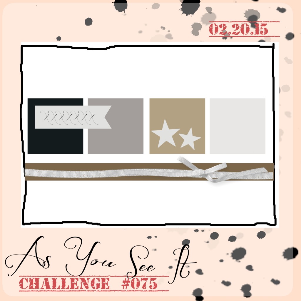
Check out the sketch for this week’s As You See it Challenge #075:

075

Here’s my Simply Pressed Clay card design:

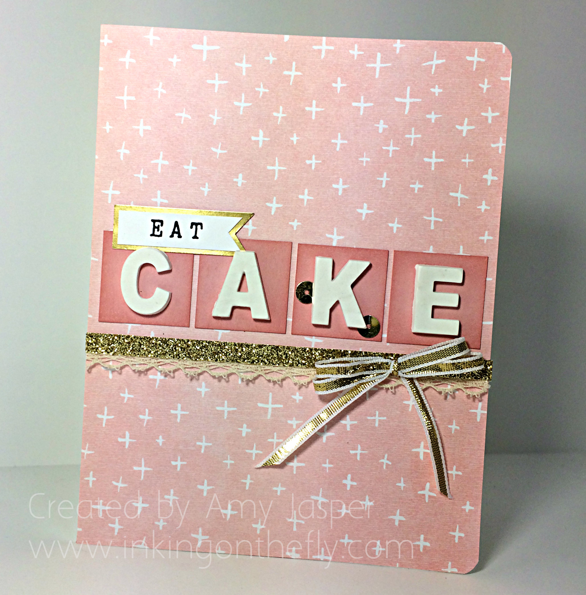
075Amy

I started with a Whisper White cardstock base. It was one that I had accidentally smudged with ink, so I cut a 4.25″ x 5.5″ piece of the Sale-a-bration paper called Best Year Ever and adhered it to cover the entire front of the card base. I felt so clever, covering up that smudge, lol!

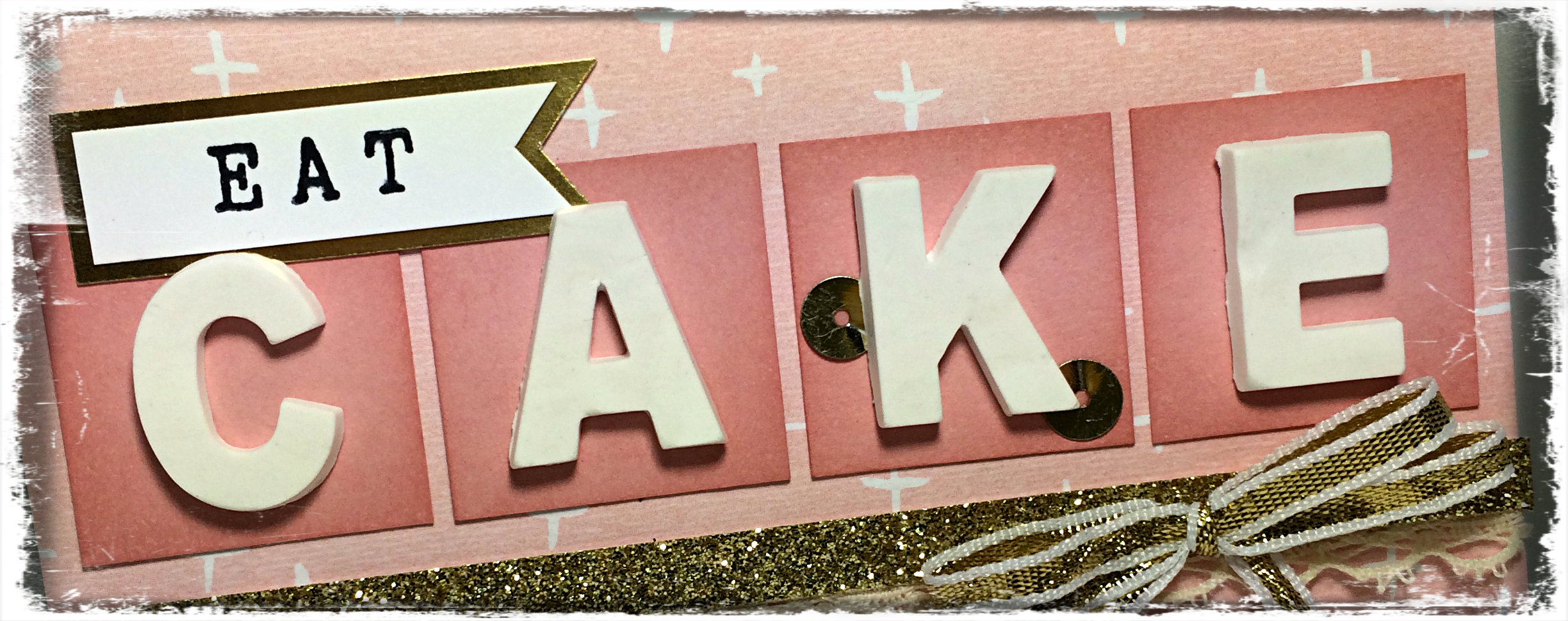
I changed the orientation of my card from landscape to portrait and rounded the corners with the Project Life Corner Rounder Punch. I used Blushing Bride cardstock for the squares and I lightly sponged the edges of those squares with Blushing Bride ink. The EAT banner at the top is stamped using my new Alphabet Rotary stamp (more words! So fun!) with Momento Tuxedo Black ink on Whisper White cardstock, matted with Gold Foil paper. I hand-cut the flag end of the banner.

The Simply Pressed Clay was carefully pressed into the letters in the mold, then I place it in the freezer for a few minutes to allow the letters to set before removing them from the mold so they could continue to dry. The first time I used the mold, I dabbed the Embossing Buddy over the mold so it could act like flour in a cake pan and prevent the clay from sticking. This was not such a good idea as it discoloured my white clay with stained gray powder. (I’ll used those letters when I want to take the time to colour them). Once the letters were completely dry, I used Tombo Multipurpose Liquid Glue to attach them to my card front. Then I tucked in my Gold Sequins under the letter “K” in accordance with the stars on the sketch.

For the gold strip, I cut a thin piece of Gold Glimmer paper and adhered the Venetian Crochet Trim to the back with Tombo liquid glue, the attached both together to my cardfront with more glue. Finally, I tied the double bow, using the Fingertip Double Loop bow technique as seen in this Youtube video, and applied it to the Glimmer paper with a Glue Dot.

A fun and pretty word card, playfully commanding that you “eat cake” on your special day!

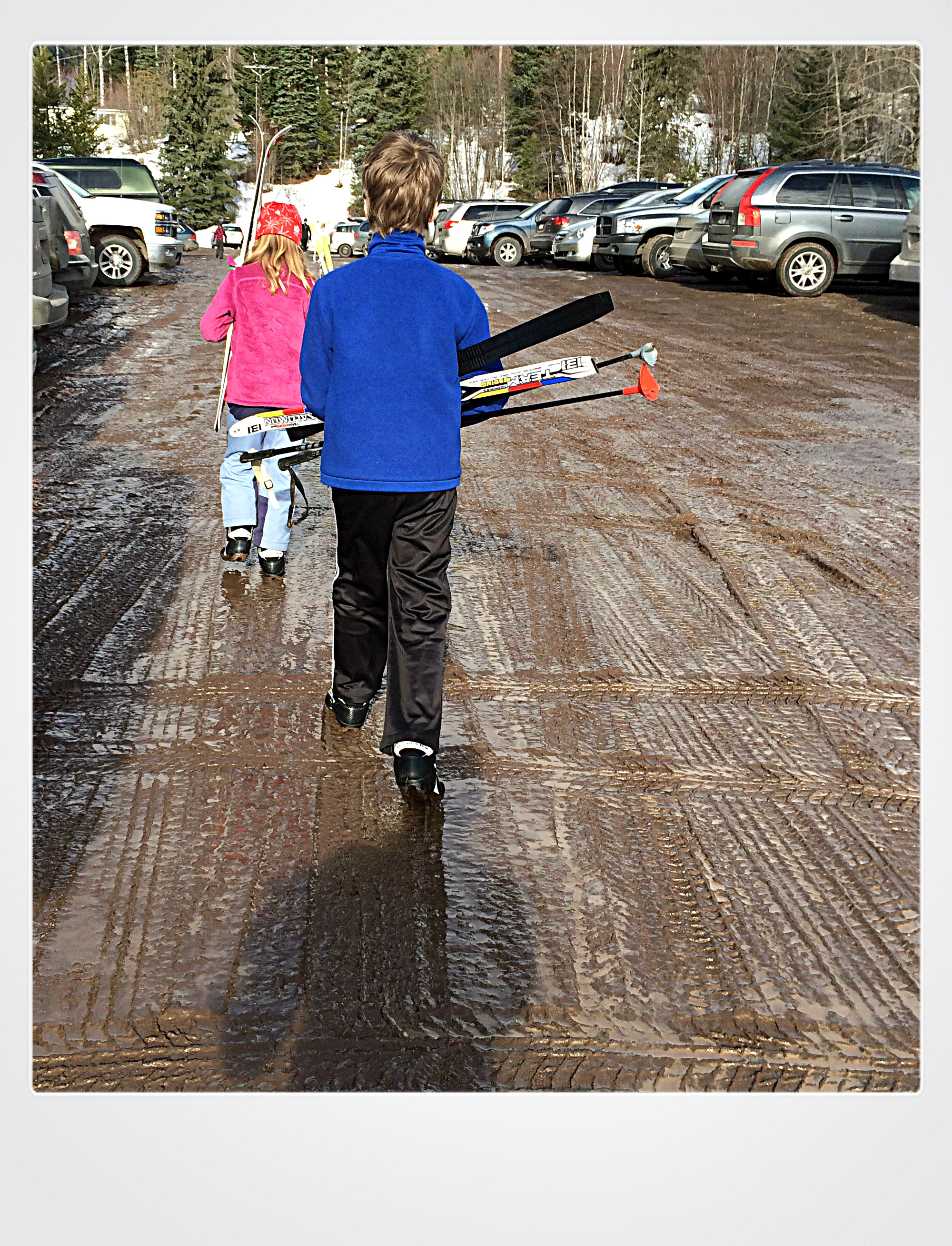
On a personal note, my family likes chocolate cake with chocolate frosting. We went cross-country skiing last Saturday (as we often do) and found that the warm weather had melted all the snow in the parking lot, leaving us to maneuver through a muddy mess.

The kids commented that it looked like chocolate frosting! lol!

chocolate frosting parking lot

Thanks for visiting today! Hope you’ll play along at the As You See It Challenge Blog and share your take on this sketch!
Amy.Designer-Badge


Sweet Birthday

074header

What!!? It’s Friday again?!!

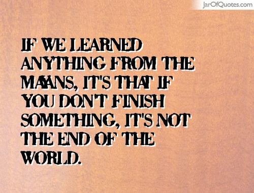
The weeks just fly by with my goals for things-to-complete left far far behind! I bought a magnet for my fridge that says this:

mayans


So, maybe I didn’t get my craft room cleaned up. Maybe I didn’t get around to getting ahead on any craft projects. Maybe next week will be better … or maybe it won’t. But, you know what? The world keeps turning, which means I get another chance to get those things done.

1. Set a goal

2. Don’t reach goal

3. Revise goal

4. Repeat as needed

Here’s a simple and appropriate theme challenge in the week with Valentine’s Day:

#74

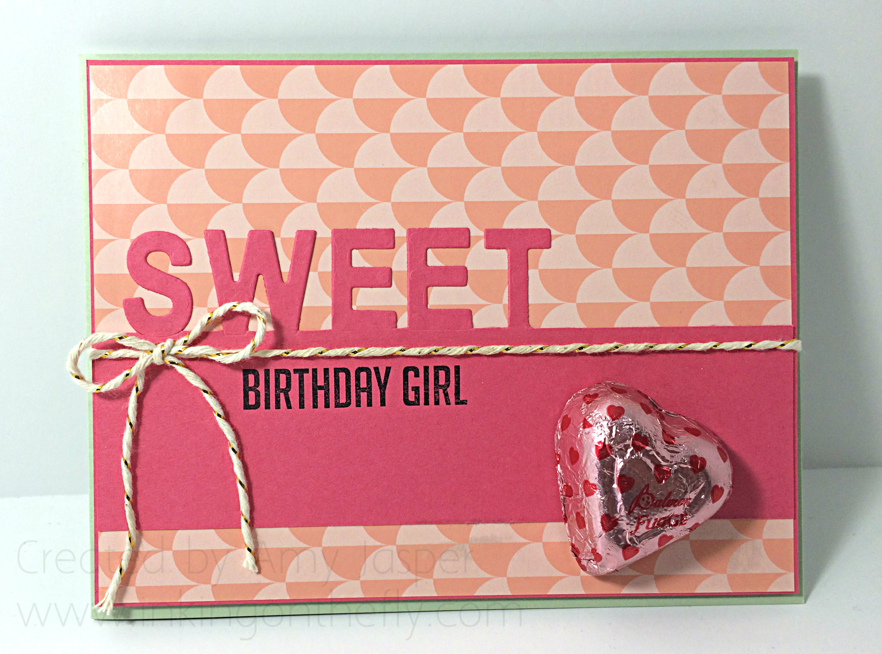
My card is simple, but uses a technique that I saw shared by Jennifer Timko. I have her adorable project pinned on my Papercrafting Ideas Pinterest board HERE. She has a tutorial video to help you create the look with the letters as I have done in my card for the challenge.

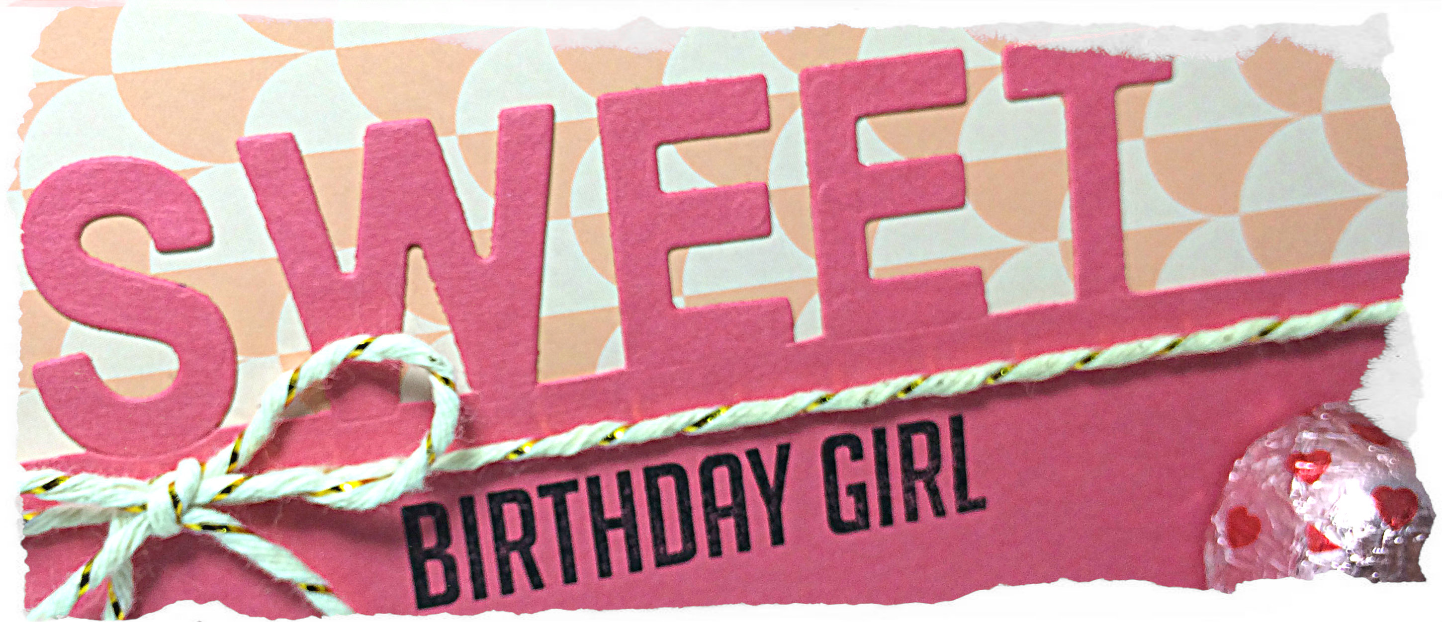
074Amy

I have to admit, that the big chocolate on the front of this card made it off-balance and impossible to stand on its own. In hindsight, I would have used my 1-3/4″ circle punch on the front of the card to allow the chocolate to be adhered inside the card in such a way that it would peek-a-boo through the circle. Then the weight would be more centered in the card base.

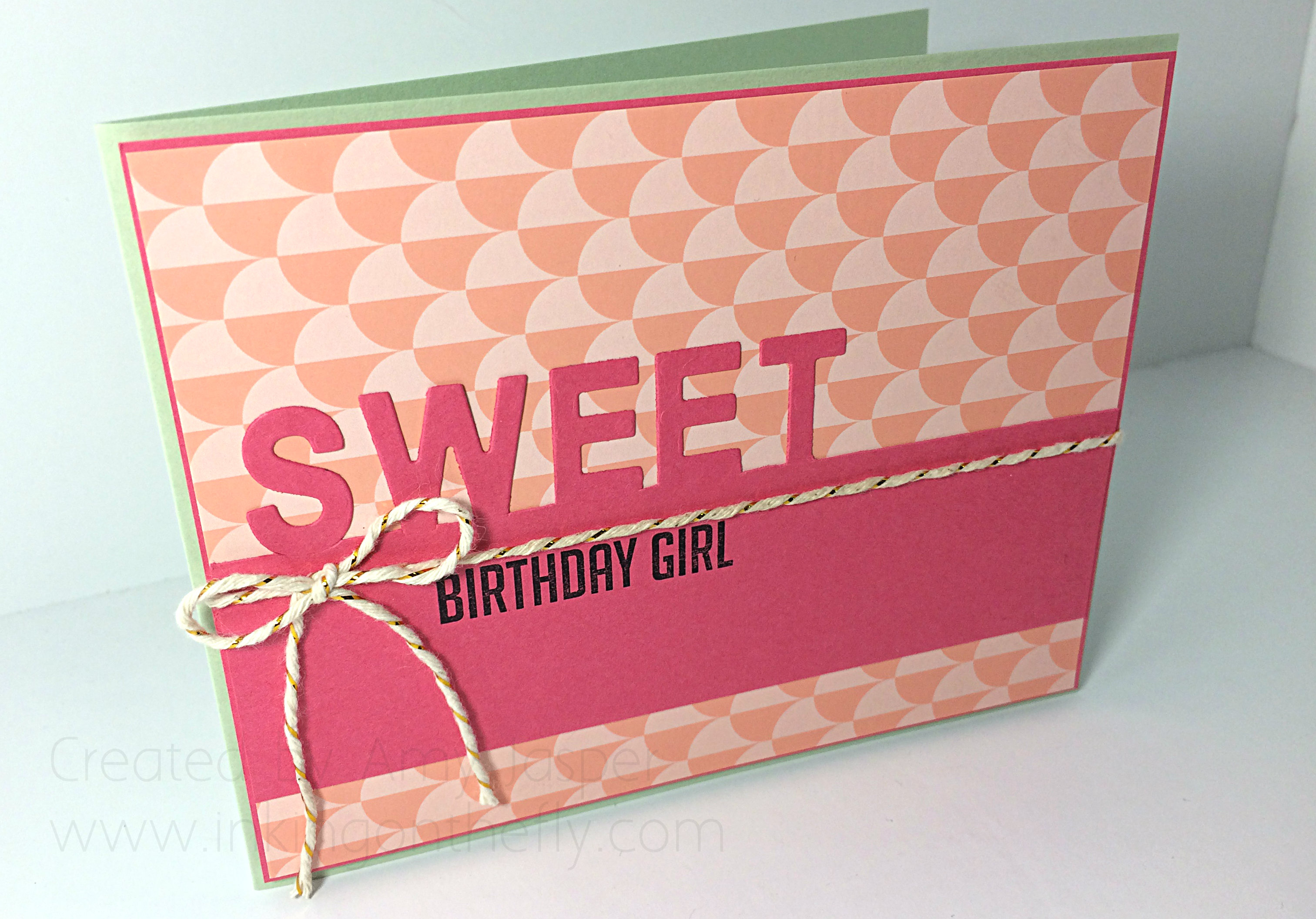
Here’s the card without the chocolate heart. Still cute.

074Amycandyfree

I used Pistachio Pudding cardstock for the card base, then there is a thin matt layer of Strawberry Slush cardstock. The patterned paper is a sheet from the Gold Soiree Specialty Designer Series paper. This paper has a unique, almost plastic or magazine glossy finish to it, giving it a wonderful, professional finish for your projects. The Little Letter thinlits were partially cut from the Strawberry Slush cardstock top layer that was stamped with the “birthday girl” image from the Hooray It’s Your Day photopolymer stamp set.

The Gold Bakers Twine is wrapped and tied around the three top layers before they were adhered to the card base with Stampin’ Up Dimensionals. The candy heart was attached with many Glue Dots to make sure it was secured well to the card.

I hope you try this theme challenge over at As You See It this week. So many ways to interpret themes! You could do a card, a 3D project, home decor, or anything to do with “sweet”. Babies are sweet. Success is sweet. Cupcakes are sweet. So many paper-crafting possibilities!!

Happy crafting!

Amy

Designer-Badge


Birdie Soiree

069header

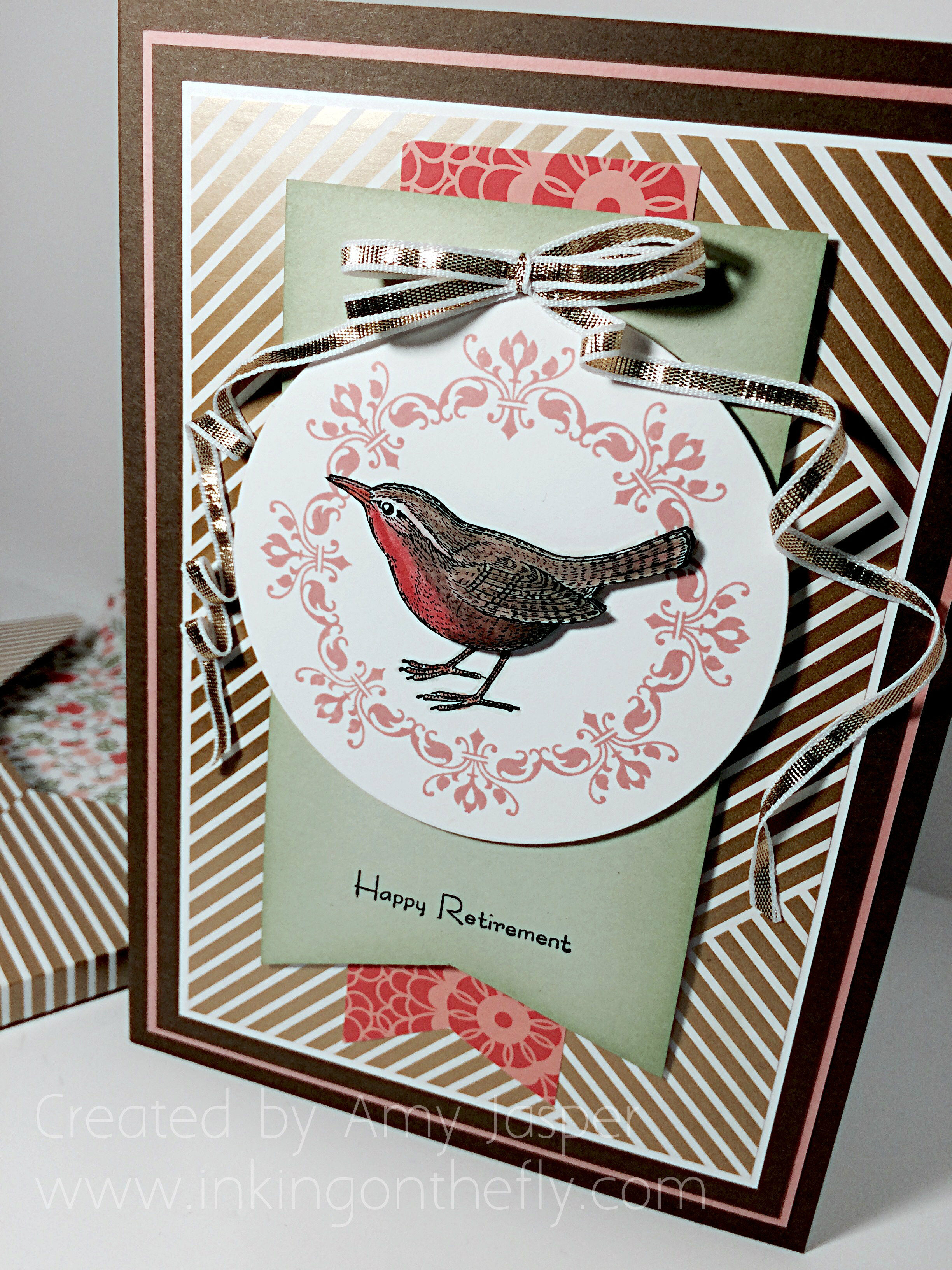
I’ve got what I call an uber-card for you today. Every now and then I get to make something fancy. This one is a 5×7″ retirement card designed for many people to say their well-wishes and farewells to someone who has brought meaning and inspiration to their lives and has earned the title “Retired”. A time where you get to live off of your savings and live out your golden years. I used Gold Soiree Specialty Designer Series Paper and my beloved An Open Heart stamp set from Stampin’ Up!

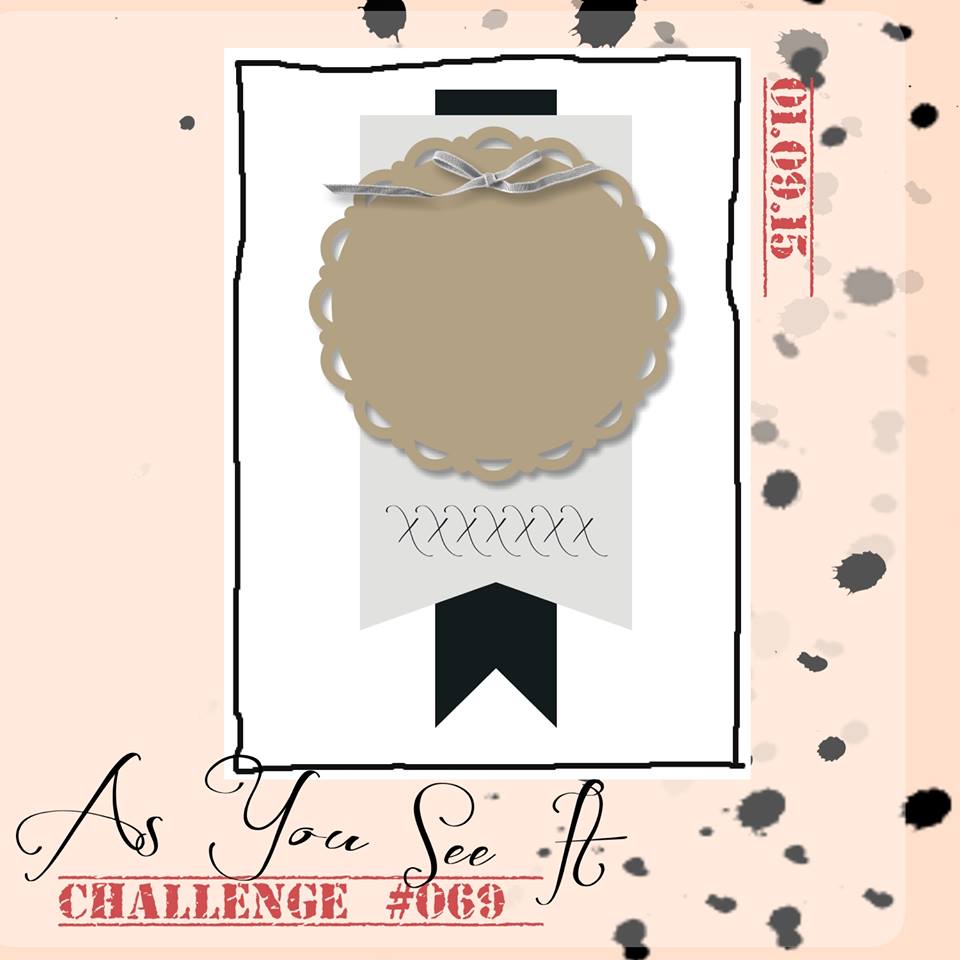
I decided to use a challenge sketch to find some inspiration and creative mojo to get this card going. This is the sketch I used:

#069

When I make cards with multiple writing pages inside, I like to create the card with a 1/8″ to 1/4″ spine to allow for the extra bulk of the pages. This one started with a 7″x10.25″ piece of Soft Suede cardstock which I scored at 5″ and 5.25″ to make two folds for the book-like shape of the card base.

069Amy

Unfortunately, I realize that none of the pictures taken of this card allow you to see the spine, but you can see the same extra depth added to the envelope beside the card in the photo above. The spine of the card is narrower, but this gives you an idea of what the spine would look like.

I chose to add some layers on the card base to frame the Gold Soiree Specialty Designer Series paper (DSP). You have the base layer of Soft Suede, the second layer of Crisp Cantaloupe, another layer of Soft Suede, until the final matte of Whisper White cardstock to frame the geometric gold base of the artwork. This Gold Soiree Specialty DSP is very unique as it has a sheen and texture that is cool and smooth, a bit like plastic. It makes for a nice professional finish on your projects.

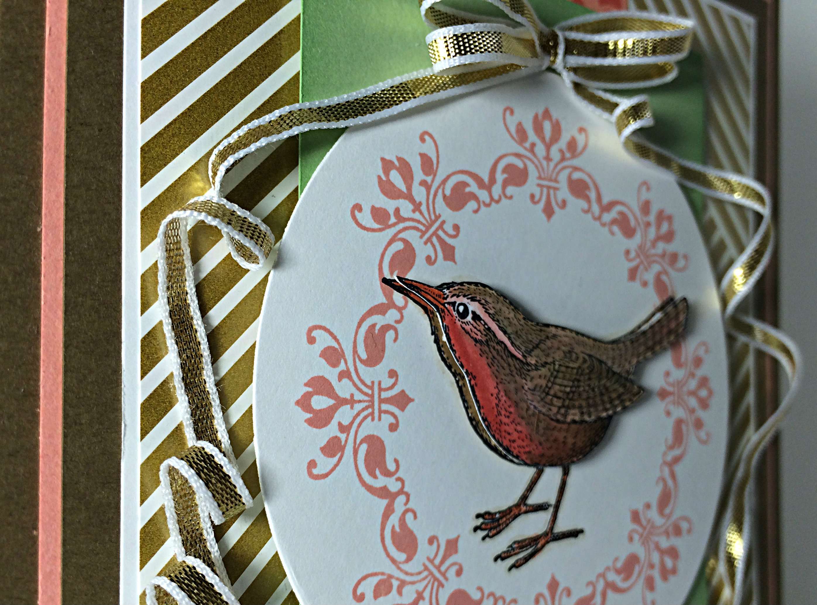
069birdclose

The bow was created using a fingertip double loop bow technique and the long tails were twisted into submission a bit at a time and strategically adhered with glue dots along the way.

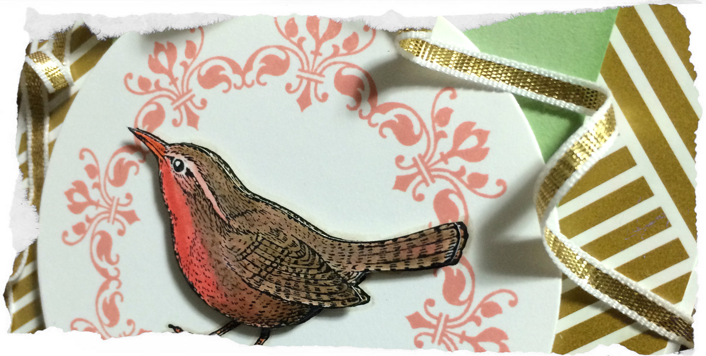
Isn’t that bird from the An Open Heart stamp set cute? You can see that he was stamped twice, once in the center of the circle and again on a seperate piece of Whisper White cardstock from which he was carefully cut out with my Paper Snips (I didn’t cut out the legs, but relied on the legs from the first image). I coloured both birds, with more detail on the top layer, using my inks and blender pens. I chose Calypso Coral for the breast, Tangerine Tango for the beak and feet, and I carefully added a shadow outline with Sahara Sand and a blender pen. That little guy is raised up on Stampin’ Dimensionals.

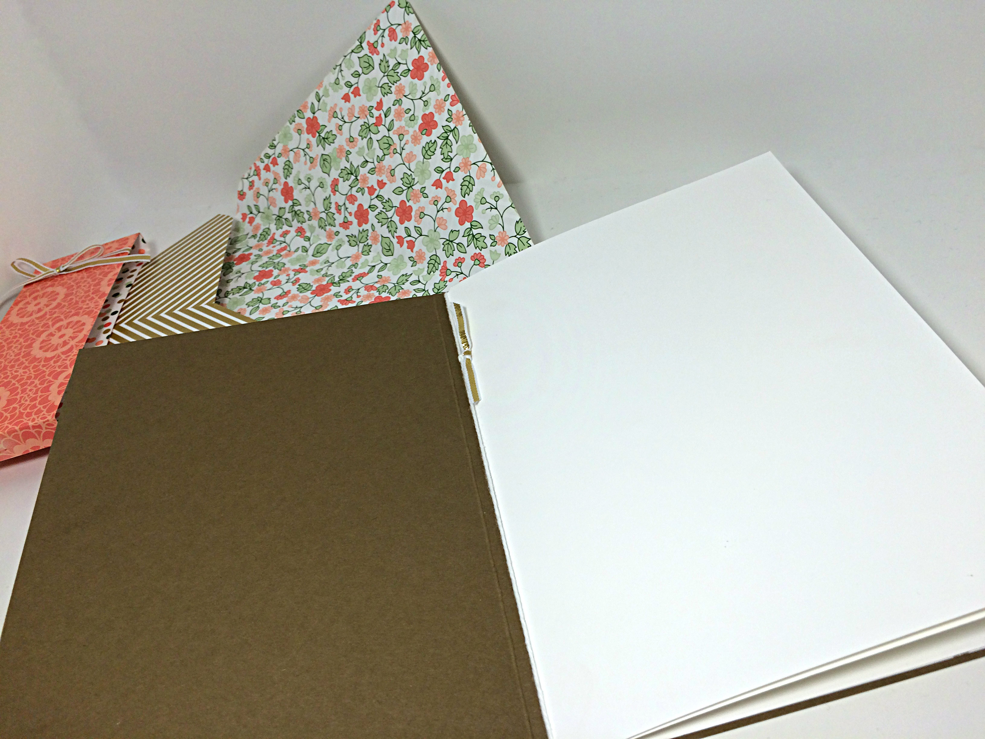
069insidepages

To create the pages of this card, I cut two 6.75″x9.5″ pieces of Whisper White cardstock and scored and folded them to create two 6.75″x4.75″ inserts which were placed one inside the other and tied together at the “binding” with Whisper White bakers twine. I added a little bit of the 1/8″ gold ribbon for a simple embellishment. The back of the last page of this insert was adhered directly to the inside back of the card base, allowing it to be secure inside the card.

069envelope

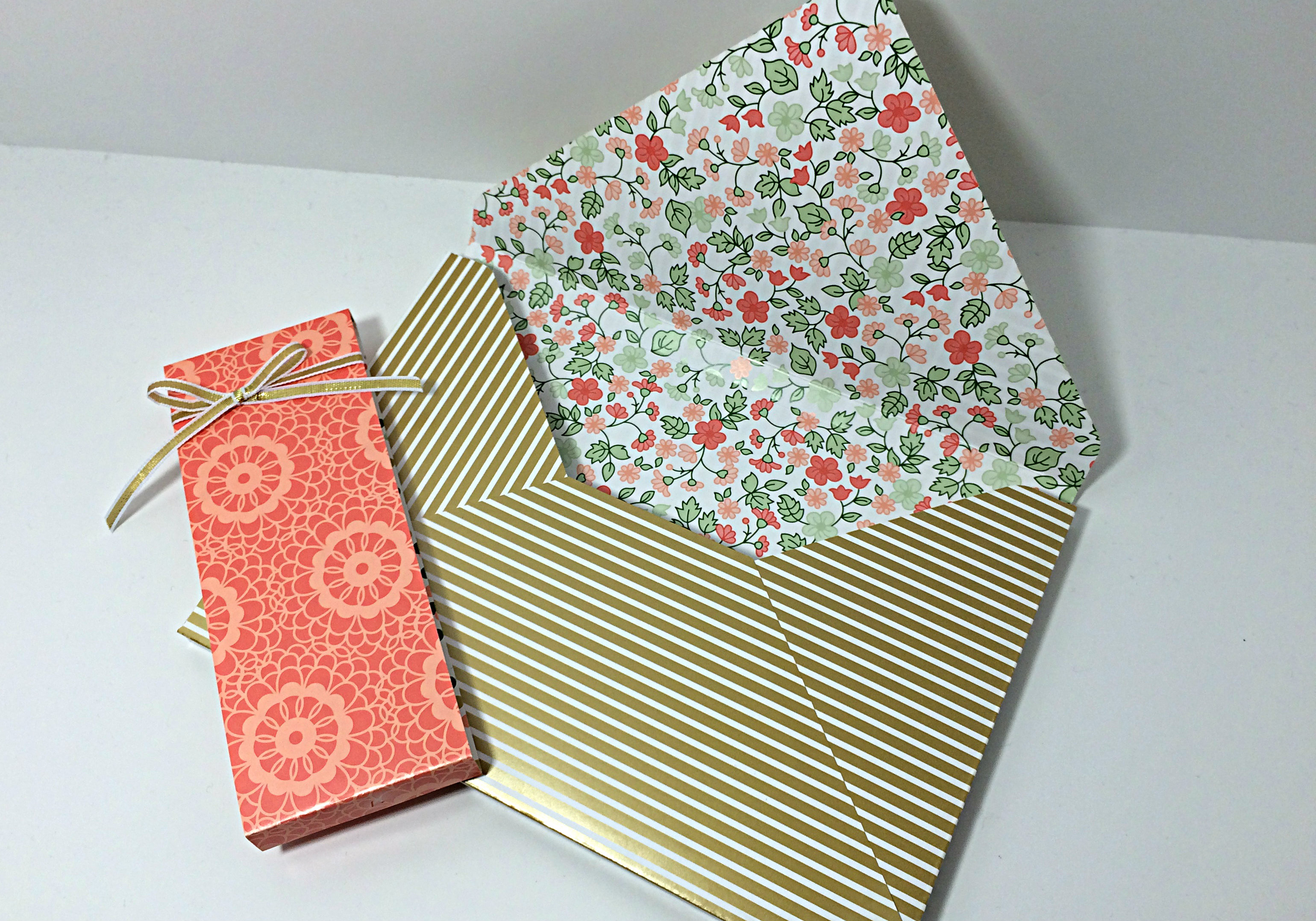
Due to the size of the card, a custom envelope was required. I used the matching Gold Soiree Specialty DSP and my Envelope Punch Board (which just so happens to be on sale this week!) to create a 3D envelope that is deep enough to fit the dimensions of my card. When I do custom envelope that are hand delivered rather than delivered by the postal service, I prefer to close the envelope with a belly band of paper rather than seal it with adhesive. It’s a bit of a prettier presentation, I think.

I hope you give the sketch this week a try and link your creations to As You See It Challenge #69. I love how your designs offer new inspirations each week!

Happy stamping!!

Amy

Designer-Badge