colour challenge

Rooted Heirloom

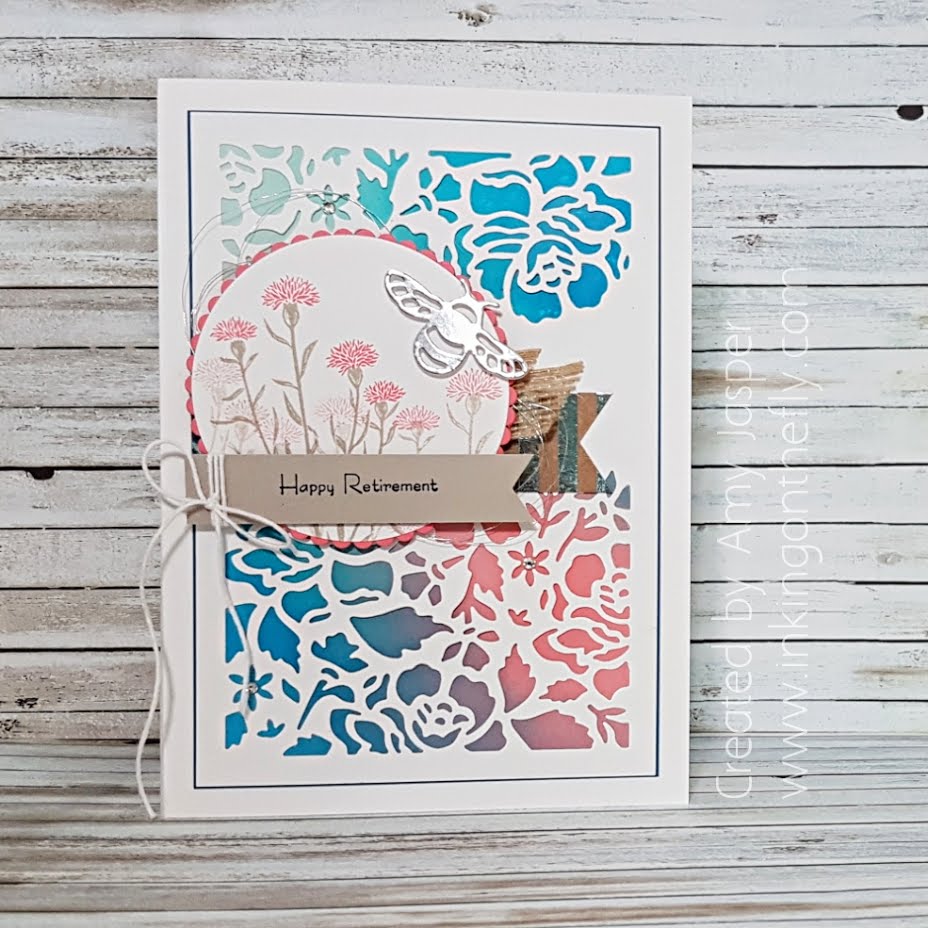
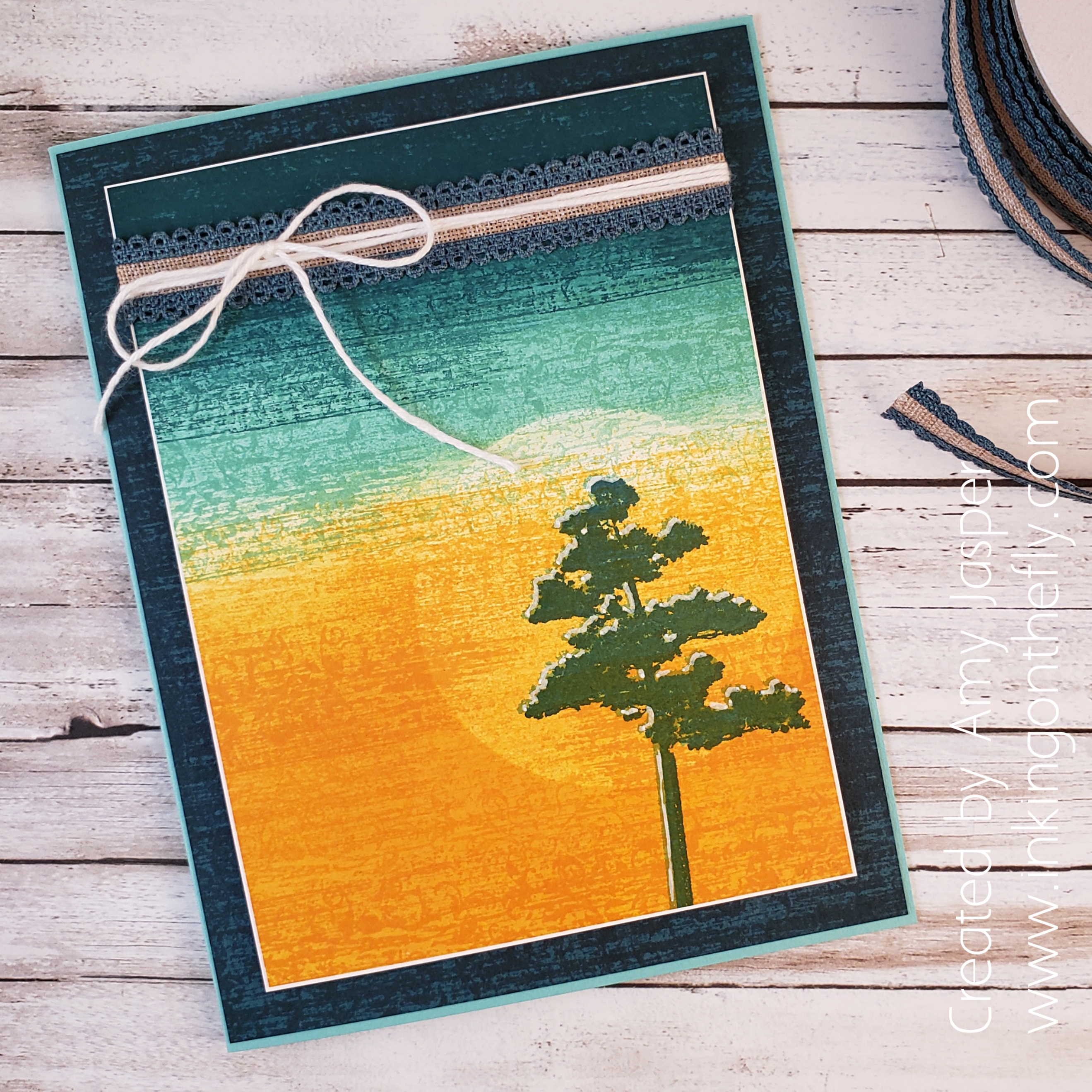
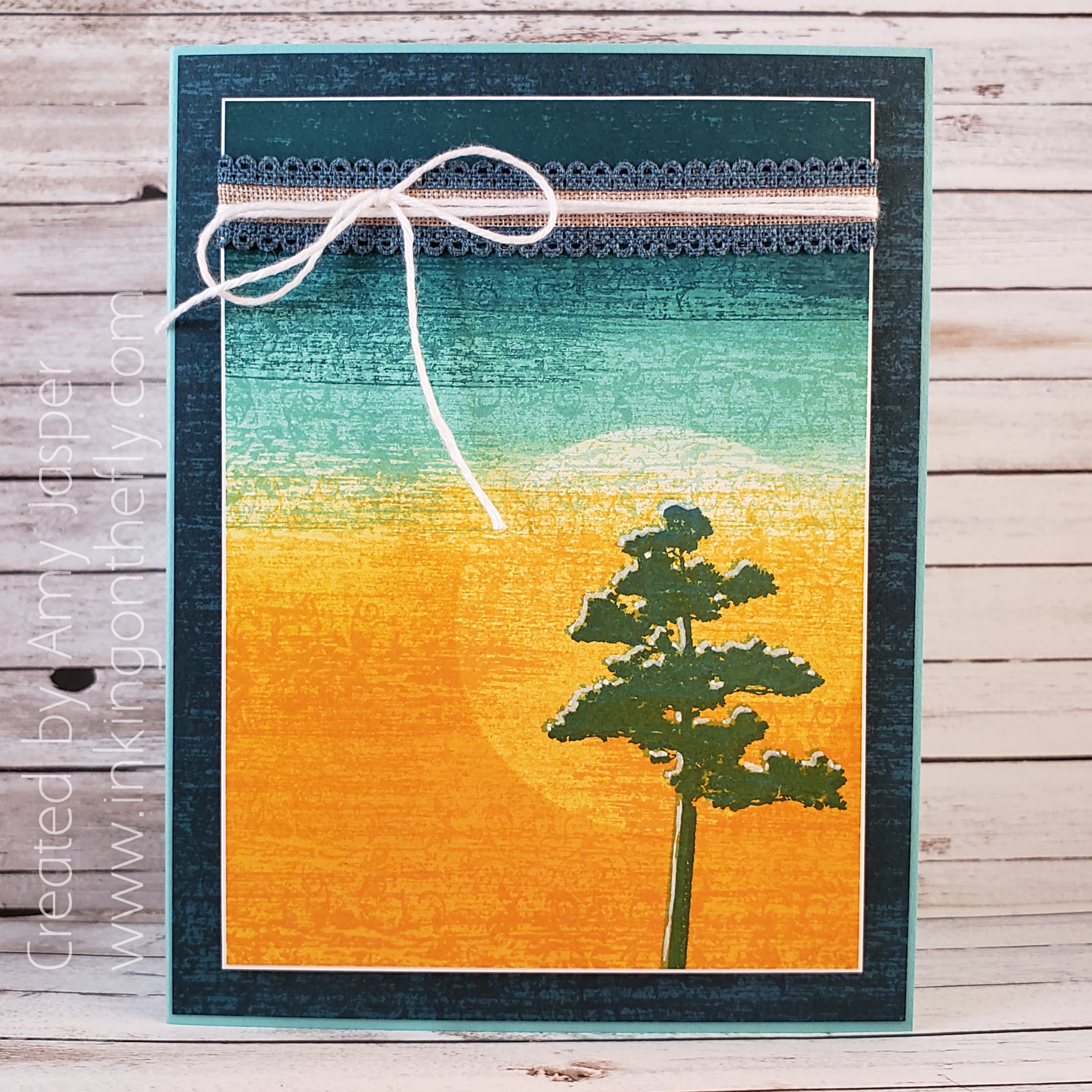
My card today features the Rooted in Nature stamp set and the Woven Heirlooms stamp set by Stampin’ Up! Check out the gorgeous texture created by sponging and stamping!

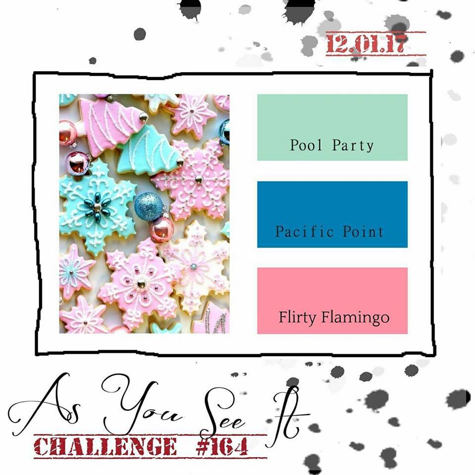
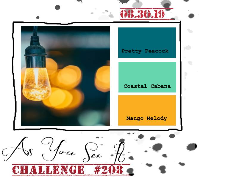
Here’s the inspirational colour challenge from the As You See It Challenge Blog.

I love this image of warm light and the out of focus background of contrasting colour that creates a bokeh effect. It makes me want to know what else is in the room and who is enjoying that atmosphere. Is it an outdoor wedding? or is it on the front porch of a rustic cabin that overlooks the lake? or maybe it’s in a Greek taverna, and we are looking out at the lamp-lit, stone-paved streets through the large open doorways. I can hear the bouzouki music, the subtle clinking of dishes, and the murmur of intimate table conversations. Wherever it is. I think I’d like to be there. How about you?

My first instinct with this colour scheme was to play with sponging and blending. This had me pulling out my Sponge Brayers from Stampin’ Up!. Here’s my take on this colour challenge.

I tried to find a sentiment to add once all of my sponging and rolling and stamping was done, but nothing seemed to fit without taking away the balance of the overall card design. This one will have to say it all on the inside with my personal note instead.

My first step was to take a piece of Whisper White cardstock and roll Mango Melody ink across the bottom half with my Sponge Brayer. Then I placed a circle piece of Post-It Note that I had punched out using the 2-1/4″ Circle Punch from Stampin’ Up! where I wanted the sun to be. Then more rolling. I added more Mango Melody, then switched to a clean brayer sponge and rolled on some Coastal Cabana, then some Pretty Peacock ink. I removed the Post-It Note and added a bit more Coastal Cabana and Mango Melody until my sun didn’t feel so harsh.

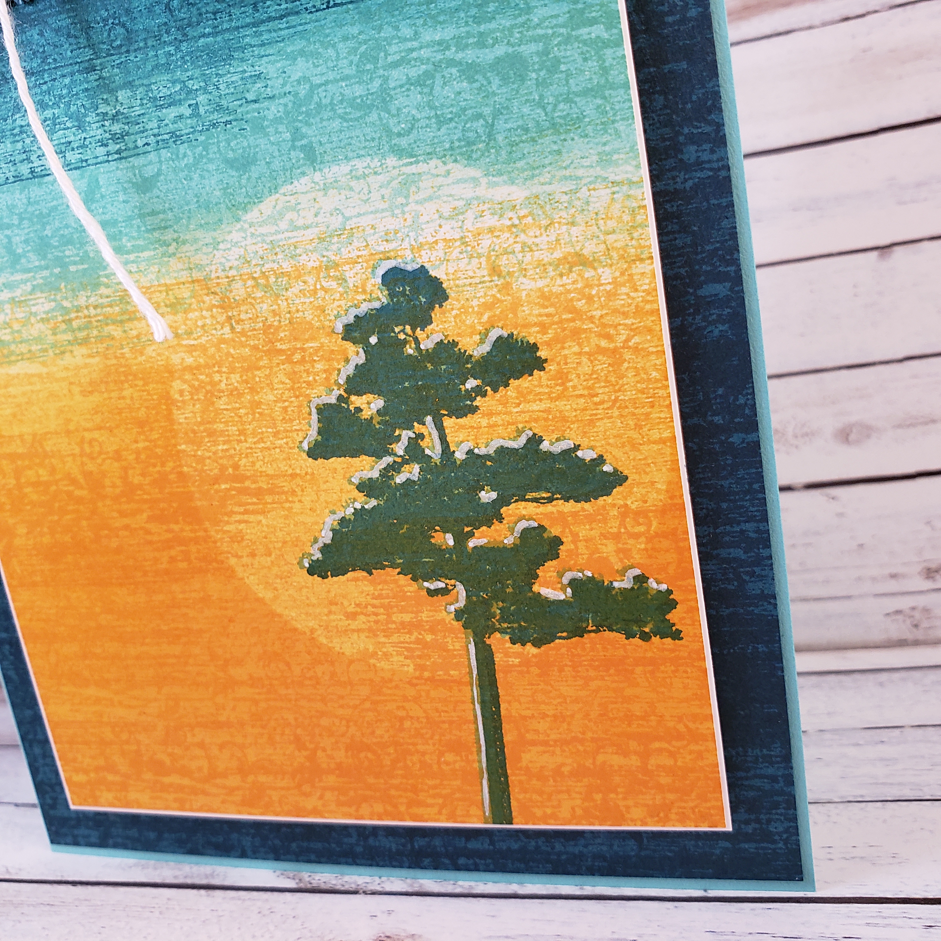
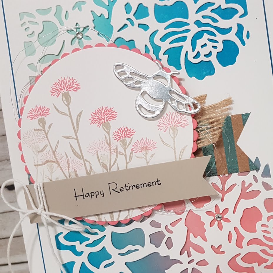
Next, I stamped the tree image from the Rooted in Nature stamp set from Stampin’ Up! using Coastal Cabana ink (it’s in there, I promise). To stamp the image, I used my Stamparatus because I wanted to reposition the paper after stamping and stamp it again with Pretty Peacock ink so that the top of the tree would have a sort of highlight as though the sun was brightening the other side of the tree. It worked, but I added something else at the end. Keep reading!

Once my tree image was in place, I was mostly happy with my artwork, but it was missing something. It was so smooth and … a bit too perfect. I decided to add some texture using the largest stamp image in the Woven Heirlooms stamp set. This I added over the entire paper, being sure to use Mango Melody over the Mango Melody, Coastal Cabana over the Coastal Cabana, and the … well, you get the idea. I stamped like this multiple times until the texture you see came to existence. You can see that I also used this technique on the Pretty Peacock layer of cardstock in the bactkground. Such great texture and suddenly the image was interesting and alive. It makes me think there’s quiet air movement and a lot of heat where that tree lives!

The tree begged for more light, so I used my White Stampin’ Chalk Marker to add highlights between the Coastal Cabana tree and the Pretty Peacock tree images.

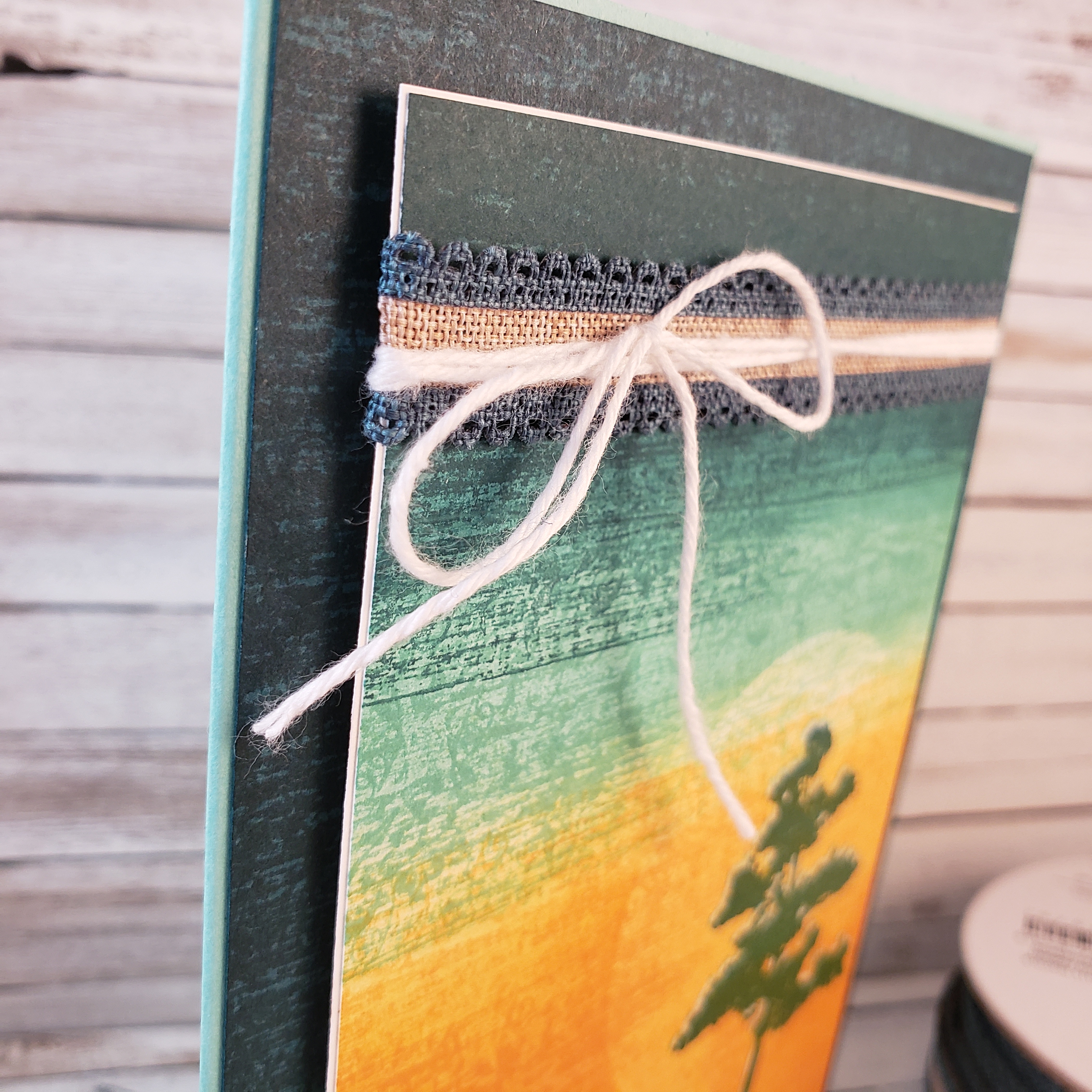
Once my art piece was complete, I knew that I wanted to add some embellishments. That’s where the Pretty Peacock Scalloped Linen Ribbon and the Whisper White Solid Baker’s Twine come in. First, I added a very narrow Whisper White matte layer to delicately frame my art, then I wrapped the linen ribbon around the card front, securing it on the back with Mini Glue Dots. The baker’s twine was wrapped around three times before finishing it with a bow.

Stampin’ Dimensionals hold those layers in place on the stamped Pretty Peacock layer. The card base is Coastal Cabana cardstock.

What would you do with these colours? What does the image inspire in your creative mind? Why not create something and share it with us at the As You See It Challenge Blog.

As always, if you are in Canada, you can order any of these products from me at my online store by clicking on the shop button on this page or the menu at the top of the page.


Floral Retirement

It’s time for ….

AN UBER CARD!!

Every now and then my husband asks me to design a card for staff at the university who are moving on to bigger and better things – like retirement! This is when I get to design what I call a book card; that is a larger card (usually 5″x7″, like the one today) with multiple pages inside for a large group of people to sign. I like to do the accordion binding, but sometimes I do different bindings with stitching, o-rings, or flip designs. The card I have to show you today has an accordion binding with three pages.

I chose to use the As You See It Challenge colour combination as a starting point for the design as my husband didn’t have much to give me to go on. I like to customize the card to the person, if possible.

I really struggle with blue and pink colour combos, but I think it worked out with the Whisper White and Sahara Sand neutrals that I chose to add to the mix on my Uber Card.

It is a 5″x7″ card with a 1/4″ depth (basically, it has a 1/4″ spine, like a book). The card base is created with Stampin’ Up’s Thick Whisper White Cardstock. I used Pacific Point cardstock as a very thin mat layer under the layer of Whisper White Floral Thinlit die cut. Peeking out from under the die cut, you can see the sponging of the three challenge colours, Pacific Point, Pool Party, and Flirty Flamingo that I did on Stampin’ Up’s beautiful Glossy White cardstock! I love how well the colour blends on this glossy paper!

The Flirty Flamingo scalloped circle and the Whisper White circle are cut using the Layering Circle Framelit Dies. The images from the Wild About Flowers stamp set were stamped on the Whisper White circle using Sahara Sand and Flirty Flamingo ink. The circles were attached together with Tombo Multipurpose Liquid Glue and adhered over the 5/8″ Burlap Ribbon and the Foil Frenzy Specialty Designer Paper banner with Stampin’ Up Dimensionals. Behind the circles, you can also see the Silver Metallic Thread in swooshy loops (such a pretty addition to almost any card).

The Happy Retirement sentiment is from the Teeny Tiny Wishes stamp set and was stamped on the Sahara Sand banner with Tuxedo Black Momento Ink. The ends of both paper banners were perfectly cut using the Triple Banner Punch (Thank you, Stampin’ Up!). Whisper White Baker’s Twine was just the right touch to wrap and tie on the Sahara Sand banner before attaching it to the circle with Stampin’ Dimensionals.

The sweet little Silver Foil bee was die cut with the Detailed Dragonfly Thinlit Dies and also attached with Stampin’ Dimensionals.

The inside of this Uber Card, is created with an accordion fold binding technique. This is done by scoring the cardstock of choice at half inch intervals, then gluing them together with your pages caught between every second fold. I keep meaning to do a tutorial video of this technique! If you bug me with comments on this, I just might get around to it more quickly (just sayin’, lol!)

For a secure binding, I left a section of the accordion folded cardstock free of scoring so it could be used as a full back page. The little bee from the Dragonfly Dreams stamp set was stamped in Sahara Sand ink with the You’ll be Missed sentiment from the Wild about Flowers over it with black ink.

I really struggled with mucking up my paper with ink repeatedly! So frustrating!! The pretty little Detailed Floral die above the bee is covering up one of those smudges. I also added extra stamped bees on my inside pages to cover up annoying smudges. Even the front of the card ended up with a blasted smudge of Sahara Sand ink on the Whisper White cardstock!!! All I could do there was dab it with my White Chalk Marker, letting it dry, then repeating until the smudge was mostly hidden unless the light caught it just so. I have had to use that Chalk Marker technique a few times for small smudge repairs. It’s definitely better than redoing the entire card and most people won’t notice the tiny flaw that remains. If they do, they chalk it up (pun intended, lol!) as a unique flaw in a hand made product.

If you’re interested in a video tutorial on how to make an accordion fold binding like I used in this card, write it in the comments on this blog post.

Also, if you have any tips on hiding ink smudges (or avoiding them), please add it to the comments on this post as well. I would love to hear any wisdom that you have to share!

Emboss Resist with a Twist

What happens when something goes wrong on your card or scrapbook design? Do you start over or see if you can fix it?

My memory of an old technique saved the day and enabled me to fix a problem with gunk getting embedded in my heat-embossed image. And I love it!

It all began with this colour challenge from the As You See It Challenge blog:

I was a little worried with the intensity of these colours, but by using the coloured ink instead of coloured cardstock, I was able to keep my design from getting too loud.

I wanted to get a jump on my holiday cards, so I went with a Christmas design using the Carols of Christmas stamp set and the Card Front Builder Thinlits.

I call this technique, “Emboss Resist with a Twist” or “Emboss Resist and Wipe”. The second name definitely gives you a better understanding of what this technique involves.

The regular emboss resist technique, as you may know, is when you heat emboss an image, usually with clear embossing powder, then sponge or paint with a water-based ink over the image. The embossed area resists the ink and often it is advised to use a paper towel to polish any ink residue off of the embossed image to make it really pop. With the “Emboss Resist with a Twist” technique, you take it another step: Heat the clear embossed image and, while the embossing powder is still warm and soft from being reheated, wipe it with a paper towel to remove it from the surface of your paper!

Wait, WHAT!?

Why would you want to remove it, you ask? Once it’s removed and all the shine has been wiped clean from your cardstock, the image remaining will be more crisp, more white, and will have a beautiful matte finish.

Another reason to remove it is when you make a gunky mistake, like I did! I used the regular emboss resist technique, then ran my piece of cardstock through the Big Shot to cut the beautiful border from the Card Front Builder thinlit dies. To my dismay, I discovered that my dirty embossing plates left a bunch of dark specs of old paper dust and bits embedded into my embossed image!!  EW! Heating and wiping the embossing finish away allowed me to clean up my mess without having to start over again!

I absolutely love how it looks!

The rest of the card came fairly quickly. I used my markers to ink up the rubber on my holly stamp from the Carols of Christmas stamp set so that I could have Lemon Lime Twist leaves with a spackling of Elegant Eggplant around the edges, but still have Real Red berries. After doing the old huffing-with-your-breath-on-the-stamp-to-remoisten-the-ink technique, I stamped the holly image and die cut it with the co-ordinating die from the Card Front Builder Thinlits. This was attached with half of a Mini Dimensional to my card front.

The beautiful little ornament image was also coloured with markers. I used Real Red and Elegant Eggplant to only colour two of the three ornaments, then used Basic Gray for the string of the ornament. I used a sticky note to mask the bottom of the sentiment as my stamp was too tall for where I wanted it, then I huffed once again and stamped the image. I also used a Blender Pen to blend some of the ink in the each ornament on my paper, then added a small bead glue with the Fine Tip Glue Pen to the center of each ornament to I could apply Dazzling Diamonds Glitter. The Linen Thread, tied into a tiny little bow was attached with a carefully rolled Glue Dot.

I wanted a little something-something behind my card front, so I adhered a piece of Dazzling Diamonds Glimmer paper to my card base before attaching my completed card front to it with Stampin’ Up! Dimensionals. Tip: Because of the nature of glitter, even on Glimmer Paper, I was liberal with the Dimensionals and used generous pressure to ensure good contact the the Glimmer paper. If this isn’t done, you might find that your card front detaches without your permission!

If you’re in my area, this card will be offered at my technique class. Contact me if you’d like to join us!

Be sure to give this colour combination a try and load it up on the As You See It Challenge page so we can see your beautiful creations.