In Color Blocks
Are you excited for the new catalogue?! I am! There are so many new colours and fun things that I wish I could get them all at once! But, alas, I must be wise with my spending and pace myself. So far, I have two of the new inks, a sampling of all the new colours, all of the In Color inks and most of the In Color cardstock. I also decided to get the early release products in the Share What You Love Suite (of course, I had to choose the “Gotta Have It All” bundle so I could get all the free gifts with it!) You can check out the bundles by clicking on my SHOP button here on my website.
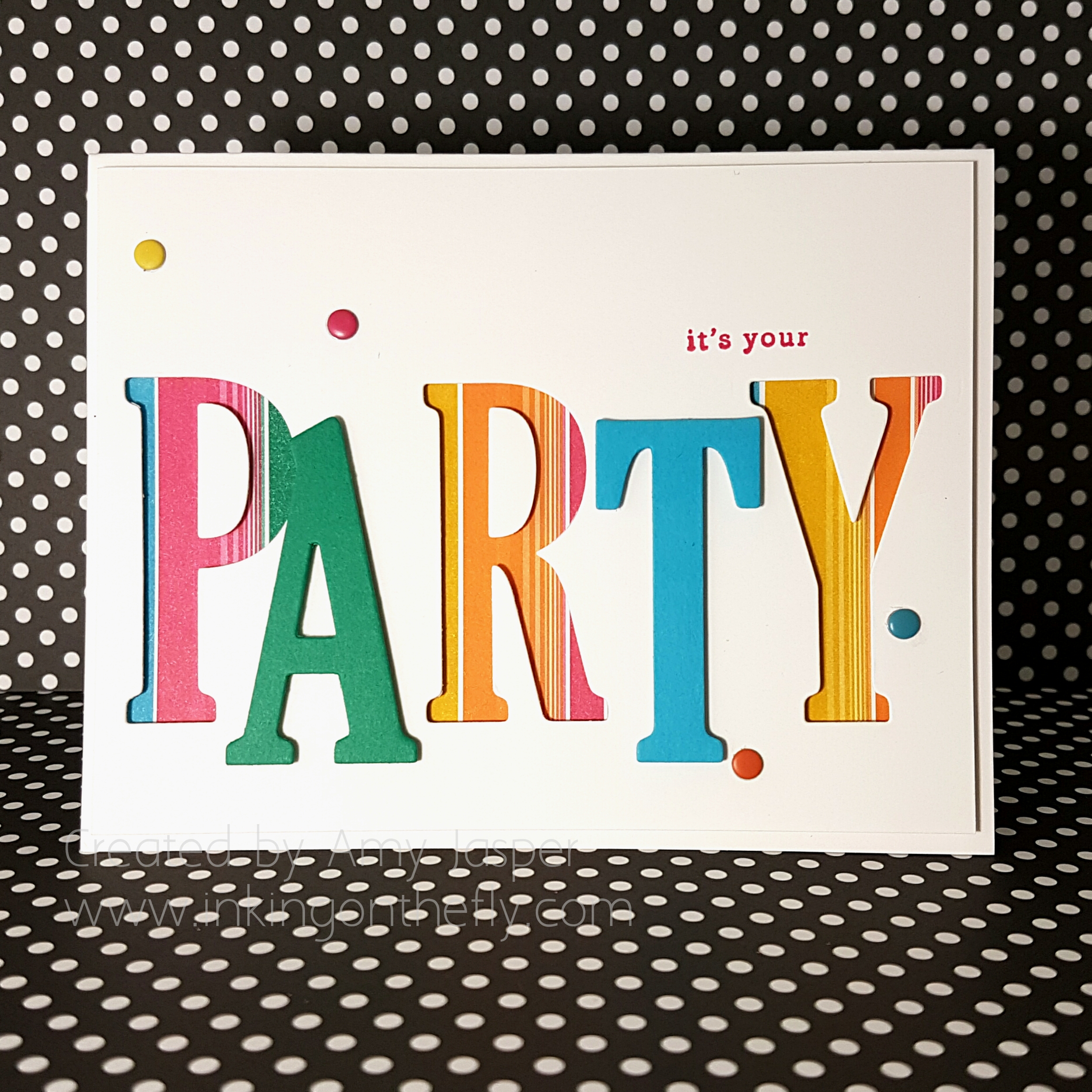
The card design today features four of the five 2018-2020 In Colors. These colours are bright and playful and full of cheer!
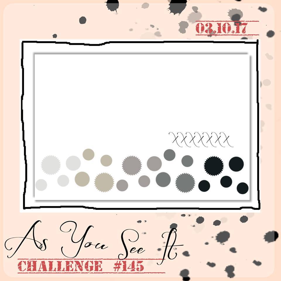
Here’s the challenge sketch that I started with: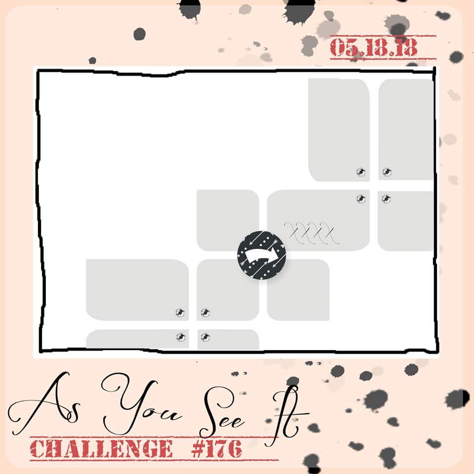 When I saw this sketch, I immediately thought of using the acrylic blocks to stamp the rectangle and square shapes and that is exactly what I did!
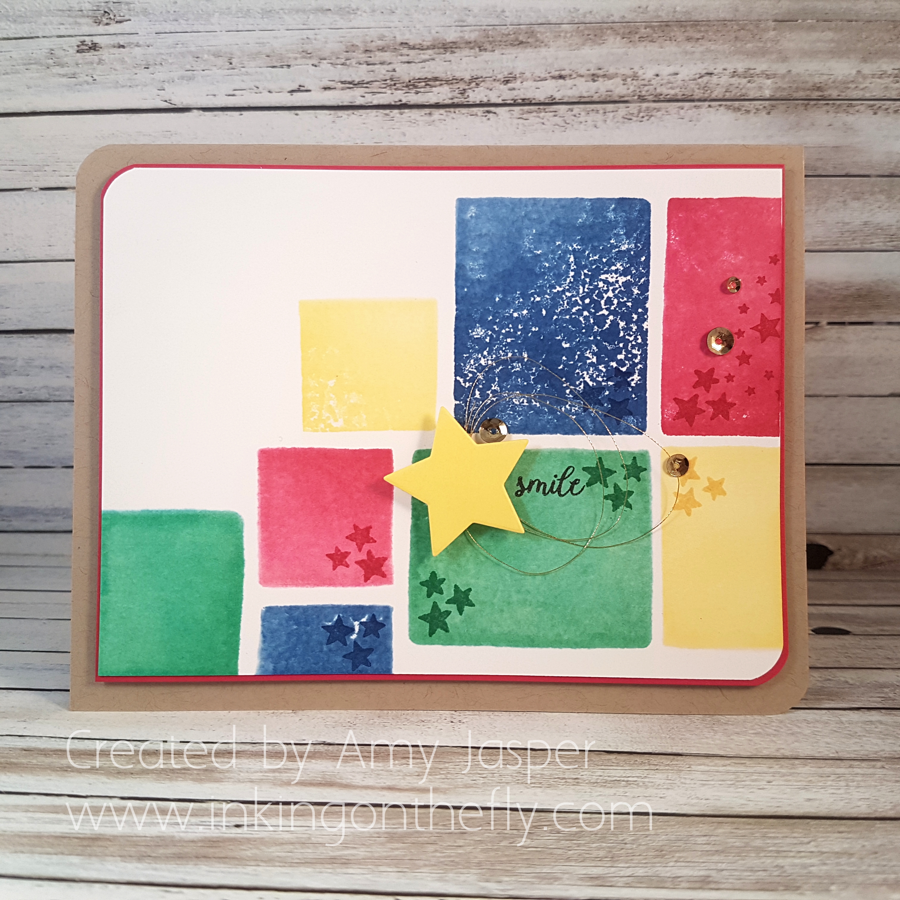
I used Clear Block C and Clear Block A from Stampin’ Up! to create this playful, colour blocked background. I simply pressed the block onto the ink pad, spritzed the ink on the block with 70% rubbing alcohol using my Stampin’ Spritzer, then pressed the block on my paper where I wanted it. I used Lovely Lipstick, Blueberry Bushel, Pineapple Punch, and Call Me Clover.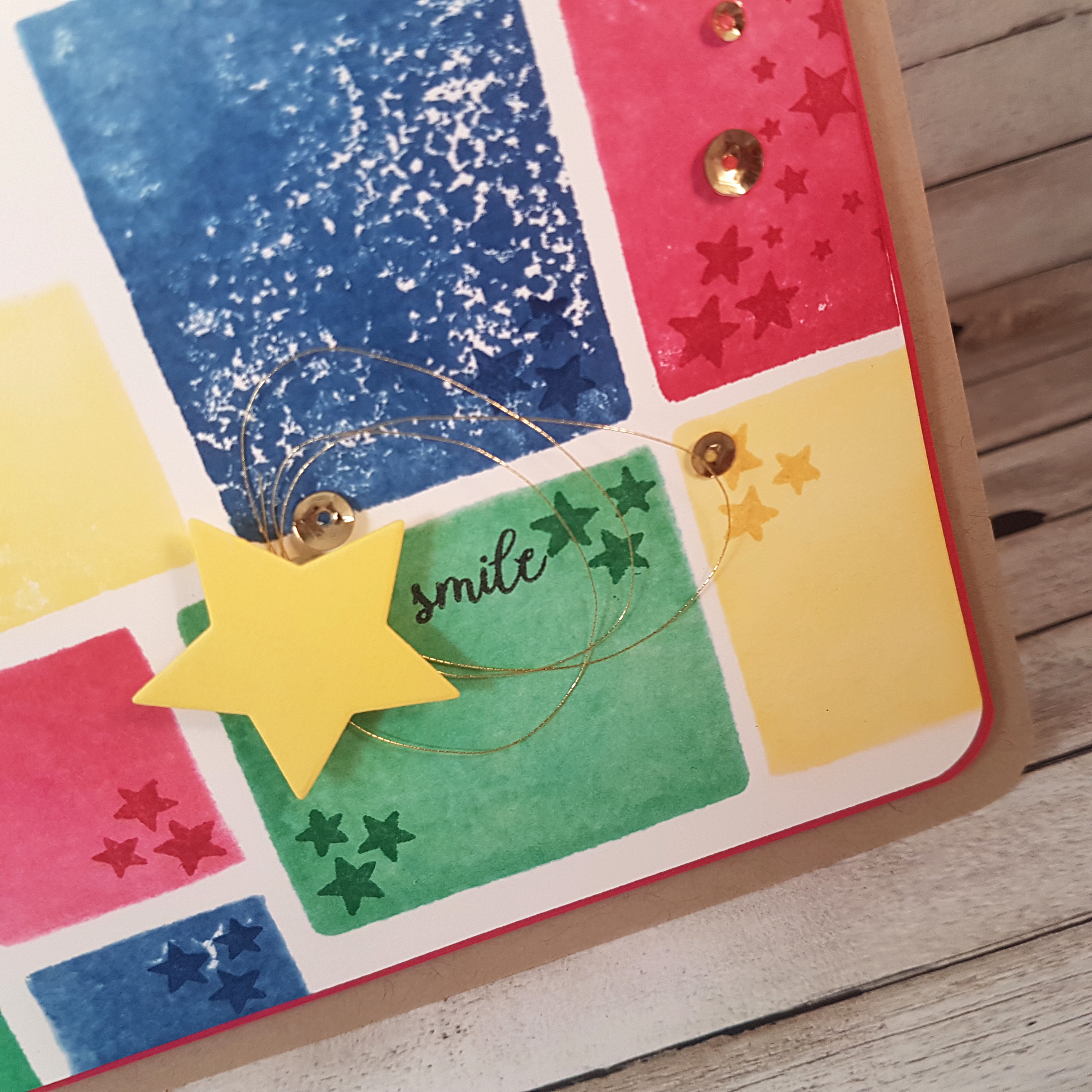 The Pineapple Punch yellow die cut star is cut using the Wood Crate Framelits Dies and attached with a piece of Foam Adhesive Strips (no reason, it was just closer to me than my Stampin’ Dimensionals!). I looped some Gold Metallic Thread to stick behind the star for some extra flourish. The sentiment, “smile”, is from the Tabs for Everything stamp set and was stamped with Momento Tuxedo Black ink. The stars from the Tabs for Everything stamp set and the stars from the the Wood Words stamp set were stamped with the coordinating colours of the blocked area on which they are placed.
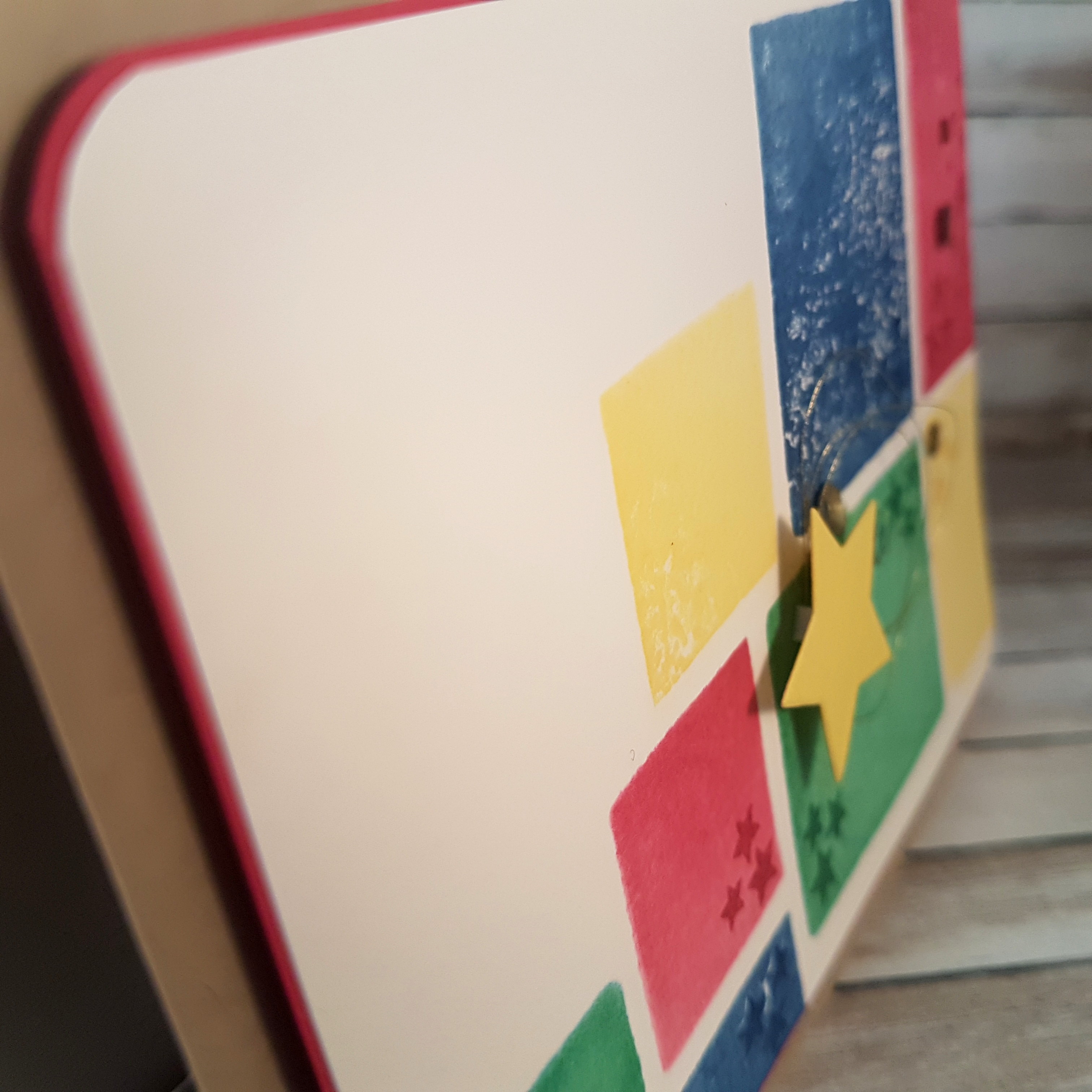 Once I was happy with my stamping and the star elements, I used the Envelope Punch Board to punch the upper left and lower right corners with the corner rounder part of the punch board. I did the same on the Lovely Lipstick matte layer and the same again with the Crumb Cake card base. Dimensionals were used to adhere the Lovely Lipstick layer and give the card some pop.
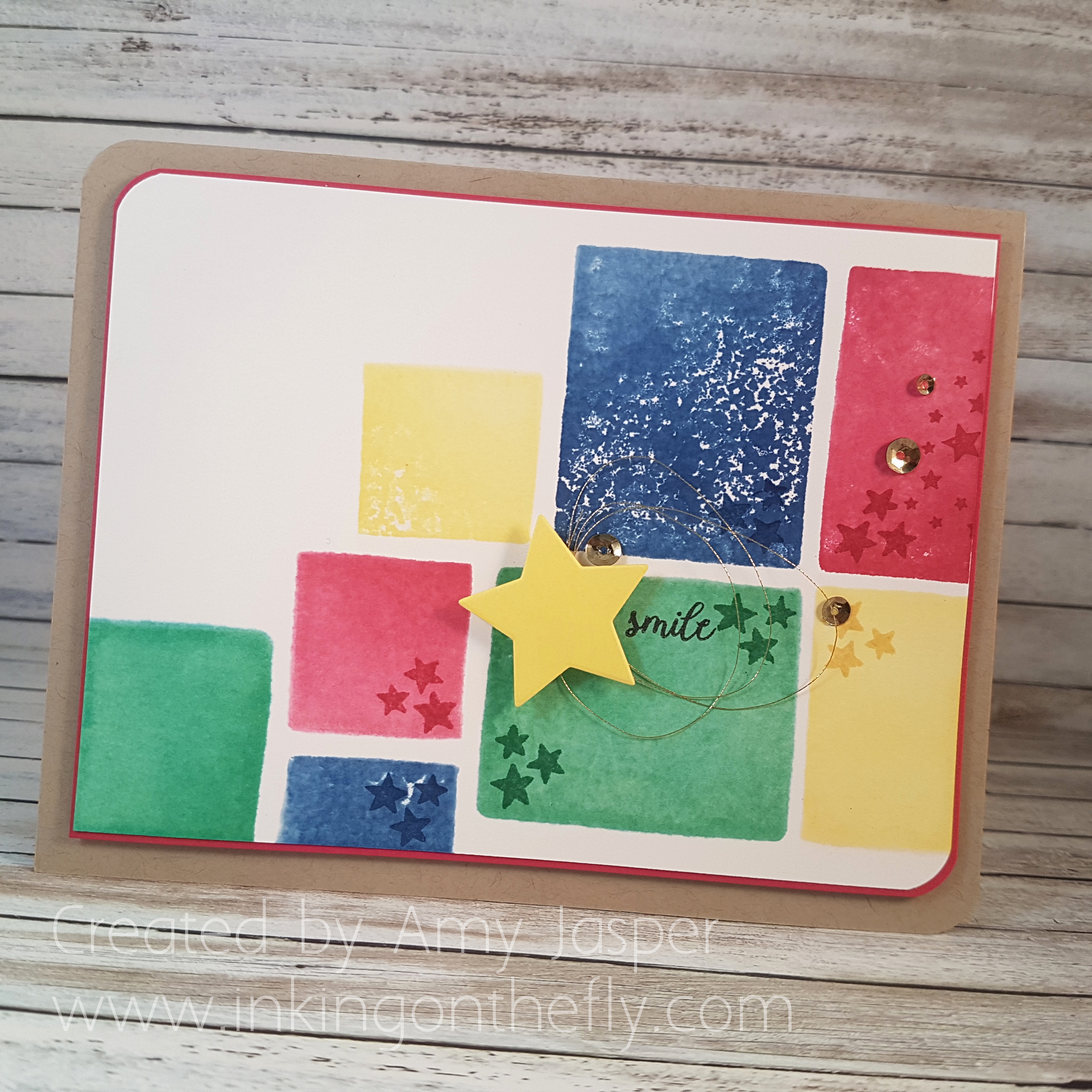 The final touch was to add the gold sequin from the Metallics Sequin Assortment pack. I used the Fine-tipped Glue Pen to adhere these to the card front.
If you want to order these ink colours and you are in Canada, you can order them from me through my online store. Just find the SHOP button on my website and it will take you to my online store. These cheerful ink colours are available on the Share What You Love link on the left side of the online store page. The coordinating cardstock and sooo many other amazing new products will be available June 1st! Whoohoo!!