technique

Origami Window Frame Fun Fold

Check out this card design with a 3D folded frame — origami style!

I’m not sure where the folded frame idea originated, but this is my take on this fun fold technique.

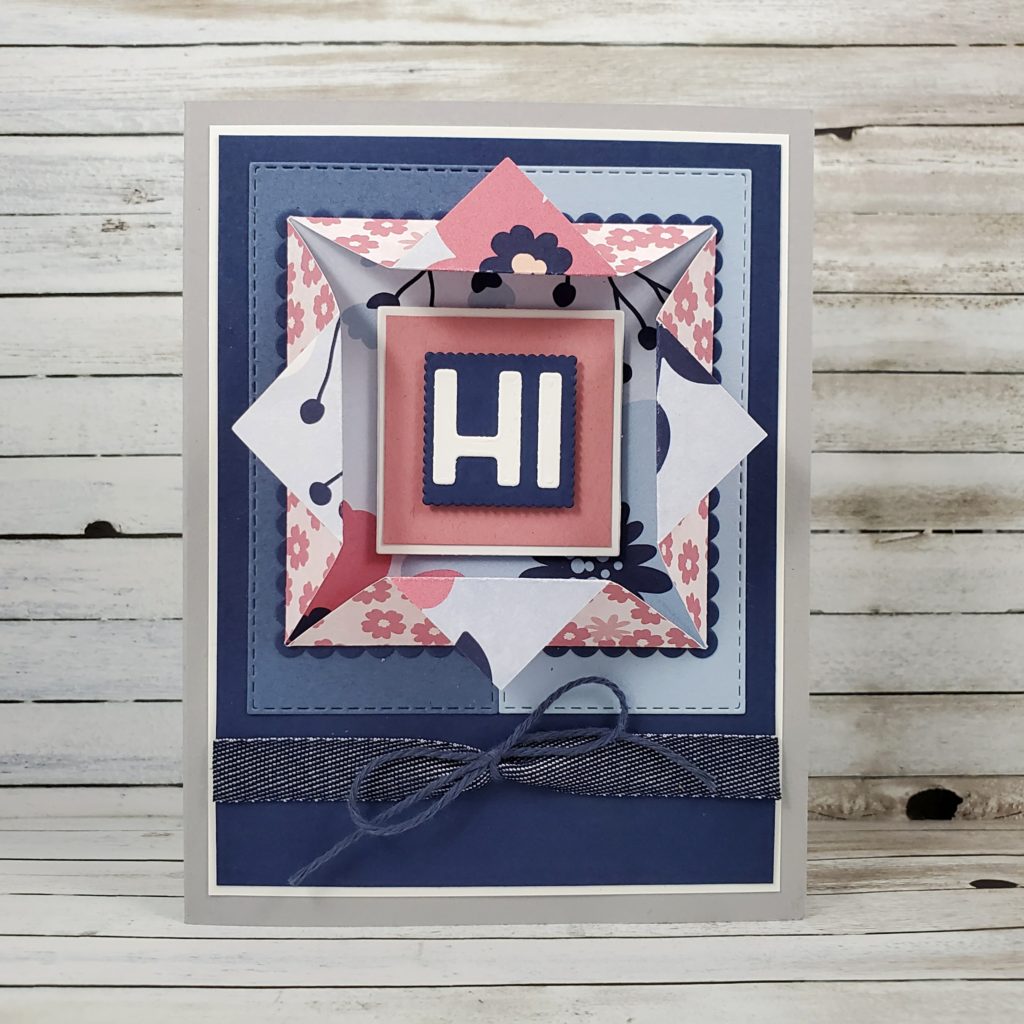
This card was one of the designs I shared with my technique class a couple months ago. It’s such a great fun fold because it’s quick to make and is a beautiful way to feature both sides of your designer series paper.

If you’re in Canada, you can join in on my monthly technique class and receive the class packet of pre-cut card supplies so we can make the cards together virtually. Not in Canada? Ask me how you can get VIP Access to my technique video and PDF tutorials at the same time as my class participants. No need to wait!

Check out the video tutorial for this card.


Here is a list of the Stampin’ Up! products and measurements. Remember, this card was presented to my class back in February, which means that some of these products are no longer available for purchase.

8 ½” x 5 ½” Smoky Slate
3 ⅞” x 5 ⅛” Basic White (x2)
1 ⅝” Basic White square (die-cut with the Layered Squares Dies)
¾” high Basic White letters (die-cut with the Playful Alphabets Dies)
3 ¾” x 5” Night of Navy
3″ Night of Navy scallop square (die-cut with the Layered Squares Dies)
1″ Night of Navy scallop square (die-cut with the Layered Squares Dies)
3 ⅝” x 1 ⅝” Misty Moonlight (die-cut with the Stitched Rectangle Dies)
3 ⅝” x 1 ⅝” Seaside Spray (die-cut with the Stitched Rectangle Dies)
1 ½” x 1 ½” Rococo Rose
4” x 4” Paper Blooms Designer Series Paper
5 ½” Denim Ribbon
12” Night of Navy Baker’s Twine

🇨🇦 You can order any current Stampin’ Up! products with me here in Canada by clicking on the shop button. Contact me anytime to ask questions or to find out how you can become an Independent Stampin’ Up! Demonstrator, like me!

Sunflower Clam Shell Fancy Fold

Hello, from British Columbia, Canada!

I created my own fancy fold card design so that it could stand on its own for display. I call it a clam shell fancy fold as it reminds me of the familiar image of an open seashell with a pearl resting inside. According to my very brief online search, clams don’t usually create pearls – did you know that? The common image that we see is likely a scallop rather than a clam. I wonder why the image isn’t commonly created with an oyster shell, since that’s where most pearls come from? I suppose oysters aren’t as aesthetically appealing as a scallop or clam. They sure taste good, though.

The Canadian west coast has some very large and tasty oysters. My dad would cook them in the shell on the barbecue, then we’d scoop them out of their shell and smother them in melted garlic butter. We had to eat them with a knife and fork because they were so big. I don’t enjoy the raw or breaded oysters nearly as much as I enjoy the ones that are steamed in their shell over the grill.  I haven’t had them for quite a while now. Ah! I might have to see if I can get my hands on some again soon.

Anyone who participated in my online technique class in February made this very card and now I get to share it with you! I offer my monthly technique class via Zoom, but I also provide everyone with a written tutorial and a video tutorial. That way, if they can’t attend the class, they can still receive the pre-cut supplies and follow the tutorials to make the cards at their convenience and, of course, access the tutorial as often as they like.

Check out the video below to find out how to make this Clam Shell Fancy Fold card.


Top Shelf

Check out this Stampin’ Up!® card with earth tones and a whiskey theme featuring the Whiskey Business stamp set.

Lots of women drink whiskey (I know I do!) and love the colours in the earth’s palette, so to say my card today is designed for a man would be inaccurate. I don’t think that certain colours or styles are for men and others are for women and I would LOVE to see us move away from that. I have also struggled with saying that something is masculine or feminine – who decides that anyway? That said, it is super challenging to re-train our thinking and our descriptive language out of using these terms. When someone tells me that something looks masculine, I know exactly what they mean – brown, navy, gray, black, green, rust and maybe shades of darker reds and oranges. It often also implies textures like wood, stone, and leather. Themes like cars, sports, hunting, fishing, whisky, beer, and barbecues. Thus being caught between wanting to avoid using “masculine” or “feminine” as descriptive terms and recognizing these as commonly understood descriptives.

My card today is made with rich earth tones and textures, modern lines, and a whiskey theme. You might choose to give it to your dad for Father’s Day, or to your friend along with a bottle of her favourite scotch whiskey for her birthday (yes, please! LOL!).

Here’s the As You See It Challenge that inspired my design:

One of the patterns from the In Good Taste Designer Series Paper looks like granite or cement, which I embossed using the Brick & Mortar 3D Embossing Folder. I lightly sponged it with Crumb Cake ink to highlight the bricks and warm up the gray of the patterned paper. This was adhered to a piece of Basic White and then to the Mossy Meadow card base.

To create a frame, I used two of the Stitched Rectangle Dies with Early Espresso cardstock and adhered it to the card with Stampin’ Dimensionals. The images were stamped on Basic White cardstock with Tuxedo Black Momento ink and coloured with my Stampin’ Blends Markers. I used Light Mango Melody and Light Pumpkin Pie to create the amber liquid. Sparse use of the Light Gray Granite with the Light Mango Melody help to achieve some shading on the decanter and the whiskey tumbler. I stamped the same images on some Window Sheets with Black StazOn ink. I fussy cut tight around all the images and adhered the Window Sheet image to the Basic White image using sparing dots of Multipurpose Liquid Glue. The decanter is adhered directly to the Early Espresso Stitched Rectangle frame and the tumbler is on Stampin’ Dimensionals over the bottle.

I tied a piece of Mossy Meadow Linen Trim in a loose bow, folded it in half and tucked it under the decanter with a glue dot. The sentiment is stamped on the Basic Black cardstock with Versamark Ink, then powdered with White Embossing powder and heat set to the smooth glossy finish with the Heat Tool. I flagged the ends by hand with my Paper Snips and adhered the sentiment to the card front with Stampin’ Dimensionals over the frame.

This was my first time to finally use the Whiskey Business stamp set from Stampin’ Up! and I’m so happy with how it turned out!