watercolour

Social Undistancing

Imagine that you’re really excited to get into a hot tub. You’re foot is hovering in the steam above the surface, but you don’t dare dip it into the water yet, because you have a feeling that the water is way too hot! It might even be hot enough to burn!

That’s pretty much how I plan to ease into normalcy as our government moves us through each phase of our restart plan. Here in BC, Canada, certain businesses are allowed to re-open with strict protective measures in place. I could make an appointment to have my hair trimmed, if I want to, but is my vanity worth the risk? Nah, I’m okay with my locks being a bit more disheveled than usual for a little while yet. I’m even okay without my dental checkup for another couple months. I’m pretty nervous about getting out there again and I’m expecting some peer pressure as the government starts releasing us from the current limitations. Friends are going to want to get together, but I’m not keen to open my bubble too soon. I’m eager to get back to normalcy and I can’t wait to social un-distance, but I’m not ready to jump in quite yet. I think I’m going to wait this out and see how it looks a month from now.

In the meantime, I need to get myself a face mask for when I go to the grocery store. It’s getting far too peopley out there, making it harder to keep that 2 metre distance. I know it won’t protect me as much, but it will protect those around me if I’m sick and don’t know it yet. Plus, if I make a mask, I can make it out of some of Stampin’ Up!’s retired fabric! Or I can use some iron-on vinyl and die-cut some letters to iron onto my mask and make it fun. Something like, “If you can read this, then you’re too close!” or, “It’s so peopley out today”.

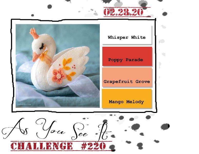
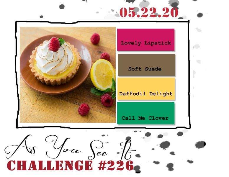
The As You See It Challenge that inspires my card design today is this crazy colour combination! I was a little worried, as these are not colours that I usually put together.


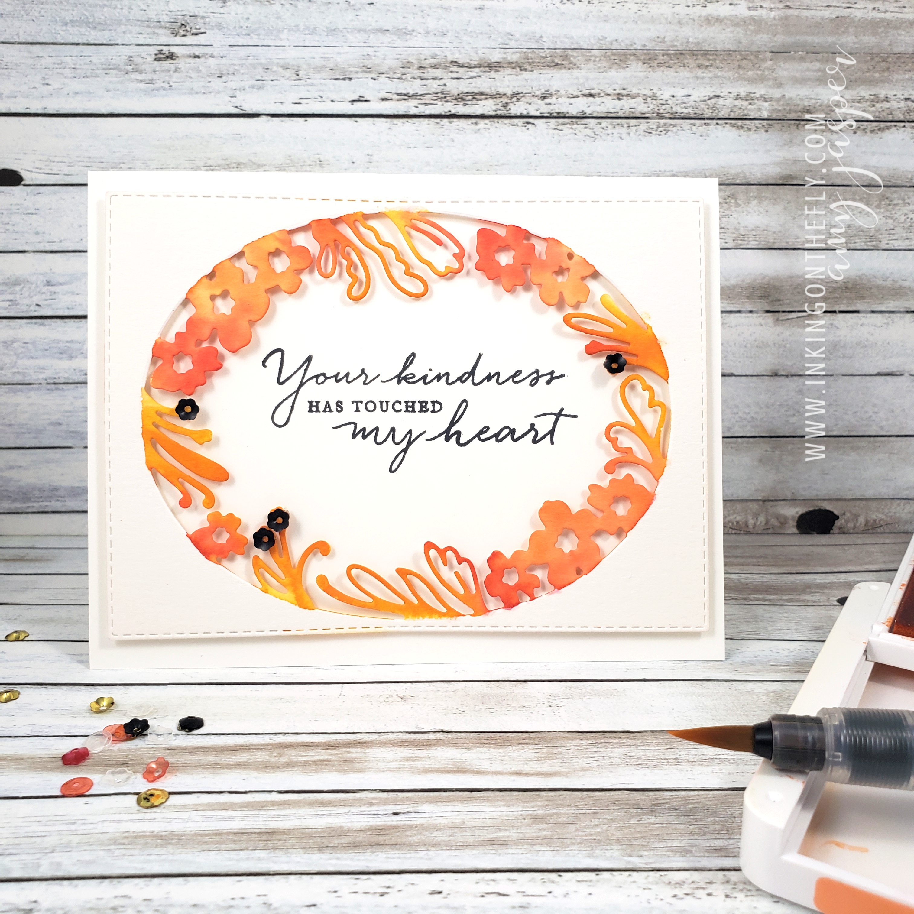
However, once I got started, I realized that these colours are quite cheerful together! Here’s the card design that I landed on, using the Share Sunshine digital stamp set from Stampin’ Up! with the Artfully Aware stamp set (which is retiring AND at a discounted price as I’m writing this!).

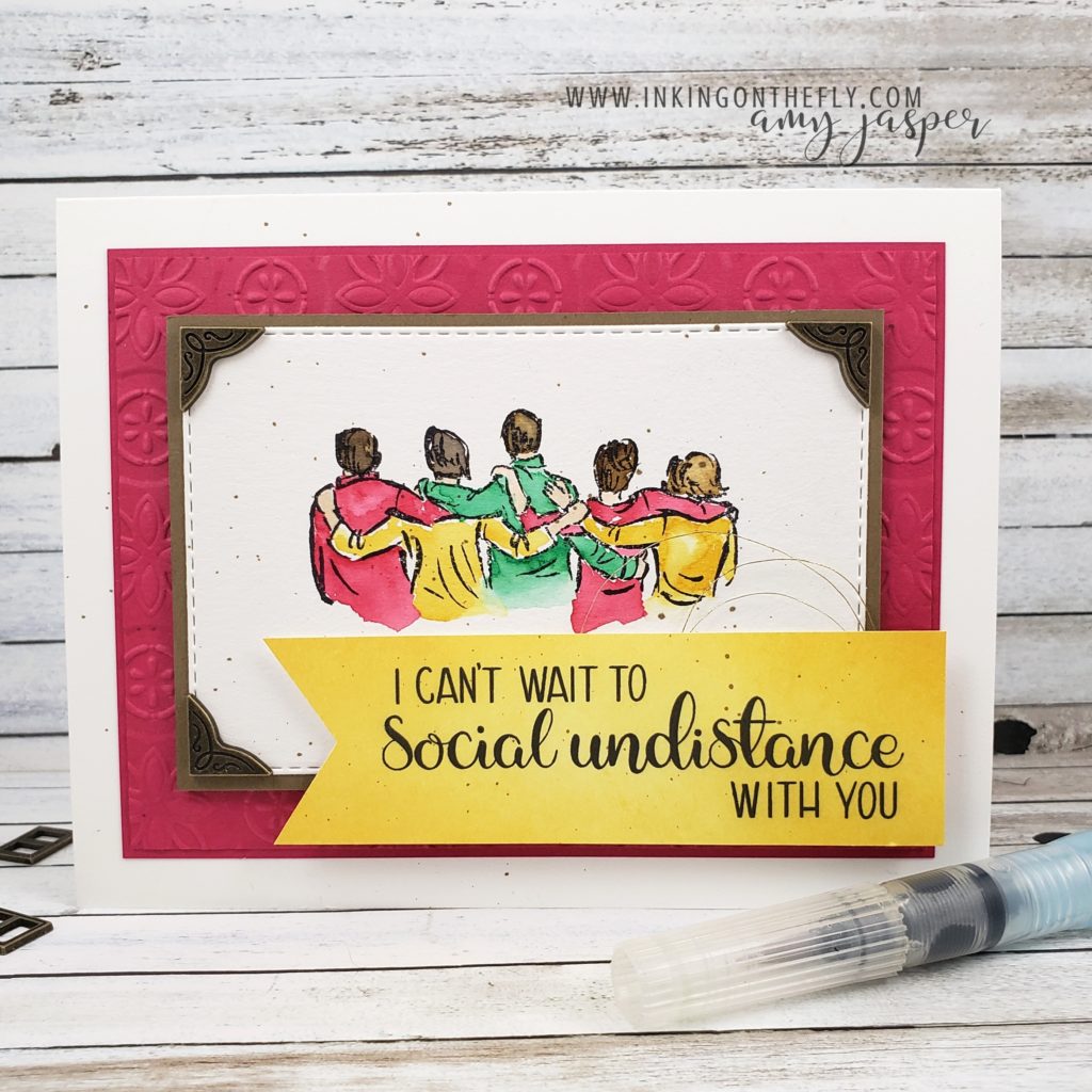
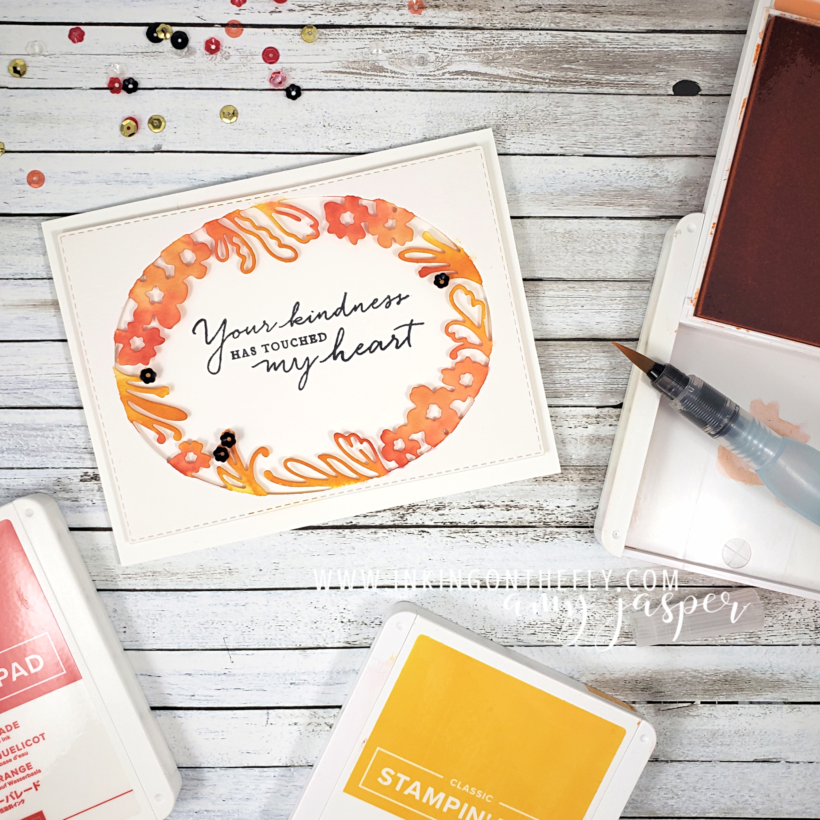
I chose to watercolour the image using the colours in the challenge. The watercolour paper is die cut using one of the Rectangle Stitched Dies from Stampin’ Up! I layered that on some Soft Suede Cardstock and attached that to the Lovely Lipstick layers, the top of which was embossed using the Tin Tile embossing folder and my die cutting and embossing machine. This is all on the clean Whisper White card base.

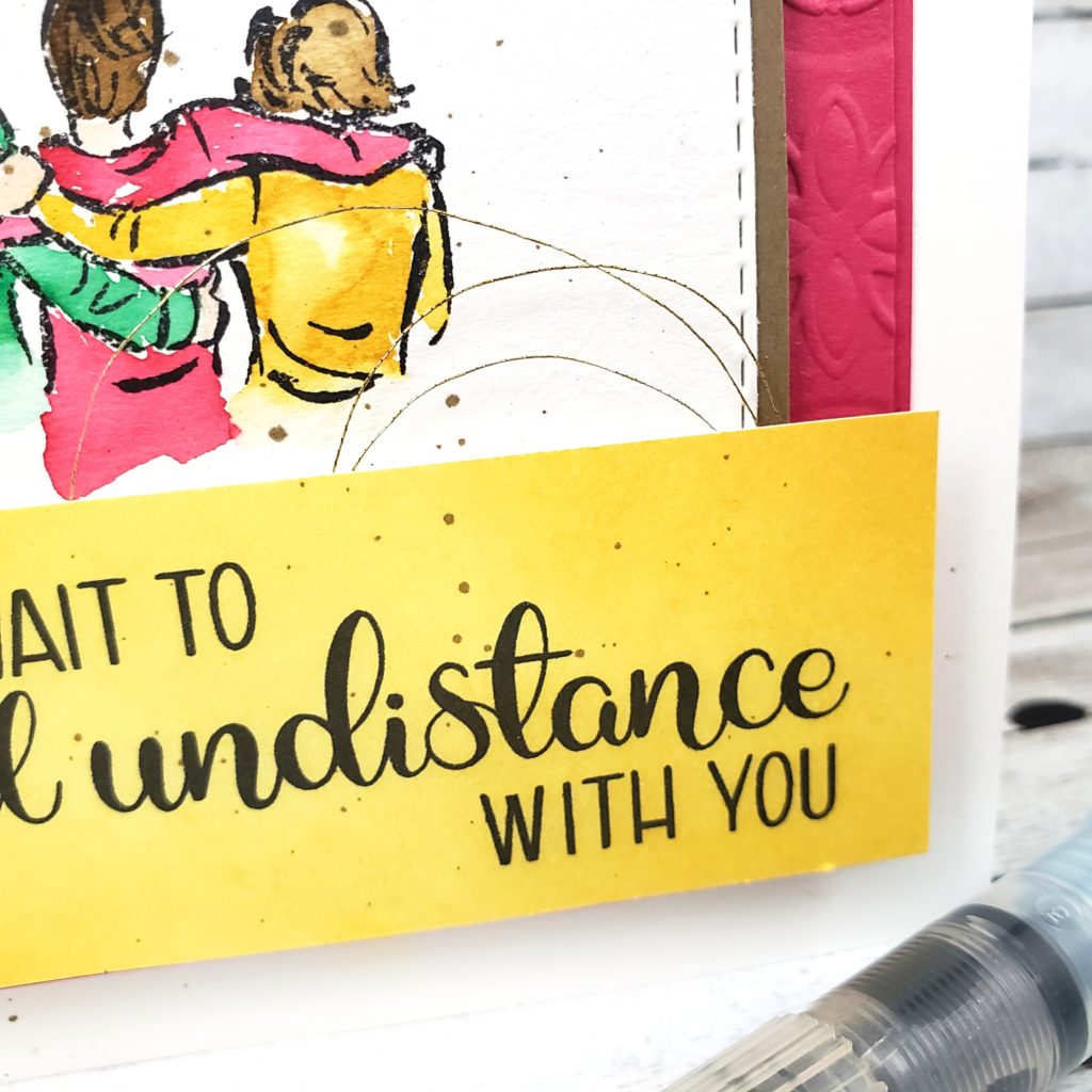
The sentiment is from the Share Sunshine digital stamp set, which is a COVID-19 giveback global fundraising initiative as part of Stampin’ Up!’s Making a Difference program. 100% of the proceeds of the sale of this 15 page PDF stamp set will to to the COVID-19 efforts of The World Health Organization’s COVID-Solidarity Response Fund and/or the United Way Worldwide’s COVID-19 Community Response and Recovery Fund. You can find out more about this set by clicking HERE. I have been finding this set to be so much fun to use!

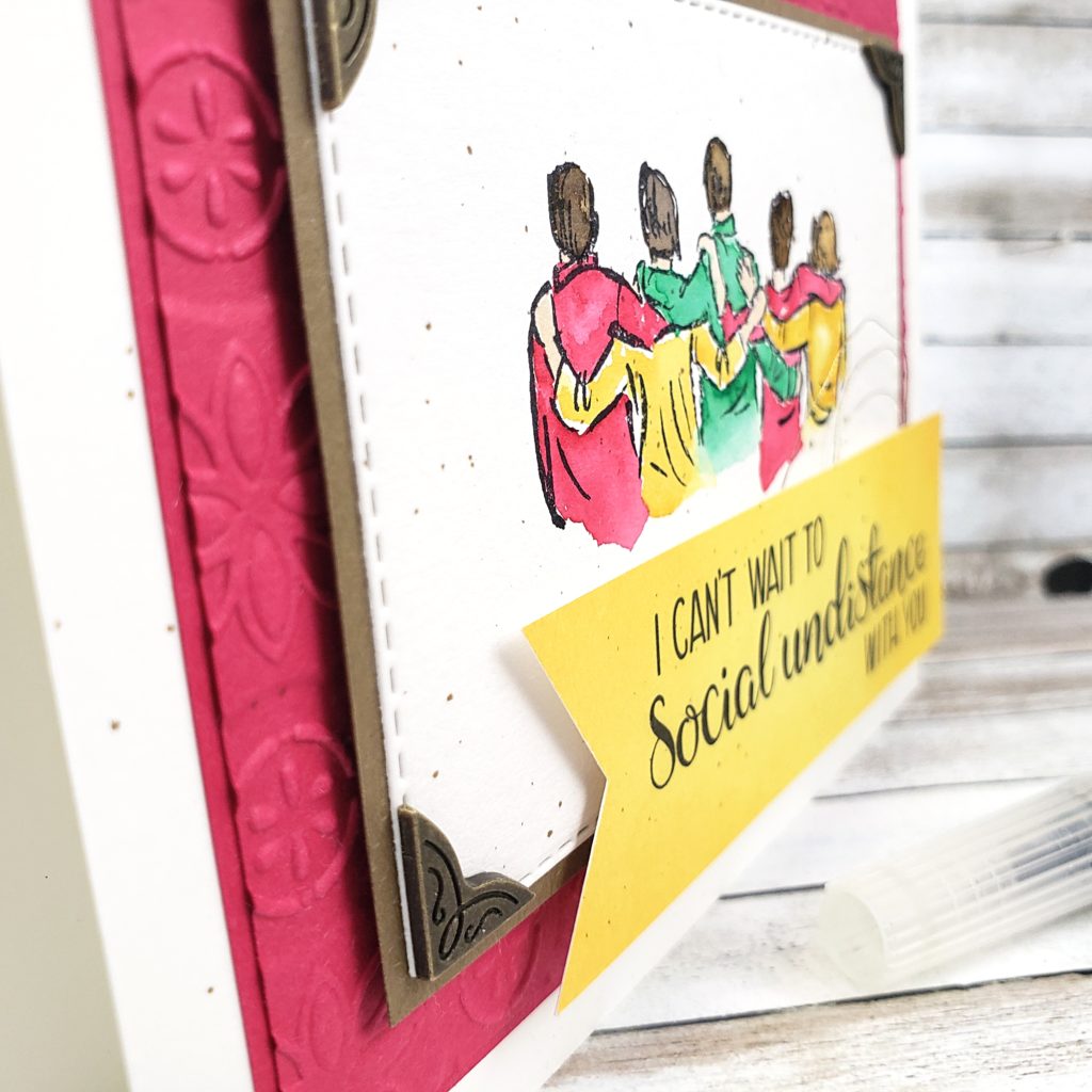
I printed the PDF on Whisper White cardstock and cut out the sentiment from the page. I sponged the cardstock with Daffodil Delight ink and trimmed it down to size, flagging the end using the Banner Triple Punch. This was applied to the front of my card with more Stampin’ Dimensionals, but I also added a swirl of the Silver Metallic Thread (retiring), which I actually took the time to “tarnish” by colouring it with the Soft Suede Stampin’ Blends Marker. It’s a subtle difference, but it works!

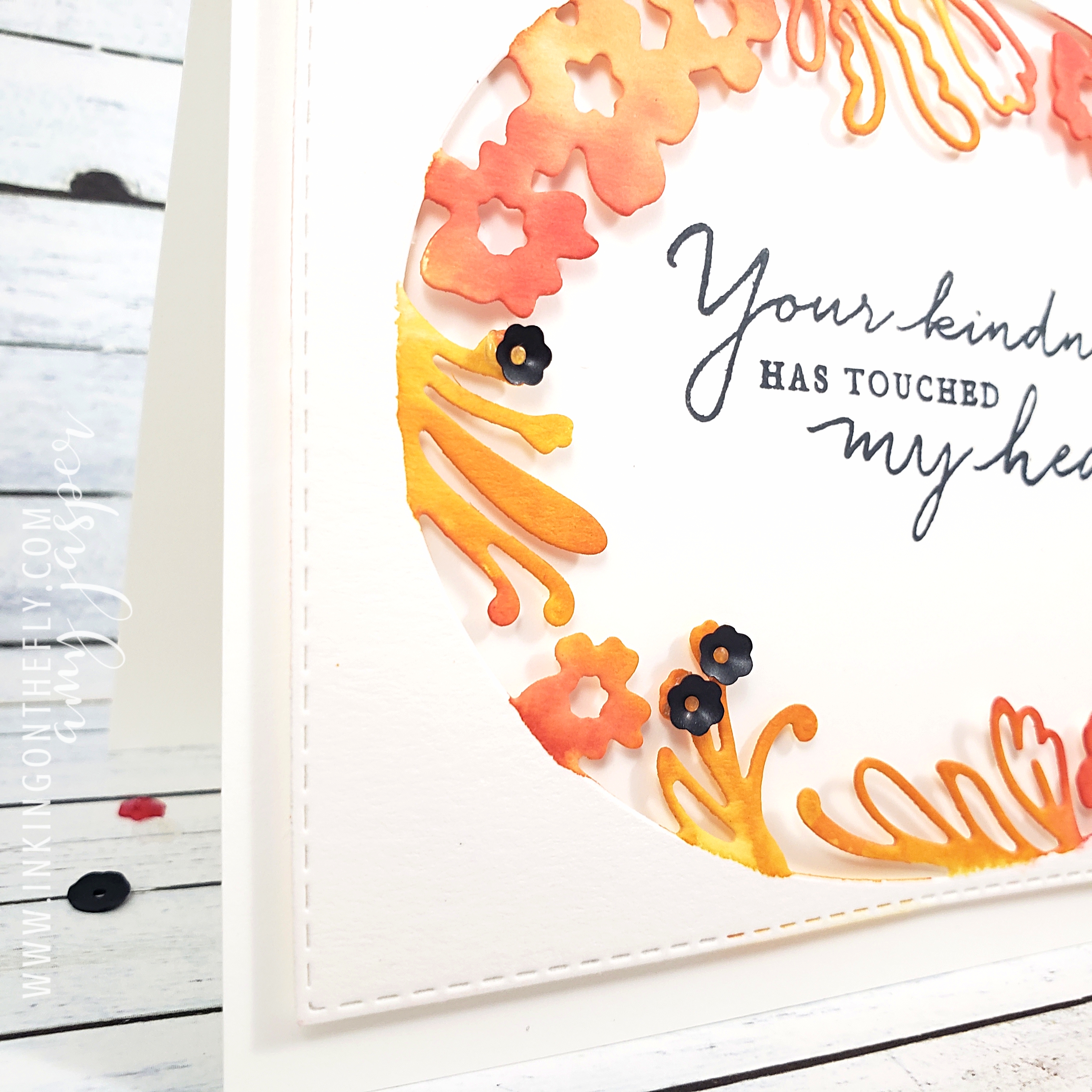
Now, there is an embellishment on here that I haven’t mentioned yet. Those three little metal photo corners are not available to customers until the new catalogue goes live in June. I attached these antiqued corners from the Antiqued Corners and Slides embellishment pack using Multipurpose Liquid Glue. I love them!

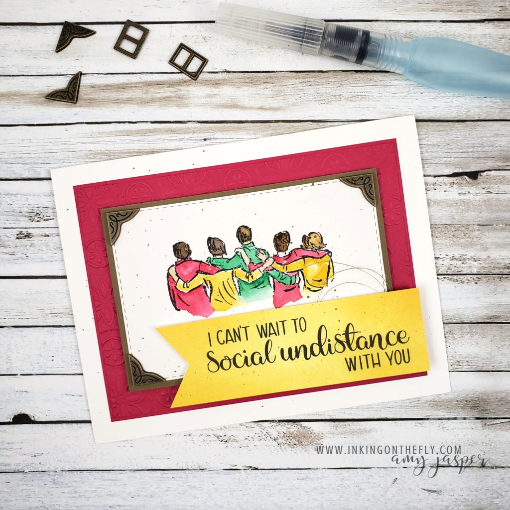
The final touch on my card was to add some Soft Suede spatter. I used the Soft Suede Stampin’ Blends Marker and flicked the brush tip on the lid to cause the ink to spatter across my paper. This might not be a look that everyone loves, but it’s a look that I definitely love!

Did you know that two of these colours are retiring? Lovely Lipstick and Call Me Clover will be leaving us forever to make room for new colours. It’s a bitter sweet time, but I have to say that my excitement for the new products always overshadows the disappointment of what will be left behind!

Head on over to my online store to find all of these products and take advantage of some of the discounted prices on the Last-Chance Products and the Clearance Rack.

Stay safe and craft on!


Painted Petal Label

The As You See It Challenge has a very pretty and fresh colour challenge for us today! I thought I would try using the beautiful Petal Label Dies from Stampin’ Up! along with some watercolouring to create my design..

Here’s the colour combo that inspired the card in today’s blog post.

Isn’t it a precious image! The little swan makes me think of the Christmas ornaments my mom made out of felt one year. She never made a swan, but she did make a little dove. I get a lot of my creativity from her, of course. Thanks mom!

I used the Petal Labels Dies and the Stitched Retangle Dies to cut the Watercolor Paper for my card front. I don’t think the 2019-2020 Annual Stampin’ Up! Catalogue gives the Path of Petals Bundle enough air time. It really is a gorgeous bundle and is only part of the Pressed Petals Suite by Stampin’ Up!. The entire suite is so stunningly beautiful, but I feel like it has been lost in the shadows of the many show-stopping suites in the catalogue. I want to give this one a little more attention! The Petal Labels Dies are delicate and beautiful. The Path of Petals Photopolymer stamp set has the most beautiful fonts for the most eloquent sentiments.

I chose to use a Thick Whisper White card base for this card. Let’s be honest here, I use Thick Whisper White A LOT for my card bases. It is so easy to just add a layer to a white base. I don’t need to do anything fancy to the inside and it makes such a clean and crisp card every time! I struggle to use coloured cardstock for my card bases. I think I need to try to branch away from that a bit. Maybe, I’ll try Very Vanilla. LOL!

With an Aqua Painter and my three ink colours, Mango Melody, Grapefruit Grove, and Poppy Parade, I added colour to the floral edge of the oval die cut watercolour paper. I started with the lightest colour first, then worked up to the darkest colour. I was careful to colour only the floral shapes, trying to keep a clean edge so the oval area would remain defined.

To some of the fronds, I added black sequins from the Peaceful Poppies Sequins pack using Glue Dots to hold them in place.

On a separate piece of Whisper White cardstock, I stamped the beautiful sentiment from the Path of Petals Photopolymer stamp set using Tuxedo Black Momento Ink. I did stamp it a little bit crooked, but that’s why I did it on a separate piece rather than stamping it directly on the card base!! (I’m smart like that, LOL!). I adhered it (with the sentiment straight) to the water coloured, die cut layer using Stampin’ Dimensionals. I needed to do some trimming with my Paper Snips (since the Whisper White layer was now sticking out, crooked, under the die cut layer), then I was ready to attach those two layers to my card base using my trusty Multipurpose Liquid Glue.

Now it’s your turn. Get into your craft supplies and make a card using these colours (or colours as close to these as you can get). This is an opportunity for you to get creative and use this colour challenge as a jumping off point. Sometimes, you just don’t know where you might land!! Don’t forget to share your finished card on a public internet site (Pinterest, public Facebook Page, public Instagram page, Flicker, Splitcoast Stampers, your blog, etc), then share it with us on the As You See It Challenge Blog! We love to see what you’re creative brain does with the challenges.

As always, if you like any of these products, head on over to my Online Store and get them into your shopping cart! Stampin’ Up! makes it easy to create beautiful things!

If you’re outside of Canada, you can’t legally shop from me, but I hope you will continue to visit. Don’t forget to comment and let me know that you did!!

New Year’s Resolutions

I know, I know, nobody really takes New Year’s Resolutions seriously these days. The problem is that we are all gungho to make change and be better, but we often don’t have a plan to make those changes stick. I don’t have the answer for that problem. I can barely stick to a plan in a day, let alone stick to one for a year! I keep trying to find that thing that will turn on the part of my brain that gives me discipline and perseverance. I’ll let you know if I ever do.

In the meantime, I feel like we have to keep trying. Where would we be if we just stopped trying to be better. Nobody would invent things, nobody would make new discoveries, and we probably wouldn’t have any stamps!!! It would be disaster!

I don’t have any official New Year’s Resolutions, but I do know that I will continue to push to be healthy, to be more organised, to spend less time on the internet and more time with my kids, to declutter my house, and to share more of my love of stamping. There are a lot of things that I am always working on. I don’t know that I want to focus on just one thing. And it certainly doesn’t have to be decided for my whole year.

Being healthy is important to me and that’s why I’m drawn to the Do the Impossible stamp set in the new catalogue. I also have some athletes in my life that I can make cards for, using this stamp set.

If you were on my blog yesterday, you would have seen this set altered for a card I designed to give to my niece. That card was pretty involved and shows how making your own cards allows you to personalize it to the recipient. I wanted to show you another design with the same stamp that you can easily replicate. (Because not everyone wants to lay down all that extra ink or even knows what cross-country skiing is!)

The fanciest part of this card is the colour wash background behind the joggers. If you want to see that technique in a Facebook Live video by clicking HERE.

If you don’t want to get caught in the Facebook vortex, the technique involves applying ink with Stampin’ Write Markers to an acrylic block, spritzing it with water using your Stampin’ Spritzer, then “stamping” that colour onto your watercolour paper with the block as your stamp. You might need to blot off some excess water to take control of the look you’re going for, then let the colour wash fully dry before carrying on with the rest of your card.

The rest is simple stamping. Here’s the supply list: Sahara Sand cardstock, Peaceful Poppies Designer Series Paper, Whisper White cardstock, Watercolor Paper, Daffodil Delight Stampin’ Write Marker, Crumb Cake Stampin’ Write Marker, Coastal Cabana Stampin’ Write Marker, Stampin’ Spritzer, Clear Block E, Daffodil Delight cardstock, Jet Black Stazon Ink, Do the Impossible stamp set, Black Stampin’ Mini Dimensionals.

Do you have a New Year’s Resolution? I hope it involves stamping. You know that if you’re in Canada, you can order all you stamping and paper crafting supplies from my Online Store, right!? And that there’s a bunch of new products AND it’s time for Sale-a-bration when you get free stuff just by purchasing stuff that you were already going to get anyway!! How awesome is that!! Go to my ONLINE STORE and have a look!