watercolour

Beautiful and Brave

When I watch superhero movies, I see how brave the heroes are – they’re confident in what they’re doing and there’s no hesitation when they step in the way of the evil villain to protect the innocent. How brave and strong they are and how I wish I could be like that – fearless, confident, smart, and full of purpose!

But that’s not actually the full picture of being brave, is it? To be brave is to have the ability to take action even when you’re afraid. You have to build up courage.

There are quite a few women in my life who I look up to for their courage to step out of their comfort zone and take on a new challenge! Often times, they don’t see it. They only see their own insecurities, doubts and fears. The interesting thing that we often forget about being brave is that it doesn’t mean “not being afraid”, it means being afraid – but doing it anyway.

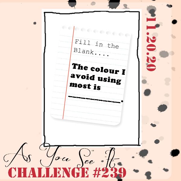
For the As You See It Challenge sketch today, I chose to use the sentiment from the retiring Strong and Beautiful stamp set from Stampin’ Up! and it has me thinking about the brave women in my life. They are an inspiration to me and help me to be a little bit braver by their example.

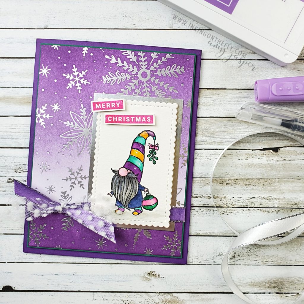
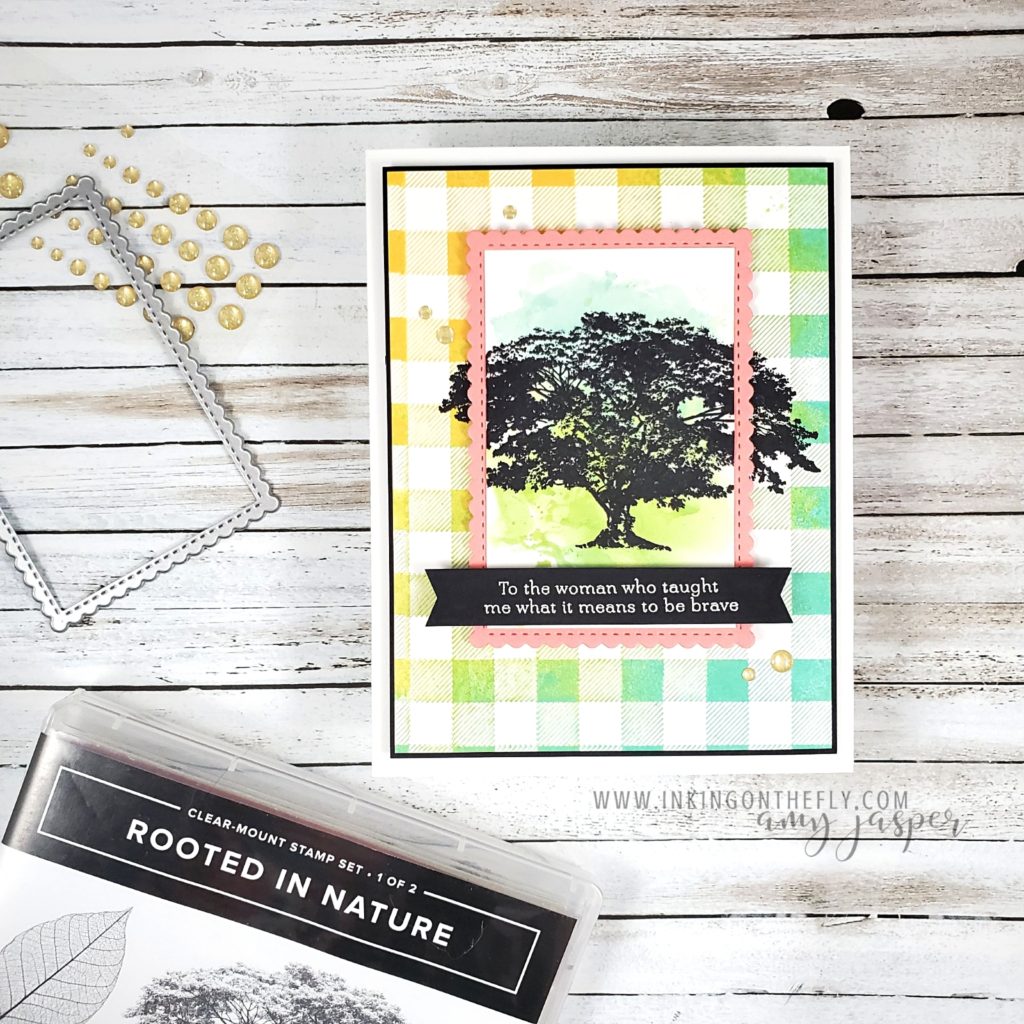
I’ve been doing a lot of die-cutting and paper layers lately and have been feeling like I’m neglecting my ink and stamps, so there’s some fancy inking tricks on this one!

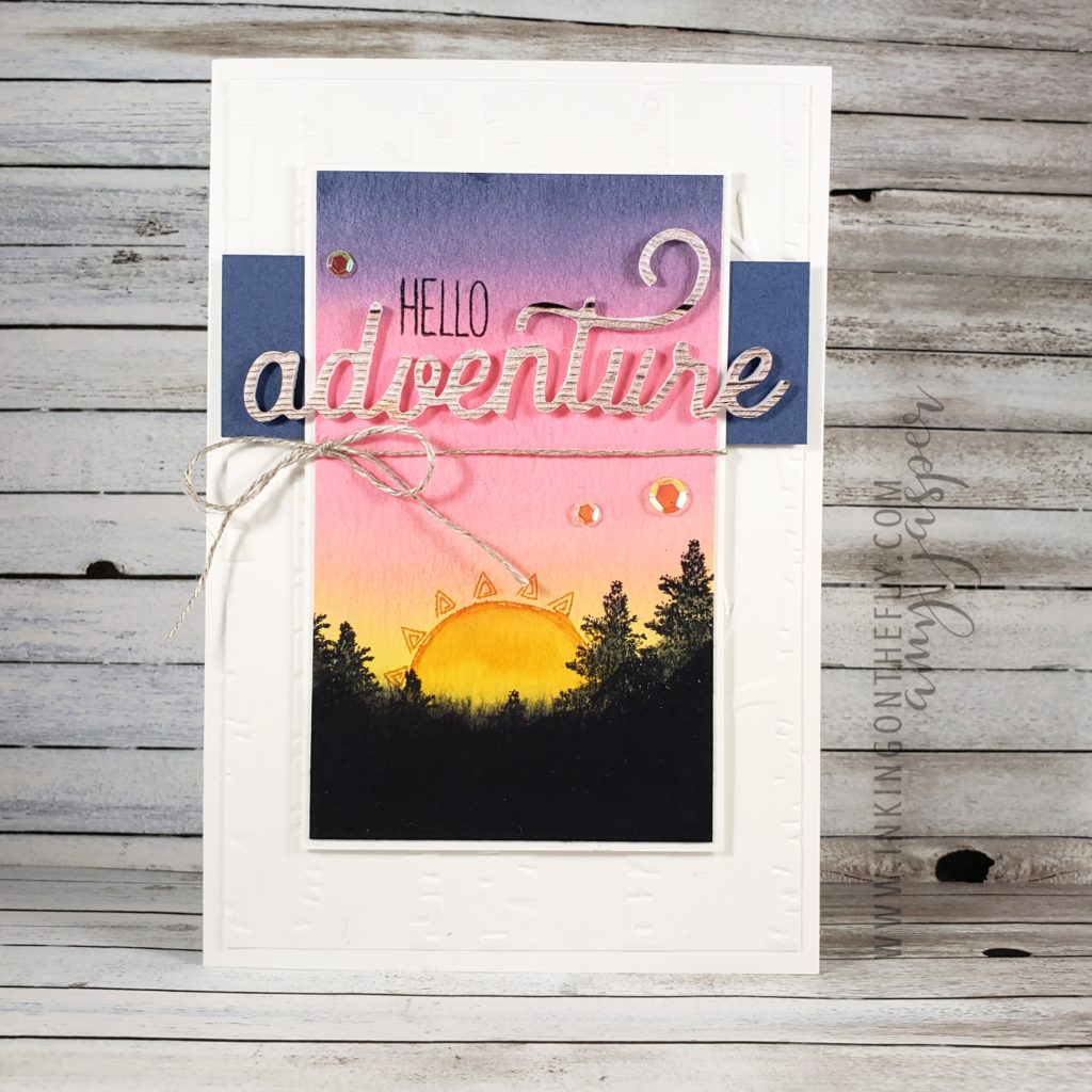
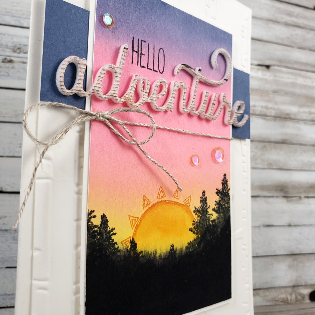
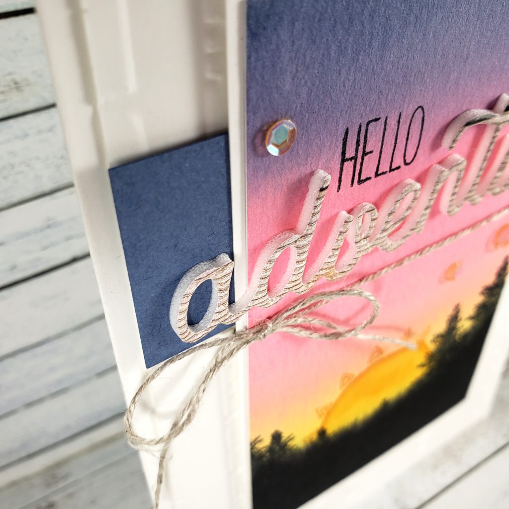
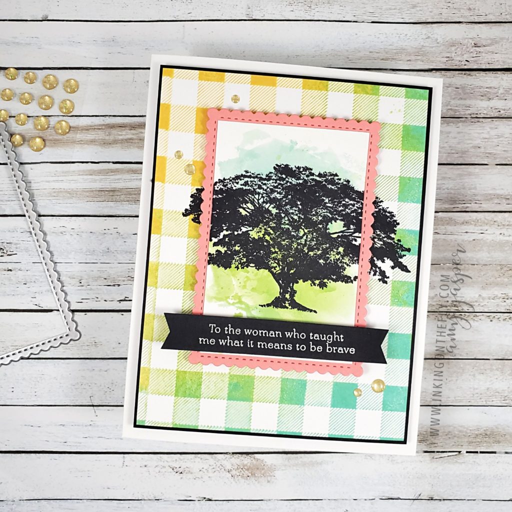
I started by applying Daffodil Delight and Coastal Cabana ink to the Buffalo Check background stamp (retiring soon!). Then I used a piece of paper towel and blended the colours together and pulled off some ink to try to achieve a bit of a distressed look (it still stamped much nicer than I planned). I then added a bit of Granny Apple Green ink to the stamp where the yellow and blue met in the middle to blend the colours even more. With the large stamp facing rubber-side-up, I placed my Basic White cardstock on top of it and pressed evenly all over with my fingertips to transfer the ink to my paper.

I pulled out my Stamparatus stamp positioning tool and placed the checked piece there with a smaller piece of Basic White cardstock over top of it in the center, using the magnets to hold the papers in place. I used Jet Black Stazon Ink on the tree image from the retiring Rooted in Nature stamp set and stamped the image so it stamped on the smaller piece of paper and over the edges onto the larger checked piece. Using the Stamparatus allowed me to stamp it a couple times to get the best image. Good thing I did that, too, because my Stazon ink pad was a bit dry and stamped very poorly the first time! Good thing I had an ink refill on hand!

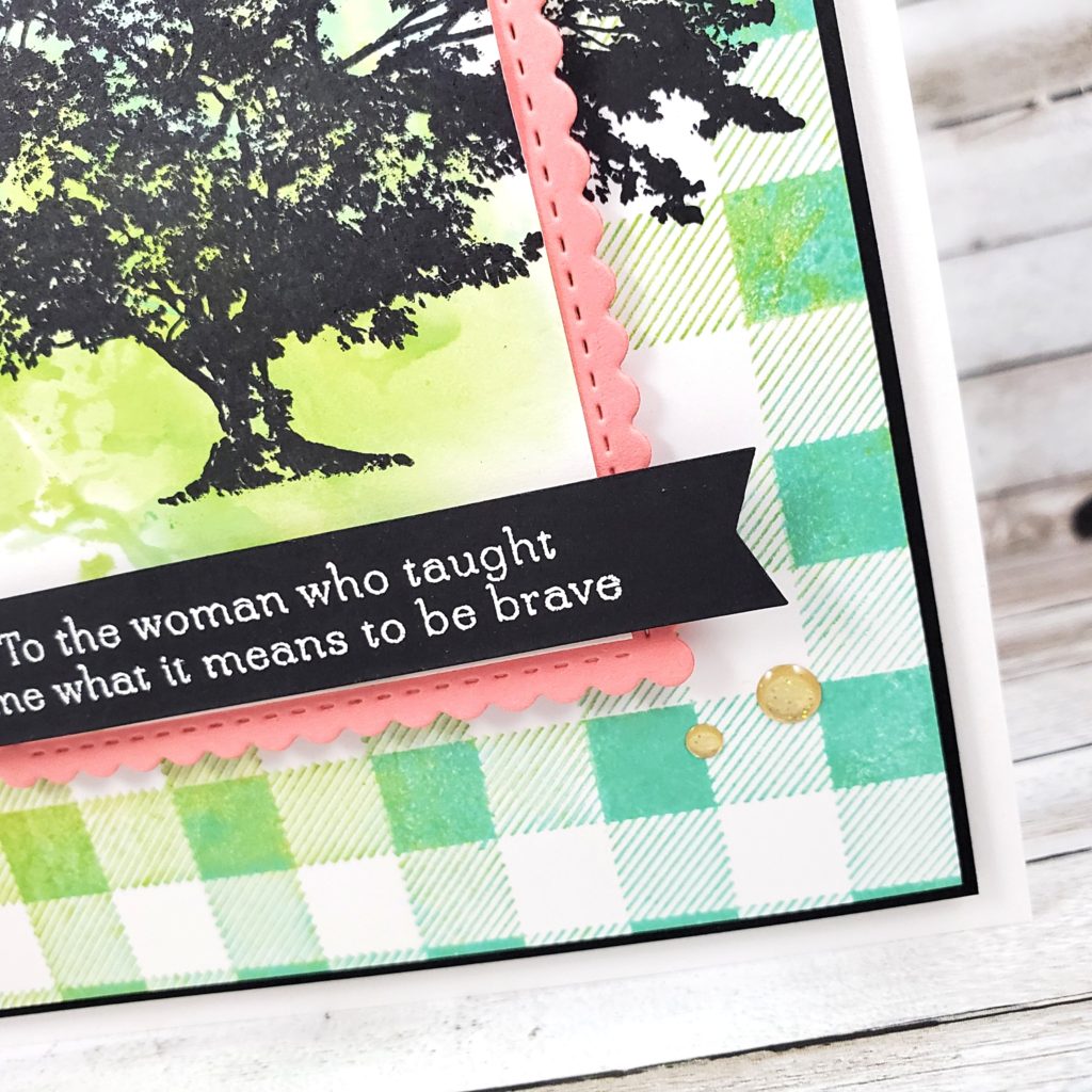
The black tree silhouette looked a bit stark on the small white piece of cardstock, so I grabbed a clear envelope and placed some ink directly from the ink pads of my Granny Apple Green and my Coastal Cabana. With my Stampin’ Spritzer filled with a water and rubbing alcohol solution, I spritzed the clear plastic, then flipped the plastic over and transferred the wet ink to my paper, creating the watercolour effect.

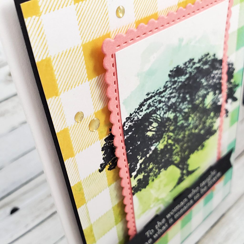
The rest of the card is more straight forward. I adhered the Buffalo Check piece to a slightly larger piece of Basic Black to create a very thin border, then attached it to the Thick Basic White cardbase with Stampin’ Dimensionals. The watercoloured tree image was layered on a Flirty Flamingo die-cut stitched rectangle from the Stitched So Sweetly Dies. These two layers were attached with Stampin’ Dimensionals to the front of the card. Then I stamped the sentiment from the retiring Strong and Beautiful stamp set with Versamark ink on a strip of Basic Black cardstock, applied White Embossing Powder and heat set it with my Heat Tool. I used the Banners Pick a Punch to flag the ends of this piece and adhered it to the front of my card with Stampin’ Dimensionals.

Finally, I added some of the retiring Gold Glitter Enamel Dots to my design.

“I learned that courage was not the absence of fear, but the triumph over it. The brave man is not he who does not feel afraid, but he who conquers that fear.” – Nelson Mandela

If you walked away from an abusive marriage and are now a single working parent, you taught me what it means to be brave. If you came out to your friends and family as LGTBQ+, expecting you’d be rejected by many of them, I am inspired by your courage! If you started a new job, you moved to a different town, you took the city bus for the first time, you did that class presentation, you opened up to someone and let yourself be vulnerable – you have courage!

And sometimes being brave is not about the big moments in our lives. Sometimes, being brave is facing the day-to-day grind so you can have a roof over your head and food on the table. Sometimes, being brave is admitting that you’re struggling and you need help. Sometimes, it’s saying sorry.

I get so inspired when I think of the beautiful and brave people I know. There’s more courage in you than you realize.

There’s more courage in me, too.

Purple for Christmas

We all have our go-to colours. The ones we know will lead us with a devout certainty to creating something beautiful. My colours are often blues and greens with soft neutrals and white to pull it all together. Those are my loyal colours. I trust them. I know what to expect from them. I know who they play nicely with.

But there are a few colours who aren’t trustworthy. They are the trouble-makers. They only want to play with very specific friends and become irritating when they are around any others. This is how I feel about purple. Not all purples wreak havoc, but most do. Currently, the worst of these hooligans is a colour called Gorgeous Grape. The purplest of all the purples. The worst of the worst.

You might want to defend purple in this moment, saying purple has been a comfort to you. Perhaps you would rather point your finger at orange instead. (how dare you! LOL!)

I think we all have an offending colour that we avoid using in our self-expression. We use what inspires us and makes us feel happy. It’s amazing how powerful a colour can be!

This brings me to announcing the fill in the blank challenge from the As You See It Challenge blog for which I have the pleasure of being a designer: The colour I avoid using most is _____.

Oof! This was a tough one. I really struggle with using purple in my card-making. It doesn’t inspire me and I only feel safe pairing it with gray and white. Well, I decided that this was my chance to play with it and give it a respectful effort. I would bring purple and “not gray” together. I didn’t really know what “not gray” was going to be, yet, but I was determined!

And you know what? I really like this card!

I started out with a piece of Feels Like Frost Designer Series Paper, which I sponged with Gorgeous Grape in an ombre from dark to light. I was off to a pretty safe start with purple and silver.

Next I stamped my little Christmas gnome from the Gnome for the Holidays stamp set on watercolor paper with Stazon Jet Black Ink and pulled out my set of Water Painters and got to water colouring my little bearded bearer of Christmas delight. I took my time and enjoyed the process of choosing my colours and waiting patiently for sections to dry so my colours wouldn’t bleed into one another. I even finished it off with some Wink of Stella to give my gnome image some holiday shimmer! Unfortunately, the Wink of Stella detail doesn’t show up well in these photos. You’ll have to take my word for it that it adds a an additional touch of whimsy.

I added even MORE purple to my design by using the dark Highland Heather Blends Marker to colour the Silver Metallic Edged Ribbon. I love how you can make any white ribbon coordinate with your paper using markers! You’ll notice where the ribbon is wrapped around the card, the lightly sponged designer series paper suddenly becomes a darkly sponged area. That was a simple chopping off the top of my sponged paper and moving it to the bottom. I did a lot of crazy thing to make this darn purple work for me, by golly!

I’m not going to get into all of the products and techniques I used to make this card. It’s pretty late and time to cozy up in my blankets and pillows. If you have any questions about products I used or how I did anything on this design, I’d be happy to have a conversation in the comments. Ask away!

I hope you’ll take on this challenge. I warn you, though. It’s not an easy challenge. Give yourself time to get to know the colour you’ve been avoiding. This is your opportunity to learn more about it, who it plays well with and who causes it to be nasty and miserable. Maybe, like me, you’ll be surprised what you’ve come up with.

I wonder if I’d like this card even more if I made it “not purple”

Hello Adventure

The concept of a vacation is different for everyone. Some people think of vacations as travelling over-seas. Those are definitely very special and memorable vacations. My family vacations usually have camping and adventure involved. Vacations don’t have to be anything fancy, though. I recently enjoyed a mini vacation on my front porch; just me and an entire bucket of Häagen-Dazs ice cream. My family had no idea where I was and didn’t come looking for me for at least an hour. It was glorious!!

Why am I talking about vacations, you ask? Well, that is the theme for the challenge from the As You See It Challenge Blog today.

My card design represents vacationing with my family on our camping adventures. I was so excited to try die-cutting my sentiment using the new Foam Adhesive Sheets from Stampin’ Up! I love how the foam pops up this die-cut word from the Sweet Silhouette dies.

I also used the new Water Painters to paint the colour wash background with Mango Melody, Magenta Madness, Misty Moonlight, and Tuxedo Black Momento ink.

Some elements on this card are from the June 2020 Box of Sunshine Paper Pumpkin kit. Can you spot them? If you already are a Paper Pumpkin subscriber, then you’ll recognize them right away. If you aren’t a Paper Pumpkin subscriber, why aren’t you!? Go and subscribe right now so you don’t miss anymore kits! I get so excited when my box arrives at my door each month. It’s a little creative boost and a mini escape.

Hmm… kind of like a mini … vacation!

(See what I did there? I very cleverly pulled Paper Pumpkin into the vacation theme. Yes, I am clever sometimes. Yes, I know I’m being a bit sassy right now, just groan and roll your eyes and move on. I love making people groan at my bad jokes. It makes me feel whole, LOL!)

Where was I?

Oh yes … Here’s another photo.

You can see the very cool Foam Adhesive under the die-cut word in this photo. Seriously, having this stuff for die-cutting makes me really happy! I just peel off the backing of one side of the sheet and apply my paper of choice to that sticky surface (in this case, I used one of the wood patterns from the In Good Taste designer series paper) and run it through my die cutting machine just like I normally would.

What are you most excited about in the 2020-2021 Annual Stampin’ Up! catalogue? I want to know what’s on your wish list!

If you don’t have a copy of the Canadian catalogue, you can view a digital copy by accessing the menu at the top of this blog.

I’d also love to see your take on this theme challenge. Give it a try and share it with us at the As You See It Challenge Blog! We are inspired by your creativity!