2018

Happiness Looks Good

Have you ever thought about how we compliment each other? A friend mentioned this on a Facebook post recently and it really made me think. Here’s what she wrote:

“Many times I hear people being complimented on their appearance – what they are wearing, their hair, the weight they’ve lost, the stuff they have bought, the amazing house they have. I wonder why we don’t really compliment people on how happy they look, or how relaxed they look, or how kind or compassionate or authentic they are. We could compliment people on their generosity and helpfulness. I guess it’s just a reflection of what we value In our society.”

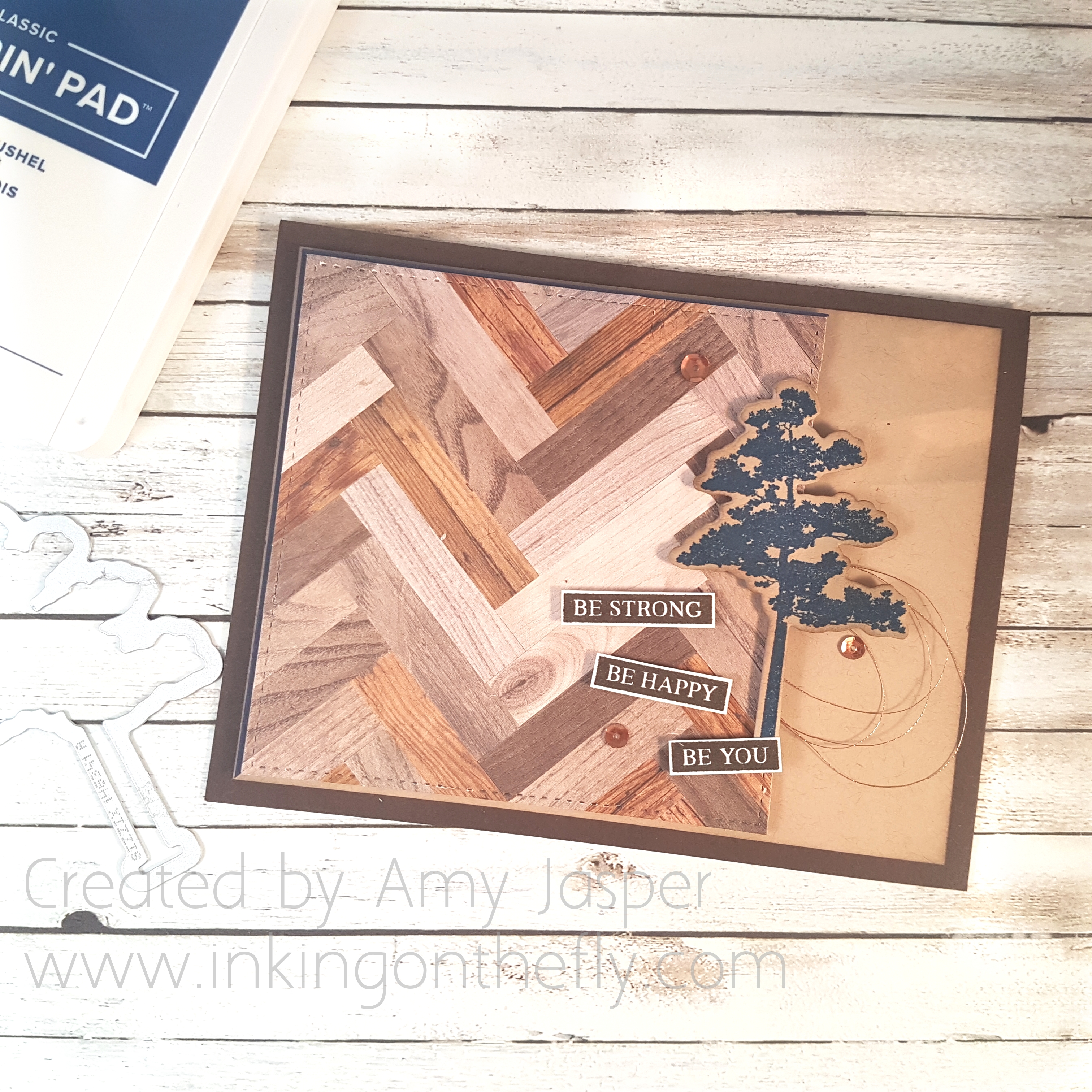
My card today is a reflection of this. I decided to create my own sentiment using the “Make a Difference” stamp set from Stampin’ Up! It has the beautiful hand lettering script and the small block print letters so you can create your own words.

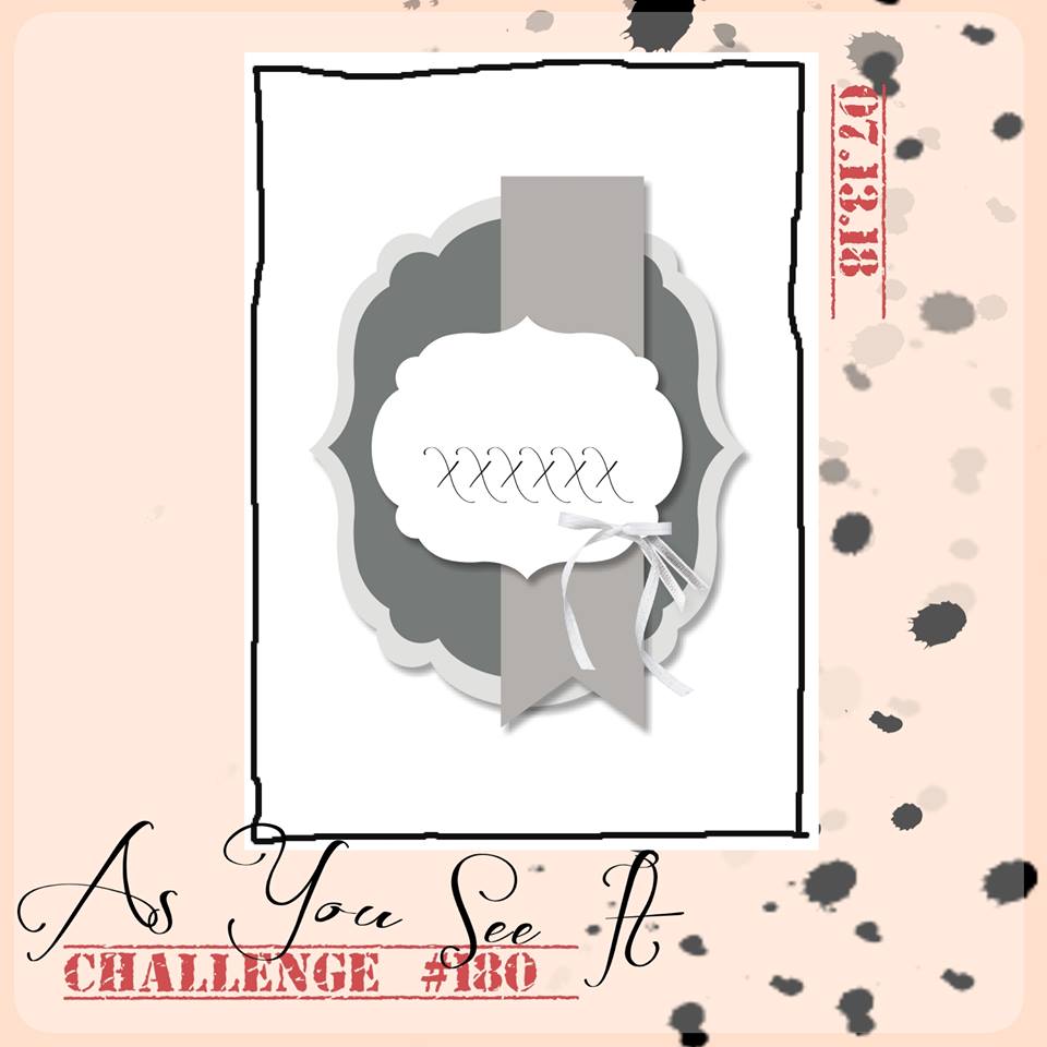
Of course, as usual, I started with the As You See It Challenge sketch.

(but before I did anything, I had to clean my stamp room! It was back to its ol’ disaster of a mess again – silly room – I don’t know why it can’t just clean itself and let me get on with creating!)

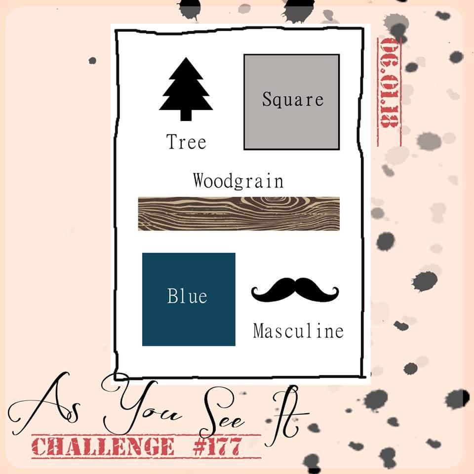
Here’s the As You See It Sketch:

The sentiment on this design is great for anyone who is experiencing something in life that has brought them happiness – an engagement, graduation, new home, new baby. 
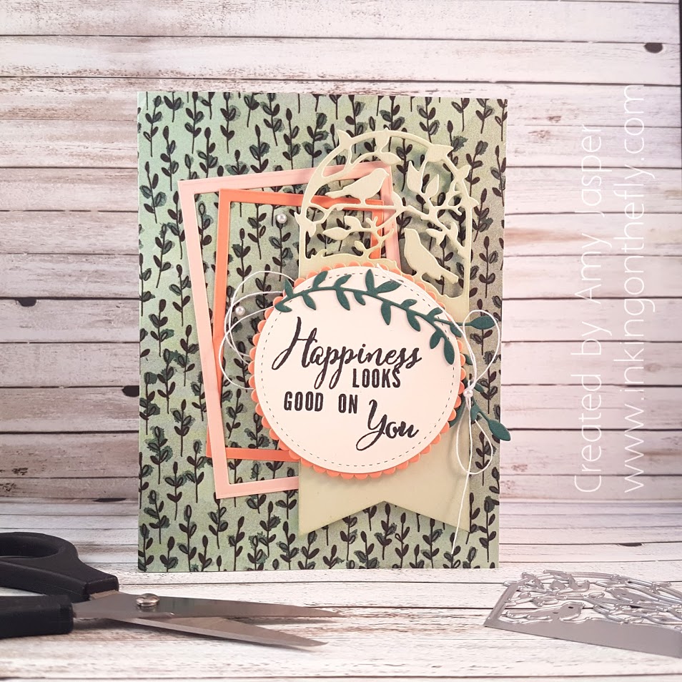
I love how the Share What You Love Specialty Designer Series Paper is cardstock weight so you can use it for a card base. The Petal Pink and Grapefruit Grove rectangular frames were created using the Layering Squares thinlits – to cut the rectangle inside, I just cut a square twice – side by side. Easy peasy. 
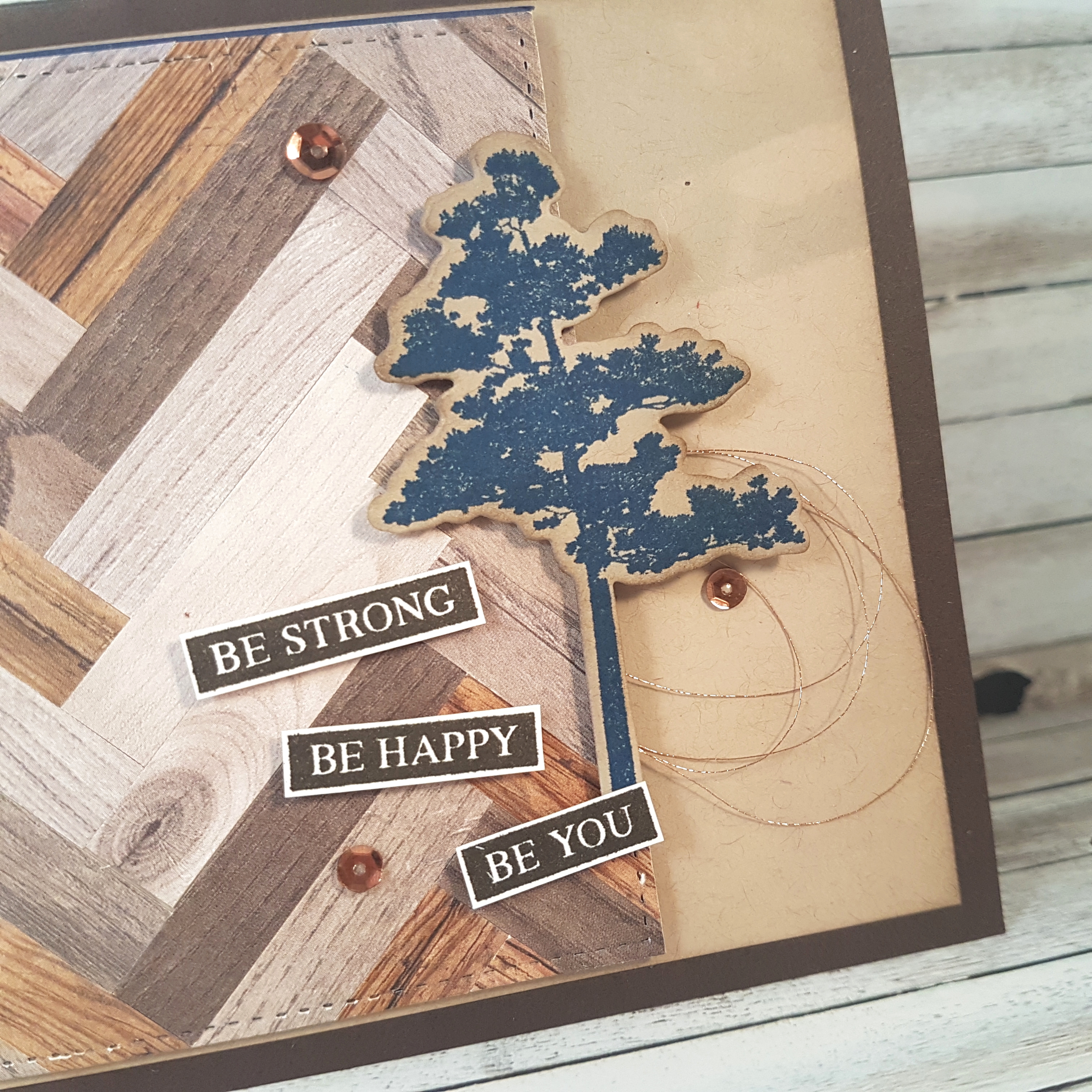
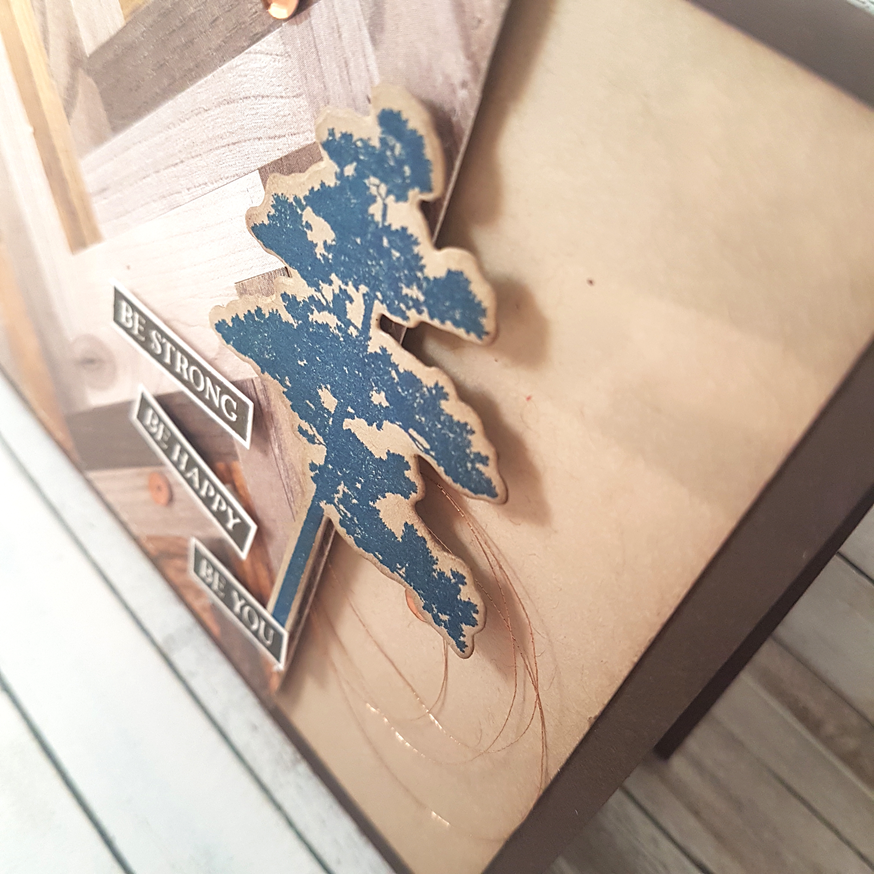
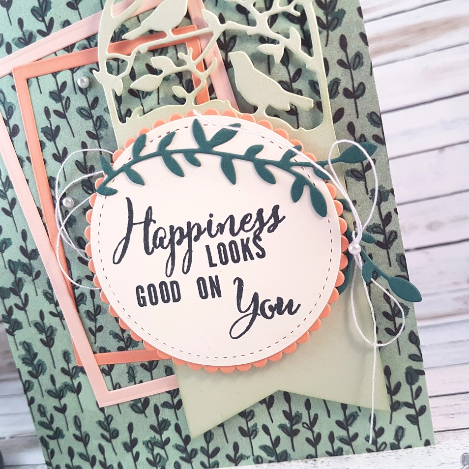
A tag was made using the Botanical Tags thinlits and Soft Seafoam cardstock and attached with Dimensionals. Layered over that is a Grapefruit Grove scallop circle cut using a circle die from the Layering Circles framelits with a Very Vanilla circle cut using a circle die from the Stitched Shapes Framelits. A few leaves from the Botanical Tags Thinlits were cut from Tranquil Tide cardstock and adhered to the card front.
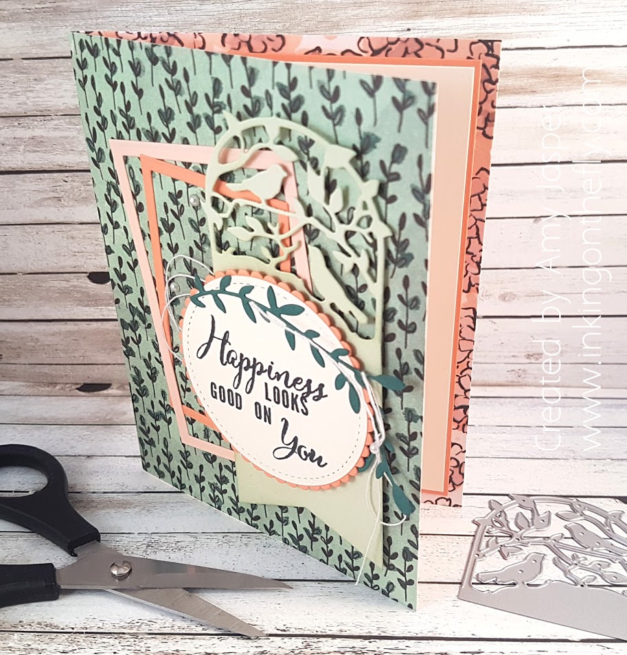
The sentiment is stamped one letter at a time using the Make a Difference stamp set. I drew some lines very lightly in pencil to help me stamp my words straight, then erased them when I was done. It turned out quite well for my first try!

The final touch of White Thread from the Share What You Love Embellishment kit and a few Basic Pearls finish this card off nicely.

Be sure to try the sketch and play along. We love to see what you’re creative brains can do!

Watercolor Watermelon

The background for this card is a total and utter CASE (Copy and Share Everything) from Kreativformat on Instagram. I loved the stripes, and the fresh vibrant colours. It was the perfect fit for today’s As You See It Challenge!Themes are so fun and completely open to interpretation. I feel like the colours on my card are bright and fresh, but the watermelon is also juicy fresh fruit.

I used an Aqua Painter to paint with my Stampin’ Up inks: Flirty Flamingo, Call Me Clover, and a wee bit of So Saffron. I drew in the watermelon seeds by hand using my journaling pen after the ink was completely dry, then I stamped the cheerful sentiment “happy life” from the Tabs for Everything stamp set with Tuxedo Black Momento ink.I die cut the watermelon image with a Stitched Shapes framelit circle, then matted it with the Cool Caribbean scallop circle , die cut with a Layered Circle scallop. The tag is created with the Scallop Tag Punch and a piece of the Share What You Love Designer Series paper. The background was created using a piece of Whisper White cardstock and 1/2″ strips of Gray Granite, Mint Macaron, Soft Seafoam, So Saffron, Petal Pink, and Flirty Flamingo cardstock.I loved the look so much that I tried it with another image as well.

Which card do you like best?

Be Parquet

When I was nine years old, we moved into a new home – well, new to us. The yard was full of tall yellow wild grass and grasshoppers. So many grasshoppers! The house was built in the 80s,  I think. It was a two story, white stucco house with a nice layout where the staircase was at the center.  When you walked in through the front door, you were welcomed with a large foyer that was as tall as the two floors of the whole house! The large entry way was a great spot for happy hellos and long, lingering good-byes.

I remember skipping with my jump rope on that open foyer space. I played board games on that floor.  I remember the comforting “click click” sound of dog nails on the floor as our small honey-coloured maltese/cocker spaniel made her way through the house. We raced around the staircase and would watch the floor flash past as it changed under our feet – beige carpet in the living room, linoleum in the kitchen, beige carpet in the TV room, parquet flooring in the foyer – carpet, lino, carpet, parquet, carpet, lino, carpet, parquet.

The parquet pattern was in squares. It has since been updated and now there is laminate wood flooring throughout the foyer, TV room and kitchen. My own kids have raced around the house when we visit my parents for Sunday dinner – lately it’s during a rubber band war.

Good times. Good memories.

My card design today reminds me of that parquet flooring. Instead of squares, I tried a herringbone pattern. Of course, it all begins with some prompting to get that creative mojo going. Here’s the assortment challenge from the As You See it Challenge blog:

I get pretty excited when I find a fun way to use paper scraps, especially with paper that I LOVE! The Wood Textures Designer Series paper is on the top of my list, so you you can imagine how satisfying it was to turn my scraps into something awesome!

The herringbone pattern is created using short, narrow strips of patterned paper and adhering them to a piece of cardstock. I used my Multipurpose Liquid Glue to adhere the strips (remember, less is more – nobody wants a sticky oozy mess!).

I started by scoring a line in the center of the paper and laying my first five strips down without adhesive first, so that I could use the line as a guide for straight placement. Then I was able to pick up and adhere one piece at a time until my piece of cardstock was full. Once full, I trimmed the paper to size and carried on with the rest of the card.

I trimmed my herringbone parquet into a square and then thought about something crazy – what if I used my Stitched Shapes Framelits to add a decorative stitched edge to this large square!?

I know – CRAZY!!

But it worked! And it wasn’t even that hard!!

I used the largest square from the Stitched Shapes Framelits and placed it, blade up, on my Big Shot clear plate so that I could see the cutting edges clearly. I placed my parquet piece right side facing down, so that the paper lined up in the corner of the framelit.

(Oh my goodness, I need to give you photos of this process! SERIOUSLY! … I’ll try to add them later)

I put my top plate over the corner that I wanted to cut (and ONLY over that corner) and ran it through the Big Shot. The Big Shot cuts when there is pressure, so where the top plate didn’t make contact with the die, cutting did not occur. I repeated this process three more times to make a border around my entire 3-3/4″ parquet.

So cool!!

The rest is detail.

I sponged Crumb Cake ink all around the edges of a layer of Crumb Cake cardstock, then adhered it to my Early Espresso card base.

It’s not super noticeable in the photos, but there is a piece of Night of Navy cardstock matting the upper left corner of my parquet square, which is adhered to the Crumb Cake layer with Mini Stampin’ Dimensionals. The tree image from the new Rooted in Nature stamp set, is stamped on Crumb Cake cardstock with Blueberry Bushel ink (new ink! new ink!), then die cut with the coordinating framelit. To make it pop a bit more on the card, I sponged the edges of the tree with more Crumb Cake ink.

The sentiment is also from the Rooted in Nature Stamp Set. I stamped it on Whisper White Cardstock with Early Espresso ink, then cut it out by hand to use the pieces individually. I adhered the tree and the sentiment with Mini Dimensionals, cut in half so they would fit.

The Copper Metallic Thread was looped and stuck on one of those Dimensionals before that tree was planted on my card.The final step was to add a few copper sequin from the Metallics Sequin Assortment to the card front using Mini Glue Dots.

And there you have it! It has a tree. It has a square. It has woodgrain. It has blue. AND it is masculine! It has it all, Folks!

I think I like it!

What will you do with this assortment challenge? Give it a try and share it on the As You See it Challenge blog!