tutorial

Watercolour Floral Anniversary

I admit. There are many times when I find a great card online and I shamelessly copy it. In the stamping world, of course, we call it CASEing: Copy And Share Everything! My design for you today is a CASE of a card I saw and loved; simple and elegant, with a touch of whimsy. If you want to see the inspiration, click here.

And who doesn’t love the look of some watercolouring, anyway!?

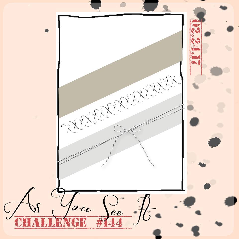
The As You See It Challenge Blog has a theme challenge this week.

My card design uses the lovely Flirty Flamingo for the card. I used the Flirty Flamingo cardstock for the base and I used the Flirty Flamingo ink for the sentiment from the Number of Years photopolymer stamp set from Stampin’ Up!

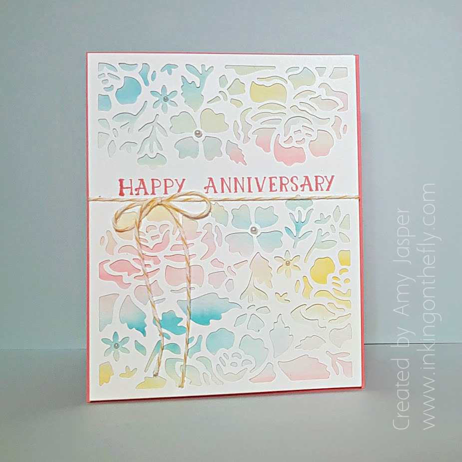
To create the watercolour background, I first used an Aqua Painter to wet the entire surface of the Watercolor Paper from Stampin’ Up! It needs to be wet enough that the water sits on the surface without pooling, but not so wet that your colour just slides to the edges of the paper.

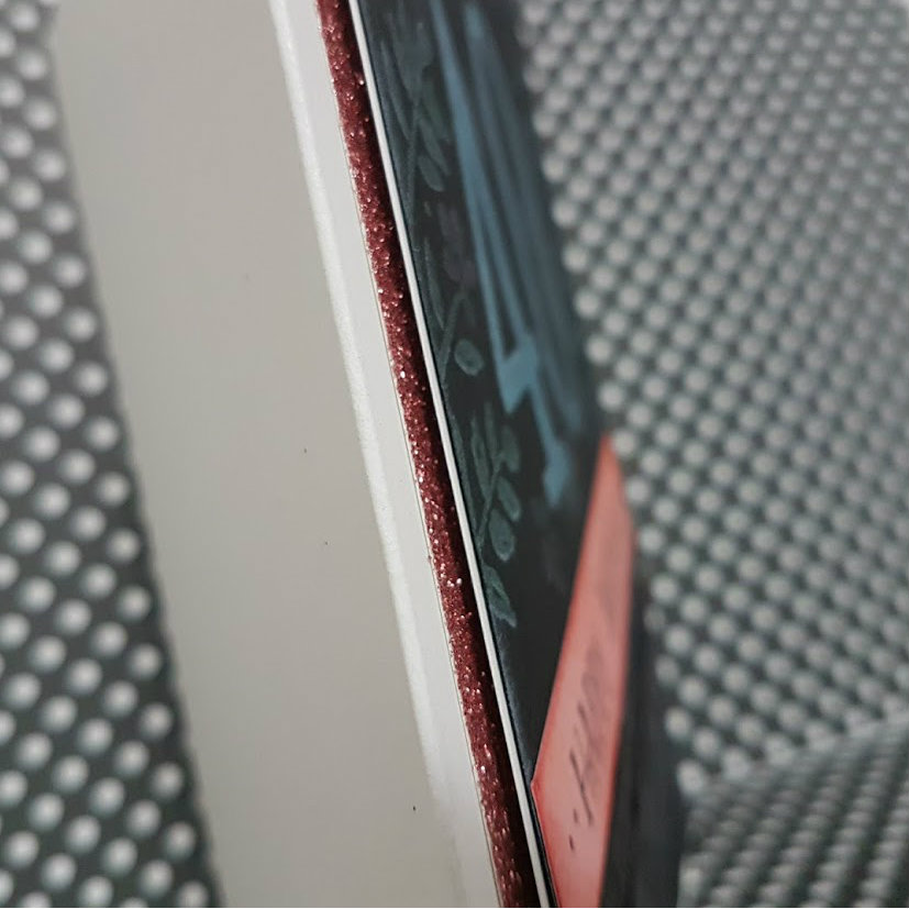
Then I picked up Flirty Flamingo Ink with my Aqua Painter and spread out a few brushstrokes of colour here and there on the Watercolor Paper. I wiped off the Aqua Painter before picking up some Tempting Turquoise ink and added some random swashes of it to the Watercolor Paper. Again I wiped off the colour before moving on to add some Daffodil Delight to the page until the page was full. With each colour that I added, I also took the time to carefully pull a little bit of one colour into the other on the page so they would blend together a little bit rather than having a sharp line between colours. This gave me some soft green, hazy purple and quiet peach tones in my palette.
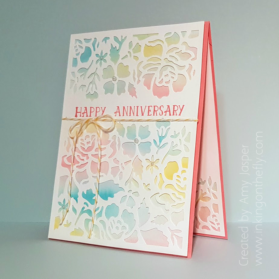
While I waited for my watercolouring to dry, I used my Detailed Floral Thinlit dies, my Big Shot (you definitely want the Precision Plate with these dies!) to cut the floral detail out of the Whisper White cardstock. I stamped the sentiment from the Number of Years stamp set by Stampin’ Up on the card with Flirty Flamingo ink.

When the watercolour was completely dry, I adhered the die cut Whisper White piece of cardstock to the Watercolor Paper with some Multipurpose Liquid Glue (not too much!). The Crushed Curry Baker’s Twine was then tied around these adhered layers before attaching them to the card base using Stampin’ Dimensionals. Basic Pearls were added to a few of the flower centers as a finishing touch.
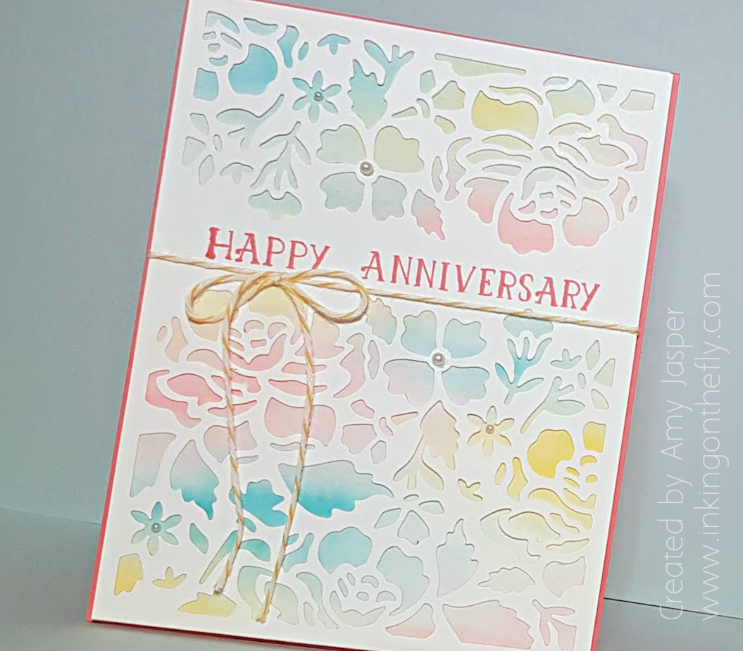
I also used the same technique for the inside of the card, but only used the smallest of the two floral dies from the Detailed Floral Thinlits.

Seriously folks, if you haven’t done any watercolouring by now, you MUST. Go right now and order some Watercolor Paper and some Aqua Pens. You won’t regret having these tools in your supplies!

Be sure to also play along with the As You See It Challenge using this anniversary theme. You never fail to inspire me with your creativity. So bring it!

Save

Save

Faux Coloured Chalk 40th Birthday

This faux coloured chalk 40th birthday card was created using Whisper White Craft ink from Stampin’ Up along with their regular Classic ink colours. It’s so easy to create this effect with the see through photopolymer stamps!

The layout of the card is inspired directly from the As You See It Challenge blog. This one is challenge #144.

As You See It Challenge #144I finally purchased the Number of Years photopolymer stamp set from Stampin’ Up and was so excited to be able to use it to create this card for my friend’s 40th birthday celebration. I felt inspired to try a technique that I’ve never really seen done before, though I’m sure it has been done by someone, somewhere!

chalk 40I created a faux coloured chalk by first stamping the numbers and the flower images with Craft Whisper White ink on my Basic Black cardstock. This ink is thick and takes a while to dry, so after stamping, I heat set it with my Stampin’ Up Heat Tool. Once dry, I thoroughly cleaned my stamps and chose bright coloured inks: Tempting Turquoise for the numbers, Cucumber Crush for the leaves, and Flirty Flamingo for the flowers. Since you can see through the photopolymer stamps, I could stamp my coloured ink right over the dry craft ink on top of the previously stamped images. This added a soft shade of colour to the white ink. I found that I could even stamp with the coloured ink a second time to get a bit more colour added to the look.

chalk 40 close chalkIf you choose to use the Stamp-a-majig positioning tool, you could be even more precise with placement, but I think it turned out quite well with my crazy-eye-balling-it skills.

After everything was stamped, I added some strategically placed smudges of the Whisper White Craft ink over the Basic Black cardstock using a Sponge Dauber and a very light touch. The Gorgeous Grunge stamp set from Stampin’ Up also added some detail to my faux chalkboard.

chalk 40 metallic threadThe lower portion of the card has two diagonally placed pieces of cardstock: Blushing Bride and a strip of the black patterned paper from the Neutrals Designer Series Paper Stack. The Blushing Bride strip of cardstock was stamped with the sentiment using Momento Tuxedo Black ink, then sponged around the edges with Blushing Bride ink. A couple of hand drawn dots were added with my Project Life pen for a bit of detail. The patterned paper was a bit too crisp for my liking, so I sponged all over it, with a heavier hand around the edges, using the Momento Tuxedo Black ink. I adhered these strips to the Basic Black “chalkboard”. I wanted to add a subtle detail using the Black Metallic Thread, so I punched notches into the edges of the layer with my hand held 1/8″ Circle Punch. This allowed me to easily wrap the thread and have it hook into the notches and hold it into place.

chalk 40 sideThe Basic Black cardstock layer was then adhered directly to a layer of Whisper White cardstock. This was then adhered to the Blushing Bride Glimmer paper layer (which was adhered directly to the Thick Whisper White card base) with Stampin’ Dimensionals. I was quite liberal with my dimensionals and was sure to press them firmly to the glimmer paper as sometimes the glitter resists good adhesion.

chalk 40And the result is this fun faux coloured chalk 40th birthday card!

If you haven’t already seen the other projects that the design team created using this fun layout, be sure to head on over to the As You See It Challenge blog and have a look. Give the challenge a go yourself and be sure to share it with us on the challenge blog using the link on the page.  We love seeing what you do with the challenges!!

Save

Save

Twist and Pop Chickens Pop Up Card

I found my new favourite pop-up card! Once you know how to build this one, it’s super easy and doesn’t take very much time at all! I had a look at a few tutorials for this particular card and found this to be the easiest way with the least amount of measuring and fuss.

When I first had a look at the Stampin’ Up Sale-a-bration brouchure for 2017, I squealed with delight when I saw the funny little chickens in the Hey Chick stamp set! I think they are so fun and silly and I fell in love with them immediately. Believe it or not, this card is the first time for me to use this stamp set.

Here’s the simple card front:

twist and pop chicken card by Amy Jasper www.inkingonthefly.comI love the simplicity of this card. The hand-drawn lines around the Whisper White layer add a simple light frame. The chicken image is stamped with Jet Black Stazon ink and coloured with Blender Pens using Smoky Slate ink, Crushed Curry ink and Watermelon Wonder.

Here’s what happens when you open it:

Save

You can see that I did more of those hand-drawn lines with my Project Life pen on each of the inside panels of this card. I used some Tangerine Tango ink with my Blender Pen for the crazy chicken’s “hair” and tail feathers, some Crumb Cake ink for the body of the crazy chicken and the body of the looking back chicken. Smoky Slate ink accents the pecking chicken and the cracking egg images.

Twist and Pop inside by Amy Jasper www.inkingonthefly.comThe best part about this pop-up card is that it is super easy to make. I started with preparing the piece for my inner mechanics, Thick Whisper White cardstock measuring 3-1/2″ x 8″. This piece was scored lengthwise at 1-3/4″, then I used my Simply Scored tool to make a notch marking at 2-1/4″ on the long edge of the cardstock. I did four of these marks, then used them as guidelines to score the X needed for these magical inner workings of this pop-up card. The So Saffron panel piece measures 3-1/2″ x 10″ and is scored at 2-1/2″, 5″, and 7-1/2″, then folded in an accordian fold style.

It’s not easy to explain this fun card in writing. Are you confused, yet? LOL! I thought you might be, so I made a video! Check it out on my youtube channel by clicking here.

twist and pop chicken card by Amy Jasper www.inkingonthefly.comI hope you give this super fun card a try. It’s guaranteed to delight anyone who opens it to find that it’s much bigger on the inside!

Save

Save

Save